comparing data displays
TRANSCRIPT
Page 1 of 21 MCC@WCCUSD 03/10/2014
Grade Level/Course: Grade 6, Grade 7
Lesson/Unit Plan Name: Comparing Data Displays
Rationale/Lesson Abstract: This lesson will focus on the progression of data displays from grades 6 through grades 7. First by comparing displays of numerical data in dot plots, histograms, and box plots. Then it will go on to compare two populations with similar variabilities represented using the same type of display.
Timeframe: This lesson covers two class periods and two grades. The grade 6 portion of this lesson is designed to be used in one class period and the grade 7 portion of this lesson is designed to be used in one class period.
Common Core Standard(s): Summarize and describe data distributions. 6.SP.4 Display numerical data in plots on a number line, including dot plots, histograms, and box plots. Draw informal comparative inferences about two populations. 7.SP.3 Informally assess the degree of visual overlap of two numerical data distributions With similar variabilities, measuring the difference between the centers by expressing it as a multiple of a measure of variability. For example, the mean height of players on the basketball team is 10 cm greater than the mean height of players on the soccer team, about twice the variability (mean absolute deviation) on either team; on a dot plot, the separation between the two distributions of heights is noticeable.
Instructional Resources/Materials: Warm Up (on last page), Something to Measure Students’ Heights, Dice, Straight Edges (to create displays)
Page 2 of 21 MCC@WCCUSD 03/10/2014
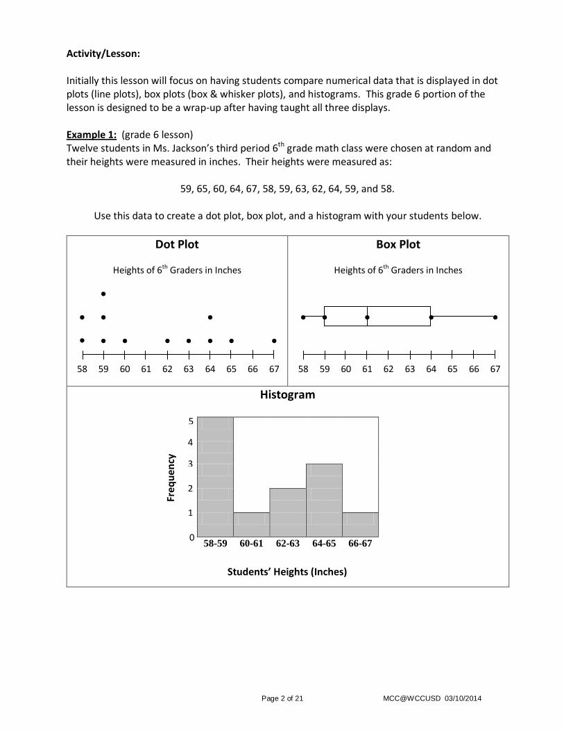
Activity/Lesson: Initially this lesson will focus on having students compare numerical data that is displayed in dot plots (line plots), box plots (box & whisker plots), and histograms. This grade 6 portion of the lesson is designed to be a wrap-up after having taught all three displays. Example 1: (grade 6 lesson) Twelve students in Ms. Jackson’s third period 6th grade math class were chosen at random and their heights were measured in inches. Their heights were measured as:
59, 65, 60, 64, 67, 58, 59, 63, 62, 64, 59, and 58.
Use this data to create a dot plot, box plot, and a histogram with your students below.
Dot Plot
Heights of 6th Graders in Inches
●
● ● ●
● ● ● ● ● ● ● ●
58 59 60 61 62 63 64 65 66 67
Box Plot
Heights of 6th Graders in Inches
● ● ● ● ●
58 59 60 61 62 63 64 65 66 67
Histogram
58-59 60-61 62-63 64-65 66-67
0
5
4
3
2
1
Students’ Heights (Inches)
Freq
uen
cy
Page 3 of 21 MCC@WCCUSD 03/10/2014
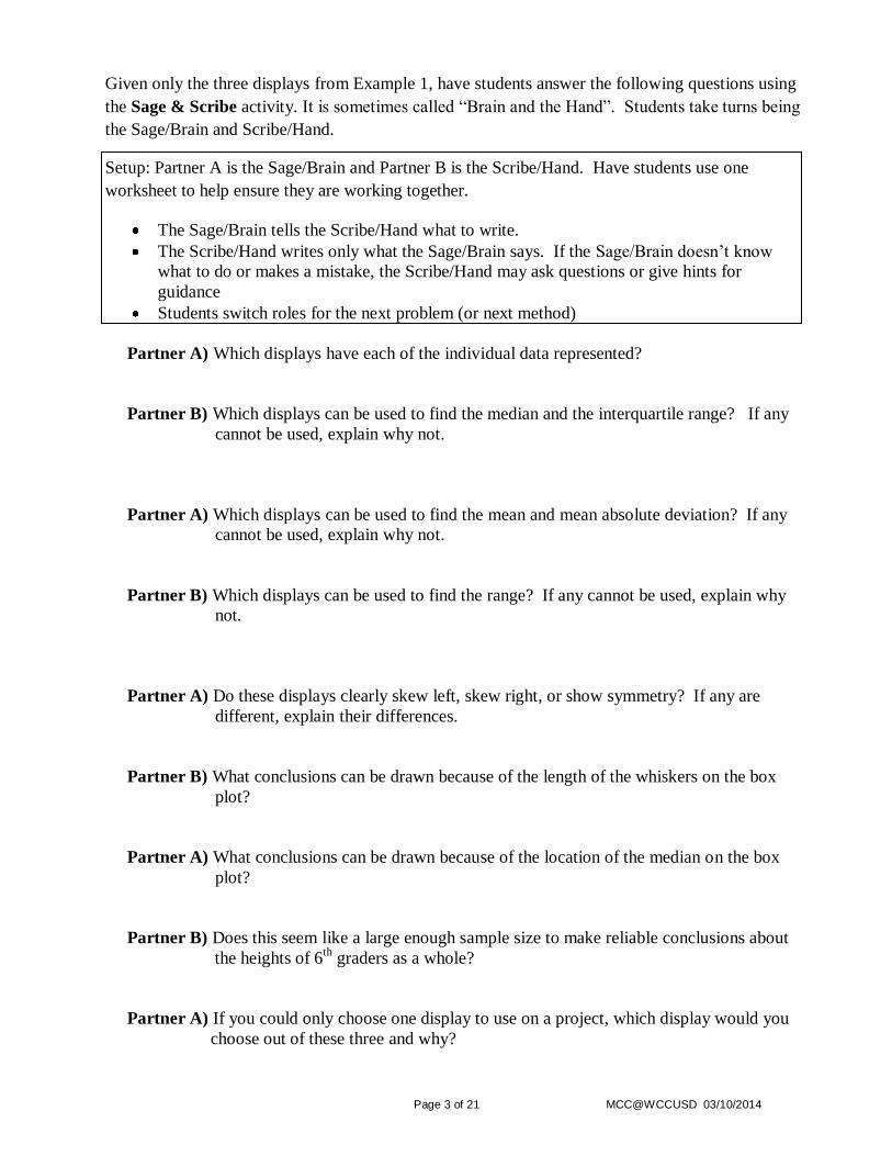
Given only the three displays from Example 1, have students answer the following questions using
the Sage & Scribe activity. It is sometimes called “Brain and the Hand”. Students take turns being
the Sage/Brain and Scribe/Hand.
Setup: Partner A is the Sage/Brain and Partner B is the Scribe/Hand. Have students use one
worksheet to help ensure they are working together.
The Sage/Brain tells the Scribe/Hand what to write.
The Scribe/Hand writes only what the Sage/Brain says. If the Sage/Brain doesn’t know
what to do or makes a mistake, the Scribe/Hand may ask questions or give hints for
guidance
Students switch roles for the next problem (or next method)
Partner A) Which displays have each of the individual data represented?
Partner B) Which displays can be used to find the median and the interquartile range? If any
cannot be used, explain why not.
Partner A) Which displays can be used to find the mean and mean absolute deviation? If any
cannot be used, explain why not.
Partner B) Which displays can be used to find the range? If any cannot be used, explain why
not.
Partner A) Do these displays clearly skew left, skew right, or show symmetry? If any are
different, explain their differences.
Partner B) What conclusions can be drawn because of the length of the whiskers on the box
plot?
Partner A) What conclusions can be drawn because of the location of the median on the box
plot?
Partner B) Does this seem like a large enough sample size to make reliable conclusions about
the heights of 6th
graders as a whole?
Partner A) If you could only choose one display to use on a project, which display would you
choose out of these three and why?
Page 4 of 21 MCC@WCCUSD 03/10/2014
Sample Answers:
Partner A) Which displays have each of the individual data represented?
The dot plot is the only one that displays each of the individual data.
Partner B) Which displays can be used to find the median and the interquartile range? If any
cannot be used, explain why not.
The box plot and the dot plot can be used to find the median and interquartile range. The
histogram does not show individual data or the median and interquartile range because it is
displaying intervals of data.
Partner A) Which displays can be used to find the mean and mean absolute deviation? If any
cannot be used, explain why not.
The mean and mean absolute deviation can be found using the data displayed in the dot plot
only. The box plot and histogram do not show individual data and therefore cannot be used
to find these two measures.
Partner B) Which displays can be used to find the range? If any cannot be used, explain why
not.
The dot plot and box plot can be used to find the range because one can identify the minimum
and maximum values. One can tell that all students sampled are between 58 and 67 inches in
height using the histograms but it is not clear that 58 is the minimum or 67 is the maximum
and therefore one cannot find the range using the histogram.
Partner A) Do these displays clearly skew left, skew right, or show symmetry? If any are
different, explain their differences.
All of the displays show that the data is not symmetric, it seems to skew left slightly in each of
the displays. They all show a cluster of students between 58 and 60 inches in height.
Partner B) What conclusions can be drawn because of the length of the whiskers on the box
plot?
The short whisker on left side of the box plot indicates a cluster and the long whisker on the
right side of the box plot indicates the data is more spread out.
Partner A) What conclusions can be drawn because of the location of the median on the box
plot?
The median is not located in the middle of the box, therefore the data is not symmetric.
Partner B) Does this seem like a large enough sample size to make reliable conclusions about
the heights of 6th
graders as a whole?
It would be a more accurate representation of the height of 6th
graders if more people were
sampled.
Partner A) If you could only choose one display to use on a project, which display would you
choose out of these three and why?
Students’ answers will vary, what is important is their reasoning, justifications and
explanations as to why they choose the display they do.
Page 5 of 21 MCC@WCCUSD 03/10/2014
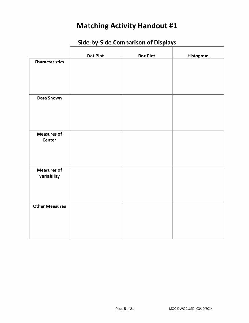
Matching Activity Handout #1
Side-by-Side Comparison of Displays
Dot Plot
Box Plot
Histogram
Characteristics
Data Shown
Measures of Center
Measures of Variability
Other Measures
Page 6 of 21 MCC@WCCUSD 03/10/2014
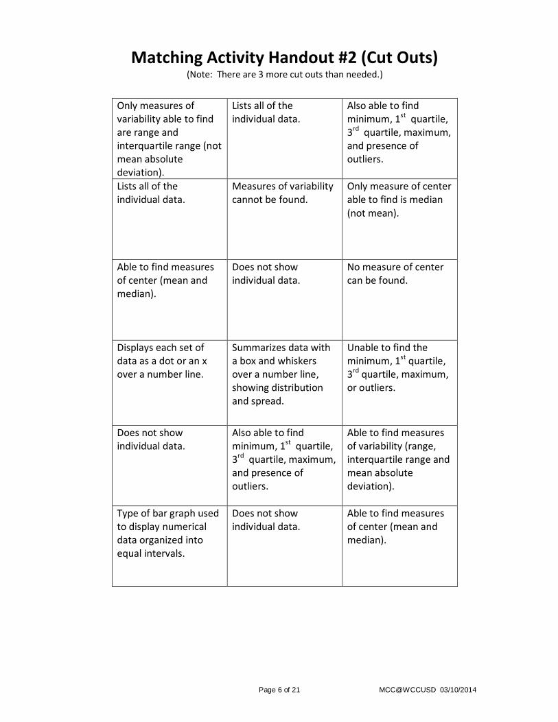
Matching Activity Handout #2 (Cut Outs) (Note: There are 3 more cut outs than needed.)
Only measures of variability able to find are range and interquartile range (not mean absolute deviation).
Lists all of the individual data.
Also able to find minimum, 1st quartile, 3rd quartile, maximum, and presence of outliers.
Lists all of the individual data.
Measures of variability cannot be found.
Only measure of center able to find is median (not mean).
Able to find measures of center (mean and median).
Does not show individual data.
No measure of center can be found.
Displays each set of data as a dot or an x over a number line.
Summarizes data with a box and whiskers over a number line, showing distribution and spread.
Unable to find the minimum, 1st quartile, 3rd quartile, maximum, or outliers.
Does not show individual data.
Also able to find minimum, 1st quartile, 3rd quartile, maximum, and presence of outliers.
Able to find measures of variability (range, interquartile range and mean absolute deviation).
Type of bar graph used to display numerical data organized into equal intervals.
Does not show individual data.
Able to find measures of center (mean and median).
Page 7 of 21 MCC@WCCUSD 03/10/2014
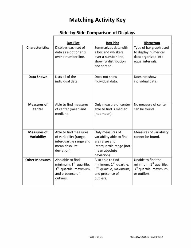
Matching Activity Key
Side-by-Side Comparison of Displays
Dot Plot
Box Plot
Histogram
Characteristics Displays each set of data as a dot or an x over a number line.
Summarizes data with a box and whiskers over a number line, showing distribution and spread.
Type of bar graph used to display numerical data organized into equal intervals.
Data Shown Lists all of the individual data
Does not show individual data.
Does not show individual data.
Measures of Center
Able to find measures of center (mean and median).
Only measure of center able to find is median (not mean).
No measure of center can be found.
Measures of Variability
Able to find measures of variability (range, interquartile range and mean absolute deviation).
Only measures of variability able to find are range and interquartile range (not mean absolute deviation).
Measures of variability cannot be found.
Other Measures Also able to find minimum, 1st quartile, 3rd quartile, maximum, and presence of outliers.
Also able to find minimum, 1st quartile, 3rd quartile, maximum, and presence of outliers.
Unable to find the minimum, 1st quartile, 3rd quartile, maximum, or outliers.
Page 8 of 21 MCC@WCCUSD 03/10/2014
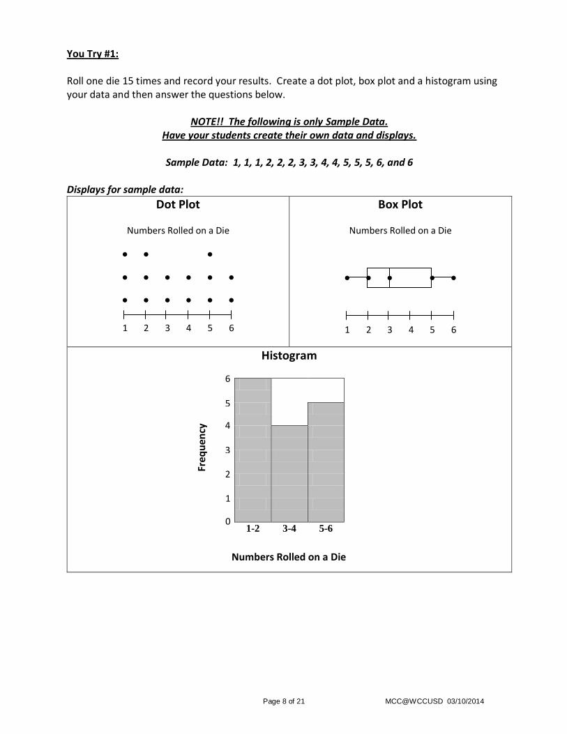
You Try #1: Roll one die 15 times and record your results. Create a dot plot, box plot and a histogram using your data and then answer the questions below.
NOTE!! The following is only Sample Data. Have your students create their own data and displays.
Sample Data: 1, 1, 1, 2, 2, 2, 3, 3, 4, 4, 5, 5, 5, 6, and 6
Displays for sample data:
Dot Plot
Numbers Rolled on a Die
● ● ●
● ● ● ● ● ●
● ● ● ● ● ●
1 2 3 4 5 6
Box Plot
Numbers Rolled on a Die
● ● ● ● ●
1 2 3 4 5 6
Histogram
1-2 3-4 5-6
6
Numbers Rolled on a Die
Freq
uen
cy
1
5
4
3
2
0
Page 9 of 21 MCC@WCCUSD 03/10/2014
Given only the three displays from You Try 1, answer the following using complete sentences.
1) What is the mean and mean absolute deviation of the data?
2) What is the interquartile range?
3) Do these displays clearly skew left, skew right, or show symmetry? If any are different
explaining their differences.
4) What conclusions can be drawn because of the length of the whiskers on the box plot?
5) What conclusions can be drawn because of the location of the median on the box plot?
6) Does this seem like a large enough sample size to make reliable conclusions about the
distribution of numbers rolled using one die?
7) If you could only choose one display to use on a project, which display would you choose
out of these three?
Page 10 of 21 MCC@WCCUSD 03/10/2014
Sample Answers to the Sample Data only! Students’ answers will vary based on their data.
Given only the three displays from You Try 1, answer the following using complete sentences.
1) What is the mean and mean absolute deviation of the data?
The mean is 31
3 and the mean absolute deviation is 1
5
9.
2) What is the interquartile range?
The interquartile range is 3.
3) Do these displays clearly skew left, skew right, or show symmetry? If any are different
explaining their differences.
The displays seem ever so slightly skewed left. One might argue that they are mildly
symmetric.
4) What conclusions can be drawn because of the length of the whiskers on the box plot?
Both whiskers seem to be about the same size which show that the data is evenly spread
on each side of the interquartile range.
5) What conclusions can be drawn because of the location of the median on the box plot?
The median is not located in the middle of the box, it is slightly left of center. Therefore
the data does not seem symmetric.
6) Does this seem like a large enough sample size to make reliable conclusions about the
distribution of numbers rolled using one die?
The data seems to be close to what one would expect. However, it would be a more
accurate and reliable representation if the die was rolled more times.
7) If you could only choose one display to use on a project, which display would you choose
out of these three?
Students’ answers will vary. Most important is their reasoning, justifications and
explanations as to why they choose the display they do.
Page 11 of 21 MCC@WCCUSD 03/10/2014
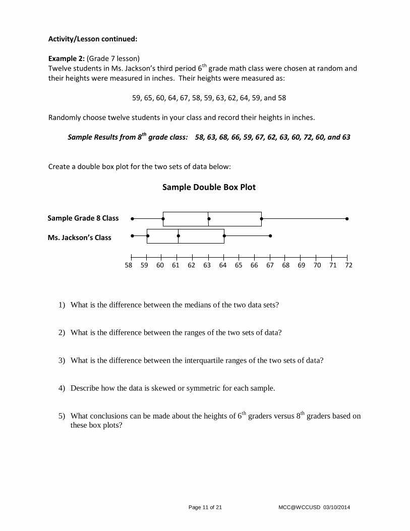
Activity/Lesson continued: Example 2: (Grade 7 lesson) Twelve students in Ms. Jackson’s third period 6th grade math class were chosen at random and their heights were measured in inches. Their heights were measured as:
59, 65, 60, 64, 67, 58, 59, 63, 62, 64, 59, and 58 Randomly choose twelve students in your class and record their heights in inches.
Sample Results from 8th grade class: 58, 63, 68, 66, 59, 67, 62, 63, 60, 72, 60, and 63
Create a double box plot for the two sets of data below:
Sample Double Box Plot
1) What is the difference between the medians of the two data sets?
2) What is the difference between the ranges of the two sets of data?
3) What is the difference between the interquartile ranges of the two sets of data?
4) Describe how the data is skewed or symmetric for each sample.
5) What conclusions can be made about the heights of 6th
graders versus 8th graders based on
these box plots?
58 59 60 61 62 63 64 65 66 67 68 69 70 71 72
● ● ● ●
● ● ● ● ● Ms. Jackson’s Class
Sample Grade 8 Class ●
Page 12 of 21 MCC@WCCUSD 03/10/2014
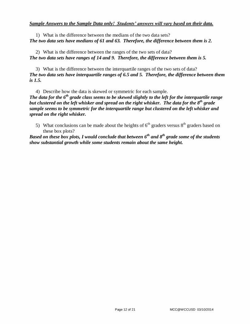
Sample Answers to the Sample Data only! Students’ answers will vary based on their data.
1) What is the difference between the medians of the two data sets?
The two data sets have medians of 61 and 63. Therefore, the difference between them is 2.
2) What is the difference between the ranges of the two sets of data?
The two data sets have ranges of 14 and 9. Therefore, the difference between them is 5.
3) What is the difference between the interquartile ranges of the two sets of data?
The two data sets have interquartile ranges of 6.5 and 5. Therefore, the difference between them
is 1.5.
4) Describe how the data is skewed or symmetric for each sample.
The data for the 6th
grade class seems to be skewed slightly to the left for the interquartile range
but clustered on the left whisker and spread on the right whisker. The data for the 8th
grade
sample seems to be symmetric for the interquartile range but clustered on the left whisker and
spread on the right whisker.
5) What conclusions can be made about the heights of 6th
graders versus 8th graders based on
these box plots?
Based on these box plots, I would conclude that between 6th
and 8th
grade some of the students
show substantial growth while some students remain about the same height.
Page 13 of 21 MCC@WCCUSD 03/10/2014
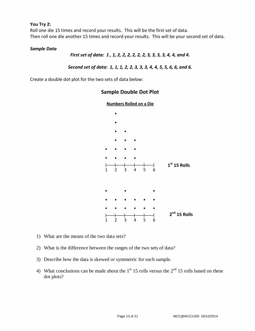
You Try 2: Roll one die 15 times and record your results. This will be the first set of data. Then roll one die another 15 times and record your results. This will be your second set of data. Sample Data
First set of data: 1 , 1, 2, 2, 2, 2, 2, 2, 3, 3, 3, 3, 4, 4, and 4.
Second set of data: 1, 1, 1, 2, 2, 3, 3, 3, 4, 4, 5, 5, 6, 6, and 6.
Create a double dot plot for the two sets of data below:
Sample Double Dot Plot
Numbers Rolled on a Die
●
●
● ●
● ● ●
● ● ● ●
● ● ● ●
1 2 3 4 5 6
● ● ●
● ● ● ● ● ●
● ● ● ● ● ●
1 2 3 4 5 6
1) What are the means of the two data sets?
2) What is the difference between the ranges of the two sets of data?
3) Describe how the data is skewed or symmetric for each sample.
4) What conclusions can be made about the 1st 15 rolls versus the 2
nd 15 rolls based on these
dot plots?
1st 15 Rolls
2nd 15 Rolls
Page 14 of 21 MCC@WCCUSD 03/10/2014
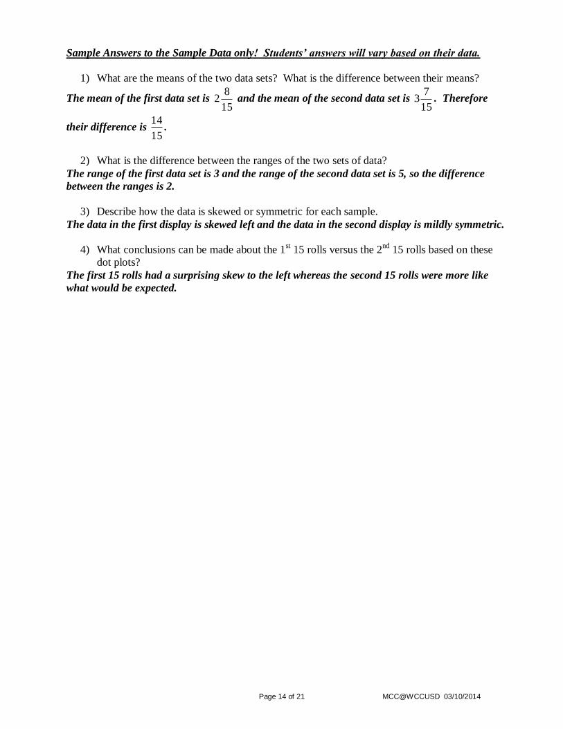
Sample Answers to the Sample Data only! Students’ answers will vary based on their data.
1) What are the means of the two data sets? What is the difference between their means?
The mean of the first data set is 15
82 and the mean of the second data set is
15
73 . Therefore
their difference is 15
14.
2) What is the difference between the ranges of the two sets of data?
The range of the first data set is 3 and the range of the second data set is 5, so the difference
between the ranges is 2.
3) Describe how the data is skewed or symmetric for each sample.
The data in the first display is skewed left and the data in the second display is mildly symmetric.
4) What conclusions can be made about the 1st 15 rolls versus the 2
nd 15 rolls based on these
dot plots?
The first 15 rolls had a surprising skew to the left whereas the second 15 rolls were more like
what would be expected.
Page 15 of 21 MCC@WCCUSD 03/10/2014
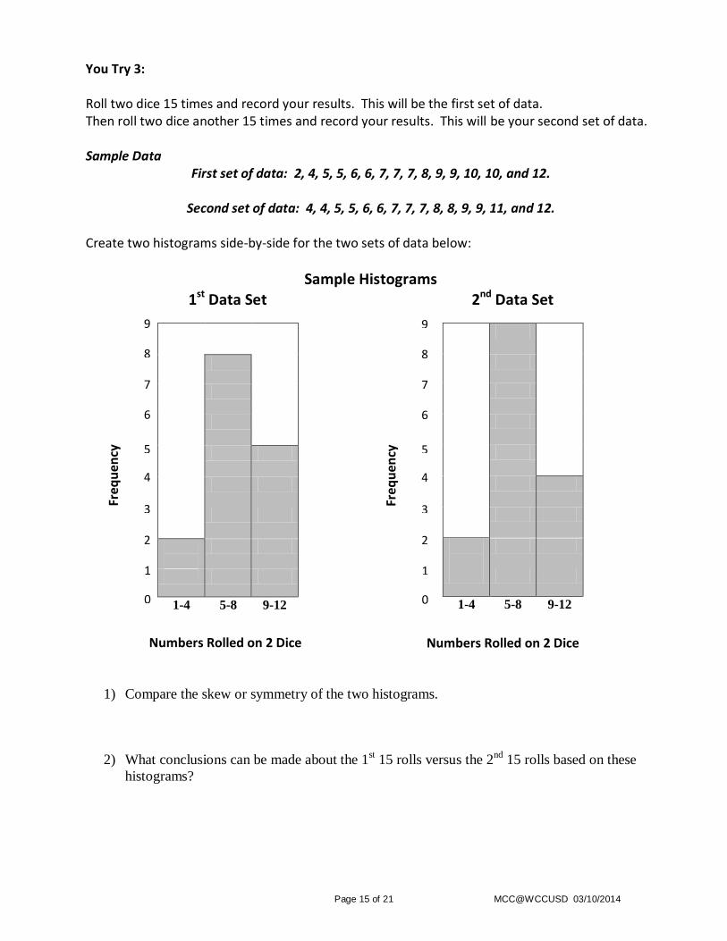
You Try 3: Roll two dice 15 times and record your results. This will be the first set of data. Then roll two dice another 15 times and record your results. This will be your second set of data. Sample Data
First set of data: 2, 4, 5, 5, 6, 6, 7, 7, 7, 8, 9, 9, 10, 10, and 12.
Second set of data: 4, 4, 5, 5, 6, 6, 7, 7, 7, 8, 8, 9, 9, 11, and 12.
Create two histograms side-by-side for the two sets of data below:
Sample Histograms 1st Data Set
1-4 5-8 9-12
2nd Data Set
1-4 5-8 9-12
1) Compare the skew or symmetry of the two histograms.
2) What conclusions can be made about the 1st 15 rolls versus the 2
nd 15 rolls based on these
histograms?
7
Numbers Rolled on 2 Dice
Freq
uen
cy
1
5
4
3
2
0
6
8
9
7
Numbers Rolled on 2 Dice
Freq
uen
cy
1
5
4
3
2
0
6
8
9

Page 16 of 21 MCC@WCCUSD 03/10/2014
Sample Answers to the Sample Data only! Students’ answers will vary based on their data.
1) Compare the skew or symmetry of the two histograms.
Based on the histograms, the data seems mildly symmetric. Possibly slightly skewed right.
However the intervals are misleading because it isn’t possible to roll a 1 with two dice.
2) What conclusions can be made about the 1st 15 rolls versus the 2
nd 15 rolls based on these
histograms?
Based on the histograms, the results seem very similar. Also, it is what one would expect given
that rolling 5 – 8 is more likely than rolling the other two intervals.
Page 17 of 21 MCC@WCCUSD 03/10/2014
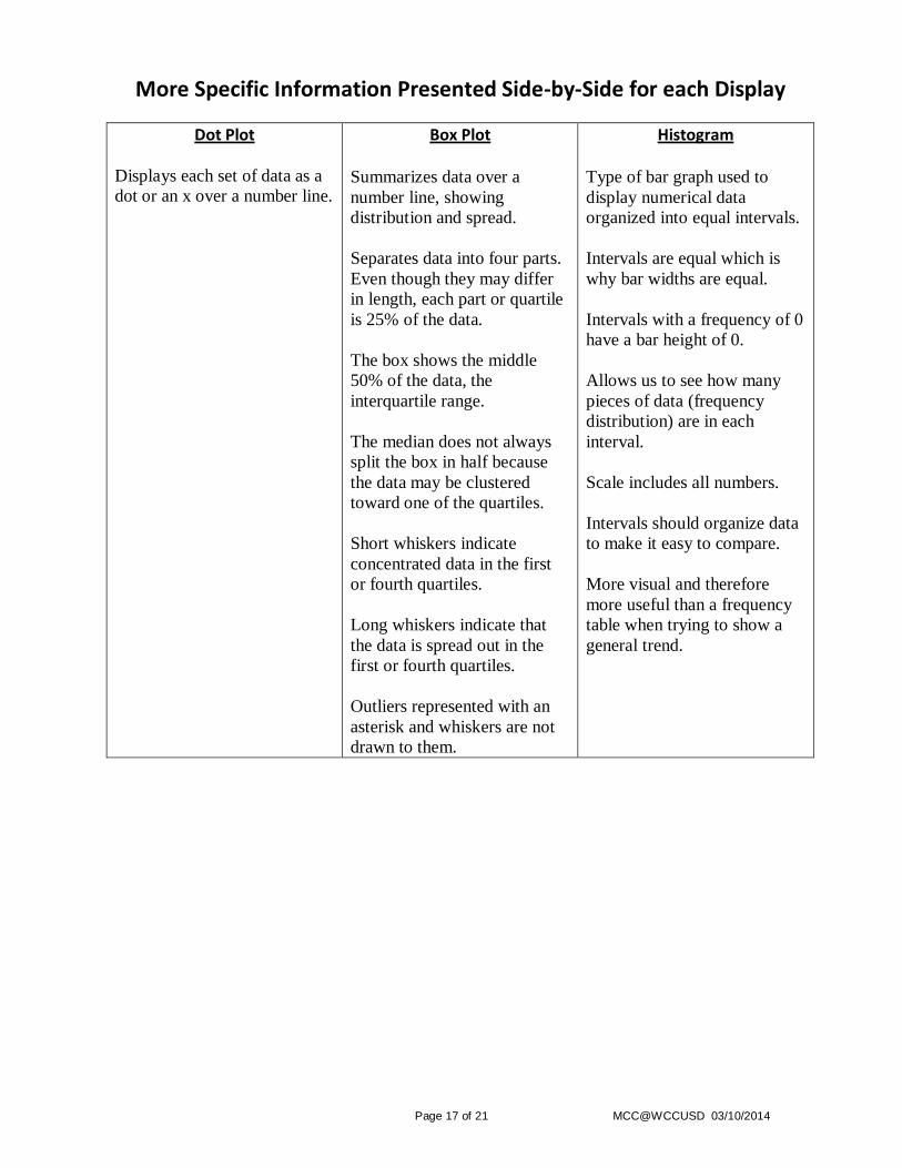
More Specific Information Presented Side-by-Side for each Display
Dot Plot
Displays each set of data as a
dot or an x over a number line.
Box Plot Summarizes data over a
number line, showing
distribution and spread.
Separates data into four parts.
Even though they may differ
in length, each part or quartile
is 25% of the data.
The box shows the middle
50% of the data, the
interquartile range.
The median does not always
split the box in half because
the data may be clustered
toward one of the quartiles.
Short whiskers indicate
concentrated data in the first
or fourth quartiles.
Long whiskers indicate that
the data is spread out in the
first or fourth quartiles.
Outliers represented with an
asterisk and whiskers are not
drawn to them.
Histogram Type of bar graph used to
display numerical data
organized into equal intervals.
Intervals are equal which is
why bar widths are equal.
Intervals with a frequency of 0
have a bar height of 0.
Allows us to see how many
pieces of data (frequency
distribution) are in each
interval.
Scale includes all numbers.
Intervals should organize data
to make it easy to compare.
More visual and therefore
more useful than a frequency
table when trying to show a
general trend.
Page 18 of 21 MCC@WCCUSD 03/10/2014
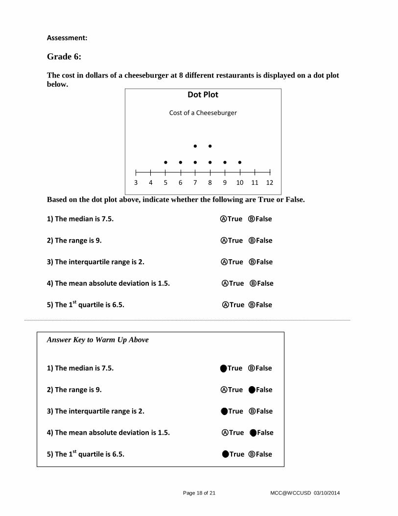
Assessment:
Grade 6:
The cost in dollars of a cheeseburger at 8 different restaurants is displayed on a dot plot
below.
Dot Plot
Cost of a Cheeseburger
● ●
● ● ● ● ● ●
3 4 5 6 7 8 9 10 11 12
Based on the dot plot above, indicate whether the following are True or False.
1) The median is 7.5. ⒶTrue ⒷFalse
2) The range is 9. ⒶTrue ⒷFalse
3) The interquartile range is 2. ⒶTrue ⒷFalse
4) The mean absolute deviation is 1.5. ⒶTrue ⒷFalse
5) The 1st quartile is 6.5. ⒶTrue ⒷFalse
Answer Key to Warm Up Above
1) The median is 7.5. ⒶTrue ⒷFalse
2) The range is 9. ⒶTrue ⒷFalse
3) The interquartile range is 2. ⒶTrue ⒷFalse
4) The mean absolute deviation is 1.5. ⒶTrue ⒷFalse
5) The 1st quartile is 6.5. ⒶTrue ⒷFalse
Page 19 of 21 MCC@WCCUSD 03/10/2014
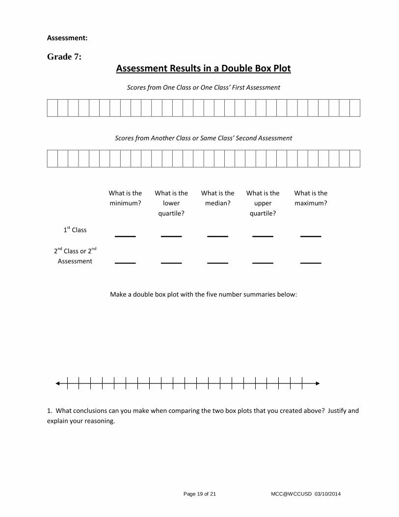
Assessment:
Grade 7:
Assessment Results in a Double Box Plot
Scores from One Class or One Class’ First Assessment
Scores from Another Class or Same Class’ Second Assessment
What is the
minimum? What is the
lower
quartile?
What is the
median? What is the
upper
quartile?
What is the
maximum?
1st Class ____ ____ ____ ____ ____
2nd Class or 2nd
Assessment ____ ____ ____ ____ ____
Make a double box plot with the five number summaries below:
1. What conclusions can you make when comparing the two box plots that you created above? Justify and
explain your reasoning.
Page 20 of 21 MCC@WCCUSD 03/10/2014
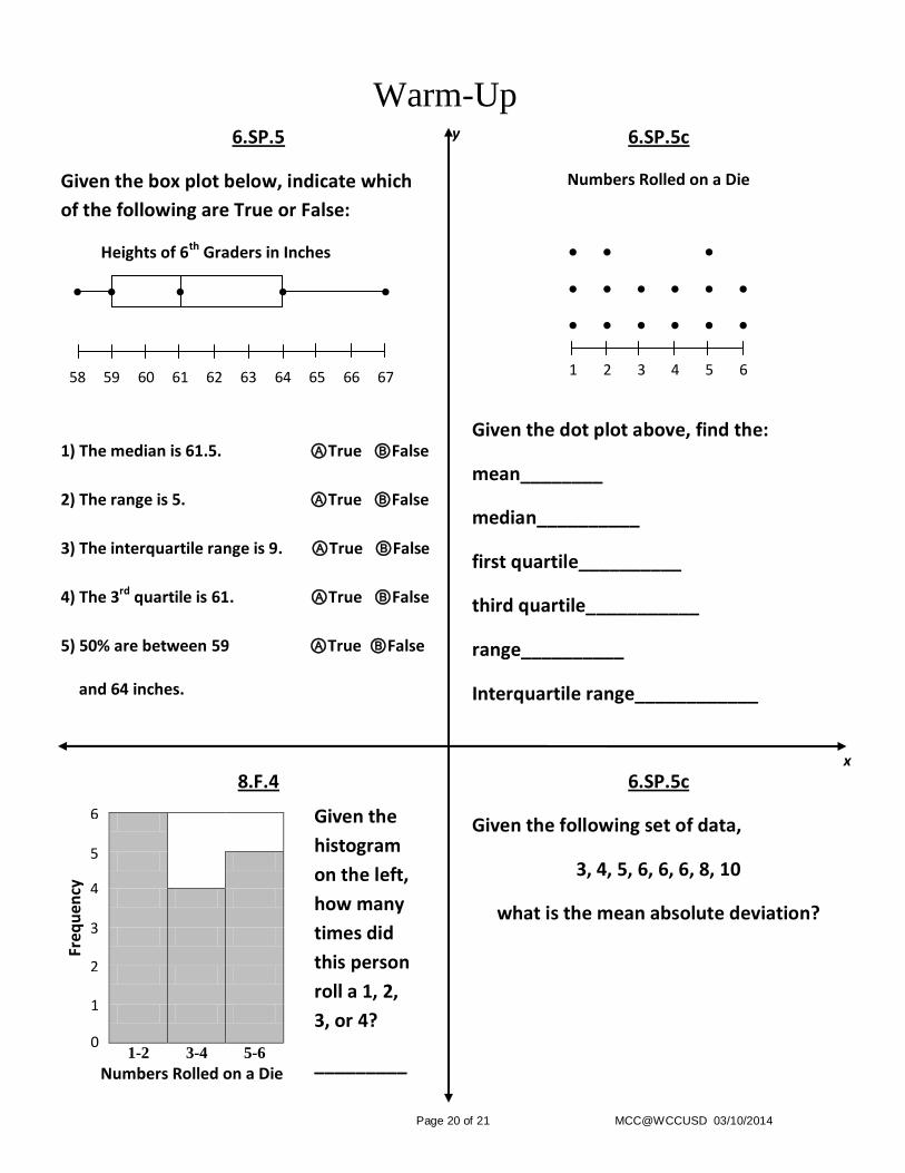
Warm-Up 6.SP.5
Given the box plot below, indicate which
of the following are True or False:
6.SP.5c
Numbers Rolled on a Die
Heights of 6th Graders in Inches
● ● ● ● ●
58 59 60 61 62 63 64 65 66 67
1) The median is 61.5. ⒶTrue ⒷFalse
2) The range is 5. ⒶTrue ⒷFalse
3) The interquartile range is 9. ⒶTrue ⒷFalse
4) The 3rd quartile is 61. ⒶTrue ⒷFalse
5) 50% are between 59 ⒶTrue ⒷFalse
and 64 inches.
Given the dot plot above, find the:
mean________
median__________
first quartile__________
third quartile___________
range__________
Interquartile range____________
● ● ●
● ● ● ● ● ●
● ● ● ● ● ●
1 2 3 4 5 6
8.F.4 6.SP.5c
1-2 3-4 5-6
Given the following set of data,
3, 4, 5, 6, 6, 6, 8, 10
what is the mean absolute deviation?
y
Given the
histogram
on the left,
how many
times did
this person
roll a 1, 2,
3, or 4?
_________
6
Numbers Rolled on a Die
Freq
uen
cy
1
5
4
3
2
0
x

Page 21 of 21 MCC@WCCUSD 03/10/2014
Warm-Up Answer Key 6.SP.5
Given the box plot below, indicate which
of the following are True or False:
6.SP.5c
Numbers Rolled on a Die
Heights of 6th Graders in Inches
● ● ● ● ●
58 59 60 61 62 63 64 65 66 67
1) The median is 61.5. ⒶTrue ⒷFalse
2) The range is 5. ⒶTrue ⒷFalse
3) The interquartile range is 9. ⒶTrue ⒷFalse
4) The 3rd quartile is 61. ⒶTrue ⒷFalse
5) 50% are between 59 ⒶTrue ⒷFalse
and 64 inches.
Given the dot plot above, find the:
mean 3
13
median 3
first quartile 2
third quartile 5
range 5
Interquartile range 3
● ● ●
● ● ● ● ● ●
● ● ● ● ● ●
1 2 3 4 5 6
8.F.4 6.SP.5c
1-2 3-4 5-6
Given the following set of data,
3, 4, 5, 6, 6, 6, 8, 10
what is the mean absolute deviation?
The mean absolute deviation is 1.5.
y
Given the
histogram
on the left,
how many
times did
this person
roll a 1, 2,
3, or 4?
10
x
6
Numbers Rolled on a Die
Freq
uen
cy
1
5
4
3
2
0