collecting and presenting data
TRANSCRIPT

Collecting and Presenting Data A step-by-step guide to using Excel and Powerpoint
Anthony J. Evans Associate Professor of Economics, ESCP Europe
www.anthonyjevans.com
London, February 2015
(cc) Anthony J. Evans 2015 | http://creativecommons.org/licenses/by-nc-sa/3.0/

A note on powerpoint
• As soon as you provide visual aids for an audience their eyes will be drawn to them (that is the whole point of using visual aids), therefore if you present a slide with lots of text your audience will automatically begin to read it. Because you can read faster than I can speak if I simply narrate the text then I will be reading out what you have already read, and instead of conveying information I am simply annoying you. What this shows is that you should avoid using a large amount of text – this is supposed to be a talk, after all, and if I wanted you read what I have written I might as well just give you a book. Try to avoid using powerpoint simply to convey text. It’s dull.
2

3 Source http://grassshackroad.com/meetings-podcast/business/what-do-lead-paint-asbestos-and-powerpoint-presentations-have-in-common
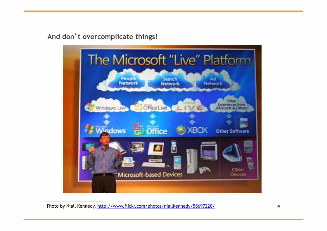
And don’t overcomplicate things!
4 Photo by Niall Kennedy, http://www.flickr.com/photos/niallkennedy/58697220/

Getting started
• Download "aje_template.potx”
• Creating a template in Powerpoint is a good way to save time and ensure consistency – Create the design you want, select “save as”, and
choose the template format • When you open Powerpoint make sure you select “New
from Template” rather than “New Presentation” • All templates are saved as .potx files in a designated folder
– Word templates are .dotx – Excel templates are .xltx
• Alternatively, you could open an existing presentation that you’re happy with and use that as a basis
5

Task 1: replicate the following
6

Finding NGDP data
• We are going to use Nominal GDP data for the UK • To understand more about the UK National Accounts see
this article: – http://www.kaleidic.org/news/2013/5/15/guide-to-
using-the-uk-national-accounts.html
• Go to http://www.ons.gov.uk/ • See “Key Figures” on the right hand side and select GDP • This will take you to the most recent release, but we need
a Second or Final Estimate to obtain Nominal GDP figures • At the time of writing, the most recently published release
is: – “Quarterly National Accounts, Q3 2014” – This was released on 23rd December 2014
• Going forward, we could use a more recent version but this would include revisions and may differ from the one we are attempting to replicate
7

Downloading the series
• Select “Reference tables” • Annoyingly the ONS list the Annex’s first, but we want the
main Table which is – Quarterly National Accounts Data Tables, Q3 2014
(Excel sheet 3551Kb) • You will automatically download the Excel spreadsheet
• Alternatively, select “View datasets associated with this release (1)”
• Choose – Time Series Data: Quarterly National Accounts, Q3
2014 • Follow the “Select series from this dataset” link in the
green box on the right hand side
8

Creating a spreadsheet
• Choose A2 (National Accounts) Aggregates • We want “Gross Domestic Product at Market Prices” (Series
code YBHA) • Copy and paste the dates into Column A • Copy and paste the seasonally adjusted, quarterly data into
a new Excel spreadsheet into Column B – Label this column Actual NGDP
9

Adding a projection
• Next, we want to add a 4% growth rate from the peak of the boom
• Actual NGDP was at it’s highest in 2008 Q1 • We use the following formula to convert an annual growth
rate into a quarterly one:
• Insert the desired growth rate into Cell C3 (in our case 4%) – If you Format the Cell you can either categorise it as a
number (0.04) or as a percentage (4). If you enter a “%” sign Excel should recognise this
• Insert the formula into Cell C2 – (1+C3)^(1/4)-1
• This allows us to apply a 4% year-on-year growth rate
10
Q = (1+Y )1/4 −1
See: http://www.experiglot.com/2006/06/07/how-to-convert-from-an-annual-rate-to-an-effective-periodic-rate-javascript-calculator/

Completing the dataset
• Column C will display our projected growth rate. Go to 2008 Q1 and copy the Actual NGDP figure into Column C
• For 2008 Q2 we enter the following equation: – =C48+(C48*$C$2)
• In other words, – 2008 Q2 = 2008 Q1 + 2008 Q1 * quarterly growth rate
• We use the $ sign to indicate that this is a stable reference • We copy this formula to complete Column C
• To tidy things up we can Format Cell for the number: – Category: Number, 0 decimal places, Use 1000
Separate (,) and Fill background color: no fill • I’ve also ensured everything is the same Font (Arial) and
Font Size (12)
11

Creating the graph
• We can now insert a line chart comparing the Actual NGDP and the 4% projection
• I’ve moved the chart into a new sheet so that it’s easier to work with – Change Font to Arial – Place the Legend at the Bottom – Format the 4% series so that the Line is 1.5pt weight
and dashed – Add “£ million” to the Y axis title – I’ve also renamed the sheets and switched their order
• Copy and paste the chart into Powerpoint – Resize so that width = 20 (but make sure the height is
proportionally resized as well)
12

Actual NGDP is lagging behind a 4% growth path
13
0
100,000
200,000
300,000
400,000
500,000
600,000
1997
Q1
1997
Q3
1998
Q1
1998
Q3
1999
Q1
1999
Q3
2000
Q1
2000
Q3
2001
Q1
2001
Q3
2002
Q1
2002
Q3
2003
Q1
2003
Q3
2004
Q1
2004
Q3
2005
Q1
2005
Q3
2006
Q1
2006
Q3
2007
Q1
2007
Q3
2008
Q1
2008
Q3
2009
Q1
2009
Q3
2010
Q1
2010
Q3
2011
Q1
2011
Q3
2012
Q1
2012
Q3
2013
Q1
2013
Q3
2014
Q1
2014
Q3
£ m
illio
n
Actual NGDP 4%
NGDP is a measure of total spending in the economy In 2008 it dropped below it’s previous growth rate
Mind the gap!
Source: ONS, own calculations

Actual NGDP is lagging behind a 4% growth path
14 Source: ONS, own calculations
0
100,000
200,000
300,000
400,000
500,000
600,000
1997
Q1
1997
Q3
1998
Q1
1998
Q3
1999
Q1
1999
Q3
2000
Q1
2000
Q3
2001
Q1
2001
Q3
2002
Q1
2002
Q3
2003
Q1
2003
Q3
2004
Q1
2004
Q3
2005
Q1
2005
Q3
2006
Q1
2006
Q3
2007
Q1
2007
Q3
2008
Q1
2008
Q3
2009
Q1
2009
Q3
2010
Q1
2010
Q3
2011
Q1
2011
Q3
2012
Q1
2012
Q3
2013
Q1
2013
Q3
2014
Q1
2014
Q3
£ m
illio
n
Actual NGDP 4%
1 key message per slide
Highlight the message
Provide a source
NGDP is a measure of total spending in the economy In 2008 it dropped below it’s previous growth rate
Provide an interpretation of the key points
Mind the gap!
Use a narrative in the title

Comparing two different series
• We now want to compare the NGDP growth rate with the savings ratio – NGDP growth rate
• See Table A2 Aggregates • Gross Domestic Product at market prices (quarter compared to
same quarter of previous year) • Series code: IHYO
– Savings ratio • See Table J3 HH Disposable Income • Household’s saving ratio* (per cent) • Series code: NRJS
• Similar formatting changes as before – Note that when looking at the data it’s good to have 1 decimal place
but the graph is clearer without any – The savings ratio is a different type of % than GDP growth so we can
use a secondary Y axis (making sure it’s clearly labelled) – To save space the axis labels are contained in the Legend
15 * Households' saving as a percentage of total available households' resources

0
2
4
6
8
10
12
14
-6
-4
-2
0
2
4
6
8
1998
Q1
1998
Q3
1999
Q1
1999
Q3
2000
Q1
2000
Q3
2001
Q1
2001
Q3
2002
Q1
2002
Q3
2003
Q1
2003
Q3
2004
Q1
2004
Q3
2005
Q1
2005
Q3
2006
Q1
2006
Q3
2007
Q1
2007
Q3
2008
Q1
2008
Q3
2009
Q1
2009
Q3
2010
Q1
2010
Q3
2011
Q1
2011
Q3
2012
Q1
2012
Q3
2013
Q1
2013
Q3
2014
Q1
2014
Q3
NGDP growth (%) Savings Ratio (%) RHS
Savings ratio is falling again despite NGDP growth picking up
16 Source: ONS
1.A strong savings rate provides funds for investment and generates sustainable long term growth
3.But high house prices and low interest rates
encourage people to continue to fund
consumption through personal
debt
2.During the recession the savings ratio rose
as people reduced their spending

Task 2: replicate the following
17

Graphing three variables
• This example is taken from the excellent textbook: • Cowen, T., and Tabarrok, A., Modern Principles:
Macroeconomics, (Worth, 2013) – see Appendix A-9
• A line chart shows us that child labour declines with increases in real GDP
• But we also want to understand the total amount of child labour in each country
• Create a Bubble graph (under “Other”) with: – Real GDP on the X axis – % Children in Workforce on the Y axis – Total Children in the Workforce as the “size”
• Instead of a legend chose “Data Labels” and “Series Name” • Add a title, increase the font size to 16 and remove
gridlines • Save as Picture (select PNG)
18

Creating handouts
• Edit “handout master” • Save as PDF
19

Thoughts on presentations
• Get into the room early and become familiar with the equipment
• Be careful about telling jokes to people you don’t know
• Use a clicker – Allows you to move away from the desk – Allows you to shut down the screen
• Don’t thank the audience
20