children's book research
TRANSCRIPT
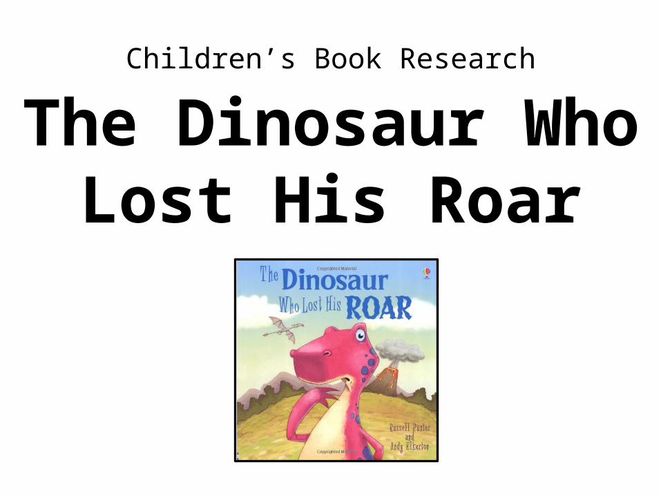
Children’s Book Research
The Dinosaur WhoLost His Roar
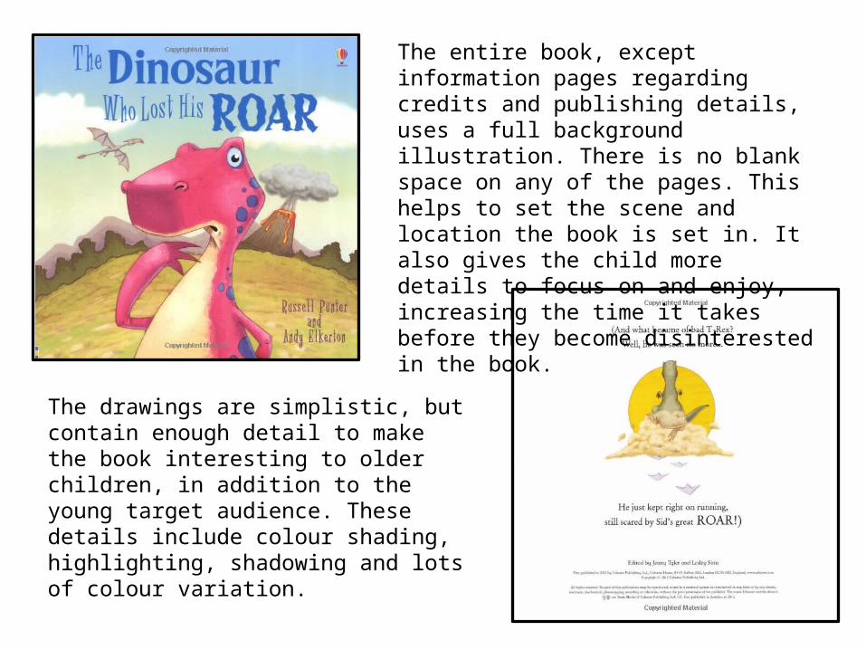
The entire book, except information pages regarding credits and publishing details, uses a full background illustration. There is no blank space on any of the pages. This helps to set the scene and location the book is set in. It also gives the child more details to focus on and enjoy, increasing the time it takes before they become disinterested in the book.
The drawings are simplistic, but contain enough detail to make the book interesting to older children, in addition to the young target audience. These details include colour shading, highlighting, shadowing and lots of colour variation.
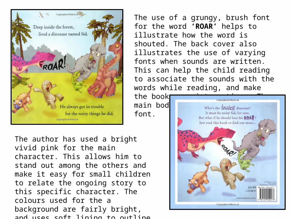
The use of a grungy, brush font for the word ‘ROAR’ helps to illustrate how the word is shouted. The back cover also illustrates the use of varying fonts when sounds are written. This can help the child reading to associate the sounds with the words while reading, and make the book more interactive. The main body text uses a serif font.
The author has used a bright vivid pink for the main character. This allows him to stand out among the others and make it easy for small children to relate the ongoing story to this specific character. The colours used for the a background are fairly bright, and uses soft lining to outline shapes and characters.
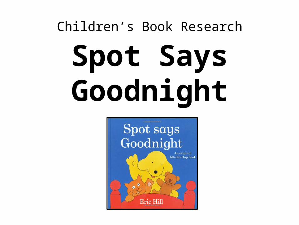
Children’s Book Research
Spot SaysGoodnight

There is a lot of blank, white space in this book. This can help the child reading to focus on the content without too much distraction from the text and main image. The colours are very simplistic and don’t have much shading or highlighting. This allows the child to understand what the pictures represent easily. They are placed near the edges of the page so that the centrally aligned text is the primary focus. The text is also easy for small children to read due to it’s large, page filling nature.
The fonts used in this book are of a Serif typeface. This is commonly used in children’s books as it is easier for them to read in contrast to Sans Serif typefaces.The font is kept black, not colour, as this further increases its readability.
The image on the front of the cover is very large and central. This helps the child to identify the main characters within the story.
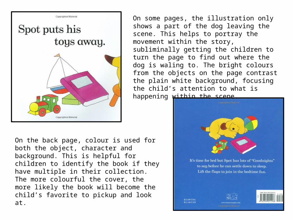
On some pages, the illustration only shows a part of the dog leaving the scene. This helps to portray the movement within the story, subliminally getting the children to turn the page to find out where the dog is waling to. The bright colours from the objects on the page contrast the plain white background, focusing the child’s attention to what is happening within the scene.
On the back page, colour is used for both the object, character and background. This is helpful for children to identify the book if they have multiple in their collection. The more colourful the cover, the more likely the book will become the child’s favorite to pickup and look at.
Children’s Book Research
Where TheWild Things Are

Unlike the other serif font books I have researched, the fonts used in this book are graphical and use a bolder font type. This style appeals to it’s older children target audience who are more fluent in reading difficult texts.This book uses a lot of white space. This is to allow space for the graphic text and to separate it from the illustrations. Due to it’s exotic nature, if the text was placed over the images, it would be a little difficult to read.
The illustrations in this book use a lot of harsh lines and shadowing to add depth. The colours are plain and simplistic, including various light shades of greens, blues and reds.
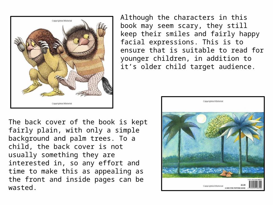
Although the characters in this book may seem scary, they still keep their smiles and fairly happy facial expressions. This is to ensure that is suitable to read for younger children, in addition to it’s older child target audience.
The back cover of the book is kept fairly plain, with only a simple background and palm trees. To a child, the back cover is not usually something they are interested in, so any effort and time to make this as appealing as the front and inside pages can be wasted.