children's book anaysis
TRANSCRIPT
Children’s Books analysis.
David Horne
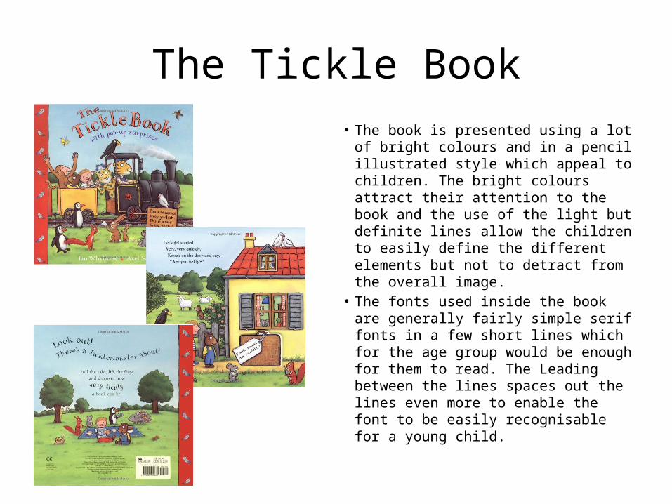
The Tickle Book• The book is presented using a lot of
bright colours and in a pencil illustrated style which appeal to children. The bright colours attract their attention to the book and the use of the light but definite lines allow the children to easily define the different elements but not to detract from the overall image.
• The fonts used inside the book are generally fairly simple serif fonts in a few short lines which for the age group would be enough for them to read. The Leading between the lines spaces out the lines even more to enable the font to be easily recognisable for a young child.
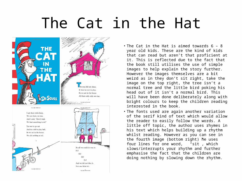
The Cat in the Hat• The Cat in the Hat is aimed towards 6 – 8 year old
kids. These are the kind of kids that can read but aren’t that proficient at it. This is reflected due to the fact that the book still utilises the use of simple images to help explain the story further. However the images themselves are a bit weird as in they don’t sit right, take the image on the top right, the tree isn’t a normal tree and the little bird poking his head out of it isn’t a normal bird. This will have been done deliberately along with bright colours to keep the children reading interested in the book.
• The fonts used are again another variation of the serif kind of text which would allow the reader to easily follow the words. A little off topic, the author uses rhymes in his text which helps building up a rhythm whilst reading. However as you can see in the fourth image (bottom right) he uses four lines for one word, “sit”, which slows/interrupts your rhythm and further emphasise the fact that the children are doing nothing by slowing down the rhythm.
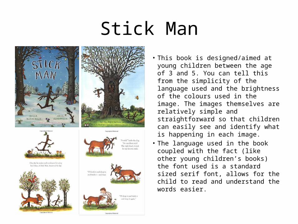
Stick Man• This book is designed/aimed at young
children between the age of 3 and 5. You can tell this from the simplicity of the language used and the brightness of the colours used in the image. The images themselves are relatively simple and straightforward so that children can easily see and identify what is happening in each image.
• The language used in the book coupled with the fact (like other young children’s books) the font used is a standard sized serif font, allows for the child to read and understand the words easier.