chart constellations: effective chart summarization for...
TRANSCRIPT
Eurographics Conference on Visualization (EuroVis) 2018J. Heer, H. Leitte, and T. Ropinski(Guest Editors)
Volume 37 (2018), Number 3
Chart Constellations: Effective Chart Summarizationfor Collaborative and Multi-User Analyses
Shenyu Xu∗1, Chris Bryan∗1, Jianping Kelvin Li∗1, Jian Zhao2, and Kwan-Liu Ma1
1University of California, Davis, USA2FX Palo Alto Laboratory, Palo Alto, USA
∗ These authors contributed equally to this work.
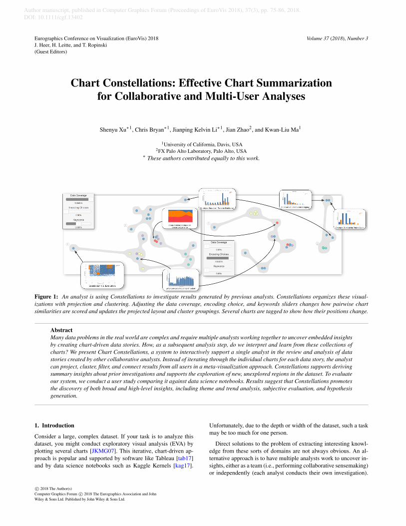
Figure 1: An analyst is using Constellations to investigate results generated by previous analysts. Constellations organizes these visual-izations with projection and clustering. Adjusting the data coverage, encoding choice, and keywords sliders changes how pairwise chartsimilarities are scored and updates the projected layout and cluster groupings. Several charts are tagged to show how their positions change.
AbstractMany data problems in the real world are complex and require multiple analysts working together to uncover embedded insightsby creating chart-driven data stories. How, as a subsequent analysis step, do we interpret and learn from these collections ofcharts? We present Chart Constellations, a system to interactively support a single analyst in the review and analysis of datastories created by other collaborative analysts. Instead of iterating through the individual charts for each data story, the analystcan project, cluster, filter, and connect results from all users in a meta-visualization approach. Constellations supports derivingsummary insights about prior investigations and supports the exploration of new, unexplored regions in the dataset. To evaluateour system, we conduct a user study comparing it against data science notebooks. Results suggest that Constellations promotesthe discovery of both broad and high-level insights, including theme and trend analysis, subjective evaluation, and hypothesisgeneration.
1. Introduction
Consider a large, complex dataset. If your task is to analyze thisdataset, you might conduct exploratory visual analysis (EVA) byplotting several charts [JKMG07]. This iterative, chart-driven ap-proach is popular and supported by software like Tableau [tab17]and by data science notebooks such as Kaggle Kernels [kag17].
Unfortunately, due to the depth or width of the dataset, such a taskmay be too much for one person.
Direct solutions to the problem of extracting interesting knowl-edge from these sorts of domains are not always obvious. An al-ternative approach is to have multiple analysts work to uncover in-sights, either as a team (i.e., performing collaborative sensemaking)or independently (each analyst conducts their own investigation).
c© 2018 The Author(s)Computer Graphics Forum c© 2018 The Eurographics Association and JohnWiley & Sons Ltd. Published by John Wiley & Sons Ltd.
Author manuscript, published in Computer Graphics Forum (Proceedings of EuroVis 2018), 37(3), pp. 75-86, 2018.DOI: 10.1111/cgf.13402

Xu et al. / Chart Constellations: Effective Chart Summarization from Collaborative and Multi-User Analyses
But the question now becomes, how then do we understand andlearn from this analysis?
We assume a meta-visualization approach (i.e., [PL13]), usingvisualizations to analyze and review the other visualizations cre-ated by prior analysts. We introduce the Chart Constellations sys-tem which supports EVA of visualization ensembles and data sto-ries created by multiple users. Our tool is so-named because itprojects visualizations as points (much as stars appear to us aspoints) into a two-dimensional subspace (much like our perspectiveof stars in outer space is flat) based on similarity. Visualizations thatare arranged close together have similar characteristics (conversely,proximate stars are imagined into meaningful patterns).
Constellations is a fully interactive system, including multiple,coordinated interfaces and a backend server with data managementcomponents. In addition to providing an ordination-based view ofcharts which is interactively adjustable based on an introduced dis-tance heuristic, the tool supports visual clustering, selection andfiltering mechanisms to extract subsets of charts, inspection of in-dividual charts, a workflow for suggesting new areas to explore inthe dataset, and mechanisms for creating new charts.
We base the design of Constellations on a task analysis for re-viewing EVA leading to continued investigations (i.e., creating newcharts). Particularly in collaborative settings, this promotes a hand-off approach for asynchronous data review and further exploration.In addition to the tool itself, we contribute design considerationsand rationale for chart summarization and analysis. We conduct atwo-part user study that compares our tool with the data notebookinterface used by Kaggle, a popular website for publicly sourceddata stories. The results provide insights into how enabling a collab-orative view of multiple data stories encourages new thinking anddifferent analysis behaviors. This means Constellations promotesboth broader and higher-level insights about analyses by prior in-vestigators.
2. Related Work
In this section, we review related work on modeling visualizationsimilarity, supporting collaborative visual analysis and handoff, andcurrent practices in using data science notebooks.
2.1. Modeling Visualization Similarity
When a set of visualizations is created to explore a dataset, the simi-larities and sequences between the visualizations provide importantsemantic information about the exploration process, such as thecoverage and direction of the exploration. Multiple projects haveproposed models for visualization similarity. Image Graphs [Ma99]use parameters in volume rendering to denote the changes betweenscientific visualizations. Visualizations are treated as nodes in agraph and the differences between parameters are represented asedges connecting the nodes. The P-Set Model [JKMG07] extendsthe idea of Image Graphs to information visualization, where pa-rameter changes indicate the exploration process of using differentvisualization techniques. Similarly, Hullman et al. [HDR∗13] use adirected graph model for representing the design space of visualiza-tion charts. GraphScape [KWHH17] proposes a generative model
for reasoning visualization similarity and sequencing. GraphScaperepresents visualization states as Vega-Lite [SMWH17] specifica-tions and uses a sophisticated cost function for accounting changesin data transformations and visual encodings among visualizationcharts. Peltonen et al. [PL13] introduce a nonlinear embeddingmethod for arranging an ensemble of scatter plots into a single pro-jection. Since they only consider one visualization technique, theirmethod determines similarity using dataset intersections only.
For Constellations, we adapt GraphScape’s method for determin-ing similarity between visualizations. In addition to data transfor-mation and visual encoding, we extend the definition of similarityto include the application of SQL data queries and chart annotations(keywords) to obtain a more complete assessment and support col-laborative visualization and analysis.
2.2. Supporting Collaborative Visual Analysis and Handoff
In the fields of information visualization and visual analytics, akey challenge is supporting collaborative visualization and analy-sis [CT05, IES∗11]. Researchers in these fields have provided sys-tem design guidelines [WK06,VWVH∗07,HA08,HVW07,MT14],software infrastructures [BE14, MBM∗12, LCM15], and user be-havior studies [ITC08, IFM∗10, Rob08]. Like many of these, Con-stellations allows an analyst to explore by querying data, creatingnew visualizations, and attaching descriptive captions and labels.
Effectively summarizing and connecting findings is importantfor collaborative data analysis and visualization. Keel [Kee06] de-signed a visual analytics system that infers possible relationshipsamong findings by analyzing their spatial and temporal organiza-tion in each team member’s graphical interface. Lark [TIC09] of-fers a mechanism for integrating individual findings through an in-formation visualization pipeline, allowing team members to buildon each other’s findings. Recently, Badam et al. [BZW∗17] intro-duced an interface design that conveys each analyst’s goals and ac-tivities for improving coordination within a team of analysts. InConstellations, we use visualization similarity to arrange explo-ration results and findings. In addition, we adapt the approach usedby Sarvghad et al. [ST15] for exploiting analysis history to visual-ize explored dimensions using a treemap (see Section 4.2.1).
The concept of handoff, or the sharing and asynchronous reviewof others’ work, is an overarching goal for Chart Constellations.The idea here is that one or more prior workers produce a set ofoutput, which is then reviewed, synthesized, and used as input forfuture (i.e., deeper) tasks. Recent work in handoff has focused oncontinuing analysis based on partial, prior work. In particular, KT-Graph [ZGI∗17] uses both analysis history and user-created exter-nalizations to organize the results of previous investigations into anetwork graph of text notes and meta-labels. Handoff has also beenstudied in applications of information help desks [Sha08], prod-uct recommendations [SF09], and intelligence analysis [BCB10].There is an inherent idea of collaborative, team-based investigation,even though the analysis is not simultaneously occurring. Constel-lations not only visualizes the analysis history of each analyst (i.e.,their created charts) but also arranges the charts from multiple ana-lysts into a single view. This allows an analyst to perform post hocreview of the work from all analysts who have created data stories.
c© 2018 The Author(s)Computer Graphics Forum c© 2018 The Eurographics Association and John Wiley & Sons Ltd.

Xu et al. / Chart Constellations: Effective Chart Summarization from Collaborative and Multi-User Analyses
2.3. The Rise of Data Science Notebooks
Constellations is also motivated by the rise of data science note-books. Notebook IDEs are interactive computational environmentsthat combine code execution, text processing, statistics, visual-izations, and other rich media. Popular modern notebooks in-clude Mathematica [mat17b], Project Jupyter [jup17], MATLABLive Editor [mat17a], R Notebooks [rno17], and Kaggle Ker-nels [kag17]. Notebooks support coding in multiple languages, in-cluding MATLAB, Python, Julia, Scala, R, and SQL, and provideextensive tools for data wrangling. In part because they promoteliterate programming [Knu84], notebooks support a broad range ofuser tasks including research documentation, exploration and anal-ysis, the running of statistical calculations, and being a means tocreate, publish, and share data stories.
Unfortunately, while modern data notebooks support collabo-rative sensemaking in that multiple analysts can work on sharednotebooks and manually review each other’s work, it is difficult to,as a post hoc or summary step, contextualize findings from sev-eral independently-created notebooks, especially when each datastory is separately authored. Constellations can bridge this gap byproviding simultaneous review of multiple data stories. For morediscussion of the limitations of data notebooks as they pertain toConstellations, see Section 6.1 and the ensuing user study.
3. Task Analysis
Prior work has significantly shaped our motivation for this project.We want to enable flexible exploratory visual analysis (EVA) ofprior-created visualizations, which can be highly complex and di-verse, comprising many varied charts across different portions ofdata within a domain. Unfortunately, current systems are either toocumbersome, inefficient, unable to handle the complexity of thetask, or (especially in the case of data notebooks) do not facilitatesimultaneous multi-user analyses.
We aim to design a visual analytics tool for organizing an en-semble of visualizations and facilitating interactive exploration andanalysis. Upon conducting this exploration and analysis, we mightbe inspired to undertake our own chart creations for further dataexploration and/or storytelling. Based on these goals, we identifythe following set of high-level tasks that such a system should sat-isfy. To contextualize why each task is necessary and how it can beaccomplished, we reference the multi-level typology introduced byBrehmer and Munzner [BM13].
Task 1: Provide an ordination-based overview of all charts
Why? Produce + Discover → Explore → Summarize
How? Derive + Encode + Arrange + Aggregate
At a minimum, we must be able to review an ensemble of createdcharts. Data notebooks simply list charts by creation order for a sin-gle user. While this shows the temporal progression in a straight-forward way, connections between different charts are difficult toidentify. On the other hand, arranging similar charts together re-veals valuable information about both the results and process ofprior data exploration. Ordination is the process of ordering mul-tivariate objects such that similar objects are near each other and
dissimilar objects far from each other. Namely, dimensionality re-duction techniques can spatially project data (in our case, visual-izations) into two dimensions, thereby facilitating EVA.
Doing this enables the analyst to discover trends, patterns, andoutliers by exploring the summarized ensemble. To accomplishthis, we implement several functions. First, we produce a set ofderived, pairwise distances between each chart (based on their sim-ilarities). These are encoded and arranged in a meaningful way(i.e., placing similar charts near each other). Discrete clusters ofcharts can be aggregated via grouping or binning.
Task 2: Extract a subset of charts from the overview
Why? Discover → Search → Compare + Summarize
How? Filter + Select + Arrange + Change + Aggregate
Instead of seeing all charts, we might want to review only a sub-set at a time. That is, during the discovery process, we want tosearch for charts that match specific criteria. These charts are in-dividually compared to each other or viewed in summary.
This means our system should include functions for querying thecharts. For charts shown in the overview (Task 1), we implementfiltering to hide charts that do not meet desired constraints. Filteringalso happens by proactively selecting a set of charts (such as witha lasso). The projected positions of charts are updated (i.e., theirarrangement is changed) and new aggregate clusters or bins mightbe subsequently re-computed.
Task 3: Inspect individual charts
Why? Discover → Lookup → Identify
How? Select + Encode
To see the specific charts created by users (i.e., to discover the in-formation they contain), the system should enable individual chartsto be reviewed at full resolution. That is, the analyst can look upor identify a single chart. Selecting the chart will display it (i.e.,encode it) for inspection.
Task 4: Suggest areas for further exploration
Why? Discover → Explore → Identify
How? Select + Navigate + Filter
In addition to reviewing prior-created charts, we might want todiscover unexplored (or underexplored) regions in the dataset andexplore them. One way to enable this is by identifying attributeswithin the dataset that have thus far been not been highly used. Weshould therefore let the analyst navigate to and select dimensionsbased on their prior usages. In filtering the available dimensions toonly show these unexplored regions, new avenues for future inves-tigation will become apparent.
Task 5: Crew new charts
Why? Produce
How? Select + Arrange + Aggregate + Encode + Record
c© 2018 The Author(s)Computer Graphics Forum c© 2018 The Eurographics Association and John Wiley & Sons Ltd.

Xu et al. / Chart Constellations: Effective Chart Summarization from Collaborative and Multi-User Analyses
Finally, as a part of exploration, we might conduct our own in-vestigation (i.e., create our own data story). The system should al-low us to produce new charts. This is done by selecting (and op-tionally aggregating) a set of data points from the raw dataset, ar-ranging them into a desired organization, encoding the data into avisualization, and then recording (i.e., saving) the created chart tothe system for later review.
4. Constellations: Heuristics and System Design
Tasks 1–5 naturally lend themselves to a design that follows the Vi-sual Information-Seeking Mantra: “overview first, zoom and filter,details on demand” [Shn96]. However, before describing Constel-lations’ interface, we first quantify how to measure a set of chartsbased on the notion of “similarity.”
4.1. Transforming Visualizations into Constellations
Given an ensemble of charts—each with its own encoding speci-fications, referenced data points, and descriptive meta-labels (title,keywords, caption, author, etc.)—how do we determine its similar-ity with other charts in a corpus?
Prior work has addressed this problem using specific sub-sets of the possible feature space. GraphScape [KWHH17] de-fines distances between visualizations based on differences inchart specification properties: visualization techniques, marks,channels, axis settings, etc. Word embedding models, such asword2vec [MCCD13], solely consider text elements but are quitecomputationally efficient when given text-based feature vectors.Information retrieval methods that only consider data points(i.e., [PL13]) define similarity based on dataset dimensional inter-sections. Colloquially, charts that visualize the same set of datapoints are similar. Unfortunately, pure dimensional intersectioncannot handle new data outside of the specifically-referenced re-gion nor can it quantify different visualization techniques.
Our approach is to use the outputs from these multiple heuris-tics. Specifically, the trio of aforementioned metrics—chart encod-ings, keyword taggings, and dimensional intersections—are com-bined into a single aggregate pairwise distance value for each pairof charts that we want to display in Constellations. This allows usto consider multiple facets of the charts that make up a data story.
Chart Encoding Distance. GraphScape [KWHH17] is a recently-introduced, directed graph model of the visualization design spacebased on chart encoding similarities. Graph nodes represent chartspecifications and edge weights between nodes represent the costto transform one chart into another. Given two charts, we calculatethe encoding distance between them by summing the edge weightsalong the shortest path traversal between the charts according toGraphScape’s graph model [gra17].
Unfortunately, GraphScape’s algorithm for real-time calculationis quite expensive due to running a breadth-first search for shortestpath finding. However, their code is open-source (see [gra17]) andincludes a set of default, static transition costs for encodings thatcan quickly be added together to compare two charts. This is theapproach our system currently uses.
Figure 2: An overview of the Constellations system, showing thethree primary modules and their associated features. Arrows de-note navigation or data transfer connections.
Keyword Tagging Distance. word2vec [wor17a] is a predictivemodel for calculating vector representations of words (i.e., embed-dings) from raw text. In Constellations, we allow for data storycharts to have manually-annotated, descriptive keywords attachedto them. We use word2vec (downloadable from [wor17b]) to ob-tain word vectors for the tagged keywords and then compute thepairwise cosine distances between the word vectors for each chart.
Dimensional Intersection Distance. We use a simple binary en-coding to represent all the data dimensions as a vector. Each charthas its own vector, where the value of each dimension is 1 if thedimension is used for one of the chart encodings and 0 otherwise.With the vectors, we compute the dimensional intersection distancebetween each pair of charts.
Aggregate Pairwise Distance. After individually calculating dis-tances for the chart encodings, keyword taggings, and dimensionalintersections between each pair of charts, the distances are normal-ized along a [0,1] scale and combined with user-defined scalingweights in the following function:
dist(a,b) = wgs ∗dgs(a,b)+wke ∗dke(a,b)+wdi ∗ddi(a,b) (1)
This computes the aggregate pairwise distance between two chartsa and b. Here, dgs, dke, and ddi are the distances for chart encodings,keyword taggings, and dimensional intersections, respectively, andwgs, wke, and wdi are their relative scaling weights. The result is theoverall pairwise distance between two charts.
An advantage of this aggregate approach is that new heuristicscan easily be added or updated (as future work) to handle more as-pects of the data stories. As an example, the system currently doesnot consider similarities between chart titles or captions (the onlytext elements it considers are keywords). Additional text embed-ding models could be used to quantify distances for these elements.
4.2. System Components in Constellations
Figure 2 shows the primary system components for Constellations.The Collab View is where visualizations are projected using ordi-nation (Task 1) and explored via selection and filtering (Task 2); adata coverage panel shows past attribute usage and suggests newavenues for exploration (Task 4). The Chart View facilitates review
c© 2018 The Author(s)Computer Graphics Forum c© 2018 The Eurographics Association and John Wiley & Sons Ltd.

Xu et al. / Chart Constellations: Effective Chart Summarization from Collaborative and Multi-User Analyses
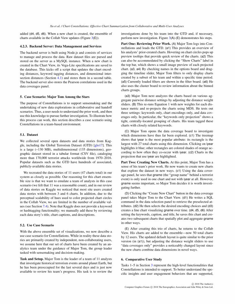
Figure 3: The Constellations interface. (A) The Collab View projects visualizations as circles. (B) Updating distance weights adjusts theprojected layout. (C) The data coverage panel allows for review of prior dimensional exploration, intersection, and correlation. (D) TheChart View facilitates inspection of existing charts and the creation of new ones. (E) Adding new charts updates the projection in the CollabView. See the case study in Section 5 for an explanation of label tags and arrows. Figure 9 in the Appendix shows a larger version of thisimage.
of individual charts (Task 3) and the creation of new ones (Task 5).A backend server provides data storage and functions to calculatenecessary statistical metrics.
4.2.1. Collab View: Enabling Overview and Analysis
The Collab View (Figure 3(A)) functions as the the main overview.Based on the aggregate pairwise distances, the ensemble of prior-created charts are spatially positioned using dimensionality re-duction (a1). Each chart is plotted with a circle mark and useshue to denote its creation author (using a categorical palette fromColorBrewer [HB03]). A user can toggle between two projec-tion techniques: multidimensional scaling (MDS) [KW78] and t-SNE [MH08]. For simplicity, we use MDS projections in thispaper—primarily because it results in a deterministic layout whichallows us to make the user study experience more consistent.
Labeling options are available in a top menu (a2), including au-thor polylines: directed arrows between an author’s charts that showthe creation order. In the left side of the view (a3), the options boardcontains a set of three distance weight sliders and several filteringoptions. Adjusting the sliders modifies the scaling weights used inEquation 1, recalculating the aggregate pairwise distances for allcharts and updating the projection layout (Figure 3(B), see also Fig-ure 1). Applying a filter removes a subset of charts based on the de-sired constraint—for example, only displaying charts by a certainuser. When filters are applied, a descriptive label is created in thefilter board (a5). At the bottom, a timeline slider allows for tempo-ral filtering (a4); a user can also draw a lasso selection directly onthe projection to select a subset of charts.
Clustering is used to bin charts into discrete groups. Two met-rics are available: k-means clustering [M∗67] and affinity propaga-tion [FD07]. Clustering can be based on either the aggregate pair-
wise distances between charts or by their projected x/y coordinates.When the projection updates, such as via filtering or adjusting thedistance weight sliders, clusters are recalculated. Cluster hulls aredrawn using bubble sets [CPC09]. At right, the cluster board showsstatistics about the currently-drawn clusters (a6).
Above this is the data coverage panel (Figure 3(C)), which con-tains a treemap showing the available attributes in the dataset.Each block corresponds to an attribute and is colored accordingto whether or not it is used by any charts in the projection.
Selecting an attribute in the data coverage panel highlights itblue (c1) and highlights any intersecting dimensions orange. Anintersecting dimension is one that co-occurs in at least one chartwith the currently selected attribute. The luminance of the orangeblocks denotes co-occurrence amount. Below the treemap is a set ofdropdown menus. These show the Pearson correlations of attributepairs, allowing a user to discover the global relations of attributes.By using the treemap to explicitly show the “beaten path” of di-mensional analysis that has thus far been conducted along with theglobal attribute correlations, we provide a user with informationabout unexplored (or underexplored) regions in the dataset. Thispromotes the targeted investigation of new areas via the creation ofnew charts and data stories.
4.2.2. Chart View: Inspect and Create New Charts
The Chart View, shown in Figure 2(D), allows for the full-scaleinspection of existing charts and provides functionality to createnew ones. To create a new chart, a user enters an SQL query (d1) toretrieve data from the backend server and sets the chart encodingsusing a set of dropdown menus (d2) to create a visualization (d3).We use Vega-Lite to define encoding markups and render the chart.Custom, user-defined keywords, caption, and title can be manually
c© 2018 The Author(s)Computer Graphics Forum c© 2018 The Eurographics Association and John Wiley & Sons Ltd.
Xu et al. / Chart Constellations: Effective Chart Summarization from Collaborative and Multi-User Analyses
added (d4, d5, d6). When a new chart is created, the ensemble ofcharts available in the Collab View updates (Figure 3(E)).
4.2.3. Backend Server: Data Management and Services
The backend server is built using Node.js and consists of servicesto manage and process the data. Raw dataset files are parsed andstored on the server as a MySQL instance. When a new chart iscreated in the Chart View, its Vega-Lite specifications are saved tothe database. This kicks off a script that updates the chart encod-ing distances, keyword tagging distances, and dimensional inter-section distances (Section 4.1) and stores them in a second table.The backend server also stores the Pearson correlations used in thedata coverages panel.
5. Case Scenario: Major Tom Among the Stars
The purpose of Constellations is to support sensemaking and theundertaking of new data explorations in collaborative and handoffscenarios. Thus, a user needs to understand the prior work, and thenuse this knowledge to pursue further investigation. To illustrate howthis process can work, this section describes a case scenario usingConstellations in a team-based environment.
5.1. Dataset
We collected several open datasets and data stories from Kag-gle, including the Global Terrorism Dataset (GTD) [glo17]. Thisis a large (~130 MB), multidimensional (135 dimensions), geo-graphic dataset stored in a tabular format (CSV file), catalogingmore than 170,000 terrorist attacks worldwide from 1970–2016.Popular datasets such as the GTD have hundreds of associated,publicly-available data stories.
We recreated the data stories of 11 users (47 charts total) in oursystem as closely as possible. Our reasoning for this chart ensem-ble size is that we want to emulate a team of analysts in this casescenario (we felt that 11 was a reasonable count), and in our reviewof data stories on Kaggle we noticed that most site users createddata stories with between 3 and 6 charts. In addition, due to theperceptual scalability of hues used to color projected chart circlesin the Collab View, we are limited in the number of available val-ues (see Section 7.4). Note that Kaggle does not provide a keywordor hashtagging functionality; we manually add these by reviewingeach data story’s title, chart captions, and descriptions.
5.2. Use Case Scenario
With the above ensemble set of visualizations, we now describe ause case scenario for Constellations. While in reality these data sto-ries are primarily created by independent, non-collaborating users,we assume here that our set of charts have been created by an an-alytics team under the guidance of Major Tom, the group leadertasked with sensemaking and decision-making.
Task and Setup. Major Tom is the leader of a team of 11 analyststhat investigate historical terrorism events around planet Earth, buthe has been preoccupied for the last several days and is just nowavailable to review his team’s progress. His task is to review the
investigations done by his team into the GTD and, if necessary,perform new investigation. Figure 3(A)-(E) demonstrates his steps.
Part One: Reviewing Prior Work. (A) Major Tom logs into Con-stellations and loads the GTD. (a1) This provides an overview ofhis analysts’ prior-created charts. Hovering on chart circles pops uppreview tooltips that provide quick review of the charts. (a2) Thiscan also be accommodated by clicking the “Show Charts” label inthe top bar, which shows a small image preview of each projectedchart. (a3, a4) By checking names in the options board and drag-ging the timeline slider, Major Tom filters to only display chartscreated by a subset of his team and within a specific time period.(a5) Currently loaded filters are shown in the filter board. (a6) Healso uses the cluster board to review information about the binnedcharts groups.
(a3) Major Tom next analyzes the charts based on various ag-gregate pairwise distance settings by adjusting the distance weightsliders. (B) This re-runs Equation 1 with new weights for each dis-tance metric and re-projects the charts using MDS. He tests outthree settings: keywords only, chart encodings only, and data cov-erages only. In particular, the “keywords only projection” shows atight, centrally-located grouping of charts. His team tagged thesecharts with closely related keywords.
(C) Major Tom opens the data coverage board to investigatewhich dimensions have thus far been explored. (c1) The treemapshows that iyear is the most popular attribute: its rectangle is thelargest with 27 total charts using this dimension. Clicking on iyearhighlights it blue; other rectangles are colored shades of orange ac-cording to how often they co-occur with iyear. (c2) Charts in theprojection that use iyear are highlighted.
Part Two: Creating New Charts. At this point, Major Tom has asense of his team’s prior work. He now wants to create new chartsthat explore the dataset in new ways. (c1) Using the data cover-age panel, he sees that gname (the “group name” behind a terroristevent) is only used in one chart and not with iyear at all. However,gname seems important, so Major Tom decides it is worth investi-gating further.
(D) Clicking the “Create New Chart” button in the data coveragepanel takes Major Tom to the Chart View. (d1) He writes a SQLcommand in the data selection panel to retrieve the preselected at-tributes. (d2) He then selects the desired encoding choices and (d3)creates a line chart visualizing gname over time. (d4, d5, d6) Aftersetting the keywords, caption, and title, he saves this chart and cre-ates two subsequent charts that spatially plot and aggregate gnamein other ways.
(E) After creating this trio of charts, he returns to the CollabView. His charts are added to the ensemble—now 50 total chartsby 12 users. The updated default layout is quite similar to the priorversion (in (a1)), but adjusting the distance weight sliders to use“data coverages only” provides a noticeably changed layout sincethe new charts combine data dimensions in novel ways.
6. Comparative User Study
Tasks 1–5 in Section 3 represent the high-level functionalities thatConstellations is intended to support. To better understand the spe-cific insights and user engagement behaviors that are supported,
c© 2018 The Author(s)Computer Graphics Forum c© 2018 The Eurographics Association and John Wiley & Sons Ltd.

Xu et al. / Chart Constellations: Effective Chart Summarization from Collaborative and Multi-User Analyses
we conducted a controlled user study that compares Constellationswith Kaggle’s data notebook interface.
6.1. Baseline Condition: Kaggle Kernels
Kernels is Kaggle’s browser-based, data notebook interface for cre-ating data stories [kag17]. Currently, Kaggle hosts over 5,600 opendatasets, contains over 250,000 Kernels, and has more than a mil-lion registered users [Gol17], making it the de facto standard foronline data notebooks. Kernels is officially described as a “collab-oration product” [Mon16], but unfortunately the Kaggle websiteonly allows for the selection and review of one Kernel at a time.This provides a real-world motivation for why a tool such as Con-stellations has value: it lets us simultaneously review and synthe-size a set of Kernels created by multiple users for a shared dataset.
To support our study, we extended and implemented a Kernelinterface which, for a set of users, presents their charts in a datanotebook format (see the Appendix for a screenshot). While a directcomparison between Constellations and Kernels may seem unfairat first, we note that there is no current solution for ensemble reviewof data stories on Kaggle. This is despite the fact that the Kagglewebsite describes Kernels as “the best place to explore data scienceresults and share your own work” [kag17].
6.2. Study Design and Procedure
We employed a between-subject design in our study; Figure 4shows the outline. Each participant was first assigned to a group—either Kernels or Constellations—which was used for the durationof the session. Since the focus is reviewing prior work done by oth-ers, we disabled the chart creation functionality, though the ChartView page was still usable for inspection.
Training Stage. Each participant was given a hands-on tutorial forthe assigned interface. An administrator explained system featuresand interactions. Participants could then ask questions and playaround with the system until they felt ready to proceed.
During training, participants viewed the Company HR datasetfrom Kaggle (shown in Figure 1) which contains 26 charts from5 users [hra17]. For the Task and Freeform Stages, we use the 47GTD charts created by 11 users described in Section 5.1.
Task Stage. In this stage, we measure how efficiently each interfacesupports a trio of specific investigative tasks. Each requires the userto look at charts in at least two data stories.
(t1) Idiom counting: List the three most commonly used charttypes in descending order.
(t2) Dimensional intersection: Give the name of the data dimen-sion that is most often paired with <DimensionA>.
(t3) User comparison: Between the charts made by <UserA> and<UserB>, which of the two charts are the most similar basedon chart encodings?
Compared to the higher-level Tasks 1–5 described in Section 3,t1–t3 represent specific, low-level insights about a data story en-semble that an analyst might commonly wish to realize: (t1) iden-tifying popular visual encodings, (t2) identifying common attributepairs, and (t3) understanding where the analysis of two users is
Figure 4: The user study flow. Participants were assigned eitherthe Kernels or Constellations interface. For each stage, we note thedata points collected for analysis.
most similar. These low-level tasks are performed in service of thehigher-level Tasks 1–5, and are specifically designed to be suitablefor direct performance testing.
Task order was consistent. The participant was given a sheet ofpaper with the task description at the top. To begin a task, the par-ticipant clicked a “Start Task” label in the interface. When finished,the user clicked the label again (stopping a system timer) and ver-bally stated the answer to the administrator. The task descriptionsheet was available as an optional scratch pad. After finishing t1–t3, the subject progressed to the Freeform State.
Freeform Analysis Stage. In this stage, participants conducted anundirected, freeform analysis and review—there was no explicit“answer the question” task. To motivate this stage, we put theparticipants into a scenario: They were now the team lead for agroup of analysts. As the leader, their mission was twofold: summa-rize the investigated dataset and understand the insights and anal-yses performed by the team. Participants were given ten minutesto use the tool for this review. While working, participants usedthink aloud protocol to describe their cognitive processes and ac-tions [FKG93].
Review Stage. To conclude the study, participants completed ashort questionnaire. This collected demographic information andqueried the perceived usefulness of interface features using a Likertscale (1 – strongly disagree, 7 – strongly agree). Participants werealso allowed to give any desired commentary, suggestions, and/orcriticisms about their experience.
6.3. Participant Recruitment and Apparatus
We recruited a total of 20 students at the University of California,Davis (age µ = 26.45 years, σ = 4.46 years, 3 females). Becausestudy subjects had to pose as “analysts” in the Freeform Stage, werecruited both undergraduate and graduate students from computerscience who had experience with visualization design and/or dataanalysis. Figure 8(P1) lists the familiarities of participants with re-gards to reading and interpreting visualizations: both interfaces hadsimilarly experienced users. All participants were proficient in En-glish; one was vaguely familiar with the Terrorism dataset (thoughnot at a level that was considered confounding). Two others hadcreated Kernels before (each less than five), though both were inthe Constellation group.
The hardware apparatus was a 27-inch monitor (Apple Thunder-bolt display with 2560×1440 resolution) connected to a MacBook
c© 2018 The Author(s)Computer Graphics Forum c© 2018 The Eurographics Association and John Wiley & Sons Ltd.

Xu et al. / Chart Constellations: Effective Chart Summarization from Collaborative and Multi-User Analyses
Figure 5: Completion time for tasks t1–t3 in the Task Stage. Barsshow mean completion time in seconds; error bars indicate 95%confidence intervals. For each task, Constellations is significantlyfaster than Kernels (p < 0.005).
Pro running macOS Sierra with mouse and keyboard. The inter-faces were presented using Google Chrome in full-screen mode.Quicktime Player recorded both audio and screen capture.
6.4. Study Results and Discussions
Where applicable, we report Mann-Whitney U tests to indicate ifthere is a statistically significant difference between Constellationsand Kaggle (using a threshold of p = 0.05) by providing the U andp values.
Overall, sessions generally lasted between 40–60 minutes. Aver-age session time for Constellations (µ = 58.6, σ = 8.74) was sig-nificantly longer than for Kaggle (µ = 42.7, σ = 8.31): U = 9, p <.005. One reason for the time difference is that training was muchlonger for Constellations (µ = 22.8) than Kaggle (µ = 4.95). AsConstellations is a more complex system with richer interactions,this result is not surprising.
6.4.1. Task Stage Performance: Constellations is Faster
We measure performance for t1–t3 in the Task Stage using two pri-mary data points: response correctness and timing. For both inter-faces, subjects had high correctness. All Constellations subjects an-swered t1–t3 correctly, and for Kernels subjects, t1 and t2 each hadone incorrect response and t3 two incorrect responses.
Figure 5 shows how long it took to complete each task. In termsof speed, Constellations enabled significantly faster analysis thanKernels for each task: t1: U = 10, p < .005, t2: U = 1, p < .0005,t3: U = 6, p < .005. This is not a surprising result to us, as thesetasks are designed to force browsing across the work of multipleusers. Due to Kernels’ linear presentation order, this results in amore tedious, iterative scanning behavior.
The third data point from the Task Stage is the answer to thequestion, how many subjects jotted notes on their sketchpads whilecompleting each task? For Kernels, the answers are t1 = 9, t2 = 10,and t3 = 4. For Constellation, the breakdown is t1 = 7, t2 = 1, andt3 = 0. Put another way, Kernels required manual note taking at amuch higher rate than Constellation, especially for t2 and t3.
6.4.2. Interaction Logging Shows Users Behavior Pattens
We captured participant actions during the Freeform Stage viaserver-side logging (Figure 6). Kernels is a simpler system and re-ally only has two primary interactions: clicking a user in the sidebar
Figure 6: Plots of participant investigation patterns during theFreeform Stage. The x-axis represents time in minutes (10 minutelimit). Numbers on the right indicate total counts of the actions.
to load his/her data story, and sorting the users in the sidebar (onlydone 7 total times).
Constellations has a more complex user experience. Figure 6lists commonly-invoked actions. Hovering on a projected chartnode (and showing its tooltip) was the most popular event, occur-ring 446 times. Opening and inspecting individual charts at full res-olution was a relatively rare occurrence (26 times).
Lassos (64) and sidebar/timestep filtering (62), which removedcharts from the display, were more common than adjusting the dis-tance metric sliders (21). Toggling the cluster (21) and data cover-age board (22) was performed a similar number of times. Interest-ingly, interactions with the data coverage panel tended to be later inthe investigation while cluster board interactions were distributedthroughout. Possibly, this is because participants wanted to reviewthe projected charts first and opening the cluster board toggled thecluster bubbles visibility.
6.4.3. Freeform Commentary: Constellations supportsHigh-Level Insights
We are interested in seeing how Constellations and Kernels facili-tate and encourage new insights, such as realization of factoids andgeneration of hypotheses. Compared to Kernels, we believe Con-stellations will promote both deeper and broader knowledge acqui-sition. To formalize this, we list out eleven specific insights that wethink either one or both of the interfaces will promote (Table 1).
To define this list of insights, we reflected on the specific typesof educational outcomes that these systems should support. In par-ticular, we use Bloom’s Taxonomy [AS94] as a guide to hierarchi-cally classify the insights into tiers based on complexity and speci-ficity: low- or view-level insights (basic facts and comprehension),sensemaking insights (analysis and synthesis at a global or tem-poral level), and subjective judgments (generating hypotheses andevaluating quality).
The think aloud comments from the Freeform Stage act as adata corpus for deriving participant insights. A curator reviewed thescreencasts of participants and categorized applicable spoken state-ments into insights. That is, each time a phrase was said that couldbe construed as a new learning or realization, it was categorized bythe type of insight it represented. It’s important to note that, whilewe recognize the potential for bias in this sort of data collection,the majority of statements fell clearly into a single insight category.
c© 2018 The Author(s)Computer Graphics Forum c© 2018 The Eurographics Association and John Wiley & Sons Ltd.

Xu et al. / Chart Constellations: Effective Chart Summarization from Collaborative and Multi-User Analyses
Category Insight Example Usage
View-levelinsights
(i1) Review information for a single chart “Here they’re looking at the number of attacks in Iraq specifically.”(i2) Explore a subset of charts via selection “[Applies filter] This guy only used bar charts.”(i3) Directly compare two charts “UserA and UserB came up with similar views, these are both line charts”
Sensemakinginsights
(i4) Analyzing high-level patterns and trends “It seems like most users focused on specific analysis [areas], and don’t diverge.”(i5) Defining groupings, clusters, outliers “People always make the same type of chart, like these [points at cluster bubble]”(i6) Data coverage insights “Basically, most people want to see attack count with other attributes.”(i7) Temporal-based or storytelling insights “First UserA looked at the world, and now he narrowed it down to India.”
Subjectivejudgments
(i8) Asks hypothesis about individual charts “My follow-up question for these types of charts is...”(i9) Asks hypothesis at a global level “I wonder why no user is looking at wounded, spatial, and weapon combinations?”
(i10) Evaluation about individual charts “I’m not really sure if I believe their analysis based on just this one chart.”(i11) Evaluation about users “I don’t like UserA’s graphs as much, they don’t seem as informative.”
Table 1: This table lists the types of insights that study participants discovered during freeform analysis. Insights are loosely categorized bytheir objectives. For each, we include an example statement said by a participant during his/her session.
Figure 7: The average number of insights discovered by a participant during the Freeform Stage. Error bars indicate 95% confidenceintervals. Label asterisks indicate a statistical difference of p < 0.05 between Constellations and Kernels for that insight.
For ambiguous statements (those that could potentially be placed inmultiple categories), the curator tried to be as fair and consistent aspossible across all subjects, so that all insights for both interfaceswere binned according to the same evaluation standards.
Figure 7 shows the average number of insights (for each insighttype) generated by participants for the two interfaces. For each in-sight type, we label if there is a significant difference between Con-stellations and Kernels. Interestingly, there are more insights real-ized on average using Kernels (18.9 vs. 13.7) though this was notfound to be a statistically significant difference.
More than 75% of Kernels’ insights (14.2) were view-level (i1,i2, i3). Since Kernels shows a list of charts, this localized knowledgeacquisition makes sense. This behavior also applies to sensemakinginsights ((i7), where Kernels subjects would note on the chart pro-gression within a single data story but not between users or at aglobal level. For subjective judgments, we likewise tend to see hy-potheses and evaluations only about individual charts (i8, i10).
In contrast, Constellations had much better insight ratios forhigher-level, sensemaking insights (i4, i5, i6) and judgments (i9,i11) that required multi-user or collaborative awareness. For ex-ample, Kernels had no data coverage insights (i6) nor global hy-potheses (i10). This illustrates a key takeaway between these inter-faces: Kernels emphasizes linear, focused, and iterative processing,while Constellations promotes more open-ended, global, and com-plex understanding.
6.4.4. Survey Ratings and Criticisms
Figure 8 lists ratings for Constellation and Kernels from the Re-view Stage questionnaire. Both systems were rated as easy to learnand use (G1, G2) and were seen as effective for reviewing theensemble of data stories (S1, S5). Constellations rates higher ata statistically significant level for several system functionalities:facilitating comparisons (S2), showing high-level trends and pat-terns (S3), and organizing charts into meaningful groupings (S4).Kernels rates higher at showing the temporal ordering of data sto-ries (S6). Regarding the perceived usefulness to personal investiga-tion strategies, Kernels rates higher at reviewing individual charts(C1), but Constellations promotes participants to think about filter-ing (in Kernels this was done by switching between a “Show All”list option) (C2). Other strategies (C3–C6) have statistically similarscores. Kernels provides no methods for viewing data coveragesor chart clusterings, but these are seen as important to user inves-tigation in Constellations (C7, C8). Of the other interface featuresthat are specific to Constellations (F1–F7), all are rated positively.The lowest, adjusting distance weights (F1), was rarely done in theFreeform Stage (only 21 times, see Figure 6).
At the end of the questionnaire, we solicited general feedbackabout the system. For Constellations, there were three notable sys-tem requests, each put forth by at least two subjects:
(1) Add a chart comparison panel allowing two charts to bedisplayed together. Our system did not have this sort of func-tionality; to compare charts, a user had to hover back and forthbetween charts to show their tooltips.
(2) Provide more intuitive and meaningful explanation of clustergroupings. While the cluster board lists statistics and data typesfor each cluster, subjects wanted a less text-heavy summary. One
c© 2018 The Author(s)Computer Graphics Forum c© 2018 The Eurographics Association and John Wiley & Sons Ltd.

Xu et al. / Chart Constellations: Effective Chart Summarization from Collaborative and Multi-User Analyses
Figure 8: Participants’ ratings about various system aspects dur-ing the Review Stage. Median ratings are indicated in gray. Aster-isks indicate a statistical difference of p < 0.05 between Constella-tions and Kernels for that system aspect.
participant suggested encoding homogeneity or stability metricsonto the clusters to help show their semantics.
(3) Two subjects wanted to track the thought processes of theindividual users by explicitly arranging their charts temporally.The polyline functionality in our system was considered toorudimentary for this task. In contrast, the Kernels interface iswell suited to this type of presentation.
7. Discussion
In this section, we discuss the key takeaways from our study, pro-pose a new Task 6 that our system supports, and discuss the limita-tions and future directions of the current Constellations system.
7.1. Observing Participant Strategies
Based on a review of session screencasts, think aloud commen-taries, and system logging events, we identify several strategies thatstudy participants employed to analyze charts.
Kernel Strategies. The ten Kernels participants employed an iter-ative technique for analyzing charts. They each would select a datastory and then linearly review its charts in order. Occasionally, theymight go back to see an earlier chart (such as if two charts showed
similar but not equivalent plots), but this was the only “breaking”from the iterative exploration.
Constellations Strategies. In contrast, a wide set of strategies wereemployed by participants using Constellations. Subjects commonlyswitched strategies several times during investigation:
• Cluster surveying. A common initial action was to scan over thecharts within each cluster, using the tooltip to quickly highlightindividual charts.
• Selective filtering. Participants would regularly filter chartsbased on 1–2 specific constraints—for example, filtering by spe-cific users or by chart types (i.e., only bar charts). Lassos wereused to select groups of spatially co-located charts.
• Temporal and polyline review. Some subjects adjusted the timeslider to filter charts by creation date. Other subjects used authorpolylines to show chart creation order. The polyline functionalitywas used to find which analyst had explored the “farthest” or hadcrossed multiple clusters with created charts.
• Dimensional investigation. Using the data coverage panel, afew subjects investigated data intersections. This usually hap-pened later in their analysis.
Interestingly, the distance weight sliders were not modified withregularity (see Figure 6); our impression is that most participantstrusted the default similarity scores. Notably, one Constellationsuser employed our system in an unexpected way—investigating the“impact” that chart authors had on the projection (see Section 7.3).
7.2. Study Takeaways and and Lessons Learned
Overall, the findings in the user study support the notion that Con-stellations promotes both broad and high-level insight in EVA. InConstellations, users tended to view charts through a time-agnosticlens; for Kernels, this was the primary method of investigation. Thisbrings an interesting takeaway: Constellations and Kernels can becombined. There is no constraint that prevents a data notebook in-terface from being integrated with Constellations. This can providea “best of both worlds” solution that leverages the complementarystrengths of each interface.
While our evaluation focuses on the review of data stories for asingle dataset (GTD), we have tested ensembles of data stories fromseveral Kaggle datasets. It is also worthwhile to test non-Kaggledatasets, especially ones created in truly collaborative, team-basedenvironments. While our heuristics give good results thus far, it’spossible that data stories created in different (i.e., real-world hand-off) scenarios will show different characteristics.
We also note an important study limitation: our population isfamiliar with visualization and the concept of ordination. For non-experts, such concepts may be more difficult to intuitively grasp.Future evaluations can assess the efficacy of Constellations in layuser contexts.
7.3. Serendipitously Supporting an Unexpected Task
One study participant used the projection plot in an unexpectedmanner, subverting our original intentions. Instead of investigatingthe GTD’s data stories directly, he wanted to explore the influence
c© 2018 The Author(s)Computer Graphics Forum c© 2018 The Eurographics Association and John Wiley & Sons Ltd.

Xu et al. / Chart Constellations: Effective Chart Summarization from Collaborative and Multi-User Analyses
of users on the projection layout. He would remove one user ata time and observe how the projection updated. His intuition wasthat less important users would only cause a small update to the lay-out. However, if a user created “important” charts (or created manycharts), removing the user’s charts would cause a large update tothe projection. For our part, we did not consider this task when de-signing our system, even though it is (inadvertently) supported byour implementation. Based on this finding, we formalize a Task 6:
Task 6: Analyze user influence
Why? Discover → Browse → Compare
How? Filter + Select + Arrange
The how for this process is similar to Task 2 (“extract a subset ofcharts for analysis”), as the analyst simply filters the display by se-lecting constraints: “user” in this case. The resultant plot removesthe selected user’s charts and updates the projection’s arrangement.The difference between Task 6 and Task 2 comes in the why: the an-alyst is discovering how the projection updates its layout by brows-ing and comparing the new layout to its prior state.
7.4. Current System Limitations and Future Directions
Projecting charts by similarity is useful when we have little knowl-edge about the underlying dataset or its ensemble of data stories.We believe Constellations adeptly supports this type of freeform,exploratory analysis. When we consider scenarios like hypothesisverification and focused analysis, then projecting charts with a no-tion of axial relevance can lead to more coherent insights as op-posed to dimension-free techniques like MDS and t-SNE. An ex-ample of this is the InterAxis system [KCPE16], which projectspoints values as a linear combination of data attributes bound to anaxis. To integrate the InterAxis approach in Constellations, if a userdecided some visualizations were important, these charts could beplaced along an axis in the projection plot. More relevant chartswould move closer to the anchor points and less relevant charts far-ther away.
From a software engineering perspective, there are several im-provements that can be made. One current system limitation isthe use of hues to denote chart authors in the Collab View (Fig-ure 3(a1)). Humans have difficulty accurately comparing colors asthe number of categories scales up [Hea96], limiting the number ofdata stories that can currently be loaded into the system.
The heuristics discussed in Section 4.1 can be updated andaugmented with more refined or advanced distance methods. Astronger focus on text-based clustering (using titles and captions)could help better reveal charts with similar semantic insights. Like-wise, some users expressed interest in a more powerful temporalview of the charts to better follow the reasoning processes of prioranalysts. Then they could verify, for instance, whether prior usersoften start investigations with similar kinds of charts.
8. Conclusion
In this paper, we present Chart Constellations to support meta-visual analysis by effectively summarizing the results of prior ana-
lysts who have created data stories about a shared dataset. Constel-lations provides various statistical heuristics to organize and projectresults into a single view; visualizations containing related insightsare placed closer to each other. Additionally, Constellations pro-vides methods to identify unexplored (or underexplored) subspacesof the data, promoting targeted exploration into new regions.
Results of a user study show that our system is more effectivethan a conventional data notebook interface (Kaggle Kernels) ingaining high-level insights from a set of visualization results aswell as understanding the exploration process. The user study ad-ditionally indicates that effectively summarizing a set of differentvisualizations is beneficial to collaborative visual analysis.
9. Acknowledgement
This research was supported in part by the U.S. National ScienceFoundation through grants IIS-320229 and IIS-1741536.
References[AS94] ANDERSON L. W., SOSNIAK L. A.: Bloom’s taxonomy. Uni-
versity of Chicago Press, 1994. 8
[BCB10] BIER E. A., CARD S. K., BODNAR J. W.: Principles and toolsfor collaborative entity-based intelligence analysis. IEEE Transactionson Visualization and Computer Graphics 16, 2 (2010), 178–191. doi:http://dx.doi.org/10.1109/TVCG.2009.104. 2
[BE14] BADAM S. K., ELMQVIST N.: Polychrome: A cross-deviceframework for collaborative web visualization. In Proceedings of theACM International Conference on Interactive Tabletops and Surfaces(2014), ACM, pp. 109–118. 2
[BM13] BREHMER M., MUNZNER T.: A multi-level typology of abstractvisualization tasks. IEEE Transactions on Visualization and ComputerGraphics 19, 12 (2013), 2376–2385. 3
[BZW∗17] BADAM S. K., ZENG Z., WALL E., ENDERT A., ELMQVISTN.: Supporting team-first visual analytics through group activity repre-sentations. In Proceedings of Graphics Interface Conference (2017). 2
[CPC09] COLLINS C., PENN G., CARPENDALE S.: Bubble sets: Re-vealing set relations with isocontours over existing visualizations. IEEETransactions on Visualization and Computer Graphics 15, 6 (2009),1009–1016. 5
[CT05] COOK K. A., THOMAS J. J.: Illuminating the path: The researchand development agenda for visual analytics. National Visualization andAnalytics Ctr, 2005. 2
[FD07] FREY B. J., DUECK D.: Clustering by passing messages betweendata points. Science 315, 5814 (2007), 972–976. 5
[FKG93] FONTEYN M. E., KUIPERS B., GROBE S. J.: A description ofthink aloud method and protocol analysis. Qualitative Health Research3, 4 (1993), 430–441. 7
[glo17] Global terrorism dataset | kaggle, 2017. URL: https://www.kaggle.com/START-UMD/gtd. 6
[Gol17] GOLDBLOOM A.: We’ve passed 1 million members | the offi-cial blog of kaggle.com, 2017. URL: http://blog.kaggle.com/2017/06/06/weve-passed-1-million-members/. 7
[gra17] Github | uwdata/graphscape, 2017. URL: https://github.com/uwdata/graphscape. 4
[HA08] HEER J., AGRAWALA M.: Design considerations for collabora-tive visual analytics. Information visualization 7, 1 (2008), 49–62. 2
[HB03] HARROWER M., BREWER C. A.: Colorbrewer. org: an onlinetool for selecting colour schemes for maps. The Cartographic Journal40, 1 (2003), 27–37. 5
c© 2018 The Author(s)Computer Graphics Forum c© 2018 The Eurographics Association and John Wiley & Sons Ltd.

Xu et al. / Chart Constellations: Effective Chart Summarization from Collaborative and Multi-User Analyses
[HDR∗13] HULLMAN J., DRUCKER S., RICHE N. H., LEE B., FISHERD., ADAR E.: A deeper understanding of sequence in narrative visual-ization. IEEE Transactions on Visualization and Computer Graphics 19,12 (2013), 2406–2415. 2
[Hea96] HEALEY C. G.: Choosing effective colours for data visualiza-tion. In Proceedings of the 7th Conference on Visualization’96 (1996),IEEE Computer Society Press, pp. 263–ff. 11
[hra17] Human resource analytics | kaggle, 2017. URL: https://www.kaggle.com/ludobenistant/hr-analytics. 7
[HVW07] HEER J., VIÉGAS F. B., WATTENBERG M.: Voyagers andvoyeurs: supporting asynchronous collaborative information visualiza-tion. In Proceedings of the SIGCHI conference on Human factors incomputing systems (2007), ACM, pp. 1029–1038. 2
[IES∗11] ISENBERG P., ELMQVIST N., SCHOLTZ J., CERNEA D., MAK.-L., HAGEN H.: Collaborative visualization: definition, challenges,and research agenda. Information Visualization 10, 4 (2011), 310–326.2
[IFM∗10] ISENBERG P., FISHER D., MORRIS M. R., INKPEN K., CZ-ERWINSKI M.: An exploratory study of co-located collaborative visualanalytics around a tabletop display. In IEEE Symposium on Visual Ana-lytics Science and Technology (2010), IEEE, pp. 179–186. 2
[ITC08] ISENBERG P., TANG A., CARPENDALE S.: An exploratorystudy of visual information analysis. In Proceedings of the SIGCHIConference on Human Factors in Computing Systems (2008), ACM,pp. 1217–1226. 2
[JKMG07] JANKUN-KELLY T., MA K.-L., GERTZ M.: A model andframework for visualization exploration. IEEE Transactions on Visual-ization and Computer Graphics 13, 2 (2007). 1, 2
[jup17] Project jupyter, 2017. URL: http://jupyter.org/. 3
[kag17] Kernels | kaggle, 2017. URL: https://www.kaggle.com/kernels. 1, 3, 7
[KCPE16] KIM H., CHOO J., PARK H., ENDERT A.: Interaxis: Steeringscatterplot axes via observation-level interaction. IEEE transactions onvisualization and computer graphics 22, 1 (2016), 131–140. 11
[Kee06] KEEL P. E.: Collaborative visual analytics: Inferring from thespatial organization and collaborative use of information. In IEEESymposium on Visual Analytics Science And Technology (2006), IEEE,pp. 137–144. 2
[Knu84] KNUTH D. E.: Literate programming. The Computer Journal27, 2 (1984), 97–111. 3
[KW78] KRUSKAL J. B., WISH M.: Multidimensional scaling, vol. 11.Sage, 1978. 5
[KWHH17] KIM Y., WONGSUPHASAWAT K., HULLMAN J., HEER J.:Graphscape: A model for automated reasoning about visualization sim-ilarity and sequencing. In Proceedings of the 2017 CHI Conference onHuman Factors in Computing Systems (2017), ACM, pp. 2628–2638. 2,4
[LCM15] LI J., CHOU J.-K., MA K.-L.: High performance heteroge-neous computing for collaborative visual analysis. In SIGGRAPH AsiaVisualization in High Performance Computing (2015), ACM, p. 12. 2
[M∗67] MACQUEEN J., ET AL.: Some methods for classification andanalysis of multivariate observations. In Proceedings of the BerkeleySymposium on Mathematical Statistics and Probability (1967), vol. 1,pp. 281–297. 5
[Ma99] MA K.-L.: Image graphs-a novel approach to visual data explo-ration. In Proceedings of the conference on Visualization (1999), IEEEComputer Society Press, pp. 81–88. 2
[mat17a] Matlab live editor, 2017. URL: https://www.mathworks.com/products/matlab/live-editor.html. 3
[mat17b] Wolfram mathematica: Modern technical computing, 2017.URL: https://www.wolfram.com/mathematica/. 3
[MBM∗12] MCGRATH W., BOWMAN B., MCCALLUM D., HINCAPIÉ-RAMOS J. D., ELMQVIST N., IRANI P.: Branch-explore-merge: facil-itating real-time revision control in collaborative visual exploration. InProceedings of the ACM International Conference on Interactive Table-tops and Surfaces (2012), ACM, pp. 235–244. 2
[MCCD13] MIKOLOV T., CHEN K., CORRADO G., DEAN J.: Effi-cient estimation of word representations in vector space. arXiv preprintarXiv:1301.3781 (2013). 4
[MH08] MAATEN L. V. D., HINTON G.: Visualizing data using t-SNE.Journal of Machine Learning Research 9, Nov (2008), 2579–2605. 5
[Mon16] MONTOYA A.: Kaggle kernels: A new name for“scripts”, 2016. URL: http://blog.kaggle.com/2016/07/08/kaggle-kernel-a-new-name-for-scripts/. 7
[MT14] MAHYAR N., TORY M.: Supporting communication and coordi-nation in collaborative sensemaking. IEEE transactions on visualizationand computer graphics 20, 12 (2014), 1633–1642. 2
[PL13] PELTONEN J., LIN Z.: Information retrieval perspective tometa-visualization. In Asian Conference on Machine Learning (2013),pp. 165–180. 2, 4
[rno17] R notebooks, 2017. URL: http://rmarkdown.rstudio.com/r_notebooks.html. 3
[Rob08] ROBINSON A. C.: Collaborative synthesis of visual analyticresults. In IEEE Symposium on Visual Analytics Science and Technology(2008), IEEE, pp. 67–74. 2
[SF09] SHARMA N., FURNAS G.: Artifact usefulness and usage insensemaking handoffs. Proceedings of the Association for Informa-tion Science and Technology 46, 1 (Nov. 2009), 1–19. doi:http://dx.doi.org/10.1002/meet.2009.1450460219. 2
[Sha08] SHARMA N.: Sensemaking handoff: When and how? Proceed-ings of the American Society for Information Science and Technology45, 1 (June 2008), 1–12. doi:http://dx.doi.org/10.1002/meet.2008.1450450234. 2
[Shn96] SHNEIDERMAN B.: The eyes have it: A task by data type taxon-omy for information visualizations. In Proceedings of IEEE Symposiumon Visual Languages (1996), IEEE, pp. 336–343. 4
[SMWH17] SATYANARAYAN A., MORITZ D., WONGSUPHASAWATK., HEER J.: Vega-lite: A grammar of interactive graphics. IEEE trans-actions on visualization and computer graphics 23, 1 (2017), 341–350.2
[ST15] SARVGHAD A., TORY M.: Exploiting analysis history to supportcollaborative data analysis. In Proceedings of Graphics Interface Con-ference (2015), Canadian Information Processing Society, pp. 123–130.2
[tab17] Tableau software, 2017. URL: https://www.tableau.com/. 1
[TIC09] TOBIASZ M., ISENBERG P., CARPENDALE S.: Lark: Coordi-nating co-located collaboration with information visualization. IEEETransactions on Visualization and Computer Graphics 15, 6 (2009),1065–1072. 2
[VWVH∗07] VIEGAS F. B., WATTENBERG M., VAN HAM F., KRISSJ., MCKEON M.: Manyeyes: a site for visualization at internet scale.IEEE transactions on visualization and computer graphics 13, 6 (2007).2
[WK06] WATTENBERG M., KRISS J.: Designing for social data analy-sis. IEEE Transactions on Visualization and Computer Graphics 12, 4(2006), 549–557. 2
[wor17a] Google code archive word2vec, 2017. URL: https://code.google.com/archive/p/word2vec/. 4
[wor17b] word2vec | npm, 2017. URL: https://www.npmjs.com/package/word2vec. 4
[ZGI∗17] ZHAO J., GLUECK M., ISENBERG P., CHEVALIER F., KHANA.: Supporting handoff in asynchronous collaborative sensemaking us-ing knowledge-transfer graphs. IEEE Transactions on Visualization andComputer Graphics 24, 1 (2017), 340–350. 2
c© 2018 The Author(s)Computer Graphics Forum c© 2018 The Eurographics Association and John Wiley & Sons Ltd.