chapter 11: plotting: customizing the graph plotting ... · chapter 11: plotting: customizing the...
TRANSCRIPT

Chapter 11: Plotting: Customizing the Graph
Data Plots: General Tips • 303
Plotting: Customizing the Graph Data Plots: General Tips
Making a Data Plot Active Within a graph layer, only one data plot can be active. A data plot must be set active before you can use the Data Selector tool from the Tools toolbar, fit a curve, or perform any mathematical operation on the data plot. The currently active data plot is displayed with a check in the data list at the bottom of the Data menu. This data list includes all data plots in the active graph layer.
To change the active data plot, perform one of the following operations:
1) Click to select the desired data plot from the data list at the bottom of the Data menu.
2) Right-click in the layer and select the desired data plot from the data list at the bottom of the shortcut menu.
3) Right-click on the layer icon and select the desired data plot from the data list at the bottom of the shortcut menu.
4) Right-click on the desired data plot in the graph and select Set as Active from the shortcut menu. (This shortcut menu command is not available if the data plot is already active.)
5) Right-click on the desired data plot in the graph and select the primary data set name for the data plot from the bottom of the shortcut menu.
6) Click on the data plot type icon in the legend (if the Indicate Active Dataset check box is selected on the Legend tab of the Plot Details dialog box for the graph page (Format:Page).
The data list updates each time you add or remove a data plot from the active layer. Since the list shows only those data plots in the active layer, the entire list changes whenever you switch the active layer.
Selecting the Data Plot You Want to Edit All the controls for editing data points, data plots (including data labels and error bars), functions, layers, and the graph page are available in the Plot Details dialog box. Because this dialog box provides controls for many elements in the graph, it can be opened a variety of ways. The following operations open the Plot Details dialog box with the data plot controls active:
1) Double-click on the data plot in the graph window.
2) Right-click on the data plot and select Plot Details from the shortcut menu.

Chapter 11: Plotting: Customizing the Graph
Data Plots: General Tips • 304
Note: If you right-click in the layer, but not on a data plot, Origin opens the Plot Details dialog box for the first data plot in the Data menu data list.
3) Double-click on the data plot type icon displayed on the left side of the graph legend. (Double-clicking on the legend text opens the Text Control dialog box.)
4) Right-click in the layer containing the data plot. Select Plot Details from the shortcut menu. On the left side of the Plot Details dialog box, click to select the desired data plot icon.
Note: If the data plot is part of a group in which the display properties between data plots are incrementing, Origin only allows you to select the first data plot icon of the group.)
5) Click on the graph window to make it the active window. Select Format:Plot. On the left side of the Plot Details dialog box, click to select the desired data plot icon.
6) Click on the graph window to make it the active window. Select Data and then CTRL + click on any data plot in the data list to directly open the Plot Details dialog box with that data plot's controls active.
There are a number of additional methods for opening the Plot Details dialog box with the data plot controls active. However, they involve additional mouse clicks or menu command selections. Each of the additional methods require that you first make the desired data plot active. After activating the data plot, you can open the Plot Details dialog box with the data plot's controls active from the layer's Plot Details shortcut menu command, the Format:Plot menu command, or by re-selecting the data plot from the data list.
Additionally, once the Plot Details dialog box is open, you can activate the data plot controls, independent of how you opened the dialog box. The left side of the Plot Details dialog box provides a tree structure reflecting the layer, data plot, function, and data point structure in the graph. You can open the Plot Details dialog box by editing any of these other elements in the graph. You can then expand the tree on the left side of the Plot Details dialog box by clicking on the plus signs (+) to expose additional graph elements. For example, if you open the Plot Details dialog box by double-clicking outside of the page, the dialog box displays the controls available for the page. If you click on the plus sign next to the graph icon on the left side of the dialog box and then select a layer icon, the dialog box displays the controls available for the layer. Similarly, you can click on the plus sign next to a layer icon to display the data plot icons in the layer. You can then click on a data plot icon to display its controls in the Plot Details dialog box.

Chapter 11: Plotting: Customizing the Graph
Data Plots: General Tips • 305
To disable the display of the tree structure, click the button in the Plot Details dialog box. To
re-display the tree structure, click the button.
Switching Between Graph Types After you plot your data using a particular graph template (for example, a scatter template), Origin allows you to change your graph type selection directly from the graph window. To change the graph type, perform one of the following operations:
1) Make the desired data plot active and then click the desired graph type button on the 2D Graphs, the 2D Graphs Extended, or the 3D Graphs toolbars.
2) Open the Plot Details dialog box and select the desired data plot icon from the left side of the dialog box. Select the desired graph type from the Plot Type drop-down list.
3) Right-click on the data plot and select Change to:Graph Type from the shortcut menu.
When you switch graph types using one of these three methods, Origin does not use the associated template to display the new graph type. Instead, Origin maintains and applies the relevant data plot properties to the new graph type. For example, if your current graph contains a line and symbol data plot with blue symbols and red lines, and you click the Scatter button on the 2D Graphs toolbar, Origin continues to display the symbols with blue color in the scatter data plot. Furthermore, if you then click the Line+Symbol button on the 2D Graphs toolbar, Origin again displays the data plot with blue symbols and red lines.
When you switch graph types using one of these methods, if the selected data plot is part of a data plot group in which the display properties between data plots are incrementing, then each of the data plots in the group update with the new graph type.
Additionally, Origin prevents switching between some graph types. For example, Origin prohibits switching between a line data plot and a ternary data plot, as the line data plot is comprised of XY values and the ternary data plot is comprised of XYZ values. In the Plot Details dialog box and the data plot shortcut menu, Origin provides only supported graph types. For the toolbar button method, Origin displays an Attention box when the switch is not supported.

Chapter 11: Plotting: Customizing the Graph
Data Plots: General Tips • 306
Controlling the Display Properties of a Group of Data Plots To simplify customizing the display properties of multiple data plots in a layer, Origin provides an option to group selected data plots. When you group data plots, you can automatically increment specified display properties between data plots in the group. For example, for a group of column data plots, you can automatically increment the border color and fill pattern (among other attributes) between data plots in the group. Origin also provides an option to disable this feature, so that you can edit the display properties of grouped data plots independently.
Origin automatically groups data plots when you highlight more than one worksheet or Excel workbook column (or a range from more than one column) and then plot the data using one of Origin's plotting methods. Furthermore, Origin automatically increments the display properties of the grouped data plots.
You can group data plots that are not currently grouped in the graph window using the Layer n dialog box. Open the Layer n dialog box by double-clicking on the layer n icon in the graph window. To create a data plot group in the Layer n dialog box, select the desired data sets from the Layer Contents list and click Group. To remove the group status for a data plot group in the Layer n dialog box, click on one of the grouped data plots in the Layer Contents list and click Ungroup.
Note: The following data plot types (and elements) can not be grouped: 3D XYZ scatter, 3D XYZ trajectory, vector graphs, error bars, and data labels. Furthermore, you can not ungroup the following data plot types: high-low-close charts, floating bar graphs, and floating column graphs.
When you open the Plot Details dialog box and select a data plot icon on the left side of the dialog box that is part of a data plot group in which the display properties are set to increment automatically, Origin displays the Group tab. The controls available on this tab are dependent on the current graph type and the display selections that have been made on the associated data plot's Plot Details tabs.
Chapter 11: Plotting: Customizing the Graph
Data Plots: General Tips • 307
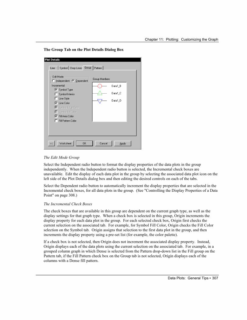
The Group Tab on the Plot Details Dialog Box
The Edit Mode Group
Select the Independent radio button to format the display properties of the data plots in the group independently. When the Independent radio button is selected, the Incremental check boxes are unavailable. Edit the display of each data plot in the group by selecting the associated data plot icon on the left side of the Plot Details dialog box and then editing the desired controls on each of the tabs.
Select the Dependent radio button to automatically increment the display properties that are selected in the Incremental check boxes, for all data plots in the group. (See "Controlling the Display Properties of a Data Point" on page 308.)
The Incremental Check Boxes
The check boxes that are available in this group are dependent on the current graph type, as well as the display settings for that graph type. When a check box is selected in this group, Origin increments the display property for each data plot in the group. For each selected check box, Origin first checks the current selection on the associated tab. For example, for Symbol Fill Color, Origin checks the Fill Color selection on the Symbol tab. Origin assigns that selection to the first data plot in the group, and then increments the display property using a pre-set list (for example, the color palette).
If a check box is not selected, then Origin does not increment the associated display property. Instead, Origin displays each of the data plots using the current selection on the associated tab. For example, in a grouped column graph in which Dense is selected from the Pattern drop-down list in the Fill group on the Pattern tab, if the Fill Pattern check box on the Group tab is not selected, Origin displays each of the columns with a Dense fill pattern.

Chapter 11: Plotting: Customizing the Graph
Data Plots: General Tips • 308
The Incremental check boxes are only available if the current selection on the associated tab can be incremented between data plots. For example, if you select Color Mapping:Dataset from the Fill Color button on the Symbol tab, then the Symbol Fill Color check box on the Group tab is unavailable. If you want to increment a display property whose check box is unavailable on the Group tab, alter the setting on the associated tab.
The Group Members View Box
This view box displays the current display settings for all the data plots in the group. The view box updates as you change selections on the Group tab or on the associated data plot tabs.
Controlling the Display Properties of a Data Point To modify the display of an individual data point, hold the CTRL key down while double-clicking on the data point. This action opens the Plot Details dialog box for the individual data point. The tree on the left side of the Plot Details dialog box displays a data point icon beneath the associated data plot icon. Additionally, the worksheet row index number of the data point displays next to the icon. Edit the dialog box (for the data point) as desired.
After a data point has been edited using the CTRL+double-click option, the data point becomes an Origin object. If you double-click on the same data point (without holding down the CTRL key), the Plot Details dialog box opens with the data point controls displayed. To remove the object status from the data point, click once on the data point to generate a highlighted border around the point and press DELETE. Alternatively, right-click on the data point and select Delete from the shortcut menu. The data point now displays with the format of the data plot.

Chapter 11: Plotting: Customizing the Graph
Data Plots: General Tips • 309
Customizing the Colors in Your Data Plot Origin provides a number of options for using color to present your data. These options are available from the color controls in the Plot Details dialog box. There are two types of color controls available: color buttons with associated options and color drop-down lists.
Color buttons and associated options are provided when you are editing a data plot element that can be customized for each data point in a data plot. Symbols and patterns are examples of elements that can be customized this way. Color drop-down lists are provided when you are editing a data plot element that can not be customized for each data point. Lines are examples of data plot elements that can not be customized for each data point in a data plot.
Displaying Your Data Plot Using a Specified Color This option is available from both the color buttons and from the color drop-down lists. You can display a data plot element using a specified color in the color palette or you can define a new color. To specify a color from the color palette, click the color button and select Individual Color:Color. If you're editing a color drop-down list, select the desired color from the drop-down list.
Some of the color buttons and color drop-down lists include an Automatic color option which, when available, is selected by default. For each color button or drop-down list with this option, the current color associated with Automatic is displayed on the button or in the drop-down list. Origin selects the Automatic color using the criteria as follows:
How Origin Determines the Color for "Automatic"
When Automatic Displays in this Color Control: (Fill) Pattern Color, then Origin Uses this Color Control as a Source: (Border) Color.
When Automatic Displays in this Color Control: (Drop Lines) Color, then Origin Uses this Color Control as a Source: Symbol Color.
When Automatic Displays in this Color Control: Symbol Color, then Origin Uses this Color Control as a Source: (Line) Color. If the data plot does not include a Line tab, then display Black.
When Automatic Displays in this Color Control: (Symbol) Edge Color, then Origin Uses this Color Control as a Source: (Line) Color. If the data plot does not include a Line tab, then display Black.
Chapter 11: Plotting: Customizing the Graph
Data Plots: General Tips • 310
When Automatic Displays in this Color Control: (Symbol) Fill Color, then Origin Uses this Color Control as a Source: Default Symbol Fill Color drop-down list selection on the Graph tab of the Options dialog box.
When Automatic Displays in this Color Control: (Error bar) Color, then Origin Uses this Color Control as a Source: Symbol Color. If no symbol exists, (Line) Color.
Some of Origin's color buttons and color drop-down lists also include a None option. When you select None, the data plot element display is transparent.
In addition to selecting a color, you can create a custom color from the color button options and from some of the color drop-down lists. To create a custom color, click the color button and select Custom. Right-click on the Custom button to open the Color dialog box. After defining a custom color, the color displays in the Custom button.
Displaying Each Data Point in Your Data Plot Using Sequential Colors in the Color Palette To increment the color of a data plot element (for example, symbol fill color) for all data points in a data plot, click the color button and select Increment. Then select the first color in the sequence from the associated submenu. Origin displays the selected sequence on the Increment button. After clicking OK or Apply, Origin increments the color between data points following the sequence of colors in the color palette.
Note: This color sequencing option is not available if the data plot is part of a data plot group, and the data plot element color that you want to sequence is set to increment between data plots on the Group tab (for example, Fill Color for grouped bar data plots). To make the color sequence option available, clear the associated check box on the Group tab. After editing the color, all data plots in the group reflect your color sequence settings.
Using a Selected Data Set to Control the Color of Your Data Plot Origin provides three methods for using the values in a specified data set to control the color of elements in a data plot. These three methods are available from the data plot element's color button (for example, the Symbol Color button). In each case, Origin uses the data set values in the same worksheet row (or Excel workbook row) to control the data plot display. Thus, for the data point defined by XY values in row 56, Origin uses the value in row 56 of the selected "color control" data set.
If you control the color of a data plot element based on values in a data set, and that data plot is part of a (dependent) data plot group, then Origin applies your setting to the first data plot in the group, and increments the setting for each of the remaining data plots in the group. Origin does this by checking the worksheet column location of the first data plot's Y data set, and compares this location to the worksheet column location of the "color control" data set. If the color control column is n columns to the right of the data plot's Y column, then Origin uses the column which is n columns to the right of each of the remaining data plot's Y columns to control the respective color.

Chapter 11: Plotting: Customizing the Graph
Data Plots: General Tips • 311
Note: You can not select a "color control" data set that is located to the left of the Y or Z data plot column in the worksheet. If necessary, move the desired worksheet column using the Move Right button on the Column toolbar.
Indexing
This option allows you to select a data set whose values are used as index numbers for colors in the color palette. For example, if the selected data set contains values 2 and 5 in rows 1 and 2 respectively, Origin displays the data point associated with row 1 using the second color in the color palette, and the data point associated with row 2 using the fifth color in the color palette. If a data set value exceeds the number of colors in the color palette, Origin displays the data point in black.
To access this option, click the color button and select Indexing:Dataset.
Direct RGB
This option allows you to select a data set whose values are used as RGB values for the associated data points in the data plot.
To access this option, click the color button and select Direct RGB:Dataset.
RGB values are calculated from triplet components of Red, Green, and Blue. The Red, Green, and Blue components can have numeric values from 0 to 255. The RGB value is then computed using the following formula:
RGB = (2560 * Red) + (2561 * Green) + (2562 * Blue)
which is:
RGB = Red + (256 * Green) + (65536 * Blue)
Color Mapping
This option allows you to create a mapping relationship between ranges of 2D Y values or 3D Z values and an associated scale of colors. The 2D Y values or 3D Z values are then used to determine the data point element colors in the data plot, based on the established color map.
To access this option, click the color button and select Color Mapping:Dataset. After making this selection, a Color Map/Contours tab displays in the Plot Details dialog box. Origin automatically creates a color scale with 8 colors (plus a color above and below), and maps the data set values to these colors by finding the maximum and minimum data set values, and an increment that results in 8 levels. To customize this default color map, select the Color Map/Contours tab and assign custom Y or Z value ranges to associated colors. After color mapping the data plot element, select Graph:New Color Scale (or right-click in the layer and select New Color Scale) to display the color scale and associated data set mapping relationship in the graph. (The numeric format of the color scale is set on the (Plot Details) Numeric Formats tab.)
To learn more about color mapping, review the 3D SURFACE & CONTOUR.OPJ and the CONTOUR.OPJ projects located in your Origin \SAMPLES\GRAPHING\3D PLOTS folder. Additionally, review the COLOR SCALE.OPJ project located in your Origin \SAMPLES\GRAPHING\2D PLOTS folder.

Chapter 11: Plotting: Customizing the Graph
Data Plots: General Tips • 312
The color mapping option is particularly useful for presenting data in which you have two independent variables and one dependent variable. You can plot the dependent variable versus one of the independent variables, and then use the second independent variable to color map your data plot. For example, suppose you measured some response of a sample at various positions along its length, while also varying the temperature of the sample along its length.
Without using the color mapping option, you could present your results in a two layer graph, showing the variation of temperature along the sample length, as well as the measured response.

Chapter 11: Plotting: Customizing the Graph
Data Plots: General Tips • 313
However, by using the color mapping option, you can plot the measured response of the sample versus position, and use the temperature data to color map the data plot.

Chapter 11: Plotting: Customizing the Graph
Data Plots: General Tips • 314
Using Data Sets as a Plotting Enhancement Many elements of a data plot can be controlled based on values from another data set. For example, you can control the size of the symbols in a scatter data plot based on values in a selected worksheet (or Excel workbook) column. When you select a data set to control the display of an element in a data plot, for each data point in the data plot, Origin uses the associated worksheet row value in the specified column.
These "data set control" options are available from drop-down lists and combination boxes in the Plot Details dialog box. When the option is available for a specific data plot element, Origin includes Col(Name) entries at the bottom of the drop-down list or combination box, where Name is the worksheet or Excel workbook column name.
Origin only allows access to the current data plot's Y or Z columns in the worksheet, or to columns that are located to the right of these columns. If you want to specify a column that is currently unavailable because it is located to the left of the Y or Z column, move the desired worksheet column using the Move Right button on the Column toolbar.
Note 1: If you control the display of a data plot element based on values in a data set, and that data plot is part of a (dependent) data plot group, then Origin applies your setting to the first data plot in the group, and increments the setting for each of the remaining data plots in the group. Origin does this by checking the worksheet column location of the first data plot's Y data set, and compares this location to the worksheet column location of the "control" data set. If the control column is n columns to the right of the data plot's Y column, then Origin uses the column which is n columns to the right of each of the remaining data plot's Y columns to control the respective element's display.
Note 2: To display an enhanced legend that conveys information about the data point display properties, select Graph:Enhanced Legend.

Chapter 11: Plotting: Customizing the Graph
Data Plots: General Tips • 315
Origin provides data set control for the following data plot elements:
Color (buttons and drop-down lists)
Origin provides three methods for using the values in a specified column to control the color of elements in a data plot: indexing, direct RGB, and color mapping.
Shape (for symbols, select the Show Construction check box and the Geometric radio button)
When you select a column from the Shape drop-down list, Origin makes the following association between numeric values and symbol shapes: 0 = no symbol, 1 = square, 2 = circle, 3 = up triangle, 4 = down triangle, 5 = diamond, 6 = cross (+), 7 = cross (x), 8 = star (*), 9 = bar (-), 10 = bar (|), 11 = number, 12 = LETTER, 13 = letter, 14 = right arrow, 15 = left triangle, 16 = right triangle, 17 = hexagon, 18 = sphere, 19 = star, 20 = pentagon. For any numeric values outside of this range (except 56 and 58), no symbol displays.
The numeric values of 56 and 58 display special symbol types: 56 = data markers and 58 = vertical lines that mark the X position of the data point.
Interior (for symbols, select the Show Construction check box and the Geometric radio button)
When you select a column from the Interior drop-down list, Origin makes the following association between numeric values and symbol interiors: 0 = no symbol, 1 = solid, 2 = open, 3 = dot center, 4 = hollow, 5 = + center, 6 = x center, 7 = - center, 8 = | center, 9 = half up, 10 = half right, 11 = half down, 12 = half left. For any numeric values outside of this range, no symbol displays.
Size (for symbols)
When you select a column from the Size combination box, the data set values determine the data point size in units of points. You can scale those data set values by selecting or typing a value in the associated Scaling Factor combination box.
Angle (for XYAM vector data)
When you select a column from the Angle drop-down list, the data set values determine the vector angle for each data point in the associated row. The units are determined by the Angular Unit group on the Numeric Format tab of the Options dialog box (Tools:Options).
Magnitude (for XYAM vector data)
When you select a column from the Magnitude combination box, the data set values determine the vector magnitude in units of points.
Note: The X End and Y End drop-down lists on the Vector tab of the XYXY vector Plot Details dialog box also list columns for control selection. However, these vector elements are only controllable via column selection, thus differing from the other controls.
When you control the display of a data plot element based on a selected data set, the data plot display is not necessarily uniform. Therefore, the default data plot type icon in the legend will not necessarily provide an

Chapter 11: Plotting: Customizing the Graph
Data Plots: General Tips • 316
accurate representation of the data plot. The following example illustrates how you can customize the legend so that it better reflects your custom data plot. In this example, a line + symbol data plot is created with symbols alternating between squares and circles. A D(Y) column that contains no data is then added to the graph layer as a line + symbol data plot with circle symbols. Because the column contains no data, the data plot doesn't actually display in the graph layer. However, its plot attributes can be used to customize the legend display.
Creating a Custom Data Plot with the Symbol Shape Based on a Data Set
1) Create the following worksheet and then highlight column B and click the Line + Symbol button on the 2D Graphs toolbar.
2) Double-click on the data plot to open the Plot Details dialog box.
3) On the Symbol tab, select the Show Construction check box.
4) Select Col(C) from the Shape drop-down list.
5) Click OK.

Chapter 11: Plotting: Customizing the Graph
Data Plots: General Tips • 317
Displaying Both Symbol Shapes in the Legend
1) Make the worksheet active and click the Add New Columns button on the Standard toolbar. Origin adds one D(Y) column to the worksheet.
2) Make the graph active and double-click on the layer 1 icon in the upper-left corner of the graph. This action opens the Layer 1 dialog box.
3) Click on data1_d in the Available Data list and then click the right arrow button to move this data set into the Layer Contents list.
4) Click the Layer Properties button to open the Plot Details dialog box with the layer icon selected on the left side of the dialog box.
5) Click the plus sign next to the layer icon to view the associated data plot icons.
6) Click on the Data1: A(X), D(Y) icon on the left side of the dialog box. This data plot's controls become active on the right side of the dialog box.
7) Select Line + Symbol from the Plot Type drop-down list (on the left side of the dialog box).
8) On the Symbol tab, click the down arrow next to the Preview view box.
9) Select the filled circle (column 1, row 2).
10) Click OK twice to close both dialog boxes.
11) Double-click on the "B" in the legend to open the legend's Text Control dialog box.
12) Replace \L(1) %(1) with the following text: \L(1)\L(2) %(1)
13) Click OK. The legend updates displaying a square and circle data plot icon.

Chapter 11: Plotting: Customizing the Graph
Data Plots: General Tips • 318
Clipping the Data Plot to the Frame Data plots that extend beyond the layer frame, or beyond the customized clipping margins, can be hidden from view. To clip the data plot in the active layer, select Format:Layer. Alternatively, double-click on the layer icon to open the associated Layer n dialog box and then click the Layer Properties button. Both these actions open the Plot Details dialog box with the layer icon selected on the left side of the dialog box. Select the Display tab and then select the Clip Data To Frame check box in the Data Drawing Options group. To view the clipped data, clear this check box.
To set the clipping margins inside or outside the active layer frame, type the desired margin value percentages in the Horizontal and Vertical text boxes in the Data Drawing Options group. Type a negative value to clip the data plot to a point outside the frame. Type a positive value to clip the data plot to a point inside the frame.
Hiding Data Plots Origin provides an option to hide a single data plot, all data plots in the layer except for the selected data plot, or all data plots in the active graph window.
To hide a single data plot, right-click on the desired data plot and select Hide Data Plot from the shortcut menu. To view the hidden data plot, right-click in the respective layer and select Show All Data from the shortcut menu.
To hide all data plots in the layer except for the selected data plot, right-click on the data plot you want to view and select Hide Others from the shortcut menu. To view the hidden data plots, right-click in the respective layer and select Show All Data from the shortcut menu.
To hide all data plots in the active graph window, select View:Show:Data. This action removes the check mark next to the command and hides the data plots in the graph window. To view all the data plots in the active graph window, reselect View:Show:Data.
Note: Hiding data plots reduces the screen redraw time. Additionally, hiding data plots may make it easier for you to see the result of any axis, or axis label, manipulation. However, if you want the data plot included in a printout, remember to display the data plot before printing.
Setting the Data Plot's Display Range Origin provides three methods for changing the display range (without changing the axis scale) in the graph window:
1) Change the display range of the data plot by changing the display range of the data sets in the associated worksheet. However, changing the display range in the worksheet affects all current and future plot instances.
2) Change the display range of the active data plot graphically, using the Data Selector tool from the Tools toolbar. This method does not affect the worksheet display range and thus does not affect other plot instances of the data sets.
Chapter 11: Plotting: Customizing the Graph
Data Plots: General Tips • 319
3) Change the display range of a data plot by specifying the starting and ending worksheet row numbers.
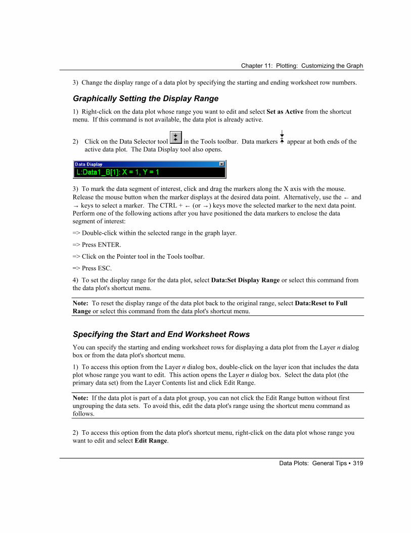
Graphically Setting the Display Range 1) Right-click on the data plot whose range you want to edit and select Set as Active from the shortcut menu. If this command is not available, the data plot is already active.
2) Click on the Data Selector tool in the Tools toolbar. Data markers appear at both ends of the active data plot. The Data Display tool also opens.
3) To mark the data segment of interest, click and drag the markers along the X axis with the mouse. Release the mouse button when the marker displays at the desired data point. Alternatively, use the ← and → keys to select a marker. The CTRL + ← (or →) keys move the selected marker to the next data point. Perform one of the following actions after you have positioned the data markers to enclose the data segment of interest:
=> Double-click within the selected range in the graph layer.
=> Press ENTER.
=> Click on the Pointer tool in the Tools toolbar.
=> Press ESC.
4) To set the display range for the data plot, select Data:Set Display Range or select this command from the data plot's shortcut menu.
Note: To reset the display range of the data plot back to the original range, select Data:Reset to Full Range or select this command from the data plot's shortcut menu.
Specifying the Start and End Worksheet Rows You can specify the starting and ending worksheet rows for displaying a data plot from the Layer n dialog box or from the data plot's shortcut menu.
1) To access this option from the Layer n dialog box, double-click on the layer icon that includes the data plot whose range you want to edit. This action opens the Layer n dialog box. Select the data plot (the primary data set) from the Layer Contents list and click Edit Range.
Note: If the data plot is part of a data plot group, you can not click the Edit Range button without first ungrouping the data sets. To avoid this, edit the data plot's range using the shortcut menu command as follows.
2) To access this option from the data plot's shortcut menu, right-click on the data plot whose range you want to edit and select Edit Range.

Chapter 11: Plotting: Customizing the Graph
Data Plots: General Tips • 320
Both these operations open the Plot Range dialog box.
The Plot Range Dialog Box
The Dataset list box displays the primary data set for the selected data plot. Set the display range for this data plot in the From row number and the To row number text boxes.
Note: To reset the display range of the data plot back to the original range, select Data:Reset to Full Range or select this command from the data plot's shortcut menu.
Rescaling the Axes to Display Data that Extends Beyond the Current Axes Range Origin provides an option to reset the axes scale values so that all the data included in the active layer displays within the layer frame. To reset the axes scale values, select Graph:Rescale to Show All or click
the Rescale button on the Graph toolbar. This operation is most useful when data plots that extend beyond the current axes range are added to the layer, or when the worksheet display range is modified. The operation has no affect on the “speed mode” setting which is located on the (Plot Details) Size/Speed tab when the layer icon is selected from the left side of the dialog box. The rescale operation resets the axes scale values only.
Note: If you have selected Manual from the Rescale drop-down list on the Scale tab of the Axis dialog box, Origin asks you if you want to override the manual rescale setting. If you click No, the axes will not rescale to show all the data.
Connecting Lines Across Missing Data Origin provides an option for connecting lines across missing data in line and line + symbol data plots. To enable this option, click on the desired graph window to make it the active window. Select Format:Page. This menu command opens the Plot Details dialog box with the graph page icon selected on the left side of the dialog box. Select the Miscellaneous tab and then select the Connect Line Across Missing Data check box.

Chapter 11: Plotting: Customizing the Graph
Data Plots: General Tips • 321
Displaying Every nth Data Point To display every nth data point in a line + symbol or scatter data plot, double-click on the data plot to open the Plot Details dialog box, select the Drop Lines tab, and then select the Skip Pts check box in the Data Points Display Control group. Specify the data point display frequency in the associated text box. For example, type 5 in the text box to display every 5th data point as a symbol. To display a continuous line in a line + symbol data plot with "skip points" enabled, select the (Plot Details) Line tab and then clear the Gap to Symbol check box in the Symbol/Line Interface group.
Moving a Data Point Select Data:Move Data Points to move a data point in the active data plot. If this menu command has not previously been selected for the data plot, an Attention dialog box opens stating that the data plot is not set to have movable data points. Click Yes to enable the option. A cursor appears on a data point in the data plot. The Data Reader tool also becomes active and the Data Display tool opens. Click on the desired data point and drag to the new location with the mouse. Alternatively, use the ← and → keys to change the active data point. The ↑ and ↓ keys move the active data point up and down. Use the CTRL+ ← (and →) keys to move the active data point left and right.
The Data Display tool displays the XY coordinates of the selected data point.
To complete the process, perform one of the following:
1) Press ESC.
2) Click on the Pointer tool in the Tools toolbar.
3) Press ENTER.
The new XY value of the data point is also displayed in the worksheet.
Deleting a Data Point To delete a data point from the active data plot, select Data:Remove Bad Data Points. After selecting this menu command, the Data Reader tool becomes active and the Data Display tool opens. To delete a data point, click on the desired data point and press ENTER. The data point is deleted from the data plot as well as from the worksheet cell. In the worksheet, all values below the deleted value shift up one row in the column.
Displaying the Data Plot's Worksheet Data To display the worksheet associated with a data plot, perform one of the following operations:
1) Right-click on the data plot and select Go to Worksheet from the shortcut menu.
2) Double-click on the data plot to open the Plot Details dialog box and click the Worksheet button.
Origin opens the worksheet containing the data for the data plot. If no worksheet exists, Origin creates the worksheet. If the worksheet exists but is "filed" in a different Project Explorer folder than the graph,

Chapter 11: Plotting: Customizing the Graph
Data Plots: Customizing Specific Elements • 322
Origin opens the worksheet in the current (graph) folder. To remove the display of the worksheet in the graph folder, make the worksheet's Project Explorer folder active, and then re-select the graph folder.
Data Plots: Customizing Specific Elements The elements in your data plot (for example, symbols, lines, fills, error bars, and data labels) are all customized in the Plot Details dialog box. Double-click on the data plot element to open the dialog box with the desired tabs active.
Symbols Origin provides access to a broad range of symbols for use in 2D scatter, line + symbol, and ternary graphs; box, histogram and probabilities, and QC statistical charts; as well as in 3D scatter and trajectory graphs. These symbols are available from the symbol gallery which is accessed by clicking the down arrow next to the Preview box on the (Plot Details) Symbol tab. Click on a symbol in the gallery to select it. The selected symbol then displays in the Preview box.
The default symbol gallery can be expanded to include characters from the Symbol font set. To display characters from the Symbol font set in the symbol gallery, select the Symbol Gallery Displays Characters check box on the Graph tab of the Options dialog box.
Displaying Your Bitmaps as Symbols You can display bitmaps that you have created in other programs as symbols in your graph. The bitmaps must be less than or equal to 16 x 16 pixels. If a bitmap is larger than this, Origin will display only the upper-left corner of the bitmap.
To display your bitmap as a data plot symbol, perform the following operations:
1) Copy your bitmap to the Clipboard.
2) In Origin, select Tools:Options and then select the Graph tab.

Chapter 11: Plotting: Customizing the Graph
Data Plots: Customizing Specific Elements • 323
3) Click on a cell in the User Defined Symbols grid (for example, click on the upper-left cell) and with the mouse still pointing at the cell, press CTRL+V. This keyboard operation pastes the symbol from the Clipboard into the cell. (To copy a symbol from a cell in the grid, click on the cell and press CTRL+C. To delete a symbol from a cell, press CTRL+X.)
4) Click OK to close the Options dialog box.
5) Re-open the (Plot Details) Symbol tab. Your user-defined symbols display at the bottom of the symbol gallery. Additionally, Origin provides access to your symbols when the Show Construction check box is selected and the associated User Defined Symbols radio button is selected.
All white portions of your bitmap will display as transparent in the data plot symbol. The black portions of your bitmap, or any colored portions, will display using the color from the Symbol Color button.
Note 1: On some computers, user-defined symbols may display as black squares in regions of the graph. If you experience such display problems, try resolving the problem by increasing the setting of your Windows Color Palette. For example, if your current setting is 256 color, increase the setting to True Color (24 bit). Additionally, the user-defined symbols display problem might be resolved by updating your printer driver. To check if the printer driver is causing the display problem, restart your computer in Safe Mode. If this change resolves the display problem, then consider updating your printer driver.
Note 2: If you experience printout problems with the user-defined symbols, the problem is most likely related to your printer driver. Try upgrading or changing your driver to resolve this problem.
Constructing Custom Symbols Including Geometric Symbols, Characters from any Font Set, and Row Numbers In addition to selecting a symbol from the symbol gallery, you can construct custom symbols. To construct symbols, select the Show Construction check box on the (Plot Details) Symbol tab. After selecting this check box, a number of controls display beneath the check box that allow you to perform the following operations:
1) Construct a geometric symbol.
2) Select a character from a font set.
3) Select a start character to increment through a font set.
4) Select row numbers.
5) Select a user-defined symbol.
After making your selections from the Show Construction controls, the Preview box displays your selection.

Chapter 11: Plotting: Customizing the Graph
Data Plots: Customizing Specific Elements • 324
Displaying a Box Around Alphabetic Symbols When you select the Show Construction check box on the (Plot Details) Symbol tab and then select either the Single Alphabetic or the Incremental Alphabetics radio button, you can display a box around each data point symbol. To do this, select the Outline check box on the (Plot Details) Symbol tab.
Using a Data Set to Control the Symbol Display in a Data Plot In addition to constructing custom symbols from the Show Construction controls on the Symbol tab, you can also use these controls to assign a worksheet column whose values determine the symbol display on a "point-by-point" basis. This option is available for geometric symbols and user-defined symbols. However, it is only available when editing a data plot that is not part of a group, or when editing a data plot that is part of a group in which the Edit Mode is set to Independent on the (Plot Details) Group tab.
Controlling Symbols with Grouped Data Plots When editing the Plot Details dialog box for grouped data plots that include symbols, Origin provides a Symbol Type check box on the Group tab. This check box is only available if the selected symbol can be incremented between data plots.
When the Symbol Type check box is selected on the Group tab and you select a symbol from the symbol library on the Symbol tab, Origin increments the symbol between data plots using the following symbol order: square, circle, up triangle, down triangle, diamond, left triangle, right triangle, hexagon, sphere, star, pentagon, cross (+), cross (x), star (*), bar (-), bar (|), number, LETTER, letter. If you select the Show Construction check box on the Symbol tab, Origin increments the symbol based on your radio button selection. For example, if you select the Single Alphabetic radio button and a start character, Origin displays the first member of the data plot group using that start character, and increments the character using the selected font set for each additional data plot in the group.
The (Plot Details) Symbol Tab The symbols in 2D scatter, line + symbol, and ternary graphs; box, histogram and probabilities, and QC statistical charts; as well as in 3D scatter and trajectory graphs are all controlled from the (Plot Details) Symbol tab.

Chapter 11: Plotting: Customizing the Graph
Data Plots: Customizing Specific Elements • 325
The Preview Group
Click the down arrow next to the Preview box (not shown) to open the symbol gallery for symbol selection. Display characters in the symbol gallery by selecting the Symbol Gallery Displays Characters check box on the Graph tab of the Options dialog box.
The Size Combination Box
Type or select the symbol size, in points, from the Size combination box. If you select a worksheet column from this combination box, a Scaling Factor combination box displays. Type or select a value to scale the associated column values. For example, select 0.25 to scale each cell value by 0.25.
The Edge Thickness Drop-down List
Select the desired value from this drop-down list to determine the border width of hollow or open symbols. Enter n to specify the width of the symbol border as n% of the symbol's half diameter. Select Default to use the value specified from the Symbol Border Width combination box on the Graph tab of the Options dialog box.
The Color Buttons
Depending on your symbol selection, either a Symbol Color button displays, or a Symbol Edge Color button and a Symbol Fill Color button display. Select a color by clicking on the respective button.
The Overlapped Points Offset Plotting Check Box
If your data includes repeated (X,Y) pairs, you can display the repeated pairs with an X offset, and then display the actual (X,Y) value as a short vertical line by selecting this check box.
The Show Construction Check Box and Associated Controls
Select the Show Construction check box to build symbols for your graph, based on your selections from the associated controls.

Chapter 11: Plotting: Customizing the Graph
Data Plots: Customizing Specific Elements • 326
Select the Geometric radio button to use a symbol from the Shape drop-down list and an interior pattern from the Interior drop-down list. Select Hollow from the drop-down list to display overlapping data plot elements through the symbol. Select Open from the Interior drop-down list to prevent overlapping data plot elements from displaying through the symbol (except when None is selected from the Fill Color button, in which case the overlapping elements display).
Select the Single Alphabetic radio button to use the same alphanumeric character for all the points in the data plot. Select the desired font set and character from the associated controls.
Select the Incremental Alphabetics radio button to use alphanumeric characters incrementing by one for each consecutive data point in the data plot. Select the desired font set and start character from the associated controls.
Select the Row Number Numerics radio button to use the row number corresponding to the data point as the symbol in the data plot. Select the desired font set from the associated drop-down list.
Select the User Defined Symbols radio button to display a bitmap that you added to the User Defined Symbols grid on the Graph tab of the Options dialog box. Your available user-defined symbols display in the Symbol List drop-down list.
When either the Single Alphabetic radio button or the Incremental Alphabetics radio button is selected, the Outline check box is available. Select this check box to display an outline or box around each data point symbol.
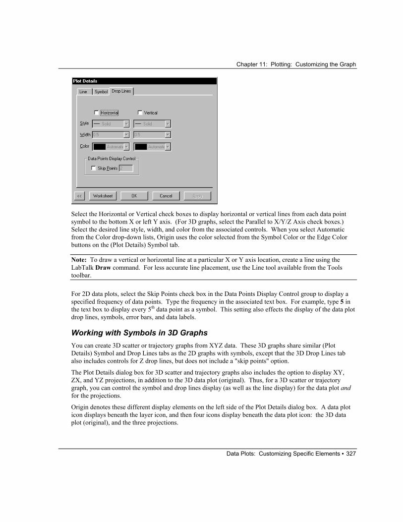
The (Plot Details) Drop Lines Tab You can add horizontal or vertical drop lines to any 2D data plot type that includes symbols. You can also add drop lines to the Z axis for 3D scatter and trajectory graphs. The drop lines controls are available on the (Plot Details) Drop Lines tab.
Chapter 11: Plotting: Customizing the Graph
Data Plots: Customizing Specific Elements • 327
Select the Horizontal or Vertical check boxes to display horizontal or vertical lines from each data point symbol to the bottom X or left Y axis. (For 3D graphs, select the Parallel to X/Y/Z Axis check boxes.) Select the desired line style, width, and color from the associated controls. When you select Automatic from the Color drop-down lists, Origin uses the color selected from the Symbol Color or the Edge Color buttons on the (Plot Details) Symbol tab.
Note: To draw a vertical or horizontal line at a particular X or Y axis location, create a line using the LabTalk Draw command. For less accurate line placement, use the Line tool available from the Tools toolbar.
For 2D data plots, select the Skip Points check box in the Data Points Display Control group to display a specified frequency of data points. Type the frequency in the associated text box. For example, type 5 in the text box to display every 5th data point as a symbol. This setting also effects the display of the data plot drop lines, symbols, error bars, and data labels.
Working with Symbols in 3D Graphs You can create 3D scatter or trajectory graphs from XYZ data. These 3D graphs share similar (Plot Details) Symbol and Drop Lines tabs as the 2D graphs with symbols, except that the 3D Drop Lines tab also includes controls for Z drop lines, but does not include a "skip points" option.
The Plot Details dialog box for 3D scatter and trajectory graphs also includes the option to display XY, ZX, and YZ projections, in addition to the 3D data plot (original). Thus, for a 3D scatter or trajectory graph, you can control the symbol and drop lines display (as well as the line display) for the data plot and for the projections.
Origin denotes these different display elements on the left side of the Plot Details dialog box. A data plot icon displays beneath the layer icon, and then four icons display beneath the data plot icon: the 3D data plot (original), and the three projections.

Chapter 11: Plotting: Customizing the Graph
Data Plots: Customizing Specific Elements • 328
Whenever the data plot icon is selected on the left side of the dialog box, an Edit Control tab displays (see the next topic). Whenever one of the four data plot element icons is selected from the left side of the Plot Details dialog box, a Symbol, Drop Lines, and Line tab display. The check boxes next to the data plot element icons determine whether or not the element will display in the data plot. Select the check box to display the element.
Note: When you select a data plot element icon on the left side of the dialog box, be careful not to inadvertently clear the icon's check box. To activate the tabs of a data plot element icon with a selected check box, click on the text next to the icon, not in the check box.
To learn more about 3D scatter graphs, review the 3D SCATTER.OPJ project located in your Origin \SAMPLES\GRAPHING\3D PLOTS folder.
The (Plot Details) Edit Control Tab The Edit Control tab is provided so that you can quickly display projections in your 3D scatter or trajectory graph, and quickly control their display based on your original 3D data plot settings. Alternatively, you can use this dialog box for custom edit control.

Chapter 11: Plotting: Customizing the Graph
Data Plots: Customizing Specific Elements • 329
Select the All Together radio button to display and edit the settings on the (Plot Details) Line, Symbol, and Drop Lines tabs for the 3D data plot (original) and the three projections.
Select the Fully Independent radio button to edit each of the 3D data plot elements separately.
Select the Original Independent of Projections radio button to edit the 3D data plot (original) element separate from the projections.
Lines Origin provides access to a broad range of line connections and styles for use in 2D line, line + symbol, polar, area, fill area, XYAM vector, XYXY vector, and high-low-close graphs; box and histogram statistical charts; as well as in 3D scatter, trajectory, ribbons, walls, and waterfall graphs. Line control is available from the (Plot Details) Line tab.
The (Plot Details) Line Tab The controls available on the Line tab are dependent on the current data plot type. The following reference section reviews all the possible controls on this tab.
Chapter 11: Plotting: Customizing the Graph
Data Plots: Customizing Specific Elements • 330
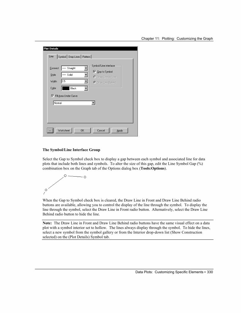
The Symbol/Line Interface Group
Select the Gap to Symbol check box to display a gap between each symbol and associated line for data plots that include both lines and symbols. To alter the size of this gap, edit the Line Symbol Gap (%) combination box on the Graph tab of the Options dialog box (Tools:Options).
When the Gap to Symbol check box is cleared, the Draw Line in Front and Draw Line Behind radio buttons are available, allowing you to control the display of the line through the symbol. To display the line through the symbol, select the Draw Line in Front radio button. Alternatively, select the Draw Line Behind radio button to hide the line.
Note: The Draw Line in Front and Draw Line Behind radio buttons have the same visual effect on a data plot with a symbol interior set to hollow. The lines always display through the symbol. To hide the lines, select a new symbol from the symbol gallery or from the Interior drop-down list (Show Construction selected) on the (Plot Details) Symbol tab.

Chapter 11: Plotting: Customizing the Graph
Data Plots: Customizing Specific Elements • 331
Other Controls
1) The Connect Drop-down List
Select the desired line connection from this drop-down list. Note that if you perform an interpolation on your data plot, the line connection type will affect the interpolation results.
The available line connection types are as follows:
No Line: The data points are not connected.
Straight: A straight line is displayed between data points.
Segment: The connection display alternates between Straight and No Line.
Segment 3: The connection display alternates between Straight for three points, No Line, Straight for three points, etc.
B-Spline: For a pair of data sets with coordinates ( [ ], [ ])X i Y i , , Origin makes a smooth curve using a cubic B-spline connection. The B-spline curve can be described by parametric equations. Around point
i = 1 2, ,...n
( [ ], [ ])X i Y i it takes the form:
Xi(t) =
{ }16
3 3 1 1 3 6 4 3 3 3 1 1 23 2 3 2 3 2 3( ) [ ] ( ) [ ] ( ) [ ]− + − + − + − + + − + + + + + +t t t X i t t X i t t t X i t X i[ ]
and Yi(t) =
{ }16
3 3 2 3 1 1 3 3 6 2 4 3 3 3 2 3 1 1 3 2( ) [ ] ( ) [ ] ( ) [ ] [ ]− + − + − + − + + − + + + + + +t t t Y i t t Y i t t t Y i t Y i
where 2 2 . ≤ ≤ −i nThe coordinates are calculated around each point letting t range from 0 to 1. This cubic B-spline curve is continuous up to a second order derivative. Unlike spline curves which pass through the original data points ( [ ], [ ])X i Y i , the B-spline curve winds around the original data points without passing through them. (Origin duplicates the first and last data points so the curve passes through them.)
Note: One advantage of the B-spline connection is that it does not have any requirements for the original data points, whereas the spline connection requires that the X coordinates by strictly increasing.
Spline: This option generates a cubic spline connection. To use the connection, the X values must be discrete and increasing. Furthermore, the number of data points cannot exceed 900 (if the data set exceeds this number, the operation will fail). Since curvature information is held in memory, the spline resolution remains the same regardless of page magnification. The SplineStep variable in the ORIGIN.INI file controls the spline calculation increment. It is expressed in units of .1 point.
Chapter 11: Plotting: Customizing the Graph
Data Plots: Customizing Specific Elements • 332
4
Step Horz: This option generates a right angle connection. The initial line is horizontal.
Step Vert: This option generates a right angle connection. The initial line is vertical.
Step H Center: This option generates a right angle connection. Each point is in the middle of the horizontal run.
Step V Center: This option generates a right angle connection. Each point is in the middle of the vertical run.
Bezier: This option generates a Bezier curve. The Bezier curve is very similar to the B-spline curve. It can be described by parametric equations around four original data points:
X t t t t X t t t X t t X t X( ) ( ) [ ] ( ) [ ] ( ) [ ] [ ]= − + − + + − + + − + +3 2 3 2 3 2 33 3 1 1 3 6 3 2 3 3 3
Y t t t t Y t t t Y t t Y t Y( ) ( ) [ ] ( ) [ ] ( ) [ ] [ ]= − + − + + − + + − + +3 2 3 2 3 2 33 3 1 1 3 6 3 2 3 3 3 4
Origin uses four consecutive data points, say ( [ ], [ ])X i Y i , i = 1, 2, 3, 4, to construct a section of Bezier curve letting t range from 0 to 1. The curve always passes through the first and the fourth points, but not the second and third. The next section of the curve is constructed by ( [ ], [ ])X i Y i , i = 4, 5, 6, 7. The process is repeated until all data points are included (if the total number of points is not a multiple of 4, the remaining points are not used in the connection). The derivatives of the curve are not continuous over the whole range, but within each section (where t ranges from 0 to 1) the curve is continuous up to the second order derivative.
2) The Style Drop-down List
Select the style for the connection line from this drop-down list. At low screen resolutions or in small windows, the dash lines may appear solid. However, the print out displays the correct line type.
Note: You can customize the dash patterns in the Origin Dash Lines group on the Graph tab of the Options dialog box (Tools:Options).
3) The Width Combination Box
Type or select the desired line width from this combination box. The line width is measured in point size where 1 point=1/72 inch.
4) The Color Drop-down List
Select the desired line color from this drop-down list.
Note: You can display the lines and symbols in a line + symbol data plot using different colors. To do this, select the desired symbol color from the Symbol Color button or from the Edge Color and Fill Color buttons on the Symbol tab, and then select the desired line color from the Color drop-down list on the Line tab. Alternatively, if you edit the line Color drop-down list first and then click OK or Apply, both the lines and symbols in the data plot will reflect your change. This is because by default, Automatic is selected

Chapter 11: Plotting: Customizing the Graph
Data Plots: Customizing Specific Elements • 333
from the symbol color buttons, so that the symbol color follows the line color. To alter this behavior, make a different selection from the symbol color buttons.
5) The Fill Area Under Curve Check Box and Drop-down List
Select this check box and then select Normal from the associated drop-down list to fill the area denoted by the data plot line and the bottom X axis (assuming the axis position is not offset) for a line and a line + symbol data plot. For the polar data plot, Origin fills the area denoted by the data plot line and the bottom X axis major grid lines at 0 and 180 degrees.
Sample of Fill Set to Inclusive Broken by Missing Values
Select this check box and then select Inclusive Broken by Missing Values from the associated drop-down list to fill the area determined by the data plot and a baseline defined by the first and last data points in the data plot. If the data plot includes missing values, Origin fills the first segment of the data plot (up to the first missing value), and then fills the second segment of the data plot up the next missing value, etc. This option is also ideal if you want to fill an enclosed area determined by a data plot.
Sample of Fill Set to Exclusive Broken by Missing Values

Chapter 11: Plotting: Customizing the Graph
Data Plots: Customizing Specific Elements • 334
Select this check box and then select Exclusive Broken by Missing Values from the associated drop-down list to fill the region outside of the area determined by the data plot and a baseline defined by the first and last data points in the data plot. If the data plot includes missing values, Origin fills the area outside of the first segment of the data plot (up to the first missing value), and then fills the area outside of the second segment of the data plot up the next missing value, etc. This option is also ideal if you want to fill the region outside of an enclosed area determined by a data plot.
When you select the Fill Area Under Curve check box, Origin displays a Pattern tab in the Plot Details dialog box. Edit the Pattern tab to customize the fill region. For information on the Pattern tab, see "Fill Patterns" on page 334.
Fill Patterns Origin provides access to a broad range of fill patterns for use in 2D bar, column, stack bar, stack column, floating column, floating bar, pie, area, fill area, and polar graphs; box, histogram, stacked histograms, and histogram and probabilities statistical charts; as well as in (XYY...) 3D bars, ribbons, walls, and waterfall graphs. Fill pattern control is available from the (Plot Details) Pattern tab. For 3D bars, walls, and waterfall graphs, this control is available from the XY Faces, YZ Faces, and XZ Faces tabs.
The (Plot Details) Pattern (or XY/YZ/XZ Faces) Tab These tabs provide controls to edit the fill region and border in your graph. If a control is not appropriate for a particular graph type, the control is unavailable on the tab.
The Border Group
Select a border color from the Color button.
Select a line style from the Style drop-down list.

Chapter 11: Plotting: Customizing the Graph
Data Plots: Customizing Specific Elements • 335
Note: You can customize the dash patterns available from the Style drop-down list in the Origin Dash Lines group on the Graph tab of the Options dialog box (Tools:Options).
Select or type a line width from the Width combination box. The line width is measured in point size where 1 point=1/72 inch.
The Fill Group
Select the desired fill color from the Fill Color button. Select None to display a transparent fill.
Select the desired fill pattern from the Pattern drop-down list.
When a pattern is selected from the Pattern drop-down list, the Pattern Color button is available. Select the desired color from this button. When Automatic is selected, Origin uses the Border Color button setting for the pattern color.
Type or select the desired fill pattern line width from the Width combination box. The line width is measured in point size where 1 point=1/72 inch.
The Preview Box
Origin displays your current tab settings in this view box.
The Relation to XY Faces Drop-down List (YZ and XZ Faces tabs only)
Select Same to use the Fill settings on the XY Faces tab for the YZ faces (or XZ faces) of your 3D data plot. Select Independent to control the fill display of the YZ faces (or XZ faces) independent of the Fill settings on the XY Faces tab. Select Lighter or Darker to display a lighter or darker shade of the fill color selected on the XY Faces tab for the YZ faces (or XZ faces).
Column, Bar, and Box Spacing Origin provides controls to customize the spacing between bars, columns, and boxes in 2D bar, column, stack bar, stack column, floating column, and floating bar graphs; box, histogram, stacked histograms, and histogram and probabilities statistical charts; as well as in (XYY...) 3D bars, ribbons, walls, and waterfall graphs. Spacing control is available from the (Plot Details) Spacing tab.
The (Plot Details) Spacing Tab The controls available on the Spacing tab are dependent on the current data plot type. The following reference section reviews all the possible controls on this tab.

Chapter 11: Plotting: Customizing the Graph
Data Plots: Customizing Specific Elements • 336
The Box Gap Between Groups Combination Box
This combination box value controls the spacing between the columns, bars, or boxes for each X value, in units of % of the width of the columns, bars, or boxes at each X value.
In the following example, the first graph displays three Y datasets grouped in a column graph with the spacing set to 0%. In the second graph, the spacing is set to 50%. The spacing was determined by finding 50% of the width of a set of columns for an X value from the first graph.

Chapter 11: Plotting: Customizing the Graph
Data Plots: Customizing Specific Elements • 337
The Overlap Combination Box
This combination box is only available if the data plot is part of a data plot group. Type or select a value from this combination box to overlap the columns or bars at each X value by this amount. The combination box is in units of % of the width of an individual column or bar.
The Bar Thickness Combination Box
This combination box is only available for (XYY...) 3D bar graphs. Type or select a value from this combination box to set the thickness of the 3D bars. The combination box is in units of % of the X axis increment.
Stacking Columns or Bars To stack grouped bars or columns in the active graph layer, select Plot:Stack Grouped Data in Layer. This menu command is checked when selected. Though any graph type can be stacked, this menu command is used mainly with column, bar, and area graphs. To unstack the data plots, re-select the menu command.
A stacked data plot displays data against a cumulative Y axis scale, with the Y values in each X axis category combined and displayed as subgroups.
Pie Slices Origin provides Plot Details dialog box controls to customize the pie slice fill, the pie and pie slice geometry, and the pie slice labels.
Note: To learn more about pie charts, review the 3D PIE CHART.OPJ project located in your Origin \SAMPLES\GRAPHING\3D PLOTS folder.

Chapter 11: Plotting: Customizing the Graph
Data Plots: Customizing Specific Elements • 338
Retaining the Changes You Make to the Pie Slice Labels Default labels display next to each pie slice in a pie chart. The default label display is determined by the settings on the (Plot Details) Labels tab. You can, however, customize the display of the pie slice labels. For example, you can click-and-drag to move a label or double-click on a label to change or format the text. However, when the pie chart's graph window is refreshed, the labels will return to their default location and content (although custom text formatting is retained, for example, font size).
To ensure that all your customizations are retained, edit the (Plot Details) Labels tab. Clear the Associate with Wedge check box in the Position group to prevent Origin from moving the labels back to their default location. Clear the Display check box in the Contents group to prevent Origin from changing the content back to the default setting. To keep your changes, you must clear these check boxes before printing or refreshing the graph.
Removing the Boundary Box Around the Pie Chart To remove the boundary box around the pie chart, select Format:Layer when the pie chart graph window is active. Select the Display tab, and then clear the X Axes and the Y Axes check boxes in the Show Elements group. Click OK to close the dialog box.

Chapter 11: Plotting: Customizing the Graph
Data Plots: Customizing Specific Elements • 339
The (Plot Details) Pie Geometry Tab The (Plot Details) Pie Geometry tab provides controls to edit the view and rotation of the pie chart, as well as the displacement of individual pie slices.
The 3D View Group
The View Angle text box determines the view angle of the pie chart. The units are in degrees. Type 90 to view the chart as 2D.
The Thickness text box determines the thickness of the pie slices. The units are in % of the pie chart radius.
The Rotation/Radius Group
The Starting Azimuth (deg) text box determines the location of the first pie slice in the chart.
Select the Counterclockwise check box to display the pie slices in a counterclockwise orientation.
The Rescale Radius text box resizes the pie chart. The units are in % of the frame. The frame is the boundary box around the pie chart.
The Pie Sections Group
To displace a pie slice from the pie chart, select the pie slice's check box in this group. Specify the displacement for any selected slices from the Displacement text box. The units are in % of the pie chart radius.
The (Plot Details) Labels Tab The (Plot Details) Labels tab provides controls for customizing the labels of the pie chart.

Chapter 11: Plotting: Customizing the Graph
Data Plots: Customizing Specific Elements • 340
The Contents Group
When the Display check box is selected, the contents of the pie slice labels are determined by the selections from the associated check boxes. Select the Values check box to display the worksheet cell values as labels. Select the Percentages check box to display the percent of the total for each cell value. Select the Categories check box to display associated X values for each pie slice. If there is no associated X column, then row numbers display.
If the Display check box is selected, any changes that you make to the label content (for example, by double-clicking on a label to open and edit the Text Control dialog box) will not be retained when the graph window is refreshed. To customize the label content using the Text Control dialog box, clear the Display check box before making your changes.
The Position Group
When the Associate with Wedge check box is selected, the position of the pie slice labels are determined by the Dist. from Pie Edge text box. The units of this text box are in % of the pie chart radius.
If the Associate with Wedge check box is selected, any changes that you make to the label locations (for example, by dragging the label) will not be retained when the graph window is refreshed. To customize the label position by dragging to a new location, clear the Display check box before making your changes.
Vectors Origin offers two types of vector graphs, XYAM and XYXY. The XYAM vector graph is composed of X, Y, angle, and magnitude data sets. The XYXY vector graph is composed of X1, Y1, X2, and Y2 data sets.
Using Color to Represent the Vector Magnitude For XYAM vector graphs, the length of the vectors are controlled by the values in the magnitude worksheet column (in units of points). Another option for displaying each vector's magnitude is to use

Chapter 11: Plotting: Customizing the Graph
Data Plots: Customizing Specific Elements • 341
color. You can establish a mapping relationship between ranges of magnitude values and an associated scale of colors. You can then use the worksheet magnitude values to determine each vector color in the graph, based on your established color map. The basic steps you should follow to use color to represent the vector magnitude follow.
1) On the (Plot Details) Vector tab, select Color Mapping:Col(MagnitudeColumn).
2) You can set the vector length to a constant value or keep the length mapped to the MagnitudeColumn from the Magnitude combination box.
3) Select the Color Map tab and customize the magnitude ranges and associated colors.
4) After you close the Plot Details dialog box, add a color scale legend to your graph by selecting Graph:New Color Scale. Alternatively, right-click in the layer and select New Color Scale.
The (Plot Details) Vector Tab The vectors in both XYAM and XYXY graphs are customized on the (Plot Details) Vector tab.
The (XYAM) Vector Tab on the Plot Details Dialog Box

Chapter 11: Plotting: Customizing the Graph
Data Plots: Customizing Specific Elements • 342
The (XYXY) Vector Tab on the Plot Details Dialog Box
The Color Button
Select a vector color from the Color button.
The Width Combination Box
Type or select the desired vector width from this combination box, in units of points.
The Arrowheads Group
The Length combination box determines the length of the arrowheads. The units are in points.
The Angle combination box determines the arrowhead angles in degrees.
Select the Closed radio button to display the arrowheads with fill. Select the Open radio button to display the arrowheads without fill (transparent).
The Position Group (XYAM only)
The XY values can determine the head, midpoint, or tail of the vector. Select the desired radio button.
The Vector Data Group (XYAM only)
Select the column that contains the vector angle values from the Angle combination box. Alternatively, select a value from this combination box. The angle is measured counterclockwise from a line parallel to the X axis, bisecting the vector. The units are controlled by the Angular Unit setting on the Numeric Format tab of the Options dialog box (Tools:Options).
Select the column that contains the vector magnitude values from the Magnitude combination box. Alternatively, select a value from this combination box. The units are points.

Chapter 11: Plotting: Customizing the Graph
Data Plots: Customizing Specific Elements • 343
Select or type a value to proportionally increase or decrease the length of the vectors from the Magnitude Multiplier combination box. For example, type .5 to draw the vectors at half their original length. The default value is 1, so that the Magnitude combination box value determines the vector lengths.
The End Point Group (XYXY only)
Select the column that contains the X end point values from the X End drop-down list. Select the column that contains the Y end point values from the Y End drop-down list.
Contours Contour graphs are surface graphs of matrix data, plotted in 2D space. Viewing a contour graph is the same as viewing a 3D surface graph from a point perpendicular to the XZ plane. In contour graphs, ranges of Z values are distinguished by different colors or gray scale, labeled contour lines, or both.
Origin provides three contour graph types: color fill, black and white lines and labels, and gray scale maps. The (Plot Details) Color Map/Contours, Label, and Numeric Formats tabs provide controls for editing your contour graphs.
To learn more about color mapping and contour graphs, review the 3D SURFACE & CONTOUR.OPJ and the CONTOUR.OPJ projects located in your Origin \SAMPLES\GRAPHING\3D PLOTS folder. Additionally, review the COLOR SCALE.OPJ project located in your Origin \SAMPLES\GRAPHING\2D PLOTS folder.
The (Plot Details) Color Map/Contours Tab The (Plot Details) Color Map/Contours tab provides controls for customizing the contour levels, fill, contour lines, and contour labels for contour graphs. In addition to contour graphs, this tab is also available when you select Color Mapping:Col(ColumnName) from a data plot element's Color button on the respective tab of the Plot Detail's dialog box.
Note: To resize a column in the dialog box view box, point the mouse at the edge of a column button until the pointer displays as a left/right arrow . Then drag to resize the column.

Chapter 11: Plotting: Customizing the Graph
Data Plots: Customizing Specific Elements • 344
Customizing the Contour or Color Map Levels
Origin displays a default set of Z or Y levels by finding the minimum and maximum Z or Y values plotted in the contour (or other) graph, and then finding a Z or Y increment that results in eight levels. Two additional levels are added to represent any values outside the minimum and maximum Z or Y values. Thus, by default there are a total of 10 levels. The fill color, lines, and labels associated with each level display to the right in the viewing box.
You can add a level to the range by clicking on the level that is directly below where you want the level added. Click the Insert button in the Level group to add a level. Origin divides the range for the level you clicked on in half, and assigns the first half of the range to the inserted level.
To delete a level, click on the level to select it and then click the Delete button in the Level group. When you delete a level, the surrounding levels are not altered.
You can edit an individual level value by double-clicking on the value and typing the desired value. You can also edit the full range of levels by clicking on the Level button. This action opens the Set Levels dialog box.

Chapter 11: Plotting: Customizing the Graph
Data Plots: Customizing Specific Elements • 345
The Set Levels Dialog Box
To customize the minimum or maximum Z or Y level, type the desired value in the associated text box. Click the Find Min/Max button to automatically set the Minimum and Maximum text box values, based on your Z or Y values.
Additionally, you can customize the range associated with each level or you can specify the number of levels by selecting the appropriate radio button.
If your data is plotted on a logarithmic scale, select the Log Scale check box to establish a logarithmic set of level ranges.
Customizing the Contour or Color Map Fill Colors and Patterns
Once you have set up the ranges of Z or Y values (levels), you can customize the color and fill associated with each level. For contour graphs, this option is only available if the Enabled check box is selected in the Color Fill Control group. When this check box is selected, you can display the fills using the contour lines as a boundary, or using the axis grid lines.
You can customize the fill associated with any level by clicking on the respective fill in the viewing box. This action opens the Fill dialog box for that level. Select a fill color, pattern, pattern color, and pattern line width from this dialog box. The pattern line width is in units of points. Select None from the Fill Color drop-down list for a transparent fill. To create a custom color, select Custom from the drop-down list and then right-click on the "Custom" text.
You can also customize a range of fills, or all the fills, by establishing the minimum and maximum fill criteria for the associated range. To customize the fills for a range, select the desired range from the Level column (so that your range is highlighted), and then click the Fill button. To customize all the fills, click the Fill button when either no level is highlighted, only one level is highlighted, or when all the levels are highlighted. These actions open the (expanded) Fill dialog box.

Chapter 11: Plotting: Customizing the Graph
Data Plots: Customizing Specific Elements • 346
The Fill Dialog Box
To customize the colors in the selected range (or for all levels), edit the controls in the Color Generations by Interpolation group. Select the Limited Mixing radio button to select a minimum level fill color (From) and a maximum level fill color (To) and to fill the levels between these extremes with a linear mix of the two colors. Select the Introducing Other Colors in Mixing radio button to have Origin automatically introduce complementary colors into the mix. This option provides fill colors that are more distinct than the Limited Mixing option.
To customize the patterns in the selected range (or for all levels), edit the controls in the Pattern Generations group. Select the From and To patterns, pattern colors, and line widths. If the pattern selections are of the same style (for example, Dense to Sparse), then the pattern is interpolated between the levels. If the pattern selections are not of the same style, then the levels are split in half with the bottom half using the From style and the top half using the To style. If only one pattern is defined (for example, the From pattern), then that pattern is used for all levels.
The Range group displays the range of levels that are affected by the current dialog box settings. To alter the range, you must close the dialog box and select the desired range from the Level column of the Color Map/Contours tab and then click the Fill button again. If you want to edit all the levels, make sure that no more than one level is selected from the Level column (or that all the levels are selected).
Customizing the Contour Lines
To edit the details of a contour line, click on the desired line in the viewing box. This action opens the Line dialog box.

Chapter 11: Plotting: Customizing the Graph
Data Plots: Customizing Specific Elements • 347
The Line Dialog Box
Select or clear the Show check box to display or hide the respective line in the contour graph. When the check box is selected, you can customize the line color, style, and width from the associated controls.
To edit all the contour lines in your graph, click the Line button (on the Color Map/Contours tab). This action opens the Contour Lines dialog box.
The Contour Lines Dialog Box
The Show Lines group controls the show/hide display of the contour lines. Select the Keep Current radio button to maintain your selections from the Color Map/Contours tab. Alternatively, select the Show All or Hide All radio buttons to show or hide all the contour lines.
The Line Properties group allows you to control the display of all the contour lines in your graph. To do this, select the Apply to All check box. When the check box is selected, you can customize the color, style, and width - for all the lines - from the associated controls.

Chapter 11: Plotting: Customizing the Graph
Data Plots: Customizing Specific Elements • 348
Customizing the Contour Labels
To control the display of Z level labels in your contour graph, click to select the desired level check boxes. To show or hide all the labels in your graph, click the Labels button. This action opens the Contour Labels dialog box.
The Contour Labels Dialog Box
Select the Keep Current radio button to maintain your selections from the Color Map/Contours tab. Alternatively, select the Show All or Hide All radio buttons to show or hide all the contour labels.
Note: To add labels directly in your graph, right-click on the contour line location where you want to display a label and select Add Contour Label from the shortcut menu. Additionally, to move a label on a contour line, drag the label to the desired location.
Controlling the Color Map Rescale Mode When the Z or Y Values Change
The Rescale Mode drop-down list allows you to control whether or not the Z or Y levels that are established on the Color Map/Contours tab will update if the currently plotted Z or Y values change, or if new data is plotted into the template.
If you select Normal, Origin will automatically find the minimum and maximum Z or Y values in your data set, and then create evenly sized Z or Y levels and associated colors.
If you select Manual, the current Z or Y levels and associated colors set on the Color Map/Contours tab will remain fixed, independent of the Z or Y range of your data set. To alter the levels and colors, you must edit the Level and Fill controls.
If you select Fixed From, the minimum level will remain unchanged, independent of the Z or Y range of your data set. Alternatively, if you select Fixed To, the maximum level will remain unchanged, independent of the Z or Y range of your data set.
The (Plot Details) Label Tab When you select any Labels check boxes on the (Plot Details) Color Map/Contours tab, you can customize the font for the labels on the Label tab. Select the desired font, color, and size from the associated controls. Additionally, bold, italic, and underline buttons are available. To enhance the display of the labels on the color contours, select the White Out check box.

Chapter 11: Plotting: Customizing the Graph
Data Plots: Customizing Specific Elements • 349
The (Plot Details) Numeric Formats Tab The (Plot Details) Numeric Formats tab provides controls for customizing the display of the numeric values for the color map levels. This control includes the level values in the Level dialog box, the level list on the Color Map/Contours tab, the contour labels in the graph, and the color scale legend in the graph.
The Numeric Formats Group
Specify the display format for the color map and contour levels from the Format drop-down list. Select between decimal, engineering, and scientific display. If you select one of the decimal formats, Origin uses a threshold for conversion to scientific notation. This threshold is controlled on the Numeric Format tab of the Options dialog box (Tools:Options).
Type a value in the Divide by Factor text box to divide all the color map and contour levels by this amount.
Select the Decimal Places radio button to control the display of the number of digits after the decimal place. Select the desired value from the associated list box.
Select the Significant Digits radio button to control the number of digits displayed. Select the desired value from the associated list box.
Type a prefix or a suffix to append to the color map and contour level labels in the associated text boxes. The prefix and suffix display in the graph. They do not, however, display in the level list on the Color Map/Contours tab. When you type a prefix or suffix, you can use special formatting commands to control the font style (for example, superscript, subscript, and bold).

Chapter 11: Plotting: Customizing the Graph
Data Plots: Customizing Specific Elements • 350
The Labeling Criteria Group
The Min. Area combination box can be used to set a percent value such that only contours that have a fraction of the total area larger than the set value will have a label associated with them.
3D Surfaces Origin provides the following surface graph types: color fill, X or Y constant with base, color map, bars, and wire frames. The (Plot Details) Side Walls, Wire Frame, Grids, Surface/Projections, and Bars tabs provide controls for editing your surface graphs.
Note: To customize the XY, YZ, and ZX planes, or the axis length and rotation, edit the Axis tab of the Plot Details dialog box when the layer icon is selected on the left side of the dialog box.
The (Plot Details) Wire Frame (or Grids) Tab The (Plot Details) Wire Frame (or Grids) tab provides controls for customizing the wire frame or grids for all the surface graphs except the 3D bars. The controls on the tab are identical for each of these surface graphs, except for the grid and fill color controls. These controls are dependent on the type of surface graph you are editing.
The Enable Grids Drop-down List
Select the grid lines for display in the graph from this drop-down list.

Chapter 11: Plotting: Customizing the Graph
Data Plots: Customizing Specific Elements • 351
The Grid Line Width
Type or select the desired grid line width from this combination box. The grid line width is in units of points.
The Grid Color Group
For color fill and X or Y constant with base surfaces, select a grid color from the associated drop-down list.
For color map surfaces, select the Single radio button to display all the grids using the color from the associated drop-down list. Select the Use Color Map radio button to display the grids using the color map established on the Color Map tab.
For wire frames and wire frame surfaces, select the Single radio button to display the grids using the color from the associated drop-down list. Select the Dual Color radio button to display additional lines between the surface grid lines. Type the number of additional lines in the Number of Lines text box. Select the color for the additional lines from the Second Color drop-down list.
The Surface Group
Select the Back Color check box to display a color on the back side of the surface. Select the desired color from the associated drop-down list.
The Front Color Drop-down List (color fill and X or Y constant with base only)
Select the surface color from this drop-down list.
The (Plot Details) Side Walls Tab Side walls are 2D walls that extend from the height of the surface graph down to the bottom of the Z axis range. X side walls display in the XZ plane. Y side walls display in the YZ plane. The (Plot Details) Side Walls tab provides controls for displaying the side walls and customizing their color.

Chapter 11: Plotting: Customizing the Graph
Data Plots: Customizing Specific Elements • 352
Select the Enable button to display X and Y side walls in the graph. Select the desired color from the associated drop-down lists. To hide either the X or Y side walls, select None from the associated drop-down list.
The (Plot Details) Surface/Projections Tab The Surface/Projections tab provides controls to edit the surface display of a color map surface graph, as well as the top and bottom contour projections. This tab also provides controls to hide data above or below a specified Z value.
The Surface, Top Contour, and Bottom Contour Controls
To display a fill color on the 3D surface, select the Fill Color check box in the Surface column. To display the fill color as top or bottom contours, select the Fill Color check box in the Top Contour or Bottom Contour column.
Similarly, to display contour lines with the fill color, select the check box associated with the surface or the desired contour. Select the contour line color and width from the associated drop-down lists. The contour line width is in units of points.
The Z Clipping Group
The Z clipping controls allow you to clip the color map surface at the lower or upper axis scale range. Both controls are in units of % of the Z axis scale.
When the Low (%) text box is set to 0, the surface is not clipped at the low end. If you type n in this text box, the surface that is associated with the lower n% of the Z axis scale is clipped from view.
When the High (%) text box is set to 100, the surface is not clipped at the high end. If you type n in this text box, the surface above n% of the Z axis scale is clipped from view. For example, type 75 to clip the surface associated with the top 25% of the Z axis scale range.
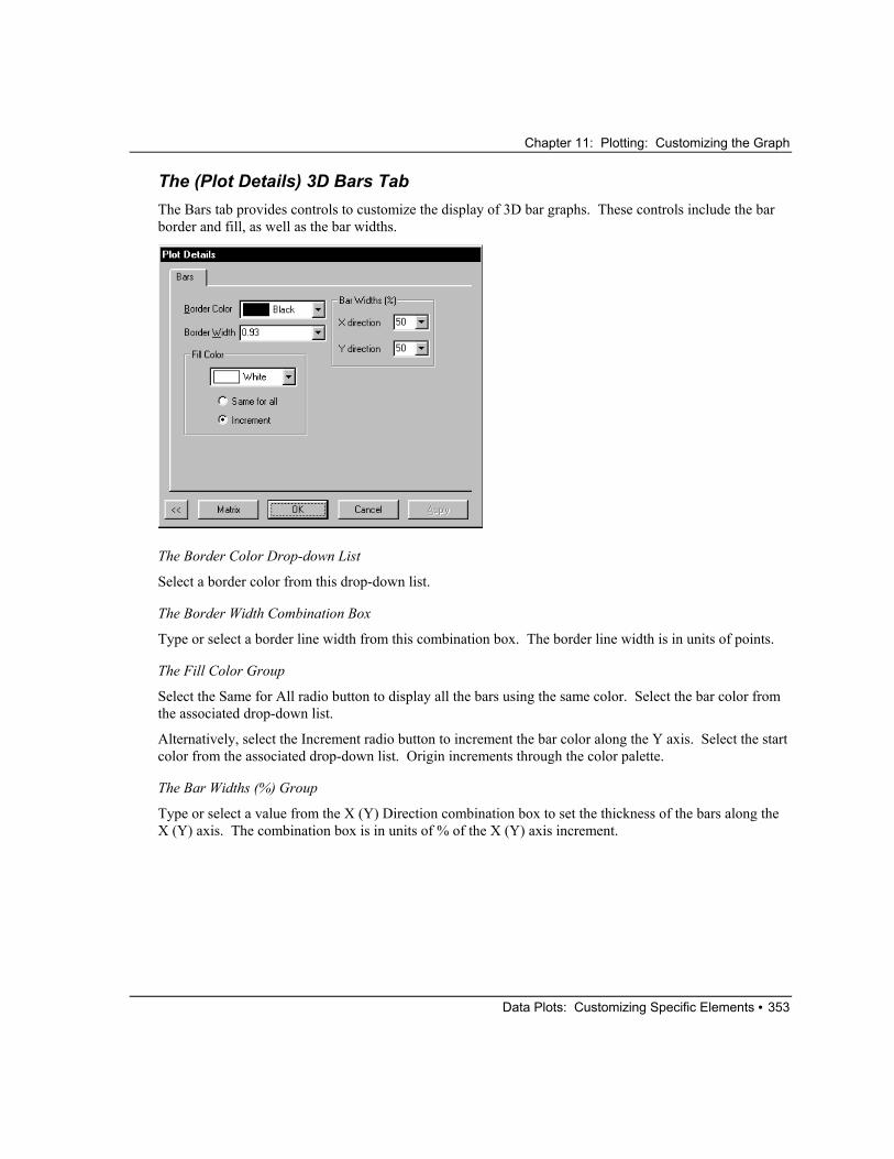
Chapter 11: Plotting: Customizing the Graph
Data Plots: Customizing Specific Elements • 353
The (Plot Details) 3D Bars Tab The Bars tab provides controls to customize the display of 3D bar graphs. These controls include the bar border and fill, as well as the bar widths.
The Border Color Drop-down List
Select a border color from this drop-down list.
The Border Width Combination Box
Type or select a border line width from this combination box. The border line width is in units of points.
The Fill Color Group
Select the Same for All radio button to display all the bars using the same color. Select the bar color from the associated drop-down list.
Alternatively, select the Increment radio button to increment the bar color along the Y axis. Select the start color from the associated drop-down list. Origin increments through the color palette.
The Bar Widths (%) Group
Type or select a value from the X (Y) Direction combination box to set the thickness of the bars along the X (Y) axis. The combination box is in units of % of the X (Y) axis increment.

Chapter 11: Plotting: Customizing the Graph
Data Plots: Customizing Specific Elements • 354
Error Bars When a data plot includes error bars, the Plot Details dialog box lists an error bars icon beneath the associated data plot icon on the left side of the dialog box.
When the error bars icon is selected, an Error Bar tab displays on the right side of the dialog box.
The (Plot Details) Error Bar Tab The Error Bar tab provides controls to edit the color, line width, and other style properties of the error bars in the data plot, as well as the direction of the error bars.
The Style Group
Select the desired error bar color from the Color drop-down list. Select Automatic to ensure that the error bar color follows the associated symbol color in a data plot with symbols, or the associated line color if no symbols exist.
Type or select the error bar line width from the Line Width combination box. The width is in units of points.
Type or select the error bar cap width from the Cap Width combination box. The error bar cap width is in units of points.
Select the Through Symbol check box to display error bars through points in the data plot.
Select the Apply to Layer check box to apply the Style group settings to all error bars plotted in the layer.

Chapter 11: Plotting: Customizing the Graph
Data Plots: Customizing Specific Elements • 355
The Direction Group
Select the Plus check box to draw error bars above the data plot, or pointing away from 0, when the Relative radio button is selected. This option is most useful when editing error bars in a column graph that includes negative column values.
Select the Minus check box to draw error bars below the data plot, or pointing toward 0, when the Relative radio button is selected.
Select the X Error Bar check box to draw error bars in the X (horizontal) direction.
Select the Absolute radio button to draw plus Y error bars pointing up and minus Y error bars pointing down. Select the Relative radio button to draw plus Y error bars pointing away from 0 and minus Y error bars pointing toward 0.
Data Labels Data labels provide a useful way to annotate specific data points or axis scale values in a graph. Worksheet or Excel workbook column values can be used as data labels in a graph window. To include worksheet data label values in the graph window, the column containing the data label values must be designated as Label. Origin plots each data label at the XY position of the associated data point.
Note: You can use text formatting switches in the cells of a worksheet Label column. For example, to display a data label in bold font style, type \b(YourLabel) in the worksheet cell.

Chapter 11: Plotting: Customizing the Graph
Data Plots: Customizing Specific Elements • 356
When a data plot includes data labels, the Plot Details dialog box lists a data labels icon beneath the associated data plot icon on the left side of the dialog box.
When the data labels icon is selected, a Label tab displays on the right side of the dialog box.
The (Plot Details) Label Tab The Label tab provides controls to edit the appearance and location of the data labels in the data plot. Additionally, the Label tab controls the display of contour labels in a contour graph. The controls available on the Label tab are dependent on the type of data plot element you are editing.
The Font Drop-down List
Select the desired font from this drop-down list. The Default font is controlled from the Default drop-down list on the Text Fonts tab of the Options dialog box.
The Color Drop-down List
Select the desired color from this drop-down list.
The Size Combination Box
Type or select a size from this combination box. The size is in units of points.

Chapter 11: Plotting: Customizing the Graph
Legends and Color Scales • 357
The Justify Drop-down List
You can center, left justify, or right justify the data labels relative to their associated data points. For example, select Left to align the left edge of the labels with the XY coordinates of the data point.
The Attach to Axis Drop-down List
Align the data labels by selecting Left Y, Right Y, Top X, or Bottom X from this drop-down list. The label maintains the orientation set in the Rotate text box, but shifts to the specified axis location. Select None to align the data labels at the XY coordinate.
The Rotate Text Box
The value in the Rotate text box determines the degree of rotation of the data labels. Positive values rotate counterclockwise, negative values rotate clockwise.
The X Offset and Y Offset Text Boxes
The value in the X Offset text box determines the horizontal offset of the data labels. The value in the Y Offset text box determines the vertical offset. The offset is measured as a percentage of the font height.
The White Out Check Box
Select this check box to display a white background for each data label value.
Legends and Color Scales The legend is a special text label that identifies each data plot in the associated layer. The data plot is identified by name and by graph type. The data plot name is determined by the name of the worksheet column in which the data set resides. If the worksheet column includes a label, the label is used to create the legend.
Note: When instructed to double-click or ALT + double-click on the legend, DO NOT position the mouse on the data plot type representation when double-clicking. Instead, double-click on the legend text.
Position the mouse here when double-clicking to edit the legend.
Do not double-click on the plot type representations to edit the legend.

Chapter 11: Plotting: Customizing the Graph
Legends and Color Scales • 358
Creating and Updating a Legend The legend is automatically displayed when you select and plot worksheet data. When additional data sets are added to the layer, the legend will not update to include the new data sets unless the Auto Update check box is selected on the Legends tab of the page's Plot Details dialog box (Format:Page).
In addition, a new legend can be created by selecting Graph:New Legend or by right-clicking in the layer and selecting New Legend from the shortcut menu. This menu command adds a legend to the active layer. If a legend already exists in the layer, the menu command updates the legend to reflect the current data displayed in the layer.
Changing the Legend Text A legend is a unique text label. Origin names the text label "Legend" to identify it. This name is stored in the legend's Label Control dialog box. You can open this dialog box by selecting the legend and then selecting Format:Label Control. If you rename the legend, it will maintain its current contents but it will no longer update when you click New Legend or when you add data to the layer.
A legend text label uses special formatting to display the data set names and the data plot type icon (such as a line). If you double-click on the legend text, the in-place editing mode will display as shown in the following figure (in this example, one data plot is in the layer).
In-place Editing of a Legend Text Label - One Data Plot
The %(1) is called substitution notation. This notation instructs Origin to display the data set name for the first data set in this layer. If there were two data plots in the layer, the in-place editing mode would display similar to the following figure:
In-place Editing of a Legend Text Label - Two Data Plots
When you are in-place editing any label, you can use substitution notation. For example, you can display the value of a specific data point in a data plot using the following substitution notation:
%(WorksheetName, ColumnNumber, RowNumber)
For example, if a worksheet is named data1, and you have plotted columns A(X) and B(Y), you can display the value of the data point in column 2, row 3 using:
%(data1, 2, 3)
You can also add special @letter arguments to the %(DataListPosition) notation. For example, to display the worksheet name instead of the column label, use the following syntax: %(DataListPosition,@w)
Chapter 11: Plotting: Customizing the Graph
Legends and Color Scales • 359
Possible @letter arguments for the legend are:
@d: Primary data set name.
@c: Column name.
@w: Worksheet name.
@l: All lines of column label on separate lines.
@u: First two lines of column label on same line, second label is enclosed in parentheses.
To use substitution notation, you must select the Link to Variables (%,$) check box in the Label Control dialog box of the legend. To open this dialog box, select the label and then select Format:Label.
In addition to substitution notation, Origin uses a special escape sequence to display the data plot icon in the legend (such as a line). This special escape sequence is:
\L(DataListPosition)
Where DataListPosition is the data plot's position in the data list, the list of plotted data at the bottom of the Data menu.
If you double-click on a legend to enter the in-place editing mode, you will see the data plot icon, not the \L( ) escape sequence. This is because Origin does not support using escape sequences in the in-place editing mode. To use escape sequences, you must edit the label in the Text Control dialog box (to open this dialog box, right-click on the label and select Properties from the shortcut menu).
Furthermore, you can enter any text in the in-place editing mode.
Remember that if you edit the legend text, to ensure that Origin does not overwrite your changes, you must rename the legend in its Label Control dialog box.
Note: Another option for customizing the legend is to edit the Origin initialization file that defines what the legend will display. Origin creates graph legends based on the legend variable setting in the [Text] section of the ORIGIN.INI file (located in your Origin folder). In the ORIGIN.INI file, legend=\L(%d) %%(%d)\r\n, where the string is in C printf format. This notation can be summarized as follows:
\L(%d) creates a data plot type icon for each data plot in the data list.
%%(%d) creates the text entry for each data plot type icon.
\r\n creates a new line between legend entries.
In the second part of this expression, the @letter notation has been omitted: %%(%d,@letter) When @letter is omitted, Origin assumes @u. @u tells Origin to take the first two lines from the column label field and display them in a single line in the graph legend:
first line (second line)
If no labels exist, Origin displays the column name in the legend by default.
You can customize your legends by modifying the legend assignment statement in the ORIGIN.INI file. You can use any of the @letter arguments reviewed above. One advantage for customizing the legend by editing the legend variable is that Origin will not overwrite your custom legend. However, if the Full

Chapter 11: Plotting: Customizing the Graph
Legends and Color Scales • 360
Dataset Name check box on the Legend tab of the Plot Details dialog box (graph page icon selected on left side of dialog box) is selected, Origin will always display the data set name in the legend, independent of the @letter specification in the ORIGIN.INI file.
Displaying Data Plots from Different Layers in One Legend The default legend displays the data plot type icons and column names of the data plots displayed in the associated layer. When creating a graph with multiple layers, a legend is created for each layer. Origin provides the option of displaying data plot type icons and column names of data sets from any, or all, of the layers in the graph window in the same legend.
Use the following syntax to create a legend that includes data sets from other layers. To use this syntax, you must open the legend's Text Control dialog box, as Origin does not support using escape sequences in the in-place editing mode. To open a legend's Text Control dialog box, right-click on the label and select Properties from the shortcut menu.
\L(LayerNumber.DataPlotNumber,DataPointNumber)
where LayerNumber is the layer number displaying the data plot. If LayerNumber is not specified, the legend layer is the default. DataPlotNumber is the position of the data plot in the data list (when the respective layer is active), and DataPointNumber is the row or index number of the data point in the data set.
When using the \L(LayerNumber.DataPlotNumber,DataPointNumber) notation to create a legend from multiple layers, you cannot use the %( ) notation to create the data plot names for the legend. Enter the appropriate names after the \L( ) command in the text box of the Text Control dialog box.

Chapter 11: Plotting: Customizing the Graph
Legends and Color Scales • 361
For example, the following graph legend was created by typing the following lines of text in the Text Control dialog box:
\L(1.1,1) Test 1
\L(2.1,1) Test 2
Adding an Individual Data Point to the Legend Individual data points can be added to the legend. This is useful when the point has been individually formatted. Use the following syntax to create a legend that includes an individual point. To use this syntax, you must open the legend's Text Control dialog box, as Origin does not support using escape sequences in the in-place editing mode. To open a legend's Text Control dialog box, right-click on the label and select Properties from the shortcut menu.
\L(LayerNumber.DataPlotNumber,DataPointNumber)
where LayerNumber is the layer number displaying the data plot. If a LayerNumber is not specified, the legend layer is the default. DataPlotNumber is the position of the data plot in the data list (when the respective layer is active), and DataPointNumber is the row or index number of the data point in the data plot.

Chapter 11: Plotting: Customizing the Graph
Legends and Color Scales • 362
For example, the following graph legend was created by typing the following lines of text in the Text Control dialog box:
\L(1) %(1)
\L(1.1,6) Response
How to Have Complete Control Over the Legend Display A graph legend can be created displaying data plot icons that are completely independent of the displayed plot details. Origin allows for complete control over the data plot icons in the legend by using the following syntax in the text box of the legend’s Text Control dialog box (to open this dialog box, right-click on the label and select Properties from the shortcut menu).
\L(O(SymEdgeColor,Sym,Fill,Size,ColorLn,LineStyle,Gap,LnWidth,SymFillColor))
where:
SymEdgeColor determines the color of the symbol edge in the legend. Type a value corresponding to the color sequence in the color palette (1=Black, 2=Red, etc.). To view the complete color sequence, select Format:Color Palette.
Sym determines the symbol shape in the legend. Type a value corresponding to the symbol shape, where 0 = no symbol, 1 = square, 2 = circle, 3 = up triangle, 4 = down triangle, 5 = diamond, 6 = cross (+), 7 = cross (x), 8 = star (*), 9 = bar (-), 10 = bar (|), 11 = number, 12 = LETTER, 13 = letter, 14 = right arrow, 15 = left triangle, 16 = right triangle, 17 = hexagon, 18 = star, 19 = pentagon, and 20 = sphere.
Fill determines the symbol interior for the symbols in the legend. Type a value corresponding to the symbol interior, where 0 = solid, 1 = open, 2 = dot center, 3 = hollow, 4 = + center, 5 = x center, 6 = - center, 7 = | center, 8 = half up, 9 = half right, 10 = half down, and 11 = half left.
Size determines the symbol size in the legend. Type a value for the symbol size in points.
ColorLn determines the line color in the legend. Type a value corresponding to the color sequence in the color palette (1=Black, 2=Red, etc.). To view the complete color sequence, select Format:Color Palette.
LineStyle determines the line style for the legend. Type a value corresponding to the line style sequence in the Style drop-down list on the Line tab of the Plot Details dialog box (0=Solid, 1=Dash, etc.).
Chapter 11: Plotting: Customizing the Graph
Legends and Color Scales • 363
Gap determines the line and symbol gap in the legend. Type a gap value that corresponds to a % of the symbol diameter. For example, type 50 to display a gap between the symbol and the line (in the legend) which is 50% of the symbol diameter.
LnWidth determines the line width for the legend. Type a value for the line width in points. A value of 0 results in no line display.
SymFillColor determines the color of the symbol fill in the legend. Type a value corresponding to the color sequence in the color palette (1=Black, 2=Red, etc.). To view the complete color sequence, select Format:Color Palette.
Setting the Active Data Plot using the Legend To enable the selection of the active data plot by clicking on the respective data plot type icon in the legend, select Format:Page to open the Plot Details dialog box, select the Legends tab, and then select the Indicate Active Dataset check box.
Controlling the Width of the Data Plot Type Icons in the Legend To control the width of the data plot type icons in the legend, select Format:Page to open the Plot Details dialog box, select the Legends tab, and then type the desired value in the Symbol Width text box. The value is in units of % of the font.
Displaying and Editing Color Scales The color scale is a specialized object that displays a color map and associated Y or Z levels for color mapped or contour data plots. The color scale displays by default when creating color filled or gray scale contour graphs.
To add a color scale to a graph layer containing a color mapped data plot, select Graph:New Color Scale or right-click in the layer and select New Color Scale. This menu command is only available if the active data plot is color mapped and a color scale is not already displayed.
The numeric format of the color scale is controlled by the Numeric Formats tab on the Plot Details dialog box (when the data plot icon is active on the left side of the dialog box). However, to customize the format of the color scale text, double-click on the color scale or right-click and select Properties from the shortcut menu. Both actions open the Color Scale Control dialog box.
Note: By default, the color scale displays vertically. To display the color scale horizontally, click on the color scale and then drag a control handle in the horizontal direction.

Chapter 11: Plotting: Customizing the Graph
Legends and Color Scales • 364
The Color Scale Control Dialog Box
The Text Group
Select the desired font, color, and size from the associated controls. The Size combination box is in units of points.
The Background Drop-down List
Select the desired background from this drop-down list.
The Reverse Order Check Box
Select this check box to reverse the color map and associated level text order.
The Size and Gaps Group
Set the width of the color scale from the Color Bar Thickness combination box. Set the gap between the color scale and the associated labels from the Label Gap combination box. To shift the labels up and down in relation to the color scale, edit the Label Side Offset combination box. Negative values move the labels up in relation to the color scale, while positive values move the labels down. All controls in this group are in units of % of font height.
The Label Increment Combination Box
If your color scale has a large number of levels, the level labels may overlap and be difficult to read. In this case, select or type the desired label increment from this combination box. For example, to display every third label, select 3 from this combination box.

Chapter 11: Plotting: Customizing the Graph
Text Labels • 365
The Set Default Button
Click this button to set the current text settings as the default settings for future color scales in all graph windows in the project.
To learn more about color scales, review the COLOR SCALE.OPJ project located in your Origin \SAMPLES\GRAPHING\2D PLOTS folder.
Text Labels
Creating and Editing Text Labels To create a new text label, right-click and select Add Text from the shortcut menu or click the Text Tool
button and then click at the desired location.
=> If you click within a layer the text becomes a part of that layer. The text is thus attached to the layer frame. If you move or resize the layer, the text label maintains its size and position with respect to the layer.
=> If you click outside of any layer the text label will not move or resize when the layer is moved or resized, unless you click and drag the label explicitly. Use independent labels to create text that won’t be moved, like page titles.
After clicking at the desired location, begin typing the text. As you type your text, formatting options are available from the Format toolbar and color control is available from the Style toolbar.
The Format and Style Toolbars
If no text is currently highlighted, the formatting/color option begins at the current cursor location. Otherwise, the formatting/color applies to the highlighted text only.
You can also add characters from a selected font set by right-clicking while in in-place editing mode and selecting Symbol Map from the shortcut menu (or by pressing CTRL+M).

Chapter 11: Plotting: Customizing the Graph
Text Labels • 366
Adding Characters from a Selected Font Set
If you frequently use certain characters in your text labels, you can create shortcut keys for those characters. To set up a shortcut, enter in-place editing mode and select the text which will become your shortcut. Then, right-click on the selected text and select Assign Shortcut. This opens the Assign Shortcut dialog box. The text you selected is entered into the String text box. Select a shortcut from the Key drop-down list and click the Add button.
Note: You can enter text into the String text box manually. However, if you do, any formatting syntax (i.e. \b(text) etc.) must also be entered manually.
For example, to create a shortcut for the Greek character π, click the Text tool and then click in your graph window. This starts the in-place editing mode. Now right-click and select Symbol Map. Select π and click Insert. Click Close. Now highlight and right-click on the character. Select Assign Shortcut. Select a shortcut from the Key drop-down list and click Add.
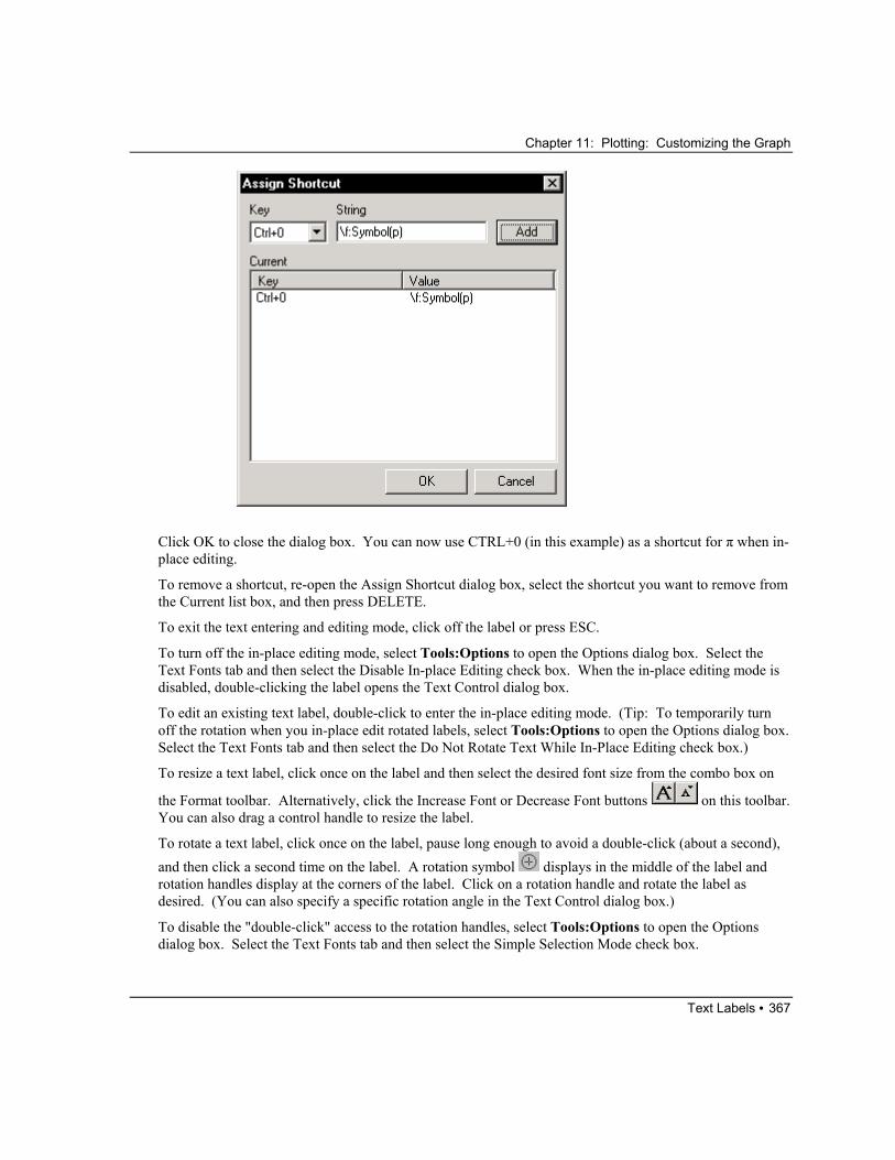
Chapter 11: Plotting: Customizing the Graph
Text Labels • 367
Click OK to close the dialog box. You can now use CTRL+0 (in this example) as a shortcut for π when in-place editing.
To remove a shortcut, re-open the Assign Shortcut dialog box, select the shortcut you want to remove from the Current list box, and then press DELETE.
To exit the text entering and editing mode, click off the label or press ESC.
To turn off the in-place editing mode, select Tools:Options to open the Options dialog box. Select the Text Fonts tab and then select the Disable In-place Editing check box. When the in-place editing mode is disabled, double-clicking the label opens the Text Control dialog box.
To edit an existing text label, double-click to enter the in-place editing mode. (Tip: To temporarily turn off the rotation when you in-place edit rotated labels, select Tools:Options to open the Options dialog box. Select the Text Fonts tab and then select the Do Not Rotate Text While In-Place Editing check box.)
To resize a text label, click once on the label and then select the desired font size from the combo box on
the Format toolbar. Alternatively, click the Increase Font or Decrease Font buttons on this toolbar. You can also drag a control handle to resize the label.
To rotate a text label, click once on the label, pause long enough to avoid a double-click (about a second), and then click a second time on the label. A rotation symbol displays in the middle of the label and rotation handles display at the corners of the label. Click on a rotation handle and rotate the label as desired. (You can also specify a specific rotation angle in the Text Control dialog box.)
To disable the "double-click" access to the rotation handles, select Tools:Options to open the Options dialog box. Select the Text Fonts tab and then select the Simple Selection Mode check box.

Chapter 11: Plotting: Customizing the Graph
Text Labels • 368
To access the Text Control dialog box for the label, right-click on the text label and select Properties from the shortcut menu. Alternatively, press CTRL while double-clicking on the label.
The Text Control Dialog Box
Note: You can use the scroll bars or resize this dialog box to enhance the text box view.
The Background Drop-down List
Select the desired text label background from this drop-down list. Select None to display the label without a background.
Black Line Shadow Dark Marble
White Out Black Out
← Note that White (font color) was selected from the Color drop-down list.

Chapter 11: Plotting: Customizing the Graph
Text Labels • 369
The Rotate (deg) Combination Box
To rotate the label, type or select the desired value from this combination box. Positive values rotate the label counterclockwise. Negative values rotate it clockwise.
The Size (pts) Combination Box
Type or select the desired font size (in points) from this combination box. The default point size is determined by the Size combination box value in the Text Tool group on the Text Fonts tab of the Options dialog box (Tools:Options).
Note: You can also quickly increase or decrease the font size of any selected text labels (CTRL select
multiple labels) by clicking the Increase Font or Decrease Font buttons on the Format toolbar (View:Toolbars).
The Font Drop-down List
Select the desired font from this drop-down list. The default font selection is determined by the Font drop-down list in the Text Tool group on the Text Fonts tab of the Options dialog box.
Select Default:FontName to use the font determined by the Default drop-down list on the Text Fonts tab of the Options dialog box.
The Use System Font Check Box
Select the Use System Font check box to ignore the settings from the Font drop-down list and the Size combination box. Instead, use the system font. The system font provides faster redraw speed and enhanced screen legibility. However, when this check box is selected, text formatting (for example, italic, bold, and symbol) will not display.
The Center Multi Line Check Box
Select this check box to center the label text. This option is only useful for multiple line labels.
The White Out Check Box
To draw a separate white background for each line of text in the label, select the White Out check box.
The Apply Formatting to All Labels in Layer Check Box
Select this check box to apply the selection from the Size combination box and the Font and Color drop-down lists to all text labels in the layer.
The Color Drop-down List
Select the desired color from this drop-down list.

Chapter 11: Plotting: Customizing the Graph
Text Labels • 370
The Formatting Buttons and the Text Box
Type the desired text in the text box in the middle of the dialog box. Press ENTER to start a new line. Press CTRL+TAB to insert a tab.
To format the text, use the text formatting buttons (Normal, Bold, Italic, Underline, Superscript, Subscript, and Greek Symbols) above the text box. Click-and-drag to highlight the desired text. Click on the desired formatting button to apply the format to the highlighted text. The formatting option displays in the text box as an embedded text formatting command. However, the lower view box provides a WYSIWYG display of the text.
If you click one of the formatting buttons without highlighting text first, Origin inserts the appropriate formatting commands at the current cursor location. Begin typing to add the text with the selected formatting.
Note: The Normal button removes the formatting of the highlighted text.
The View Box
The lower view box provides a WYSIWYG display of the text in the text box. If the layer that the text label is located in displays with a background color, the layer color displays in the view box.
The Set Default Button
To set the current text settings as the default settings for future text labels in all graph windows in the project, click this button.
Supported Escape Sequences When you are in-place editing a text label...
=> You have access to the formatting options available from the Format and Style toolbars.
=> You can add characters from a selected font set by right-clicking and selecting Symbol Map from the shortcut menu (or by pressing CTRL+M).
=> You can assign shortcuts to characters.
To learn how to access the Symbol Map and assign shortcuts, see "Creating and Editing Text Labels" on page 365.
However, if you are entering text in the Text Control dialog box, adding prefixes or suffixes in text boxes (for example, in the Prefix or Suffix text boxes on the Tick Labels tab of the Axes dialog box), or entering text in a worksheet Label column, you'll need to use escape sequences to add special characters or to format text.
Note: To open a label's Text Control dialog box, right-click on the label and select Properties from the shortcut menu.

Chapter 11: Plotting: Customizing the Graph
Text Labels • 371
Escape sequences always begin with a backslash "\", which is followed directly by a control character. The control character determines the action of the command. The text to be altered follows the control character, and must be enclosed in parentheses.
\ControlCharacter(text)
When you format text in the Text Control dialog box using the formatting buttons, Origin automatically adds the associated formatting commands around your selected text. For example, if you type Control, and then highlight the text and click the Bold button, Origin displays \b(Control) in the text box. However, you can also explicitly use special formatting commands in the Text Control dialog box, a worksheet Label column, or in prefix or suffix text boxes. The following text formatting commands are available:
\v(text): Override any escape sequences that are included in text. This is particularly useful when displaying a path that includes a backslash ‘\’.
\+(text): Format text as superscript.
\-(text): Format text as subscript.
\=(text1,text2): Format text1 as subscript, text2 as superscript.
\p%pointsize(text): Change the point size of text. 200 doubles the size, 100 results in no change, etc.
\i(text): Format text as italics.
\b(text): Format text as bold.
\g(text): Format text in Greek symbols. 1
\ab(text): Display a bar above text.
\ad(text): Display a short line - a dot - above text.
\(ASCII character code): Displays the specified ASCII symbol.
\f:fontname(text): Displays text using the fontname font. You can abbreviate fontname, as long as you use enough letters for the name to be unique.
\cnumber(text): Displays text in the color located at position number in the Color drop-down lists.
Note: The \g( ) text formatting command uses the symbol font by default. This setting is controlled from the Greek drop-down list in the Text Tool group on the Text Fonts tab of the Options dialog box (Tools:Options).
To use Greek symbols you must have the “symbol” font in your printer, or have font generation software (for example, Adobe Type Manager).
Note: To learn more about text formatting, review the TEXT FORMATTING.OPJ project located in your Origin \SAMPLES\MISCELLANEOUS folder.
Chapter 11: Plotting: Customizing the Graph
Text Labels • 372
A Note about Displaying the Backslash Character in Text Labels When you are in-place editing a text label, you can type the backslash character. It will not be interpreted as an escape sequence, as in-place editing does not support escape sequences.
However, when you are entering text in the Text Control dialog box, using the backslash character can be problematic, as the Text Control dialog box interprets this as an escape sequence.
For example, if you type the following in a Text Control dialog box:
This file is located at C:\MY FILES
Origin displays:
This file is located at C:MY FILES
Note that the backslash doesn't display. If an unsupported option or no parenthesis follows the backslash character, then the backslash character is ignored and does not display.
One way to display a backslash character in your text labels is to type \\ in place of \. Origin will then display the second backslash. However, another way to display the backslash character is to use the \v( ) special formatting command.
For example, if you type the following in a Text Control dialog box:
This file is located at \v(C:\MY FILES)
Origin displays:
This file is located at C:\MY FILES
Accessing the Extended Character Set When you are in-place editing a text label, you can add characters from a selected font set by right-clicking and selecting Symbol Map from the shortcut menu (or by pressing CTRL+M).
When you are entering text in the Text Control dialog box, in worksheet column cells set to Label, or when typing prefixes or suffixes in text boxes, you can access the entire ANSI character set using the following procedure.
1) Click at the location in which you want to add the special character in the text box or worksheet cell.
2) Make sure the Num Lock is on (the light is on) on your keyboard.
3) Press and hold down the ALT key.
4) While holding down the ALT key, type 0, followed by the decimal code for the ANSI character (using the number keypad).
5) Release the ALT key and the character displays (in the Text Control dialog box, it displays in the lower view box).
For the Text Control dialog box and prefix and suffix text boxes, Origin uses the font selected from the associated Font drop-down list to determine the character display in the label. Thus, if Arial is selected from the Font drop-down list, Origin uses the Arial character set to display the character in the label. If you want the special character to be derived from a font set other than that selected from the Font drop-

Chapter 11: Plotting: Customizing the Graph
Text Labels • 373
down list, you must add the appropriate embedded text formatting command around the special character. This requirement is most noticeable when adding a special character from the Symbol set. In most cases, Symbol will not be selected from the Font drop-down list, as your label will include text. To instruct Origin to display the character associated with the code from the Symbol set, you must perform one of the following steps:
1) Add the \g(SpecialCharacter) embedded text formatting command.
2) Highlight the special character and click the Greek button.
For text that you type in a worksheet column cell set to Label, Origin uses the font selected from the Worksheet Display Control dialog box.
Note: Each font has a unique ANSI character set. To find codes for characters from any font sets, use the Windows Character Map (in the Accessories folder).
Resolving Math Expressions in Text Labels Origin supports substitution notation when in-place editing text as well as when editing text in the Text Control dialog box. You can use this notation to resolve a mathematical expression to a value in a text label.
The syntax follows:
$(expression)
In this substitution notation, expression is resolved to a value each time the text label is redrawn. The text label is redrawn whenever you move the label or redraw the graph window.
For example, type the following text in in-place edit mode or in the Text Control dialog box:
The value of X is $(pi^2)
to display the following label (you may need to refresh the window):
The value of X is 9.8696
(In in-place edit mode, click off the label to see the substitution.)
When using the $(expression) notation in a text label, you must select the Link to Variables (%,$) check box in the associated Label Control dialog box. To open the Label Control dialog box, hold down the ALT key while double-clicking on the text label. After selecting the Link to Variables (%,$) check box, click OK.
Linking Text Labels to Data and Variables Text labels can also display information about your data set using substitution notation when in-place editing or when editing text in the Text Control dialog box. For example, the text label could display “The value of x is number.” in which number represents a data set value that is accessed via substitution notation.
The worksheet syntax follows:

Chapter 11: Plotting: Customizing the Graph
Lines, Arrows, and Other Annotations • 374
%(WorksheetName,ColNumber,RowNumber)
For example, if the cell at row 2, column C, of the Data1 worksheet contains the value 15, then typing the following text using the in-place editing mode or in the Text Control dialog box:
The value is %(Data1,3,2).
The label displays as follows (you may need to refresh the window):
The value is 15.
When using the %(expression) notation in a text label, you must select the Link to Variables (%,$) check box in the associated Label Control dialog box. To open the Label Control dialog box, hold down the ALT key while double-clicking on the text label. After selecting the Link to Variables (%,$) check box, click OK.
In addition to displaying worksheet values in text labels, you can include string variables in text labels. As long as the Link to Variables (%,$) check box in the Label Control dialog box is selected, Origin will substitute the contents of the string variable in the text label.
Origin uses a number of string variables for storing data. For example, the %X string variable contains the drive and path of the current saved project. The %G string variable contains the current project name. If your current project MYPROJECT.OPJ is saved to C:\MYFILES\, then typing the following in the Text Control dialog box:
This project is saved to \v(%X%G).
displays the following label (you may need to refresh the window):
This project is saved to C:\MYFILES\MYPROJECT.
Note that this notation included the \v( ) special formatting command, to display the backslash character.
Lines, Arrows, and Other Annotations
Drawing Lines and Arrows => To add a straight line or arrow to the graph, click on the Line (or Arrow) tool from the Tools toolbar. Click-and-drag at the desired location in the graph window. Release the mouse button and the line (or arrow) is displayed. You can add or remove arrow heads from lines and arrows by double-clicking on the line or arrow. This opens the Object Properties dialog box. Select the Arrow tab to control the display of the begin and end arrow head.
=> To draw a vertical or horizontal line or arrow, press the SHIFT key as you drag with the Line tool or Arrow tool.
=> To add a curved arrow to the graph, click on the Curved Arrow tool from the Tools toolbar. Click consecutively on the page four times with the mouse. Place the first click at the beginning of the curve, the second two clicks along the curve, and the final click at the point where you want the arrow head. After the fourth click, Origin displays the curved arrow. The points are connected with a Bezier curve. To

Chapter 11: Plotting: Customizing the Graph
Lines, Arrows, and Other Annotations • 375
create a Bezier curve without an arrow head, double-click on the arrow. This opens the Object Properties dialog box. Select the Arrow tab to control the arrow head display.
=> To draw a polyline, click on the Polyline tool on the Tools toolbar and then click in the window at each of the corner locations for the polyline. Either double-click at the last location or click once and then press ESC.
=> To draw a freehand line, click on the Freehand Draw tool and then click and drag the desired line. Release the mouse button to complete the operation.
Aligning Existing Lines and Arrows Vertically or Horizontally To align lines or arrows vertically or horizontally, perform one of the following operations:
1) Double-click on the object to open the Object Properties dialog box. Select the Line tab and select the Horizontal or Vertical check boxes.
2) Click on the existing line or arrow to select it. Then press the SHIFT key and at the same time click on the control handle of the end that you want to move. The line or arrow will automatically align horizontally or vertically, which ever alignment requires the least angular movement. Additionally, you can press the SHIFT key and drag the control handle of the end that you want to move. The line or arrow will align horizontally or vertically as you move the control handle.
3) Select the desired objects (press SHIFT to select multiple objects) and click either the Vertical Alignment button or the Horizontal Alignment button on the Arrow toolbar (View:Toolbars).
Creating Vertical or Horizontal Lines at Specific X or Y Values Origin provides a number of options for displaying vertical or horizontal lines at specific X or Y values. One option is to create a vertical or horizontal line by pressing the SHIFT key while drawing a line with the Line tool on the Tools toolbar, and then dragging the line to the desired location.
For more accurate placement, you can name the line in the line's Object Properties dialog box (double-click on the object) and then assign an X or Y position using LabTalk script.
For example, if you create a line, align it vertically, and then name the line MyLine in the line's Object Properties dialog box, you can type the following text in the Script window (Window:Script Window) to move the line to X=5.
myline.x=5 (ENTER)
One disadvantage of using this technique to draw a line at a specific X or Y location is the rough control you have over the length of the line. Alternatively, you can use the LabTalk Draw command to create a vertical (or horizontal) line that is the length of the layer and is located at a specific X (or Y) axis value:
draw -l -v XAxisValue
draw -l -h YAxisValue
For example, to create a vertical line the length of the layer at X=5, type the following text in the Script window:
draw -l -v 5 (ENTER)

Chapter 11: Plotting: Customizing the Graph
Lines, Arrows, and Other Annotations • 376
You can then double-click on this line and format it as you would any line object.
If you require multiple vertical or horizontal lines in your graph, you can perform the previous steps multiple times. Alternatively, you can display multiple lines by creating a new data set which contains XY pairs at the locations that you require vertical or horizontal lines. You can then add this data to your graph layer as a scatter graph, and then use the LabTalk Set command to display vertical lines for each XY pair. The syntax for this script is:
set Worksheet_ColumnName -k 58
For example, if columns A(X) and B(Y) of the Data2 worksheet contain the XY pairs for your vertical lines and are plotted in your graph as a scatter graph, type the following text in the Script window:
set data2_b -k 58 (ENTER)
Note: In addition to displaying vertical or horizontal lines in your graph, you can enable the display of vertical or horizontal drop lines for any data point in a data plot that includes symbols. Press CTRL while double-clicking on a data point, then edit the (Plot Details) Drop Lines tab.
Drawing Boxes, Circles, Polygons, and Regions To add a rectangle, circle, ellipse, polygon, or region to the graph, click the respective button on the Tools toolbar.
=> For all objects but the polygon, click-and-drag at the desired location in the graph window. Release the mouse button to display the object.
=> For polygons, click in the window at each of the corner locations for the polygon. Either double-click at the last location or click once and then press ESC.
Editing Objects All of Origin's drawing objects can be rotated and skewed. Additionally, individual points can be moved.
=> To rotate an object, click once on the object, pause long enough to avoid a double-click (about a second), and then click a second time on the object. A rotation symbol displays in the middle of the object and rotation handles display at the corners of the object. Click on a rotation handle and rotate the object as desired.

Chapter 11: Plotting: Customizing the Graph
Lines, Arrows, and Other Annotations • 377
Rotating an Object
Click and rotate.
=> To skew an object, click once on the object, pause long enough to avoid a double-click (about a second), and then click a second time on the object. Pause again and then click a third time on the object. Triangular skew handles display at the corners of the object. Click on a skew handle and drag as desired.
Skewing an Object
Click and drag a handle.
=> To move points in an object, follow the "skew" procedure and then click one more time (a total of four clicks with pauses in between). Handles appear on moveable points. Drag the desired points to new locations.
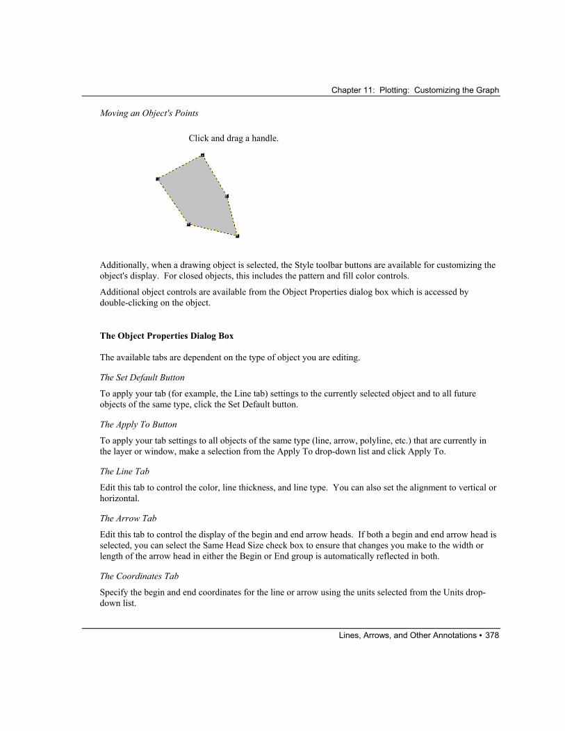
Chapter 11: Plotting: Customizing the Graph
Lines, Arrows, and Other Annotations • 378
Moving an Object's Points
Click and drag a handle.
Additionally, when a drawing object is selected, the Style toolbar buttons are available for customizing the object's display. For closed objects, this includes the pattern and fill color controls.
Additional object controls are available from the Object Properties dialog box which is accessed by double-clicking on the object.
The Object Properties Dialog Box
The available tabs are dependent on the type of object you are editing.
The Set Default Button
To apply your tab (for example, the Line tab) settings to the currently selected object and to all future objects of the same type, click the Set Default button.
The Apply To Button
To apply your tab settings to all objects of the same type (line, arrow, polyline, etc.) that are currently in the layer or window, make a selection from the Apply To drop-down list and click Apply To.
The Line Tab
Edit this tab to control the color, line thickness, and line type. You can also set the alignment to vertical or horizontal.
The Arrow Tab
Edit this tab to control the display of the begin and end arrow heads. If both a begin and end arrow head is selected, you can select the Same Head Size check box to ensure that changes you make to the width or length of the arrow head in either the Begin or End group is automatically reflected in both.
The Coordinates Tab
Specify the begin and end coordinates for the line or arrow using the units selected from the Units drop-down list.

Chapter 11: Plotting: Customizing the Graph
Lines, Arrows, and Other Annotations • 379
The Control Tab
The Object Group
This group displays the object's current name. Origin names objects by starting with a default base name (for example, Line), and incrementing the name. You can edit this name.
Label names can be used in LabTalk script to programmatically control the object.
The Attach To Group
To control the effect of layer manipulation and axis rescaling on the object's size and position, select one of the following radio buttons:
1) Page
When attached to the page, the object is both position and scale independent of its layer. The object position and size are not affected by moving or resizing the layer, or by changing the axis scale. The object is still a part of the layer, however, and is deleted if the layer is deleted.
2) Layer Frame
When attached to the layer frame, the object is position dependent on its layer. When you move the layer, the object moves with the layer. If you resize the layer, the object changes dimensions proportionally and moves with the layer. If you rescale the axes, however, the object does not change size or position.
3) Layer and Scale
When attached to the layer and scales, the object is connected to the layer in terms of size and position. If you move the layer, the object moves with the layer. If you resize the layer, the object changes dimensions

Chapter 11: Plotting: Customizing the Graph
Lines, Arrows, and Other Annotations • 380
proportionally and moves with the layer. If you rescale the axes, the object size does not change, but the object moves so that it maintains the same XY coordinate value.
The Properties Group
When the Visible check box is selected, the object is visible and selectable. When this check box is cleared, the object is not visible and not selectable. To display and edit the label, enter Button Edit Mode by selecting Edit:Button Edit Mode. Exit Button Edit Mode by re-selecting Edit:Button Edit Mode.
When the Selectable check box is selected, the object can be edited. When the check box is cleared, the object is non-editable. To edit the label, enter Button Edit Mode by selecting Edit:Button Edit Mode. Exit Button Edit Mode by re-selecting Edit:Button Edit Mode.
The Disable Group
This group provides controls to enable or disable various editing states such as rotation, skewing, and resizing.
The Border Tab
Specify the border display properties from this tab.
The Fill Pattern Tab
Specify the fill color and pattern from this tab.
The Dimensions Tab
Specify the top and left object position in units selected from the Units drop-down list.
Select the Keep Aspect Ratio check box to only allow proportional sizing.
Grouping Objects When you select multiple objects in a window, you can click the Group button on the Object Edit toolbar to group the objects. You can then drag the group of objects to a new location, or align the group of objects with other objects on the page. To ungroup the objects, click the Ungroup button on the Object Edit toolbar.
Aligning Objects Origin provides two tools for aligning objects on the page:
1) The alignment tools on the Object Edit toolbar.
2) Snapping objects to a grid.
The Object Edit toolbar displays buttons that provide easy arrangement of objects.

Chapter 11: Plotting: Customizing the Graph
Lines, Arrows, and Other Annotations • 381
The Object Edit Toolbar
Only selected objects are affected by clicking on buttons in the Object Edit toolbar. Click on the desired object to select it. To select multiple objects, SHIFT + click on the desired objects. Alternatively, drag a box around the desired objects using the Pointer tool. When you select multiple objects, Origin aligns the objects in respect to the first selected object.
Origin provides an object grid that facilitates object alignment in the window. To view the object grid, select View:Show:Object Grid. This menu command is checked when the grid is displayed.
Objects on the page of the window are automatically aligned with the grid by selecting Format:Snap Object to Grid. This menu command is checked when selected. Objects which are added to the page after selection of this menu command automatically align with the nearest grid upon placement. Objects which are already located on the page align with the nearest grid when the object is moved.
Moving Objects to the Front or the Back If your graph includes text labels or other annotations that are overlapping, you can move selected objects to the front or the back of the display. To do this, select the objects that you want to move to the front or back and then click the Front button or the Back button on the Object Edit toolbar (View:Toolbars).
Hiding Objects To reduce the screen redraw time, objects can be hidden in the graph window. To hide all objects, de-select the View:Show:Labels menu command. This menu command is checked when the labels are displayed. To print a graph with objects, re-select the View:Show:Labels menu command before printing.
Associating LabTalk Script with an Object All objects such as text labels, rectangles, lines, arrows, and other annotations have associated Label Control dialog boxes. The Label Control dialog box is used to name the object (for programmatic control) and to define the object's LabTalk script and script execution trigger. An example of a script execution trigger is to display the object as a button that can be clicked to run the associated script.
In the following example, you create a button from a text label and define the button to open a dialog box containing the message “Hello World!”.
Creating the Text Label
1) Click the New Graph button on the Standard toolbar to open a new graph window.
2) Select the Text tool from the Tools toolbar and click in a blank area of the graph. This starts the in-place text editing mode.
3) Type Hello World.
5) Press ESC to de-select the label. The Hello World text label displays on the screen.

Chapter 11: Plotting: Customizing the Graph
Lines, Arrows, and Other Annotations • 382
Changing the Label into a Button
1) Click on the label and then select Format:Label Control.
2) Click in the text box at the bottom of the dialog box and type in the following text (this is the script for the control):
type -b "Hello World!";
Selecting the Script Execution Option
1) Select Button Up from the Script, Run After drop-down list.
The Button Up option informs Origin that the script is executed when the button is clicked. Each of the options from the Script, Run After drop-down list establish a different method for script execution. For example, select Moved to execute the associated script when the text label is moved.
2) Click OK to close the dialog box.
The Hello World text label now displays on your screen as a button. When you click the button, an Attention dialog box opens and displays “Hello World!”.
Note: To learn more about programming in Origin, including using Origin C, see the Programming Guide Help file (Help:Programming, from the Origin menu).
The Label Control Dialog Box
The Object Name Text Box
The label may be named, enabling Origin to identify the label during execution of built-in or user-defined programming scripts. Unnamed labels are not affected by any script other than within the Label Control dialog box. Enter the desired name in the text box provided.

Chapter 11: Plotting: Customizing the Graph
Lines, Arrows, and Other Annotations • 383
Warning: Some labels, such as the legend and the axis titles, are already named by Origin. These labels should not be renamed! If you rename these labels, menu commands that update the labels will no longer work, will create a duplicate label, or will over-write the modified label.
The Attach To Group
To control the effect of layer manipulation and axis rescaling on the label’s size and position, select one of the following radio buttons:
1) Page
When attached to the page, the label is both position and scale independent of its layer. The label position and size are not affected by moving or resizing the layer, or by changing the axis scale. The label is still a part of the layer, however, and is deleted if the layer is deleted.
2) Layer Frame
When attached to the layer frame, the label is position dependent on its layer. When you move the layer, the label moves with the layer. If you resize the layer, the label changes dimensions proportionally and moves with the layer. If you rescale the axes, however, the label does not change size or position.
3) Layer and Scales
When attached to the layer and scales, the label is connected to the layer in terms of size and position. If you move the layer, the label moves with the layer. If you resize the layer, the label changes dimensions proportionally and moves with the layer. If you rescale the axes, the label size does not change, but the label moves so that it maintains the same XY coordinate value.
The Link to Variables (%,$) Check Box
This check box is only useful in the Label Control dialog box of a text label. Select this check box if data or variables will display in the message displayed by the text label. Each time Origin redraws the label, the label is updated to reflect any changes made to the data or variables signified within.
When this check box is selected, proper notation conventions must be followed in the associated text label. Basic notation conventions are listed in Plotting: Customizing the Graph.
The Mouse Click Group
Select the No Vertical Movement check box to prevent movement of the label in the vertical direction. When the No Horizontal Movement check box is selected, the label cannot be moved in the horizontal direction. Select the Not Selectable check box to restrict selection or movement of the label entirely. This option is useful when using a label as a backdrop to a page or layer. When the Not Selectable check box is selected, you cannot use the ALT+double-click shortcut to edit the dialog box. Instead, enter Button Edit Mode, click on the label, and select Format:Label Control.
The Visible Check Box
When the Visible check box is selected, the label’s associated Text Control dialog box, as well as the Label Control dialog box, are accessible by double-clicking on the label, or ALT+double-clicking on the label, respectively. The label can also be moved and resized.
Chapter 11: Plotting: Customizing the Graph
Lines, Arrows, and Other Annotations • 384
When this check box is cleared, the label is not visible and its associated dialog boxes cannot be accessed by double-clicking (or ALT+double-clicking) on the label. To display and edit the label, enter Button Edit Mode by selecting Edit:Button Edit Mode. Exit Button Edit Mode after editing the label by re-selecting Edit:Button Edit Mode. (When in Button Edit Mode, the Button Edit Mode menu command is checked.)
The Real-Time Check Box
Select the Real-Time check box to update the label in real-time whenever there is a real-time plotting event.
The Script, Run After Drop-down List
The option selected from this drop-down list defines the circumstances required for script execution. Enter the script to be executed in the associated text box beneath this drop-down list.
Script Execution Methods
None: Do not execute script.
Button Up: Execute script when button is clicked.
Moved: Execute script when button is moved.
Sized: Execute script when button is resized.
Moved or Sized: Execute script when button is moved or resized.
Redrawn: Execute script when button is redrawn.
Real-Time: Execute script when a real-time event occurs. These events are typically generated through DDE data transfer or from a Data Acquisition module.
Window Create: Execute script when the button’s window first opens.
Window Close: Execute script when the button’s window closes.
Window Activate: Execute script when the button’s window becomes active.
Window Deactivate: Execute script when the button’s window becomes inactive.
New Selection: Execute script when unselected button is clicked.
Before Save: Execute script immediately before saving the project.
Axes Rescale: Execute script when graph axes rescale.
All Events: Execute script when any one of the previous events occur.
The (Script) Text Box
Type the desired script directly in this text box or copy it from any text editor. Every LabTalk statement in the script must end with a semicolon. ENTER is a simple carriage return. To add a tab within the text box, use CTRL + TAB.

Chapter 11: Plotting: Customizing the Graph
Lines, Arrows, and Other Annotations • 385
Adding a Scale Object to Your Graph
Click the Add XY Scale button on the Graph toolbar to add a movable XY Scale that displays the current X and Y axes scales to your graph,. Once added, you can move the object anywhere on the graph. By default, the XY Scale displays the scale of the current X and Y axes' major tick scales. However, you can customize the object's X and Y scale range by double-clicking on the object to open the Scale Object dialog box. This dialog box also provides controls for adding titles and ticks to the XY Scale object.
The Scale Object Dialog Box
Note: After making changes to the XY Scale object dialog box and clicking OK, you may need to select Window:Refresh to view the changes to the XY Scale object.
The Axis Titles Group
Type the desired X and Y axis title in the X Title and Y Title text boxes.
Control the display position of the object's X and Y axis titles by selecting the desired radio button in this group.
The X (and Y) Scale Group
Control the position of the object's X (or Y) axis by selecting the desired radio button in this group. To disable the X (or Y) axis display, select Off.
The X (and Y) Range Text Box
Control the object's X (or Y) range by typing the desired value in this text box.

Chapter 11: Plotting: Customizing the Graph
Exchanging Graphics Between Graph Windows • 386
The Color Drop-Down List
Select the desired object color from this drop-down list.
The Line Width Drop-Down List
Select the desired line width for the display of the object's axis from this drop-down list.
The X (and Y) Ticks Group
Control the display of major and minor X (or Y) axis ticks in this group. Set the total number of major ticks in the Number text box.
The Gaps Group
Set the distance between the edge of the page and the object's X axis in the X to Edge text box. Set the distance between the object's X axis title and the X axis in the X to Axis text box.
Set the distance between the edge of the page and the object's Y axis in the Y to Edge text box. Set the distance between the object's Y axis title and the Y axis in the Y to Axis text box.
The Font Group
Select the Dialog radio button to display the object's axis title using a font which can be adjusted to incremental sizes. This selection is preferred when displaying a small font size. Select the Scalable radio button to display the object's axis title using a font which can be adjusted to any size. This selection is preferred when displaying a larger font size.
Select the desired font size from the Points text box. To bold the axis titles, select the Bold check box.
Pasting Graphics from the Clipboard Graphic elements that are copied to the Clipboard from another Windows application can be pasted into an Origin window. To paste a graphic, click at the desired location and select Edit:Paste or press CTRL+V, or right-click at the desired location and select Paste from the shortcut menu.
Once a graphic element is copied into an Origin window, it becomes an object. The object is selected, moved, and resized like any Origin object. To edit the object, double-click on the object to open the Object Properties dialog box. When editing a pasted object, this dialog box includes an Image tab. You can add a background from this tab. For more information on this dialog box, see "Editing Objects" on page 376.
Exchanging Graphics Between Graph Windows
Copying the Entire Page of the Active Graph Window (as an Active Layer) to another Graph Window You may want to copy the page in the active graph window to another graph window in the same project. This can be accomplished using the Edit:Merge All Pages menu command. In addition, use the Clipboard

Chapter 11: Plotting: Customizing the Graph
Exchanging Graphics Between Graph Windows • 387
to copy the entire page of the active graph window to another graph window. When a graph is copied in this way, it becomes an active layer in the new window. You can edit the layer contents or plot details of this layer.
Copying the Entire Page of the Active Graph Window (as an Object) to another Graph Window Origin provides the option of copying a graph, as an object, from one graph window to another graph window. To add a graph, as an object, to a graph window, select the graph window containing the graph you want to copy, copy it to the Clipboard, and then select the destination graph window and paste the Clipboard contents.
Copying Labels via the Clipboard Labels and other objects can be copied between windows using the Clipboard. Select the object by either clicking on the object, or by dragging a box around the object and then releasing the mouse button. Both techniques result in a highlighted box displaying around the object. Copy the selected object to the Clipboard and then click at the desired destination location and paste the Clipboard contents.

Chapter 11: Plotting: Customizing the Graph
Exchanging Graphics Between Graph Windows • 388
This page is left intentionally blank.