chapter 1 exercises - maths-people.anu.edu.aujohnm/r-book/3edn/exercises/all.pdf · chapter 2...
TRANSCRIPT

Chapter 1 Exercises 1
Data Analysis & Graphics Using R, 3rd edn – Solutions to Selected Exercises(April 29, 2010)
Preliminaries
> library(DAAG)
Exercise 1The following table gives the size of the floor area (ha) and the price ($000), for 15 housessold in the Canberra (Australia) suburb of Aranda in 1999.. . . . . .Type these data into a data frame with column names area and sale.price.
(a) Plot sale.price versus area.
(b) Use the hist() command to plot a histogram of the sale prices.
(c) Repeat (a) and (b) after taking logarithms of sale prices.
The Aranda house price data are also in a data frame in the DAAG package, calledhouseprices.
(a) Omitted
(b) Omitted
(c) The following code demonstrates the use of the log="y" argument to cause plotto use a logarithmic scale on the y axis, but with axis tick labels that are specifiedin the original units.
> plot(sale.price ~ area, data=houseprices, log="y",
+ pch=16, xlab="Floor Area", ylab="Sale Price",
+ main="(c) log(sale.price) vs area")
The following puts a logarithmic scale on the x-axis of the histogram.
> hist(log(houseprices$sale.price),
+ xlab="Sale Price (logarithmic scale)",
+ main="(d) Histogram of log(sale.price)")
●
●●
●
●
●
●●
●●
●
● ●
●
●
700 900 1100 1300
150
200
300
(c) log(sale.price) vs area
Floor Area
Sale
Pric
e
(d) Histogram of log(sale.price)
Sale Price (logarithmic scale)
Freq
uenc
y
4.6 5.0 5.4 5.8
01
23
45
6
Figure 1: Plots for Exercise2c.
Here is an alternative that prints x-axis labels in the original units:

2
> logbreaks <- hist(log(houseprices$sale.price))$breaks
> hist(log(houseprices$sale.price), xlab="Sale Price",
+ axes=FALSE, main="Aranda House Price Data")
> axis(1, at=logbreaks,labels=round(exp(logbreaks),0),
+ tick=TRUE)
> axis(2, at=seq(0,6), tick=TRUE)
> box()
Exercise 2The orings data frame gives data on the damage that had occurred in US space shuttlelaunches prior to the disastrous Challenger launch of January 28, 1986. Only the ob-servations in rows 1, 2, 4, 11, 13, and 18 were included in the pre-launch charts used indeciding whether to proceed with the launch.Create a new data frame by extracting these rows from orings, and plot total incidentsagainst temperature for this new data frame. Obtain a similar plot for the full data set.
Use the following to extract rows that hold the data that were presented in the pre-launch charts:
> orings86 <- orings[c(1,2,4,11,13,18), ]
Points are best shown with filled symbols in the first plot, and with open symbols in thesecond plot. (Why?)
Exercise 6Create a data frame called Manitoba.lakes that contains the lake’s elevation (in metersabove sea level) and area (in square kilometers) as listed below. Assign the names ofthe lakes using the row.names() function.
. . . .
Plot lake area against elevation, identifying each point by the name of the lake. Becauseof the outlying value of area, use of a logarithmic scale is advantageous.
(a) Use the following code to plot log2(area) versus elevation, adding labeling in-formation:
attach(Manitoba.lakes)plot(log2(area) ~ elevation, pch=16, xlim=c(170,280))# NB: Doubling the area increases log2(area) by 1.0
text(log2(area) ~ elevation,labels=row.names(Manitoba.lakes), pos=4)
text(log2(area) ~ elevation, labels=area, pos=2)title("Manitoba's Largest Lakes")detach(Manitoba.lakes)
Devise captions that explain the labeling on the points and on the y-axis. It willbe necessary to explain how distances on the scale relate to changes in area.
(b) Repeat the plot and associated labeling, now plotting area versus elevation, butspecifying log="y" in order to obtain a logarithmic y-scale. [NB: The log="y"setting is automatic, after its initial use with plot(), for the subsequent use oftext(). ie, having specified a log scale for the y-axis in the plot() statement, thesame representation on a logarithmic scale is used for the text() command.]

Chapter 1 Exercises 3
A better choice of x-axis limits would be c(170, 260)Note that the data are also in the data frame Manitoba.lakes that is included with
the DAAG package. Before running the code, specify
> attach(Manitoba.lakes)
The following code extracts the lake areas from the Manitoba.lakes data frame andattaches the lake names to the entries of the resulting vector.
area.lakes <- Manitoba.lakes[[2]]names(area.lakes) <- row.names(Manitoba.lakes)
Exercise 7Look up the help for the R function dotchart(). Use this function to display the datain area.lakes.
> area.lakes <- Manitoba.lakes[[2]]
> names(area.lakes) <- row.names(Manitoba.lakes)
> dotchart(area.lakes, pch=16, main="Areas of Large Manitoba Lakes",
+ xlab="Area (in square kilometers)")
Exercise 11Run the following code:
gender <- factor(c(rep("female", 91), rep("male", 92)))table(gender)gender <- factor(gender, levels=c("male", "female"))table(gender)gender <- factor(gender, levels=c("Male", "female"))
# Note the mistake# The level was "male", not "Male"
table(gender)rm(gender) # Remove gender
Explain the output from the final table(gender).
The output is
genderfemale male
91 92
> table(gender)
gendermale female92 91
> gender <- factor(gender, levels=c("Male", "female")) # Note the mistake
> # The level was "male", not "Male"
> table(gender)
4
genderMale female
0 91
> rm(gender) # Remove gender
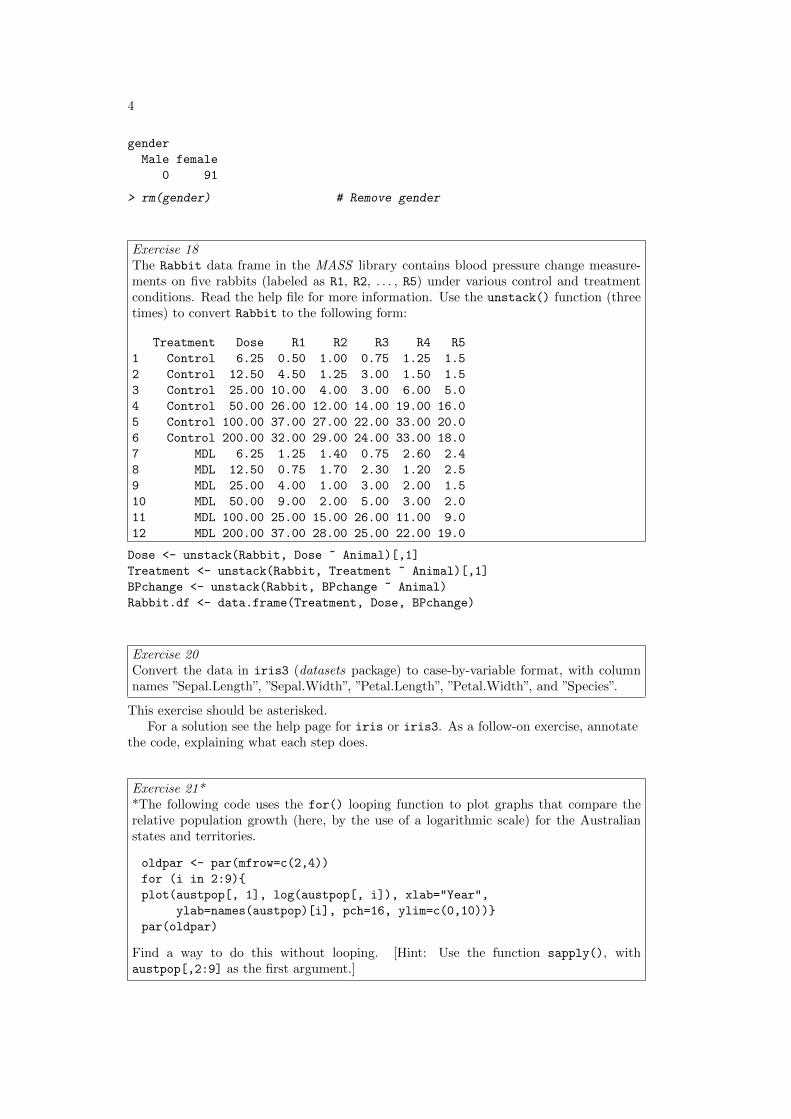
Exercise 18The Rabbit data frame in the MASS library contains blood pressure change measure-ments on five rabbits (labeled as R1, R2, . . . , R5) under various control and treatmentconditions. Read the help file for more information. Use the unstack() function (threetimes) to convert Rabbit to the following form:
Treatment Dose R1 R2 R3 R4 R51 Control 6.25 0.50 1.00 0.75 1.25 1.52 Control 12.50 4.50 1.25 3.00 1.50 1.53 Control 25.00 10.00 4.00 3.00 6.00 5.04 Control 50.00 26.00 12.00 14.00 19.00 16.05 Control 100.00 37.00 27.00 22.00 33.00 20.06 Control 200.00 32.00 29.00 24.00 33.00 18.07 MDL 6.25 1.25 1.40 0.75 2.60 2.48 MDL 12.50 0.75 1.70 2.30 1.20 2.59 MDL 25.00 4.00 1.00 3.00 2.00 1.510 MDL 50.00 9.00 2.00 5.00 3.00 2.011 MDL 100.00 25.00 15.00 26.00 11.00 9.012 MDL 200.00 37.00 28.00 25.00 22.00 19.0
Dose <- unstack(Rabbit, Dose ~ Animal)[,1]Treatment <- unstack(Rabbit, Treatment ~ Animal)[,1]BPchange <- unstack(Rabbit, BPchange ~ Animal)Rabbit.df <- data.frame(Treatment, Dose, BPchange)
Exercise 20Convert the data in iris3 (datasets package) to case-by-variable format, with columnnames ”Sepal.Length”, ”Sepal.Width”, ”Petal.Length”, ”Petal.Width”, and ”Species”.
This exercise should be asterisked.For a solution see the help page for iris or iris3. As a follow-on exercise, annotate
the code, explaining what each step does.
Exercise 21**The following code uses the for() looping function to plot graphs that compare therelative population growth (here, by the use of a logarithmic scale) for the Australianstates and territories.
oldpar <- par(mfrow=c(2,4))for (i in 2:9){plot(austpop[, 1], log(austpop[, i]), xlab="Year",
ylab=names(austpop)[i], pch=16, ylim=c(0,10))}par(oldpar)
Find a way to do this without looping. [Hint: Use the function sapply(), withaustpop[,2:9] as the first argument.]

Chapter 1 Exercises 5
We give the code, omitting the graphs
> oldpar <- par(mfrow=c(2,4))
> sapply(2:9, function(i, df)
+ plot(df[,1], log(df[, i]),
+ xlab="Year", ylab=names(df)[i], pch=16, ylim=c(0,10)),
+ df=austpop)
> par(oldpar)
There are several subtleties here:
(i) The first argument to sapply() can be either a list (which is, technically, a type ofvector) or a vector. Here, we have supplied the vector 2:9
(ii) The second argument is a function. Here we have supplied an inline function that hastwo arguments. The argument i takes as its values, in turn, the sucessive elementsin the first argument to sapply
(iii) Where as here the inline function has further arguments, they area supplied asadditional arguments to sapply(). Hence the parameter df=austpop.
Note that lapply() could be used in place of sapply().
Chapter 2 Exercises 1
Data Analysis & Graphics Using R, 3rd edn – Solutions to Exercises (April 29, 2010)
Preliminaries
> library(DAAG)
Exercise 1Use the lattice function bwplot() to display, for each combination of site and sex inthe data frame possum (DAAG package), the distribution of ages. Show the differentsites on the same panel, with different panels for different sexes.
> library(lattice)
> bwplot(age ~ site | sex, data=possum)
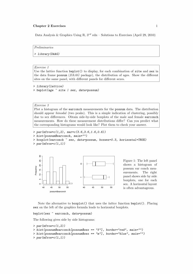
Exercise 3Plot a histogram of the earconch measurements for the possum data. The distributionshould appear bimodal (two peaks). This is a simple indication of clustering, possiblydue to sex differences. Obtain side-by-side boxplots of the male and female earconchmeasurements. How do these measurement distributions differ? Can you predict whatthe corresponding histograms would look like? Plot them to check your answer.
> par(mfrow=c(1,2), mar=c(3.6,3.6,1.6,0.6))
> hist(possum$earconch, main="")
> boxplot(earconch ~ sex, data=possum, boxwex=0.3, horizontal=TRUE)
> par(mfrow=c(1,1))
possum$earconch
Frequency
40 45 50 55
05
1015
2025
30
fm
40 45 50 55
Figure 1: The left panelshows a histogram ofpossum ear conch mea-surements. The rightpanel shows side by sideboxplots, one for eachsex. A horizontal layoutis often advantageous.
Note the alternative to boxplot() that uses the lattice function bwplot(). Placingsex on the left of the graphics formula leads to horizontal boxplots.
bwplot(sex ~ earconch, data=possum)
The following gives side by side histograms:
> par(mfrow=c(1,2))
> hist(possum$earconch[possum$sex == "f"], border="red", main="")
> hist(possum$earconch[possum$sex == "m"], border="blue", main="")
> par(mfrow=c(1,1))

2
The histograms make it clear that sex differences are not the whole of the explanationfor the bimodality.
Alternatively, use the lattice function histogram()
> library(lattice)
> histogram(~ earconch | sex, data=possum)
Note: We note various possible alternative plots.Density plots, in addition to their other advantages, are easy to overlay. Alternatives
1 & 2 obtain overlaid density plots:
> "Alternative 1: Overlaid density plots"
> fden <- density(possum$earconch[possum$sex == "f"])
> mden <- density(possum$earconch[possum$sex == "m"])
> xlim <- range(c(fden$x, mden$x))
> ylim <- range(c(fden$y, mden$y))
> plot(fden, col="red", xlim=xlim, ylim=ylim, main="")
> lines(mden, col="blue", lty=2)
> library(lattice)
> "Alternative 2: Overlaid density plots, using the lattice package"
> print(densityplot(~earconch, data=possum, groups=sex), main="")
Alternatives 3 and 4 give alternative forms of histogram plot.
> "Alternative 3: Overlaid histograms, using regular graphics"
> fhist <- hist(possum$earconch[possum$sex=="f"], plot=F,
+ breaks=seq(from=40,to=58,by=2))
> mhist <- hist(possum$earconch[possum$sex=="m"], plot=F,
+ breaks=seq(from=40,to=58,by=2))
> ylim <- range(fhist$density, mhist$density)
> plot(fhist, freq=F, xlim=c(40,58), ylim=ylim, border="red", main="")
> lines(mhist, freq=F, border="blue", lty=2)
Note the use of border="red" to get the histogram for females outlined in red. Theparameter setting col="red" gives a histogram with the rectangles filled in red.
Unfortunately, histogram() in the lattice package ignores the parameter groups.With histogram(), we are limited to side by side histograms:
> "Alternative 4: Side by side histograms, using the lattice package"
> print(histogram(~earconch | sex, data=possum), main="")
Both for density plots and for histograms, do we really want the separate total areasto be scaled to 1, as happens with the setting freq=FALSE, rather than to the totalfrequencies in the respective populations? This will depend on the specific application.
Exercise 4For the data frame ais (DAAG package), draw graphs that show how the values of thehematological measures (red cell count, hemoglobin concentration, hematocrit, white cellcount and plasma ferritin concentration) vary with the sport and sex of the athlete.
Use for example

Chapter 2 Exercises 3
> bwplot(sport ~ rcc | sex, data=ais)
Exercise 5Using the data frame cuckoohosts, plot clength against cbreadth, and hlength againsthbreadth, all on the same graph and using a different color to distinguish the first set ofpoints (for the cuckoo eggs) from the second set (for the host eggs). Join the two pointsthat relate to the same host species with a line. What does a line that is long, relativeto other lines, imply? Here is code that you may wish to use:
attach(cuckoohosts)plot(c(clength, hlength), c(cbreadth, hbreadth),
col=rep(1:2,c(12,12)))for(i in 1:12)lines(c(clength[i], hlength[i]),
c(cbreadth[i], hbreadth[i]))text(hlength, hbreadth, abbreviate(rownames(cuckoohosts),8))detach(cuckoohosts)
A line that is long relative to other lines, as for the wren, is indicative of an unusuallylarge difference in egg dimensions.
Exercise 7Install and attach the package Devore5, available from the CRAN sites. Then gain accessto data on tomato yields by typing
library(Devore5)tomatoes <- ex10.22
This data frame gives tomato yields at four levels of salinity, as measured by electricalconductivity (EC, in nmhos/cm).
(a) Obtain a scatterplot of yield against EC.
(b) Obtain side-by-side boxplots of yield for each level of EC.
(c) The third column of the data frame is a factor representing the four different levelsof EC. Comment upon whether the yield data are more effectively analyzed usingEC as a quantitative or qualitative factor.
> library(Devore6)
> tomatoes <- ex10.22
> plot(yield ~ EC, data=tomatoes)
> boxplot(split(tomatoes$yield, tomatoes$EC))

4
●
●
●
●
●
●
●
●
●
●
●
●
●
●
●
●
●●
2 4 6 8 10
4550
5560
EC
yield
1.6 3.8 6 10.2
4550
5560
Figure 2: The left panelplots yield against EC.The right panel showsboxplots of yield foreach distinct value ofEC.
The data are more effectively analyzed using EC as a quantitative factor. Treating ECas a factor would ignore the linear or near linear dependence of yield on EC.
Exercise 8Examine the help for the function mean(), and use it to learn about the trimmed mean.For the total lengths of female possums, calculate the mean, the median, and the 10%trimmed mean. How does the 10% trimmed mean differ from the mean for these data?Under what circumstances will the trimmed mean differ substantially from the mean?
> fossum <- possum[possum$sex=="f", ]
> mean(fossum$totlngth)
[1] 87.90698
> c(median=median(fossum$totlngth),
+ "trim-mean-0.1"= mean(fossum$totlngth, trim=0.1))
median trim-mean-0.188.50000 88.04286
The following gives an indication of the shape of the distribution:
70 80 90 100
0.00
0.04
0.08
N = 43 Bandwidth = 1.662
Den
sity
Figure 3: Density plot of female possumlengths.
> totlngth <- fossum[, "totlngth"]
> plot(density(totlngth), main="")
The distribution is negatively skewed, i.e., it has a tail to the left. As a result, themean is substantially less than the mean. Removal of the smallest and largest 10% of

Chapter 2 Exercises 5
values leads to a distribution that is more nearly symmetric. The mean is then similarto the median. (Note that trimming the same amount off both tails of the distributiondoes not affect the median.)
The trimmed mean will differ substantially from the mean when the distribution ispositively or negatively skewed.
Exercise 9Assuming that the variability in egg length for the cuckoo eggs data is the same for allhost birds, obtain an estimate of the pooled standard deviation as a way of summarizingthis variability. [Hint: Remember to divide the appropriate sums of squares by thenumber of degrees of freedom remaining after estimating the six different means.]
> sapply(cuckoos, is.factor) # Check which columns are factors
length breadth species idFALSE FALSE TRUE FALSE
> specnam <- levels(cuckoos$species)
> ss <- 0
> ndf <- 0
> for(nam in specnam){
+ lgth <- cuckoos$length[cuckoos$species==nam]
+ ss <- ss + sum((lgth - mean(lgth))^2)
+ ndf <- ndf + length(lgth) - 1
+ }
> sqrt(ss/ndf)
[1] 0.9051987
A more cryptic solution is:
> diffs <- unlist(sapply(split(cuckoos$length, cuckoos$species),
+ function(x)x-mean(x)))
> df <- unlist(sapply(split(cuckoos$length, cuckoos$species),
+ function(x)length(x) - 1))
> sqrt(sum(diffs^2)/sum(df))

Chapter 3 Exercises 1
Data Analysis & Graphics Using R – Solutions to Exercises (April 29, 2010)
Exercise 3An experimenter intends to arrange experimental plots in four blocks. In each block thereare seven plots, one for each of seven treatments. Use the function sample() to find fourrandom permutations of the numbers 1 to 7 that will be used, one set in each block, tomake the assignments of treatments to plots.
> for(i in 1:4)print(sample(1:7))
[1] 5 6 7 4 1 3 2[1] 1 4 7 3 5 2 6[1] 6 1 3 4 2 7 5[1] 3 4 1 6 2 5 7
> ## Store results in the columns of a matrix> ## The following is mildly cryptic> sapply(1:4, function(x)sample(1:7))
[,1] [,2] [,3] [,4][1,] 1 5 1 4[2,] 4 6 5 2[3,] 7 7 3 5[4,] 3 4 6 3[5,] 5 1 2 7[6,] 6 2 4 6[7,] 2 3 7 1
Exercise 4Use y <- rnorm(100) to generate a random sample of size 100 from a normal distribution.
(a) Calculate the mean and standard deviation of y.
(b) Use a loop to repeat the above calculation 25 times. Store the 25 means in a vectornamed av. Calculate the standard deviation of the values in av.
(c) Create a function that performs the calculations described in (b). Run the functionseveral times, showing each of the distributions of 25 means in a density plot.
(a) > av <- numeric(25)> sdev <- numeric(25)
(b) > for(i in 1:25){+ y <- rnorm(100)+ av[i] <- mean(y)+ sdev[i] <- sd(y)+ }> sd(av)
[1] 0.09311444

2
(c) > avfun <- function(m=50, n=25){+ for(i in 1:25){+ y <- rnorm(50)+ av[i] <- mean(y)+ }+ sd(av)+ }
It is insightful to run the function several times, and see how the value that isreturned varies.
Exercise 8The function pexp(x, rate=r) can be used to compute the probability that an exponentialvariable is less than x. Suppose the time between accidents at an intersection can bemodeled by an exponential distribution with a rate of .05 per day. Find the probabilitythat the next accident will occur during the next 3 weeks.
We require the probability that the time to the next accident is less than or equal to 21days.
> pexp(21, .05)
[1] 0.6500623
Note that the rate is both the waiting time from an arbitrary time to the next accident,and the “interarrival” time between accidents. The expected time to the next accident isunaffected by whether or not an accident has just occurred.
Exercise 9Use the function rexp() to simulate 100 exponential random numbers with rate .2. Obtaina density plot for the observations. Find the sample mean of the observations. Comparewith the the population mean. (The mean for an exponential population is 1/rate.)
0 5 10 15 20 25
0.00
0.04
0.08
0.12
N = 100 Bandwidth = 1.288
Den
sity
Figure 1: Density plot, for 100 random val-ues from an exponential distribution withrate = 0.2
> ## Code> z <- rexp(100, .2)> plot(density(z, from=0), main="")
Notice the use of the argument from=0, toprevent density() from giving a positivedensity estimate to negative values.
Compare mean(z) = 4.47 with 1/0.2 = 5.

Chapter 3 Exercises 3
Exercise 11The following data represent the total number of aberrant crypt foci (abnormal growthsin the colon) observed in 7 rats that had been administered a single dose of the carcinogenazoxymethane and sacrificed after six weeks:
87 53 72 90 78 85 83
Enter these data and compute their sample mean and variance. Is the Poisson modelappropriate for these data. To investigate how the sample variance and sample meandiffer under the Poisson assumption, repeat the following simulation experiment severaltimes:
x <- rpois(7, 78.3)mean(x); var(x)
> y <- c(87, 53, 72, 90, 78, 85, 83)> c(mean=mean(y), variance=var(y))
mean variance78.28571 159.90476
Then try
> x <- rpois(7, 78.3)> c(mean=mean(x), variance=var(x))
mean variance84.28571 33.23810
variance as that observed for these data, making it doubtful that these data are from aPoisson distribution.
Exercise 12**A Markov chain is a data sequence which has a special kind of dependence. For example,a fair coin is tossed repetitively by a player who begins with $2. If ‘heads’ appear, theplayer receives one dollar; otherwise, she pays one dollar. The game stops when theplayer has either $0 or $5. The amount of money that the player has before any coin flipcan be recorded – this is a Markov chain. A possible sequence of plays is as follows:
Player’s fortune: 2 1 2 3 4 3 2 3 2 3 2 1 0Coin Toss result: T H H H T T H T H T T T
Note that all we need to know in order to determine the player’s fortune at any time isthe fortune at the previous time as well as the coin flip result at the current time. Theprobability of an increase in the fortune is .5 and the probability of a decrease in thefortune is .5. The transition probabilities can be summarized in a transition matrix:
P =
1 0 0 0 0 0.5 0 .5 0 0 00 .5 0 .5 0 00 0 .5 0 .5 00 0 0 .5 0 .50 0 0 0 0 1

4
Exercise 12*, continued
The (i, j) entry of this matrix us the probability of making a change from the value ito the value j. Here, the possible values of i and j are 0, 1, 2, . . . , 5. According to thematrix, there is a probability of 0 of making a transition from $2 to $4 in one play, sincethe (2,4) element is 0; the probability of moving from $2 to $1 in one transition is 0.5,since the (2,1) element is 0.5.The following function can be used to simulate N values of a Markov chain sequence,with transition matrix P :
Markov <- function (N=100, initial.value=1, P){
X <- numeric(N)X[1] <- initial.value + 1 # States 0:5; subscripts 1:6n <- nrow(P)for (i in 2:N){X[i] <- sample(1:n, size=1, prob=P[X[i-1], ])}X - 1
}
Simulate 15 values of the coin flip game, starting with an initial value of $2. Repeat thesimulation several times.
Code that may be used for these calculations is:
> P <- matrix(c(1, rep(0,5), rep(c(.5,0,.5, rep(0,4)),4), 0,1),+ byrow=TRUE,nrow=6)> Markov(15, 2, P)

Chapter 4 Exercises 1
Data Analysis & Graphics Using R, 3rd edition – Solutions to Exercises (April 30, 2010)
Preliminaries
> library(DAAG)
Exercise 2Draw graphs that show, for degrees of freedom between 1 and 100, the change in the 5%critical value of the t-statistic. Compare a graph on which neither axis is transformedwith a graph on which the respective axis scales are proportional to log(t-statistic) andlog(degrees of freedom). Which graph gives the more useful visual indication of thechange in the 5% critical value of the t-statistic changes with increasing degrees of free-dom?
> par(mfrow=c(1,2))> nu <- 1:100> plot(nu, qt(0.975,nu), type="l")> plot(log(nu), qt(0.975,nu), type="l",xaxt="n")> axis(1,at=log(nu),labels=paste(nu))> par(mfrow=c(1,1))
0 20 40 60 80 100
24
68
10
nu
qt(0
.975
, nu)
24
68
10
log(nu)
qt(0
.975
, nu)
1 2 4 8 16 36 81
Figure 1: Plot of two-sided95% critical value for a t-statistic (a) against degreesof freedom and (b) againstlog(degrees of freedom).
The second graph, because it makes it possible to see the large changes with lowdegrees of freedom, gives the more useful visual indication.
Exercise 6Here we generate random normal numbers with a sequential dependence structure.
y1 <- rnorm(51)y <- y1[-1] + y1[-51]acf(y1) # acf is �autocorrelation function' (see Ch. 9)acf(y)
Repeat this several times. There should be no consistent pattern in the acf plot fordifferent random samples y1. There will be a fairly consistent pattern in the acf plot fory, a result of the correlation that is introduced by adding to each value the next value inthe sequence.
2
0 5 10 15
−0.2
0.2
0.6
1.0
Lag
ACF
Series y1
0 5 10 15
−0.2
0.2
0.6
1.0
Lag
ACF
Series y
Figure 2: Autocorrelation function (a) for independently and identically distributed nor-mal deviates and (b) for sequentially correlated deviates.
Exercise 7Create a function that does the calculations in the first two lines of the previous exercise.Put the calculation in a loop that repeats 25 times. Calculate the mean and variancefor each vector y that is returned. Store the 25 means in the vector av, and store the 25variances in the vector v. Calculate the variance of av.
> corfun <- function(n=51){+ y1 <- rnorm(n)+ y <- y1[-1]+y1[-n]+ y+ }> av <- numeric(25)> sdev <- numeric(25)> for(i in 1:25){+ z <- corfun()+ av[i] <- mean(z)+ sdev[i] <- sd(z)+ }> var(av)
[1] 0.0741
Note: The variance of the values that are returned by corfun() is var(y1i = var(yi +var(yi+1) = 2 Thus, compare var(av) as calculated above with var(y1i)/50 = 2/50 =0.04. As a result of the correlation between successive values, var(av) will, on average,be greater than this.
Exercise 10Use mosaicplot() to display the table rareplants (Subsection 4.4.1) that was createdusing code in Footnote 11. Annotate the mosaic plot to highlight the results that emergedfrom the analysis in Subsection 4.4.1.
The data are:

Chapter 4 Exercises 3
> rareplants <- matrix(c(37,190,94,+ 23,59,23,+ 10,141,28,+ 15,58,16), ncol=3, byrow=T,+ dimnames=list(c("CC","CR","RC","RR"), c("D","W","WD")))
D W WD
CC
CR
RC
RR
Figure 3: Mosaicplot for therareplants data. Observe thatthe matrix rareplants has beentransposed so that the layout ofthe graph reflects the layout of thetable in Section 4..4.1.
> oldpar <- par(mar=c(3.1,3.1,2.6,1.1))> mosaicplot(t(rareplants),+ color=TRUE, main=NULL)> par(oldpar)
For each color, i.e., row of the table, compare the heights of the rectangles. Largepositive residuals in the table of residuals on page 87 correspond to rectangles that are tallrelative to other rectangles with the same color, while large negative residuals correspondto rectangles that are short relative to other rectangles with the same color.
Exercise 11The table UCBAdmissions was discussed in Subsection 2.2.1. The following gives a tablethat adds the 2 × 2 tables of admission data over all departments:
## UCBAdmissions is in the datasets package## For each combination of margins 1 and 2, calculate the sumUCBtotal <- apply(UCBAdmissions, c(1,2), sum)
What are the names of the two dimensions of this table?
(a) From the table UCBAdmissions, create mosaic plots for each faculty separately. (Ifnecessary refer to the code given in the help page for UCBAdmissions.)
(b) Compare the information in the table UCBtotal with the result from applying thefunction mantelhaen.test() to the table UCBAdmissions. Compare the two setsof results, and comment on the difference.
(c) The Mantel–Haenzel test is valid only if the male to female odds ratio for admissionis similar across departments. The following code calculates the relevant oddsratios:
apply(UCBAdmissions, 3, function(x)(x[1,1]*x[2,2])/(x[1,2]*x[2,1]))

4
Exercise 11, continued
Is the odds ratio consistent across departments? Which department(s) stand(s) outas different? What is the nature of the difference?
[For further information on the Mantel–Haenszel test, see the help page for mantel-haen.test.]
Use dimnames(UCBAdmissions)[1:2] to get the names of the first two dimensions,which are Admit and Gender.
(a) First note the code needed to give a mosaic plot for the totals; the question doesnot ask for this. There is an excess of males and a deficit of females in the Admittedcategory.
> par(mar=c(3.1,3.1,2.6,1.1))> UCBtotal <- apply(UCBAdmissions, c(1,2), sum)> mosaicplot(UCBtotal,col=TRUE)
Now obtain the mosaic plots for each department separately.
> oldpar <- par(mfrow=c(2,3), mar=c(3.1,3.1,2.6,1), cex.main=0.8)> for(i in 1:6)+ mosaicplot(UCBAdmissions[,,i], xlab = "Admit", ylab = "Sex",+ main = paste("Department", LETTERS[i]), color=TRUE)> par(mfrow=c(1,1))> par(oldpar)
Department A
Admit
Sex
Admitted Rejected
Male
Female
Department B
Admit
Sex
Admitted Rejected
Male
Female
Department C
Admit
Sex
Admitted Rejected
Male
Female
Department D
Admit
Sex
Admitted Rejected
Male
Female
Department E
Admit
Sex
Admitted Rejected
Male
Female
Department F
Admit
Sex
Admitted Rejected
Male
Female
Figure 4: Mosaicplots, for each department separately. The greatest difference in theproportions in the two vertical columns is for Department A.
(b) > apply(UCBAdmissions, 3, function(x)(x[1,1]*x[2,2])/(x[1,2]*x[2,1]))
A B C D E F0.3492 0.8025 1.1331 0.9213 1.2216 0.8279

Chapter 4 Exercises 5
The odds ratio (male to female admissions) is much the lowest for Department A.
Exercise 12*Table 3.3 (Chapter 3) contained fictitious data that illustrate issues that arise in com-bining data across tables. Table 1 is another such set of fictitious data, designed todemonstrate how biases that go in different directions in the two subtables may cancelin the table to totals.
Engineering Sociology Total
Male Female Male Female Male FemaleAdmit 30 20 Admit 10 20 Admit 40 40Deny 30 10 Deny 5 25 Deny 35 35
Table 1: In these data, biases that go in different directions in the two faculties havecanceled in the table of totals.
To enter the data for Table 3.3, type:
admissions <- array(c(30,30,10,10,15,5,30,10),dim=c(2,2,2))
Similarly for Table 1. The third dimension in each table is faculty, as required for usingfaculty as a stratification variable for the Mantel–Haenzel test. From the help page formantelhaen.test(), extract and enter the code for the function woolf(). Apply thefunction woolf(), followed by the function mantelhaen.test(), to the data of each ofTables 3.3 and 1. Explain, in words, the meaning of each of the outputs. Then applythe Mantel–Haenzel test to each of these tables.
> admissions <- array(c(30, 30, 10, 10, 15, 5, 30, 10),+ dim=c(2, 2, 2))> woolf <- function(x) {+ x <- x + 1 / 2+ k <- dim(x)[3]+ or <- apply(x, 3, function(x) (x[1,1]*x[2,2])/(x[1,2]*x[2,1]))+ w <- apply(x, 3, function(x) 1 / sum(1 / x))+ 1 - pchisq(sum(w * (log(or) - weighted.mean(log(or), w)) ^ 2), k - 1)+ }> woolf(admissions)
[1] 0.9696
The differences from homogeneity (equal odds ratios for males and females in each ofthe two departments) are well removed from statistical significance.
> admissions1 <- array(c(30, 30, 20, 10, 10, 5, 20, 25),+ dim=c(2, 2, 2))> woolf(admissions1)
[1] 0.04302
There is evidence of department-specific biases.
> mantelhaen.test(admissions)

6
Mantel-Haenszel chi-squared test without continuitycorrection
data: admissionsMantel-Haenszel X-squared = 0, df = 1, p-value = 1alternative hypothesis: true common odds ratio is not equal to 195 percent confidence interval:0.4566 2.1902sample estimates:common odds ratio
1
The estimate of the common odds ratio is 1.
> mantelhaen.test(admissions1)
Mantel-Haenszel chi-squared test with continuity correction
data: admissions1Mantel-Haenszel X-squared = 0.0141, df = 1, p-value = 0.9053alternative hypothesis: true common odds ratio is not equal to 195 percent confidence interval:0.4481 1.8077sample estimates:common odds ratio
0.9
The common odds ratio is given as 0.9. However, because the odds ratio is not homoge-neous within each of the two departments, this overall figure can be misleading.
Exercise 13The function overlapDensity() in the DAAG package can be used to visualize theunpaired version of the t-test. Type in
attach(two65)overlapDensity(ambient, heated) # Included with our DAAG packagedetach(two65)
in order to observe estimates of the stretch distributions of the ambient (control) andheated (treatment) elastic bands.
0.00
0.01
0.02
0.03
0.04
Score
Density
220 230 240 250 260 270
ControlTreatment
228.7 269
1:20 20:1
Figure 5: Estimated densities for am-bient and heated bands, overlaid.
> attach(two65)> overlapDensity(ambient, heated)> detach(two65)

Chapter 4 Exercises 7
The densities look quite similar, except that the controls are more widely spread. Toget an idea of the sorts of differences that may appear in repeated random sampling, try
> par(mfrow=c(2,2))> for(i in 1:4){+ y1 <- rnorm(10)+ y2 <- rnorm(11)+ overlapDensity(y1,y2)+ }> par(mfrow=c(1,1))
Exercise 14**For constructing bootstrap confidence intervals for the correlation coefficient, it is advis-able to work with the Fisher z-transformation of the correlation coefficient. The followinglines of R code show how to obtain a bootstrap confidence interval for the z-transformedcorrelation between chest and belly in the possum data frame. The last step of theprocedure is to apply the inverse of the z-transformation to the confidence interval toreturn it to the original scale. Run the following code and compare the resulting intervalwith the one computed without transformation. Is the z-transform necessary here?
z.transform <- function(r) .5*log((1+r)/(1-r))z.inverse <- function(z) (exp(2*z)-1)/(exp(2*z)+1)possum.fun <- function(data, indices) {chest <- data$chest[indices]belly <- data$belly[indices]z.transform(cor(belly, chest))}possum.boot <- boot(possum, possum.fun, R=999)z.inverse(boot.ci(possum.boot, type="perc")$percent[4:5])# See help(bootci.object). The 4th and 5th elements of# the percent list element hold the interval endpoints.
> library(boot)
> z.transform <- function(r) .5*log((1+r)/(1-r))> z.inverse <- function(z) (exp(2*z)-1)/(exp(2*z)+1)> possum.fun <- function(data, indices) {+ chest <- data$chest[indices]+ belly <- data$belly[indices]+ z.transform(cor(belly, chest))}> possum.boot <- boot(possum, possum.fun, R=999)> z.inverse(boot.ci(possum.boot, type="perc")$percent[4:5])
[1] 0.4768 0.7045
Exercise 15The 24 paired observations in the data set mignonette were from five pots. The obser-vations are in order of pot, with the numbers 5, 5, 5, 5, 4 in the respective pots. Plot thedata in a way that shows the pot to which each point belongs. Also do a plot that shows,by pot, the differences between the two members of each pair. Do the height differencesappear to be different for different pots?
8
8 10 12 14 16 18 20
1015
2025
self
cross
1
1
1
1
1
2
2
2
2
2
33
3
3 3
4
444
4
5
5
5
5
Figure 6: Plot of cross versus self,with points identified by pot.
> ## Code> mignonette$pot <- rep(1:5,+ c(5,5,5,5,4))> attach(mignonette)> plot(cross ~ self, type="n")> text(cross ~ self,+ labels=paste(pot),+ col=pot, lwd=2)> detach(mignonette)
> "Alternative to above"> plot(cross ~ self, col=pot, lwd=2)> text(cross ~ self, labels=paste(pot), pos=1, cex=0.8)
> ## Now examine height differences> library(lattice)> print(stripplot(pot ~ I(cross-self), data=mignonette, pch=15))
I(cross − self)
pot
1
2
3
4
5
−5 0 5 10
Figure 7: Alternative plotof cross versus self, withpoints identified by pot.
x
> summary(lm(I(cross-self) ~ factor(pot), data=mignonette))
Call:lm(formula = I(cross - self) ~ factor(pot), data = mignonette)
Residuals:Min 1Q Median 3Q Max
-8.525 -3.694 0.725 3.386 7.850
Coefficients:Estimate Std. Error t value Pr(>|t|)
(Intercept) 0.275 2.418 0.11 0.91factor(pot)2 5.250 3.419 1.54 0.14factor(pot)3 -2.350 3.419 -0.69 0.50factor(pot)4 6.100 3.419 1.78 0.09factor(pot)5 2.444 3.626 0.67 0.51
Residual standard error: 5.41 on 19 degrees of freedom

Chapter 4 Exercises 9
Multiple R-squared: 0.311, Adjusted R-squared: 0.166F-statistic: 2.14 on 4 and 19 DF, p-value: 0.115
The evidence for a difference between pots is not convincing. Nevertheless a carefulanalyst, when checking for a systematic difference between crossed and selfed plants,would allow for a pot effect. (This requires the methods that are discussed in Chapter10.)
Exercise 17Use the function rexp() to simulate 100 random observations from an exponential distri-bution with rate 1. Use the bootstrap (with 99999 replications) to estimate the standarderror of the median. Repeat several times. Compare with the result that would beobtained using the normal approximation, i.e.
�π/(2n).
> med.fn <- function(x, index) median(x[index])> x <- rexp(100)> x.boot <- boot(x, statistic=med.fn, R=99999) # this takes a> # few seconds> x.boot
ORDINARY NONPARAMETRIC BOOTSTRAP
Call:boot(data = x, statistic = med.fn, R = 99999)
Bootstrap Statistics :original bias std. error
t1* 0.6184 0.03152 0.08463
We see that the normal approximation is over-estimating the standard error slightly.For large exponential samples (with rate 1), the standard error of the median is 1/
√n.
Exercise 18Low doses of the insecticide toxaphene may cause weight gain in rats. A sample of 20 ratsare given toxaphene in their diet, while a control group of 8 rats are not given toxaphene.Assume further that weight gain among the treated rats is normally distributed witha mean of 60g and standard deviation 30g, while weight gain among the control ratsis normally distributed with a mean of 10g and a standard deviation of 50g. Usingsimulation, compare confidence intervals for the difference in mean weight gain, usingthe pooled variance estimate and the Welch approximation. Which type of interval iscorrect more often?Repeat the simulation experiment under the assumption that the standard deviations are40g for both samples. Is there a difference between the two types of intervals now? Hint:Is one of the methods giving systematically larger confidence intervals? Which type ofinterval do you think is best?
> "Welch.pooled.comparison" <-+ function(n1=20, n2=8, mean1=60, mean2=10,+ sd1=30, sd2=50, nsim=1000) {
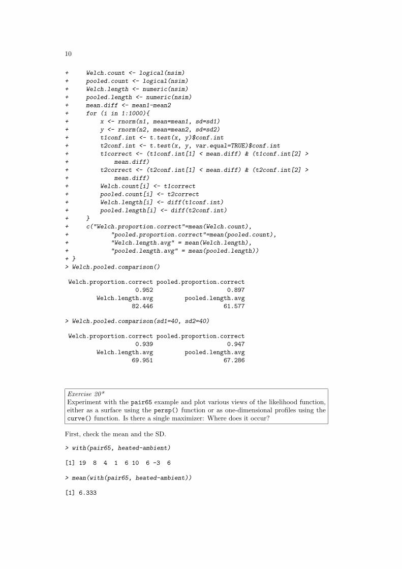
10
+ Welch.count <- logical(nsim)+ pooled.count <- logical(nsim)+ Welch.length <- numeric(nsim)+ pooled.length <- numeric(nsim)+ mean.diff <- mean1-mean2+ for (i in 1:1000){+ x <- rnorm(n1, mean=mean1, sd=sd1)+ y <- rnorm(n2, mean=mean2, sd=sd2)+ t1conf.int <- t.test(x, y)$conf.int+ t2conf.int <- t.test(x, y, var.equal=TRUE)$conf.int+ t1correct <- (t1conf.int[1] < mean.diff) & (t1conf.int[2] >+ mean.diff)+ t2correct <- (t2conf.int[1] < mean.diff) & (t2conf.int[2] >+ mean.diff)+ Welch.count[i] <- t1correct+ pooled.count[i] <- t2correct+ Welch.length[i] <- diff(t1conf.int)+ pooled.length[i] <- diff(t2conf.int)+ }+ c("Welch.proportion.correct"=mean(Welch.count),+ "pooled.proportion.correct"=mean(pooled.count),+ "Welch.length.avg" = mean(Welch.length),+ "pooled.length.avg" = mean(pooled.length))+ }> Welch.pooled.comparison()
Welch.proportion.correct pooled.proportion.correct0.952 0.897
Welch.length.avg pooled.length.avg82.446 61.577
> Welch.pooled.comparison(sd1=40, sd2=40)
Welch.proportion.correct pooled.proportion.correct0.939 0.947
Welch.length.avg pooled.length.avg69.951 67.286
Exercise 20*Experiment with the pair65 example and plot various views of the likelihood function,either as a surface using the persp() function or as one-dimensional profiles using thecurve() function. Is there a single maximizer: Where does it occur?
First, check the mean and the SD.
> with(pair65, heated-ambient)
[1] 19 8 4 1 6 10 6 -3 6
> mean(with(pair65, heated-ambient))
[1] 6.333

Chapter 4 Exercises 11
> sd(with(pair65, heated-ambient))
[1] 6.103
Now create and use a function that calculates the likelihood, given mu and sigma
> funlik <- function(mu, sigma, x=with(pair65, heated-ambient))+ prod(dnorm(x, mu, sigma))
Next, calculate a vector of values of mu, and a vector of values of sigma
> muval <- seq(from=2, to=12, by=0.5) # Values about mu=6.33> sigval <- seq(from=1, to=15, by=0.5) # Values about mu=6.10
Now calculate an array of logliklihoods
> loglikArray <- function(mu, sigma, d=with(pair65, heated-ambient)){+ xx <- matrix(0, nrow=length(mu), ncol=length(sigma))+ for (j in seq(along=sigma)) for (i in seq(along=mu))+ xx[i,j] <- log(funlik(mu[i], sigma[j], d))+ xx+ }> loglik <- loglikArray(mu=muval, sigma=sigval)
Now create a perspective plot
> persp(x=muval, y=sigval, loglik)
A wider range of values of mu, and a narrower range of values of sigma, seems preferable:
> muval <- seq(from=-1, to=14, by=0.5)> sigval <- seq(from=3, to=12, by=0.2)> loglik <- loglikArray(mu=muval, sigma=sigval)> persp(x=muval, y=sigval, loglik)
Try also
> contour(muval, sigval, loglik)> filled.contour(muval, sigval, loglik)
Exercise 22*Suppose the mean reaction time to a particular stimulus has been estimated in severalprevious studies, and it appears to be approximately normally distributed with mean 0.35seconds with standard deviation 0.1 seconds. On the basis of 10 new observations, themean reaction time is estimated to be 0.45 seconds with an estimated standard deviationof 0.15 seconds. Based on the sample information, what is the maximum likelihoodestimator for the true mean reaction time? What is the Bayes’ estimate of the meanreaction time.
Following Section 4.2.2 the posterior density of the mean is normal with mean
ny + µ0σ2/σ20
n+ σ2/σ20
and varianceσ2
n+ σ2/σ20
where, hereµ0 = 0.35,σ0 = 0.1, y = 0.45, n = 10,σ = 0.15
Thus the posterior mean and variance of the mean are:

12
> print(c(mean = (10 * 0.45 + 0.35 * 0.15^2/0.1^2)/(10 + 0.15^2/0.1^2)))
mean0.4316
> print(c(variance = 0.1^2/(10 + 0.15^2/0.1^2)))
variance0.0008163
The posterior mean is the Bayes’ estimate of the mean.

Chapter 5 Exercises 1
Data Analysis & Graphics Using R, 3rd edn – Solutions to Exercises (April 30, 2010)
Preliminaries
> library(DAAG)
Exercise 2For each of the data sets elastic1 and elastic2, determine the regression of stretch ondistance. In each case determine(i) fitted values and standard errors of fitted values and
(ii) the R2 statistic. Compare the two sets of results. What is the key differencebetween the two sets of data?
Use the robust regression function rlm() from the MASS package to fit lines to the datain elastic1 and elastic2. Compare the results with those from use of lm(). Compareregression coefficients, standard errors of coefficients, and plots of residuals against fittedvalues.
The required regressions are as follows:
> e1.lm <- lm(distance ~ stretch, data=elastic1)> e2.lm <- lm(distance ~ stretch, data=elastic2)
The fitted values and standard errors of the fits are then:
> predict(e1.lm, se.fit=TRUE)
$fit1 2 3 4 5 6 7
183.1 235.7 196.3 209.4 170.0 156.9 222.6
$se.fit[1] 6.587 10.621 5.892 6.587 8.332 10.621 8.332
$df[1] 5
$residual.scale[1] 15.59
The R2 statistic, in each case, is obtained as follows:
> summary(e1.lm)$r.squared
[1] 0.7992
> summary(e2.lm)$r.squared
[1] 0.9808
The standard errors are somewhat smaller for the second data set than for the first,while the R2 value is much larger for the second than the first. The main reason for the

2
difference in R2 is the larger range of stretch for the second data set. There is morevariation to explain. More specifically
R2 = 1− (n− 2)s2�(y − y2)
(1)
= 1− s2�(y − y2)/(n− 2)
(2)
(3)
Increasing the range of values greatly increases the denominator. If the line is adequateover the whole of the range, s2 will, as here, not change much. (For these data, in spiteof the greater range, it reduces somewhat.)
The robust regression fits can be obtained as follows:
> library(MASS)> e1.rlm <- rlm(distance ~ stretch, data=elastic1)> e2.rlm <- rlm(distance ~ stretch, data=elastic2)
The robust regression fits can be obtained as follows:
The residual plots can be obtained for rlm in the same was as for lm. It may howeverbe more insightful to overlay the rlm plots on the lm plots.
> par(mfrow=c(1,2))> plot(e1.lm, which=1, add.smooth=FALSE)> points(resid(e1.rlm) ~ fitted(e1.rlm), col=2, pch=2)> plot(e2.lm, which=1, add.smooth=FALSE)> points(resid(e2.rlm) ~ fitted(e2.rlm), col=2, pch=2)> par(mfrow=c(1,1))
160 180 200 220
−20
020
Fitted values
Res
idua
ls
●
●
●
●
●
●
●
Residuals vs Fitted7
2
5
100 150 200 250
−10
010
20
Fitted values
Res
idua
ls
●
●
●
●
●●
●
●
●
Residuals vs Fitted4
3 6
Figure 1: Overlaid plots of residuals versus fitted values, for the dataframes elastic1(left panel) and elastic2 (right panel). Circles are for the lm fit and triangles for therlm fit.
For comparison purposes, we include residual plots for the ordinary regression fits.Note, in particular, how the robust regression has reduced the weight of the outlyingobservation in the first data set. The residual at that point is larger than it was usingordinary least-squares. The residual plots for the ordinary and robust fits are very similarfor the second data set, since there are no outlying observations.
As can be seen in the summaries below, the ordinary and robust fits for the first dataset give quite different estimates of the slope and intercept. The robust fit is more in linewith both sets of results obtained for the second data set.

Chapter 5 Exercises 3
Note also the downward effect of the robust regression on the residual standard error.This is again due to the down-weighting of the outlying observation.
For further details, run the following code:
> summary(e1.rlm)> summary(e1.lm)> summary(e2.rlm)> summary(e2.lm)
Exercise 3Using the data frame cars (datasets), plot distance (i.e. stopping distance) versusspeed. Fit a line to this relationship, and plot the line. Then try fitting and plotting aquadratic curve. Does the quadratic curve give a useful improvement to the fit? [Readerswho have studied the relevant physics might develop a model for the change in stoppingdistance with speed, and check the data against this model.]
The data can be plotted using
> plot(dist ~ speed, data=cars, xlab="stopping distance", pch=16)
The linear model can be fit, and a line added, as follows:
> cars.lm <- lm(dist ~ speed, data=cars)> abline(cars.lm)
One way of fitting a quadratic curve to the data is as follows:
> cars.lm2 <- lm(dist ~ speed + I(speed^2), data=cars)
The following overlays the quadratic curve:Here is the graph
●●
●
●●●●●●
●
●
●●●●●●●
●
●
●
●
●
●●
●
●●●●
●●
●
●●
●
●
●
●
●●●● ●
●
●
●●
●
●
5 10 15 20 25
020
6010
0
stopping distance
dist
Figure 2: Quadratic curve fitted to cardata.
> xval <- pretty(cars$speed, 50)> hat2 <- predict(cars.lm2,+ newdata=list(speed=xval))> lines(xval, hat2, col="red", lty=2, lwd=2)
Based on what we’ve seen so far, the quadratic curve does not appear to fit the datamuch better than the line. Checking the summary and the p-value might lead us tobelieve that the quadratic term is not needed:
> summary(cars.lm2)
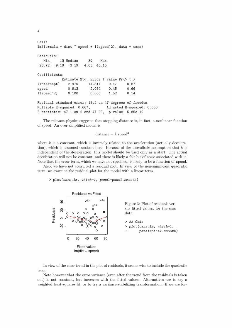
4
Call:lm(formula = dist ~ speed + I(speed^2), data = cars)
Residuals:Min 1Q Median 3Q Max
-28.72 -9.18 -3.19 4.63 45.15
Coefficients:Estimate Std. Error t value Pr(>|t|)
(Intercept) 2.470 14.817 0.17 0.87speed 0.913 2.034 0.45 0.66I(speed^2) 0.100 0.066 1.52 0.14
Residual standard error: 15.2 on 47 degrees of freedomMultiple R-squared: 0.667, Adjusted R-squared: 0.653F-statistic: 47.1 on 2 and 47 DF, p-value: 5.85e-12
The relevant physics suggests that stopping distance is, in fact, a nonlinear functionof speed. An over-simplified model is
distance = k speed2
where k is a constant, which is inversely related to the acceleration (actually decelera-tion), which is assumed constant here. Because of the unrealistic assumption that k isindependent of the deceleration, this model should be used only as a start. The actualdeceleration will not be constant, and there is likely a fair bit of noise associated with it.Note that the error term, which we have not specified, is likely to be a function of speed.
Also, we have not consulted a residual plot. In view of the non-significant quadraticterm, we examine the residual plot for the model with a linear term.
> plot(cars.lm, which=1, panel=panel.smooth)
0 20 40 60 80
−20
020
40
Fitted values
Res
idua
ls
●
●
●
●
●
●●
●
●
●
●
●●●●●
●●
●
●
●
●
●
●●
●
●
●
●
●
●
●
●
●
●
●
●
●
●
●●●
●●
●
●
●●
●
●
lm(dist ~ speed)
Residuals vs Fitted
4923
35 Figure 3: Plot of residuals ver-sus fitted values, for the carsdata.
> ## Code> plot(cars.lm, which=1,+ panel=panel.smooth)
In view of the clear trend in the plot of residuals, it seems wise to include the quadraticterm.
Note however that the error variance (even after the trend from the residuals is takenout) is not constant, but increases with the fitted values. Alternatives are to try aweighted least-squares fit, or to try a variance-stabilizing transformation. If we are for-

Chapter 5 Exercises 5
tunate, a variance-stabilizing transformation may also reduce any trend that may bepresent. In particular, a square-root transformation seems to work well:
3 4 5 6 7 8 9
−20
12
3
Fitted values
Res
idua
ls
●
●
●
●
●
●
●
●
●
●
●
●
●●●
●
●●
●
●
●
●
●
●
●
●
●
●
●
●
●
●
●
●●
●
●
●
●
●●●
●
●
●
●
●●
●
●
lm(sqrt(dist) ~ speed)
Residuals vs Fitted
23
35
39
Figure 4: Residuals from the regression ofthe square root of distance on speed, forthe car data.
> ## Code> cars.lm3 <- lm(sqrt(dist) ~ speed, data=cars)> plot(cars.lm3, which=1, panel=panel.smooth)
Incidentally, the square root transformation is also indicated by the Box-Cox proce-dure (see exercise 5). This is seen from the output to either of
> boxcox(dist ~ speed, data=cars)> boxcox(dist ~ I(speed^2), data=cars)
Exercise 5In the data set pressure (datasets), examine the dependence of pressure on temperature.[The relevant theory is that associated with the Claudius-Clapeyron equation, by whichthe logarithm of the vapor pressure is approximately inversely proportional to the abso-lute temperature. For further details of the Claudius-Clapeyron equation, search on theinternet, or look in a suitable reference text.]
First we ignore the Claudius-Clapeyron equation, and try to transform pressure. When thelogarithmic transformation is too extreme, as happens in this case, a power transformation witha positive exponent may be a candidate. A square root transformation is a possibility:
> pressure$K <- pressure$temperature+273> p.lm <- lm(I(pressure^.5) ~ K, data=pressure)> plot(p.lm, which=1)
A systematic search for a smaller exponent is clearly required.
The Clausius-Clapeyron equation suggests that log(pressure) should be a linearfunction of 1/K, where K is degrees kelvin.
> p.lm2 <- lm(log(pressure) ~ I(1/K), data=pressure)> plot(p.lm2, which=1)
Consulting the residual plot, we see too much regularity. One point appears to be anoutlier, and should be checked against other data sources. Some improvement is obtainedby considering polynomials in the inverse of temperature. For example, the quadraticcan be fit as follows:
> p.lm4 <- lm(log(pressure) ~ poly(1/K,2), data=pressure)> plot(p.lm4, which=1)

6
The residual plot still reveals some unsatisfactory features, particularly for low temper-atures. However, such low pressure measurements are notoriously inaccurate. Thus, aweighted least-squares analysis would probably be more appropriate.
Exercise 6*Look up the help page for the function boxcox() from the MASS package, and use thisfunction to determine a transformation for use in connection with Exercise 5. Examinediagnostics for the regression fit that results following this transformation. In particular,examine the plot of residuals against temperature. Comment on the plot. What are itsimplications for further investigation of these data?
The Box-Cox procedure can be applied to the pressure data as follows:
−2 −1 0 1 2
−350
−250
−150
−50
λ
log−
Like
lihoo
d
95%
Figure 5: Boxcox plot, for pressure versusdegrees Kelvin
> ## Code> boxcox(pressure ~ K,+ data=pressure)
This suggests a power of around 0.1, so that we might fit the model using
lm(I(pressure^.1) ~ K, data=pressure)
However, remembering that the physics suggests a transformation of temperature, weshould really look at the dependence of pressure on 1/K, thus:
The result is
−2 −1 0 1 2
−300
−100
0
λ
log−
Like
lihoo
d
95%
Figure 6: Boxcox plot, for pressure versus1/K
> ## Code> boxcox(pressure ~ I(1/K), data=pressure)

Chapter 5 Exercises 7
This shows clearly that the logarithmic transformation is likely to be helpful. (How-ever check the effect of the Box-Cox transformation on the trend.)
Exercise 7Annotate the code that gives panels B and D of Figure 5.4, explaining what each functiondoes, and what the parameters are.
library(DAAG) # loads the DAAG libraryattach(ironslag) # attaches data frame contents to search pathpar(mfrow=c(2,2)) # enables a 2x2 layout on the graphics windowironslag.lm <- lm(chemical ~ magnetic)
# regress chemical on magneticchemhat <- fitted(ironslag.lm) # assign fitted values to chemhatres <- resid(ironslag.lm) # assign residuals to res## Figure 5.4Bplot(magnetic, res, ylab = "Residual", type = "n") # type = "n"
# Set up axes with correct ranges, do not plotpanel.smooth(magnetic, res, span = 0.95) # plots residuals
# vs predictor, & adds a lowess smooth; f=span## Figure 5.4Dsqrtabs <- sqrt(abs(res)) # square root of abs(residuals)plot(chemhat, sqrtabs, xlab = "Predicted chemical",
ylab = expression(sqrt(abs(residual))), type = "n")# suppressed plot again, as above
panel.smooth(chemhat, sqrtabs, span = 0.95)# plot sqrt(abs(residuals)) vs fitted values# add lowess smooth, with f=span
detach(ironslag) # remove data frame contents from search path
Exercise 8The following code gives the values that are plotted in the two panels of Figure 5.5.
## requires the data frame ironslag (DAAG)ironslag.loess <- loess(chemical ~ magnetic, data=ironslag)chemhat <- fitted(ironslag.loess)res2 <- resid(ironslag.loess)sqrtabs2 <- sqrt(abs(res2))
Using this code as a basis, create plots similar to Figure 5.5A and 5.5B. Why have wepreferred to use loess() here, rather than lowess()? [Hint: Is there a straightforwardmeans for obtaining residuals from the curve that lowess() gives? What are the x-values,and associated y-values, that lowess() returns?]
Obtaining residuals from lowess() is problematic because the fitted data are sortedaccording to the predictor variable upon output.
One way of obtaining residuals upon use of lowess() is to sort the data beforehandas below:
> ironsort <- ironslag[order(ironslag$magnetic),]> attach(ironsort)> ironsort.lw <- lowess(magnetic, chemical)> ironsort.resid <- chemical - ironsort.lw$y

8
Once we have the residuals (either from loess() or from lowess()), we may proceedto obtain the plots in Figure 5.5. One way is as follows:
> plot(ironsort.resid ~ magnetic, lwd=2, xlab="Magnetic", ylab="Residual")> lines(lowess(magnetic, ironsort.resid, f=.8), lty=2)
To obtain the plot in Figure 5.5B, we could then do the following:
> sqrtabs2 <- sqrt(abs(ironsort.resid))> plot(sqrtabs2 ~ ironsort.lw$y, xlab="Predicted chemical",+ ylab=expression(sqrt(Residual)))> lines(lowess(ironsort.lw$y, sqrtabs2, f=.8))> detach(ironsort)
One could also use loess() instead of lowess().
Exercise 10Write a function which simulates simple linear regression data from the model
y = 2 + 3x+ ε
where the noise terms are independent normal random variables with mean 0 and variance1.Using the function, simulate two samples of size 10. Consider two designs: first, assumethat the x-values are independent uniform variates on the interval [−1, 1]; second, assumethat half of the x-values are -1’s, and the remainder are 1’s. In each case, compute slopeestimates, standard error estimates and estimates of the noise standard deviation. Whatare the advantages and disadvantages of each type of design?
> ex10fun <-+ function(x=runif(n), n=20){+ eps <- rnorm(n)+ y <- 2 + 3*x + eps+ lm(y ~ x)+ }> summary(ex10fun())
Call:lm(formula = y ~ x)
Residuals:Min 1Q Median 3Q Max
-1.8855 -0.6041 -0.0552 0.6178 2.3180
Coefficients:Estimate Std. Error t value Pr(>|t|)
(Intercept) 2.758 0.427 6.45 4.5e-06x 2.127 0.835 2.55 0.020
Residual standard error: 0.991 on 18 degrees of freedomMultiple R-squared: 0.265, Adjusted R-squared: 0.224F-statistic: 6.48 on 1 and 18 DF, p-value: 0.0202
> summary(ex10fun(x=rep(c(-1,1), c(10,10))))

Chapter 5 Exercises 9
Call:lm(formula = y ~ x)
Residuals:Min 1Q Median 3Q Max
-1.5157 -0.5944 -0.0867 0.4167 2.0823
Coefficients:Estimate Std. Error t value Pr(>|t|)
(Intercept) 1.516 0.219 6.92 1.8e-06x 3.085 0.219 14.07 3.7e-11
Residual standard error: 0.98 on 18 degrees of freedomMultiple R-squared: 0.917, Adjusted R-squared: 0.912F-statistic: 198 on 1 and 18 DF, p-value: 3.74e-11
Notice the substantial reduction in the SE for the intercept, and the even larger reductionin the SE for the slope, for the design that divides the sample points equally between thetwo ends of the interval.
This reduction in the SEs is of course a benefit. The disadvantage is that there isno possibility to check, with the second design, whether the assumed form of regressionrelationship is correct.
Note: The estimate and variance of the intercept are:
a = y − bx; var[a] = σ2/n+σ2
n�
(x− x)2
The estimate and variance of the intercept are:
b =
�(x− x)y
n�
(x− x)2var[b] =
σ2
n�
(x− x)2
Here σ = 1.
For a uniform random variable on [-1, 1], it can be shown that the varianceis 1
3 . It follows that E[�
(x − x)2] = n−13 . When sample points are divided
equally between the two ends of the interval,�
(x− x)2 = n. The ratio of theexpected SE for the slope in the first design to the SE in the second design
is then�
(n−1)3n . Here, this ratio is approximately 0.56. Asymptotically, it is
approximately 0.58.
Chapter 6 Exercises 1
Data Analysis & Graphics Using R, 3rd edn – Solutions to Exercises (April 30, 2010)
Preliminaries
> library(DAAG)
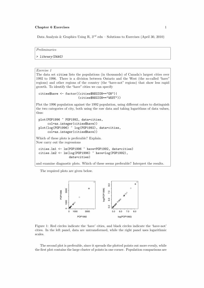
Exercise 1The data set cities lists the populations (in thousands) of Canada’s largest cities over1992 to 1996. There is a division between Ontario and the West (the so-called “have”regions) and other regions of the country (the “have-not” regions) that show less rapidgrowth. To identify the “have” cities we can specify
cities$have <- factor((cities$REGION=="ON")|
(cities$REGION=="WEST"))
Plot the 1996 population against the 1992 population, using different colors to distinguishthe two categories of city, both using the raw data and taking logarithms of data values,thus:
plot(POP1996 ~ POP1992, data=cities,
col=as.integer(cities$have))
plot(log(POP1996) ~ log(POP1992), data=cities,
col=as.integer(cities$have))
Which of these plots is preferable? Explain.Now carry out the regressions
cities.lm1 <- lm(POP1996 ~ have+POP1992, data=cities)
cities.lm2 <- lm(log(POP1996) ~ have+log(POP1992),
data=cities)
and examine diagnostic plots. Which of these seems preferable? Interpret the results.
The required plots are given below.
●
●
●
●●●
●●●●●●●●●●●●●●●●●●●
0 1000 3000
01000
3000
POP1992
POP1996
●
●
●
●●●
●●●
●●●●●●●
●●
●●●●●●●
5.0 6.0 7.0 8.0
5.0
6.0
7.0
8.0
log(POP1992)
log(PO
P1996)
Figure 1: Red circles indicate the ‘have’ cities, and black circles indicate the ‘have-not’cities. In the left panel, data are untransformed, while the right panel uses logarithmicscales.
The second plot is preferable, since it spreads the plotted points out more evenly, whilethe first plot contains the large cluster of points in one corner. Population comparisons are
2
usually best made using ratios instead of differences; differences of logarithms correspondto logarithms of ratios, which is another reason for preferring the second plot.
We plot residuals against fitted values, first for the untransformed data and then forthe transformed data.
> par(mfrow=c(1,2))
> cities.lm1 <- lm(POP1996 ~ have+POP1992, data=cities)
> cities.lm2 <- lm(log(POP1996) ~ have+log(POP1992),
+ data=cities)
> plot(cities.lm1, which=1)
> plot(cities.lm2, which=1)
> par(mfrow=c(1,1))
0 1000 3000
−100
−50
050
100
Fitted values
Res
idua
ls
●
●
●
●
●
●●
●●
●
●
●
●
●●●●●●●
●
●●
●
●
Residuals vs Fitted
2
3
1
5.0 6.0 7.0 8.0
−0.0
40.
000.
04
Fitted values
Res
idua
ls
●
●
●
●
●
●
●
●●
●
●
●
●
●
●
●
●
●
●●
●
●
●
●
●
Residuals vs Fitted
16 3
21
Figure 2: Plots of residualsagainst fitted values. Theleft panel is for the modelthat used untransformed data,while the right panel is forthe model that used log-transformed data.
These plots indicate the need for transformation.It is also a good idea to check plots of the residuals versus the predictors, as in
plot(resid(cities.lm2) ~ log(cities$POP1992))
plot(resid(cities.lm2) ~ cities$have)
These plots (not shown) and plots of Cook’s distance and normal probability plots (alsonot shown) do not indicate any problems.
Here is the regression summary:
> summary(cities.lm2)
Call:
lm(formula = log(POP1996) ~ have + log(POP1992), data = cities)
Residuals:
Min 1Q Median 3Q Max
-0.03478 -0.01698 -0.00332 0.01836 0.04821
Coefficients:
Estimate Std. Error t value Pr(>|t|)
(Intercept) -0.05565 0.03062 -1.82 0.083
haveTRUE 0.02254 0.01004 2.25 0.035
log(POP1992) 1.01352 0.00523 193.92 <2e-16
Residual standard error: 0.0239 on 22 degrees of freedom
Multiple R-squared: 0.999, Adjusted R-squared: 0.999
F-statistic: 2.05e+04 on 2 and 22 DF, p-value: <2e-16
This suggests that the ‘have’ cities grew faster between 1992 and 1996 than the ‘have-not’cities.

Chapter 6 Exercises 3
Exercise 2In the data set cement (MASS package), examine the dependence of y (amount of heatproduced) on x1, x2, x3 and x4 (which are proportions of four constituents). Begin byexamining the scatterplot matrix. As the explanatory variables are proportions, do theyrequire transformation, perhaps by taking log(x/(100 − x))? What alternative strategiesmight be useful for finding an equation for predicting heat?
First, obtain the scatterplot matrix for the untransformed cement data:
y5 15
●●
●
●●
●●
●
●
●
●
●●
●●
●
●●
●●
●
●
●
●
●●
5 15
●●
●
●●
●●
●
●
●
●
●●
80110
●●
●
●●
●●
●
●
●
●
●●
515
●
●
●●
●
●
●● ●
●
●
●● x1 ●
●
●●
●
●
●● ●
●
●
●●●
●
●●
●
●
●●●
●
●
●●●
●
● ●
●
●
●●●
●
●
●●
●●
●
●
● ●
●
●
●●
●
●●
●●
●
●
● ●
●
●
●●
●
●●
x2● ●
●
●
●●
●
●
●●
●
●●30
60
●●
●
●
●●
●
●
●●●
●●
515
●
●
●●●
●
●
●
●
●
●
●●●
●
●●●
●
●
●
●
●
●
●●●
●
●●●●
●
●
●
●
●
●●x3
●
●
● ●●
●
●
●
●
●
●
●●
80 110
●●
●
●
●
●
●
●
● ●●
●●
●●
●
●
●
●
●
●
● ●●
●●
30 60
●●
●
●
●
●
●
●
●●●
●●
●●
●
●
●
●
●
●
●●●
●●
10 40
1040x4
Figure 3: Scatterplotmatrix for the cementdata.
Since the explanatory variables are proportions, a transformation such as that sug-gested might be helpful, though the bigger issue is the fact that the sum of the explanatoryvariables is nearly constant. Thus, there will be severe multicollinearity as indicated bythe variance inflation factors:
> cement.lm <- lm(y ~ x1+x2+x3+x4, data=cement)
> vif(cement.lm)
x1 x2 x3 x4
38.50 254.42 46.87 282.51
The scatterplot matrix indicated that x4 and x2 are highly correlated, so we may wishto include just one of these variables as in
> cement.lm2 <- lm(y ~ x1+x2+x3, data=cement)
> vif(cement.lm2)
x1 x2 x3
3.251 1.064 3.142

4
The multicollinearity is less severe, and we can proceed. We consult the standard diag-nostics using
> par(mfrow=c(1,4))
> plot(cement.lm2)
> par(mfrow=c(1,1))
80 90 100 110
−4−2
02
4
Fitted values
Res
idua
ls
●
●
●●
●
●
●
●
●
●
●
●
●
Residuals vs Fitted
6
8
13
●
●
●
●
●
●
●
●
●
●
●
●
●
−1.5 −0.5 0.0 0.5 1.0 1.5
−10
12
Theoretical Quantiles
Stan
dard
ized
resi
dual
s
Normal Q−Q
6
8
13
80 90 100 110
0.0
0.2
0.4
0.6
0.8
1.0
1.2
1.4
Fitted values
Stan
dard
ized
resi
dual
s
●
●
●
●
●
●
●
●
●
●
●
●
●
Scale−Location68
13
0.0 0.1 0.2 0.3 0.4 0.5 0.6 0.7
−2−1
01
2
Leverage
Stan
dard
ized
resi
dual
s
●
●
●
●
●
●
●
●
●
●
●
●
●
Cook's distance
1
0.5
0.5
1
Residuals vs Leverage
8
11
13
Figure 4: Diagnostic plots for the model cement.lm2
Nothing seems amiss on these plots. The three variable model seems satisfactory.Upon looking at the summary, one might argue in favour of removing the variable x3.
For the logit analysis, first define the logit function:
> logit <- function(x) log(x/(100-x))
Now form the transformed data frame, and show the scatterplot matrix:
> logitcement <- data.frame(logit(cement[,c("x1", "x2","x3","x4")]),
+ y=cement[, "y"])
> pairs(logitcement)
x1
−1.0 0.5
●
●
●●●●
●
●
●
●
●
●●●
●
●●●
●
●
●
●
●
●
●●
−2.5 0.0
●
●
● ●●
●
●
●
●
●
●
●●
−4.5
−2.0
●
●
●●●
●
●
●
●
●
●
●●
−1.0
0.5
●●
●
●
●●
●
●
●●
●
●●
x2●
●
●
●
● ●
●
●
●●
●
●●
●●
●
●
●●
●
●
●●●
●●
●●
●
●
● ●
●
●
●●
●
●●
●
●
●●●
●
●●
●
●
●
●●●
●
●●●
●
●●
●
●
●
●● x3●
●
● ●●
●
●●
●
●
●
●●
−3.0
−1.5
●
●
●●●
●
●●
●
●
●
●●
−2.5
0.0 ●
●
●
●●●
●
●
● ●●
●●
●●
●
●●●
●
●
●●●
●●
●●
●
●●
●
●
●
●●●
●●x4
●●
●
●●
●
●
●
● ●●
●●
−4.5 −2.0
●●
●
●●
●●
●
●
●
●
●●
●●
●
●●
●●
●
●
●
●
●●
−3.0 −1.5
●●
●
●●
●●
●
●
●
●
●●
●●
●
●●
●●
●
●
●
●
●●
80 110
80110
y
Figure 5: Scatterplotmatrix for the logits ofthe proportions.
Chapter 6 Exercises 5
Notice that the relationship between x2 and x4 is now more nearly linear. This is helpful;it is advantageous for collinearities or multicollinearities to be explicit.
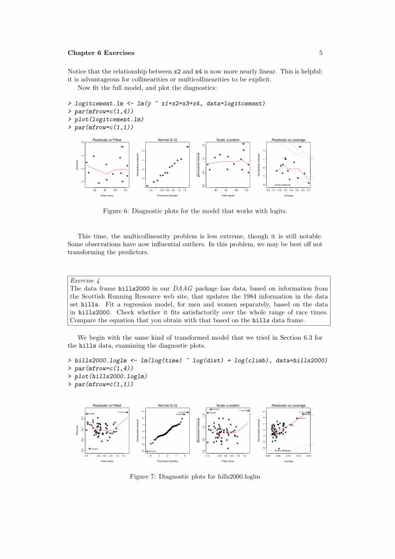
Now fit the full model, and plot the diagnostics:
> logitcement.lm <- lm(y ~ x1+x2+x3+x4, data=logitcement)
> par(mfrow=c(1,4))
> plot(logitcement.lm)
> par(mfrow=c(1,1))
80 90 100 110
−50
510
Fitted values
Res
idua
ls
●
●
●
●
●
●
●
●
●
●
●
●
●
Residuals vs Fitted
10
17 ●
●
●
●
●
●
●
●
●
●
●
●
●
−1.5 −0.5 0.0 0.5 1.0 1.5
−10
12
Theoretical Quantiles
Stan
dard
ized
resi
dual
sNormal Q−Q
10
7
1
80 90 100 110
0.0
0.5
1.0
1.5
Fitted valuesSt
anda
rdiz
ed re
sidu
als
●
●
●
●
●
●
●
● ●
●
●
●
●
Scale−Location10
7
1
0.0 0.1 0.2 0.3 0.4 0.5 0.6 0.7
−2−1
01
2
Leverage
Stan
dard
ized
resi
dual
s
●
●
●
●
●
●
●
●
●
●
●
●
●
Cook's distance
1
0.5
0.5
1
Residuals vs Leverage
7
10
4
Figure 6: Diagnostic plots for the model that works with logits.
This time, the multicollinearity problem is less extreme, though it is still notable.Some observations have now influential outliers. In this problem, we may be best off nottransforming the predictors.
Exercise 4The data frame hills2000 in our DAAG package has data, based on information fromthe Scottish Running Resource web site, that updates the 1984 information in the dataset hills. Fit a regression model, for men and women separately, based on the datain hills2000. Check whether it fits satisfactorily over the whole range of race times.Compare the equation that you obtain with that based on the hills data frame.
We begin with the same kind of transformed model that we tried in Section 6.3 forthe hills data, examining the diagnostic plots.
> hills2000.loglm <- lm(log(time) ~ log(dist) + log(climb), data=hills2000)
> par(mfrow=c(1,4))
> plot(hills2000.loglm)
> par(mfrow=c(1,1))
−1.5 −0.5 0.0 0.5 1.0 1.5
−0.4
−0.2
0.0
0.2
Fitted values
Res
idua
ls
●●
●
●
●
●
●
●
●
●●
●
●
●
●
●
●
●
●
●●
●
●●
●●
●
●
●
●●●
●
●
●
●
●●
●
●
●
●
●
●
●
●
●
●
●
●●
●●
● ●
●
Residuals vs Fitted
Caerketton
12 Trig TrogChapelgill
●●
●
●
●
●
●
●
●
●●
●
●
●
●
●
●
●
●
●●
●
●●
●●
●
●
●
●●
●
●
●
●
●
●●
●
●
●
●
●
●
●
●
●
●
●
● ●
●●
●●
●
−2 −1 0 1 2
−3−2
−10
12
3
Theoretical Quantiles
Stan
dard
ized
resi
dual
s
Normal Q−Q
Caerketton
12 Trig TrogChapelgill
−1.5 −0.5 0.0 0.5 1.0 1.5
0.0
0.5
1.0
1.5
Fitted values
Stan
dard
ized
resi
dual
s
●●
●
●
●
●
●
●
●
●
●
●
●
●
●
●
●
●
●
●
●
●
●
●
●
●
●
●
●
●
●
●
●
●
●
●
●
●
●
●
●
●
●
●
●
●
●
●
●
●●
●
●
●●
●
Scale−LocationCaerketton 12 Trig Trog
Chapelgill
0.00 0.05 0.10 0.15 0.20
−3−2
−10
12
3
Leverage
Stan
dard
ized
resi
dual
s
●●
●
●
●
●
●
●
●
●●
●
●
●
●
●
●
●
●
● ●
●●●
●●
●
●
●
●●
●
●
●
●
●
●●
●
●
●
●
●
●
●
●
●
●
●
●●
●●
● ●
●
Cook's distance 1
0.5
0.5
1
Residuals vs Leverage
12 Trig TrogChapelgill
Beinn Lee
Figure 7: Diagnostic plots for hills2000.loglm

6
The first of the diagnostic plots (residuals versus fitted values) reveals three potentialoutliers, identified as 12 Trig Trog, Chapelgill, and Caerketton. A robust fit is howevera safer guide. The plot from such a fit shows Eildon Two and Braemar as outliers.El-Brim-Ick stands out as different primarily because there is residual curvature in theplot.
−1.5 −0.5 0.5 1.5
−0.4
−0.2
0.0
0.2
Fitted values
Res
idua
ls
●●
●
●
●
●
●
●
●
●●
●
●
●
●
●
●
●
●
●●
●●
●
●●
●
●
●
●●●
●●
●●
●●
●
●●
●
●
●
●
●
●
●
●
●●
● ●
● ●
●
lm(log(time) ~ log(dist) + log(climb))
Residuals vs Fitted
Caerketton
12 Trig TrogChapelgill
Figure 8: Residuals vs fitted values forhills2000r.loglm
> ## Code is
> use <- !row.names(hills2000)%in% c("Eildon Two","Braemar")
> hills2000r.loglm <- lm(log(time) ~ log(dist) + log(climb),
+ data=hills2000[use, ])
> plot(hills2000r.loglm, panel=panel.smooth, which=1)
There is clear evidence of curvature in the plot of residuals. Caerketton now standsout. We will omit that also, for the time being.
A possibility is to try the addition of the interaction term log(dist):log(climb).This does not remove the curvature in the plot of residuals versus fitted values.
Additional Note:Use of spline curves to transform the explanatory variables does work well. We includeresiduals and fitted values for the three omitted races in the plot. The code is
> library(splines)
> use <- !row.names(hills2000)%in%c("Eildon Two","Braemar","Caerketton")
> hills2000.bs <- lm(log(time) ~ bs(dist,4)+bs(climb,4), data=hills2000[use, ])
> hat <- predict(hills2000.bs, newdata=hills2000)
> res <- log(hills2000$time)-hat
> par(mfrow=c(1,3), pty="s")
> plot(hat,res)
> text(hat[!use], res[!use], row.names(hills2000)[!use], pos=4)
> plot(hills2000.bs, panel=panel.smooth, which=1)
> termplot(hills2000.bs, partial.resid=TRUE)
> par(mfrow=c(1,1))

Chapter 6 Exercises 7
●●
●
●
●
●
●
●
●
●●
●
●
●
●
●
●
●
●
●
●
●
●
●
●
●
●
●
●●
●
●
●
●
●
●●
●
●●
●
●
●●
●
●
●
●
●
●●
●●
●
●●
−1.0 0.0 0.5 1.0 1.5 2.0
−0.4
−0.2
0.0
0.1
hat
res
Caerketton
−1.0 0.0 0.5 1.0 1.5 2.0
−0.2
−0.1
0.0
0.1
Fitted values
Res
idua
ls
●
●
●
●
●
●
●
●
●
●●
●
●
●
●
●
●
●
●
●
●
●
●
●
●
●
●
●
●●
●
●
●
●
●
●●
●
●●
●
●
●
●
●
●
●
●
●
●
●
●
●
●
●
Residuals vs Fitted
Ben LomondDollarOban
0 10 20 30 40−1.0
−0.5
0.0
0.5
1.0
1.5
dist
Parti
al fo
r bs(
dist
, 4)
●●
●
●●
●
●
●
●
●
●
●
●
●
●
●
●
●
●
●●
●
●
●
●
●
●●
●
●
●
●
●
●
●●
●
●
●
●
●
●●
●
●
●
●
●
●
●
●
●
●
●
●
Figure 9: Residuals vs fitted values, and termplots, for hills2000.bs.
The plot of residuals versus fitted values shows no evidence either of trend or of hetero-geneity of variance. Caerketton shows the clearest evidence that is should perhaps beidentified as an outlier.
To complete the analysis, check the effect of including back in the model (i) all threeomitted points except Caerketton, and (ii) all three omitted points. If it makes littledifference, they should be included back.
(A further model that may be tried has time on the left-hand side. The plot ofresiduals against fitted values then shows clear evidence of curvature.)Additional Note: The following may be interesting. We use the spline model, derived fromthe hills2000 data, to determine predicted values, and compare these with predictedvalues from the spline model that is fitted to the hills data.
> hills2000.bs <- lm(log(time) ~ bs(dist,4)+bs(climb,4), data=hills2000[use, ])
> hills.bs <- lm(log(time) ~ bs(dist,4)+bs(climb,4), data=hills[-18, ])
> fits <- predict(hills.bs)
> fits2 <- predict(hills2000.bs, newdata=hills[-18,])
> plot(fits, fits2, xlab="Fitted values, from hills.bs",
+ ylab="Fitted values, hills2000.bs model")
> mtext(side=3, line=1, "All fitted values are for the hills data")
> abline(0,1)
The warnings arise because some values of climb for the hills data lie outside of therange of this variable for the hills2000 data.
Exercise 5Section 6.1 used lm() to analyze the allbacks data that are presented in Figure 6.1.Repeat the analysis using (1) the function rlm() in the MASS package, and (2) thefunction lqs() in the MASS package. Compare the two sets of results with the results inSection 6.1.
Here are fits, w/wo intercept, using rlm()
> allbacks.rlm <- rlm(weight ~ volume+area, data=allbacks)
> summary(allbacks.rlm)
Call: rlm(formula = weight ~ volume + area, data = allbacks)
Residuals:
Min 1Q Median 3Q Max
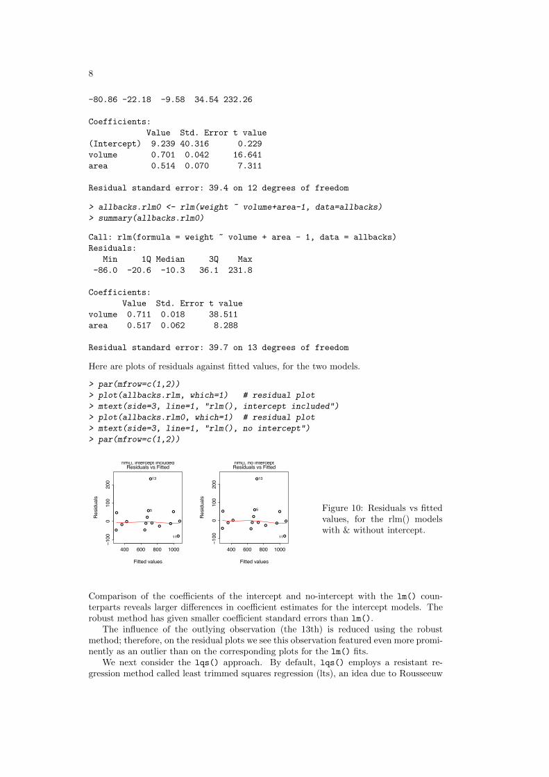
8
-80.86 -22.18 -9.58 34.54 232.26
Coefficients:
Value Std. Error t value
(Intercept) 9.239 40.316 0.229
volume 0.701 0.042 16.641
area 0.514 0.070 7.311
Residual standard error: 39.4 on 12 degrees of freedom
> allbacks.rlm0 <- rlm(weight ~ volume+area-1, data=allbacks)
> summary(allbacks.rlm0)
Call: rlm(formula = weight ~ volume + area - 1, data = allbacks)
Residuals:
Min 1Q Median 3Q Max
-86.0 -20.6 -10.3 36.1 231.8
Coefficients:
Value Std. Error t value
volume 0.711 0.018 38.511
area 0.517 0.062 8.288
Residual standard error: 39.7 on 13 degrees of freedom
Here are plots of residuals against fitted values, for the two models.
> par(mfrow=c(1,2))
> plot(allbacks.rlm, which=1) # residual plot
> mtext(side=3, line=1, "rlm(), intercept included")
> plot(allbacks.rlm0, which=1) # residual plot
> mtext(side=3, line=1, "rlm(), no intercept")
> par(mfrow=c(1,2))
400 600 800 1000
−100
010
020
0
Fitted values
Res
idua
ls
●●
●
●
●
●
●
●
●
●
●
●
●
● ●
Residuals vs Fitted
13
11
5
rlm(), intercept included
400 600 800 1000
−100
010
020
0
Fitted values
Res
idua
ls
●●
●
●
●
●
●
●
●
●
●
●
●
●●
Residuals vs Fitted
13
11
5
rlm(), no intercept
Figure 10: Residuals vs fittedvalues, for the rlm() modelswith & without intercept.
Comparison of the coefficients of the intercept and no-intercept with the lm() coun-terparts reveals larger differences in coefficient estimates for the intercept models. Therobust method has given smaller coefficient standard errors than lm().
The influence of the outlying observation (the 13th) is reduced using the robustmethod; therefore, on the residual plots we see this observation featured even more promi-nently as an outlier than on the corresponding plots for the lm() fits.
We next consider the lqs() approach. By default, lqs() employs a resistant re-gression method called least trimmed squares regression (lts), an idea due to Rousseeuw

Chapter 6 Exercises 9
(1984) (“Least median of squares regression.” Journal of the American Statistical Associ-ation 79: 871–888). The method minimizes the sum of the k smallest squared residuals,where k is usually taken to be slightly larger than 50% of the sample size. This approachremoves all of the influence of outliers on the fitted regression line.
> library(MASS)
> allbacks.lqs <- lqs(weight ~ volume+area, data=allbacks)
> allbacks.lqs$coefficients # intercept model
(Intercept) volume area
-59.6232 0.7737 0.4709
> allbacks.lqs0 <- lqs(weight ~ volume+area-1, data=allbacks)
> coefficients(allbacks.lqs0) # no-intercept model
volume area
0.7117 0.4849
The robust coefficient estimates of volume and area are similar to the correspondingcoefficient estimates for the lm() fit.
Here are plots of residuals against fitted values, for the two models.
> par(mfrow=c(1,2))
> plot(allbacks.lqs$residuals ~ allbacks.lqs$fitted.values)
> mtext(side=3, line=1, "lqs(), intercept included")
> plot(allbacks.lqs0$residuals ~ allbacks.lqs0$fitted.values)
> mtext(side=3, line=1, "lqs(), no intercept")
> par(mfrow=c(1,1))
●●
●●
●
● ●●
●
●
●
●
●
●
●
400 600 800 1000
−100
050
150
allbacks.lqs$fitted.values
allb
acks
.lqs$
resi
dual
s
lqs(), intercept included
●●
●
●
●
●
●
●
●
●
●
●
●
●●
400 600 800 1000
−50
050
150
allbacks.lqs0$fitted.values
allb
acks
.lqs0
$res
idua
ls
lqs(), no intercept
Figure 11: Residuals vs fittedvalues, for the lqs() modelswith & without intercept.
Because the outlying observation (13) is now not used at all in the final regressioncoefficient estimates, it has no influence. Neither does observation 11, another outlier.Both points plot farther away from the reference line at 0 than in the corresponding lm()residual plots.
Exercise 7Check the variance inflation factors for bodywt and lsize for the modelbrainwt ~ bodywt + lsize, fitted to the litters data set. Comment.
We can use the function vif() to determine the variance inflation factors for the littersdata as follows:
> litters.lm <- lm(brainwt ~ bodywt + lsize, data=litters)
> vif(litters.lm)

10
bodywt lsize
11.33 11.33
A scatterplot of litter size versus body weight would confirm that the two variableshave a relation which is close to linear. The effect is to give inflated standard errors in theabove regression, though not enough to obscure the relationship between brain weightand body weight and litter size completely.
It is hazardous to make predictions of brain weight for pigs having body weight andlitter size which do not lie close to the line relating these variables.
Exercise 10The data frame table.b3 in the MPV package contains data on gas mileage and elevenother variables for a sample of 32 automobiles.
(a) Construct a scatterplot of y (mpg) versus x1 (displacement). Is the relationshipbetween these variables nonlinear?
(b) Use the xyplot() function, and x11 (type of transmission) as a group variable. Isa linear model reasonable for these data?
11. Fit the model relating y to x1 and x11 which gives two lines having possibly differentslopes and intercepts. Check the diagnostics. Are there any influential observations?Are there any influential outliers?
(c) Plot the residuals against the variable x7 (number of transmission speeds), againusing x11 as a group variable. Is there anything striking about this plot?
(a) > library(MPV)
> plot(y ~ x1, data=table.b3)
The scatterplot is suggests a curvilinear relationship.
(b) > library(lattice)
> xyplot(y ~ x1, group=x11, data=table.b3)
This suggests that the apparent nonlinearity is better explained by the two typesof transmission.
(c) > b3.lm <- lm(y ~ x1*x11, data=table.b3)
> par(mfrow=c(1,4), pty="s")
> plot(b3.lm)
Observation 5 is influential, but it is not an outlier.
(d) > xyplot(resid(b3.lm) ~ x7, group=x11, data=table.b3)
This plot demonstrates that observation 5 is special. It is based on the only car inthe data set with a 3-speed manual transmission.
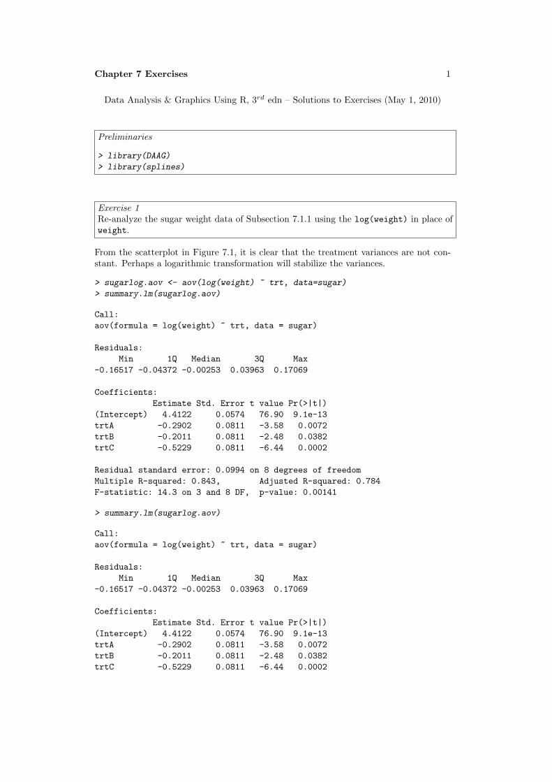
Chapter 7 Exercises 1
Data Analysis & Graphics Using R, 3rd edn – Solutions to Exercises (May 1, 2010)
Preliminaries
> library(DAAG)
> library(splines)
Exercise 1Re-analyze the sugar weight data of Subsection 7.1.1 using the log(weight) in place ofweight.
From the scatterplot in Figure 7.1, it is clear that the treatment variances are not con-stant. Perhaps a logarithmic transformation will stabilize the variances.
> sugarlog.aov <- aov(log(weight) ~ trt, data=sugar)
> summary.lm(sugarlog.aov)
Call:
aov(formula = log(weight) ~ trt, data = sugar)
Residuals:
Min 1Q Median 3Q Max
-0.16517 -0.04372 -0.00253 0.03963 0.17069
Coefficients:
Estimate Std. Error t value Pr(>|t|)
(Intercept) 4.4122 0.0574 76.90 9.1e-13
trtA -0.2902 0.0811 -3.58 0.0072
trtB -0.2011 0.0811 -2.48 0.0382
trtC -0.5229 0.0811 -6.44 0.0002
Residual standard error: 0.0994 on 8 degrees of freedom
Multiple R-squared: 0.843, Adjusted R-squared: 0.784
F-statistic: 14.3 on 3 and 8 DF, p-value: 0.00141
> summary.lm(sugarlog.aov)
Call:
aov(formula = log(weight) ~ trt, data = sugar)
Residuals:
Min 1Q Median 3Q Max
-0.16517 -0.04372 -0.00253 0.03963 0.17069
Coefficients:
Estimate Std. Error t value Pr(>|t|)
(Intercept) 4.4122 0.0574 76.90 9.1e-13
trtA -0.2902 0.0811 -3.58 0.0072
trtB -0.2011 0.0811 -2.48 0.0382
trtC -0.5229 0.0811 -6.44 0.0002
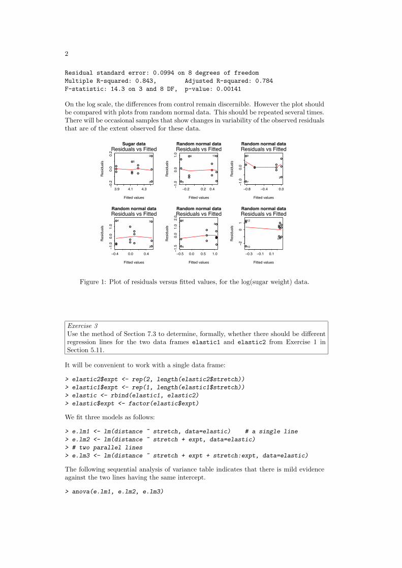
2
Residual standard error: 0.0994 on 8 degrees of freedom
Multiple R-squared: 0.843, Adjusted R-squared: 0.784
F-statistic: 14.3 on 3 and 8 DF, p-value: 0.00141
On the log scale, the differences from control remain discernible. However the plot shouldbe compared with plots from random normal data. This should be repeated several times.There will be occasional samples that show changes in variability of the observed residualsthat are of the extent observed for these data.
3.9 4.1 4.3
−0.2
0.0
0.2
Fitted values
Res
idua
ls
●
●
●
●
●
●
●
●
●
●
●
●
Residuals vs Fitted2
3
5
Sugar data
−0.2 0.2 0.4−1.0
0.0
1.0
Fitted values
Res
idua
ls
●
●
●
●●
●
●
●
●
●
●
●
Residuals vs Fitted106
9
Random normal data
−0.8 −0.4 0.0
−1.0
0.0
Fitted values
Res
idua
ls
●
●
●
●●●
●
●
●
●●
●
Residuals vs Fitted
7
9
3
Random normal data
−0.4 0.0 0.4
−1.0
0.0
1.0
Fitted values
Res
idua
ls
●
●
●
●
●●●●
●
●
●
●
Residuals vs Fitted4 2
3
Random normal data
−0.5 0.0 0.5 1.0
−1.5
0.0
1.0
2.0
Fitted values
Res
idua
ls
●
●
●
●
●
●
●
●
●
●●
●
Residuals vs Fitted6
8
4
Random normal data
−0.3 −0.1 0.1
−20
1
Fitted values
Res
idua
ls●
●●
●
●
●●●
●
●
●●
Residuals vs Fitted
10
12
5
Random normal data
Figure 1: Plot of residuals versus fitted values, for the log(sugar weight) data.
Exercise 3Use the method of Section 7.3 to determine, formally, whether there should be differentregression lines for the two data frames elastic1 and elastic2 from Exercise 1 inSection 5.11.
It will be convenient to work with a single data frame:
> elastic2$expt <- rep(2, length(elastic2$stretch))
> elastic1$expt <- rep(1, length(elastic1$stretch))
> elastic <- rbind(elastic1, elastic2)
> elastic$expt <- factor(elastic$expt)
We fit three models as follows:
> e.lm1 <- lm(distance ~ stretch, data=elastic) # a single line
> e.lm2 <- lm(distance ~ stretch + expt, data=elastic)
> # two parallel lines
> e.lm3 <- lm(distance ~ stretch + expt + stretch:expt, data=elastic)
The following sequential analysis of variance table indicates that there is mild evidenceagainst the two lines having the same intercept.
> anova(e.lm1, e.lm2, e.lm3)

Chapter 7 Exercises 3
Analysis of Variance Table
Model 1: distance ~ stretch
Model 2: distance ~ stretch + expt
Model 3: distance ~ stretch + expt + stretch:expt
Res.Df RSS Df Sum of Sq F Pr(>F)
1 14 2549
2 13 2017 1 532 3.22 0.098
3 12 1978 1 39 0.24 0.634
Recall, however, from Exercise 5.1, that observation 7 is an influential outlier. Let’scheck to see what happens to the three models when this observation is deleted.
> e.lm1 <- lm(distance ~ stretch, data=elastic[-7,])
> e.lm2 <- lm(distance ~ stretch + expt, data=elastic[-7,])
> e.lm3 <- lm(distance ~ stretch + expt + stretch:expt, data=elastic[-7,])
> anova(e.lm1, e.lm2, e.lm3)
Analysis of Variance Table
Model 1: distance ~ stretch
Model 2: distance ~ stretch + expt
Model 3: distance ~ stretch + expt + stretch:expt
Res.Df RSS Df Sum of Sq F Pr(>F)
1 13 1205
2 12 1042 1 162.5 1.79 0.21
3 11 1000 1 42.2 0.46 0.51
Now, we see that there is really very little evidence of a difference between the two lines.Observation 7 seems different in character from other observations.
Exercise 4The data frame toycars consists of 27 observations on the distance (in meters) traveledby one of three different toy cars on a smooth surface, starting from rest at the top ofa16-inch-long ramp tilted at varying angles (measured in degrees). Because of differingfrictional effects for the three different cars, we seek three regression lines relating distancetraveled toangle.
(a) As a first try, fit the model in which the three lines have the same slope but havedifferent intercepts.
(b) Note the value of R2 from the summary table. Examine the diagnostic plots care-fully. Is there an influential outlier? How should it be treated?
(c) The physics of the problem actually suggests that the three lines should have thesame intercept (very close to 0, in fact), and possibly differing slopes, where theslopes are inversely related to the coefficient of dynamic friction for each car. Fit themodel, and note that the value of R2 is slightly lower than that for the previouslyfitted model. Examine the diagnostic plots. What has happened to the influentialoutlier? In fact, we have exhibited an example where taking R2 too seriouslycould be somewhat hazardous; in this case, a more carefully thought out model canaccommodate all of the data satisfactorily. Maximizing R2 does not necessarilygive the best model!

4
> toycars$car <- factor(toycars$car) # car should be a factor
> toycars.lm <- lm(distance ~ angle + car, data=toycars)
> summary(toycars.lm)
Call:
lm(formula = distance ~ angle + car, data = toycars)
Residuals:
Min 1Q Median 3Q Max
-0.09811 -0.04240 -0.00669 0.01741 0.17251
Coefficients:
Estimate Std. Error t value Pr(>|t|)
(Intercept) 0.09252 0.03467 2.67 0.0137
angle 0.18854 0.00995 18.96 1.5e-15
car2 0.11111 0.03195 3.48 0.0020
car3 -0.08222 0.03195 -2.57 0.0170
Residual standard error: 0.0678 on 23 degrees of freedom
Multiple R-squared: 0.945, Adjusted R-squared: 0.938
F-statistic: 132 on 3 and 23 DF, p-value: 1.22e-14
From the diagnostics (below), we see that there is an influential outlier. The model isnot fitting all of the data satisfactorily.
0.2 0.4 0.6 0.8 1.0
−0.1
00.
000.
100.
20
Fitted values
Res
idua
ls
●
●
●
●
●
●
●
●
●
●●
●
●
●
●●
●
●● ●
●
●
●
● ●
●
●
Residuals vs Fitted17
12
26
●
●
●
●
●
●
●
●
●
●●
●
●
●
●●
●
●●●
●
●
●
●●
●
●
−2 −1 0 1 2
−10
12
3
Theoretical Quantiles
Stan
dard
ized
resi
dual
s
Normal Q−Q17
12
26
0.2 0.4 0.6 0.8 1.0
0.0
0.5
1.0
1.5
Fitted values
Stan
dard
ized
resi
dual
s
●
●
●
●
●
●
●
●
●
●●
●
●
●
●
●
●
●
● ●
●
●
●
● ●
●
●
Scale−Location17
1226
0.00 0.05 0.10 0.15 0.20
−2−1
01
23
Leverage
Stan
dard
ized
resi
dual
s
●
●
●
●
●
●
●
●
●
●●
●
●
●
●●
●
●●●
●
●
●
●●
●
●
Cook's distance
0.5
Residuals vs Leverage17
121
Figure 2: Diagnostic plots for toycars.lm
To fit the model with a constant intercept and possibly differing slopes, we proceedas follows:
> toycars.lm2 <- lm(distance ~ angle + angle:car, data=toycars)
> summary(toycars.lm2)
Call:
lm(formula = distance ~ angle + angle:car, data = toycars)
Residuals:
Min 1Q Median 3Q Max
-0.1084 -0.0468 -0.0122 0.0697 0.1062
Coefficients:
Estimate Std. Error t value Pr(>|t|)
(Intercept) 0.1022 0.0304 3.36 0.0027
angle 0.1819 0.0122 14.97 2.4e-13
angle:car2 0.0416 0.0112 3.71 0.0011

Chapter 7 Exercises 5
angle:car3 -0.0217 0.0112 -1.93 0.0654
Residual standard error: 0.0701 on 23 degrees of freedom
Multiple R-squared: 0.941, Adjusted R-squared: 0.934
F-statistic: 123 on 3 and 23 DF, p-value: 2.65e-14
We can see from the diagnostics below that observation 17 is still somewhat influential,but it is no longer an outlier. All of the data are accommodated by this new modelreasonably well.
0.4 0.6 0.8 1.0 1.2
−0.1
00.
000.
050.
10
Fitted values
Res
idua
ls
●
●
●
●
●
●
●
●
●
●
●
●
●
●●
●
●
●
●
●
●
●
●
●
●
●
●
Residuals vs Fitted
24
11
26
●
●
●
●
●
●
●
●
●
●
●
●
●
●●
●
●
●
●
●
●
●
●
●
●
●
●
−2 −1 0 1 2
−10
12
Theoretical Quantiles
Stan
dard
ized
resi
dual
sNormal Q−Q
17
24 26
0.4 0.6 0.8 1.0 1.2
0.0
0.2
0.4
0.6
0.8
1.0
1.2
1.4
Fitted values
Stan
dard
ized
resi
dual
s
●
●
●
●
●
●
●
●
●
●
●
●
●
●●
●
●
●
●
●
●
●
●
●
●
●
●
Scale−Location17
24 26
0.00 0.10 0.20 0.30
−2−1
01
2
Leverage
Stan
dard
ized
resi
dual
s ●
●
●
●
●
●
●
●
●
●
●
●
●
●●
●
●
●
●
●
●
●
●
●
●
●
●
Cook's distance 0.5
0.5
Residuals vs Leverage17
18
5
Figure 3: Diagnostic plots for toycars.lm2
Exercise 5The data frame cuckoos holds data on the lengths and breadths of eggs of cuckoos, foundin the nests of six different species of host birds. Fit models for the regression of lengthon breadth that have:A: a single line for all six species.
B: different parallel lines for the different host species.
C: separate lines for the separate host species.
Use the anova() function to print out the sequential analysis of variance table. Whichof the three models is preferred? Print out the diagnostic plots for this model. Do theyshow anything worthy of note? Examine the output coefficients from this model carefully,and decide whether the results seem grouped by host species. How might the results besummarized for reporting purposes?
> cuckoos.lm <- lm(length ~ breadth, data=cuckoos) # one line
> cuckoos.lm2 <- lm(length ~ breadth + species, data=cuckoos)
> # parallel lines
> cuckoos.lm3 <- lm(length ~ breadth + species + species:breadth,
+ data=cuckoos) # different lines
> anova(cuckoos.lm, cuckoos.lm2, cuckoos.lm3)
Analysis of Variance Table
Model 1: length ~ breadth
Model 2: length ~ breadth + species
Model 3: length ~ breadth + species + species:breadth
Res.Df RSS Df Sum of Sq F Pr(>F)
1 118 101.9
2 113 79.1 5 22.81 6.57 2.2e-05
3 108 75.0 5 4.14 1.19 0.32

6
From the anova summary, we see that the second model is preferable. The standarddiagnostics are given below.
20.5 21.5 22.5 23.5
−2−1
01
23
Fitted values
Res
idua
ls
●●
●
● ●
●
●
●
●●
●
●
●
●
●
●
●
●
●
●
●●●
●
●
●
●
●
●
●
●●
●●
●
●
●
●
●
●
●
●●
●
●
●
●
●
●
●
●
●
●
●
● ●
●
● ●
●
●
●
●
●
●
●
●
●
●
●
●●
●●●
●
●
●●
●
●
●
●●
● ●●
●
●
●
● ●
●●
●
●●●
●●
●
●
●
●
●
●
●
●●
●
●
●
●
●
●
●
●
●
●●
Residuals vs Fitted45
10211
●●
●
●●
●
●
●
●●
●
●
●
●
●
●
●
●
●
●
●●●
●
●
●
●
●
●
●
●●
●●
●
●
●
●
●
●
●
●●
●
●
●
●
●
●
●
●
●
●
●
●●
●
●●
●
●
●
●
●
●
●
●
●
●
●
●
●
●
●●
●
●
●
●
●
●
●
●●
●●●
●
●
●
●●
●●
●
●●●
●●
●
●
●
●
●
●
●
●●
●
●
●
●
●
●
●
●
●
●●
−2 −1 0 1 2
−3−2
−10
12
3
Theoretical Quantiles
Stan
dard
ized
resi
dual
s
Normal Q−Q45
102
11
20.5 21.5 22.5 23.5
0.0
0.5
1.0
1.5
Fitted values
Stan
dard
ized
resi
dual
s
●●
●
●●
●
●
●
●
●
●
●
●
●
●
●
●
●
●●●●
●
●
●
●
●
●
●
●
●
●
●●
●
●
●
●
●
●
●
●●
●
●
●
●
●
●
●
●
●
●
●
●●
●
●●
●
●
●
●
●
●
●
●●
●
●
●
●
●
●
●
●
●●
●
●
●
●
●
●
● ●
●
●
●
●
●●
●
●
●
●
●●
●●
●
●
●
●
●●
●
●●
●
●
●
●
●
●
●
●
●
●
●
Scale−Location45 102
11
0.00 0.04 0.08 0.12
−3−2
−10
12
3
Leverage
Stan
dard
ized
resi
dual
s
●●
●
●●
●
●
●
●●
●
●
●
●
●
●
●
●
●
●
●●●
●
●
●
●
●
●
●
●●
●●
●
●
●
●
●
●
●
●●
●
●
●
●
●
●
●
●
●
●
●
● ●
●
● ●
●
●
●
●
●
●
●
●
●
●
●
●
●
●●●
●
●
●●
●
●
●
●●
● ●●
●
●
●
●●
●●
●
●●●
● ●
●
●
●
●
●
●
●
●●
●
●
●
●
●
●
●
●
●
●●
Cook's distance
Residuals vs Leverage
102
100
63
Figure 4: Diagnostic plots for cuckoos.lm2
There is nothing on these plots that calls for especial attention.
> summary(cuckoos.lm2)
Call:
lm(formula = length ~ breadth + species, data = cuckoos)
Residuals:
Min 1Q Median 3Q Max
-2.3734 -0.4911 -0.0682 0.5298 2.5447
Coefficients:
Estimate Std. Error t value Pr(>|t|)
(Intercept) 9.5156 3.0177 3.15 0.00207
breadth 0.8112 0.1795 4.52 1.5e-05
speciesmeadow.pipit -0.8013 0.2561 -3.13 0.00223
speciespied.wagtail -0.0132 0.3145 -0.04 0.96650
speciesrobin -0.3031 0.3114 -0.97 0.33241
speciestree.pipit 0.0449 0.3114 0.14 0.88562
specieswren -1.2391 0.3530 -3.51 0.00064
Residual standard error: 0.837 on 113 degrees of freedom
Multiple R-squared: 0.419, Adjusted R-squared: 0.388
F-statistic: 13.6 on 6 and 113 DF, p-value: 1.44e-11
The baseline species is hedge sparrow, and we see some groupings among the host species.The relation between length and breadth of the eggs is similar when the host species
are hedge sparrow, pied wagtail and tree pipit. Even when the robin is the host species,there is little evidence of a difference in the way in which length and breadth are related.However, the linear relation between length and breadth has a smaller intercept whenthe host species is either the meadow pipit or the wren.
Exercise 8Apply spline regression to the geophones data frame. Specifically, regress thicknessagainst distance, and check the fits of 4-, 5- and 6-degree-of-freedom cases. Which casegives the best fit to the data? How does this fitted curve compare with the polynomialcurves obtained in the previous exercise? Calculate pointwise confidence bounds for the5-degree-of-freedom case.
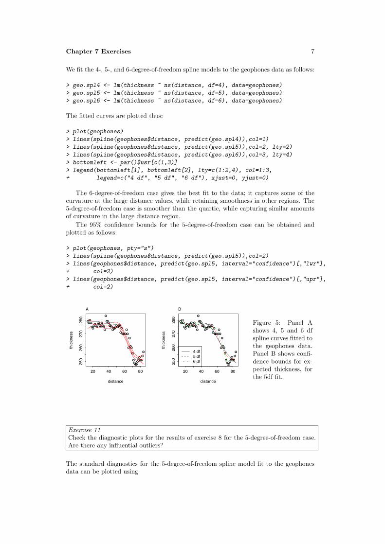
Chapter 7 Exercises 7
We fit the 4-, 5-, and 6-degree-of-freedom spline models to the geophones data as follows:
> geo.spl4 <- lm(thickness ~ ns(distance, df=4), data=geophones)
> geo.spl5 <- lm(thickness ~ ns(distance, df=5), data=geophones)
> geo.spl6 <- lm(thickness ~ ns(distance, df=6), data=geophones)
The fitted curves are plotted thus:
> plot(geophones)
> lines(spline(geophones$distance, predict(geo.spl4)),col=1)
> lines(spline(geophones$distance, predict(geo.spl5)),col=2, lty=2)
> lines(spline(geophones$distance, predict(geo.spl6)),col=3, lty=4)
> bottomleft <- par()$usr[c(1,3)]
> legend(bottomleft[1], bottomleft[2], lty=c(1:2,4), col=1:3,
+ legend=c("4 df", "5 df", "6 df"), xjust=0, yjust=0)
The 6-degree-of-freedom case gives the best fit to the data; it captures some of thecurvature at the large distance values, while retaining smoothness in other regions. The5-degree-of-freedom case is smoother than the quartic, while capturing similar amountsof curvature in the large distance region.
The 95% confidence bounds for the 5-degree-of-freedom case can be obtained andplotted as follows:
> plot(geophones, pty="s")
> lines(spline(geophones$distance, predict(geo.spl5)),col=2)
> lines(geophones$distance, predict(geo.spl5, interval="confidence")[,"lwr"],
+ col=2)
> lines(geophones$distance, predict(geo.spl5, interval="confidence")[,"upr"],
+ col=2)
●●●●
●●●●●●●●●●●●●●
●
●●●●●●●●●●●●●●
●
●
●●●
●
●
●
●
●●
●
●●●●●●●●●
●
●
20 40 60 80
250
260
270
280
distance
thickness
A
●●●●
●●●●●●●●●●●●●●
●
●●●●●●●●●●●●●●
●
●
●●●
●
●
●
●
●●
●
●●●●●●●●●
●
●
20 40 60 80
250
260
270
280
distance
thic
knes
s
4 df5 df6 df
B
Figure 5: Panel Ashows 4, 5 and 6 dfspline curves fitted tothe geophones data.Panel B shows confi-dence bounds for ex-pected thickness, forthe 5df fit.
Exercise 11Check the diagnostic plots for the results of exercise 8 for the 5-degree-of-freedom case.Are there any influential outliers?
The standard diagnostics for the 5-degree-of-freedom spline model fit to the geophonesdata can be plotted using

8
> par(mfrow=c(1,4))
> plot(geo.spl5)
> par(mfrow=c(1,1))
255 260 265 270 275
−50
5
Fitted values
Res
idua
ls
●
●
●
●
●
●
●
●
●
●
●
●
●●
●
●
●
●
●
●●
●
●●
●
●
●●
●
●
●
●●
●
●
●
●
●
●
●
●
●
●●
●
●
●●
●
●
●
●
●●
●
●
Residuals vs Fitted39 19
42
●
●
●
●
●
●
●
●
●
●
●
●
●●
●
●
●
●
●
●●
●
●●
●
●
●●
●
●
●
●●
●
●
●
●
●
●
●
●
●
●●
●
●
●●
●
●
●
●
●●
●
●
−2 −1 0 1 2
−10
12
3
Theoretical QuantilesSt
anda
rdize
d re
sidu
als
Normal Q−Q3919
42
255 260 265 270 275
0.0
0.5
1.0
1.5
Fitted values
Stan
dard
ized
resi
dual
s
●
●
●
●
●
●
●
●
●
●
●
●
●●
●
●
●
●
●
●●
●
●
●
●
●
●●
●
●
●
●
●
●
●
●
●
●
●
●
●
●
●
●
●
●
●●
●
●
●●●●
●
●
Scale−Location39 19
42
0.00 0.10 0.20 0.30
−2−1
01
23
Leverage
Stan
dard
ized
resi
dual
s
●
●
●
●
●
●
●
●
●
●
●
●
●●
●
●
●
●
●
●●
●
●●
●
●
●●
●
●
●
●●
●
●
●
●
●
●
●
●
●
●●
●
●
●●
●
●
●
●
● ●
●
●
Cook's distance
0.5
Residuals vs Leverage
57
1939
Figure 6: Diagnostic plots for 5df spline model.
There are no extreme outliers. Observation 19 is a mild outlier which exerts moderateinfluence. This should not be of major concern. The plot of the residuals versus the fittedvalues does indicate that some of the nonlinearity has not been satisfactorily modeled.
Exercise 12Continuing to refer to exercise 8, obtain plots of the spline basis curves for the 5-degree-of-freedom case. That is, plot the relevant column of the model matrix against y.
The first basis function is a constant, to include an intercept in the model. (Note thatthis implies that there are actually 6 degrees of freedom in the model.) The remainingbasis functions are plotted as follows:
> X5 <- model.matrix(geo.spl5)
> plot(X5[,2] ~ geophones$distance, type="l")
> lines(X5[,3] ~ geophones$distance, col=3)
> lines(X5[,4] ~ geophones$distance, col=4)
> lines(X5[,5] ~ geophones$distance, col=5)
> lines(X5[,6] ~ geophones$distance, col=6)
20 40 60 80
0.0
0.2
0.4
0.6
geophones$distance
X5[,
2]
Figure 7: Spline basis func-tions.
We could also use matplot() for this problem.
matplot(geophones$distance, X5[,-1], type="l")
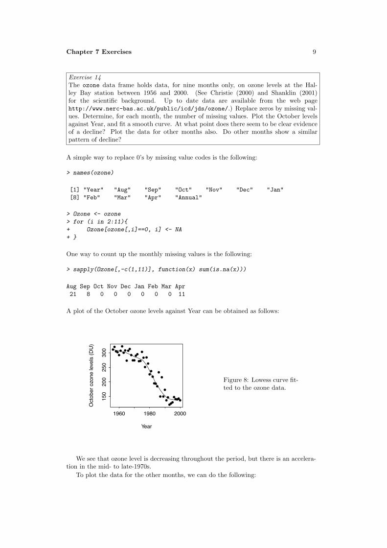
Chapter 7 Exercises 9
Exercise 14The ozone data frame holds data, for nine months only, on ozone levels at the Hal-ley Bay station between 1956 and 2000. (See Christie (2000) and Shanklin (2001)for the scientific background. Up to date data are available from the web pagehttp://www.nerc-bas.ac.uk/public/icd/jds/ozone/.) Replace zeros by missing val-ues. Determine, for each month, the number of missing values. Plot the October levelsagainst Year, and fit a smooth curve. At what point does there seem to be clear evidenceof a decline? Plot the data for other months also. Do other months show a similarpattern of decline?
A simple way to replace 0’s by missing value codes is the following:
> names(ozone)
[1] "Year" "Aug" "Sep" "Oct" "Nov" "Dec" "Jan"
[8] "Feb" "Mar" "Apr" "Annual"
> Ozone <- ozone
> for (i in 2:11){
+ Ozone[ozone[,i]==0, i] <- NA
+ }
One way to count up the monthly missing values is the following:
> sapply(Ozone[,-c(1,11)], function(x) sum(is.na(x)))
Aug Sep Oct Nov Dec Jan Feb Mar Apr
21 8 0 0 0 0 0 0 11
A plot of the October ozone levels against Year can be obtained as follows:
●●
●●●
●
●
●●
●
●●
●
●●
●●
●●
●
●
●
●
●
●●
●
●●●
●
●
●
●
●
●●
●●●
●●●●●
1960 1980 2000
150
200
250
300
Year
Oct
ober
ozo
ne le
vels
(DU
)
Figure 8: Lowess curve fit-ted to the ozone data.
We see that ozone level is decreasing throughout the period, but there is an accelera-tion in the mid- to late-1970s.
To plot the data for the other months, we can do the following:

10
Year
Ozone
150200250300350400
1960 1980 2000
● ●
●●●●●
●
●
●●●●●
●●●●●
●
●●●●
Aug
●●●
●●●●●●●
●●●●●●●●●●●●●
●●●●●●
●●●●●●●●
Sep
1960 1980 2000
●●●●●●●●●
●●●●●●●●●●●●●●●
●●●●●●
●
●
●
●●
●●●●●●●●●●
Oct
●●
●
●
●●
●●
●
●
●●●
●
●●●
●●●●●●●●●●●
●●
●
●
●
●
●●●●
●
●●●●●
●
Nov●●●
●
●●●●●●●●●●●●●●
●●●●●●●●●●●
●●●
●●
●
●●●●
●●●●●
●
Dec
150200250300350400
●●●●●●●●●●●●●●●●●●
●●●●●●●●●●●●●●●●●●●●●●
●●●●●
Jan150200250300350400
●●●●●●●●●●●●●●
●●●●●●●
●●●●●
●●●●●●
●●●●●●●
●●●●●●
Feb
1960 1980 2000
●●●●●●●●●●●●●●●
●●●●●●●●●
●●●●●●●●●●●
●●●●●●
●●●●
Mar
●●
●●●●
●●●
●
●
●●●●
●●●●
●●●●●●●●●●●●●●●
Apr
Figure 9: Change inozone levels over time,by month.
Similar declines are evident in several of the other months. The decline is less steepin some of the other months.
Exercise 18*∗Compare the two results
seedrates.lm <- lm(grain ~ rate + I(rate^2),
data=seedrates)
seedrates.pol <- lm(grain ~ poly(rate,2),
data=seedrates)
Check that the fitted values and residuals from the two calculations are the same, andthat the t-statistic and p-value are the same for the final coefficient, i.e., the same forthe coefficient labeled poly(rate, 2)2 in the polynomial regression as for the coefficientlabeled I(rate^2) in the regression on rate and rate^2.Regress the second column of model.matrix(seedrates.pol) on rate and I(rate^2),
and similarly for the third column of model.matrix(seedrates.pol). Hence express thefirst and second orthogonal polynomial terms as functions of rate and rate^2.
The following shows that the fitted values and residuals are the same for the two calcu-lations. The t-statistic and p-value are also the same for the final coefficient.
> seedrates.lm <- lm(grain ~ rate + I(rate^2), data=seedrates)
> seedrates.pol<- lm(grain ~ poly(rate, 2), data=seedrates)
> fitted(seedrates.lm)-fitted(seedrates.pol)
1 2 3 4 5
0 0 0 0 0
> resid(seedrates.lm)-resid(seedrates.pol)
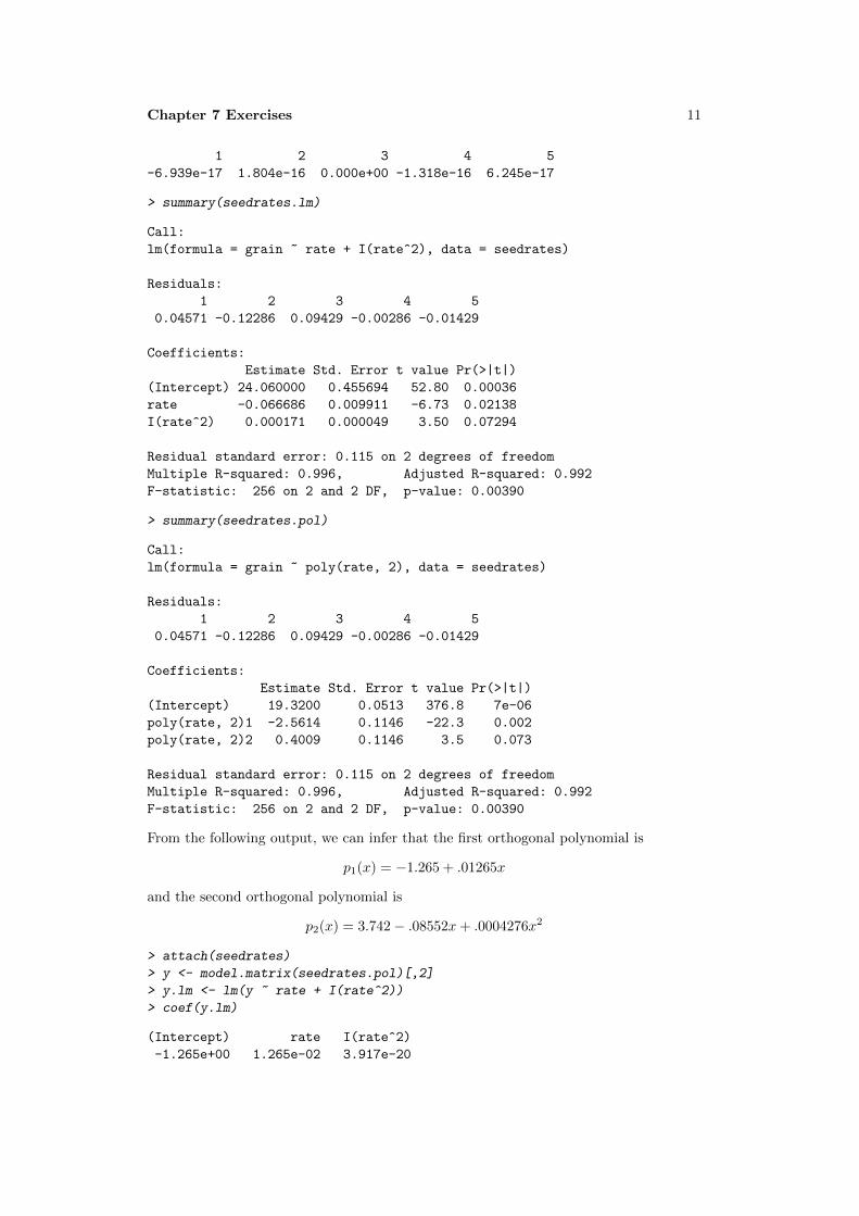
Chapter 7 Exercises 11
1 2 3 4 5
-6.939e-17 1.804e-16 0.000e+00 -1.318e-16 6.245e-17
> summary(seedrates.lm)
Call:
lm(formula = grain ~ rate + I(rate^2), data = seedrates)
Residuals:
1 2 3 4 5
0.04571 -0.12286 0.09429 -0.00286 -0.01429
Coefficients:
Estimate Std. Error t value Pr(>|t|)
(Intercept) 24.060000 0.455694 52.80 0.00036
rate -0.066686 0.009911 -6.73 0.02138
I(rate^2) 0.000171 0.000049 3.50 0.07294
Residual standard error: 0.115 on 2 degrees of freedom
Multiple R-squared: 0.996, Adjusted R-squared: 0.992
F-statistic: 256 on 2 and 2 DF, p-value: 0.00390
> summary(seedrates.pol)
Call:
lm(formula = grain ~ poly(rate, 2), data = seedrates)
Residuals:
1 2 3 4 5
0.04571 -0.12286 0.09429 -0.00286 -0.01429
Coefficients:
Estimate Std. Error t value Pr(>|t|)
(Intercept) 19.3200 0.0513 376.8 7e-06
poly(rate, 2)1 -2.5614 0.1146 -22.3 0.002
poly(rate, 2)2 0.4009 0.1146 3.5 0.073
Residual standard error: 0.115 on 2 degrees of freedom
Multiple R-squared: 0.996, Adjusted R-squared: 0.992
F-statistic: 256 on 2 and 2 DF, p-value: 0.00390
From the following output, we can infer that the first orthogonal polynomial is
p1(x) = −1.265 + .01265x
and the second orthogonal polynomial is
p2(x) = 3.742− .08552x+ .0004276x2
> attach(seedrates)
> y <- model.matrix(seedrates.pol)[,2]
> y.lm <- lm(y ~ rate + I(rate^2))
> coef(y.lm)
(Intercept) rate I(rate^2)
-1.265e+00 1.265e-02 3.917e-20

12
> y <- model.matrix(seedrates.pol)[,3]
> y.lm <- lm(y ~ rate + I(rate^2))
> coef(y.lm)
(Intercept) rate I(rate^2)
3.7416574 -0.0855236 0.0004276
Among other things, the polynomials given above have the property that
p1(50)p2(50) + p1(75)p2(75) + p1(100)p2(100) + p1(125)p2(125) + p1(150)p2(150)
since the values of the predictor are:
> rate
[1] 50 75 100 125 150
> detach(seedrates)

Chapter 8 Exercises 1
Data Analysis & Graphics Using R – Solutions to Exercises (May 1, 2010)
Preliminaries
> library(DAAG)
Exercise 1The following table shows numbers of occasions when inhibition (i.e., no flow of currentacross a membrane) occurred within 120 s, for different concentrations of the proteinpeptide-C (data are used with the permission of Claudia Haarmann, who obtained thesedata in the course of her PhD research). The outcome yes implies that inhibition hasoccurred.
conc 0.1 0.5 1 10 20 30 50 70 80 100 150no 7 1 10 9 2 9 13 1 1 4 3yes 0 0 3 4 0 6 7 0 0 1 7
Use logistic regression to model the probability of inhibition as a function of proteinconcentration.
It is useful to begin by plotting the logit of the observed proportions against log(conc).Concentrations are nearer to equally spaced on a scale of relative dose, rather than on ascale of dose, suggesting that it might be appropriate to work with log(conc). In orderto allow plotting of cases where no = 0 or yes = 0, we add 0.5 to each count.
●
● ●
●
●
●●
●●●
●
−2 0 2 4
−2.5
−1.5
−0.5
0.5
log(conc)
log(
(yes
+ 0
.5)/(
no +
0.5
)) Figure 1: Plot of log((yes+0.5)/(no+0.5)), againstlog(conc).
> conc <- c(.1, .5, 1, 10, 20, 30,+ 50, 70, 80, 100, 150)> no <- c(7, 1, 10, 9, 2, 9, 13, 1, 1, 4, 3)> yes <- c(0, 0, 3, 4, 0, 6, 7, 0, 0, 1 ,7)> n <- no + yes> plot(log(conc), log((yes+0.5)/(no+0.5)))
The plot seems consistent with the use of log(conc) as the explanatory variable.The code for the regression is:
> p <- yes/n> inhibit.glm <- glm(p ~ I(log(conc)), family=binomial, weights=n)> summary(inhibit.glm)
Call:glm(formula = p ~ I(log(conc)), family = binomial, weights = n)
Deviance Residuals:Min 1Q Median 3Q Max
-1.251 -1.060 -0.503 0.315 1.351

2
Coefficients:Estimate Std. Error z value Pr(>|z|)
(Intercept) -1.766 0.521 -3.39 0.0007I(log(conc)) 0.344 0.144 2.39 0.0170
(Dispersion parameter for binomial family taken to be 1)
Null deviance: 16.6834 on 10 degrees of freedomResidual deviance: 9.3947 on 9 degrees of freedomAIC: 29.99
Number of Fisher Scoring iterations: 4
Exercise 2In the data set (an artificial one of 3121 patients, that is similar to a subset of the dataanalyzed in Stiell et al. (2001)) minor.head.injury, obtain a logistic regression modelrelatingclinically.important.brain.injury to other variables. Patients whose risk is suffi-ciently high will be sent for CT (computed tomography). Using a risk threshold of 0.025(2.5%), turn the result into a decision rule for use of CT.
> sapply(head.injury, range)
age.65 amnesia.before basal.skull.fracture GCS.decrease GCS.13[1,] 0 0 0 0 0[2,] 1 1 1 1 1
GCS.15.2hours high.risk loss.of.consciousness[1,] 0 0 0[2,] 1 1 1
open.skull.fracture vomiting clinically.important.brain.injury[1,] 0 0 0[2,] 1 1 1
> injury.glm <- glm(clinically.important.brain.injury ~ .,+ data=head.injury, family=binomial)> summary(injury.glm)
Call:glm(formula = clinically.important.brain.injury ~ ., family = binomial,
data = head.injury)
Deviance Residuals:Min 1Q Median 3Q Max
-2.277 -0.351 -0.210 -0.149 3.003
Coefficients:Estimate Std. Error z value Pr(>|z|)
(Intercept) -4.497 0.163 -27.61 < 2e-16age.65 1.373 0.183 7.52 5.6e-14amnesia.before 0.689 0.172 4.00 6.4e-05basal.skull.fracture 1.962 0.206 9.50 < 2e-16GCS.decrease -0.269 0.368 -0.73 0.46515

Chapter 8 Exercises 3
GCS.13 1.061 0.282 3.76 0.00017GCS.15.2hours 1.941 0.166 11.67 < 2e-16high.risk 1.111 0.159 6.98 2.9e-12loss.of.consciousness 0.955 0.196 4.88 1.1e-06open.skull.fracture 0.630 0.315 2.00 0.04542vomiting 1.233 0.196 6.29 3.2e-10
(Dispersion parameter for binomial family taken to be 1)
Null deviance: 1741.6 on 3120 degrees of freedomResidual deviance: 1201.3 on 3110 degrees of freedomAIC: 1223
Number of Fisher Scoring iterations: 6
Observe that log(.025/(1-.025)) = -3.66, an increase of 0.84 above the intercept (= -4.50). This change in risk results from (1) GCS.decrease with any other individual factorexcept amnesia.before, GCS.decrease and open.skull.fracture; (2) GCS.decreasewith any two of amnesia.before, open.skull.fracture and loss.of.consciousness;(3) any of the individual factors age.65, basal.skull.fracture, GCS.15.2hours, high.riskand vomiting, irrespective of the levels of other factors.
Exercise 3Consider again the moths data set of Section 8.4.
(a) What happens to the standard error estimates when the poisson family is used inglm() instead of the quasipoisson family?
(b) Analyze the P moths, in the same way as the A moths were analyzed. Comment onthe effect of transect length.
(a) The dispersion estimate was 2.69. Use of the quasipoisson family has the effectof increasing SEs by a factor of
√2.69, relative to the poisson family. See the first
two lines on p.215. SEs on pp.214-215 will thus be reduced by this factor if thepoisson family is (inappropriately) specified.
(b) > sapply(split(moths$P, moths$habitat), sum)
Bank Disturbed Lowerside NEsoak NWsoak SEsoak4 33 17 14 19 6
SWsoak Upperside48 8
> moths$habitat <- relevel(moths$habitat, ref="Lowerside")> P.glm <- glm(P ~ habitat + log(meters), family=quasipoisson,+ data=moths)
The highest numbers are now for SWsoak and for Disturbed The number of mothsincreases with transect length, by a factor of approximately 1.74 (= e.55) for eachone meter increase in transect length.

4
Exercise 4*The factor dead in the data set mifem (DAAG package) gives the mortality outcomes(live or dead), for 1295 female subjects who suffered a myocardial infarction. (SeeSection 11.5 for further details.) Determine ranges for age and yronset (year of onset),and determine tables of counts for each separate factor. Decide how to handle casesfor which the outome, for one or more factors, is not known. Fit a logistic regressionmodel, beginning by comparing the model that includes all two-factor interactions withthe model that has main effects only.
First, examine various summary information:
> str(mifem)
'data.frame': 1295 obs. of 10 variables:$ outcome : Factor w/ 2 levels "live","dead": 1 1 1 1 2 1 1 2 2 2 ...$ age : num 63 55 68 64 67 66 63 68 46 66 ...$ yronset : num 85 85 85 85 85 85 85 85 85 85 ...$ premi : Factor w/ 3 levels "y","n","nk": 2 2 1 2 2 2 2 1 2 1 ...$ smstat : Factor w/ 4 levels "c","x","n","nk": 2 1 4 2 4 2 3 3 1 1 ...$ diabetes: Factor w/ 3 levels "y","n","nk": 2 2 3 2 3 3 2 2 2 2 ...$ highbp : Factor w/ 3 levels "y","n","nk": 1 1 1 1 3 3 1 1 1 1 ...$ hichol : Factor w/ 3 levels "y","n","nk": 1 1 3 2 3 3 2 1 3 2 ...$ angina : Factor w/ 3 levels "y","n","nk": 2 2 1 1 3 3 2 1 3 2 ...$ stroke : Factor w/ 3 levels "y","n","nk": 2 2 2 2 3 3 2 1 2 1 ...
> sapply(mifem[, c("age", "yronset")], range)
age yronset[1,] 35 85[2,] 69 93
> lapply(mifem[, -(1:3)], table)
$premi
y n nk311 928 56
$smstat
c x n nk390 280 522 103
$diabetes
y n nk248 978 69
$highbp
y n nk813 406 76

Chapter 8 Exercises 5
$hichol
y n nk452 655 188
$angina
y n nk472 724 99
$stroke
y n nk153 1063 79
For all of the factors, there are a large number of nk’s, i.e., not known. A straightforwardway to handle them is to treat nk as a factor level that, as for y and n, may giveinformation that helps predict the outcome. For ease of interpretation we will make n,the reference level.
> for(j in 4:10)mifem[,j] <- relevel(mifem[,j], ref="n")> mifem1.glm <- glm(outcome ~ ., family=binomial, data=mifem)> mifem2.glm <- glm(outcome ~ .^2, family=binomial, data=mifem)> anova(mifem1.glm, mifem2.glm)
Analysis of Deviance Table
Model 1: outcome ~ age + yronset + premi + smstat + diabetes + highbp +hichol + angina + stroke
Model 2: outcome ~ (age + yronset + premi + smstat + diabetes + highbp +hichol + angina + stroke)^2
Resid. Df Resid. Dev Df Deviance1 1277 11732 1152 1014 125 159
> CVbinary(mifem1.glm)
Fold: 6 10 9 5 2 7 1 4 8 3Internal estimate of accuracy = 0.807Cross-validation estimate of accuracy = 0.803
> CVbinary(mifem2.glm)
Fold: 2 1 8 7 9 10 6 5 4 3Internal estimate of accuracy = 0.839Cross-validation estimate of accuracy = 0.775
The difference in deviance seems statistically significant (pchisq(125,159) = 0.021),but it may be unwise to trust the chi-squared approximation to the change in deviance.
It is safer to compare the cross-validated accuracy estimates, which in individualcross-validation runs were marginally lower for mifem2.glm than for mifem2.glm; 0.78 asagainst 0.80. Note also that there were convergence problems for the model that includedall first order interaction terms.

Chapter 9 Exercises 1
Data Analysis & Graphics Using R, 3rd
edn – Solutions to Exercises (April 29, 2010)
Preliminaries
> library(DAAG)
Exercise 1A time series of length 100 is obtained from an AR(1) model with σ = 1 and α = −.5. What
is the standard error of the mean? If the usual σ/√n formula were used in constructing a
confidence interval for the mean, with σ defined as in Section 9.1.3, would it be too narrow
or too wide?
If we know σ, then the usual σ/√n formula will give an error that is too narrow; refer
back to Subsection 9.1.3 on pp. 288-289.
The need to estimate σ raises an additional complication. If σ is estimated by fitting
a time series model, e.g., using the function ar(), this estimate of σ can be plugged into
the formula in Subsection 9.1.3. The note that now follows covers the case where σ2is
estimated using the formula
σ2 =
�(Xi − X)
2
n− 1
The relevant theoretical results are not given in the text. Their derivation requires a
kmowledge of the algebra of expectations.
Note 1: We use the result (proved below)
E[(Xi − µ)2] = σ2/(1− α2) (1)
and that
E[
�(Xi − X)
2] =
1
1− α2(n− 1− α)σ2 � 1
1− α2(n− 1)σ2
(2)
Hence, if the variance is estimated from the usual formula σ2 =
�(Xi−X)2
n−1 , the standard
error of the mean will be too small by a factor of approximately
�1−α1+α .
Note 2: We square both sides of
Xt − µ = α(Xt−1 − µ) + εt
and take expectations. We have that
E[(Xt − µ)2] = (1− α2)E[(Xt − µ)2] + σ2
from which the result (eq.1) follows immediately. To derive E[�
(Xi− X)2], observe that
E[
�(Xi − X)
2] = E[(Xt − µ)2]− n(X − µ)2

2
Exercise 2Use the ar function to fit the second order autoregressive model to the Lake Huron time
series.
> ar(LakeHuron, order.max=2)
Call:ar(x = LakeHuron, order.max = 2)
Coefficients:1 2
1.054 -0.267
Order selected 2 sigma^2 estimated as 0.508
It might however be better not to specify the order, instead allowing the ar() function
to choose it, based on the AIC criterion. For this to be valid, it is best to specify also
method="mle". Fitting by maximum likelihood can for long series be very slow. It works
well in this instance.
> ar(LakeHuron, method="mle")
Call:ar(x = LakeHuron, method = "mle")
Coefficients:1 2
1.044 -0.250
Order selected 2 sigma^2 estimated as 0.479
The AIC criterion chooses the order equal to 2.
Exercise 3Repeat the analysis of Section 9.2, replacing avrain by: (i) southRain, i.e., annual averagerainfall in Southern Australia; (ii) northRain, i.e., annual average rainfall in Northern
Australia.
The following functions may be used to automate these calculations. First, here is a
function that gives the time series plots.
> bomts <-+ function(rain="NTrain"){+ plot(ts(bomsoi[, c(rain, "SOI")], start=1900),+ panel=function(y,...)panel.smooth(bomsoi$Year, y,...)) }
Next, here is a function that automates the calculations and resulting plots, for the
analysis used for all-Australian rainfall data. The parameter choices may for some areas
need to be varied, but output from this function should be a good start.
> bomplots <-+ function(loc="NTrain"){+ oldpar <- par(fig=c(0,0.5,0.5,1), mar=c(3.6,3.6,1.6,0.6), mgp=c(2.25,.5,0))

Chapter 9 Exercises 3
+ on.exit(par(oldpar))+ rain <- bomsoi[, loc]+ xbomsoi <-+ with(bomsoi, data.frame(SOI=SOI, cuberootRain=rain^0.33))+ xbomsoi$trendSOI <- lowess(xbomsoi$SOI)$y+ xbomsoi$trendRain <- lowess(xbomsoi$cuberootRain)$y+ rainpos <- pretty(rain, 5)+ par(fig=c(0,0.5,0.5,1), new=TRUE)+ with(xbomsoi,+ {plot(cuberootRain ~ SOI, xlab = "SOI",+ ylab = "Rainfall (cube root scale)", yaxt="n")+ axis(2, at = rainpos^0.33, labels=paste(rainpos))+ ## Relative changes in the two trend curves+ lines(lowess(cuberootRain ~ SOI))+ lines(lowess(trendRain ~ trendSOI), lwd=2, col="gray40")+ })+ xbomsoi$detrendRain <-+ with(xbomsoi, cuberootRain - trendRain + mean(trendRain))+ xbomsoi$detrendSOI <-+ with(xbomsoi, SOI - trendSOI + mean(trendSOI))+ par(fig=c(.5,1,.5,1),new=TRUE)+ plot(detrendRain ~ detrendSOI, data = xbomsoi,+ xlab="Detrended SOI", ylab = "Detrended rainfall", yaxt="n")+ axis(2, at = rainpos^0.33, labels=paste(rainpos))+ with(xbomsoi, lines(lowess(detrendRain ~ detrendSOI)))+ attach(xbomsoi)+ xbomsoi.ma12 <- arima(detrendRain, xreg=detrendSOI,+ order=c(0,0,12))+ xbomsoi.ma12s <- arima(detrendRain, xreg=detrendSOI,+ seasonal=list(order=c(0,0,1), period=12))+ print(xbomsoi.ma12)+ print(xbomsoi.ma12s)+ par(fig=c(0,0.5,0,0.5), new=TRUE)+ acf(resid(xbomsoi.ma12))+ par(fig=c(0.5,1,0,0.5), new=TRUE)+ pacf(resid(xbomsoi.ma12))+ par(oldpar)+ detach(xbomsoi)+ }
Data for further regions of Australia are available from the websites noted on the help
page for bomsoi.
Exercise 4In the calculation
Box.test(resid(lm(detrendRain ~ detrendSOI, data = xbomsoi)),type="Ljung-Box", lag=20)
try the test with lag set to values of 1 (the default), 5, 20, 25 and 30. Comment on the
different results.
The calculation for a lag of 20 was given on page 296. Here are the results for the other
suggested lags:

4
> if(!exists("xbomsoi"))+ {xbomsoi <-+ with(bomsoi, data.frame(SOI=SOI, cuberootRain=avrain^0.33))+ xbomsoi$trendSOI <- lowess(xbomsoi$SOI)$y+ xbomsoi$trendRain <- lowess(xbomsoi$cuberootRain)$y}> xbomsoi$detrendRain <-+ with(xbomsoi, cuberootRain - trendRain + mean(trendRain))> xbomsoi$detrendSOI <-+ with(xbomsoi, SOI - trendSOI + mean(trendSOI))> Box.test(resid(lm(detrendRain ~ detrendSOI, data = xbomsoi)),+ type="Ljung-Box", lag=15)
Box-Ljung test
data: resid(lm(detrendRain ~ detrendSOI, data = xbomsoi))X-squared = 32.86, df = 15, p-value = 0.004905
> Box.test(resid(lm(detrendRain ~ detrendSOI, data = xbomsoi)),+ type="Ljung-Box", lag=25)
Box-Ljung test
data: resid(lm(detrendRain ~ detrendSOI, data = xbomsoi))X-squared = 38.44, df = 25, p-value = 0.04192
> Box.test(resid(lm(detrendRain ~ detrendSOI, data = xbomsoi)),+ type="Ljung-Box", lag=30)
Box-Ljung test
data: resid(lm(detrendRain ~ detrendSOI, data = xbomsoi))X-squared = 46.41, df = 30, p-value = 0.02836
The p-values are:
n=15 n=20 n=25 n=300.005 0.023 0.042 0.028
Notice that the indication of sequential correlation is much stronger for n=15 than for
larger values of n. As the number of possibilities that are canvassed increases (a greater
number of lags at which there may be autocorrelations) the probability of detection of
autocorrelation decreases.The small p-value for n=30 may thus seem surprising.

Chapter 10 Exercises 1
Data Analysis & Graphics Using R, 3rd edn – Solutions to Exercises (May 1, 2010)
Preliminaries
> library(lme4)
> library(DAAG)
The final two sentences of Exercise 1 are challenging! Exercises 1 & 2 should be asterisked.
Exercise 1Repeat the calculations of Subsection 2.3.5, but omitting results from two vines at random.Here is code that will handle the calculation:
n.omit <- 2
take <- rep(TRUE, 48)
take[sample(1:48,2)] <- FALSE
kiwishade.lmer <- lmer(yield ~ shade + (1|block) + (1|block:plot),
data = kiwishade,subset=take)
vcov <- show(VarCorr(kiwishade.lmer))
gps <- vcov[, "Groups"]
print(vcov[gps=="block:plot", "Variance"])
print(vcov[gps=="Residual", "Variance"])
Repeat this calculation five times, for each of n.omit = 2, 4, 6, 8, 10, 12 and 14. Plot (i)the plot component of variance and (ii) the vine component of variance, against numberof points omitted. Based on these results, for what value of n.omit does the loss of vinesbegin to compromise results? Which of the two components of variance estimates is moredamaged by the loss of observations? Comment on why this is to be expected.
For convenience, we place the central part of the calculation in a function. On slowmachines, the code may take a minute or two to run.
> trashvine <- function(n.omit=2)
+ {
+ k <- k+1
+ n[k] <- n.omit
+ take <- rep(T, 48)
+ take[sample(1:48, n.omit)] <- F
+ kiwishade$take <- take
+ kiwishade.lmer <- lmer(yield ~ shade + (1 | block) + (1|block:plot),
+ data = kiwishade, subset=take)
+ varv <- as.numeric(attr(VarCorr(kiwishade.lmer), "sc")^2)
+ varp <- as.numeric(VarCorr(kiwishade.lmer)$�block:plot�)+ c(varp, varv)
+ }
> varp <- numeric(35)
> varv <- numeric(35)
> n <- numeric(35)
> k <- 0
> for(n.omit in c( 2, 4, 6, 8, 10, 12, 14))
+ for(i in 1:5){
+ k <- k+1
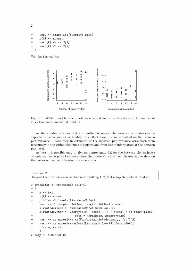
2
+ vec2 <- trashvine(n.omit=n.omit)
+ n[k] <- n.omit
+ varp[k] <- vec2[1]
+ varv[k] <- vec2[2]
+ }
We plot the results:
●●●●
●
●
●
●●●
●
●
●
●
●
●
●
●
●
●
●
●
●
●
●
●
●
●
●
●
●●
●
●
●
2 4 6 8 10 12 14
910
1112
1314
Number of vines omitted
With
in p
lots
var
ianc
e es
timat
e
●●
●
●
●
●
●
●●●
●
●●
●
●
●
●●
●
●
●
●
●
●
●
●
●
●
●
● ●
●
●
●
●
2 4 6 8 10 12 140
24
68
Number of vines omitted
Betw
een
plot
s va
rianc
e es
timat
e
Figure 1: Within, and between plots variance estimates, as functions of the number ofvines that were omitted at random
As the number of vines that are omitted increases, the variance estimates can beexpected to show greater variability. The effect should be most evident on the betweenplot variance. Inaccuracy in estimates of the between plot variance arise both frominaccuracy in the within plot sums of squares and from loss of information at the betweenplot level.
At best it is possible only to give an approximate d.f. for the between plot estimateof variance (some plots lose more vines than others), which complicates any evaluationthat relies on degree of freedom considerations.
Exercise 2Repeat the previous exercise, but now omitting 1, 2, 3, 4 complete plots at random.
> trashplot <- function(n.omit=2)
+ {
+ k <- k+1
+ n[k] <- n.omit
+ plotlev <- levels(kiwishade$plot)
+ use.lev <- sample(plotlev, length(plotlev)-n.omit)
+ kiwishade$take <- kiwishade$plot %in% use.lev
+ kiwishade.lmer <- lmer(yield ~ shade + (1 | block) + (1|block:plot),
+ data = kiwishade, subset=take)
+ varv <- as.numeric(attr(VarCorr(kiwishade.lmer), "sc")^2)
+ varp <- as.numeric(VarCorr(kiwishade.lmer)$�block:plot�)+ c(varp, varv)
+ }
> varp <- numeric(20)
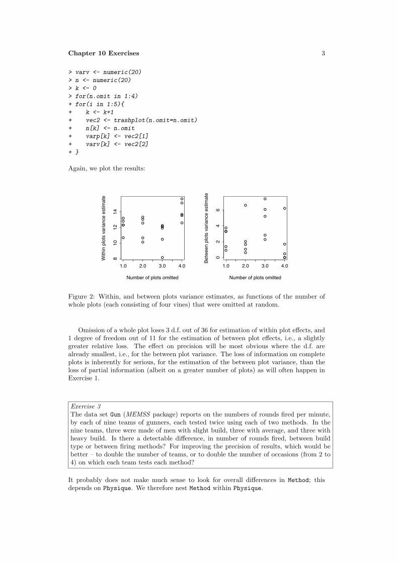
Chapter 10 Exercises 3
> varv <- numeric(20)
> n <- numeric(20)
> k <- 0
> for(n.omit in 1:4)
+ for(i in 1:5){
+ k <- k+1
+ vec2 <- trashplot(n.omit=n.omit)
+ n[k] <- n.omit
+ varp[k] <- vec2[1]
+ varv[k] <- vec2[2]
+ }
Again, we plot the results:
●
●
●
●
●
●
●
●●
●●
●●
●
●
●
●
●
●
●
1.0 2.0 3.0 4.0
810
1214
Number of plots omitted
With
in p
lots
var
ianc
e es
timat
e
●
●
●
●
●
●
●
●●
●
●
●
●
●
●
●
●
●
●
●
1.0 2.0 3.0 4.0
02
46
Number of plots omitted
Betw
een
plot
s va
rianc
e es
timat
e
Figure 2: Within, and between plots variance estimates, as functions of the number ofwhole plots (each consisting of four vines) that were omitted at random.
Omission of a whole plot loses 3 d.f. out of 36 for estimation of within plot effects, and1 degree of freedom out of 11 for the estimation of between plot effects, i.e., a slightlygreater relative loss. The effect on precision will be most obvious where the d.f. arealready smallest, i.e., for the between plot variance. The loss of information on completeplots is inherently for serious, for the estimation of the between plot variance, than theloss of partial information (albeit on a greater number of plots) as will often happen inExercise 1.
Exercise 3The data set Gun (MEMSS package) reports on the numbers of rounds fired per minute,by each of nine teams of gunners, each tested twice using each of two methods. In thenine teams, three were made of men with slight build, three with average, and three withheavy build. Is there a detectable difference, in number of rounds fired, between buildtype or between firing methods? For improving the precision of results, which would bebetter – to double the number of teams, or to double the number of occasions (from 2 to4) on which each team tests each method?
It probably does not make much sense to look for overall differences in Method; thisdepends on Physique. We therefore nest Method within Physique.

4
> library(MEMSS)
> Gun.lmer <- lmer(rounds~Physique/Method +(1|Team), data=Gun)
> summary(Gun.lmer)
Linear mixed model fit by REML
Formula: rounds ~ Physique/Method + (1 | Team)
Data: Gun
AIC BIC logLik deviance REMLdev
143 156 -63.5 134 127
Random effects:
Groups Name Variance Std.Dev.
Team (Intercept) 1.09 1.04
Residual 2.18 1.48
Number of obs: 36, groups: Team, 9
Fixed effects:
Estimate Std. Error t value
(Intercept) 23.589 0.492 47.9
Physique.L -0.966 0.853 -1.1
Physique.Q 0.191 0.853 0.2
PhysiqueSlight:MethodM2 -8.450 0.852 -9.9
PhysiqueAverage:MethodM2 -8.100 0.852 -9.5
PhysiqueHeavy:MethodM2 -8.983 0.852 -10.5
Correlation of Fixed Effects:
(Intr) Phys.L Phys.Q PS:MM2 PA:MM2
Physique.L 0.000
Physique.Q 0.000 0.000
PhysqSl:MM2 -0.289 0.353 -0.204
PhysqAv:MM2 -0.289 0.000 0.408 0.000
PhysqHv:MM2 -0.289 -0.353 -0.204 0.000 0.000
A good way to proceed is to determine the fitted values, and present these in an interactionplot:
> Gun.hat <- fitted(Gun.lmer)
> interaction.plot(Gun$Physique, Gun$Method, Gun.hat)
Differences between methods, for each of the three physiques, are strongly attested. Thesecan be estimated within teams, allowing 24 degrees of freedom for each of these compar-isons.
Clear patterns of change with Physique seem apparent in the plot. There are howevertoo few degrees of freedom for this effect to appear statistically significant. Note howeverthat the parameters that are given are for the lowest level of Method, i.e., for M1. MakingM2 the baseline shows the effect as closer to the conventional 5% significance level.
The component of variance at the between teams level is of the same order of mag-nitude as the within teams component. Its contribution to the variance of team means(1.0442) is much greater than the contribution of the within team component (1.4762/4;there are 4 results per team). If comparison between physiques is the concern; it willbe much more effective to double the number of teams; compare (1.0442+1.4762/4)/2(=0.82) with 1.0442+1.4762/8 (=1.36).

Chapter 10 Exercises 5
Exercise 4*The data set ergoStool (MEMSS package) has data on the amount of effort needed toget up from a stool, for each of nine individuals who each tried four different types ofstool. Analyse the data both using aov() and using lme(), and reconcile the two sets ofoutput. Was there any clear winner among the types of stool, if the aim is to keep effortto a minimum?
For analysis of variance, specify
> aov(effort~Type+Error(Subject), data=ergoStool)
Call:
aov(formula = effort ~ Type + Error(Subject), data = ergoStool)
Grand Mean: 10.25
Stratum 1: Subject
Terms:
Residuals
Sum of Squares 66.5
Deg. of Freedom 8
Residual standard error: 2.883
Stratum 2: Within
Terms:
Type Residuals
Sum of Squares 81.19 29.06
Deg. of Freedom 3 24
Residual standard error: 1.100
Estimated effects may be unbalanced
For testing the Type effect for statistical significance, refer (81.19/3)/(29.06/24) (=22.35)with the F3,24 distribution. The effect is highly significant.
This is about as far as it is possible to go with analysis of variance calculations. WhenError() is specified in the aov model, R has no mechanism for extracting estimates.(There are mildly tortuous ways to extract the information, which will not be furtherdiscussed here.)
For use of lmer, specify
> summary(lmer(effort~Type + (1|Subject), data=ergoStool))
Linear mixed model fit by REML
Formula: effort ~ Type + (1 | Subject)
Data: ergoStool
AIC BIC logLik deviance REMLdev
133 143 -60.6 122 121
Random effects:
Groups Name Variance Std.Dev.
Subject (Intercept) 1.78 1.33
Residual 1.21 1.10
Number of obs: 36, groups: Subject, 9

6
Fixed effects:
Estimate Std. Error t value
(Intercept) 8.556 0.576 14.85
TypeT2 3.889 0.519 7.50
TypeT3 2.222 0.519 4.28
TypeT4 0.667 0.519 1.29
Correlation of Fixed Effects:
(Intr) TypeT2 TypeT3
TypeT2 -0.450
TypeT3 -0.450 0.500
TypeT4 -0.450 0.500 0.500
Observe that 1.1002952 (Residual StdDev) is very nearly equal to 29.06/24 obtained fromthe analysis of variance calculation.
Also the Stratum 1 mean square of 66.5/8 (=8.3125) from the analysis of varianceoutput is very nearly equal to 1.33252 +1.1002952/4 (= 2.078) from the lme output.
Exercise 5*In the data set MathAchieve (MEMSS package), the factors Minority (levels yes and no)and sex, and the variable SES (socio-economic status) are clearly fixed effects. Discusshow the decision whether to treat School as a fixed or as a random effect might dependon the purpose of the study? Carry out an analysis that treats School as a random effect.Are differences between schools greater than can be explained by within school variation?
School should be treated as a random effect if the intention is to generalize results toother comparable schools. If the intention is to apply them to other pupils or classesswithin those same schools, it should be taken as a fixed effect.
For the analysis of these data, both SES and MEANSES should be included in themodel. Then the coefficient of MEANSES will measure between school effects, while thecoefficient of SES will measure within school effects.
> library(MEMSS)
> MathAch.lmer <- lmer(MathAch ~ Minority*Sex*(MEANSES+SES) + (1|School),
+ data=MathAchieve)
> options(width=90)
> MathAch.lmer
Linear mixed model fit by REMLFormula: MathAch ~ Minority * Sex * (MEANSES + SES) + (1 | School)
Data: MathAchieveAIC BIC logLik deviance REMLdev
46344 46441 -23158 46308 46316Random effects:Groups Name Variance Std.Dev.School (Intercept) 2.51 1.58Residual 35.79 5.98Number of obs: 7185, groups: School, 160
Fixed effects:Estimate Std. Error t value
(Intercept) 12.799 0.179 71.4MinorityYes -2.605 0.279 -9.3

Chapter 10 Exercises 7
SexMale 1.277 0.186 6.9MEANSES 2.237 0.504 4.4SES 2.508 0.185 13.5MinorityYes:SexMale -0.462 0.376 -1.2MinorityYes:MEANSES 1.439 0.684 2.1MinorityYes:SES -1.101 0.319 -3.5SexMale:MEANSES 0.574 0.574 1.0SexMale:SES -0.517 0.264 -2.0MinorityYes:SexMale:MEANSES -0.713 0.903 -0.8MinorityYes:SexMale:SES 0.110 0.468 0.2
Correlation of Fixed Effects:(Intr) MnrtyY SexMal MEANSE SES MnY:SM MY:MEA MY:SES SM:MEA SM:SES MY:SM:M
MinorityYes -0.346SexMale -0.481 0.268MEANSES -0.095 0.066 0.054SES -0.017 0.031 0.007 -0.355MnrtyYs:SxM 0.207 -0.671 -0.433 -0.030 -0.010MnY:MEANSES 0.091 0.161 -0.043 -0.510 0.271 -0.142MnrtyYs:SES 0.008 0.117 -0.012 0.211 -0.584 -0.089 -0.446SxM:MEANSES 0.044 -0.035 -0.141 -0.540 0.315 0.092 0.366 -0.181SexMale:SES 0.010 -0.017 -0.081 0.252 -0.703 0.045 -0.194 0.409 -0.430MY:SM:MEANS -0.033 -0.140 0.096 0.316 -0.205 0.120 -0.651 0.332 -0.576 0.280MnrY:SM:SES -0.011 -0.076 0.056 -0.140 0.397 0.122 0.300 -0.678 0.241 -0.567 -0.473
> options(width=68)
The between school component of variance (1.5852) is 2.51, compared with a within schoolcomponent that equals 35.79. To get confidence intervals (strictly Bayesian credibleintervals) for these variance estimates, specify:
> MathAch.mcmc <- mcmcsamp(MathAch.lmer, n=10000)
> HPDinterval(VarCorr(MathAch.mcmc, type="varcov"))
lower upper
[1,] 1.626 2.954
[2,] 34.698 37.061
attr(,"Probability")
[1] 0.95
The 95% confidence interval for the between school component of variance ranged, in mycalculation, from 1.64 to 3.0. The confidence interval excludes 0.
The number of results for school varies between 14 and 67. Thus, the relative contri-bution to class means is 5.51 and a number that is at most 5.9824292/14 = 2.56.

Chapter 11 Exercises 1
Data Analysis & Graphics Using R, 3rd
edn – Solutions to Exercises (April 29, 2010)
Preliminaries
> library(DAAG)> library(rpart)
Exercise 1Refer to the head.injury data frame.
(a) Use the default setting in rpart() to obtain a tree-based model for predicting oc-
currence of clinically important brain injury, given the other variables.
(b) How many splits gives the minimum cross-validation error? item Prune the tree
using the 1 standard error rule.
(a) > set.seed(29) ## Gives the results presented here> injury.rpart <- rpart(clinically.important.brain.injury ~ .,+ data=head.injury, method="class", cp=0.0001)> plotcp(injury.rpart)> printcp(injury.rpart)
Classification tree:rpart(formula = clinically.important.brain.injury ~ ., data = head.injury,
method = "class", cp = 1e-04)
Variables actually used in tree construction:[1] GCS.13 GCS.15.2hours[3] age.65 amnesia.before[5] basal.skull.fracture high.risk[7] loss.of.consciousness vomiting
Root node error: 250/3121 = 0.08
n= 3121
CP nsplit rel error xerror xstd1 0.0400 0 1.00 1.00 0.0612 0.0360 2 0.92 0.99 0.0603 0.0140 3 0.88 0.90 0.0584 0.0080 5 0.86 0.90 0.0585 0.0001 10 0.82 0.92 0.058
The setting cp=0.0001 was reached after some experimentation.
(b) The minimum cross-validated relative error is for nsplit=3, i.e., for a tree size of
4.
(c) The one-standard-error rule likewise chooses nsplit=3, with cp=0.014. Setting
cp=0.02, i.e., larger than cp for the next smallest number of splits, will prune the
tree back to this size. We have
> injury0.rpart <- prune(injury.rpart, cp=0.02)

2
We plot the tree from (a) that shows the cross-validated relative error, and the tree
obtained from (c).
● ●
● ●●
cp
X−va
l Rel
ative
Erro
r
0.8
0.9
1.0
1.1
Inf 0.038 0.011
1 3 4 6 11|GCS.15.2hours< 0.5
vomiting< 0.5
GCS.13< 0.5
0
0 1
1
Figure 1: Plots
from the rpartanalysis of the
head injury data:
(i) cross-validated
relative error versus
cp; and (ii) the tree
obtained in (c).
There can be substantial change from one run to the next.
Exercise 2The data set mifem is part of the larger data set in the data frame monica that we have
included in our DAAG package. Use tree-based regression to predict mortality in this
larger data set. What is the most immediately striking feature of your analysis? Should
this be a surprise?
> monica.rpart <- rpart(outcome ~ ., data=monica, method="class")
> plot(monica.rpart)> text(monica.rpart)
|hosp=a
highbp=ab
live deaddead
Figure 2: Classification
tree for monica data.
Those who were not hospitalised were very likely to be dead! Check by examining the
table:
> table(monica$hosp, monica$outcome)
live deady 3522 920n 3 1922

Chapter 11 Exercises 3
Exercise 3Use tree-based regression to predict re78 in the data frame nsw74pred1 that is in our
DAAG package. Compare the predictions with the multiple regression predictions in
Chapter 6.
In order to reproduce the same results as given here, do:
> set.seed(21)
Code for the initial calculation is:
> nsw.rpart <- rpart(re78~., data=nsw74psid1, cp=0.001)> plotcp(nsw.rpart)
It is obvious that cp=0.002 will be adequate. At this point, the following is a matter of
convenience, to reduce the printed output:
> nsw.rpart <- prune(nsw.rpart, cp=0.002)> printcp(nsw.rpart)
Regression tree:rpart(formula = re78 ~ ., data = nsw74psid1, cp = 0.001)
Variables actually used in tree construction:[1] age educ re74 re75
Root node error: 6.5e+11/2675 = 2.4e+08
n= 2675
CP nsplit rel error xerror xstd1 0.3446 0 1.00 1.00 0.0462 0.1101 1 0.66 0.66 0.0393 0.0409 2 0.55 0.56 0.0334 0.0318 3 0.50 0.52 0.0355 0.0158 4 0.47 0.51 0.0356 0.0106 5 0.46 0.49 0.0357 0.0105 6 0.45 0.48 0.0358 0.0063 7 0.44 0.47 0.0339 0.0057 8 0.43 0.46 0.03310 0.0039 9 0.42 0.46 0.03311 0.0036 10 0.42 0.46 0.03312 0.0032 11 0.42 0.47 0.03413 0.0028 12 0.41 0.48 0.03414 0.0027 13 0.41 0.47 0.03415 0.0023 15 0.40 0.48 0.03416 0.0020 16 0.40 0.48 0.03417 0.0020 17 0.40 0.48 0.034
The minimum cross-validated relative error is at nsplit=12. The one standard error
limit is 0.498 (=0.463+0.035). The one standard error rule suggests taking nsplit=5.If we go with the one standard error rule, we have a residual variance equal to
244284318 × 0.49177 = 120131699.
For the estimate of residual variance from the calculations of Section 6.x, we do the
following.

4
> attach(nsw74psid1)> here <- age <= 40 & re74 <= 5000 & re75 <= 5000 & re78 < 30000> nsw74psidA <- nsw74psid1[here, ]> detach(nsw74psid1)> A1.lm <- lm(re78 ~ trt + (age + educ + re74 + re75) + (black ++ hisp + marr + nodeg), data = nsw74psidA)> summary(A1.lm)$sigma^2
[1] 40177577
The variance estimate is 40177577. This is about a third of the variance estimate that
was obtained with tree-based regression.
Exercise 4Copy down the email spam data set from the web site given in Section 10.2. Carry out a
tree-based regression using all 57 available explanatory variables. Determine the change
in the cross-validation estimate of predictive accuracy.
We set the random number seed to 21, to allow users to reproduce our results. In
most other contexts, it will be best not to set a seed. The file spam.shortnamesis available for copying from the web address http://wwwmaths.anu.edu.au/~johnm/r-book/xtra-data. The data frame spam is created thus:
> spam <- read.table("spambase.data", header=FALSE, sep=",")> nam <- scan("spam.shortnames", what="")> names(spam) <- nam
Now load rpart and proceed with the calculations.
> set.seed(21)> spam.rpart <- rpart(yesno~., data=spam, cp=0.0001, method="class")> printcp(spam.rpart)
Classification tree:rpart(formula = yesno ~ ., data = spam, method = "class", cp = 1e-04)
Variables actually used in tree construction:[1] address bang crl.av crl.long crl.tot[6] data dollar edu email font[11] free george hp internet leftparen[16] money n1999 n650 our over[21] re remove semicolon technology will[26] you your
Root node error: 1813/4601 = 0.39
n= 4601
CP nsplit rel error xerror xstd1 0.47656 0 1.00 1.00 0.0182 0.14892 1 0.52 0.56 0.0153 0.04302 2 0.37 0.46 0.0144 0.03089 4 0.29 0.32 0.012
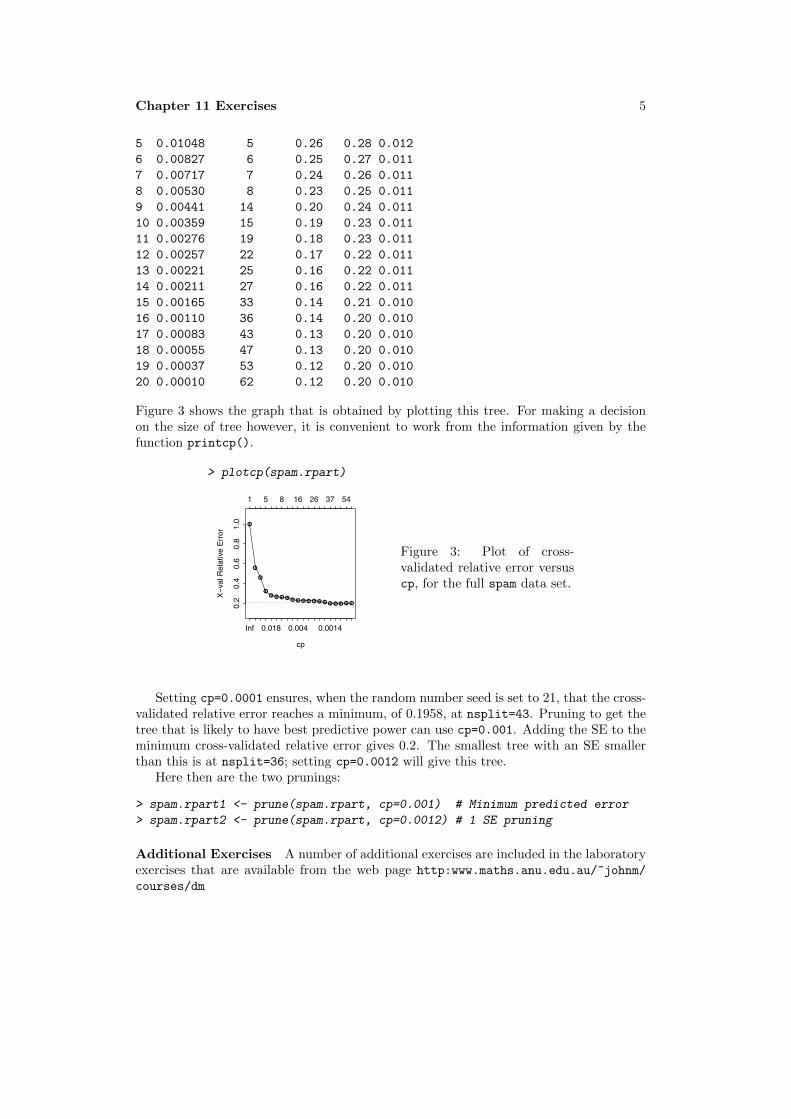
Chapter 11 Exercises 5
5 0.01048 5 0.26 0.28 0.0126 0.00827 6 0.25 0.27 0.0117 0.00717 7 0.24 0.26 0.0118 0.00530 8 0.23 0.25 0.0119 0.00441 14 0.20 0.24 0.01110 0.00359 15 0.19 0.23 0.01111 0.00276 19 0.18 0.23 0.01112 0.00257 22 0.17 0.22 0.01113 0.00221 25 0.16 0.22 0.01114 0.00211 27 0.16 0.22 0.01115 0.00165 33 0.14 0.21 0.01016 0.00110 36 0.14 0.20 0.01017 0.00083 43 0.13 0.20 0.01018 0.00055 47 0.13 0.20 0.01019 0.00037 53 0.12 0.20 0.01020 0.00010 62 0.12 0.20 0.010
Figure 3 shows the graph that is obtained by plotting this tree. For making a decision
on the size of tree however, it is convenient to work from the information given by the
function printcp().
> plotcp(spam.rpart)
●
●
●
●● ● ● ● ● ● ● ● ● ● ● ● ● ● ● ●
cp
X−va
l Rel
ative
Erro
r
0.2
0.4
0.6
0.8
1.0
Inf 0.018 0.004 0.0014
1 5 8 16 26 37 54
Figure 3: Plot of cross-
validated relative error versus
cp, for the full spam data set.
Setting cp=0.0001 ensures, when the random number seed is set to 21, that the cross-
validated relative error reaches a minimum, of 0.1958, at nsplit=43. Pruning to get the
tree that is likely to have best predictive power can use cp=0.001. Adding the SE to the
minimum cross-validated relative error gives 0.2. The smallest tree with an SE smaller
than this is at nsplit=36; setting cp=0.0012 will give this tree.
Here then are the two prunings:
> spam.rpart1 <- prune(spam.rpart, cp=0.001) # Minimum predicted error> spam.rpart2 <- prune(spam.rpart, cp=0.0012) # 1 SE pruning
Additional Exercises A number of additional exercises are included in the laboratory
exercises that are available from the web page http:www.maths.anu.edu.au/~johnm/courses/dm

Chapter 12 Exercises 1
Data Analysis & Graphics Using R, 3rd edn – Solutions to Exercises (April 29, 2010)
Preliminaries
> library(DAAG)
Exercise 1Carry out the principal components analysis of Section Subsection 12.1.2, separately formales and females. Compare the loadings for the first and second principal componentsin these new analyses with the loadings obtained in Subsection 12.1.2.
We do the analysis (i) for all observations; (ii) for females; (iii) for males.
> all.pr <- princomp(na.omit(possum[, -(1:5)]))> femp.pr <- princomp(na.omit(possum[possum$sex=="f", -(1:5)]))> malep.pr <- princomp(na.omit(possum[possum$sex=="m", -(1:5)]))
One way to compare the separate loadings is to plot each set in turn against the loadingsfor all observations. We put the code into a function so that we can easily do the plot foreach component in turn. The settings for the two elements of signs allow us to switchthe signs of all elements, for males and females separately. Loadings that differ only in achange of sign in all elements are equivalent.
> compare.loadings <- function(i=1, all.load=loadings(all.pr),+ fload=loadings(femp.pr),+ mload=loadings(malep.pr), signs=c(1,1)){+ alli <- all.load[,i]+ fi <- fload[,i]*signs[1]+ mi <- mload[,i]*signs[2]+ plot(range(alli), range(c(fi, mi)), type="n")+ chw <- par()$cxy[1]+ points(alli, fi, col="red")+ text(alli, fi, lab=row.names(fload), adj=0, xpd=T, col="red",+ pos=2, cex=0.8)+ points(alli, mi, col="blue")+ text(alli, mi, lab=row.names(mload), adj=0, xpd=T, col="blue",+ pos=4, cex=0.8)+ abline(0,1)+ }
Now compare the loadings for the first and second principal components. From exami-nation of the results for default settings for signs, it is obvious that a switch of sign isneeded for the female loadings.
> par(mfrow=c(1,2))> compare.loadings(1) # Compare loadings on 1st pc> compare.loadings(2, signs=c(-1,1)) # Compare loadings on 2nd pc> par(mfrow=c(1,1))
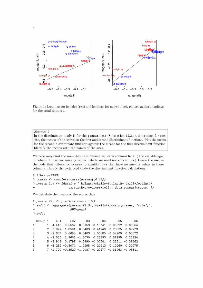
2
−0.5 −0.4 −0.3 −0.2 −0.1
−0.6
−0.2
0.2
0.4
range(alli)
rang
e(c(
fi, m
i))
●
●
●
●
●
●
●
●●
hdlngthskullw
totlngth
taill
footlgth
earconch
eye
chestbelly
●
●
●
●
●
●
●
●●
hdlngth
skullw
totlngth
taill
footlgth
earconch
eye
chestbelly
−0.6 −0.4 −0.2 0.0 0.2
−0.6
−0.2
0.2
0.4
range(alli)
rang
e(c(
fi, m
i))
●●
●
●
●
●
●●
●
hdlngthskullw
totlngth
taill
footlgth
earconch
eyechest
belly
●● ●●
●
●
●● ●
hdlngthskullwtotlngthtaill
footlgth
earconch
eyechestbelly
Figure 1: Loadings for females (red) and loadings for males(blue), plotted against loadingsfor the total data set.
Exercise 2In the discriminant analysis for the possum data (Subsection 12.2.4), determine, for eachsite, the means of the scores on the first and second discriminant functions. Plot the meansfor the second discriminant function against the means for the first discriminant function.Identify the means with the names of the sites.
We need only omit the rows that have missing values in columns 6-14. (The variable age,in column 4, has two missing values, which are need not concern us.) Hence the use, inthe code that follows, of ccases to identify rows that have no missing values in thesecolumns. Here is the code used to do the discriminant function calculations:
> library(MASS)> ccases <- complete.cases(possum[,6:14])> possum.lda <- lda(site ~ hdlngth+skullw+totlngth+ taill+footlgth++ earconch+eye+chest+belly, data=possum[ccases, ])
We calculate the means of the scores thus:
> possum.fit <- predict(possum.lda)> avfit <- aggregate(possum.fit$x, by=list(possum[ccases, "site"]),+ FUN=mean)> avfit
Group.1 LD1 LD2 LD3 LD4 LD5 LD61 1 4.410 0.5562 0.3159 -0.16741 -0.06322 0.005642 2 3.879 -1.8591 -0.5403 0.41949 0.25835 -0.022793 3 -2.607 0.6693 0.5403 1.06685 -0.52209 0.050724 4 -2.555 1.9663 -1.3030 0.23393 0.57195 0.221245 5 -3.948 0.1797 0.5990 -0.02541 0.23511 -0.396626 6 -4.282 -0.8074 1.0298 -0.22913 0.10260 0.302757 7 -2.720 -0.3520 -1.0987 -0.29477 -0.31963 -0.03311

Chapter 12 Exercises 3
The matrix avfit has 7 rows (one for each site) and 6 columns (one for each of the six dis-criminant functions). The row labels can be obtained from the data frame possumsites.Here then is the plot:
> plot(avfit[,"LD1"], avfit[,"LD2"], xlab="1st discriminant function",+ ylab="2nd discriminant function")> chw <- par()$cxy[1]> text(avfit[,"LD1"]+0.5*chw, avfit[,"LD2"], labels=row.names(possumsites),+ adj=0, xpd=TRUE)
●
●
●
●
●
●
●
−4 −2 0 2 4
−2−1
01
2
1st discriminant function
2nd
disc
rimin
ant f
unct
ion
Cambarville
Bellbird
Allyn River
Whian Whian
Byrangery
ConondaleBulburin
Figure 2: Plot of the sec-ond discriminant functionagainst the first discrimi-nant function, for the pos-sum data frame. The dis-criminant functions are de-signed to discriminate be-tween sites.
Cambarville and Bellbird seem distinguised from the other sites.
Exercise 3The data frame possumsites (DAAG package) holds latitudes, longitudes, and altitudes,for the seven sites. The following code, which assumes that the oz package is installed,locates the sites on a map that shows the Eastern Australian coastline and nearby stateboundaries.
library(DAAG); library(oz)oz(sections=c(3:5, 11:16))attach(possumsites)points(latitude, longitude)chw <- par()$cxy[1]chh <- par()$cxy[2]posval <- c(2, 4, 2, 2, 4, 2, 2)text(latitude+(3-posval)*chw/4, longitude,
row.names(possumsites), pos=posval)
Do the site means that were calculated in Exercise 2 relate in any obvious way to geo-graphical position, or to altitude?
Cambarville and Bellbird, which were distinguished from the main cluster in the plot inExercise 2, are the southernmost sites.

4
Exercise 5Create a version of Figure 12.5B that shows the discriminant line. In the example ofSubsection 12.2.1, investigate whether use of logpet, in addition to logwid and loglen,improve discrimination?
Here are the discriminant function calculations:
> leaf17.lda <- lda(arch ~ logwid + loglen, data = leafshape17)> leaf17.fit <- predict(leaf17.lda)> leaf17.lda$prior
0 10.6721 0.3279
> leaf17.lda$scaling
LD1logwid 0.1555loglen 3.0658
> leaf17.lda$means
logwid loglen0 1.429 2.4601 1.866 2.994
The information needed to reconstruct the discriminant function is provided by leaf17.lda$prior,leaf17.lda$means and leaf17.lda$scaling. First we calculate a grand mean, fromthat the constant term for the discriminant function, and then do a plot (see below) thatchecks that we are correctly recovering the discriminant function scores. Calculationscan be done without matrix multiplication, but are tedious to write down. The followingassumes a knowledge of matrix multiplication, for which the symbol is %*%:
> gmean <- leaf17.lda$prior%*%leaf17.lda$means> const <- as.numeric(gmean%*%leaf17.lda$scaling)> z <- as.matrix(leafshape17[,c(5,7)])%*%leaf17.lda$scaling - const
Note that R distinguishes between a 1 by 1 matrix and a numeric constant. The finaltwo lines are a check that the discriminant function has been correctly calculated. It hasthe form ax+ by − c = z, where the discriminant line is given by z = 0. The equation ofthe line is then y = −a/bx+ c/b. We have
> slope <- -leaf17.lda$scaling[1]/leaf17.lda$scaling[2]> intercept <- const/leaf17.lda$scaling[2]
We now show the plot that checks that we have correctly recovered the discriminantfunction scores, with the requested plot alongside.
> par(mfrow=c(1,2))> plot(z, leaf17.fit$x[,1]); abline(0,1)> mtext(side=3, line=1, "Check that z=leaf17.fit$x[,1]")> plot(loglen ~ logwid, data=leafshape17, xlab="log(leaf width)",+ ylab="log(leaf length)", pch=leafshape17$arch+1)> abline(intercept, slope)> mtext(side=3, line=1, "Fig.12.4B, with discriminant line")> par(mfrow=c(1,1))
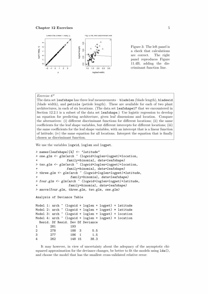
Chapter 12 Exercises 5
●●●●●●●●●●●●
●●●●●●●●●●●●●●●●●●●●●●●
●●●
●
●
●
●●●●●●●
●●●●●●●●
●●●
●
●
−2 −1 0 1 2 3
−2−1
01
23
z
leaf
17.fi
t$x[
, 1]
Check that z=leaf17.fit$x[,1]
●● ●
●●●●●
● ●●●● ●●● ●● ●● ●● ●●
●●●● ●● ●●●● ●
●● ●
●
●
●
1.0 1.5 2.0 2.5 3.0
2.0
2.5
3.0
3.5
log(leaf width)
log(
leaf
leng
th)
Fig.12.4B, with discriminant line
Figure 3: The left panel isa check that calculationsare correct. The rightpanel reproduces Figure11.4B, adding the dis-criminant function line.
Exercise 6*The data set leafshape has three leaf measurements – bladelen (blade length), bladewid(blade width), and petiole (petiole length). These are available for each of two plantarchitectures, in each of six locations. (The data set leafshape17 that we encountered inSection 12.2.1 is a subset of the data set leafshape.) Use logistic regression to developan equation for predicting architecture, given leaf dimensions and location. Comparethe alternatives: (i) different discriminant functions for different locations; (ii) the samecoefficients for the leaf shape variables, but different intercepts for different locations; (iii)the same coefficients for the leaf shape variables, with an intercept that is a linear functionof latitude; (iv) the same equation for all locations. Interpret the equation that is finallychosen as discriminant function.
We use the variables logwid, loglen and logpet.
> names(leafshape)[4] <- "latitude"> one.glm <- glm(arch ~ (logwid+loglen+logpet)*location,+ family=binomial, data=leafshape)> two.glm <- glm(arch ~ (logwid+loglen+logpet)+location,+ family=binomial, data=leafshape)> three.glm <- glm(arch ~ (logwid+loglen+logpet)*latitude,+ family=binomial, data=leafshape)> four.glm <- glm(arch ~ (logwid+loglen+logpet)+latitude,+ family=binomial, data=leafshape)> anova(four.glm, three.glm, two.glm, one.glm)
Analysis of Deviance Table
Model 1: arch ~ (logwid + loglen + logpet) + latitudeModel 2: arch ~ (logwid + loglen + logpet) * latitudeModel 3: arch ~ (logwid + loglen + logpet) + locationModel 4: arch ~ (logwid + loglen + logpet) * locationResid. Df Resid. Dev Df Deviance
1 281 1932 278 188 3 5.53 277 186 1 1.54 262 148 15 38.3
It may however, in view of uncertainty about the adequacy of the asymptotic chi-squared approximation for the deviance changes, be better to fit the models using lda(),and choose the model that has the smallest cross-validated relative error:

6
> one.lda <- lda(arch ~ (logwid+loglen+logpet)*location, CV=TRUE,+ data=leafshape)> two.lda <- lda(arch ~ (logwid+loglen+logpet)+location, CV=TRUE,+ data=leafshape)> three.lda <- lda(arch ~ (logwid+loglen+logpet)*latitude, CV=TRUE,+ data=leafshape)> four.lda <- lda(arch ~ (logwid+loglen+logpet)+latitude, CV=TRUE,+ data=leafshape)> table(leafshape$arch, one.lda$class)
0 10 173 191 25 69
> table(leafshape$arch, two.lda$class)
0 10 177 151 24 70
> table(leafshape$arch, three.lda$class)
0 10 179 131 22 72
> table(leafshape$arch, four.lda$class)
0 10 177 151 24 70
The smallest cross-validated relative error was for the third model.
Additional Exercises A number of additional exercises are included in the laboratoryexercises that are available from the web page http:www.maths.anu.edu.au/~johnm/courses/dm

Chapter 13 Exercises 1
Data Analysis & Graphics Using R, 3rd edn – Solutions to Exercises (April 30, 2010)
Preliminaries
> library(DAAG)
Exercise 1Repeat the principal components calculation omitting the points that appear as outliers
in Figure 13.1, and redo the regression calculation. What differences are apparent, in
loadings for the first two principal components and/or in the regression results?
The following repeats the calculations that are described in the text.
> not.na <- complete.cases(socsupport[,9:19])> not.na[36] <- FALSE> ss.pr <- princomp(as.matrix(socsupport[not.na, 9:19]), cor=TRUE)> ss.lm <- lm(BDI[not.na] ~ ss.pr$scores[, 1:6], data=socsupport)> attach(socsupport)> plot(BDI[not.na] ~ ss.pr$scores[ ,1], col=as.numeric(gender[not.na]),+ pch=as.numeric(gender[not.na]),+ xlab ="1st principal component", ylab="BDI")> topleft <- par()$usr[c(1,4)]> legend(topleft[1], topleft[2], col=1:2, pch=1:2, legend=levels(gender))> detach(socsupport)
Examination of Figure 13.1 makes it clear that we need to omit points for which BDI is
greater than 35. We determine the relevant row numbers:
> (1:95)[socsupport$BDI>35]
[1] 36 68 95
Row 36 had already been omitted. We need, additionally, to omit rows 68 and 95. The
following repeats the calculations given above, but now with observations 36, 68 and 95
omitted:
> not3.na <- complete.cases(socsupport[,9:19])> not3.na[c(36,68,95)] <- FALSE> ss3.pr <- princomp(as.matrix(socsupport[not3.na, 9:19]), cor=TRUE)> ss3.lm <- lm(BDI[not3.na] ~ ss3.pr$scores[, 1:6], data=socsupport)> attach(socsupport)> plot(BDI[not3.na] ~ ss3.pr$scores[ ,1], col=as.numeric(gender[not3.na]),+ pch=as.numeric(gender[not3.na]),+ xlab ="1st principal component", ylab="BDI")> topleft <- par()$usr[c(1,4)]> legend(topleft[1], topleft[2], col=1:2, pch=1:2, legend=levels(gender))> detach(socsupport)
The following (shown in the left panel below) compares the loadings, with (x-axis) and
without (y-axis) rows 68 and 95.

2
> plot(loadings(ss.pr)[,1], loadings(ss3.pr)[,1])> abline(0,1, col="green", xpd=FALSE)> ord <- order(loadings(ss3.pr)[,1])> texpos <- numeric(length(ord))> texpos[ord] <- rep(c(2,4), length.out=length(ord))> text(loadings(ss.pr)[,1], loadings(ss3.pr)[,1], pos=texpos,+ labels=row.names(loadings(ss.pr)), adj=0, xpd=TRUE)> plot(loadings(ss.pr)[,2], loadings(ss3.pr)[,2])> ord <- order(loadings(ss3.pr)[,2])> texpos[ord] <- rep(c(2,4), length.out=length(ord))> text(loadings(ss.pr)[,2], loadings(ss3.pr)[,2], pos=texpos,+ labels=row.names(loadings(ss.pr)), adj=0, xpd=TRUE)> abline(0,1, col="green", xpd=FALSE)
Omission of the two outliers has made very little difference. The graph below shows the
comparisons.
●
●
●
●
●
●
●
●
●●●
−0.36 −0.32 −0.28
−0.3
6−0
.32
−0.2
8
loadings(ss.pr)[, 1]
load
ings
(ss3
.pr)[
, 1]
emotional
emotionalsat
tangible
tangiblesat
affect
affectsat
psi
psisat
esupport psupportsupsources
●
●
●
●
●
●
●
●
●
●
●
−0.4 −0.2 0.0 0.2 0.4
−0.4
−0.2
0.0
0.2
0.4
loadings(ss.pr)[, 2]
load
ings
(ss3
.pr)[
, 2]
emotionalemotionalsat
tangible
tangiblesat
affectaffectsat
psipsisat
esupport
psupportsupsources
Figure 1: The left
panel compares the
two sets of loadings
on the first prin-
cipal component,
while the right
panel makes the
comparison for the
second principal
component.
Now compare the two sets of regression coefficients.
> plot(coef(ss.lm)[-1], coef(ss3.lm)[-1])> text(coef(ss.lm)[-1], coef(ss3.lm)[-1], labels=paste(1:6),+ adj=0, xpd=TRUE)> abline(0,-1, col="green")
●
●
●
●
●
●
0.5 1.0 1.5 2.0
0.5
1.0
1.5
2.0
coef(ss.lm)[−1]
coef(ss3.lm
)[−1]
1
2
3
4
5
6
Figure 2: Compari-
son between the two
sets of regression coef-
ficients.
Notice that the inter-
cepts have been omit-
ted from the compar-
ison; these should be
compared directly.
The coefficients for the first principal component agree fairly well. For other principal
components, there is little agreement. As these are not statistically significant, this is of
no consequence.

Chapter 14 Exercises 1
Data Analysis & Graphics Using R, 3rd edn – Solutions to Exercises (April 30, 2010)
Preliminaries
> library(DAAG)
Exercise 1Compare the different outputs from help.search("print"), apropos(print) andmethods(print). Look up the help for each of these three functions, and use what youfind to explain the different outputs.
help.search() searches the documentation for a match in the name, or alias (i.e., analternative name for a function or other object) or title or keyword.
apropos() searches for object or alias names where there is a partial match. Forexample, try help.search("str"). [Note also the function find(), which is an alias forapropos() in which the default parameters are set to find “simple words”.]
methods(print) finds all available print methods, i.e., all the different functions thatmay, depending on the class of object that is to be printed, be called when the genericprint function is used.
Now that the number of functions and associated documentation is so extensive,consider limiting the search by using, e.g., help.search("print", package="base"),rather than help.search("print")
Exercise 2Identify as many R functions as possible that are specifically designed for manipulationswith text strings.
Try apropos("str"). Some objects (e.g., fitdistr or structure) clearly have nothingto do with strings. Look up the help for those that do seem possible string manipulationfunctions. Look under See Also: to find other related functions that may not have theletters “str” in their names. Try also apropos("char"). Once these steps are complete,this should identify most possibilities.
Another recourse may be to type in help.start(), and click on Search Engine & Keywords.
Exercise 3Test whether strsplit() is vectorized, i.e., does it accept a vector of character strings asinput, then operating in parallel on all elements of the vector?
Try applying strsplit() to a vector of character strings. For example:
> strsplit(c("eggs'nbacon", "bacon'neggs"), "'n")
[[1]][1] "eggs" "bacon"
[[2]][1] "bacon" "eggs"

2
Notice that strsplit() does accept a vector of character strings as input, and that itreturns one list element for each character string in the vector.
Exercise 4For the data frame Cars93, get the information provided by summary() for each level ofType. (Use split().)
First, note the column names:
> names(Cars93)
[1] "Manufacturer" "Model" "Type"[4] "Min.Price" "Price" "Max.Price"[7] "MPG.city" "MPG.highway" "AirBags"[10] "DriveTrain" "Cylinders" "EngineSize"[13] "Horsepower" "RPM" "Rev.per.mile"[16] "Man.trans.avail" "Fuel.tank.capacity" "Passengers"[19] "Length" "Wheelbase" "Width"[22] "Turn.circle" "Rear.seat.room" "Luggage.room"[25] "Weight" "Origin" "Make"
The code that gives the summaries is:
lapply(split(Cars93, Cars93$Type), summary)
The output runs over many pages. To present only the first two sets of summaries, forthe first five columns of the data frame, specify.
> lapply(split(Cars93[, 1:5], Cars93$Type), summary)[1:2]
Exercise 5Determine the number of cars, in the data frame Cars93, for each Origin and Type.
> table(Cars93$Origin, Cars93$Type)
Compact Large Midsize Small Sporty VanUSA 7 11 10 7 8 5non-USA 9 0 12 14 6 4
Exercise 6In the data frame Insurance (MASS package):
(a) determine the number of rows of information for each age category (Age) and cartype (Group);
(b) determine the total number of claims for each age category and car type;
(a) > library(MASS)
> sapply(Insurance, function(x)sum(is.na(x)))
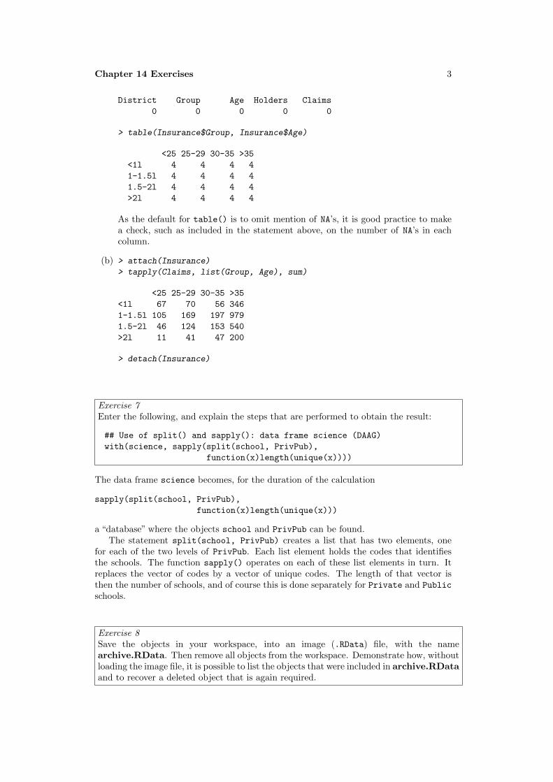
Chapter 14 Exercises 3
District Group Age Holders Claims0 0 0 0 0
> table(Insurance$Group, Insurance$Age)
<25 25-29 30-35 >35<1l 4 4 4 41-1.5l 4 4 4 41.5-2l 4 4 4 4>2l 4 4 4 4
As the default for table() is to omit mention of NA’s, it is good practice to makea check, such as included in the statement above, on the number of NA’s in eachcolumn.
(b) > attach(Insurance)
> tapply(Claims, list(Group, Age), sum)
<25 25-29 30-35 >35<1l 67 70 56 3461-1.5l 105 169 197 9791.5-2l 46 124 153 540>2l 11 41 47 200
> detach(Insurance)
Exercise 7Enter the following, and explain the steps that are performed to obtain the result:
## Use of split() and sapply(): data frame science (DAAG)with(science, sapply(split(school, PrivPub),
function(x)length(unique(x))))
The data frame science becomes, for the duration of the calculation
sapply(split(school, PrivPub),function(x)length(unique(x)))
a “database” where the objects school and PrivPub can be found.The statement split(school, PrivPub) creates a list that has two elements, one
for each of the two levels of PrivPub. Each list element holds the codes that identifiesthe schools. The function sapply() operates on each of these list elements in turn. Itreplaces the vector of codes by a vector of unique codes. The length of that vector isthen the number of schools, and of course this is done separately for Private and Publicschools.
Exercise 8Save the objects in your workspace, into an image (.RData) file, with the namearchive.RData. Then remove all objects from the workspace. Demonstrate how, withoutloading the image file, it is possible to list the objects that were included in archive.RDataand to recover a deleted object that is again required.

4
To save the workspace contents into the file archive.RData, type
> save.image(file="archive.RData")
We can now type
> rm(list=ls())
The following will again make available all objects that were in the workspace:
> attach("archive.RData", warn.conflicts=FALSE)
To see the contents of this “database”, type
> ls(name="file:archive.RData")
character(0)
Providing no other databases have been attached in the meantime, an alternative isls(pos=2).
Type the name of an object that is in the database (choose one that is not too large!)to demonstrate that all such objects are now available.
Note the use of detach("file:archive.RData") to detach the database.
Exercise 9Determine the number of days, according to R, between the following dates:
(a) January 1 in the year 1700, and January 1 in the year 1800
(b) January 1 in the year 1998, and January 1 in the year 2007
> as.Date("1/1/1800","%d/%m/%Y") - as.Date("1/1/1700","%d/%m/%Y")
Time difference of 36524 days
> as.Date("1/1/2007","%d/%m/%Y") - as.Date("1/1/1998","%d/%m/%Y")
Time difference of 3287 days

Chapter 14 Exercises 5
Exercise 10*The following code concatenates (x, y) data values that are random noise to data pairsthat contain a ‘signal’, randomly permutes the pairs of data values, and finally attemptsto reconstruct the signal:
### Thanks to Markus Hegland (ANU), who wrote the initial version##1 Generate the data# . . . .# Code is displayed below (with annotations),# and is therefore omitted here.# . . . .##1 End
##2 determine number of neighbors within# a distance <= h = 1/sqrt(length(xn))# . . . .# Annotated code is shown below# . . . .##2 End
##3 Plot data, with reconstructed signal overlaid.# . . . .# Annotated code is shown below# . . . .##3 End
(a) Run the code and observe the graph that results.
(b) Work through the code, and write notes on what each line does.[The key idea is that points that are part of the signal will, on average, have morenear neighbours than points that are noise.]
(c) Split the code into three functions, bracketed respectively between lines that begin##1, lines that begin ##2, and lines that begin ##3. The first function should take pa-rameters m and n, and return a list xy that holds data that will be used subsequently.The second function should take vectors xn and yn as parameters, and return valuesof nnear, i.e., for each point, it will give the number of other points that lie withina circle with the point as center and with radius h. The third function will take asparameters x, y, nnear and the constant ns such that points with more than ns nearneighbours will be identified as part of the signal. Run the first function, and storethe output list of data values in xy.
(d) Run the second and third functions with various different settings of h and ns.Comment on the effect of varying h. Comment on the effect of varying ns.
(e) Which part of the calculation is most computationally intensive? Which makes theheaviest demands on computer memory?
(f) Suggest ways in which the calculation might be made more efficient.
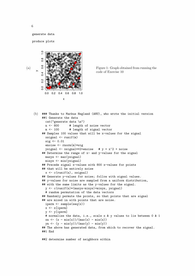
6
(a)
generate data
produce plots
●
●
●
●
●
●
●
●
●
●
●
●
●
●
●
●●
●
●
●
●
●●
●
●
●
●
●
●
●
● ●
●
●
●
●●
●
●●
●●
●
● ●●
●
●
●
●●
●
●
●
●
●
●
●
●●
●
●
●
●
●
●
●
●
●●
●
●
●
●
●
●
●
●
●
●
●
●
●
●●
●
●
●
●
●
●
●●
●
●
●
●
●
●
●
●
●
●
●●
●
●
●
●
●
●
●
●
●
●
●
●
●
● ●
● ● ●
●
●
●
●
●
●
●
●
●
●
●
●
●
●●
●
●
● ●
●
●
●
●
●
●●
●
●
●
●
●●
●
●
●
●
●
●
●
●
● ●
●●
●
●
●
●
●
● ●
●
●
●
●
●
●●
● ●
●●
● ●●
●
●
●
●
●
●
●
●
●
● ●
●●
●
●
●
●
●●
●
●●●
●●
●
●
●
●
●
●
●
●
●●
●●
●
●●
●
●
●
●
●
●
●
●
●
●
●
●
●
●
●
●
●
●
●
●
●
●
●
●
●
●●
●
●
●
●
●
●
●
●
●
●
●
●
●
●
●
●
●
●
●
●
●
●●
●
●
●
●●
●
●
●●
●
●
●
●
●
●
●
●
●
●
●
●
●
●
●
●
●
●
●
●
●
●
●
●●
●
●
●
●
●
●●
●
●
●
●
●
●
●
●
●
●
●
●
●
●
●
●●
●
●
●
●●
●
●
●
●
●
●
●
●
●
●
●●
●
●●
●
●
●
●
●
●
●●
●
●
●
●
●
●
●
●●
●
●
●●
●●
●
●
●●
●
●
●
●
●
●
●
●
●
●
●
●
●
●
●
●
●●
●
●
●●
●●
●
●
●
●
●
●
●
●
●
●
●
●
●
●
●
●
●
●
●
●
●
●●
●
●
●
●
●
●
●
●
●
●●
●
●
●
●
●
●●
●
●
●
●●
●
●●
●
●
●
●
●
●
●●
●
●
●
●
●
●
●
●
●
●
●
●
●
●
●
●
●●
●
●
●
●
●
●
●
●
●
●
●
●
●
●
●●
●
●
●
●
●
●
●
●
●
●
●
●
●
●●
●
●
●
●
●
●
●
●
●
●
●
●●
●
●
●
●
●
●
●
●
●
●
●
●
●
●
●
●
●
●
●
●
●●
● ●
●● ●
●
●
●
●
●
●
●
●
●
●
●
●
●
●
●
●
●
●
●
●●
●
●
●
●
●
●
●
●
●
●●
●
●
●
●
●
●
●
●
●●
●
●
●
●
●
●
●
●
●
●
●●
●
●●
●
● ●
●
●
●
●
●
●
●
●
●
●
●
●
●
●
●
●
●
●
●
●
●
●
●
●
●
●
●
●
●
●
●
●
●●
●
●
●
●
●
●
●
●
●
●
●
●
●
●
●
●●●
●
●
●
●
●
●
●
●
●
●
●
●
●
●
●
●
●
●
●
●
●
●
●
●
●
●
●
●
●
●
●
●
●
●
●●●
●●
●
●
●
●
●
●
●
●
●
●
●●●
●
●
●
●
●
●
●
●
●
●●
●
●
●
●
●
●
●
●●
●
●
●
●
●
●
●
●
●
●
●
●
●
●
●
●
●
●
●
●
●
●
●
●
●
●
●
●
●●
●
●
●
●
●
●
●●
●
●
●
●●
●
●
●
●
●●
●
●
●
●
●
●
●●
●
●
●
●
●
●
●●
●
●
●
●
●
●
●
●
●
●
●
●
●
●
●●
●
● ●
●
● ●
●
●
●
●
●
●
●
●
●
●
●
●
●
●
●
●
●
●
●
●
●●
●
●
●
●
●
●
●
●
●
●
●
●
●
●●
●
●
●
●
●
●
●
●
●
●
●●
●
●
●
●
●●
●●
●●
●●
●
●
●●
●
●
●
●
●
●
●
●
●●
●
0.0 0.2 0.4 0.6 0.8 1.0
0.0
0.2
0.4
0.6
0.8
1.0
x
y
●
●●
●
●
●
●●
●
●●●
●
●●
●
●
●
●
●
●
●
●●●
●
●●
●
●
●●
●
●
●
●
●
●
●
●●
●
●●
●
●●
●
●
●
●
● ●
●●
●
●●●
●●
●
●
Figure 1: Graph obtained from running thecode of Exercise 10
(b) ### Thanks to Markus Hegland (ANU), who wrote the initial version##1 Generate the datacat("generate data \n")n <- 800 # length of noise vectorm <- 100 # length of signal vector
## Samples 100 values that will be x-values for the signalxsignal <- runif(m)sig <- 0.01enoise <- rnorm(m)*sigysignal <- xsignal**2+enoise # y = x^2 + noise
## Determine the range of x- and y-values for the signalmaxys <- max(ysignal)minys <- min(ysignal)
## Precede signal x-values with 800 x-values for points## that will be entirely noisex <- c(runif(n), xsignal)
## Generate y-values for noise; follow with signal values.## y-values for noise are sampled from a uniform distribution,## with the same limits as the y-values for the signal.y <- c(runif(n)*(maxys-minys)+minys, ysignal)# random permutation of the data vectors
## Randomly permute the points, so that points that are signal## are mixed in with points that are noise.iperm <- sample(seq(x))x <- x[iperm]y <- y[iperm]# normalise the data, i.e., scale x & y values to lie between 0 & 1xn <- (x - min(x))/(max(x) - min(x))yn <- (y - min(y))/(max(y) - min(y))
## The above has generated data, from which to recover the signal.##1 End
##2 determine number of neighbors within

Chapter 14 Exercises 7
# a distance <= h = 1/sqrt(length(xn))## These distances will be available for all pointsnx <- length(xn)# determine distance matrix
## The following is a clever way to calculate## sqrt((xi-xj)^2 + (yi-yj)^2), and store the result in the (i,j)## position of d.d <- sqrt( (matrix(xn, nx, nx) - t(matrix(xn, nx, nx)) )**2 +
(matrix(yn, nx, nx) - t(matrix(yn, nx, nx)) )**2 )## Next, we need a threshold, such that most random points are## will not be closer than this. Detailed investigation will## require examination of the distribution of d. Here we choose## 1/sqrt(nx); if this does not seem to work, it can be varied.## Better (and here is a starting point for further exercises),## the distribution of d can be examined empirically and/or## theoretically.h <- 1/sqrt(nx)
## Count the number of points that lie closer than this thresholdnnear <- apply(d <= h, 1, sum)
##2 End
##3 Plot data, with reconstructed signal overlaid.cat("produce plots \n")plot(x, y)# plot only the points which have many such neighbors
## ns is another tuning constant.ns <- 8points(x[nnear > ns], y[nnear > ns], col="red", pch=16)
##3 End
(c) Next, the code will be split between three functions:
> generate.data <- function(m=100, n=800){
+ xsignal <- runif(m)
+ sig <- 0.01
+ enoise <- rnorm(m)*sig
+ ysignal <- xsignal**2+enoise
+ maxys <- max(ysignal)
+ minys <- min(ysignal)
+ x <- c(runif(n), xsignal)
+ y <- c(runif(n)*(maxys-minys)+minys, ysignal)
+ # random permutation of the data vectors
+ iperm <- sample(seq(x))
+ x <- x[iperm]
+ y <- y[iperm]
+ # normalise the data, i.e., scale x & y values to lie between 0 & 1
+ xn <- (x - min(x))/(max(x) - min(x))
+ yn <- (y - min(y))/(max(y) - min(y))
+ list(x=x, y=y, xn=xn, yn=yn)
+ }
> count.neighbours <- function(xn, yn, h=1/sqrt(length(xn))){
+ nx <- length(xn)
+ d <- sqrt( (matrix(xn, nx, nx) - t(matrix(xn, nx, nx)) )**2 +

8
+ (matrix(yn, nx, nx) - t(matrix(yn, nx, nx)) )**2 )
+ nnear <- apply(d <= h, 1, sum)
+ nnear
+ }
> plot.signal <- function(x, y, nnear, ns=8){
+ plot(x, y)
+ # plot only the points which have many such neighbors
+ ns <- 8
+ points(x[nnear > ns], y[nnear > ns], col="red", pch=16)
+ }
Here then is a sequence of calls:
> xy <- generate.data(m=100, n=800)
> nnear <- count.neighbours(xn=xy[["xn"]], yn=xy[["yn"]])
> plot.signal(x=xy[["x"]], y=xy[["y"]], nnear=nnear, ns=8)
(d) In an initial simulation, the range of values of nnear, obtained from range(nnear),was from 1 to 13. Hence, we will try setting nnear = 6 and nnear=10. For ns wewill try 2/sqrt(length(xn)) and 0.5/sqrt(length(xn)).
> par(mfrow=c(2,2))
> nx <- length(xy[["xn"]])
> nnear <- count.neighbours(xn=xy[["xn"]], yn=xy[["yn"]], h=sqrt(0.5/nx))
> plot.signal(x=xy[["x"]], y=xy[["y"]], nnear=nnear, ns=6)
> title(main="h=sqrt(0.5/nx); ns=6")
> plot.signal(x=xy[["x"]], y=xy[["y"]], nnear=nnear, ns=10)
> title(main="h=sqrt(0.5/nx); ns=10")
> nnear <- count.neighbours(xn=xy[["xn"]], yn=xy[["yn"]], h=sqrt(2/nx))
> plot.signal(x=xy[["x"]], y=xy[["y"]], nnear=nnear, ns=6)
> title(main="h=sqrt(2/nx); ns=6")
> plot.signal(x=xy[["x"]], y=xy[["y"]], nnear=nnear, ns=10)
> title(main="h=sqrt(2/nx); ns=10")
The result is sensitive to the choice of h. Therefore, repeat the exercise withh=sqrt(0.75/nx) and h=sqrt(1/nx) The result is relatively insensitive to vari-ation in ns.
(e) The most computationally intensive part of the calculations is the determinationof the distances. This is done for all nx^2 pairs (x,y), though actually we onlyneed the nx*(nx+1)/2 points in the upper triangle of the matrix. This makes, ifnx is large, heavy demands on computer memory. Calculation of nnear, as doneabove, requires nx comparisons for each point, i.e., a total of nx^2 comparisons,with the result stored in a vector of length nx. These should be much cheaper thanmultiplications.
We now examine the costs in an actual machine run.
> system.time(xy <- generate.data(m=100, n=800))
user system elapsed0.001 0.000 0.000
> system.time(nnear <- count.neighbours(xn=xy[["xn"]], yn=xy[["yn"]]))
user system elapsed0.208 0.079 0.286

Chapter 14 Exercises 9
> system.time(plot.signal(x=xy[["x"]], y=xy[["y"]], nnear=nnear, ns=8))
user system elapsed0.128 0.032 0.193
The function count.neighbours() has taken most of the time, on my system 3.10seconds. We now break this down further.
> xn <- xy[["xn"]]
> yn <- xy[["yn"]]
> nx <- length(xn)
> h <- 1/sqrt(nx)
> system.time(
+ d <- sqrt( (matrix(xn, nx, nx) - t(matrix(xn, nx, nx)) )**2 +
+ (matrix(yn, nx, nx) - t(matrix(yn, nx, nx)) )**2 ))
user system elapsed0.153 0.079 0.247
> system.time(nnear <- apply(d <= h, 1, sum))
user system elapsed0.055 0.000 0.059
Calculation of d took 1.62 seconds, whereas calculation of nnear tool 0.67 seconds.
(f) The focus should be on those calculations that are computationally intensive, i.e.,the calculation of the distances. There are nx*(nx-1)/2 distances that need becalculated, where the code has calculated nx^2 distances, i.e. the distance frompoint 2 to point 1 as well as the distance from point 1 to point 2.
Exercise 11This question has been rewordedTry the following, for a range of values of n between, e.g., 2 ×10⁵ and 107. (On systemsthat are unable to cope with such large numbers of values, adjust the range of numbers ofvalues accordingly.)
n <- 10000; system.time(sd(rnorm(n)))
The first output number is the user cpu time, while the third output number is the elapsedtime. Plot each of these numbers, separately, against n. Comment on the graphs. Is theelapsed time roughly linear with n? Try the computations both for an otherwise emptyworkspace, and with large data objects (e.g., with 107 or more elements) in the workspace.
On a 1.2MHz Macintosh G4 PowerBook with half a gigabyte of memory, results were:
> nn <- 2000000*(1:5)
> cpu <- numeric(5)
> cpu[1] <- system.time(sd(rnorm(n=nn[1])))[1]
> cpu[2] <- system.time(sd(rnorm(n=nn[2])))[1]
> cpu[3] <- system.time(sd(rnorm(n=nn[3])))[1]
> cpu[4] <- system.time(sd(rnorm(n=nn[4])))[1]
> cpu[5] <- system.time(sd(rnorm(n=nn[5])))[1]

10
Here is a graph:
●
●
●
●
●
2e+06 6e+06 1e+07
0.5
1.0
1.5
2.0
nn
cpu
Figure 2: Cpu time, versusnumber of elements.
On my system, the response was remarkably linear with time. The increase in timewith increasing values of nn reduced slightly as nn increased.