cell press graphical abstract guidelines · cell press graphical abstract guidelines overview the...
TRANSCRIPT

Cell Press Graphical Abstract Guidelines
OVERVIEW
The graphical abstract is one single‐panel image that is designed to give readers an immediate understanding of the take‐home message of the paper.
Its intent is to encourage browsing, promote interdisciplinary scholarship, and help readers quickly identify which papers are most relevant to their research interests.
TECHNICAL REQUIREMENTS
Size: The submitted image should be 1200 pixels square at 300 dpi.
Font: Arial, 12–16 points. Smaller fonts will not be legible online
Preferred file types: TIFF, PDF, JPG
Content: the abstract should consist of one single panel
A note about color: Effective use of color can enhance the graphical abstract both aesthetically and by directing the reader's attention to focal points of interest. Authors are encouraged to select colors that are consistent with and complementary to the colors used on the Cell Press website. Heavily saturated, primary colors can be distracting.
CONTENT
UNIQUENESS AND CLARITY
The graphical abstract should:
Have a clear start and end, "reading" from top‐to‐bottom or left‐to‐right
Provide a visual indication of the biological context of the results depicted (subcellular location, tissue or cell type, species, etc.)
Be distinct from any model figures or diagrams included in the paper itself
Emphasize the new findings from the current paper without including excess details from previous literature
Avoid the inclusion of features that are more speculative (unless the speculative nature can be made apparent visually)
Not include data items of any type; all the content should be in a graphical form
KEEP IT SIMPLE
The graphical abstract should also:
Use simple labels
Use text sparingly
Highlight one process or make one point clear
Be free of distracting and cluttering elements
EXAMPLES
Below are four examples of graphical abstracts that were modified according to the guidelines above. The original submissions illustrated the article's take‐home messages, but with a few minor tweaks to their style and layout, those messages were made even clearer.

EXAMPLE 1
The three panels have been condensed as one split panel.
The Hira–/– panel has been removed because it was not absolutely essential to conveying the article's take‐home message.
Extraneous text has been removed, including the smaller text, which at 6.5 pt would not be legible online.
BEFORE AFTER

EXAMPLE 2
The image's components have been reoriented to tell the story from left to right.
Some arrows and text were removed for simplicity.
The color palate was softened.
The paper's take‐away message and new findings ("Activation of Hv1") were set as the focal point of the abstract.
BEFORE AFTER

EXAMPLE 3
The image's components have been reoriented and condensed to tell the story from top to bottom.
The colors have been adjusted to highlight and direct focus toward the most relevant information.
BEFORE AFTER
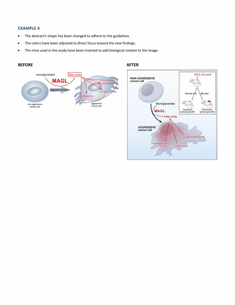
EXAMPLE 4
The abstract's shape has been changed to adhere to the guidelines.
The colors have been adjusted to direct focus toward the new findings.
The mice used in the study have been inserted to add biological context to the image.
BEFORE AFTER