carrollton sign design guidelines
TRANSCRIPT

November 2012Development Services 972-466-3225 • cityofcarrollton.com
Carrollton Sign Design GuidelinesCommercial Business Districts & Transit-Oriented Development

2012-2014 City Council
Mayor Matthew Marchant
Mayor Pro Tem Jeff Andonian
Councilmember Anthony Wilder
Councilmember Doug Hrbacek
Councilmember Bob Garza
Deputy Mayor Pro Tem Kevin Falconer
Councilmember Terry Simons
Councilmember Lisa Sutter
AcknowledgementCity Council Redevelopment Sub-committee
Councilmember Kevin Falconer Chairman
Councilmember Jeff Andonian
Councilmember Terry Simons

Table of ContentsPurpose ....................................................................................... 1
Applicability .......................................................................... 2
Design Objectives .............................................................3
Qualitative Sign Guidelines ......................................4 Sign Compatibility ..................................................................4 Sign Colors ................................................................................5 Sign Design and Materials ....................................................5 Sign Legibility ..........................................................................6 Sign Illumination ..................................................................... 7 Sign Integration with Site .....................................................8
Performance Based Freestanding Signs ......9
Sign Types ...............................................................................9 Wall Signs ..................................................................................9 Awning and Canopy Signs ................................................. 10 Projecting Signs ......................................................................11 Marquee Signs ........................................................................12 Hanging Signs .........................................................................12 Window Signs .........................................................................12 Restaurant Menu Signs ........................................................13 Plaque Signs ............................................................................13 Tenant Identification Signs ................................................ 14 A-Frame Signs ........................................................................15 Permanent Banner Signs .....................................................15 Temporary Signs ....................................................................16 Directional Signs ....................................................................17 Electronic Signs ......................................................................17


1
PurposeThe intent of the Sign Design Guidelines
is to provide guidance as to how signs are designed, constructed and placed and to provide creative, high quality signage that positively contributes to the improvement of the visual environment, expression of local character, and development of a distinctive City image.
• Establish criteria with which to judge the appropriateness of a sign design.
• Establish reasonable and improved standards for business identification.
• Assist property owners and business owners in understanding City expectations for well designed, quality signs.
• Encourage creative and innovative approaches to signage within an established framework.
• Enhance overall property values and the visual environment in the City by discouraging signs which contribute to the visual clutter of the streetscape.
• Ensure that freestanding and signs on the façade of buildings reinforce the existing character of the development and are integrated into the architectural scheme of the building.
• Promote a quality visual environment by allowing signs that are compatible with their surroundings and which effectively communicate their message.

2
ApplicabilityThe standards and guidelines set forth in
this manual apply to all properties within the City of Carrollton, with the exception of certain districts.
• The Sign Design Guidelines are applicable to all new signs and the modification or reconstruction of existing signs throughout the City.
• The Sign Design Guidelines will be utilized during the City’s review of sign permit applications or through the review of other permit applications when signs are a part of a larger project.
• Signs will be reviewed for their consistency with the Guidelines and the standards contained in the Sign Code.
• The Sign Design Guidelines are designed to help ensure quality signs that communicate their message in a clear fashion.
• These Guidelines are not strict sign standards as are found in the City’s Sign Code.
• To ensure compliance with the Guidelines, sign permits will be issued in compliance with the Sign Code. Therefore, voluntary compliance with these guidelines is highly encouraged for businesses with existing signage.
• Provide merchants with a way to effectively communicate without creating sign clutter.

3
Design Objectives• All signs should be architecturally
integrated with surroundings in terms of size, shape, color, texture and lighting so that they are complementary to the overall design of the buildings.
• Signs should enhance primary design elements or unique architectural features of buildings and should reflect the character of the building and its use.
• Signs should respect the immediate context of the building’s location and the overall character of its immediate vicinity.
• Consider the layout and shape of the architectural features of the building when determining the size and location of a sign.
• Retail signs should be designed with the purpose of promoting retail and street activity while enhancing the pedestrian experience where applicable.
• The size of a sign and its letters should be located in logical signable areas which relate to the pattern of the façade.
• The number of signs per building façade should be limited to the fewest necessary to clearly identify business located within.
• Signs are not permitted to cover or obscure architectural features of buildings.
• Design elements such as window patterns (vertical and horizontal rectangles, arches, squares, etc.) will help determine the sign shape that will suit the building.
• All signs are to be maintained properly such that they are always in clean, working condition, and the copy is not obscured or damaged.
• New signs proposed for existing buildings shall provide a compatible appearance with the existing signage of other tenants. Signs should attempt to unify the business with its nearest neighboring tenants.

4
A. Sign Compatibility
• Quality Signs. The City encourages high quality, imaginative and innovative design. A well-designed sign can be a major asset to a business and should make a positive contribution to the general appearance of the street and the surrounding area.
• Proportional Size and Scale. The scale of monument and wall signs should be appropriate for the building and site on which it is placed and should be proportional to the size of the location and the scale of the structure.
• Integrate Signs with the Building. Signs should be designed to relate to the architectural features of the building and site on which they are located and create a similar visual continuity with other storefronts.
• Wall Sign Placement. Wall signs should be placed in a manner which is consistent with the proportion of the building façade.
• Sign Placement. Wall signs should be placed in a manner that creates a façade rhythm, scale and proportion. Repetitious signage information on the same building frontage should be avoided, regardless of the maximum sign area allowed by the Sign Code. The architecture of the building and site layout often identify specific locations for signs.
Qualitative Sign Guidelines

5
B. Sign Colors
• Selecting Colors Carefully. Use of color is one of the primary means of visual communication. Excessive and uncoordinated use of colors can confuse and negate the message of a sign. Complementary colors should be applied that provide a good contrast with one another.
• Contrasting Color. Contrast is an important influence on the legibility of signs. A substantial contrast should be provided between the color and material of the background and the letters or symbols to make the sign legible.
• Too Many Colors. Avoid using color combinations that interfere with the legibility of the sign copy. Too many different colors on a sign can interfere with the basic function of advertising because they compete with the content for the viewer’s attention. Typically, it is best to limit colors to no more than three on a single sign.
C. Sign Design and Materials
• Compatibility of Materials. Exterior materials, finishes and colors should be the same or similar to the building or structures on site. Consideration should be given to the architectural design of the building’s façade and materials selected that complement the design.
• Appropriate Materials. Sign should be professionally constructed using high-quality materials such as brick, stone, metal, brass/silver-plated exterior materials. “Can” or “box” signs are prohibited.
• Design Compatibility. Internally lit plastic letters or plastic box formed cabinet signs should be avoided and in most cases are prohibited. The design of colors and lettering style should complement the building façade and harmonize with neighboring businesses. Excessively bright colors or over-scaled letters shall not be used as a means to attract attention.
• Alignment. The design and alignment of signs on multiple-use buildings should complement each other, creating a unified appearance. Signs shall respect the zoning district’s dominant characteristics. Low profile signs are more appropriate in commercial districts, whereas wall signs are more appropriately located in retail districts.

6
D. Sign Legibility
• Ensure Legibility. An effective sign should do more than attract attention; it should communicate its message clearly. Usually, this is a question of the readability of words and phrases. The most significant influence on legibility is lettering style and spacing. Use the following guidelines to help ensure sign legibility.
– Avoid hard to read, intricate typefaces – Avoid spacing letters and words too
closely – Limit the number of lettering styles to
increase legibility – Avoid faddish and bizarre typefaces
• Use a Brief Message. The fewer the words, the more effective the sign. A sign with a brief, succinct message is simpler and faster to read, looks cleaner and is more attractive. Evaluate each word carefully, and, if it does not contribute directly to the sign’s message, it should probably be eliminated.
• Use Significant Contrast. If there is little contrast between the brightness or hue of the message of a sign and its background, it will be difficult to read.
• Avoid Signs with Strange Shapes. Signs that are unnecessarily narrow or oddly shaped can restrict the legibility of the message. If an unusual shape is not symbolic, it will probably be confusing.
• Use symbols and logos. Pictographic images will usually register more quickly in the viewer’s mind than a written message.

7
E. Sign Illumination
• Use Illumination Only if Necessary. Like color, illumination can provide more effective visual communication, or it can confuse the sign’s message. Consider if the sign needs to be lighted at all.
• Internal Illumination. Individually illuminated letters, either internally illuminated or back-lighted solid letters (reverse channel) are a preferred alternative to internally illuminated plastic cabinet signs. Signs comprised of individual letters mounted directly on a structure can often use a distinctive element of the structure’s façade as a backdrop, thereby providing a better integration of the sign with the structure.
• Use a Projected Light Source. If the sign can be externally illuminated by a projected light (e.g., spotlight), the sign will appear to be better integrated with the building’s architecture. Light fixtures supported in front of the sign cast light on the sign and generally a portion of the building’s face as well. Projected lighting emphasizes the continuity of the structure’s surface and signs become an integral part of the façade. This is not the case with internal illumination.
8
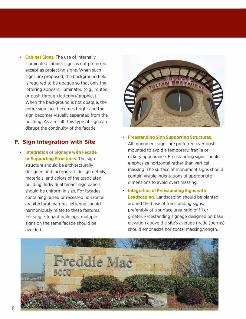
• Cabinet Signs. The use of internally illuminated cabinet signs is not preferred, except as projecting signs. When such signs are proposed, the background field is required to be opaque so that only the lettering appears illuminated (e.g., routed or push-through lettering/graphics). When the background is not opaque, the entire sign face becomes bright and the sign becomes visually separated from the building. As a result, this type of sign can disrupt the continuity of the façade.
F. Sign Integration with Site
• Integration of Signage with Façade or Supporting Structures. The sign structure should be architecturally designed and incorporate design details, materials, and colors of the associated building. Individual tenant sign panels should be uniform in size. For facades containing raised or recessed horizontal architectural features, lettering should harmoniously relate to these features. For single-tenant buildings, multiple signs on the same façade should be avoided.
• Freestanding Sign Supporting Structures. All monument signs are preferred over post-mounted to avoid a temporary, fragile or rickety appearance. Freestanding signs should emphasize horizontal rather than vertical massing. The surface of monument signs should contain visible indentations of appropriate dimensions to avoid overt massing.
• Integration of Freestanding Signs with Landscaping. Landscaping should be planted around the base of freestanding signs, preferably at a surface area ratio of 1:1 or greater. Freestanding signage designed on base elevation above the site’s average grade (berms) should emphasize horizontal massing/length.
9
Performance Based Freestanding Signs
To promote aesthetic improvements to site developments, allowances for additional
height and proportional sign area will be granted if specific enhancements are implemented as elements of sign installations.
• Architectural design implemented to match the design and material construction of the building associated with the sign.
• Use of contrasting colors for enhanced readability.
• External or projected light sources (no internal lighting).
• Panels for individual tenants must cover entire width of sign and have minimum height per panel.
• Additional landscaping area must be provided around sign in a square footage ratio of 1:1 as compared to area of sign.
Sign Types
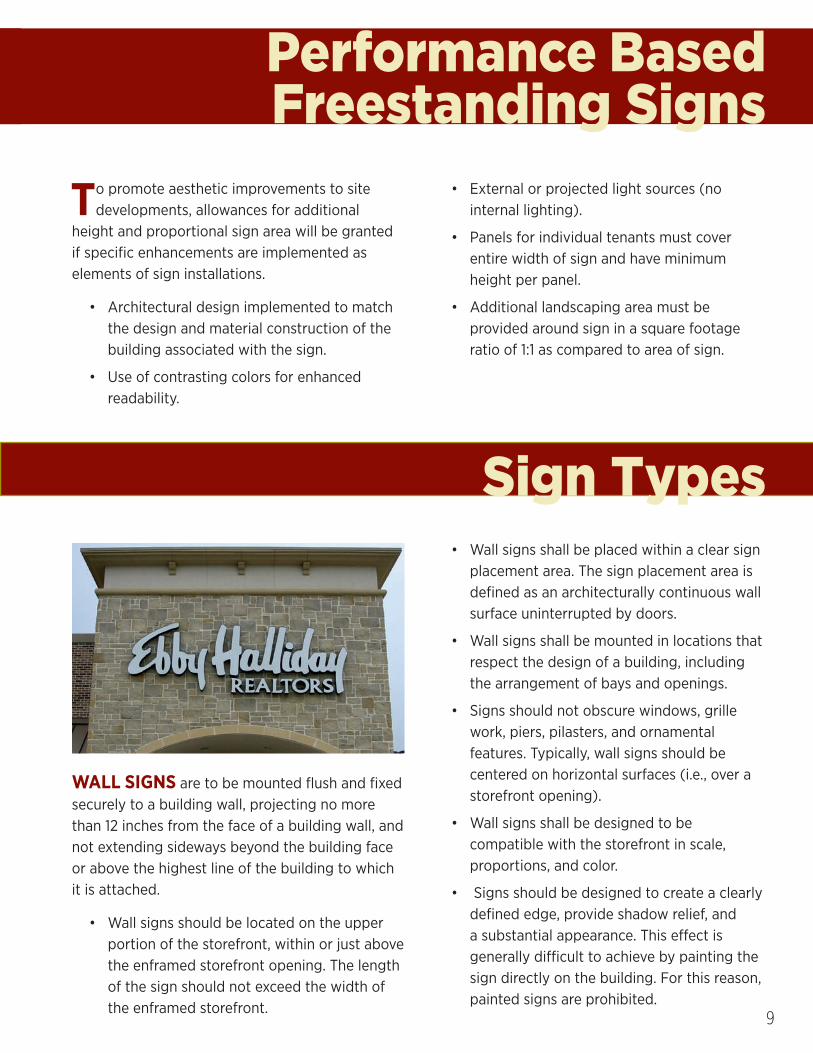
WALL SIGNS are to be mounted flush and fixed securely to a building wall, projecting no more than 12 inches from the face of a building wall, and not extending sideways beyond the building face or above the highest line of the building to which it is attached.
• Wall signs should be located on the upper portion of the storefront, within or just above the enframed storefront opening. The length of the sign should not exceed the width of the enframed storefront.
• Wall signs shall be placed within a clear sign placement area. The sign placement area is defined as an architecturally continuous wall surface uninterrupted by doors.
• Wall signs shall be mounted in locations that respect the design of a building, including the arrangement of bays and openings.
• Signs should not obscure windows, grille work, piers, pilasters, and ornamental features. Typically, wall signs should be centered on horizontal surfaces (i.e., over a storefront opening).
• Wall signs shall be designed to be compatible with the storefront in scale, proportions, and color.
• Signs should be designed to create a clearly defined edge, provide shadow relief, and a substantial appearance. This effect is generally difficult to achieve by painting the sign directly on the building. For this reason, painted signs are prohibited.

10
AWNING AND CANOPY SIGNS are signs that are printed on, painted on, or attached to an awning or canopy above a business door or window. They generally serve to bring color to the shopping environment and are oriented toward pedestrians from the opposite side of the street.
• Awnings and canopies must be permanently attached to buildings.
• The minimum height of awnings shall be 8 feet from the lowest point to the sidewalk.
• Open-ended awnings are preferred.
• Awnings and canopies shall be mounted on the horizontal framing element separating the storefront window from the transom (a crosspiece separating a doorway from a window).
• Awnings shall be designed to project over individual window and door openings and not project as a single continuous feature extending over masonry piers or arches.
• Awnings with back-lit graphics or other kinds of interior illumination are not permitted.
• Matte finish canvas, glass, or metal are appropriate materials for awnings or canopies.
• Awnings with a solid color are preferred. Striped awnings may be appropriate for some buildings without ornamental facades. Striped awnings with highly contrasting, bright colors may be visually blaring and inappropriate.

11
PROJECTING SIGNS are affixed to the face of a building or structure and project in a perpendicular manner more than 12 inches from the wall surface of that portion of the building or structure to which it is mounted. Projecting signs are strongly encouraged in transit center districts and should be carefully designed to reflect the character of each building and business as well as fitting comfortably with other adjacent signage.
• Projecting signs should not be mounted above the second floor window-sill in multi-storied buildings.
• The design of the sign should consider visually interesting elements such as square or rectangular shapes with painted or applied letters, two or three dimensional symbols or icons, irregular outlines, and/or internal cut-outs.
• Projecting signs should fit within an imaginary rectangle with a maximum area of 5 square feet.
• Projecting signs shall be small in scale and provide a vertical clearance of 7.5 feet along pedestrian areas.
• Projecting signs shall be oriented to pedestrians passing on the sidewalk in front of the buildings rather than to automobiles or pedestrians on the far side of the street. This can be achieved by providing a maximum clearance of 12 inches between the building face and sign and maintaining a projection of 36 inches.
• Mounting hardware should be an attractive and integral part of the sign design. Simple round pipe brackets with plugged ends or added decorative end elements are generally appropriate for signs. However, metal brackets of a more decorative and complex shapes are encouraged where appropriate to add to the character of the building.

12
MARQUEE SIGNS are projecting signs attached to or supported by a permanent canopy often made of metal and glass. Marquee signs are to be installed only on buildings occupied by theaters, cinemas, performing arts facilities, or parking structures.
• The sign copy of marquee signs shall be limited to include only the facility’s name and changeable copy related to current and future attractions.
HANGING SIGNS are similar to projecting signs except that they are suspended below a marquee or under a canopy. Hanging signs are generally smaller than projecting signs due to their lower mounting height.
• Hanging signs shall be used only at ground floor locations except for upper floor businesses with covered entry porches and balconies.
• Hanging signs shall be treated similar to but smaller than projecting signs.
• Hanging signs, excluding supporting rods, chains or similar hangers, shall fit within an imaginary rectangle with a maximum area of 4 square feet.
• Signs shall be oriented toward the pedestrian and impart a sense of creativity in its design.
WINDOW SIGNS are signs that are painted, posted, displayed, or etched on an interior translucent or transparent surface, including windows or doors. This type of signage generally contains only text, but in some circumstances can express a special business personality through graphic logos or images combined with color.
• Window signs should not exceed 15% of the window area so that visibility into and out of the window is not obscured.
• Sign copy shall not exceed 8 inches in height.
• Window sign copy shall be applied directly to glazed area.
• Window signs should be created from high-quality materials such as paint, gold-leaf, or neon. Appropriate techniques for window signs include sandblasting or etched glass.
• Window signs should be applied directly to the interior face of the glazing or hung inside the window, thereby concealing all mounting hardware and equipment.
• Well-designed window graphics should be used in the construction of the sign to attract attention but still allow pedestrians to view store interiors.

13
RESTAURANT MENU SIGNS are signs that incorporate a menu containing a listing of products and prices offered by the business. Such signs facilitate the customer in locating a restaurant in which to patronize. Therefore, prominently displayed menus with prices and other important information can help the customer in making this decision.
• Restaurant menu signs should be located in a permanently mounted display box on the surface of the building adjacent to the entry. Taping a menu to a box is not an appropriate menu sign.
• For special circumstances in which restaurants occupy a considerable amount of window space, menus are to be decoratively displayed in the window adjacent to the entry.
• High quality materials and artistic designs shall be used in the construction of menu signs.
• Restaurant menu signs are not included in the calculation of maximum sign area.
• Restaurant menu signs shall be appropriate in size, location, and design to the character and architectural detail of the building as well as to the character of the restaurant.
PLAQUE SIGNS are small versions of wall signs that are attached to surfaces adjacent to shop front entries.
• Plaque signs are to be located only on wall surfaces adjacent to tenant entries.
• Plaque signs are to fit within an imaginary rectangle with a maximum area of 2 square feet.
• Limit plaque sign projections from wall surfaces to a maximum of 2 inches.
• Signs are to include the business name and a business logo.
• Plaque signs are encouraged to include unique designs or other visually stimulating decorations and may be irregular in outline shape.

14
TENANT IDENTIFICATION SIGNS are used to identify multi-tenant buildings and businesses that have direct frontage on a public street. Tenant directory signs shall be constructed and oriented to the pedestrian.
• Tenant directory signs shall be mounted flat against a solid wall or incorporated into a freestanding sign located on the property on which the tenants are located.
• The maximum sign height, including the sign base, is not to exceed 6 feet.
• The sign copy may include the following: building or project name, project logo, address, business tenant names.
• The letter size of the building name, project name, or logo shall not exceed 30% of the copy allowed.
• Tenant directory signs should be constructed out of materials that compliment both the building structure and its use.

15
A-FRAME SIGNS are designed to stand on their own, either on public or private property. Such signs are portable and are usually placed along public sidewalks to attract pedestrians into shopping areas.
• A-frame signs are permitted in the TC (Transit Center) district only.
• A-frame signs must be constructed using one of the following durable materials: wooden or metal signs suspended from a wire frame, wooden A-frame signs with open bases, or shaped silhouette signs made of plywood, metal, or similar wood-like material that can withstand various weather conditions.
• Glass, breakable materials, paper, laminated paper, vinyl, plastic, PVC pipe frames or illumination are not permitted materials for a-frame signs.
• A-frame sign designs shall be uncluttered, with a minimum of text. Logos and graphics are encouraged.
• A-frame signs must not be permanently affixed to any object, structure, or the ground.
• A-frame signs may contain one area not larger than one square foot in size, with small text. The remainder of the sign lettering shall be between 2-4 inches high.
PERMANENT BANNER SIGNS often help to add interest and color to blank facades and special buildings. They are to be vertically oriented and compatible with the overall character and color of the building.

16
TEMPORARY SIGNS can take the form of real estate, banners, window graphics, etc. Temporary signs may contain written messages and should use a simple font that is easy to read.
• Temporary signs shall not cover more than 10% of the total window and door sign area visible from the exterior.
• Temporary signs should be made of durable materials and shall not incorporate fluorescent or intensely bright colors.
• Temporary signs should be carefully designed and constructed, as they reflect on the quality of the business.
• Temporary signs are to be displayed for no more than ninety days in a calendar year.
TEMPORARY GROUND SIGNS for real estate are on-premise signs pertaining to the sale or rental of a property.
• Real estate signs have a duration of 12 months.
• Real estate signs are renewable annually or until 80% of building space has been leased or sold.
• Real estate signs should be setback from the street and comply with the visibility ordinance.

17
DIRECTIONAL SIGNS are signs intended to route traffic through a site to access additional tenants or services.
• Directional signs are to be similar in nature to other directional signs on site.
• Directional signs should be compatible with building and site design.
ELECTRONIC SIGNS may be used to provide changeable messages using light-emitting diodes (LED).
• Electronic panels in signs shall not take up more than one third (1/3) of the overall sign area.
• Minimum sign change cycle shall be seven (7) seconds.
• Limited to public and private schools, churches, retail, banking and similar services.