bringing statistics to life! -...
TRANSCRIPT
Bringing Statistics to Life!A five-day exploration of frequency tables, line
plots and box-and-whisker plots.
Grade Seven
by:
~Cory Savard~
2
Overall Unit Objectives
Upon completion of this unit, students will be able to complete the following tasks:
1. Organize and interpret data in a frequency table.
Standards met:NCTM:Data Analysis and Probability
- select, create and use appropriate graphical representations of data, includinghistograms, box plots and scatterplots.
NYS/MST:#4 Modeling/Multiple Representation
- represent numerical relationships in one and two-dimensional graphs.2. Construct and interpret line plots.Standards met:NCTM:Data Analysis and Probability
- select, create and use appropriate graphical representations of data, includinghistograms, box plots and scatterplots.
- discuss and understand the correspondence between data sets and theirgraphical representation, especially histograms, stem-and-leaf plots, boxplotsand scatterplots.
NYS/MST:#4 Modeling/Multiple Representation
- represent numerical relationships in one and two-dimensional graphs.3. Find measures of central tendency and use them to describe a set of data.Standards met:NCTM:Data Analysis and Probability
- find, use and interpret measures of central spread, including mean and theinter-quartile range.
NYS/MST#5 Measurement
- use statistical methods including measures of central tendency to display,describe and compare data.
4. Construct and interpret a box-and-whisker plot using traditional methods as wellas the TI-73 graphing calculator.Standards met:NCTM:Data Analysis and Probability
- select, create and use appropriate graphical representations of data, includinghistograms, box plots and scatterplots.
- discuss and understand the correspondence between data sets and theirgraphical representation, especially histograms, stem-and-leaf plots, boxplotsand scatterplots.

3
- select, apply and translate among mathematical representations to solveproblems.
NYS/MST:#4 Modeling/Multiple Representation
- represent numerical relationships in one and two-dimensional graphs.
4
Resources Used
1. “Mathematics: Applications and Concepts Course 2”, Calculator and SpreadsheetMasters, Copyright by Glencoe/The McGraw-Hill Companies, Inc. Material usedincludes the calculator activity on page #19.
2. “Dinah Zike’s Teaching Mathematics with Foldables”, Copyright by Glencoe/TheMcGraw-Hill companies, Inc. Material used includes the foldable instructions for thebox-and-whisker plot found on page #79 as well as the instructions for the book typefound on page #17.
3. “Mathematics: Applications and Concepts Course 2”, Copyright 2004 byGlencoe/The McGraw-Hill Companies, Inc. Materials used include various sectionsfrom chapter two.
4. The NCTM standards found on the NCTM website: www.nctm.org
5. The MST standards on CD.
5
Materials and Equipment Needed
1. . “Mathematics: Applications and Concepts Course 2”, Calculator and SpreadsheetMasters: one copy of page #19 for each student as well as any needed teacher copies.
2. “Dinah Zike’s Teaching Mathematics with Foldables”: teacher should reference pages#17 and #79.
3. A class set of TI-73 graphing calculators.
4. An overhead projector.
5. An overhead view screen unit for the TI-73 as well as a compatible calculator.
6. Three sheets of lined paper for each student as well as extras for the teacher.
7. Markers/drawing materials.
8. Stapler
9. Bookwork Answer Keys #1 - 5
10. “Mathematics: Applications and Concepts Course 2” by Glencoe.
6
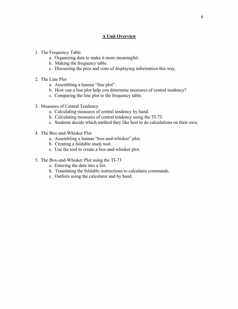
A Unit Overview
1. The Frequency Tablea. Organizing data to make it more meaningful.b. Making the frequency table.c. Discussing the pros and cons of displaying information this way.
2. The Line Plota. Assembling a human “line plot”.b. How can a line plot help you determine measures of central tendency?c. Comparing the line plot to the frequency table.
3. Measures of Central Tendencya. Calculating measures of central tendency by hand.b. Calculating measures of central tendency using the TI-73.c. Students decide which method they like best to do calculations on their own.
4. The Box-and-Whisker Plota. Assembling a human “box-and-whisker” plot.b. Creating a foldable study tool.c. Use the tool to create a box-and-whisker plot.
5. The Box-and-Whisker Plot using the TI-73a. Entering the data into a list.b. Translating the foldable instructions to calculator commands.c. Outliers using the calculator and by hand.
7
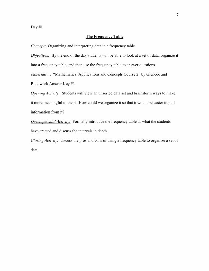
Day #1
The Frequency Table
Concept: Organizing and interpreting data in a frequency table.
Objectives: By the end of the day students will be able to look at a set of data, organize it
into a frequency table, and then use the frequency table to answer questions.
Materials: . “Mathematics: Applications and Concepts Course 2” by Glencoe and
Bookwork Answer Key #1.
Opening Activity: Students will view an unsorted data set and brainstorm ways to make
it more meaningful to them. How could we organize it so that it would be easier to pull
information from it?
Developmental Activity: Formally introduce the frequency table as what the students
have created and discuss the intervals in depth.
Closing Activity: discuss the pros and cons of using a frequency table to organize a set of
data.
8
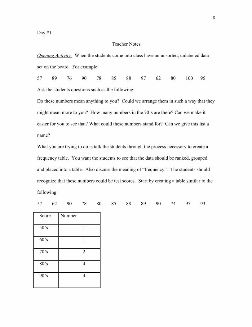
Day #1
Teacher Notes
Opening Activity: When the students come into class have an unsorted, unlabeled data
set on the board. For example:
57 89 76 90 78 85 88 97 62 80 100 95
Ask the students questions such as the following:
Do these numbers mean anything to you? Could we arrange them in such a way that they
might mean more to you? How many numbers in the 70’s are there? Can we make it
easier for you to see that? What could these numbers stand for? Can we give this list a
name?
What you are trying to do is talk the students through the process necessary to create a
frequency table. You want the students to see that the data should be ranked, grouped
and placed into a table. Also discuss the meaning of “frequency”. The students should
recognize that these numbers could be test scores. Start by creating a table similar to the
following:
57 62 90 78 80 85 88 89 90 74 97 93
Score Number
50’s 1
60’s 1
70’s 2
80’s 4
90’s 4
9
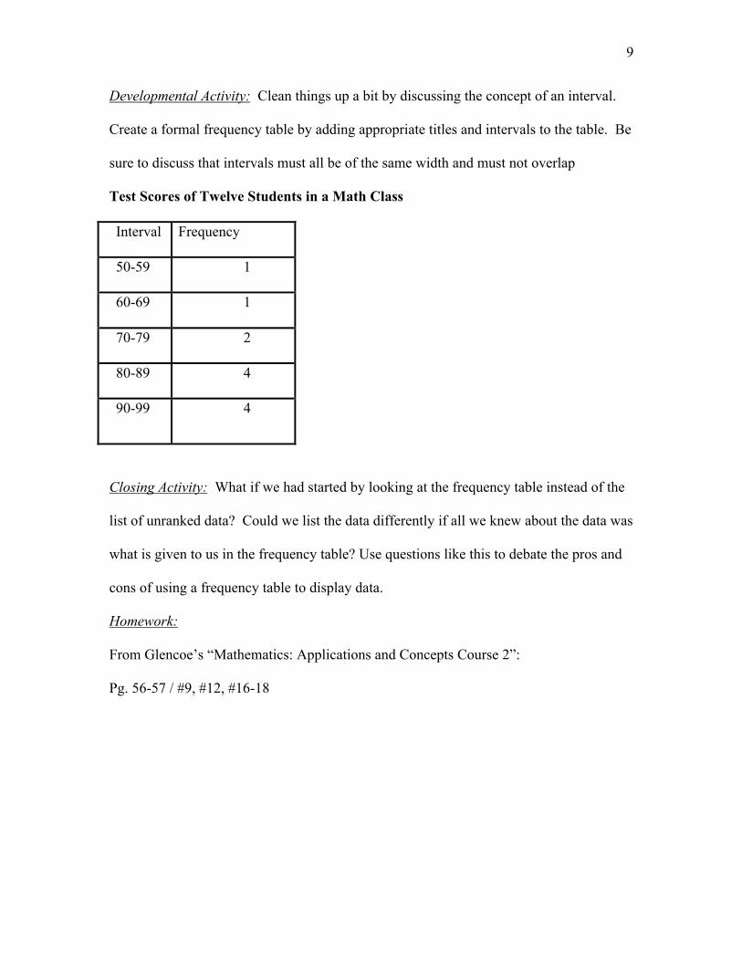
Developmental Activity: Clean things up a bit by discussing the concept of an interval.
Create a formal frequency table by adding appropriate titles and intervals to the table. Be
sure to discuss that intervals must all be of the same width and must not overlap
Test Scores of Twelve Students in a Math Class
Interval Frequency
50-59 1
60-69 1
70-79 2
80-89 4
90-99 4
Closing Activity: What if we had started by looking at the frequency table instead of the
list of unranked data? Could we list the data differently if all we knew about the data was
what is given to us in the frequency table? Use questions like this to debate the pros and
cons of using a frequency table to display data.
Homework:
From Glencoe’s “Mathematics: Applications and Concepts Course 2”:
Pg. 56-57 / #9, #12, #16-18
10
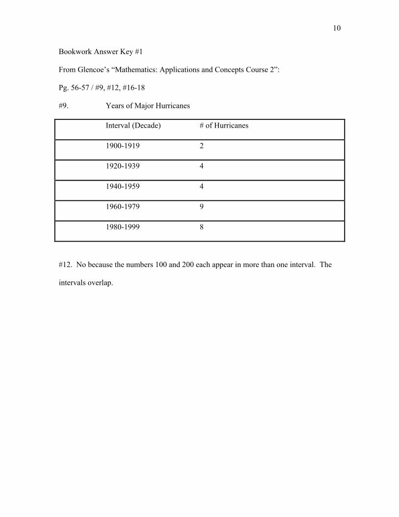
Bookwork Answer Key #1
From Glencoe’s “Mathematics: Applications and Concepts Course 2”:
Pg. 56-57 / #9, #12, #16-18
#9. Years of Major Hurricanes
Interval (Decade) # of Hurricanes
1900-1919 2
1920-1939 4
1940-1959 4
1960-1979 9
1980-1999 8
#12. No because the numbers 100 and 200 each appear in more than one interval. The
intervals overlap.
11
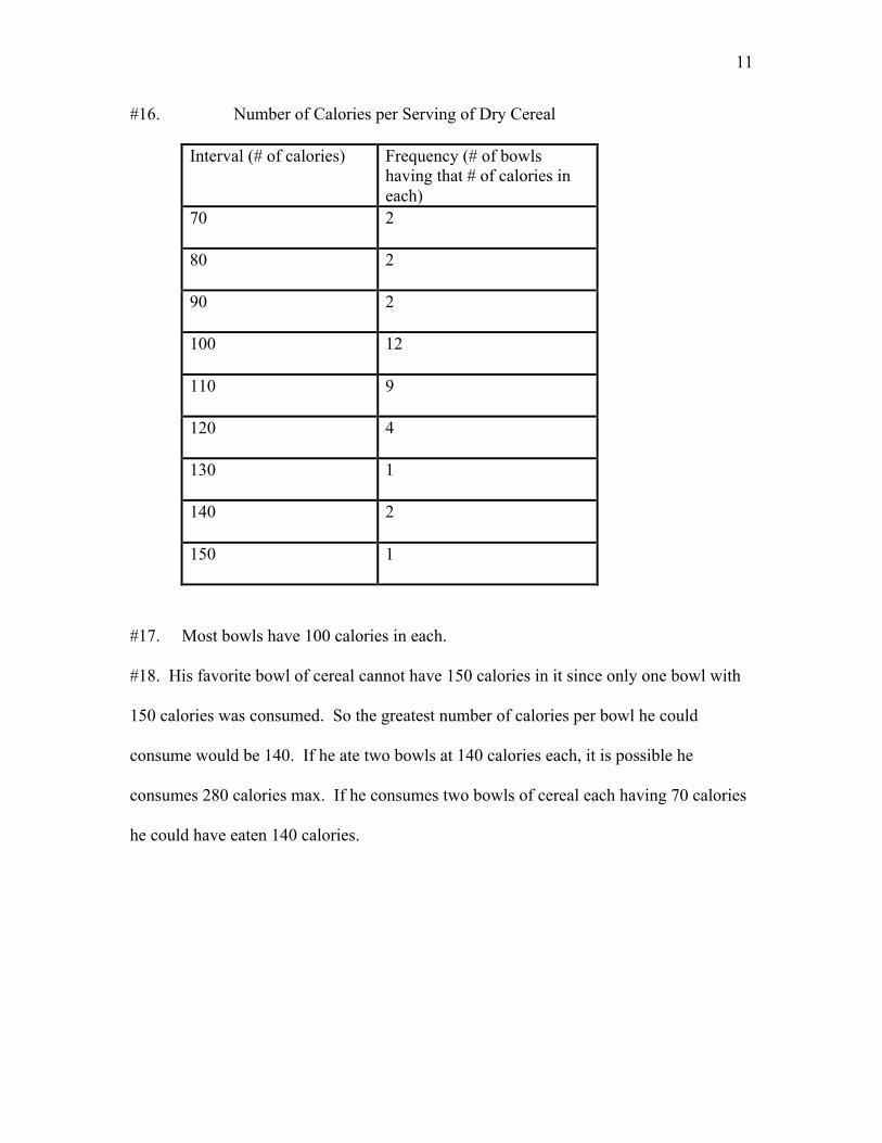
#16. Number of Calories per Serving of Dry Cereal
Interval (# of calories) Frequency (# of bowlshaving that # of calories ineach)
70 2
80 2
90 2
100 12
110 9
120 4
130 1
140 2
150 1
#17. Most bowls have 100 calories in each.
#18. His favorite bowl of cereal cannot have 150 calories in it since only one bowl with
150 calories was consumed. So the greatest number of calories per bowl he could
consume would be 140. If he ate two bowls at 140 calories each, it is possible he
consumes 280 calories max. If he consumes two bowls of cereal each having 70 calories
he could have eaten 140 calories.
12
Day #2
The Line Plot
Concept: Constructing and interpreting a line plot.
Objectives: By the end of the day students will be able to create and read a line plot and
also use the line plot to answer questions.
Materials: Post-it notes (one for each student), “Mathematics: Applications and
Concepts Course 2” by Glencoe and Bookwork Answer Key #2.
Opening Activity: Assemble the students into a human “line plot” based on a survey
posted on the board.
Developmental Activity: Discuss how we could use a line plot to answer questions and
even find measures of central tendency.
Closing Activity: Compare and contrast the line plot vs. the frequency table. Which one
is better and why?
13
Day #2
Teacher Notes
Opening Activity: As the students enter the room they should receive a post-it note and
see a survey question on the board, such as “How many brothers and sisters do you
have?”. Students are to write the number of siblings they have on the post-it note, and
then assemble themselves into a line beginning with the lowest number and ending with
the highest number. Once they have done this, ask the students with the same number to
stand in rows one in front of the other. Explain to the students that what they have just
done is create a human line plot. Draw a number line on the board beginning with one
less than the smallest number and ending with one greater than the largest number of
siblings, and ask each student to place their post-it note above the corresponding number
on the number line. This gives a visual of the human line plot that we can study once the
students return to their seats.
Developmental Activity: There are several questions that could be answered by reading
information off of our line plot. Such as, how many students have three siblings? What is
the smallest number of siblings in the class? The largest? What is the most common
number of siblings? How can you tell? What is another name for the most common
number of siblings? We now have entered the realm of measures of central tendency.
We can ask the students to calculate the range of this set of data. They can easily
calculate the mean (average) number if siblings and count off from each side of the line
plot to find the median number if siblings. Also discuss clusters, gaps and outliers and if
there are any on your line plot.
14
Closing Activity: Ask the students to compare and contrast the line plot vs. the frequency
table. Is one more informative than the other? Why? Is there any information that you
can get from looking at one that you can’t get from looking at the other?
Homework:
From Glencoe’s “Mathematics: Applications and Concepts Course 2”:
Pg #67-68/ #14-18, #23
15
Bookwork Answer Key #2
From Glencoe’s “Mathematics: Applications and Concepts Course 2”:
Pg #67-68/ #14-18, #23
#14. True. Simply count the number of marks above the line.
#15. Not always. A cluster could appear anywhere in a plot.
#16. One can and two cans both had four responses.
#17. The range is 5.
#18. Of the 16 people surveyed, most of them drink between zero and two cans of pop
per day.
#23. The more consistent person is Bowler B since there is a cluster of scores between
95 and 97, where as the scores of Bowler A are scattered over a much wider range.
16
Day #3
Measures of Central Tendency
Concept: Calculating mean, median, mode and range.
Objectives: By the end of this lesson students will be able to calculate the measures of
central tendency by hand and also by using the TI-73 graphing calculator.
Materials Needed: A class set of TI-73 graphing calculators, and also an overhead
projector, view screen and a compatible TI-73 with the view screen port. Also,
“Mathematics: Applications and Concepts Course 2” by Glencoe and Bookwork Answer
Key #3.
Opening Activity: Instruct the students to calculate the measures of central tendency for
the set of data on the board by hand. Review may be necessary at this time.
Developmental Activity: Demonstrate with the teacher calculator and view screen how to
calculate the measures of central tendency using the TI-73 graphing calculator as students
follow along on their calculator from the class set.
Closing Activity: Display a second set of data on the board and ask the students to find
the measures of central tendency using whichever method they prefer. Answers will be
written down and collected.
17
Day #3
Teacher Notes
Opening Activity: When the students enter the room they will find a relatively simple set
of unranked data on the board with instructions for them to calculate the mean, median
and mode of the data set by hand. It may or may not be necessary to review this at this
time. The students should see a data set like the one below:
8 9 2 12 10 6 11 3 2
Answers:
Ranked: 2 2 3 6 8 9 10 11 12
Mean: 2 + 2 + 3 + 6 + 8 + 9 + 10 + 11 + 12 = 63; 63/9 = 7
Median: 8
Mode: 2
Developmental Activity: Now demonstrate how to calculate these measures of central
tendency using the TI-73 graphing calculator and view screen. Below are the commands
necessary to do this followed by a picture of the calculator screen as you execute these
commands.
To rank the data:
Enter the unranked data into a list as is. We first want to clear all lists by hitting 2nd,
MEM, 6, enter.
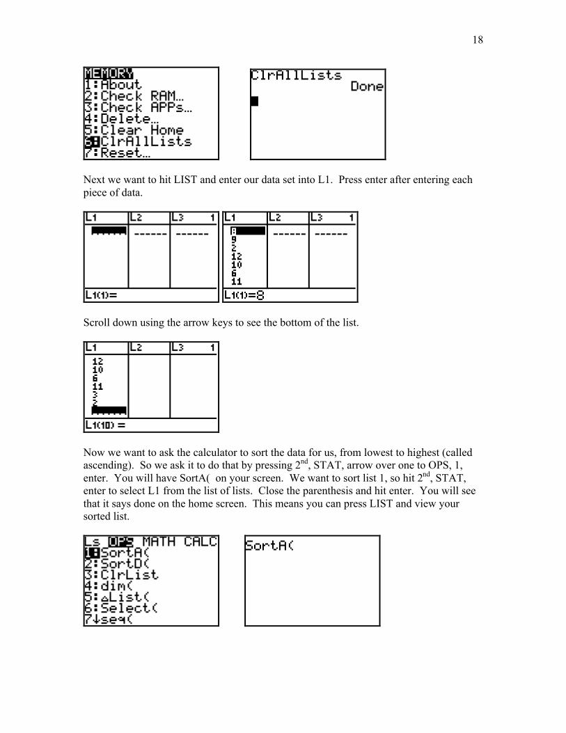
18
Next we want to hit LIST and enter our data set into L1. Press enter after entering eachpiece of data.
Scroll down using the arrow keys to see the bottom of the list.
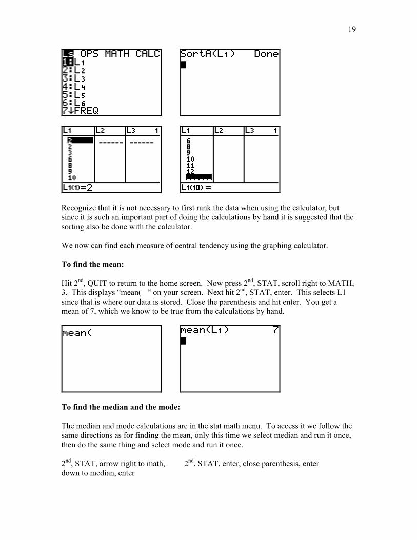
Now we want to ask the calculator to sort the data for us, from lowest to highest (calledascending). So we ask it to do that by pressing 2nd, STAT, arrow over one to OPS, 1,enter. You will have SortA( on your screen. We want to sort list 1, so hit 2nd, STAT,enter to select L1 from the list of lists. Close the parenthesis and hit enter. You will seethat it says done on the home screen. This means you can press LIST and view yoursorted list.
19
Recognize that it is not necessary to first rank the data when using the calculator, butsince it is such an important part of doing the calculations by hand it is suggested that thesorting also be done with the calculator.
We now can find each measure of central tendency using the graphing calculator.
To find the mean:
Hit 2nd, QUIT to return to the home screen. Now press 2nd, STAT, scroll right to MATH,3. This displays “mean( “ on your screen. Next hit 2nd, STAT, enter. This selects L1since that is where our data is stored. Close the parenthesis and hit enter. You get amean of 7, which we know to be true from the calculations by hand.
To find the median and the mode:
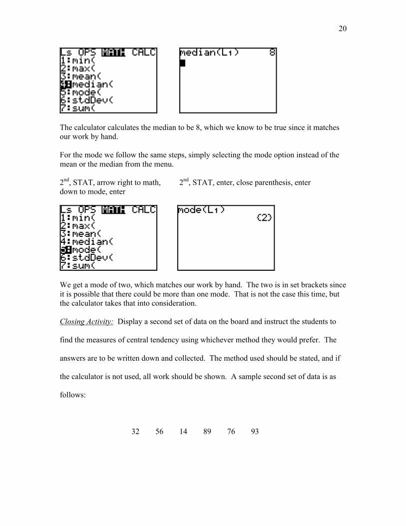
The median and mode calculations are in the stat math menu. To access it we follow thesame directions as for finding the mean, only this time we select median and run it once,then do the same thing and select mode and run it once.
2nd, STAT, arrow right to math, 2nd, STAT, enter, close parenthesis, enterdown to median, enter
20
The calculator calculates the median to be 8, which we know to be true since it matchesour work by hand.
For the mode we follow the same steps, simply selecting the mode option instead of themean or the median from the menu.
2nd, STAT, arrow right to math, 2nd, STAT, enter, close parenthesis, enterdown to mode, enter
We get a mode of two, which matches our work by hand. The two is in set brackets sinceit is possible that there could be more than one mode. That is not the case this time, butthe calculator takes that into consideration.
Closing Activity: Display a second set of data on the board and instruct the students to
find the measures of central tendency using whichever method they would prefer. The
answers are to be written down and collected. The method used should be stated, and if
the calculator is not used, all work should be shown. A sample second set of data is as
follows:
32 56 14 89 76 93
21
Answers:
Ranked: 14 32 56 76 89 93
Mean: 60
Median: 56 + 76 = 132; 132/2 = 66
Mode: None
NOTE: Do not forget to mention to the students that they should either clear their lists
again before they begin the closing activity, or store the new data in list 2 and remember
to use L2 everywhere they used L1 previously.
Also, instruct the students to think about when each measure of central tendency would
not be the best representation of the data. Discuss this as a class.
Homework:
From Glencoe’s “Mathematics: Applications and Concepts Course 2”:
Pg. #71-72 / #3, 16, 17, 18.
22
Bookwork Answer Key #3
From Glencoe’s “Mathematics: Applications and Concepts Course 2”:
Pg. #71-72 / #3, 16, 17, 18.
#3. Jared must be correct because Marissa has a mode of 9 minutes when the choices for
minutes are 1 – 4.
#16. Mean = 18.55; Median = 18.5; Mode = 12, 15, 18.
#17. The mode best represents the data because we are talking about weeks on a music
chart. It doesn’t make sense that a song would be on the chart for a fractional part of a
week.
#18. The number 3.28 must be an average because we are talking about a number of
people. Therefore all of the data entries must be whole numbers, which would make the
mode a whole number.
23
Day #4
The Box-and-Whisker Plot
Concept: Students will create a foldable study tool that they will use as a guide to help
them create a box-and-whisker plot.
Objectives: By the end of this lesson students will know what a box-and-whisker plot is
and will understand how to create a box-and-whisker plot.
Materials: A class set of TI-73 graphing calculators, an overhead projector, view screen
and compatible TI-73, three sheets of lined notebook paper for each student (and some
extra too), markers or other drawing materials, and also a stapler. Also, “Mathematics:
Applications and Concepts Course 2” by Glencoe and Bookwork Answer Key #4.
Opening Activity: Students will arrange themselves in a human box-and-whisker plot
based on the day of the year that each was born.
Developmental Activity: Students will create a foldable study tool to use as a way to
recall the steps necessary to create a box-and-whisker plot.
Closing Activity: Students will create a box-and-whisker plot using someone else’s
foldable for a given set of data. TI-73 graphing calculators will be available for those
students who prefer to use one to find the measures of central tendency.
24
Day #4
Teacher Notes
Opening Activity: Instruct each student to calculate the day of the year that he/she was
born. For example, if someone were born on January 23rd (regardless of the year), his/her
birth day number would be 23. If someone were born on February 27th, his/her birth day
would be 31 + 27 = 58. Thirty-one for the 31 days in January plus 27 because he/she was
born on the 27th day of February, for a total birth day of 58. What you should end up
with is a set of data between one and 365. If there is a student in the class who was born
on February 29th it can then be decided to have a set of data between one and 366, but it
must be decided unanimously at the beginning so the students who were born after
February know how many days to add for that month. It is suggested that the number of
days in each month be written on the board.
January – 31 days July – 31 days
February – 28 days August – 31 days
March – 31 days September – 30 days
April – 30 days October – 31 days
May – 31 days November – 30 days
June – 30 days December – 31 days
Once each student has calculated his/her birth day and written it on a scrap of
paper, the class will assemble themselves into a line, in order from lowest to highest.
This represents the ranking of the data. They should be familiar with this from working
with frequency tables and line plots.
25
Next the students will count off from the ends of the line inward to find the
median. If there is an even number of students in the class it will be necessary to average
the two middle birth days. Write the median on the board. If there is one median the
students on either side of the median student should separate slightly, leaving the one
median student alone. If there are two median students they should separate slightly,
leaving nobody in the middle. This divides the data set into two groups, the lower set of
data and the upper set of data. Repeat this process of finding the median for the lower set
of data and the upper set of data. In other words, instruct the students in the lower set of
data to count off to find the median and instruct the students in the upper set of data to
count off to find the median. This concludes the separation of the data set into quartiles.
Discuss what quartiles are, how they were determined and how they are identified. The
lower quartile is identified as Q1 and the upper quartile as Q3. The median would be Q2,
however it is referred to as the median because of its importance. Explain to the students
that the data between Q1 and Q3 is in the “box”. As these pieces of the plot are identified
they should be written on the board, slowly creating a visual of what an actual box-and-
whisker plot should look like.
Other things to discuss include the minimum and maximum values, as well as the
interquartile range. The interquartile range is the difference between Q3 and Q1. Ask
the students questions like, “Where is most of the data located?”, “How much of the data
do you think is really there? What percent?”, “How much of the data appears to be
located on either side of the box?”, “What are the minimum and maximum values?”.
Explain to the students that 50% of the data lies in the interquartile range (IQR), 25% lies
between the minimum value and Q1 and 25% lies between Q3 and the maximum value.
26
Generate as a class a list of the steps followed to create the human box-and-whisker plot.
Developmental Activity: Each student should receive three sheets of notebook paper.
These sheets of paper will be used to create the foldable study tool, which is a flipbook of
the steps necessary to create a box-and-whisker plot.
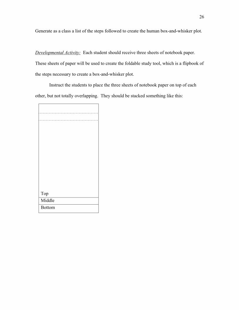
Instruct the students to place the three sheets of notebook paper on top of each
other, but not totally overlapping. They should be stacked something like this:
Top
Middle
Bottom
27
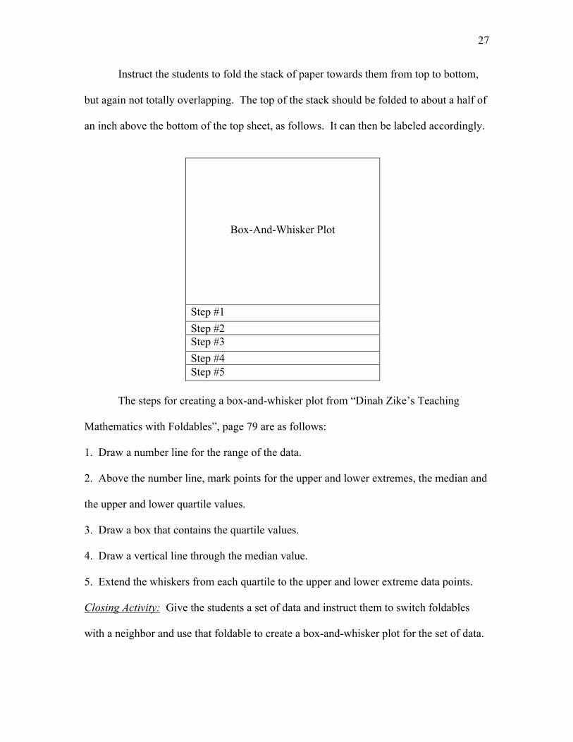
Instruct the students to fold the stack of paper towards them from top to bottom,
but again not totally overlapping. The top of the stack should be folded to about a half of
an inch above the bottom of the top sheet, as follows. It can then be labeled accordingly.
Box-And-Whisker Plot
Step #1
Step #2Step #3
Step #4Step #5
The steps for creating a box-and-whisker plot from “Dinah Zike’s Teaching
Mathematics with Foldables”, page 79 are as follows:
1. Draw a number line for the range of the data.
2. Above the number line, mark points for the upper and lower extremes, the median and
the upper and lower quartile values.
3. Draw a box that contains the quartile values.
4. Draw a vertical line through the median value.
5. Extend the whiskers from each quartile to the upper and lower extreme data points.
Closing Activity: Give the students a set of data and instruct them to switch foldables
with a neighbor and use that foldable to create a box-and-whisker plot for the set of data.
28
TI-73 graphing calculators will be available for those students who would prefer to find
the medians using the calculator.
Homework:
From Glencoe’s “Mathematics: Applications and Concepts Course 2”:
Pg. #82-83/ #2, #7 – 9
29
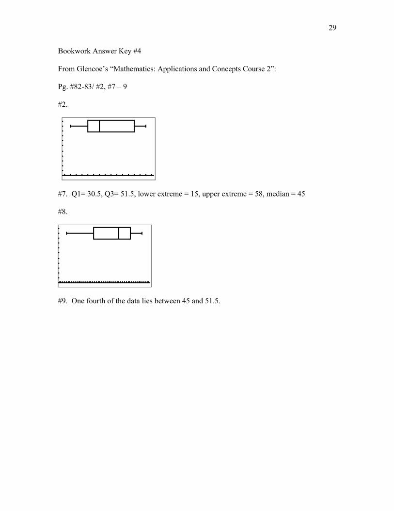
Bookwork Answer Key #4
From Glencoe’s “Mathematics: Applications and Concepts Course 2”:
Pg. #82-83/ #2, #7 – 9
#2.
#7. Q1= 30.5, Q3= 51.5, lower extreme = 15, upper extreme = 58, median = 45
#8.
#9. One fourth of the data lies between 45 and 51.5.
30
Day #5
The Box-and-Whisker Using the TI-73
Concept: Create box-and-whisker plots on the TI-73 graphing calculator.
Objective: By the end of this lesson students will be able to use the TI-73 graphing
calculator to create a box-and-whisker plot.
Materials: Each student will need a copy of the TI-73 activity on page 19 in
“Mathematics: Applications and Concepts Course 2”, Calculator and Spreadsheet
Masters. A class set of TI-73 graphing calculators, an overhead projector, an overhead
view screen and a compatible TI-73, the student- created foldables from Day #4,
“Mathematics: Applications and Concepts Course 2” by Glencoe, and Bookwork Answer
Key #5.
Opening Activity: A discussion about what the students a box-and-whisker plot would
look like under certain circumstances. For example, how would it look if there were
outliers? If there is a cluster of data?. How do we know for sure that a piece of data is an
outlier?.
Developmental Activity: As a class the students will work through a calculator activity
requiring them to create two box and whisker plots using the TI-73 graphing calculator.
Closing Activity: The method for calculating outliers will be introduced, and the students
will determine if their most recent set of data has any outliers in it.
31
Day #5
Teacher Notes
Opening Activity: Discuss with the students what they would expect a box-and-whisker
plot to look like if…..
A. There are outliers.
- The whisker on the side of the outlier would be very long.
B. There is a cluster of data, say, between Q1 and the median.
- The vertical lines for Q1 and the median would be closer together.
Ask the students if they think it is possible to determine for sure whether or not a
certain data item is an outlier. Do long whiskers always indicate the presence of an
outlier? How long is a long whisker? The students are to keep these things in mind during
the calculator activity.
Developmental Activity: Students are to complete the TI-73 activity on page 19 in
“Mathematics: Applications and Concepts Course 2”, Calculator and Spreadsheet
Masters. Students may work with a partner, using one calculator as they walk through
the example with the teacher and using the other partner’s calculator to complete the
activity at the bottom of the page with the other. The example problem gives a detailed
explanation of how to use the calculator to create a box-and-whisker plot. The activity at
the bottom of the page asks the students to create a box-and-whisker plot on their own
using the calculator and take note of the the min, max, Q1, median and Q3.
32
The box-and-whisker plot created from the example data set should be as follows:
min = 53; Q1 = 118; median = 256; Q3 = 339; max = 640.
The box-and-whisker plot created from the activity at the bottom of the page should be as
follows:
min = 15; Q1 = 29.5; median = 41; Q3 = 50; max = 72.
Closing Activity: Instruct the students to look back at the box-and-whisker plot from the
example data set. Recall that it looked like this:
Students may assume that just because the right whisker is long there are outliers. There
may be, but it cannot be determined for sure without using a proven method to be sure.
At this time inform the students that no matter how big or small a data item may seem, it
is not an outlier unless it lies more than 1.5(IQR) above Q3 or 1.5(IQR) below Q1. Now
33
instruct the students to use this formula to see whether or not there are actually any
outliers in the example set of data.
The IQR for the example set of data is as follows:
Q3 = 339
Q1 = 118
IQR = 339 – 118 = 221.
Outliers must be 1.5(IQR) above Q3 or below Q1, so let’s check it out.
1.5(221) = 331.5.
Q1 – 331.5 = 118 – 331.5 = -213.5
There are no negative values in the example data set, therefore there are no outliers to the
left.
Q3 + 331.5 = 339 + 331.5 = 670.5
The highest data item is 640. So while the whisker seems long, the maximum value is
not quite high enough to be an outlier.
If time permits the students may calculate the outliers (if any) for the activity at
the bottom of their class work page.
Homework:
From Glencoe’s “Mathematics: Applications and Concepts Course 2”:
Pg. #82-83/ #3-6, #14
34
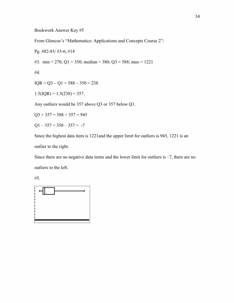
Bookwork Answer Key #5
From Glencoe’s “Mathematics: Applications and Concepts Course 2”:
Pg. #82-83/ #3-6, #14
#3. min = 270; Q1 = 350; median = 380; Q3 = 588; max = 1221
#4.
IQR = Q3 – Q1 = 588 – 350 = 238
1.5(IQR) = 1.5(238) = 357.
Any outliers would be 357 above Q3 or 357 below Q1.
Q3 + 357 = 588 + 357 = 945
Q1 – 357 = 350 – 357 = -7
Since the highest data item is 1221and the upper limit for outliers is 945, 1221 is an
outlier to the right.
Since there are no negative data items and the lower limit for outliers is –7, there are no
outliers to the left.
#5.
35
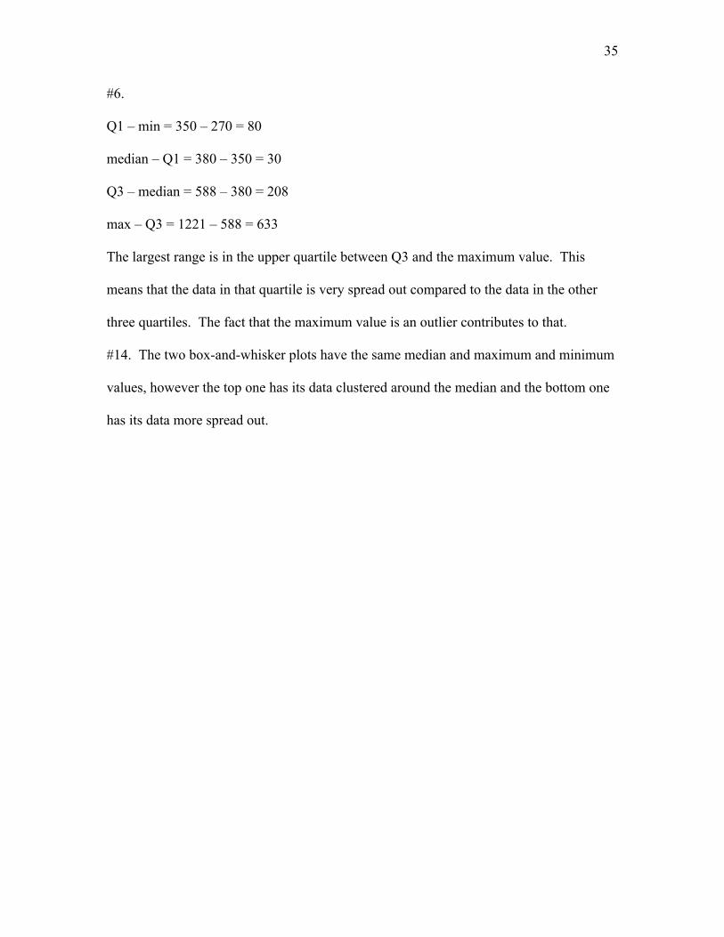
#6.
Q1 – min = 350 – 270 = 80
median – Q1 = 380 – 350 = 30
Q3 – median = 588 – 380 = 208
max – Q3 = 1221 – 588 = 633
The largest range is in the upper quartile between Q3 and the maximum value. This
means that the data in that quartile is very spread out compared to the data in the other
three quartiles. The fact that the maximum value is an outlier contributes to that.
#14. The two box-and-whisker plots have the same median and maximum and minimum
values, however the top one has its data clustered around the median and the bottom one
has its data more spread out.