brian - unit 14 lo4 - editing final materials
TRANSCRIPT

O C R - L E V E L 3 C A M B R I D G E I N T R O D U C T O R Y D I P L O M A I N M E D I A
- U N I T 1 4 :
C A N D I D A T E N A M E : B R I A N M I G U E L I N S U A C A N D I D A T E N U M B E R : 6 0 5 5 C E N T R E N A M E : S T A N D R E W S C A T H O L I C S E C O N D A R Y S C H O O L C E N T R E N U M B E R : 6 4 1 3 5

C O N T E N T S• Deadlines
• Post Production Skills
• Image Manipulation Step-by-Step
• Magazine Production Step-by-Step
• Safe Working Practices
• Changes following feedback
• Final Front Cover & Double Page Spread
• Witness Statement
• Summary

C H A R M D E A D L I N E S
• The proposed launch date for the magazine was December 2014.
• The production process ended at the end of November and the magazine was ready for retail for December 2014.

C H A R M D E A D L I N E S
• Managing the production schedule of the magazine ensured that the magazine was ready for publication before it’s December release.
• The meeting on Monday 3 November 2014 outlined the plan for the magazine. The meeting enabled us to decide on what content we want, allocate time to collect/create the content, edit the content, present the content and finally publish and retail the finished product.
Week Commencing (November 3, 2014)
Monday Tuesday Wednesday Thursday Friday
• Meeting with team to establish publication date of magazine.
• Create production schedule.
• Editorial meeting to decide content ideas for upcoming issue, including features, articles, images, interviews.
• Decide budget, allocating finances and resources for content acquisition and production.
• Content acquisition - commission in-house/external/free lance writers and editors to create content for magazine. (Includes research by journalists & reporters for stories, conducting interviews, producing images/illustrations/graphics etc.)
• Content acquisition - commission in-house/external/free lance writers and editors to create content for magazine. (Includes research by journalists & reporters for stories, conducting interviews, producing images/illustrations/graphics etc.)
• Content acquisition - commission in-house/external/free lance writers and editors to create content for magazine. (Includes research by journalists & reporters for stories, conducting interviews, producing images/illustrations/graphics etc.)
• Content acquisition - commission in-house/external/free lance writers and editors to create content for magazine. (Includes research by journalists & reporters for stories, conducting interviews, producing images/illustrations/graphics etc.)
Deadline Deadline Deadline Deadline Deadline
(End of Day November 3, 2014)
(End of Day November 14, 2014)
(End of Day November 14, 2014)
(End of Day November 14, 2014)
(End of Day November 14, 2014)

C H A R M D E A D L I N E S
• The content acquisition phase lasted a week, during which the interview for the double page spread was conducted and the images for the front cover and double page spread were taken (Thursday, November 6 2014).
• The next step was to edit the interview into the finished article and retouch and manipulate the images. This lasted two days.
Week Commencing (November 10, 2014)
Monday Tuesday Wednesday Thursday Friday
• Content acquisition - commission in-house/external/free lance writers and editors to create content for magazine. (Includes research by journalists & reporters for stories, conducting interviews, producing images/illustrations/graphics etc.)
• Sub-editing/quality control - editors/sub-editors check accuracy of facts & information, spelling, punctuation & grammar, ensure all pages follow house style.
• Sub-editing/quality control - editors/sub-editors check accuracy of facts & information, spelling, punctuation & grammar, ensure all pages follow house style.
• Layout - Layout team work on magazine layout and house style (utilising Desktop Publishing Programs such as InDesign or Pagemaker for layout and typesetting articles)
• Layout - Layout team work on magazine layout and house style (utilising Desktop Publishing Programs such as InDesign or Pagemaker for layout and typesetting articles)
Deadline Deadline Deadline Deadline Deadline
(End of Day November 10, 2014)
(End of Day November 12, 2014)
(End of Day November 12, 2014)
(End of Day November 17, 2014)
(End of Day November 17, 2014)
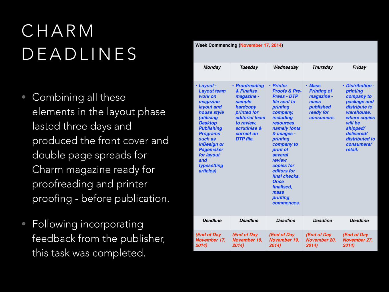
C H A R M D E A D L I N E S
• Combining all these elements in the layout phase lasted three days and produced the front cover and double page spreads for Charm magazine ready for proofreading and printer proofing - before publication.
• Following incorporating feedback from the publisher, this task was completed.
Week Commencing (November 17, 2014)
Monday Tuesday Wednesday Thursday Friday
• Layout - Layout team work on magazine layout and house style (utilising Desktop Publishing Programs such as InDesign or Pagemaker for layout and typesetting articles)
• Proofreading & Finalise magazine - sample hardcopy printed for editorial team to review, scrutinise & correct on DTP file.
• Printer Proofs & Pre-Press - DTP file sent to printing company, including resources namely fonts & images - printing company to print of several review copies for editors for final checks. Once finalised, mass printing commences.
• Mass Printing of magazine - mass published ready for consumers.
• Distribution - printing company to package and distribute to warehouse, where copies will be shipped/delivered/distributed to consumers/retail.
Deadline Deadline Deadline Deadline Deadline
(End of Day November 17, 2014)
(End of Day November 18, 2014)
(End of Day November 19, 2014)
(End of Day November 20, 2014)
(End of Day November 27, 2014)

C H A R M D E A D L I N E S
• The last week was allocated for distribution across the globe to retailers worldwide.
Week Commencing (November 24, 2014)
Monday Tuesday Wednesday Thursday Friday
• Distribution - printing company to package and distribute to warehouse, where copies will be shipped/delivered/distributed to consumers/retail.
• Distribution - printing company to package and distribute to warehouse, where copies will be shipped/delivered/distributed to consumers/retail.
• Distribution - printing company to package and distribute to warehouse, where copies will be shipped/delivered/distributed to consumers/retail.
• Distribution - printing company to package and distribute to warehouse, where copies will be shipped/delivered/distributed to consumers/retail.
• Magazine Delivery Day - available in retail stores/delivered to consumers.
Deadline Deadline Deadline Deadline Deadline
(End of Day November 27, 2014)
(End of Day November 27, 2014)
(End of Day November 27, 2014)
(End of Day November 27, 2014)
(Beginning of Day November 28, 2014)

P O S T P R O D U C T I O N S K I L L S
• Photoshop was the desktop publishing program of choice due to the flexibility and control it offers. The tools that Photoshop offers, such as the ruler tool for layout and the swatches tool for colour consistency, allows the production of Charm music magazine as it was visualised through the pre-production materials.

P O S T P R O D U C T I O N S K I L L S
• Photoshop also offers tools that allow for the retouching and manipulation of images for the front cover and double page spread. For instance, the quick selection tool (w) allows for selecting and manipulating individuals subjects/ removing background - flexibility to create high-quality photos to the magazine’s specifications.

P O S T P R O D U C T I O N S K I L L S
• Photoshop’s ruler tool (cmd + r) allows for organising the layout of the pages, positioning as many rulers as needed to plan for margins and the positioning of magazine conventions.

P O S T P R O D U C T I O N S K I L L S
• Photoshop’s layers allows for complete control and customisation, allowing for the manipulation of photos to the requirements needed by the magazine. (cmd + j to duplicate layers)

P O S T P R O D U C T I O N S K I L L S
• Photoshop also offers a huge range of adjustments for manipulating images, which allows Charm to achieve the ‘Star Appeal’ (Richard Dyer) look for its front cover images. These can be done in adjustment layers, which does the manipulations to the image on layers (non-destructive editing) or on the image itself (destructive editing).

P O S T P R O D U C T I O N S K I L L S
• Photoshop’s pen tool allows for drawing text boxes around objects/images quickly, which helps with the workflow of the magazine and enables the text to be wrapped around an image - thus achieving the desired look of text surrounding images.
P O S T P R O D U C T I O N S K I L L S
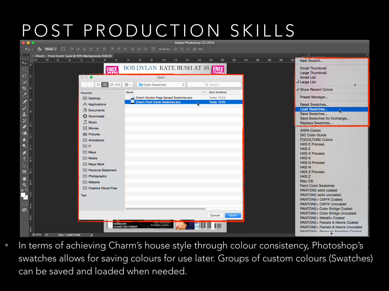
• In terms of achieving Charm’s house style through colour consistency, Photoshop’s swatches allows for saving colours for use later. Groups of custom colours (Swatches) can be saved and loaded when needed.

P O S T P R O D U C T I O N S K I L L S
• Above shows the colour swatches used for Charm’s front cover. Each front cover convention has an assigned colour, which is saved in the swatches tab. For example, each sub-convention of the cover story has a colour assigned to it (i.e. the cover story subtitle, title and context have different colours). Each colour is labelled and can be selected and used by simply clicking on the swatch itself.

P O S T P R O D U C T I O N S K I L L S
• Similarly, the swatches tool was used on the double page spread. Each convention on the double page spread was assigned a colour (for instance, each band member has an assigned colour to differentiate who is talking during the interview in the main body).

P O S T P R O D U C T I O N S K I L L S
• The eye dropper tool was useful for picking a colour, which could then be saved in the swatches bar for use later. For example, the particular shade of gold/yellow from the heading is selected and can be saved in swatches.

P O S T P R O D U C T I O N S K I L L S
• The huge range of text customisation options provided by Photoshop help achieve the fonts and house style outlined in the pre-production materials, allowing users to manipulate the spaces between letters and words as well as the height between lines of text and even the dimensions of individual letters and words.

P O S T P R O D U C T I O N S K I L L S
• Photoshop also allows for custom fonts to be downloaded and customised. Charm’s masthead font uses Lithos Black (which is inspired by Mojo’s masthead), which is a custom font downloaded from fonts.com. This was then installed in Font Book for use in Photoshop. Once a font is installed, it is fully customisable in Photoshop.

P O S T P R O D U C T I O N S K I L L S
• The font customisation tools in Photoshop allowed the manipulation of the drop capital in order to make it stand out from the main body but also conform to the layout. The Dutch 801 BT Bold font was used due to it’s professional appearance and was modified to be 160% in height of normal font size 60 and 70% of the normal width.

I M A G E M A N I P U L AT I O N
• 1.) After taking the images, the first step was to import the images and open them in Photoshop.

I M A G E M A N I P U L AT I O N
• 2.) Upon opening the image, the next step was to unlock the layer that the image is on so that the image could be manipulated and retouched.

I M A G E M A N I P U L AT I O N
• 3.) After unlocking the layer by clicking on the lock, the image can now be edited.

I M A G E M A N I P U L AT I O N
• 4.) The next step was to remove the background from the subjects. Using the Quick Selection Tool (W), the background was removed and the three subjects was selected.

I M A G E M A N I P U L AT I O N
• 5.) Each subject was then carefully selected. The Refine Edge option from the Quick Selection Tool (W) was used to refine the selection of the subject, particularly the hair.

I M A G E M A N I P U L AT I O N
• 6.) Each subject was then moved to the front cover photoshop document, for editing within the context of the front cover.

I M A G E M A N I P U L AT I O N
• 7.) To add glamour effects to each of the subjects, each must first be converted into a smart object for non-destructive editing. This was done by right-clicking on the layer and selecting “Convert to Smart Object”.

I M A G E M A N I P U L AT I O N
• 8.) Once the subjects have been converted into Smart Objects, the next step was to make a copy of each of the subject layers (cmd + j).
I M A G E M A N I P U L AT I O N
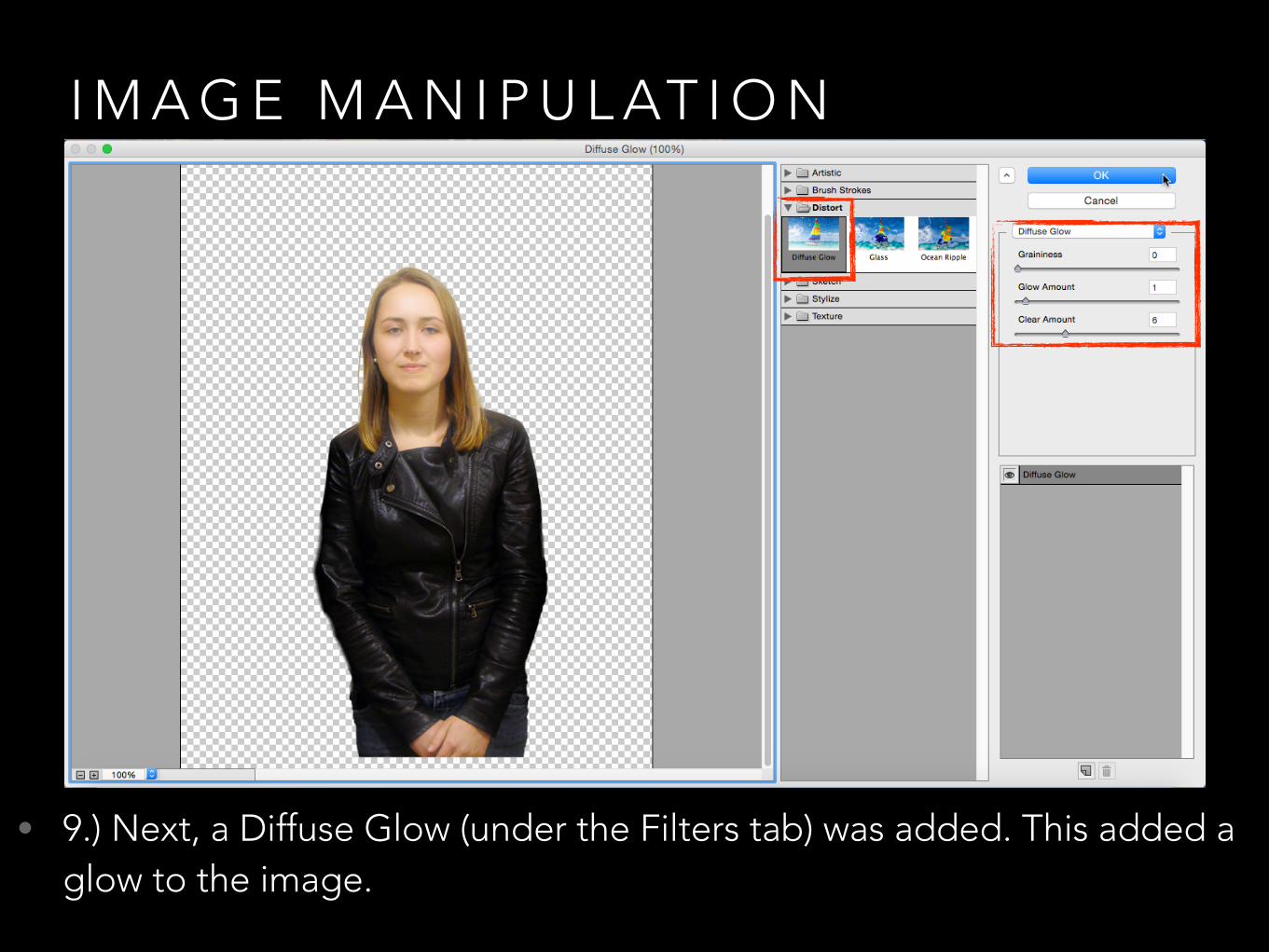
• 9.) Next, a Diffuse Glow (under the Filters tab) was added. This added a glow to the image.

I M A G E M A N I P U L AT I O N
• 10.) Following the Diffuse Glow effect, an adjustment layer was added to increase the Vibrance of the image.

I M A G E M A N I P U L AT I O N
• 11.) The next step was to make the eyes more eye-catching. A composite snapshot (cmd + shift + alt + e) had to be taken before the eye-selection could begin.

I M A G E M A N I P U L AT I O N
• 12.) After duplicating the composite snapshot, using Quick Mask Mode, a brush selection was made around the eyes.
I M A G E M A N I P U L AT I O N
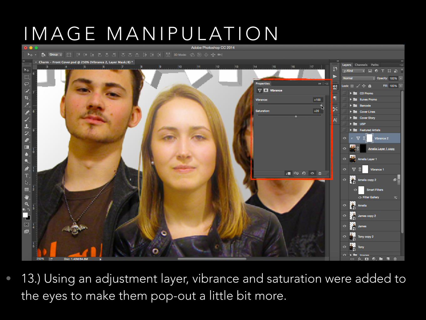
• 13.) Using an adjustment layer, vibrance and saturation were added to the eyes to make them pop-out a little bit more.

I M A G E M A N I P U L AT I O N
• 14.) These effects were then applied to the other two subjects as well as additional saturation and contrast to produce the finished front cover images.

D E S K T O P P U B L I S H I N G T O O L S
• 1.) In order to produce the magazine that has been planned and visualised through the pre-production materials, the use of a desktop publishing application such as Photoshop is needed.
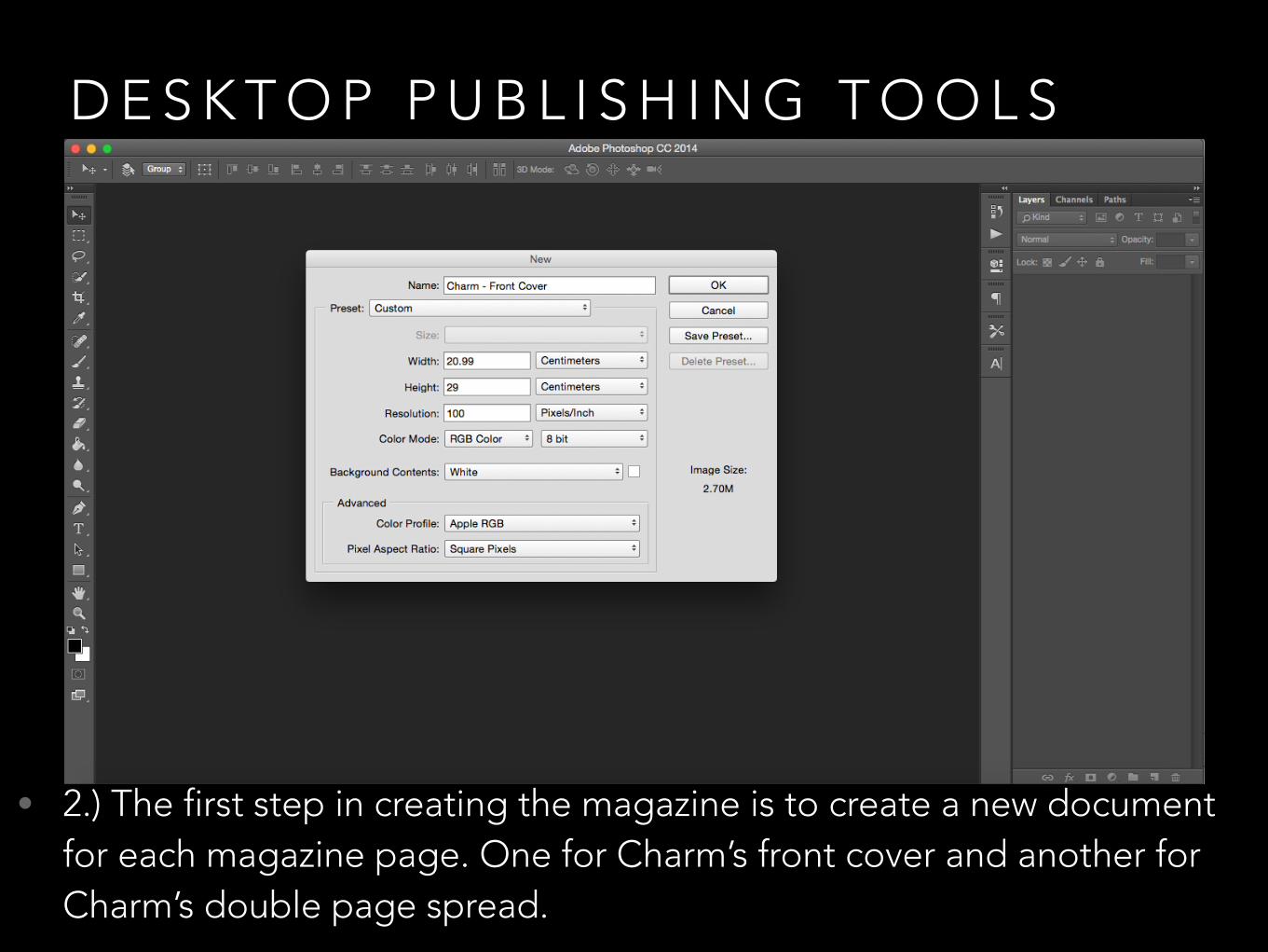
D E S K T O P P U B L I S H I N G T O O L S
• 2.) The first step in creating the magazine is to create a new document for each magazine page. One for Charm’s front cover and another for Charm’s double page spread.

D E S K T O P P U B L I S H I N G T O O L S
• 3.) Upon creating the empty canvas (in this case, for Charm’s front cover), using the ruler tool (cmd + r) will enable the creation of margins - this ensures that content remains on the printable area of the page.

D E S K T O P P U B L I S H I N G T O O L S
• 4.) Referring to the graphic layout, the ruler tool (cmd + r) is then used to plan out where each magazine convention will go.

D E S K T O P P U B L I S H I N G T O O L S
• 5.) Once the layout has been established, the magazine conventions can then begin to be inserted. This can be done through the place tool or simply dragged on to the document or created in Photoshop.

D E S K T O P P U B L I S H I N G T O O L S
• 6.) The masthead, the strapline and the main image (after retouching and post-production effects have been applied) are then placed onto the canvas.

D E S K T O P P U B L I S H I N G T O O L S
• 7.) The cover story, cover lines and featured artists are then placed onto the canvas/created in Photoshop.

D E S K T O P P U B L I S H I N G T O O L S
• 8.) The promotions in the top left and right of the front cover are added, along with the unique selling point of the issue and the barcode with price and social media icons included.

D E S K T O P P U B L I S H I N G T O O L S
• 9.) The front cover is now finished, pending approval before printing and publication. (To hide the rulers, cmd + h).

D E S K T O P P U B L I S H I N G T O O L S
• 10.) The same process applies to the double page spread. The first step is to create the double page spread document with the appropriate document size.

D E S K T O P P U B L I S H I N G T O O L S
• 11.) Once the canvas is set up, using the ruler tool (cmd + r) the margins are then put in place for the printable area and for the layout of the double page spread conventions. Based on the graphic layout, the left will contain the image whilst the right will contain the content.

D E S K T O P P U B L I S H I N G T O O L S
• 12.) Using the layout guidelines from the ruler tool, the main heading, stand first, drop capital and main body are positioned on the page.

D E S K T O P P U B L I S H I N G T O O L S
• 13.) The images (after retouching and post-production effects are applied) and caption are then added to the double page spread.

D E S K T O P P U B L I S H I N G T O O L S
• 14.) Finally, the house style and any extras are added. These include technological convergence in the form of social media and website links, fact files, pull-out quotes etc.

D E S K T O P P U B L I S H I N G T O O L S
• 15.) The double page spread is now finished, pending approval before printing and publication. (To hide the rulers, cmd + h).

S A F E W O R K I N G P R A C T I C E S
• Safe working practices when using the desktop publishing software (such as Photoshop) include using the tools available within Photoshop to streamline the production process and to ensure that the magazine design remains consistent.

S A F E W O R K I N G P R A C T I C E S
• For instance, the use of the eye dropper tool within Photoshop ensures that the colours used in the magazine remain consistent - this is done by sampling the colour of a pixel in an image - thus ensuring that the colours used within the magazine remain consistent with the colour scheme and the overall house style of the magazine.

S A F E W O R K I N G P R A C T I C E S
• Photoshop provides two palettes for selecting colour: the colour palette and the swatches palette. The swatches palette shows a range of default selectable generic colours. However, the swatches palette allows users to load custom swatch collections - which means that previously saved colours can be used again.
• This, along with the aforementioned eye dropper tool enables the same colours to be used and as a result, maintain colour consistency throughout the magazine and subsequent future magazine issues.

S A F E W O R K I N G P R A C T I C E S
• Another example of safe working practices when working with desktop publishing software would be the use of the ruler tool. This tool allows the user to establish margins as well as rulers that can be manipulated in order to position certain elements or plan the layout of particular conventions.
• Consequently, this tool is used to ensure that the layout and positioning of conventions, such as the masthead or the cover lines, is consistent and straight. Similarly, this tool ensures that elements are not placed in the area of the page that won't end up being printed.

S A F E W O R K I N G P R A C T I C E S
• Organising layers is an essential working practice. This ensures that elements are easy to find and can be ordered easily to overlap certain elements. Grouping layers into folders allows users to better organise and consequently find the layers they are looking for.
• Similarly, linking layers makes manipulating the positioning of certain elements much easier. Likewise, hiding layers allows users to focus on certain elements without having to see everything in the document.
• Layers also allow non-destructive editing - which allows for adjustments and manipulations to be made on layers rather than the elements/images themselves - which in turn means that the original image remains untouched and easily accessible.

S A F E W O R K I N G P R A C T I C E S
• One essential working practice is the backing up of data and files. Computers can crash, files can be corrupted, hard drives can fail - there are many risks that could result in data loss. Consequently, the importance of storing duplicate copies elsewhere ensures that loss of work will not have a severe effect on the production of the magazine.

S A F E W O R K I N G P R A C T I C E S
• Contingency plans implemented into the production schedule will ensure that the magazine is published without delay. Allocating contingency days throughout the production of the magazine ensures that unforeseen circumstances/events that could potentially cause delays will not impact the publication date of the magazine.

S A F E W O R K I N G P R A C T I C E S
• Additionally, identifying risks through conducting a risk assessment will ensure that the health and safety of those in the workplace. Risk Assessments, particularly at the work place and on-location during photo shoots identifies the possible risks that could potentially cause harm to people and take reasonable steps to prevent this. These are required to be carried out by law.
• Similarly, the creation of a locations recce is used to assess the suitability of a location for shooting. The primary reason for a location recce is for health and safety - identifying the environment, equipment, logistics and staff for health and safety reasons.

C H A N G E S F O L L O W I N G P U B L I S H E R F E E D B A C K
• Following feedback from the publisher, changes have been made to the front cover of Charm.

C H A N G E S F O L L O W I N G P U B L I S H E R F E E D B A C K
• Change Log
• A small iTunes indent has been added to the top right in the promotion.
• Charm indent has been added to the unique selling point by the top right hand side.
• The bar code has been made smaller with a Charm indent and the social media icons added to it.
• The strapline’s stroke effect has been strengthened (as changing it to white made it less visible).
• A faint gradient has been added to the background.
• The CD has had the line “Inspired by Against The Current” added to it.
• The main image has been retouched.

I M P R O V E D F R O N T C O V E R
• Using the place tool, a small iTunes indent has been added to the top right in the promotion.

I M P R O V E D F R O N T C O V E R
• Charm indent has been added to the unique selling point by the top right hand side (duplicated the masthead layer with cmd + j and then resized the masthead using the transform tool cmd + t).

I M P R O V E D F R O N T C O V E R
• The bar code has been made smaller (using the transform tool cmd + t) with a Charm indent and the social media icons added to it (using the place tool).

I M P R O V E D F R O N T C O V E R
• Under the layer style options, the strapline’s stroke effect has been strengthened from 1px to 3px (publisher thought it should be changed to white made but that made it less visible).

I M P R O V E D F R O N T C O V E R
• Using the gradient tool (g), a faint black and white gradient has been added to the background.

I M P R O V E D F R O N T C O V E R
• Using the text tool, the CD has had the line “Inspired by Against The Current” added to it.

I M P R O V E D F R O N T C O V E R
• Using the adjustment options in Photoshop, the main image has been retouched.

C H A N G E S F O L L O W I N G P U B L I S H E R F E E D B A C K
• Following feedback from the publisher, changes have been made to the double page spread of Charm.

C H A N G E S F O L L O W I N G P U B L I S H E R F E E D B A C K
• Change Log
• The name YouTube in the stand first has been italicised.
• A caption has been added to explain the images.
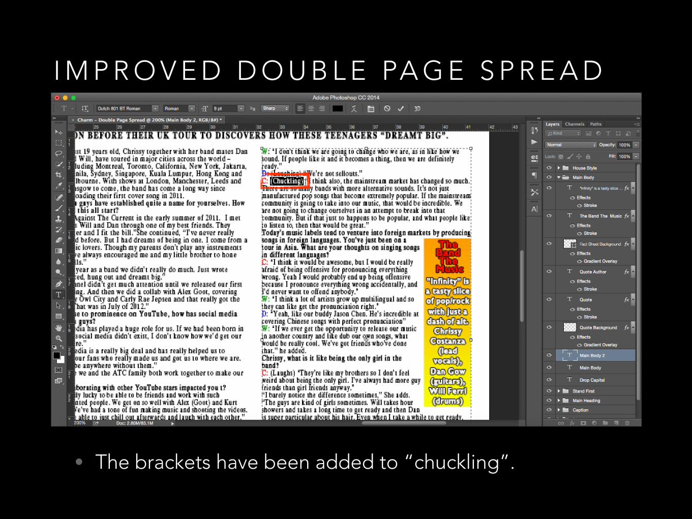
• The brackets have been added to “chuckling”.
• The dead space at the top has been filled with the word “Exclusive”.
• A Charm indent has been added to the top right.
• A link has been added to the bottom of the article/page.
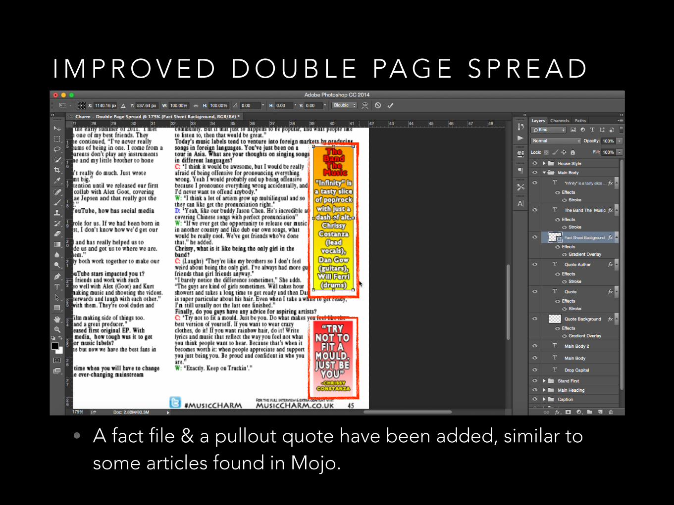
• A fact file & a pullout quote have been added, similar to some articles found in Mojo.

I M P R O V E D D O U B L E PA G E S P R E A D
• Using the text/character customisation options, the name ‘YouTube’ in the stand first has been italicised.

I M P R O V E D D O U B L E PA G E S P R E A D
• A caption has been added to explain the images.
I M P R O V E D D O U B L E PA G E S P R E A D
• The brackets have been added to “chuckling”.

I M P R O V E D D O U B L E PA G E S P R E A D
• The dead space at the top has been filled with the word “Exclusive”.

I M P R O V E D D O U B L E PA G E S P R E A D
• A Charm indent has been added to the top right by duplicating the masthead from the front cover and manipulating the size and positioning using the transform tool (cmd + t).

I M P R O V E D D O U B L E PA G E S P R E A D
• A link has been added to the bottom of the article/page.
I M P R O V E D D O U B L E PA G E S P R E A D
• A fact file & a pullout quote have been added, similar to some articles found in Mojo.

F I N A L C H A R M F R O N T C O V E R A N D D O U B L E PA G E S P R E A D

F R O N T C O V E R
• “Charm” - is a noun that connotes the power or quality of delighting/attracting/fascinating others. This appeals to the target audience by reminding them of the “charm” of the classics era, which appeals to those who are oriented in the past (Resigned - Psychographics) or interested in the older, ‘classics’.
• The Strapline is a statement that describes the unique selling point of magazine - typically simple, short and catchy - designed to be memorable - which unites to create brand. Strapline for my magazine draws inspiration from Mojo, Kerrang! and Q magazine - utilising carefully selected language to convey the unique selling point and advertise the brand.

F R O N T C O V E R
• Similar to Mojo (Genre Repetition & Difference - Steve Neale), Charm will utilise black and white images - Visual Imperative (Galtung & Ruge) connoting era - also, black and white images channel focus of consumer towards star (Richard Dyer - Star Appeal).
• Colour images will be used to appeal to youth - connotes energy and potential of upcoming stars - also coloured behind the scenes photos to make stars more relatable - allows audience to identify with artists (Katz’s Uses & Gratifications). Main images on Front Cover and Double Page Spread will be medium close-up shots with stars looking directly at camera - addresses the reader - builds rapport with consumer - entices audience.

F R O N T C O V E R
• Will appeal to younger audience through offering incentives such as a free song/ep/album from iTunes – appeals to younger audience as digital content is far more prominent than physical media (Discovery - Psychographics).
• Will include a physical CD with issue to appeal to older audience who are more comfortable with physical media (Resigned - Psychographics).

F R O N T C O V E R
• Charm will contain content that also focuses on classic rock & up and coming rising stars, similar to Mojo and many other music magazines such as Q and NME (Genre’s Repetition and Difference - Steve Neale)
• Classic rock (such as The Beatles) will appeal to both younger and older audiences whilst rising stars will particularly appeal to the younger audience (i.e. YouTube stars such as Against The Current) Furthermore, Against The Current’s online presence makes them more relatable to the younger audience. (Audience Appeal).

F R O N T C O V E R
• Similar to Mojo, will be released monthly - complete with high quality and eloquently written informative content (Katz’ Uses & Gratifications) aimed to appeal to the youth market (16-24 year olds in the ABC1 demographic - Hartley’s Subjectivities) and intelligent, educated men aged 45-55 in the ABC1 demographic (Hartley’s Subjectivities).
• Price will be lower than Mojo’s (£3.99) (in order to appeal to the youth market) however will be more expensive than other magazines due to high-quality content and target audience (ABC1 profile - middle/upper middle class - more wealthy - Hartley’s Subjectivities).

• Similar to Mojo, will place headline at top left of D.P.S. - write in large, bold text to draw attention - cater font to music focus (i.e. serif = classic rock, sans-serif = contemporary music).
• Will place Charm logo and “Exclusive” sticker to further promote Charm - advertising unique selling point (in this case, the exclusive content) over other magazines.
D O U B L E PA G E S P R E A D

• Stand First - will place underneath headline (like Mojo) - differentiate from main body with bold font - written to inform yet be vague enough to increase reader’s curiosity & entice them to read further.
• Main body text - will use serif font to connote classic rock articles and will use sans-serif font to connote contemporary music.
D O U B L E PA G E S P R E A D

• Drop Capital - will copy Mojo and incorporate drop capital on second page of D.P.S. to break up text & provide audience with eye-catching starting point.
• Q&A - will replicate Mojo (Genre’s Repetition and Difference - Steve Neale) and place questions and responses in a box w/ a border - will differentiate Questions by using bold font - will also use controversial/shocking pullout quote to engage reader & entice consumer to read further.
D O U B L E PA G E S P R E A D

• One of the conventions on Mojo’s articles and features is the inclusion of fact files and pullout quotes that are placed in colourful boxes surrounding the main body to catch the reader’s attention.
• In terms of technological convergence, for social media links, Charm’s Twitter has been included as well as a link to Charm’s website in order to connect to an audience that is increasingly moving towards digital media.
D O U B L E PA G E S P R E A D

• Images - inspired by Mojo, will use black & white images to connote classic rock era & will use colour images to connote contemporary music.
• Caption - will be short and sweet, providing context for the images on the double page spread.
D O U B L E PA G E S P R E A D
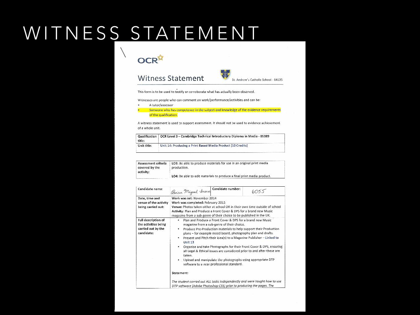
W I T N E S S S TAT E M E N T

W I T N E S S S TAT E M E N T

W I T N E S S S TAT E M E N T

S U M M A R Y
Learning Objective 4
• Outlined the production plan for the magazine, explaining each phase of the magazine production process as well as the deadlines and when they were met.

S U M M A R Y
Learning Objective 4
• Presented the reasons for selecting Photoshop as the Desktop Publishing Tool of choice, outlining and explaining the various tools and capabilities that would enable the production of the magazine.

S U M M A R Y
Learning Objective 4
• Presented a walkthrough of the techniques used whilst using Photoshop to manipulate and retouch the images taken for the magazine, adding glamour and star appeal (Richard Dyer) to the images.
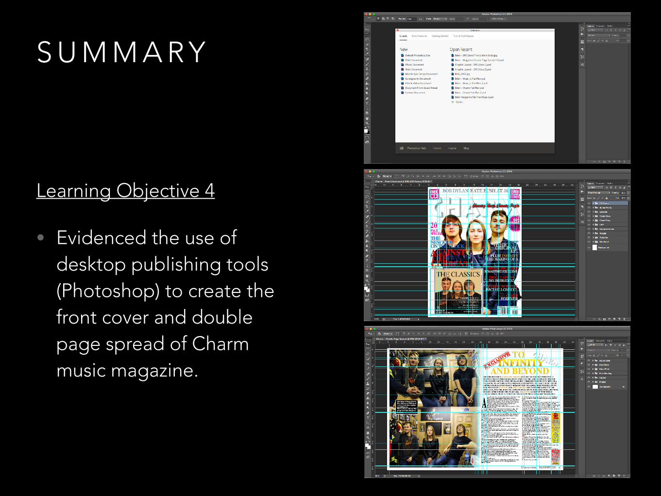
S U M M A R Y
Learning Objective 4
• Evidenced the use of desktop publishing tools (Photoshop) to create the front cover and double page spread of Charm music magazine.

S U M M A R Y
Learning Objective 4
• Evidenced safe working practices throughout magazine production process.

S U M M A R Y
Learning Objective 4
• Outlined and evidenced the changes made to the front cover and double page spread following feedback from the publisher.

S U M M A R Y
Learning Objective 4
• Analysed and explained the final front cover and double page spread.