bresciani eppler risks of visualization working paper · pdf filethe risks of visualization...
TRANSCRIPT
1
ICA Working Paper # 1/2008, February 2008
The Risks of Visualization A Classification of Disadvantages Associated with Graphic Representations of Information
By Sabrina Bresciani [email protected] Martin J. Eppler [email protected] University of Lugano (USI) Institute for Corporate Communication Faculty of Communication Sciences Lugano, Switzerland

2
Abstract In this paper, we review and classify the disadvantages and risks associated with the use of visual
representations of information. We complement a review of literature with expert interviews and
focus group results on the practical negative experiences with the use of visual representations of
information. Based on these two sources, we distinguish between social, cognitive, and
emotional risks of visualization that can be viewed from two perspectives: from the point of view
of the user and from the point of view of the designer of a graphic representation. We discuss
implications of the identified disadvantages and ways of overcoming or avoiding them. The
paper concludes by providing an outlook on overlooked or emergent risks of visualization.
Keywords Graphic representations, information visualization, visualization risks, visualization studies,
image, visualization drawbacks, visualization problems, diagram pitfalls

3
1. Introduction: Examining the Perils of Visualization
Everything that deceives may be said to enchant.
Plato
Despite the notable number of publications on the benefits of using visualization in a
variety of fields (ranging from biotechnology to corporate communication), few studies have so
far investigated the possible pitfalls of graphic depictions used for communication or reasoning.
Some researchers, however, have raised the issue and called to action: “Articles on limitations
and pitfalls [of visualization] are scarce. For the advancement of the field [of information
visualization], more such reports would be highly beneficial” (van Vijk 2006). A panel at the
2004 IEEE Visualization conference and subsequent columns in the related IEEE publication
focused on ‘Unresolved Problems of Visualization’ (Rhyne, Hibbard et al. 2004) but did not
explicitly address the issue of visualization risks or drawbacks. Thus, a clear overview and
classification of the disadvantages associated with visual depictions of information has so far not
been provided. Such an overview could provide guidelines to assist designers in avoiding
potential problems caused by visualizations (Eppler 2007), (Fong, Valerdi et al. 2007).
The starting point of our research is the analysis of visualization studies from different
research domains. Many of these disciplines focus on the benefits of graphic representations for
various application contexts. In a few of these articles, however, we have found single
disadvantages or short lists of visualization risks. A more complete and structured understanding
of the negative effects of visualization is also relevant for increasing the designers’ visual
literacy and therefore their ability to produce high-quality visualizations. The aim of this paper is
not to diminish the potential of visualization. It is rather an attempt to deepen and structure our
understanding of the possible limitations of visualizations. This is relevant not only to avoid or
detect mistakes in the production and interpretation of visualizations, but also to support
designers’ decision on the use or modification of the appropriate visual format.

4
2. Overview of Visualization Disadvantages
2.1 A Review of Literature
To survey the current state of research on disadvantages of visualization we have
analyzed peer reviewed journals and books in varied fields related to visualization (as well as
interdisciplinary fields), including information visualization, statistics, graphic design and
architecture, human computer interaction, collaboration research, and management studies. We
have focused on the visual representation of information and thus did not analyze areas such as
fine arts, photography, film or scientific imaging
In the rich and rapidly evolving domain of information visualization we can find a broad
discussion on the properties of graphic representations and their positive use, but only few
considerations on their potential drawbacks (Ware 2004; Kosslyn 2006; van Vijk 2006; Cawthon
and Vande Moere 2007). These studies highlight some of the psychological or aesthetic
restrictions inherent in the graphic format. Closely related to this field is the study of
diagrammatic representations. Here we can find some discussions on the limitations and
possible restrictions of this specific format, for example in the study by Larkin and Simon
(Larkin and Simon 1987) and the use of diagrams as an instrument for eliciting thoughts (Crilly,
Blackwell et al. 2006). Another relevant stream of literature that has examined disadvantages of
diagrams (for example their frequent over-determinism) is dedicated to so-called dimensions of
notations (Green and Petre 1996; Blackwell, Britton et al. 2001). In the related field of HCI
(Human Computer Interaction) a few authors have considered the potential drawbacks of
interactive visualizations, but only in the context of user interfaces (and how they inform or
confuse users) (Shneiderman 1998). The area of statistical graphic representations has been the
longest and possibly the most prolific regarding visualization risks. One approach in this area has
been to showcase particularly bad examples of visualized statistical information and learn from
it. This has been elegantly demonstrated in Edward Tufte’s popular books, where he highlights
numerous ways in which visualization falls short of its potential (Wainer 1984; Tufte 1986; Tufte

5
1990; Tufte 1997; Tufte 2007). In the fields of graphic design and architecture, we can find
several guidelines on how to avoid visualization pitfalls – yet without a systematic discussion or
root cause analysis of these risks and potential errors. Recently, research in the domain of
construction management has begun to analyze the positive and negative effects of visualization
on collaboration (Ewenstein and Whyte 2007; Nicolini 2007; Oliver 2007; Whyte, Ewenstein et
al. 2007). In the area of management a few researchers are beginning to explore the potential
(and to a much lesser extent the risks) of using visualization in organizations (Henderson 1995;
Buergi and Roos 2003; Roos, Bart et al. 2004; Eppler and Burkhard 2005; Eppler, Platts et al.
2006). These studies typically highlight visualization advantages through case evidence. Finally,
there are researchers who focus on group decision and collaborative settings. They have also
highlighted problems related with the collaborative use of visualization (DeSanctis and Gallupe
1987; Tversky 2005; Eppler 2007; Mengis 2007). Besides these obvious candidates, we also
found notable insights regarding visualization risks in other research domains. Specifically, we
have identified discussions on visualization perils in the fields of education and instruction
(Najjar 1998), cross-cultural studies (Nisbett 2005), engineering (Wenger 1998) and logic
(Rosenstein, Rathbone et al. 1964; Shimoijma 1996). In total, we have thus screened thirteen
domains for their discussion of the dangers of graphic representations. We have excluded,
however, disadvantages related to the mere functionalities of specific visualization environments
or software packages. From this literature review a number of concepts have emerged (see
Appendix III for the complete list), with widely differing levels of abstraction and scope. In the
next section, we enrich these literature-based results with opinions from experts regarding the
practice of visualization, before classifying the results in a concise framework, which is
presented in section 3.
2.2 Results from Expert Interviews and a Focus Group
In order to validate and further extend the compilation of disadvantages from past
research, we have conducted field work through expert interviews and a focus group. We have
questioned seven professional consultants and researchers in the UK, mainly from the University

6
of Cambridge (details can be found in Appendix I), through semi-structured interviews. The
experts were questioned regarding visualization drawbacks in general and regarding specific
scenarios and cases where visualization had a negative effect. We also collected data from a
focus group of diagram experts at the University of Cambridge (details in Appendix II) on the
topic of diagrams use and specifically on the issue of their application disadvantages. We have
chosen Cambridge as a locus for our empirical investigation as it assembles a large group of
visualization scholars and practitioners.
The results of these field studies confirm and substantiate most of the concepts already collected
from the literature. They have also surfaced a few new relevant issues, such as:
• the potentially misleading perception of reliability of a visualization
(visualizations may appear more convincing and sound than they really are),
• the (multiple) implicit meanings inherent in visualizations (leading to ambiguous
interpretations),
• the high prerequisites for diagram interpretation (a visualization’s efficacy
depends on the user’s previous experience and visual literacy).
In the next section we consider possible classification schemas for visualization drawbacks in
order to structure the many factors that can make visualization dysfunctional. Then, in section 3,
we populate the proposed classification with the aggregated disadvantages found in the literature
and through interviews.
2.3 Possible Classification Attributes for the Encountered Disadvantages
You don’t understand anything until you understand it in more than one way.
Marvin Minsky
Having collected a large quantity of concepts from both the literature and experts, we need to be
able to classify them in an efficient and relevant way in order to make them accessible.
7
Disadvantages can be classified in a number of ways, each schema having positive and negative
aspects. We briefly review the main categorization types that could be suitable and give a
motivation for our final choice.
As overall categories, we can classify visualization disadvantages by their (1) causes, (2) effects
or (3) countermeasures.
The cause of a visualization disadvantage can be twofold: the designer(s) or the user(s) (that is,
their interpretation) (Tufte 1986). The designer can intentionally or unintentionally introduce
mistakes or drawbacks in a visualization. The distinction between designer and user induced
mistakes seems valuable in pragmatic terms, as it can immediately give insights for the
producers or evaluators of visualizations; however the distinction among intentional or
unintentional problem is problematic as it is not always possible to discern the intentionally by
merely observing a visualization. In many cases, one would need additional information about a
graphic representation’s context.
Considering the effect of visualization drawbacks, many classifications are possible: Roos
(Buergi and Roos 2003; Roos, Bart et al. 2004) proposes a threefold distinction: cognitive,
emotional, and social effects. Also Norman (Norman 2004) suggests a similar threefold
distinction in design: the visceral level (corresponding to emotions), the behavioral level
(corresponding to usability) and the reflective level (about the meaning of things, the self-
image). An alternative effect classification for disadvantages can consider the effects on the user:
(1) confusion, (2) distraction, (3) misinterpretation, (4) manipulation (5) limiting reflection (6)
delay: the main drawback of this typology is that the categories are not mutually exclusive, as a
visualization drawback could have more than one of these effects on the user. Alternatively, the
collaborative dimensions framework (Bresciani, Blackwell et al. 2008) could be used for
classifying visualization drawbacks, but this would be specific to collaborative settings, which is
not the only interest of this paper.
8
The last category is classifications by countermeasures, that is, by the possible remedies.
Examples of such countermeasures can be: fundamental vs. focused changes, substantial vs.
superficial modifications, drastic vs. cosmetic ones, and substantial versus quick & dirty
improvements, etc. In practical terms, the remedies should be aligned with the gravity and
significance of a specific disadvantage; nevertheless, as the degree of gravity of a visualization
drawback depends on the actual usage context, we also discard this classification principle.
The solution of this classification challenge seems to be the combination of the two most
constructive and useful categorization principles that we have been discussing: the distinction of
the cause (designer or user) and the threefold effect distinction proposed by Roos. The resulting
classification is a two by three matrix, a concise, usable and practical (especially for
practitioners) schema that contains prior research findings on visualization risks.
In the next section we populate the proposed classification schema with the visualization
concepts that we have collected from the literature and the interviews.
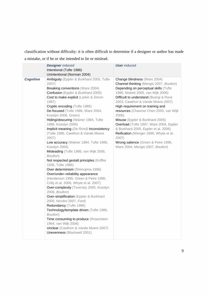
3. The Resulting Classification of Visualization Disadvantages
The classification we propose, shown in the following table (Tab 1), is a matrix based on two
disadvantage causes (designer or user induced) and three types of effects (cognitive, emotional,
social) (Buergi and Roos 2003). The concepts we have collected from the literature and the
interviews (in italic) are classified and referenced in the six resulting cells. A short definition of
each concept can be found in the appendix (Appendix III).
A crucial remark on the classification is that the designer induced problems can be either
intentional or unintentional: in reviewing the literature we found mainly analyses of
unintentional problems (designer’s mistakes), but a careful analysis should also consider the
possibility that drawbacks may be intentionally induced by a designer, for example for
manipulative purposes (Wainer 1984; Tufte 1986). However intentionality cannot be used for
9
classification without difficulty: it is often difficult to determine if a designer or author has made
a mistake, or if he or she intended to lie or mislead. Designer induced
Intentional (Tufte 1986) Unintentional (Norman 2004)
User induced
Cognitive Ambiguity (Eppler & Burkhard 2005, Tufte 2007) Breaking conventions (Ware 2004) Confusion (Eppler & Burkhard 2005) Cost to make explicit (Larkin & Simon 1987) Cryptic encoding (Tufte 1986) De-focused (Tufte 1986, Ware 2004, Kosslyn 2006, Green) Hiding/obscuring (Wainer 1984, Tufte 1986, Kosslyn 2006) Implicit meaning (De Rond) Inconsistency (Tufte 1986, Cawthon & Vande Moere 2007) Low accuracy (Wainer 1984, Tufte 1986, Kosslyn 2006) Misleading (Tufte 1986, van Wijk 2006, Boulton) Not respected gestalt principles (Koffka 1935, Tufte 1986) Over determinism (Shimojima 1996) Over/under–reliability appearance (Henderson 1995, Green & Petre 1996, Crilly et al. 2006, Whyte et al. 2007) Over-complexity (Tsversky 2005, Kosslyn 2006, Boulton) Over-simplification (Eppler & Burkhard 2005, Nicolini 2007, Ford) Redundancy (Tufte 1986) Technology/template driven (Tufte 1986, Boulton) Time consuming to produce (Rosenstein 1964, van Wijk 2006) Unclear (Cawthon & Vande Moere 2007) Unevenness (Blackwell 2001)
Change blindness (Ware 2004) Channel thinking (Mengis 2007, Boulton) Depending on perceptual skills (Tufte 1986, Nisbett 2005, van Wijk 2006) Difficult to understand (Buergi & Roos 2003, Cawthon & Vande Moere 2007) High requirement on training and resources (Chaomei Chen 2005, van Wijk 2006) Misuse (Eppler & Burkhard 2005) Overload (Tufte 1997, Ware 2004, Eppler & Burkhard 2005, Eppler et al. 2006) Reification (Wenger 1998, Whyte et al. 2007) Wrong salience (Green & Petre 1996, Ware 2004, Mengis 2007, Boulton)
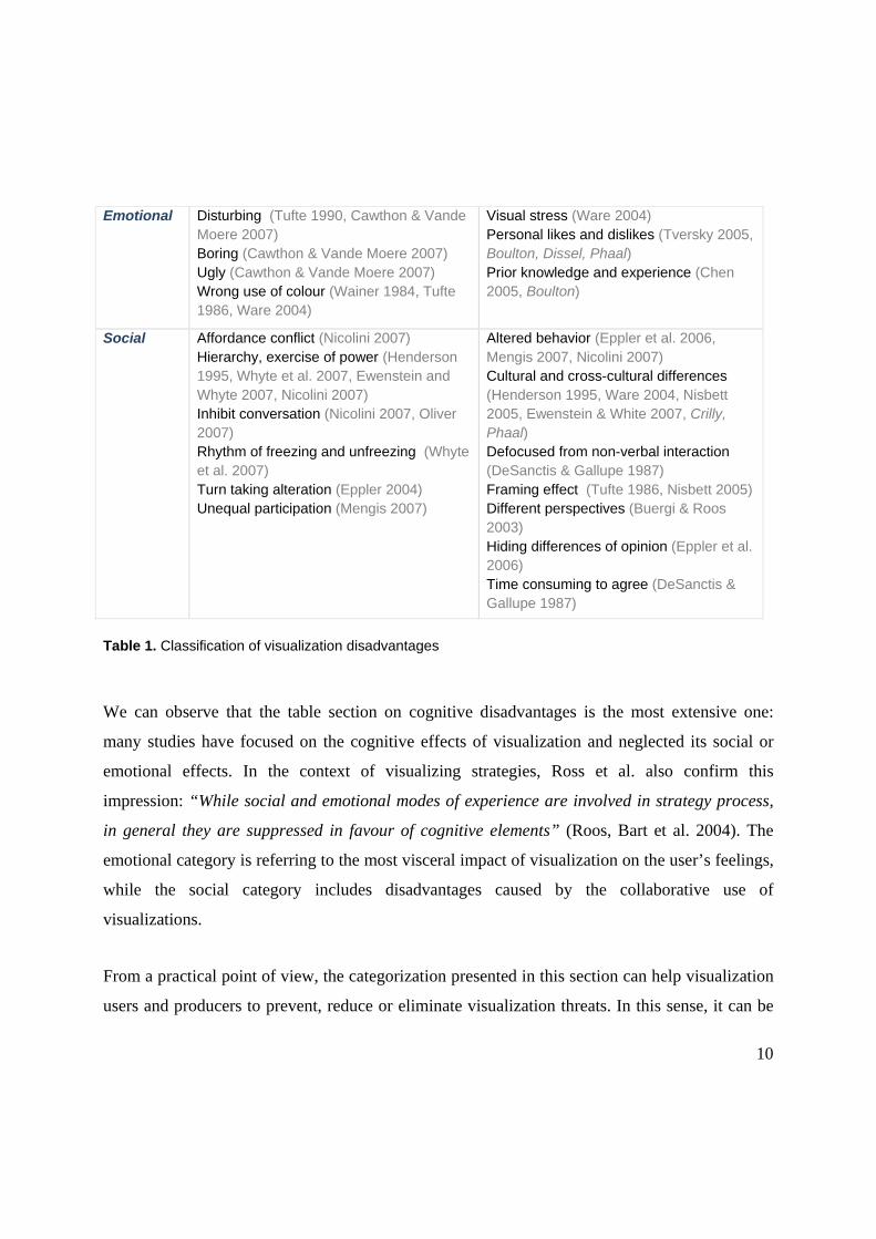
10
Emotional Disturbing (Tufte 1990, Cawthon & Vande Moere 2007) Boring (Cawthon & Vande Moere 2007) Ugly (Cawthon & Vande Moere 2007) Wrong use of colour (Wainer 1984, Tufte 1986, Ware 2004)
Visual stress (Ware 2004) Personal likes and dislikes (Tversky 2005, Boulton, Dissel, Phaal) Prior knowledge and experience (Chen 2005, Boulton)
Social Affordance conflict (Nicolini 2007) Hierarchy, exercise of power (Henderson 1995, Whyte et al. 2007, Ewenstein and Whyte 2007, Nicolini 2007) Inhibit conversation (Nicolini 2007, Oliver 2007) Rhythm of freezing and unfreezing (Whyte et al. 2007) Turn taking alteration (Eppler 2004) Unequal participation (Mengis 2007)
Altered behavior (Eppler et al. 2006, Mengis 2007, Nicolini 2007) Cultural and cross-cultural differences (Henderson 1995, Ware 2004, Nisbett 2005, Ewenstein & White 2007, Crilly, Phaal) Defocused from non-verbal interaction (DeSanctis & Gallupe 1987) Framing effect (Tufte 1986, Nisbett 2005) Different perspectives (Buergi & Roos 2003) Hiding differences of opinion (Eppler et al. 2006) Time consuming to agree (DeSanctis & Gallupe 1987)
Table 1. Classification of visualization disadvantages
We can observe that the table section on cognitive disadvantages is the most extensive one:
many studies have focused on the cognitive effects of visualization and neglected its social or
emotional effects. In the context of visualizing strategies, Ross et al. also confirm this
impression: “While social and emotional modes of experience are involved in strategy process,
in general they are suppressed in favour of cognitive elements” (Roos, Bart et al. 2004). The
emotional category is referring to the most visceral impact of visualization on the user’s feelings,
while the social category includes disadvantages caused by the collaborative use of
visualizations.
From a practical point of view, the categorization presented in this section can help visualization
users and producers to prevent, reduce or eliminate visualization threats. In this sense, it can be

11
used as a negative checklist. Designers can be supported by having a comprehensive view of the
most common cognitive threats but also of the often overlooked social and emotional issues
when using graphic representations of information. Visualization users can use the table as an
instrument to control or reflect on their own potential biases and on a designer’s quality of work.
Nevertheless, there may be instances where one or several of the listed disadvantages are
productively exploited. Visual ambiguity, for example, may lead to the creative re-interpretation
of a graphic representation and thus lead to new insights. Another example of a visualization risk
that may provide a benefit would be the shocking or disturbing effect of an emotionally
exaggerated visualization that, as a benefit, would be remembered for a long time.
4. Discussion: Addressing Visualization Risks
In this section, we consider three of the attributes from the table (defined in appendix III), in
order to provide an exemplary illustration of the potential use of the proposed classification. For
this purpose we examine the risk inherent in visualizations to lead astray (de-focusing), to
disturb, and to lead to misinterpretation due to cultural differences. For each potential risk we
provide design mechanisms that help to reduce the described risk.
De-focused (Figure 1, Tufte 1986, Ware 2004, Kosslyn 2006)
This potential disadvantage belongs to the category of cognitive problems caused by the designer
of a graphic representation. It occurs when a visualization distracts a person from the main goal
he or she tries to achieve or when several items in a graphic are emphasized at the same time,
thus confusing the viewer about where to start or to focus. Sources of distraction can be:
unnecessary ornaments, visual background noise, flashy animated graphics, or including
unrelated elements in a diagram. The design mechanisms to reduce this defect of de-focus are,
among others: the use of a more conventional position for the central elements (top or centre);
emphasizing important elements with size, colour, or accentuating symbols; avoiding un-related
elements of decoration or using as little elements as necessary.

12
Disturbing (Figure 2, Tufte 1990, Cawthon & Vande Moere 2007)
From the category of problems related to emotions and induced by the designers, disturbing
pictures are often polarizing reactions. In fact, some images may cause emotional harm to the
viewer because of their shocking or repellent content. The design manoeuvres to counteract the
potentially disturbing effects of a visualization are, for example: considering alternative ways to
raise awareness or getting attention; pre-testing the visualization on target sub-groups (women
and children), or limiting access to the visualization and providing up-front warnings.
Cultural and cross-cultural differences (Figure 3, Henderson 1995, Ware 2004, Nisbett 2005,
Ewenstein & White 2007)
These are pitfalls related to the social environment and induced by the heterogeneity of users,
due to the fact that the meaning of symbols and colours are not universal. Hence some graphic
representations may be misinterpreted in other cultural contexts. There are a number of possible
countermeasures to be taken that all focus on informing oneself about differences before
adapting a visualization to a certain context: for example women have a more accurate
perceptions of the colour palette than men (Rich 1977); Westerners tend to focus strongly on the
foreground, while east-Asian people focus on the whole picture and the background (Nisbett
2005); in some eastern countries time is shown from right to left and the meanings of red and
green are not identical to their use in the western world.
With these few examples we just illustrated the potential use of the table and how each element
of the proposed classification can be analyzed with the purpose of providing concrete guidelines
for both the users and the designers.

13
Figure 1: De-focused Average price of diamonds Source: Tufte, 1986
Figure 2: Disturbing 20th Century Civilian War Casualties by Country Source: www.understandingusa.com
Figure 3: Cultural and cross-cultural differences Japanese National Rail Road Schedule Source: Tufte 1990

14
5. Conclusion & Outlook In this article, we have tried to provide a first classification of visualization problems and
disadvantages. We believe that an analytic and concise compilation of visualization pitfalls is
crucial, especially today, in the context of a rising use of information visualization by non-
experts and because of the emergent use of visualization for Web 2.0,the availability of new
graphic technologies, software, and new ways of generating and sharing pictures.
Through our analysis we also intend to bring to light visualization problems that are often
overlooked and that are not yet extensively documented. Enthusiastic designers may, for
example, fail to consider the economic aspects of their visual creations (such as creation, use and
maintainability costs). Previous studies have demonstrated that visualization is costly to produce
in terms of time and other economic resources (money, equipment, know-how, etc.). In this
context, various authors emphasize the need for quantifiable measures of the quality of a
visualization in order to determine whether it is fit for use (van Vijk 2006). Such measures
include: efficiency (van Vijk 2006), effectiveness (Johnson 2004; Mengis 2007), decision quality
(van Vijk 2006), and reduction of stress (Chen 2005). Another often overlooked disadvantages is
that visualization may be ambiguous due to its intrinsic conciseness and abstraction, as it
conveys condensed concepts or information in a much more encoded way than an equivalent
text. Lastly, the interpretation of a visual form can depend on the familiarity of the observer and
on his or her previous experience with it. In fact, a priori positive or negative exposure to a
graphic representation may determine expectations and attitude. These issues seem still
underexplored and research on such visualization dangers is very much needed for different
application contexts, such as information visualization, management information systems or
decision support tools.

15
As Edward Tufte has shown in his books, the world is filled with misleading, unattractive and
confusing visualizations of information. Strategies to avoid pitfalls in visual communication have
not yet been comprehensively defined, and we hope that our first and provisional classification
is a first step toward a complete and functional analysis of the perils of visualization.
References Blackwell, A. F., C. Britton, et al. (2001). Cognitive dimensions of notations: design tools for
cognitive technology. Cognitive Technology M. Beynon, Nehaniv, C.L., Dautenhahn, K. . Berlin, Springer: 325-341.
Bresciani, S., A. F. Blackwell, et al. (2008). A Collaborative Dimensions Framework: Understanding the Mediating Role of Conceptual Visualizations in Collaborative Knowledge Work. HICCS 2008, Hawaii.
Buergi, P. and J. Roos (2003). "Images of Strategy." European Management Journal 21(1): 69-78.
Cawthon, N. and A. Vande Moere (2007). Qualities of Perceived Aesthetic in Data Visualization. CHI 2007, San Jose, USa.
Chen, C. (2005). "Top 10 Unresolved Information Visualization Problems." IEEE Computer Graphics and Applications 25(4): 12-16.
Crilly, N., A. Blackwell, et al. (2006). "Graphic elicitation: using research diagrams as interview stimuli." Qualitative Research 6(3): 341-366.
DeSanctis, G. and R. B. Gallupe (1987). "A Foundation for the Study of Group Decision Support System." Management Science 33(5): 589-609.
Eppler, M. J. (2007). "Toward a visual turn in collaboration analysis? ." Building Research & Information 35(5): 584-587.
Eppler, M. J. and R. Burkhard (2005). Knowledge Visualization. Encyclopedia of Knowledge Management. D. G. Schwartz, IGI.
Eppler, M. J., K. Platts, et al. (2006). Visual Strategizing. The Systematic Use of Visualization in the Strategy Process. Lugano, University of Lugano: 43.
Ewenstein, B. and J. K. Whyte (2007). "Visual representations as‘artefacts of knowing’." Building Research & Information 35(1): 81-89.
Fong, A., R. Valerdi, et al. (2007). Using a Boundary Object Framework to Analyze Inter-Organizational Collaboration. 17th INCOSE Symposium, San Diego, California.
Green, T. R. G. and M. Petre (1996). "Usability Analysis of Visual Programming Environments: a ‘cognitive dimensions’ framework." Journal of Visual Languages and Computing 7
131-174. Henderson, K. (1995). "The Political Career of a Prototype: Visual Representation in Design
Engineering." Social Problems 42(2): 274-299.
16
Johnson, C. (2004). "Top Scientific Visualization Research Problems." IEEE Computer Graphics and Applications 24(4): 13-17.
Kosslyn, S. M. (2006). Graph design for the eye and the mind. New York, Oxford University Press.
Larkin, J. H. and H. Simon (1987). "Why a Diagram is (Sometimes) Worth Ten Thousand Words
" Cognitive Science 11: 65-99. Mengis, J. (2007). Integrating Knowledge through Communication: An Analysis of Expert-
Decision Maker Interactions. ICA. Lugano, University of Lugano. PhD. Najjar, L. J. (1998). "Principles of educational multimedia user interface design." Human Factors
40(2): 311-323. Nicolini, D. (2007). "Studying visual practices in construction." Building Research &
Information 35(5): 576-580. Nisbett, R. E. (2005). The geography of thought. Finland, Bookwel. Norman, D. (2004). Emotional Design. New York, Basic Books. Oliver, G. (2007). "Erosion of drawing as a thinking and collaborative tool." Building Research
& Information 35(5): 571-575. Rhyne, T.-M., B. Hibbard, et al. (2004). Can We Determine the Top Unresolved Problems of
Visualization? IEEE Visualization 2004, Austin, Texas, USA. Rich, E. (1977). "Sex-related differences in colour vocabulary." Language & Speech 20(4): 404-
409. Roos, J., V. Bart, et al. (2004). "Playing Seriously with Strategy " Long Range Planning 37: 549-
568. Rosenstein, A. B., R. R. Rathbone, et al. (1964). Engineering Communication. Englewood Cliffs,
NJ, Prentice-Hall. Shimoijma, A. (1996). On the Efficacy of Representations, Indiana University , USA. PhD. Shneiderman, B. (1998). Designing the user interface: strategies for effective human-computer
interaction Reading, MA Addison-Wesley. Tufte, E. R. (1986). The visual display of quantitative information. Cheshire, Connecticut,
Graphic Press. Tufte, E. R. (1990). Envisioning Information. Cheshire, Connecticut, Graphic Press. Tufte, E. R. (1997). Visual Explanations. Images and Quantities, Evidence and Narrative.
Cheshire, Connecticut, Graphic Press. Tufte, E. R. (2007). Beautiful Evidence. Cheshire, Connecticut, Graphic Press. Tversky, B. (2005). Visuospatial reasoning. Handbook of Reasoning. K. a. M. Holyoak, R.
Cambridge, UK, Cambridge University Press: 209-249. van Vijk, J. J. (2006). "Views on Visualization." IEEE Transaction on Visualization and
Computer Graphics 12(4): 421-432. Wainer, H. (1984). "How to display data badly." The American Statistician 38(2): 137-147. Ware, C. (2004). Information Visualization (2nd Edition). San Francisco CA, Morgan
Kaufmann.

17
Wenger, E. (1998). Communities of Practice: Learning, Meaning and Identity. Cambridge, Uk, Cambridge University Press.
Whyte, J. K., B. Ewenstein, et al. (2007). "Visual practices and the objects used in design." Building Research & Information 35(1): 18-27.

18
Appendix I. Expert interviews details Name Occupation Date Place
Dr. Boulton, Charles Professional consultant May 29th, 2007 Cambridge, UK
Dr. Crilly, Nathan Researcher Cambridge University
July 19th, 2007 Cambridge, UK
Dr. De Rond, Mark Lecturer Cambridge University
June 29th, 2007 Cambridge, UK
Dr. Ford, Derek Responsible for industry-university link Cambridge University
July 3rd, 2007 Cambridge, UK
Dr. Green, Thomas Retired professor June 18th, 2007 York, UK
Dr. Phaal, Robert Lecturer Cambridge University and consultant
June 22nd, 2007 Cambridge, UK
Dr. Dissel, Marcel Professional consultant May 30th, 2007 Cambridge, UK
II. Experts panel details Number of participants: 15 Location : Darwin College, University of Cambridge, UK Date: July 19th, 2007 Background of participants: University of Cambridge researchers, PhD students and lecturers Organized by: Dr Nathan Crilly and Dr. Alan Blackwell III. Table of disadvantages with brief explanations Disadvantage Author(s), expert(s) Description Cognitive-Designer induced Ambiguity (Eppler & Burkhard
2005, Tufte 2007) Visual notations may contain unlabeled symbols that may be ambiguous and thus difficult to interpret.
Breaking (Ware 2004) A visualization may employ different visual

19
conventions rules or symbols than normally expected. Confusion (Eppler & Burkhard
2005) Visualization that do not have a clear overall logic or accompanying text may confuse the viewers.
Cost to make explicit (Larkin & Simon 1987) “diagrammatic representations typically display information that is only implicit in sentential representations and that therefore has to be computed, sometimes at great cost, to make it explicit for use”
Cryptic encoding (Tufte 1986) The visual format used to represent data may not be universally understandable and confuse some audiences.
De-focused (Tufte 1986, Ware 2004, Kosslyn 2006, Green)
Visualization may distract a person from the main goal he or she tries to achieve or emphasize, at the same time, several items
Hiding/obscuring (Wainer 1984, Tufte 1986, Kosslyn 2006)
A visualization may hide important insights contained in data by the way that data is represented graphically (e.g. covarying height and width, changing the starting point or varying the aspect ratio)
Implicit meaning (De Rond) Many visualizations contain allusions that are not fully described or explained and may go unnoticed or may be misinterpreted.
Inconsistency (Tufte 1986, Cawthon & Vande Moere 2007)
A visualization may make inconsistent use of certain symbols, i.e., changing their function or meaning without signaling this change.
Low accuracy (Wainer 1984, Tufte 1986, Kosslyn 2006)
Visualization generally depicts information less precisely than number and tables.
Misleading (Tufte 1986, van Wijk 2006, Boulton)
Some visualization are drawn in a way that may lead to incorrect conclusions.
Misuse of figure-ground
(Tufte 1986) The figure-ground and layers contrasts are not illustrated properly.
Not respected gestalt principles
(Koffka 1935) Some visualization do not group related information (proximity principle) or do not represent the same kind of information with the same symbols (similarity principle).
Over determinism (Shimojima 1996) Visualization is by its nature inherently more specific that text in depicting concepts and relations.
Over/under–reliability appearance
(Henderson 1995, Green & Petre 1996, Crilly et al. 2006, Whyte et al. 2007)
Highly polished visualizations might prevent users from criticizing the content whereas more provisional sketches encourage suggested revisions.
Over-complexity (Tsversky 2005, The visualization depicts elements in a more

20
Kosslyn 2006, Boulton)
complex manner than necessary.
Over-simplification (Eppler & Burkhard 2005, Nicolini 2007, Ford)
Some graphic depictions leave out essential elements in order to simplify information which leads to a distortion of the information.
Redundancy (Tufte 1986) In some graphic representations of information, the information is visualized in superfluous ways that clutter the visualization without real need.
Technology/template driven
(Tufte 1986, Boulton) Some visualizations are based on pre-defined forms or templates that are not adequate for the communication task at hand or the information to be represented.
Time consuming to produce
(Rosenstein 1964, van Wijk 2006)
Producing a visualization may take a dis-proportional amount of time for the information that is communicated.
Unclear (Cawthon & Vande Moere 2007)
A graphic depiction may leave too much room for interpretation regarding its purpose or main message.
Unevenness (Blackwell 2001) A visualization can typically not be used in many different ways. It may privilege some activities while making others harder, thus constraining users’ thoughts in one direction.
Cognitive-User induced Change blindness (Ware 2004) Important changes in pictures may go
unnoticed by the viewers. Channel thinking (Mengis 2007,
Boulton) The visualization can direct thinking in an inappropriate direction (caused by a metaphor or familiarity level).
Depending on perceptual skills
(Tufte 1986, Nisbett 2005, van Wijk 2006)
People see differently, depending on physical (e.g. colour blindness) and cultural factors (attention to foreground or background).
Difficult to understand
(Buergi & Roos 2003, Cawthon & Vande Moere 2007)
Some visualizations are inherently difficult to understand because they depict many complex relationships that may not be optimally represented.
High requirement on training and resources
(Chaomei Chen 2005, van Wijk 2006)
The use of certain images or visual applications requires extensive training and support.
Misuse (Eppler & Burkhard 2005)
A visualization may be used for a purpose for which it was not intended or adequate.
Overload (Tufte 1997, Ware 2004, Eppler & Burkhard 2005,
Some graphic depictions overload the senses of a viewer by presenting too many visual elements at the same time.

21
Eppler et al. 2006) Reification (Wenger 1998, Whyte
et al. 2007) Tendency to consider concrete an abstract concept, attributing to it properties of a material object.
Wrong salience (Green & Petre 1996, Ware 2004, Mengis 2007, Boulton)
The user concentrates on the wrong issue, for example on the tool or on the visual appearance instead of on the task.
Emotional-Designer induced Disturbing (Tufte 1990, Cawthon
& Vande Moere 2007) Some images may cause emotional harm to the viewer because of their shocking or repellent content.
Boring (Cawthon & Vande Moere 2007)
Some graphic representations are perceived as un-interesting and does do not help to focus attention for a long time.
Ugly / unappealing (Cawthon & Vande Moere 2007)
Some graphic representations may reduce the motivation to explore them in spite of their informative content, due to a sub-optimal, non-aesthetic form.
Wrong use of colour (Wainer 1984, Tufte 1986, Ware 2004)
The inadequate use of colors or their combinations may make an image confusing or unappealing.
Emotional-User induced Visual stress (Ware 2004) Some kind of patterns (striped or flickering)
may cause illness in the viewer. Personal preferences
(Tversky 2005, Boulton, Dissel, Phaal)
Some visualizations may get more attention than others, not because of their importance, but because they fit the cognitive preferences of a particular viewer.
Prior knowledge and experience
(Chaomei Chen 2005, Boulton)
Previous domain knowledge on how to interpret the content, and positive or negative experience with a specific visualization influences the willingness of people to use it.
Social-Designer induced Affordance conflict (Nicolini 2007) A visualization may signal the wrong kind of
required (inter-)activity to its viewers. Hierarchy, exercise of power
(Henderson 1995, Whyte et al. 2007, Ewenstein and Whyte 2007, Nicolini 2007,)
The political use of images in collaborative settings by certain people may result in unequal possibilities to contribute (e.g. through manipulative use of visualization provisionality, facilitator choice, sequence of contributions, etc.)
Inhibit conversation (Nicolini 2007, Oliver 2007)
Having one’s contributions visualized (for example in a group context) may lead to

22
participants being less outspoken about certain issues.
Rhythm of freezing and unfreezing
(Whyte et al. 2007) A visualization may make a certain view point or idea too rigorous and fixed too soon, thus not leaving enough room to invent alternative views or options.
Turn taking alteration
(Eppler 2004) Using a graphic representation to guide a team conversation can affect the natural turn-taking within a group in favour of those who can directly change that visualization.
Unequal participation
(Mengis 2007) The use of visualizations in group contexts may lead to unequal participation on behalf of the participants.
Social-User induced Altered behavior (Eppler et al. 2006,
Mengis 2007, Nicolini 2007)
The use of visuals in group interaction may affect the typical behavior of the user.
Cultural and cross-cultural differences
(Henderson 1995, Ware 2004, Nisbett 2005, Ewenstein & White 2007, Crilly, Phaal)
The meaning of symbols and colours are not universal and hence some graphic representations may be misinterpreted in other cultural contexts.
Defocused from non-verbal interaction
(DeSanctis & Gallupe 1987)
A group’s focus on a central visualization on a board or screen can take away the participants’ attention from their body language and gestures, which give important information on how to interpret verbal contributions.
Framing effect (Tufte 1986, Nisbett 2005)
The meaning of a visualization is not interpreted in a vacuum but as part of a broader context, that depends on what the user has been previously exposed to.
Different perspectives
(Buergi & Roos 2003) Different people look at issues from different point of views (e.g. people from different organizational levels).
Hiding differences of opinion
(Eppler et al. 2006) The use of one visualization in a group context may hide individual differences of opinion because of the need to find one common representation.
Time consuming to agree upon
(DeSanctis & Gallupe 1987)
Group discussion based on visualization requires more time than verbal discussion.