brand identity and style guide - banner...
TRANSCRIPT
VERSION 2.1 | SEPTEMBER 2017an
d
Brand IdentityStyle Guide
Along with our quality products and solutions,
expertise, experience and integrity, our
brand is one of our most valuable assets.
This Brand Identity & Style Guide has been
carefully crafted to ensure we are properly
and authentically representing Banner
Engineering through all of our Corporate
collateral to promote brand continuity.
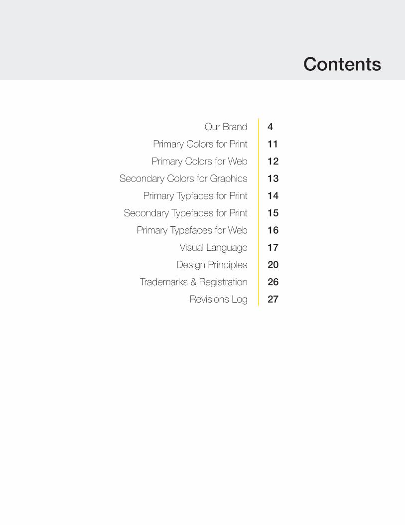
Contents
Our Brand
Primary Colors for Print
Primary Colors for Web
Secondary Colors for Graphics
Primary Typfaces for Print
Secondary Typefaces for Print
Primary Typefaces for Web
Visual Language
Design Principles
Trademarks & Registration
Revisions Log
4
11
12
13
14
15
16
17
20
26
27
BANNER ENGINEERING BRAND IDENTITY & STYLE GUIDE
| www.bannerengineering.com4
Our Brand
Banner Engineering is committed to developing new and innovative solutions, delivering products of the highest quality, fulfilling the needs of each customer, and operating with honesty and integrity. For five decades, these commitments have guided and defined us.
How we present ourselves to our partners, customers and the world should reflect these commitments and be a strong statement of who we are as a company.
Each time a customer hears our name, sees our logo, visits our website, reads our literature, and interacts with our social media, a connection is being made. With each connection we make, we have an opportunity to define our brand and tell our story. We want to create emotional connections with our customers every single day, to do so effectively, we must remain consistent in our branding and storytelling.
Throughout this Brand Identity & Style Guide, you will find an intuitively organized and easy-to-read display of approved design style information for Banner Engineering. Contents range from the use of our logo, typography, color, and key design elements to how these elements are displayed visually for print, web, and video. Each element was chosen for a specific reason: to represent Banner Engineering in a manner consistent with evolving design trends and following best practices for our print and digital platforms. Following the guidelines that we have laid out will help ensure that the connections we make with our customers are consistent with who we are as a company.
Who is Banner Engineering?
BANNER ENGINEERING BRAND IDENTITY & STYLE GUIDE
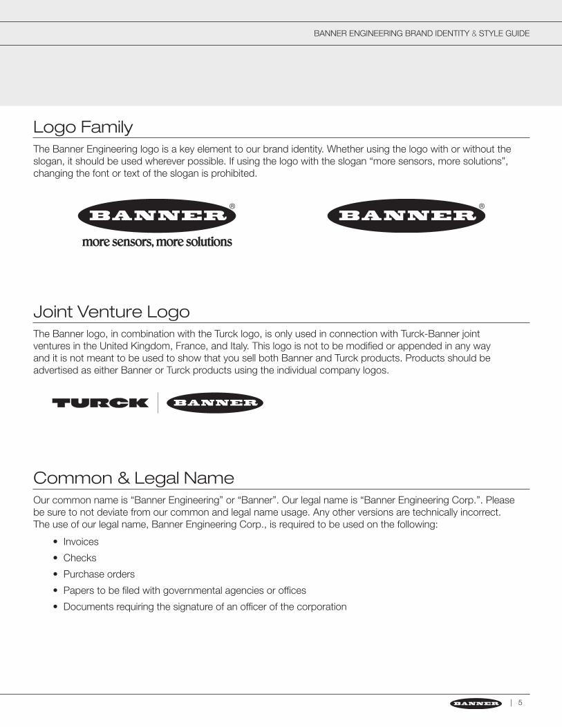
The Banner Engineering logo is a key element to our brand identity. Whether using the logo with or without the slogan, it should be used wherever possible. If using the logo with the slogan “more sensors, more solutions”, changing the font or text of the slogan is prohibited.
The Banner logo, in combination with the Turck logo, is only used in connection with Turck-Banner joint ventures in the United Kingdom, France, and Italy. This logo is not to be modified or appended in any way and it is not meant to be used to show that you sell both Banner and Turck products. Products should be advertised as either Banner or Turck products using the individual company logos.
Our common name is “Banner Engineering” or “Banner”. Our legal name is “Banner Engineering Corp.”. Please be sure to not deviate from our common and legal name usage. Any other versions are technically incorrect. The use of our legal name, Banner Engineering Corp., is required to be used on the following:
• Invoices
• Checks
• Purchase orders
• Papers to be filed with governmental agencies or offices
• Documents requiring the signature of an officer of the corporation
| 5
Logo Family
Joint Venture Logo
Common & Legal Name
BANNER ENGINEERING BRAND IDENTITY & STYLE GUIDE
| www.bannerengineering.com
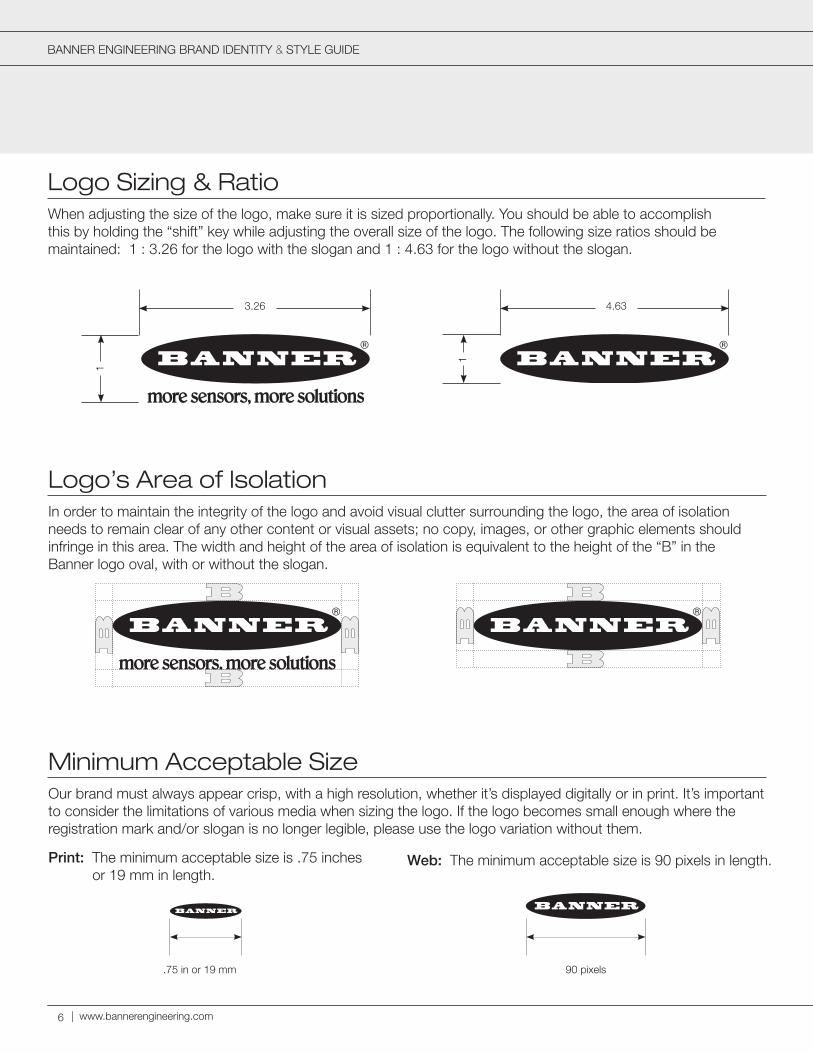
When adjusting the size of the logo, make sure it is sized proportionally. You should be able to accomplish this by holding the “shift” key while adjusting the overall size of the logo. The following size ratios should be maintained: 1 : 3.26 for the logo with the slogan and 1 : 4.63 for the logo without the slogan.
3.26
1
1
4.63
Logo Sizing & Ratio
Logo’s Area of Isolation
Minimum Acceptable Size
In order to maintain the integrity of the logo and avoid visual clutter surrounding the logo, the area of isolation needs to remain clear of any other content or visual assets; no copy, images, or other graphic elements should infringe in this area. The width and height of the area of isolation is equivalent to the height of the “B” in the Banner logo oval, with or without the slogan.
Our brand must always appear crisp, with a high resolution, whether it’s displayed digitally or in print. It’s important to consider the limitations of various media when sizing the logo. If the logo becomes small enough where the registration mark and/or slogan is no longer legible, please use the logo variation without them.
Web: The minimum acceptable size is 90 pixels in length.Print: The minimum acceptable size is .75 inches or 19 mm in length.
.75 in or 19 mm 90 pixels
6
BANNER ENGINEERING BRAND IDENTITY & STYLE GUIDE
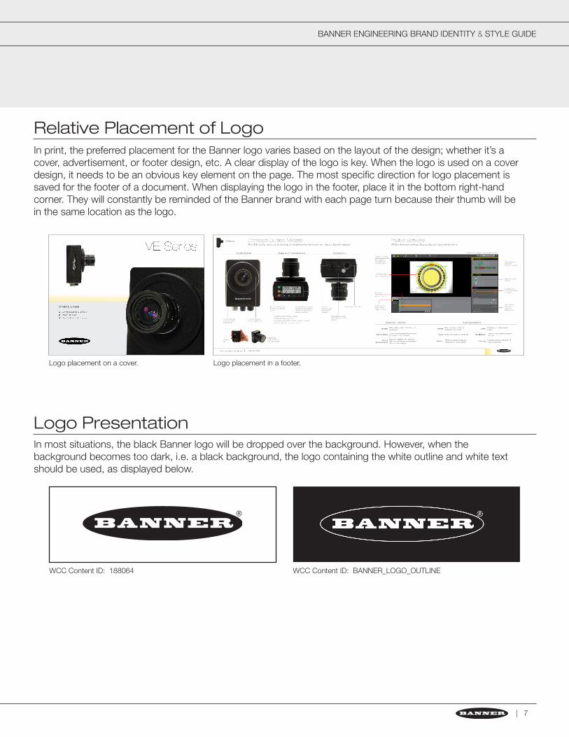
In print, the preferred placement for the Banner logo varies based on the layout of the design; whether it’s a cover, advertisement, or footer design, etc. A clear display of the logo is key. When the logo is used on a cover design, it needs to be an obvious key element on the page. The most specific direction for logo placement is saved for the footer of a document. When displaying the logo in the footer, place it in the bottom right-hand corner. They will constantly be reminded of the Banner brand with each page turn because their thumb will be in the same location as the logo.
Relative Placement of Logo
Logo Presentation
Logo placement on a cover. Logo placement in a footer.
In most situations, the black Banner logo will be dropped over the background. However, when the background becomes too dark, i.e. a black background, the logo containing the white outline and white text should be used, as displayed below.
| 7
WCC Content ID: BANNER_LOGO_OUTLINEWCC Content ID: 188064
BANNER ENGINEERING BRAND IDENTITY & STYLE GUIDE
| www.bannerengineering.com
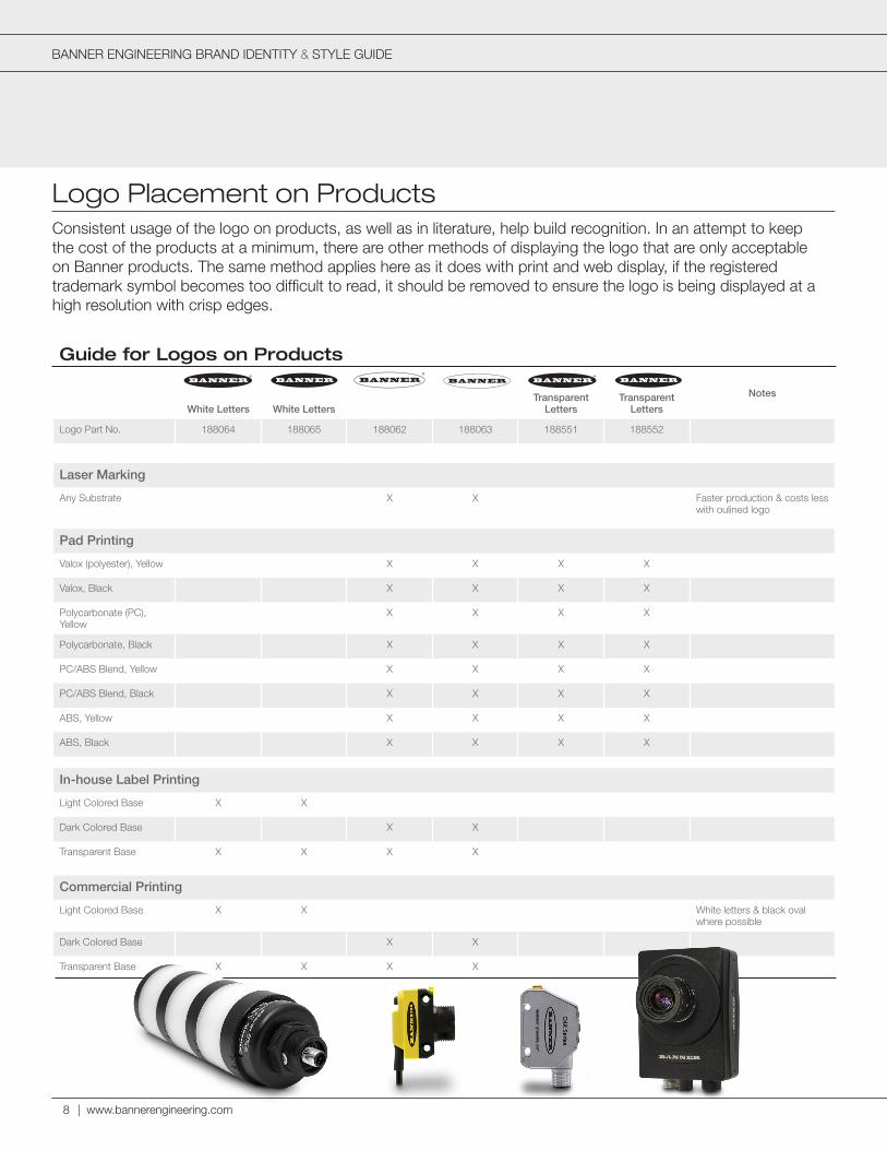
Consistent usage of the logo on products, as well as in literature, help build recognition. In an attempt to keep the cost of the products at a minimum, there are other methods of displaying the logo that are only acceptable on Banner products. The same method applies here as it does with print and web display, if the registered trademark symbol becomes too difficult to read, it should be removed to ensure the logo is being displayed at a high resolution with crisp edges.
Logo Placement on Products
Guide for Logos on Products
White Letters White LettersTransparent
LettersTransparent
Letters
Notes
Logo Part No. 188064 188065 188062 188063 188551 188552
Laser Marking
Any Substrate X X Faster production & costs less with oulined logo
Pad Printing
Valox (polyester), Yellow X X X X
Valox, Black X X X X
Polycarbonate (PC), Yellow
X X X X
Polycarbonate, Black X X X X
PC/ABS Blend, Yellow X X X X
PC/ABS Blend, Black X X X X
ABS, Yellow X X X X
ABS, Black X X X X
In-house Label Printing
Light Colored Base X X
Dark Colored Base X X
Transparent Base X X X X
Commercial Printing
Light Colored Base X X White letters & black oval where possible
Dark Colored Base X X
Transparent Base X X X X
8
BANNER ENGINEERING BRAND IDENTITY & STYLE GUIDE
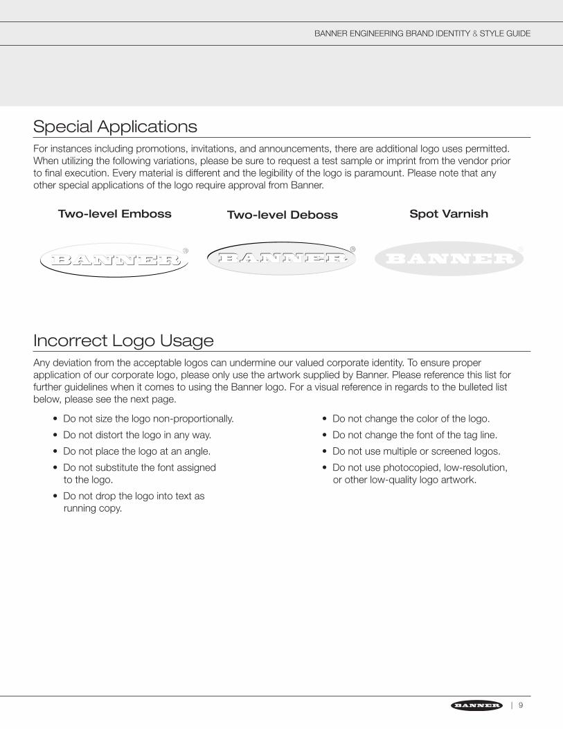
For instances including promotions, invitations, and announcements, there are additional logo uses permitted. When utilizing the following variations, please be sure to request a test sample or imprint from the vendor prior to final execution. Every material is different and the legibility of the logo is paramount. Please note that any other special applications of the logo require approval from Banner.
Special Applications
Two-level Emboss Two-level Deboss Spot Varnish
Any deviation from the acceptable logos can undermine our valued corporate identity. To ensure proper application of our corporate logo, please only use the artwork supplied by Banner. Please reference this list for further guidelines when it comes to using the Banner logo. For a visual reference in regards to the bulleted list below, please see the next page.
Incorrect Logo Usage
• Do not size the logo non-proportionally.
• Do not distort the logo in any way.
• Do not place the logo at an angle.
• Do not substitute the font assigned to the logo.
• Do not drop the logo into text as running copy.
• Do not change the color of the logo.
• Do not change the font of the tag line.
• Do not use multiple or screened logos.
• Do not use photocopied, low-resolution, or other low-quality logo artwork.
| 9
BANNER ENGINEERING BRAND IDENTITY & STYLE GUIDE
| www.bannerengineering.com10
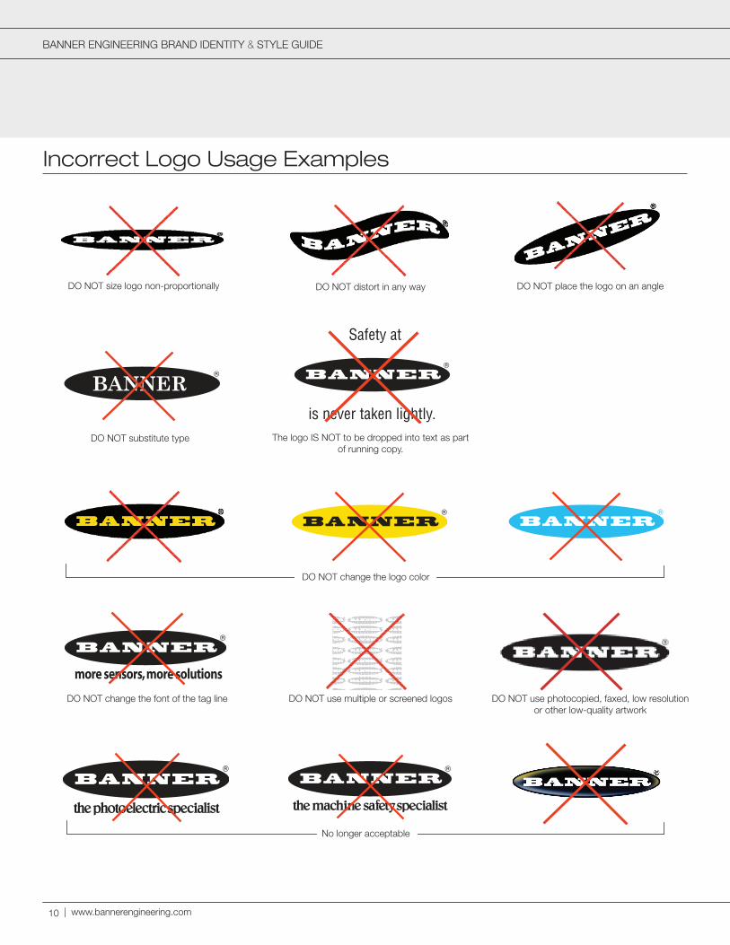
DO NOT size logo non-proportionally DO NOT place the logo on an angle
DO NOT substitute type
––––––––––––––– DO NOT change the logo color –––––––––––––––––
DO NOT distort in any way
DO NOT use multiple or screened logos DO NOT use photocopied, faxed, low resolution or other low-quality artwork
The logo IS NOT to be dropped into text as part of running copy.
is never taken lightly.
Safety at
DO NOT change the font of the tag line
––––––––––––––– No longer acceptable –––––––––––––––––
Incorrect Logo Usage Examples
BANNER ENGINEERING BRAND IDENTITY & STYLE GUIDE
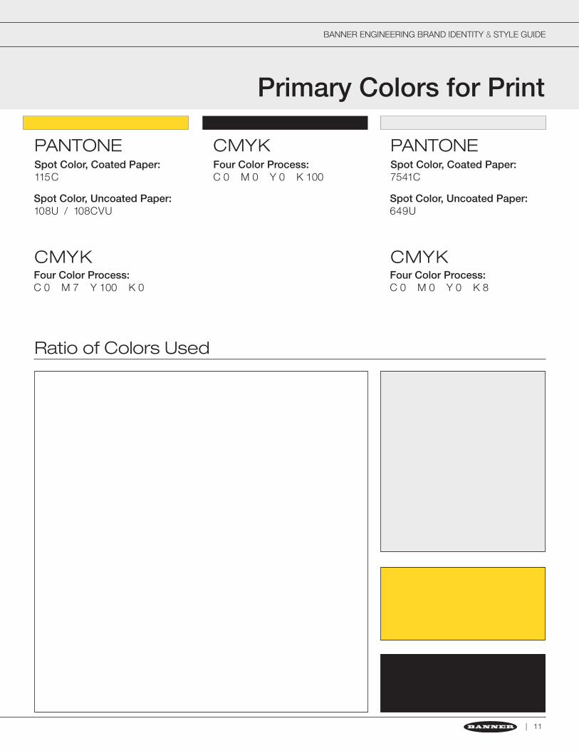
Primary Colors for Print
| 11
PANTONE CMYK PANTONESpot Color, Coated Paper: 115C
Four Color Process: C 0 M 0 Y 0 K 100
Spot Color, Coated Paper: 7541C
CMYK CMYKFour Color Process:C 0 M 7 Y 100 K 0
Four Color Process:C 0 M 0 Y 0 K 8
Spot Color, Uncoated Paper:108U / 108CVU
Spot Color, Uncoated Paper:649U
Ratio of Colors Used
BANNER BRAND IDENTITY & STYLE GUIDE
| www.bannerengineering.com
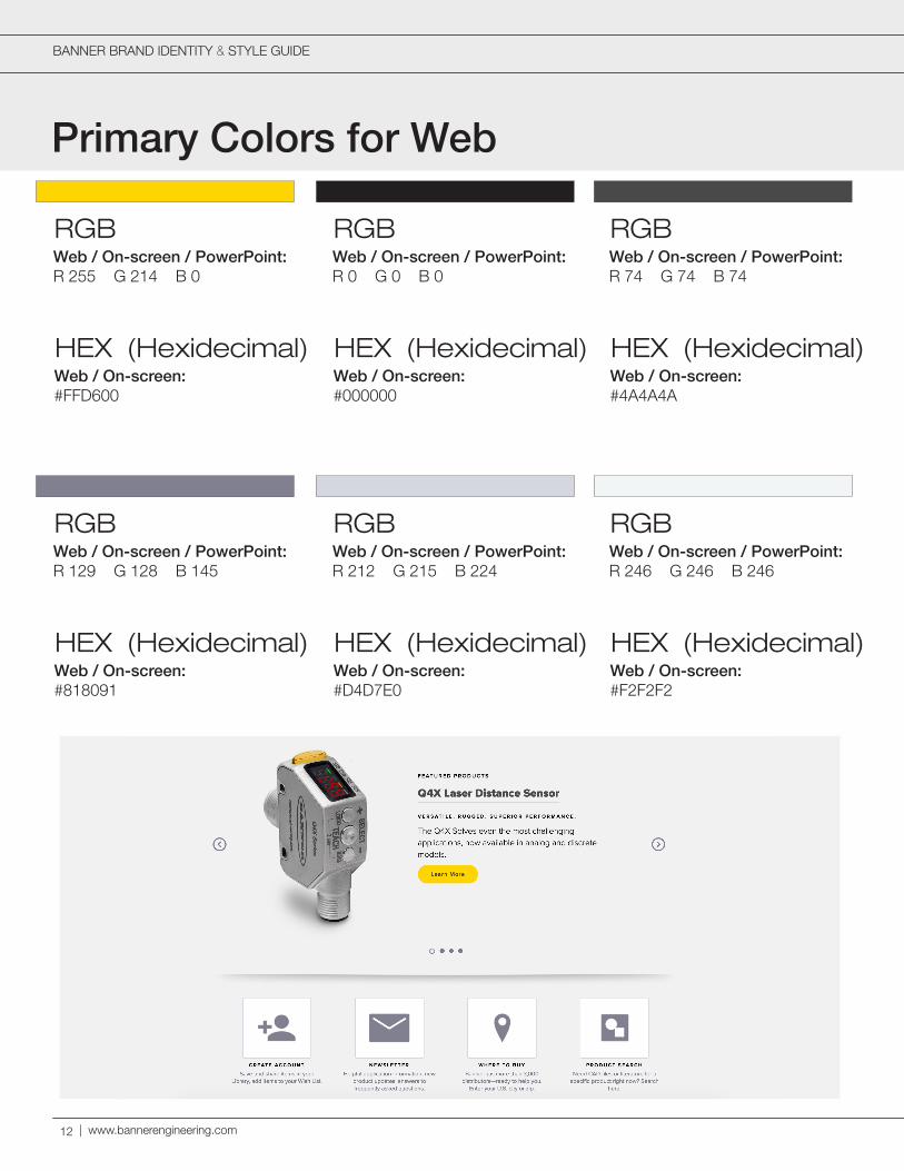
Primary Colors for Web
12
RGB
RGB
RGB
RGB
RGB
RGB
Web / On-screen / PowerPoint:R 255 G 214 B 0
Web / On-screen / PowerPoint:R 129 G 128 B 145
Web / On-screen / PowerPoint:R 0 G 0 B 0
Web / On-screen / PowerPoint:R 212 G 215 B 224
Web / On-screen / PowerPoint:R 74 G 74 B 74
Web / On-screen / PowerPoint:R 246 G 246 B 246
HEX (Hexidecimal)
HEX (Hexidecimal)
HEX (Hexidecimal)
HEX (Hexidecimal)
HEX (Hexidecimal)
HEX (Hexidecimal)
Web / On-screen:#FFD600
Web / On-screen:#818091
Web / On-screen:#000000
Web / On-screen:#D4D7E0
Web / On-screen:#4A4A4A
Web / On-screen:#F2F2F2
BANNER BRAND IDENTITY & STYLE GUIDE
Secondary Colors for Graphics
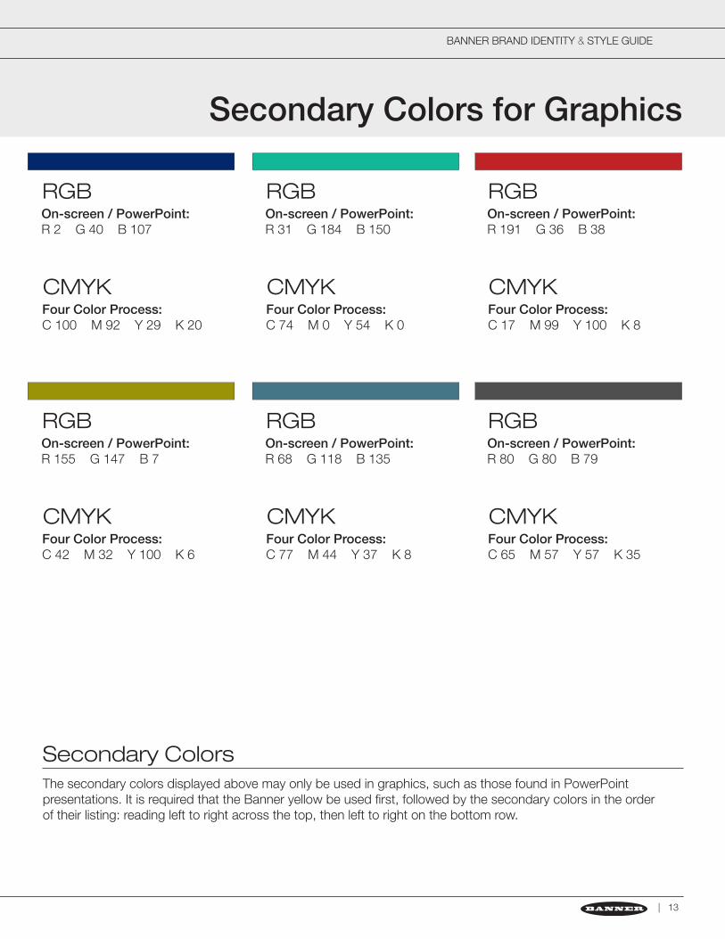
RGB
RGB
RGB
RGB
RGB
RGB
On-screen / PowerPoint:R 2 G 40 B 107
On-screen / PowerPoint:R 155 G 147 B 7
On-screen / PowerPoint:R 31 G 184 B 150
On-screen / PowerPoint:R 68 G 118 B 135
On-screen / PowerPoint:R 191 G 36 B 38
On-screen / PowerPoint:R 80 G 80 B 79
CMYK
CMYK
CMYK
CMYK
CMYK
CMYK
Four Color Process:C 100 M 92 Y 29 K 20
Four Color Process:C 42 M 32 Y 100 K 6
Four Color Process:C 74 M 0 Y 54 K 0
Four Color Process:C 77 M 44 Y 37 K 8
Four Color Process:C 17 M 99 Y 100 K 8
Four Color Process:C 65 M 57 Y 57 K 35
Secondary ColorsThe secondary colors displayed above may only be used in graphics, such as those found in PowerPoint presentations. It is required that the Banner yellow be used first, followed by the secondary colors in the order of their listing: reading left to right across the top, then left to right on the bottom row.
| 13
BANNER ENGINEERING BRAND IDENTITY & STYLE GUIDE
| www.bannerengineering.com
Primary Typefaces for Print
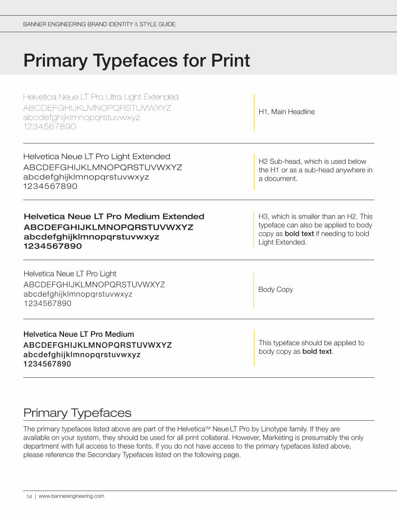
Primary TypefacesThe primary typefaces listed above are part of the HelveticaTM Neue LT Pro by Linotype family. If they are available on your system, they should be used for all print collateral. However, Marketing is presumably the only department with full access to these fonts. If you do not have access to the primary typefaces listed above, please reference the Secondary Typefaces listed on the following page.
ABCDEFGHIJKLMNOPQRSTUVWXYZabcdefghijklmnopqrstuvwxyz1234567890
Helvetica Neue LT Pro Light
Body Copy
ABCDEFGHIJKLMNOPQRSTUVWXYZabcdefghijklmnopqrstuvwxyz1234567890
Helvetica Neue LT Pro Light ExtendedH2 Sub-head, which is used below the H1 or as a sub-head anywhere in a document.
ABCDEFGHIJKLMNOPQRSTUVWXYZabcdefghijklmnopqrstuvwxyz1234567890
Helvetica Neue LT Pro Ultra Light Extended
H1, Main Headline
ABCDEFGHIJKLMNOPQRSTUVWXYZabcdefghijklmnopqrstuvwxyz1234567890
Helvetica Neue LT Pro MediumThis typeface should be applied to body copy as bold text.
ABCDEFGHIJKLMNOPQRSTUVWXYZabcdefghijklmnopqrstuvwxyz1234567890
Helvetica Neue LT Pro Medium Extended H3, which is smaller than an H2. This typeface can also be applied to body copy as bold text if needing to bold Light Extended.
14
BANNER ENGINEERING BRAND IDENTITY & STYLE GUIDE
Body Copy
H1, Main Headline
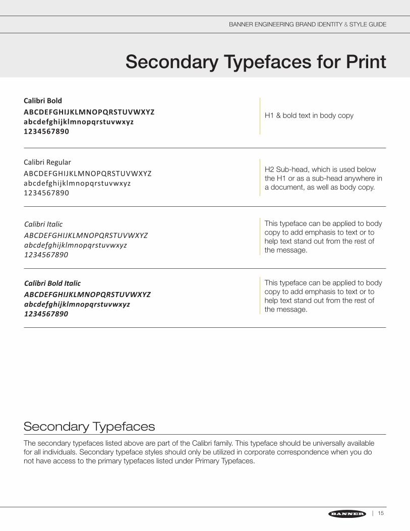
Secondary TypefacesThe secondary typefaces listed above are part of the Calibri family. This typeface should be universally available for all individuals. Secondary typeface styles should only be utilized in corporate correspondence when you do not have access to the primary typefaces listed under Primary Typefaces.
Secondary Typefaces for Print
ABCDEFGHIJKLMNOPQRSTUVWXYZabcdefghijklmnopqrstuvwxyz1234567890
Calibri RegularH2 Sub-head, which is used below the H1 or as a sub-head anywhere in a document, as well as body copy.
ABCDEFGHIJKLMNOPQRSTUVWXYZabcdefghijklmnopqrstuvwxyz1234567890
Calibri Bold
H1 & bold text in body copy
ABCDEFGHIJKLMNOPQRSTUVWXYZabcdefghijklmnopqrstuvwxyz1234567890
ABCDEFGHIJKLMNOPQRSTUVWXYZabcdefghijklmnopqrstuvwxyz1234567890
Calibri Italic
Calibri Bold Italic
This typeface can be applied to body copy to add emphasis to text or to help text stand out from the rest of the message.
This typeface can be applied to body copy to add emphasis to text or to help text stand out from the rest of the message.
| 15
BANNER BRAND IDENTITY & STYLE GUIDE
| www.bannerengineering.com
Primary Typefaces for Web
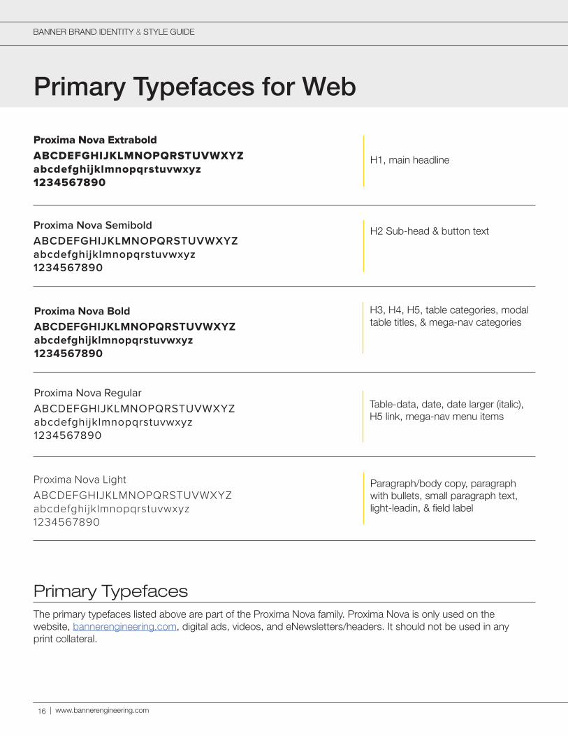
Primary TypefacesThe primary typefaces listed above are part of the Proxima Nova family. Proxima Nova is only used on the website, bannerengineering.com, digital ads, videos, and eNewsletters/headers. It should not be used in any print collateral.
ABCDEFGHIJKLMNOPQRSTUVWXYZabcdefghijklmnopqrstuvwxyz1234567890
Proxima Nova RegularTable-data, date, date larger (italic), H5 link, mega-nav menu items
ABCDEFGHIJKLMNOPQRSTUVWXYZabcdefghijklmnopqrstuvwxyz1234567890
Proxima Nova Semibold H2 Sub-head & button text
ABCDEFGHIJKLMNOPQRSTUVWXYZabcdefghijklmnopqrstuvwxyz1234567890
Proxima Nova Extrabold
H1, main headline
ABCDEFGHIJKLMNOPQRSTUVWXYZabcdefghijklmnopqrstuvwxyz1234567890
Proxima Nova Light Paragraph/body copy, paragraph with bullets, small paragraph text, light-leadin, & field label
ABCDEFGHIJKLMNOPQRSTUVWXYZabcdefghijklmnopqrstuvwxyz1234567890
Proxima Nova Bold H3, H4, H5, table categories, modal table titles, & mega-nav categories
16

H1, main headline
BANNER BRAND IDENTITY & STYLE GUIDE
Visual Language
Compelling Product PhotographyWhether capturing hero or isometric product shots, we need to create compelling images that evoke interest and admiration of our products. This is done by utilizing composition and clarity in the overall image. All photography should be edited using professional software to confirm white balance and remove any blemishes to create an exceptionally polished final product image presentation.
Hero shots are primarily used on a cover (see the images above). They are meant to create a visual statement that encompasses relevance, context, value, and emotion. This is our chance to show the passion the engineers had when designing the product. The image may be lacking detail of the product (e.g. screen displays, sensor lights, etc.), but we want the cover image to be appealing and artistic. Featuring a compelling product image on the cover will help lead the reader to open the literature piece to learn more about that product and its solutions.
Isometric and other miscellaneous angles or views in a product image are only used to help highlight features of a product (e.g. screen displays, sensor lights, etc.) for the purpose of call-outs. These images may not look as creative as far as composition goes, but their main purpose is to inform while still being displayed as a compelling product image.
Apply a subtle drop shadow to avoid creating a sense of floating.
Straight-on profile shots are compelling and dramatic.
Be creative with angles for hero shots.
| 17
BANNER BRAND IDENTITY & STYLE GUIDE
| www.bannerengineering.com
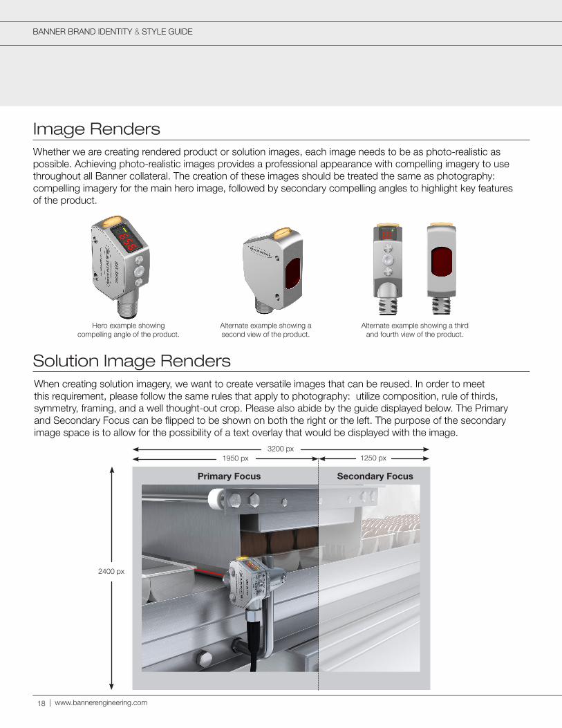
Image Renders
Solution Image Renders
Whether we are creating rendered product or solution images, each image needs to be as photo-realistic as possible. Achieving photo-realistic images provides a professional appearance with compelling imagery to use throughout all Banner collateral. The creation of these images should be treated the same as photography: compelling imagery for the main hero image, followed by secondary compelling angles to highlight key features of the product.
18
When creating solution imagery, we want to create versatile images that can be reused. In order to meet this requirement, please follow the same rules that apply to photography: utilize composition, rule of thirds, symmetry, framing, and a well thought-out crop. Please also abide by the guide displayed below. The Primary and Secondary Focus can be flipped to be shown on both the right or the left. The purpose of the secondary image space is to allow for the possibility of a text overlay that would be displayed with the image.
3200 px
2400 px
1250 px1950 px
Primary Focus Secondary Focus
Hero example showing compelling angle of the product.
Alternate example showing a second view of the product.
Alternate example showing a third and fourth view of the product.
BANNER BRAND IDENTITY & STYLE GUIDE
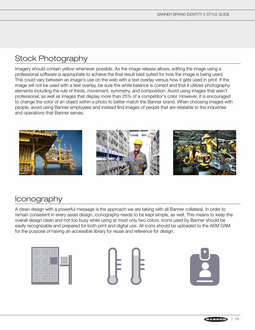
Stock Photography
Iconography
Imagery should contain yellow whenever possible. As the image release allows, editing the image using a professional software is appropriate to achieve the final result best suited for how the image is being used. This could vary between an image's use on the web with a text overlay versus how it gets used in print. If the image will not be used with a text overlay, be sure the white balance is correct and that it utilizes photography elements including the rule of thirds, movement, symmetry, and composition. Avoid using images that aren't professional, as well as images that display more than 25% of a competitor's color. However, it is encouraged to change the color of an object within a photo to better match the Banner brand. When choosing images with people, avoid using Banner employees and instead find images of people that are relatable to the industries and operations that Banner serves.
A clean design with a powerful message is the approach we are taking with all Banner collateral. In order to remain consistent in every asset design, iconography needs to be kept simple, as well. This means to keep the overall design clean and not too busy while using at most only two colors. Icons used by Banner should be easily recognizable and prepared for both print and digital use. All icons should be uploaded to the AEM DAM for the purpose of having an accessible library for reuse and reference for design.
| 19
BANNER ENGINEERING BRAND IDENTITY & STYLE GUIDE
| www.bannerengineering.com
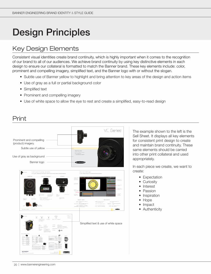
Design Principles
Key Design ElementsConsistent visual identities create brand continuity, which is highly important when it comes to the recognition of our brand to all of our audiences. We achieve brand continuity by using key distinctive elements in each design to ensure our collateral is formatted to match the Banner brand. These key elements include: color, prominent and compelling imagery, simplified text, and the Banner logo with or without the slogan.
• Subtle use of Banner yellow to highlight and bring attention to key areas of the design and action items
• Use of gray as a full or partial background color
• Simplified text
• Prominent and compelling imagery
• Use of white space to allow the eye to rest and create a simplified, easy-to-read design
Prominent and compelling (product) imagery.
Banner logo
Use of gray as background
Subtle use of yellow
Simplified text & use of white space
The example shown to the left is the Sell Sheet. It displays all key elements for consistent print design to create and maintain brand continuity. These same elements should be carried into other print collateral and used appropriately.
In each piece we create, we want to create:
• Expectation• Curiosity• Interest• Passion• Inspiration• Hope• Impact• Authenticity
20

BANNER ENGINEERING BRAND IDENTITY & STYLE GUIDE
PowerPoint
| 21
WebCenter Content ID: CORP_PPT_TEMPLATE
The PowerPoint template utilizes all key elements to create a consistent design and layout for Banner presentations. It has been uploaded to WebCenter for use by all Banner employees.
First Slide: Prominent and compelling imagery with minimal text. Here, we are simply introducing the product.
Inside Slide: Prominent and compelling imagery, simplified text, and white space. Keep it simple and easy to read with a quick message.
First Graph Example: Utilizing the Secondary Colors for Graphics, this is where you apply those colors to create easy-to-read graphics for presentations.
Second Graph Example: This graph example utilizes only the colors white, gray, and black. It's simple, clean, and easy to read while maintaining a professional and sophisticated appearance.
Inside Slide for Solution Image: The use of a full-slide image provides for a clear view of the solution being shown, as well as providing a simplified approach to the overall display by eliminating unnecessary text.
Final Slide: The final slide should remain blank to remain consistent with simplified design. This also creates a clear indication the presentation has ended and is open to questions.
BANNER BRAND IDENTITY & STYLE GUIDE
| www.bannerengineering.com
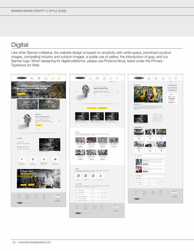
DigitalLike other Banner collateral, the website design is based on simplicity with white space, prominent product images, compelling industry and solution images, a subtle use of yellow, the introduction of gray, and our Banner logo. When designing for digital platforms, please use Proxima Nova, listed under the Primary Typefaces for Web.
22
BANNER ENGINEERING BRAND IDENTITY & STYLE GUIDE
| 23
VideographyVideo is a great tool to encourage engagement with an audience. However, like our other design elements, it is important to remain consistent with the visual elements so our branding is recognizeable. Therefore, we need display our key design elements with the use of gray, a subtle use of yellow, simplified text using the Primary Typeface for Web (Proxima Nova text styles), and the Banner logo. Each video will vary in purpose, but they all will share one commonality: a primary focus on our products. Compelling frames of our products should also be displayed throughout each video while showcasing what the product is, what it does, and it's key features. Other requirements for video are as follows.
• Because video uses RGB color space and most video doesn’t have a pure white background, content will differ from video to video.
• All videos must start and end with the Banner logo.
• The end of every video must show the disclaimer written by our legal team, as well as the copyright and year:
• “Proper application and installation is critical. Each product includes installation instructions and a manual online at BannerEngineering.com that must be carefully read and followed.”
• “©20XX Banner Engineering Corp.”
• All videos must end with a call-to-action with the Banner website and/or phone number.
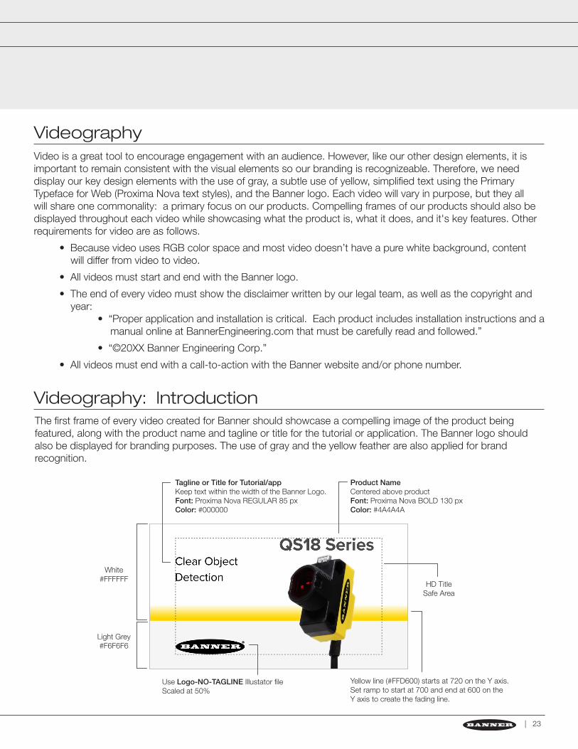
Videography: IntroductionThe first frame of every video created for Banner should showcase a compelling image of the product being featured, along with the product name and tagline or title for the tutorial or application. The Banner logo should also be displayed for branding purposes. The use of gray and the yellow feather are also applied for brand recognition.
Tagline or Title for Tutorial/appKeep text within the width of the Banner Logo.Font: Proxima Nova REGULAR 85 pxColor: #000000
Product NameCentered above productFont: Proxima Nova BOLD 130 pxColor: #4A4A4A
Yellow line (#FFD600) starts at 720 on the Y axis. Set ramp to start at 700 and end at 600 on the Y axis to create the fading line.
Use Logo-NO-TAGLINE Illustator fileScaled at 50%
White#FFFFFF
HD TitleSafe Area
Light Grey#F6F6F6
BANNER ENGINEERING BRAND IDENTITY & STYLE GUIDE
| www.bannerengineering.com
BANNER ENGINEERING BRAND IDENTITY & STYLE GUIDE
24
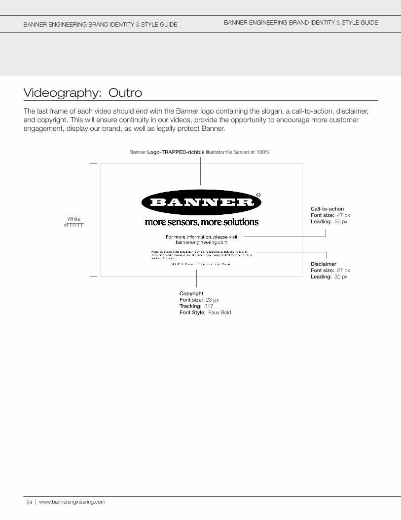
Videography: OutroThe last frame of each video should end with the Banner logo containing the slogan, a call-to-action, disclaimer, and copyright. This will ensure continuity in our videos, provide the opportunity to encourage more customer engagement, display our brand, as well as legally protect Banner.
White#FFFFFF
Banner Logo-TRAPPED-richblk Illustator file Scaled at 100%
Call-to-actionFont size: 47 pxLeading: 50 px
DisclaimerFont size: 27 pxLeading: 30 px
CopyrightFont size: 23 pxTracking: 317Font Style: Faux Bold

BANNER ENGINEERING BRAND IDENTITY & STYLE GUIDE
Brand ContinuityBy maintaining visual consistencies, we create brand continuity. This will create a more enjoyable experience for our audiences and create a smooth transition from one piece of collateral to another. Below is an example of that smooth transition. You can see the key elements that are used in each piece with proper balance between those visual elements which creates a unified design and layout consistently throughout all of Banner's collateral.
| 25
BANNER ENGINEERING BRAND IDENTITY & STYLE GUIDE
| www.bannerengineering.com
Trademarks & Registration
About Trademarks
Trademarks & Naming of Products
When to Use the ® or ™
Trademarks are essential for building consistent product branding and for preventing others from exploiting our brand recognition. They identify a product family or emphasize a common feature of several families.
All branded marks initially bear the unregistered trademark™. If a mark warrants a full registration based upon market position and competitive landscape, registration for the mark is requested from the US Patent and Trademark Office (USPTO). Proper use of all pending or registered trademarks is essential to consistently maintain and protect trademarks. To review a complete list of our trademarks, visit bannerengineering.com/.
Careful consideration must be taken before selecting or registering marks due to the international markets in which Banner participates. The diverse cultures and markets must be considered when naming Banner products. A trademark chosen for the United States market may have a substantially different meaning in the international market. Too many trademarks can also diminish the effectiveness of the Banner brand. For the reasons listed above, all trademarks and naming of products must be approved by Banner officers.
In order to obtain protection against others who may be using Banner marks without permission, the mark must both be registered in the country where protection is sought and must include the circle "R" ®. The ® provides notice to others that the mark is registered. The ™ is an optional designation to indicate protection is being sought for the mark; an application for the mark has been submitted.
®
™
The Banner logo is always registered unless the ® is too small to be legible, in which case, it is left off.
If an advertisement or any other form of literature is being developed for distribution only in the US, use the registered trademark.
All product labels and packaging should be designed with the logo using the ™.
All literature, including advertisements, that are being produced for usage outside the U.S. should use the ™.
International Presentation of TrademarksWe encourage our international partners to use our trademarked brands in their materials that are used outside the US. As a result, when referencing a registered trademark, use the statement "[Product Name] is a registered trademark of Banner Engineering Corp. with the US Patent and Trademark Office."
26
BANNER ENGINEERING BRAND IDENTITY & STYLE GUIDE
Revisions Log
| 27
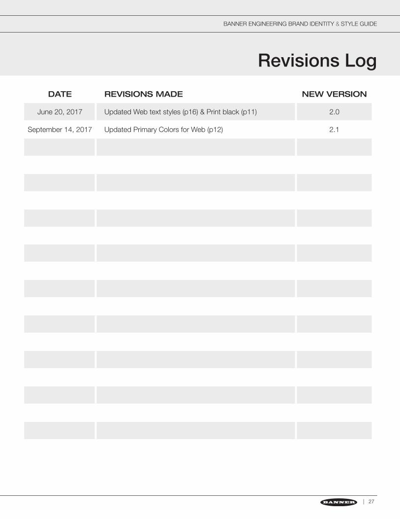
DATE REVISIONS MADE NEW VERSION
June 20, 2017 Updated Web text styles (p16) & Print black (p11) 2.0
September 14, 2017 Updated Primary Colors for Web (p12) 2.1

Banner Engineering Corp., Minneapolis, Minnesota, USAwww.bannerengineering.comPhone: 1-888-3-SENSOR© Banner Engineering Corp. All rights reserved.