brand guidelines - fresno eocfresnoeoc.org/files/pdf/fresno-eoc-brand-guidelines_071312.pdf4 | brand...
TRANSCRIPT

Brand Guidelines

Brand Guidelines | 3
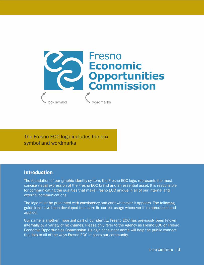
IntroductionThe foundation of our graphic identity system, the Fresno EOC logo, represents the most concise visual expression of the Fresno EOC brand and an essential asset. It is responsible for communicating the qualities that make Fresno EOC unique in all of our internal and external communications.
The logo must be presented with consistency and care whenever it appears. The following guidelines have been developed to ensure its correct usage whenever it is reproduced and applied.
Our name is another important part of our identity. Fresno EOC has previously been known internally by a variety of nicknames. Please only refer to the Agency as Fresno EOC or Fresno Economic Opportunities Commission. Using a consistent name will help the public connect the dots to all of the ways Fresno EOC impacts our community.
The Fresno EOC logo includes the box symbol and wordmarks
box symbol wordmarks
4 | Brand Guidelines
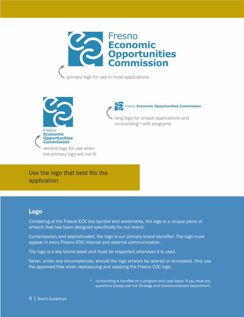
LogoConsisting of the Fresno EOC box symbol and wordmarks, the logo is a unique piece of artwork that has been designed specifically for our brand.
Contemporary and sophisticated, the logo is our primary brand identifier. The logo must appear in every Fresno EOC internal and external communication.
The logo is a key brand asset and must be respected whenever it is used.
Never, under any circumstances, should the logo artwork be altered or re-created. Only use the approved files when reproducing and applying the Fresno EOC logo.
Use the logo that best fits the application
primary logo for use in most applications
vertical logo for use when the primary logo will not fit
long logo for unique applications and co-branding* with programs
* co-branding is handled on a program and case basis. If you have any questions please ask the Strategy and Communications department.

Brand Guidelines | 5
Clear Space and Minimum SizeThe Fresno EOC logo should always be surrounded by a generous field of clear space to ensure its legibility and impact. This isolates the logo and protects it from competing visual elements such as text and supporting graphics.
As shown in the exhibit, the absolute minimum amount of clear space that can surround the logo in any application is equal to the size of the large “E” in the Fresno EOC wordmark.
The Fresno EOC logo can be scaled to a variety of sizes. However, at extremely smaller sizes, the readability of the wordmark becomes compromised. To ensure that the signature is always legible, the primary logo should never be reproduced smaller than 0.5’’ in height, the vertical logo should never be reproduced smaller than 0.75” in width, the long logo should be at least 0.25” in height.
size the logo for the application and then use 1/3 of the height of the box symbol as a guide to ensure enough clear space surrounding the logo
Clear space is important so the Fresno EOC logo is protected against competing visual elements
primary logominimum size0.5” height
vertical logominimum size0.75” width
long logo minimum size 0.25” height

6 | Brand Guidelines
Primary Color PaletteColor is a key component of the Fresno EOC visual identity, and the colors of the primary palette were inspired by those found in the Fresno EOC logo and the Community Action Partnership logo.
By using these colors consistently across brand communications, they will build recognition for the Fresno EOC brand while contributing to a unified look and feel.
The colors of the primary palette can be used for text, color fields, backgrounds, rules and other graphic devices.
Pantone® colors are specially mixed ink colors. CMYK color is a mix of cyan, magenta, yellow, and black inks. CMYK colors can vary from printer to printer whereas Pantone® colors are always the same.
PRIMARY COLORPantone® 646
RGB (for web/screen use)R: 79G: 138B: 190
CMYK (for 4-color process print use)C: 65M: 30Y: 0K: 11
SECONDARY COLORPantone® 457
RGB (for web/screen use)R: 194G: 162B: 4
CMYK (for 4-color process print use)C: 0M: 15Y: 100K: 28
COMMUNITY ACTION REDPantone® 207
RGB (for web/screen use)R: 200 G: 4 B: 82
CMYK (for 4-color process print use)C: 0M: 100Y: 43K: 18
COMMUNITY ACTION BLUEPantone® 2955
RGB (for web/screen use)R: 0G: 82B: 136
CMYK (for 4-color process print use)C: 100M: 45Y: 0K: 37
Consistent use of color will link our programs and strengthen our brand
Brand Guidelines | 7
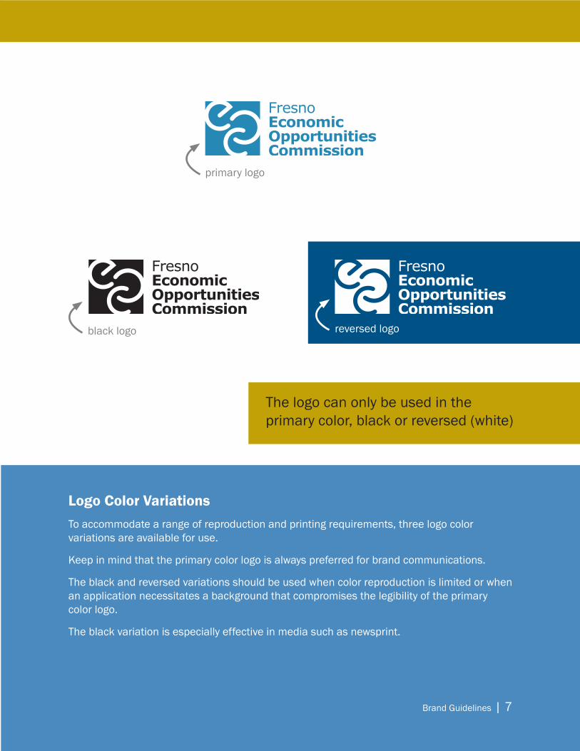
Logo Color VariationsTo accommodate a range of reproduction and printing requirements, three logo color variations are available for use.
Keep in mind that the primary color logo is always preferred for brand communications.
The black and reversed variations should be used when color reproduction is limited or when an application necessitates a background that compromises the legibility of the primary color logo.
The black variation is especially effective in media such as newsprint.
The logo can only be used in the primary color, black or reversed (white)
primary logo
black logo reversed logo
8 | Brand Guidelines
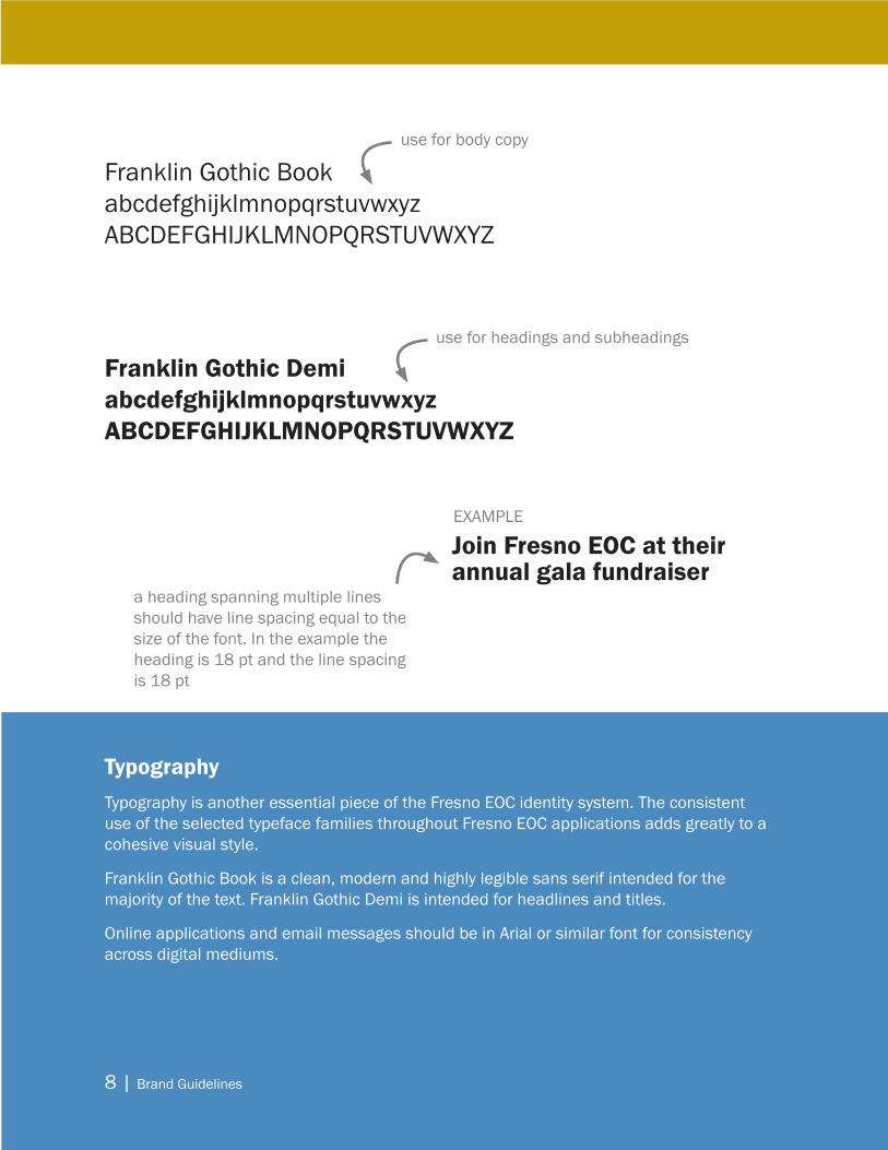
TypographyTypography is another essential piece of the Fresno EOC identity system. The consistent use of the selected typeface families throughout Fresno EOC applications adds greatly to a cohesive visual style.
Franklin Gothic Book is a clean, modern and highly legible sans serif intended for the majority of the text. Franklin Gothic Demi is intended for headlines and titles.
Online applications and email messages should be in Arial or similar font for consistency across digital mediums.
Franklin Gothic Book abcdefghijklmnopqrstuvwxyz ABCDEFGHIJKLMNOPQRSTUVWXYZ
Franklin Gothic Demi abcdefghijklmnopqrstuvwxyz ABCDEFGHIJKLMNOPQRSTUVWXYZ
use for body copy
use for headings and subheadings
Join Fresno EOC at their annual gala fundraiser
a heading spanning multiple lines should have line spacing equal to the size of the font. In the example the heading is 18 pt and the line spacing is 18 pt
EXAMPLE

Brand Guidelines | 9
Background ControlThe logo artwork was designed to be adaptable to a range of background requirements. However, it is essential that the logo is always highly legible in every application.
As shown in the exhibits, the logo and its variations can be positioned against a variety of backgrounds.
The full-color logo features well against white and black, as well as photographic backgrounds that provide significant contrast.
The grayscale and one-color reverse variations also reproduce well against white and black.
Applications that require dark photographic backgrounds or colors that compromise the logo should apply the reverse variation.
EXAMPLE OF COLOR LOGO ON A COLOR PHOTOGRAPHIC BACKGROUND
EXAMPLE OF REVERSED LOGO ON COLOR PHOTOGRAPHIC BACKGROUNDS
EXAMPLE OF BLACK LOGO IN A BLACK AND WHITE APPLICATION
10 | Brand Guidelines
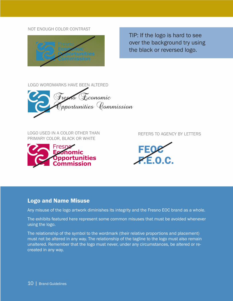
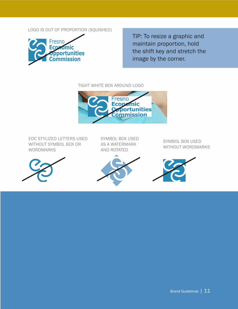
Logo and Name MisuseAny misuse of the logo artwork diminishes its integrity and the Fresno EOC brand as a whole.
The exhibits featured here represent some common misuses that must be avoided whenever using the logo.
The relationship of the symbol to the wordmark (their relative proportions and placement) must not be altered in any way. The relationship of the tagline to the logo must also remain unaltered. Remember that the logo must never, under any circumstances, be altered or re-created in any way.
NOT ENOUGH COLOR CONTRAST
LOGO WORDMARKS HAVE BEEN ALTERED
Fresno Economic Opportunities Commission
LOGO USED IN A COLOR OTHER THAN PRIMARY COLOR, BLACK OR WHITE
TIP: If the logo is hard to see over the background try using the black or reversed logo.
FEOCF.E.O.C.
REFERS TO AGENCY BY LETTERS
Brand Guidelines | 11
LOGO IS OUT OF PROPORTION (SQUISHED)
SYMBOL BOX USEDWITHOUT WORDMARKS
SYMBOL BOX USEDAS A WATERMARK AND ROTATED
EOC STYLIZED LETTERS USED WITHOUT SYMBOL BOX OR WORDMARKS
TIP: To resize a graphic and maintain proportion, hold the shift key and stretch the image by the corner.
TIGHT WHITE BOX AROUND LOGO

12 | Brand Guidelines
Email SignatureEven something as simple as your Fresno EOC email signature can impact the brand.
The primary option contains your full information. The truncated option can be used for departmental email or for mobile devices.
A properly formatted signature should be used on all internal and external emails.
John SmithTitleDepartmentFresno Economic Opportunities [email protected]
1920 Mariposa Mall, Suite 300 | Fresno, California 93721Office (559) 263-1000 | Cell (559) 555-5555 | Fax (559) 555-5555www.FresnoEOC.org
John Smith | TitleDepartment | Fresno Economic Opportunities CommissionOffice (559) 263-1000 | Cell (559) 555-5555 | Fax (559) 555-5555www.FresnoEOC.org
INFORMAL/TRUNCATED EMAIL SIGNATURE
FORMAL EMAIL SIGNATURE
Use Arial for the font, size 10, in black. Bold your name.
If you assist with multiple departments or programs or work for Executive Office, you do not need to use the Department line.Cell number is optional.
Use this shortened signature for internal communication and emails sent from mobile devices.

Brand Guidelines | 13
Logo FilesVECTOR/EPS FOR PROFESSIONAL PRINTING
Most logos and other line-art illustrations are created in vector/EPS format. Vector/EPS graphics are made up of lines and curves defined by mathematical objects called vectors. They retain their crispness, even when resized to any scale.
JPEG (JPG) FOR IN-HOUSE PRINTING AND WEB
Enlarging JPEG files beyond their original size also lowers the image quality, giving the image a jaggy or stair-stepped appearance.
FOR IN-HOUSE PRINTING AND WEB
Logo-Primary-Color.jpgLogo-Primary-Blk.jpg
Logo-Vertical-Color.jpgLogo-Vertical-Blk.jpg
Logo-Long-Color.jpgLogo-Long-Blk.jpg
FOR PROFESSIONAL PRINTING
Logo-Primary-Color.epsLogo-Primary-Blk.epsLogo-Primary-Wht.eps
Logo-Vertical-Color.epsLogo-Vertical-Blk.epsLogo-Vertical-Wht.eps
Logo-Long-Color.epsLogo-Long-Blk.epsLogo-Long-Wht.eps

14 | Brand Guidelines
Fresno EOC Logo & ProgramsSome Fresno EOC programs have state or national logos that are required to be used. The Fresno EOC long logo can be used in conjunction with these logos by either placing the logo on top of the program logo or at the bottom of the promotional material.
If there is not a program logo, please use the Fresno EOC long logo at the top of the promotional materials.
If you need help determining how to use the Fresno EOC logo to promote a program, please contact the Strategy and Communications Department for specific instructions.
Sanctuary Youth Services
REV 07/13/12

Brand Guidelines | 15
Internal and External Document Checklist
□ Fresno EOC logo is on the document
□ Fresno EOC logo is used according to the brand guidelines
□ Font, colors and feel preserves the integrity of the Fresno EOC brand
□ Use QR codes if possible to link viewers to the correct page online
□ Ensure information across all mediums is the same (web site, flyers, brochures, social media)
□ If the document is regarding an event make sure it also includes the following:
□ Who - Fresno Economic Opportunities Commission or Fresno EOC
□ What - Event name or heading
□ Where - Event location with zip code
□ When - Time and date, if the event spans multiple days - include the end date
□ Why - The purpose of the event
□ How - Information on how participants can get more information, register for the event or donate