box and whisker plots-for wkshp - participatory...
TRANSCRIPT
Comparing two or more groups with: Box and Whisker Plots
The benefit of using box and whisker plots-‐ boxplots-‐ is that they contain an incredible amount of information about the range of data in a dataset-‐ and do it within a small graphical space. Because boxplots (sometimes also called ‘5 number summaries’) can be used for comparing two or more groups, using them can help your students describe and talk about their data. Using boxplots can also help students think about variability and whether their data support their claim.
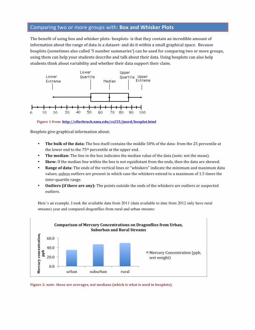
Figure 1 from: http://ellerbruch.nmu.edu/cs255/jnord/boxplot.html
Boxplots give graphical information about:
• The bulk of the data: The box itself contains the middle 50% of the data-‐ from the 25 percentile at the lower end to the 75th percentile at the upper end.
• The median: The line in the box indicates the median value of the data (note: not the mean). • Skew: If the median line within the box is not equidistant from the ends, then the data are skewed. • Range of data: The ends of the vertical lines or "whiskers" indicate the minimum and maximum data
values, unless outliers are present in which case the whiskers extend to a maximum of 1.5 times the inter-‐quartile range.
• Outliers (if there are any): The points outside the ends of the whiskers are outliers or suspected outliers.
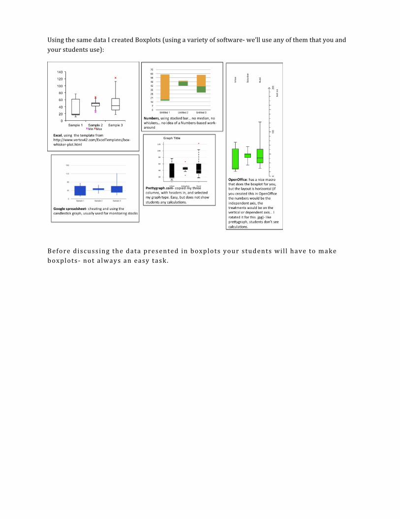
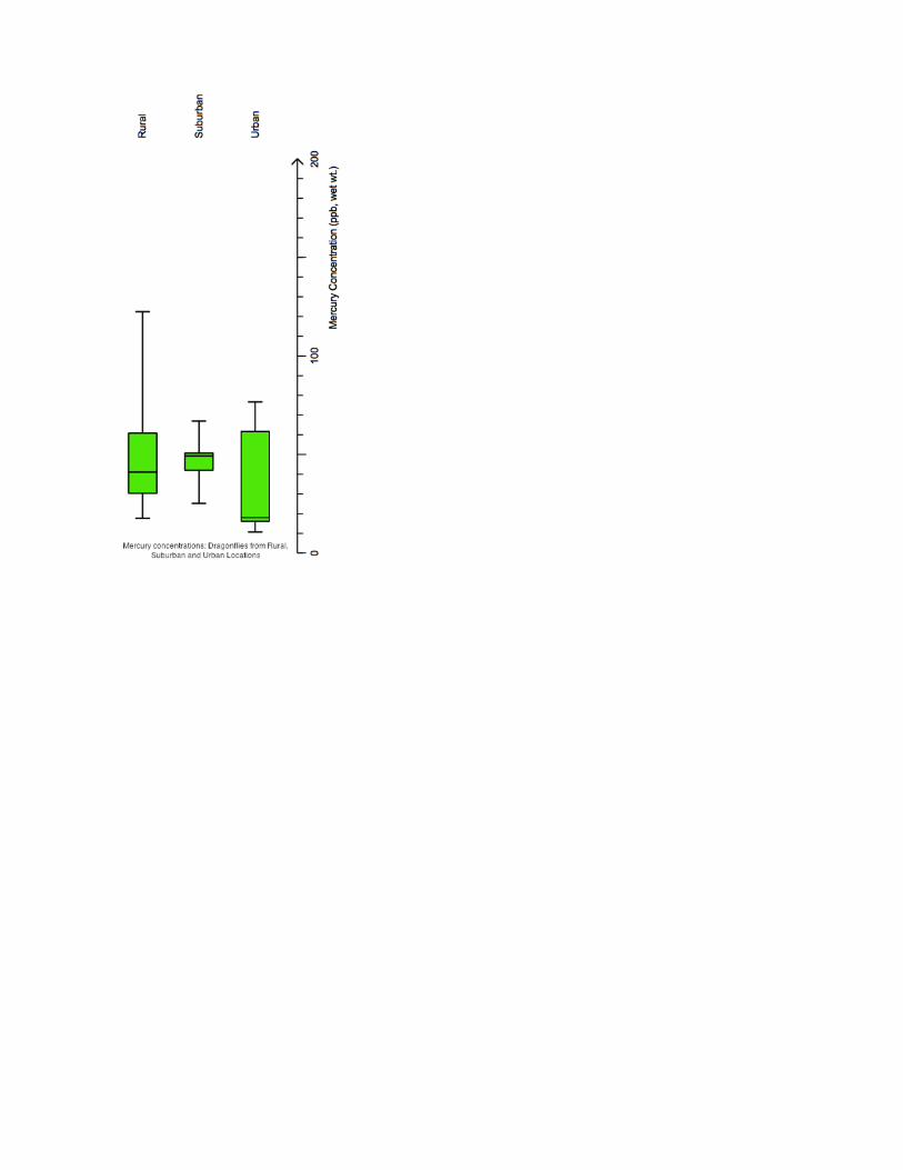
Here’s an example, I took the available data from 2011 (data available to date from 2012 only have rural streams) year and compared dragonflies from rural and urban streams:
Figure 2: note-‐ these are averages, not medians (which is what is used in boxplots).
0.0
20.0
40.0
60.0
urban suburban rural Mercury concentration,
ppb
Comparison of Mercury Concentrations on DragonLlies from Urban, Suburban and Rural Streams
Mercury Concentration (ppb, wet weight)
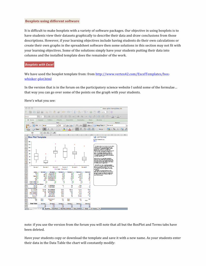
Using the same data I created Boxplots (using a variety of software-‐ we’ll use any of them that you and your students use):
Before discussing the data presented in boxplots your students wil l have to make boxplots-‐ not a lways an easy task .
Boxplots using different software
It is difficult to make boxplots with a variety of software packages. Our objective in using boxplots is to have students view their datasets graphically to describe their data and draw conclusions from those descriptions. However, if your learning objectives include having students do their own calculations or create their own graphs in the spreadsheet software then some solutions in this section may not fit with your learning objectives. Some of the solutions simply have your students putting their data into columns and the installed template does the remainder of the work.
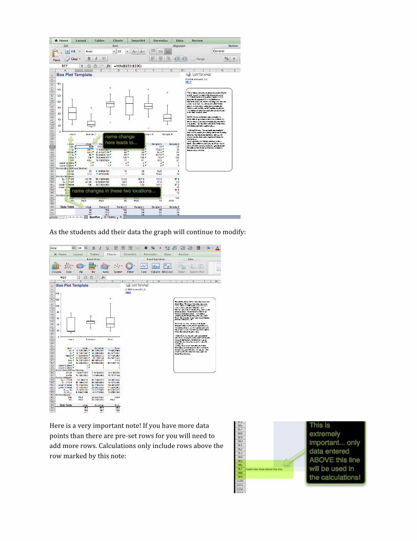
Boxplots with Excel
We have used the boxplot template from: from http://www.vertex42.com/ExcelTemplates/box-‐whisker-‐plot.html
In the version that is in the forum on the participatory science website I unhid some of the formulae… that way you can go over some of the points on the graph with your students.
Here’s what you see:
note: if you use the version from the forum you will note that all but the BoxPlot and Terms tabs have been deleted.
Have your students copy or download the template and save it with a new name. As your students enter their data in the Data Table the chart will constantly modify:
As the students add their data the graph will continue to modify:
Here is a very important note! If you have more data points than there are pre-‐set rows for you will need to add more rows. Calculations only include rows above the row marked by this note:
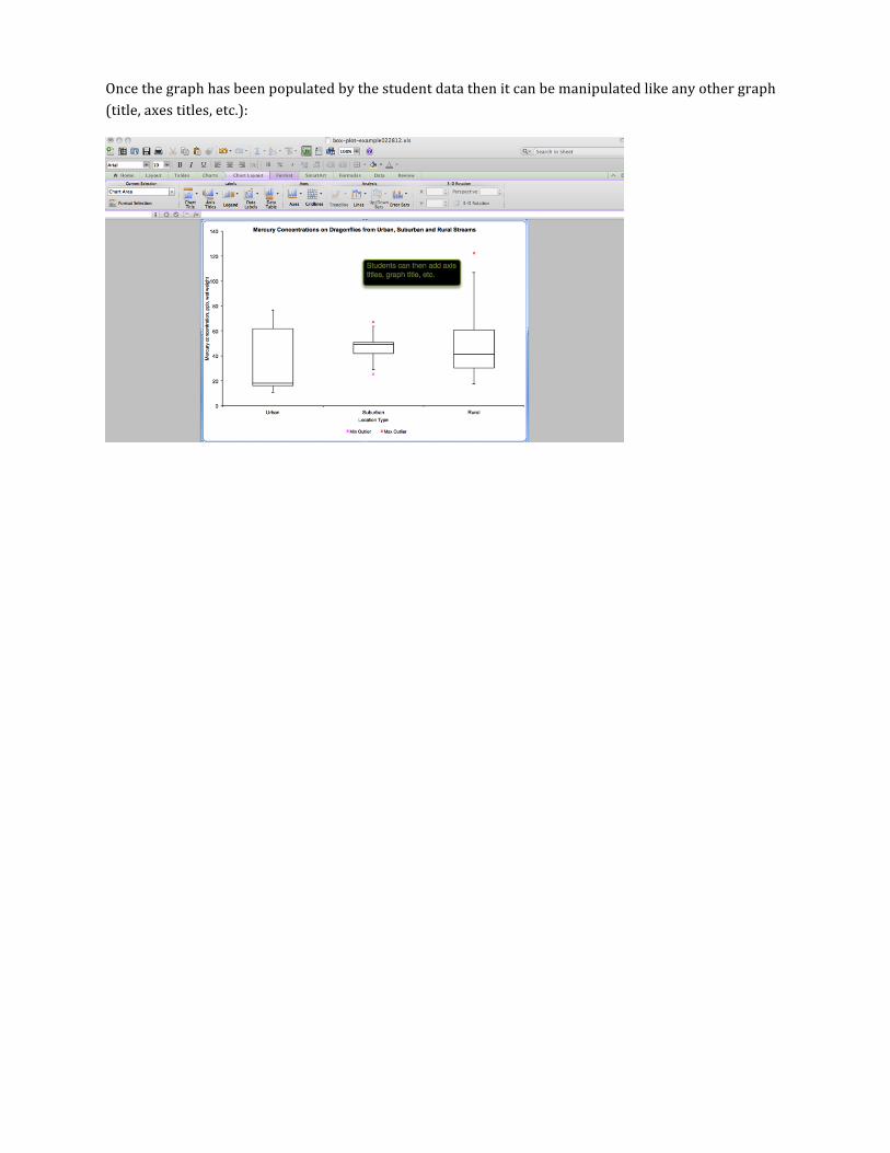
Once the graph has been populated by the student data then it can be manipulated like any other graph (title, axes titles, etc.):
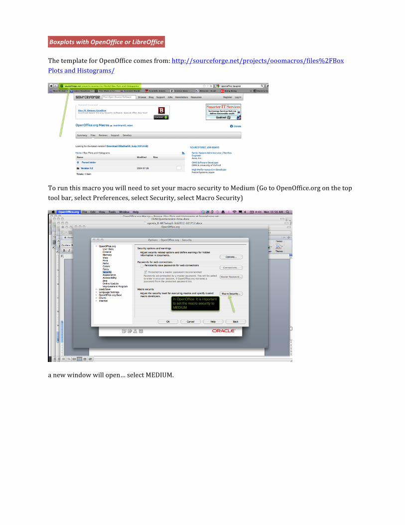
Boxplots with OpenOffice or LibreOffice
The template for OpenOffice comes from: http://sourceforge.net/projects/ooomacros/files%2FBox Plots and Histograms/
To run this macro you will need to set your macro security to Medium (Go to OpenOffice.org on the top tool bar, select Preferences, select Security, select Macro Security)
a new window will open… select MEDIUM.
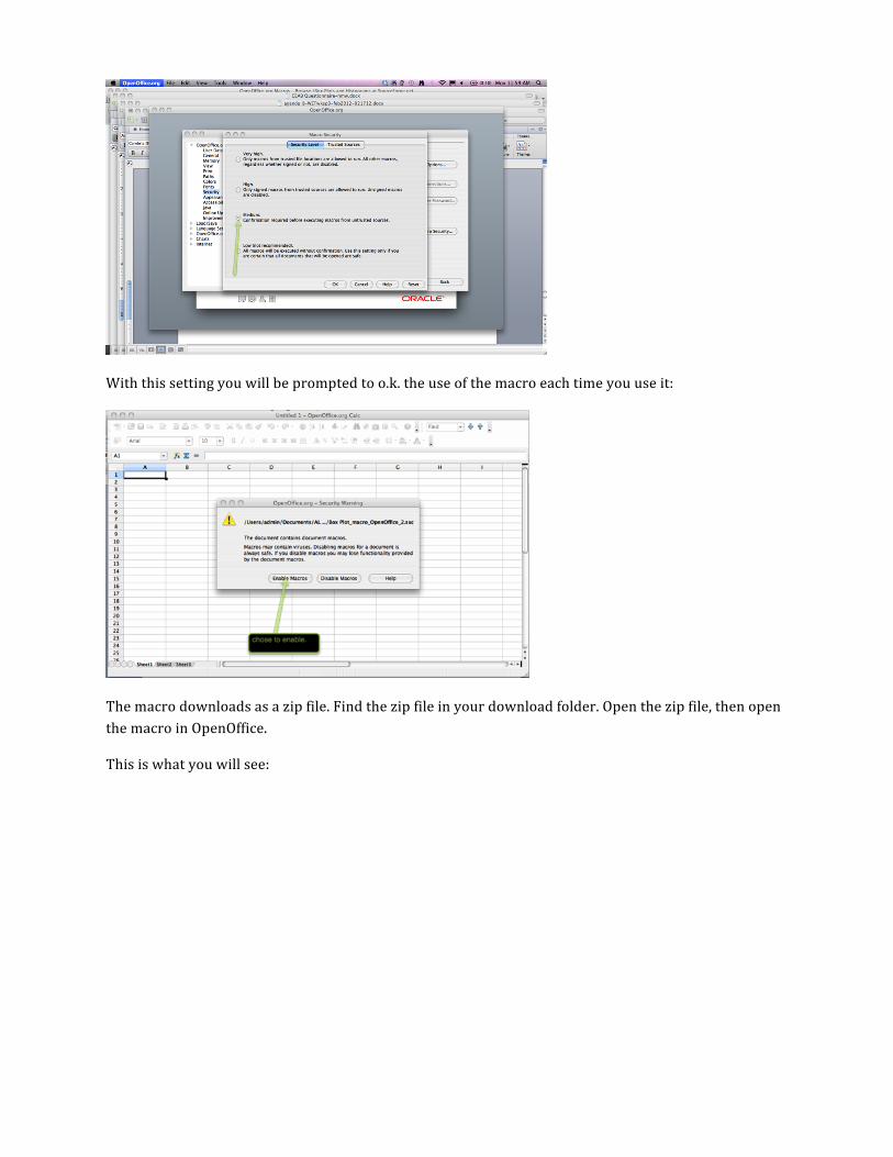
With this setting you will be prompted to o.k. the use of the macro each time you use it:
The macro downloads as a zip file. Find the zip file in your download folder. Open the zip file, then open the macro in OpenOffice.
This is what you will see:
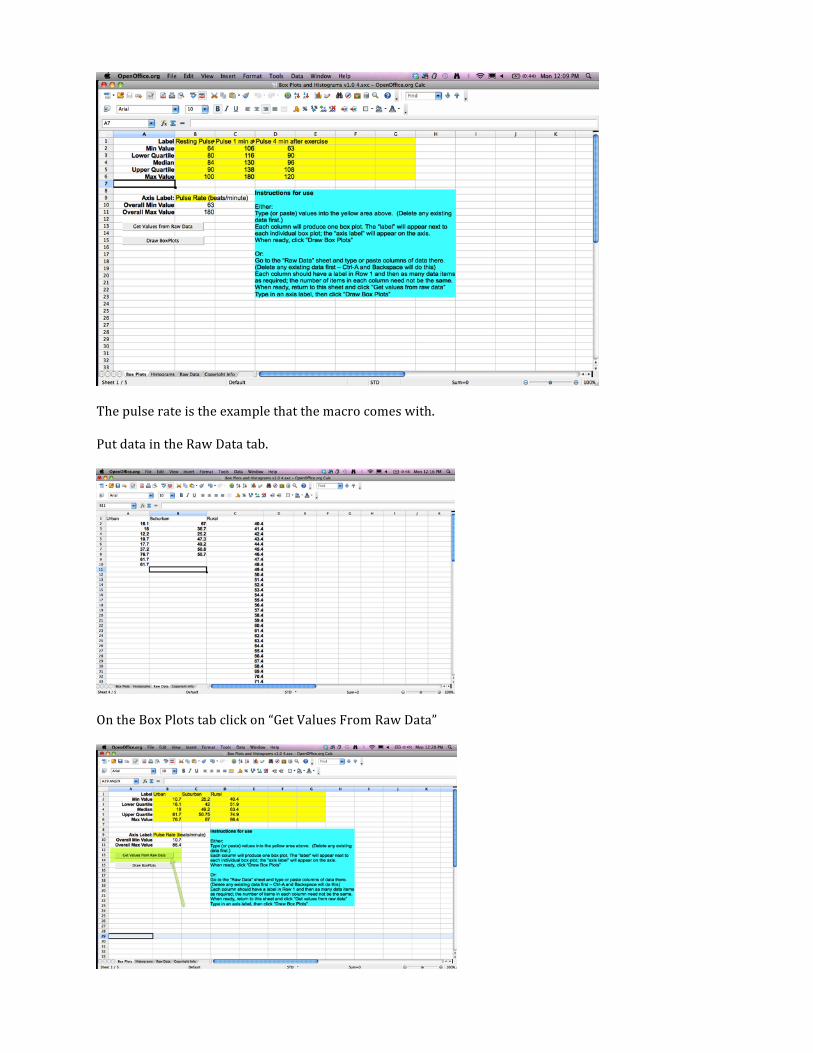
The pulse rate is the example that the macro comes with.
Put data in the Raw Data tab.
On the Box Plots tab click on “Get Values From Raw Data”
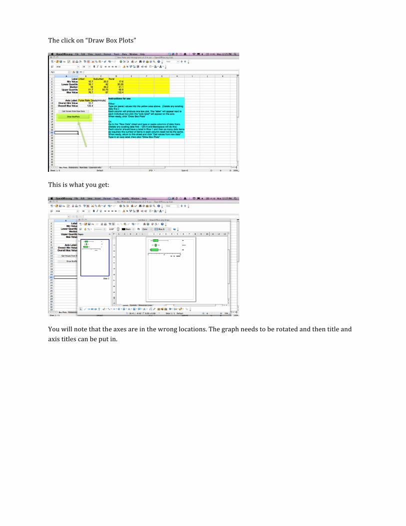
The click on “Draw Box Plots”
This is what you get:
You will note that the axes are in the wrong locations. The graph needs to be rotated and then title and axis titles can be put in.
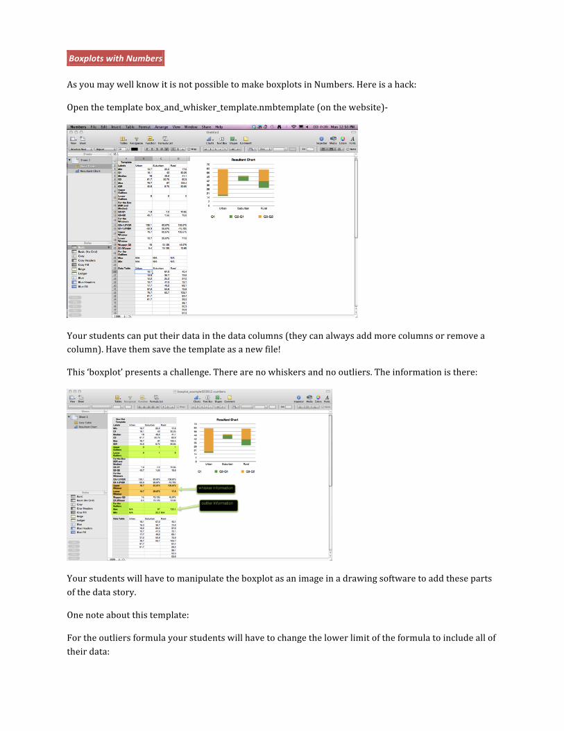
Boxplots with Numbers
As you may well know it is not possible to make boxplots in Numbers. Here is a hack:
Open the template box_and_whisker_template.nmbtemplate (on the website)-‐
Your students can put their data in the data columns (they can always add more columns or remove a column). Have them save the template as a new file!
This ‘boxplot’ presents a challenge. There are no whiskers and no outliers. The information is there:
Your students will have to manipulate the boxplot as an image in a drawing software to add these parts of the data story.
One note about this template:
For the outliers formula your students will have to change the lower limit of the formula to include all of their data:
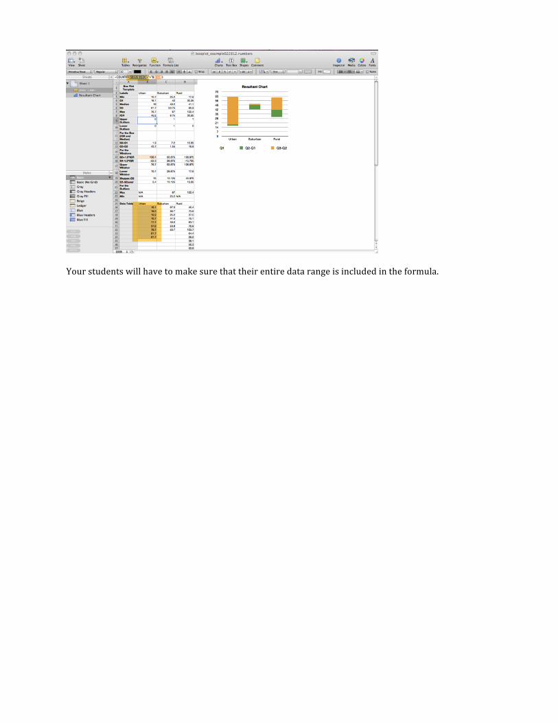
Your students will have to make sure that their entire data range is included in the formula.
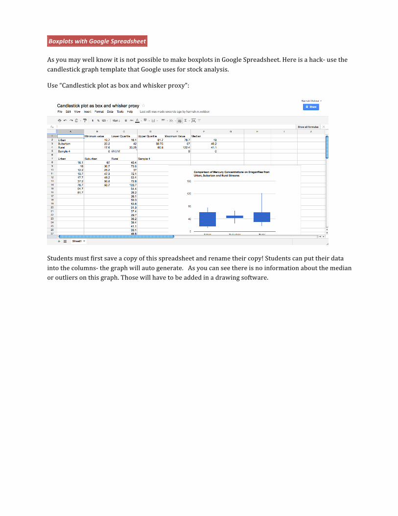
Boxplots with Google Spreadsheet
As you may well know it is not possible to make boxplots in Google Spreadsheet. Here is a hack-‐ use the candlestick graph template that Google uses for stock analysis.
Use “Candlestick plot as box and whisker proxy”:
Students must first save a copy of this spreadsheet and rename their copy! Students can put their data into the columns-‐ the graph will auto generate. As you can see there is no information about the median or outliers on this graph. Those will have to be added in a drawing software.
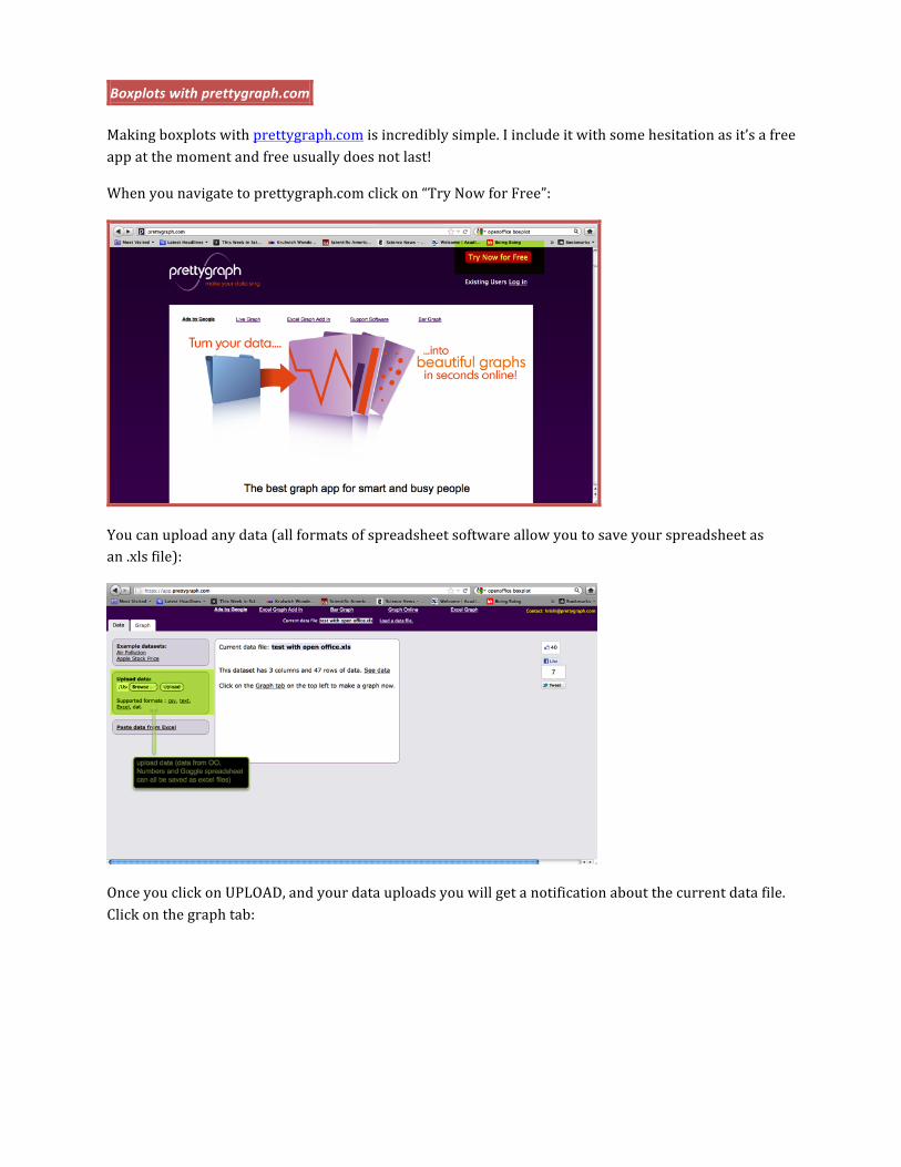
Boxplots with prettygraph.com
Making boxplots with prettygraph.com is incredibly simple. I include it with some hesitation as it’s a free app at the moment and free usually does not last!
When you navigate to prettygraph.com click on “Try Now for Free”:
You can upload any data (all formats of spreadsheet software allow you to save your spreadsheet as an .xls file):
Once you click on UPLOAD, and your data uploads you will get a notification about the current data file. Click on the graph tab:

Select boxplot and the data for the dependent axis.
You can scroll down on the lefthand column to add a title (the font is really big-‐ you might not want to add the title here), and axis titles:
If you click on SAVE you get a .png (image) file.
The drawback to using prettygraph is that your students do not see the numbers that made the boxes and whiskers-‐ they truly can only describe the data, but not back those descriptors up with numbers.