benchmarking new zealand’s payment systems · benchmarking new zealand’s payment systems | 7...
TRANSCRIPT

May 2016
RESEARCH PAPERBenchmarking New Zealand’s payment systems
© 2016 Payments NZ Limited. All rights reserved.
Payments NZ has relied on publically available information and information provided to it by third parties in the production of this report. While Payments NZ has made every effort to ensure that the information contained in the report is accurate, it takes no responsibility for any errors or omissions in relation to the information contained in this report and Payments NZ will not be liable for any loss sustained in reliance on the information in this report. If you wish to rely on such information, you should obtain your own independent advice.

Benchmarking New Zealand’s payment systems | 3
Contents
Executive summary ........................................................4
NZ benchmarking insights .............................................6
Australia and NZ comparison ........................................8
NZ benchmarking summary .......................................10
Methodology .................................................................12
Benchmarking assessment ..........................................15
4 | Benchmarking New Zealand’s payment systems
Executive summaryNew Zealand (NZ) is renowned for having one of the most developed and dynamic payment systems in the world.1 Those systems are considered efficient, safe and secure and are highly regarded internationally. Despite NZ’s reputation, it has always been a challenge to provide measurable evidence to support these claims. This paper aims to change that by completing the first comprehensive international benchmarking exercise of NZ’s payment systems.
This benchmarking paper gauges NZ’s relative standing and usage trends against 10 to 15 comparable countries, across all payment systems and payment instruments. It uses a wide range of metrics, calculations and analysis to reveal how Kiwis’ payments usage stacks up against other countries. In doing so, this paper identifies NZ’s strengths and weaknesses relative to comparable payments and usage trends of other countries.
To date, benchmarking NZ’s international standing has been difficult because NZ’s payment statistics are not included in the world’s most robust and comprehensive payment system data set - the Red Book, compiled by the Bank of International Settlements. In this paper, Payments NZ has combined its proprietary payment system statistics with the equivalent Red Book data, and then benchmarked NZ’s position across comparable countries.
This benchmarking paper is evidence-based and reports on statistical facts, as well as providing a descriptive commentary of these facts. It does not offer any views on the reasons that might explain the benchmarked position or trends.
This study is important for two reasons. Firstly, it gives us a richer understanding about the preferences Kiwis have for making and receiving payments and how these preferences compare with other countries. Benchmarking NZ’s preferences and usage provides our Participants and industry stakeholders with a set of evidence-based facts that can be used as a backdrop for strategic decision-making, and as a baseline which the impact of various initiatives and business cases can be measured against.
Secondly, the data in this benchmarking paper is an important first step in Payments NZ’s wider initiative to measure the efficiency of our payment systems. Benchmarking will provide a starting point for meaningful analysis of the efficiency levels of NZ’s payment systems. However, international benchmarking itself does not fully assess the efficiency of NZ’s payment systems. As such, Payments NZ will be continuing wider initiatives on the efficiency of NZ’s payment systems.
For the most part, the benchmarking has established that NZ’s retail payment systems and instruments rank very highly on the metrics we reviewed. A summary of benchmarked observations includes:
• NZ is a clear leader amongst the countries we benchmarked on the basis of total retail payment instrument usage per capita (combined cards, electronic and cheques).
• NZ leads all examined countries on how many card transactions we make per capita.
• NZ ranks highly on electronic credit usage (direct credits, automatic payments and bill payments).
• NZ has a very expansive and stable Point of Sale (POS) terminal fleet that is highly utilised.
• Kiwis spend more on debit cards, but we are progressively moving towards greater use of credit cards. The reverse applies in Australia.
• NZ’s direct debits usage per capita is comparatively low.
1 ICG (December 2014) Knowledge Area Review, Future of Global Payments, page 14.
Benchmarking New Zealand’s payment systems | 5
• NZ has very high usage rates of its ATM fleet. Universally, usage-per-ATM is dropping.
• NZ lags 2-3 years behind its trans-Tasman neighbour, Australia, when it comes to managing the decline in cheque volumes.
• The average transaction value of NZ’s electronic credits, cards and cheques are all relatively low, meaning that these instruments are used more often for making lower value payments than other countries.
• NZ’s total aggregate payment system values rank moderately relative to the size of our economy.
• NZ’s high value system’s total aggregate value relative to the size of NZ’s economy is comparatively low.
• The value of NZ’s cash in active circulation is very low.
Given we are trans-Tasman neighbours, it probably comes as no surprise that NZ has the most similarities with Australia on matters such as cards, cards network usage, retail payments mix, electronic payments, cheques and levels of activity through our respective high value clearing systems. NZ also has similarities with Britain (especially in relation to cheques and some card metrics) and Sweden (in relation to cash and some card metrics).
Despite being in a comparatively strong position now, NZ’s growth trajectory is often comparatively weak. Across the board, NZ has comparatively moderate payment volume growth rates. Evidence suggests NZ is poised to give up its position as leader in several areas, particularly with respect to cards and electronic payments usage where our per capita usage growth rates between 2010 and 2014 are significantly lower than the set of countries ranked just below us. We forecast several other countries will surpass NZ within a few years and NZ will slide down the country rankings.
We look forward to discussing the findings of this benchmarking paper with the industry, and considering what those findings mean for the ongoing innovation of NZ’s payments ecosystem.
6 | Benchmarking New Zealand’s payment systems
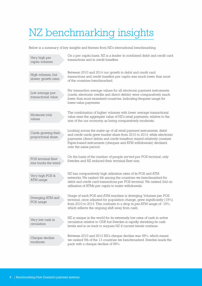
NZ benchmarking insightsBelow is a summary of key insights and themes from NZ’s international benchmarking.
On a per capita basis, NZ is a leader in combined debit and credit card transactions and in credit transfers.
Between 2010 and 2014 our growth in debit and credit card transactions and credit transfers per capita was much lower than most of the countries benchmarked.
Per transaction average values for all electronic payment instruments (cards, electronic credits and direct debits) were comparatively much lower than most examined countries, indicating frequent usage for lower-value payments
The combination of higher volumes with lower average transactional value sees the aggregate value of NZ’s retail payments, relative to the size of the our economy, as being comparatively moderate.
Looking across the make-up of all retail payment instruments, debit and credit cards grew market share from 2010 to 2014, while electronic payments (direct debits and credit transfers) stayed relatively constant. Paper-based instruments (cheques and ATM withdrawals) declined over the same period.
On the basis of the number of people served per POS terminal, only Sweden and NZ reduced their terminal fleet size.
NZ has comparatively high utilisation rates of its POS and ATM networks. We ranked 4th among the countries we benchmarked for debit and credit card transactions per POS terminal. We ranked 2nd on utilisation of ATMs per capita to make withdrawals.
Usage of each POS and ATM machine is diverging. Volumes per POS terminal, once adjusted for population change, grew significantly (19%) from 2010 to 2014. This contrasts to a drop in per-ATM usage of -18%, which reflects the ongoing shift away from cash.
NZ is unique in the world for its extremely low rates of cash in active circulation relative to GDP, but Sweden is rapidly shrinking its cash levels and is on track to surpass NZ if current trends continue.
Between 2010 and 2014 NZ’s cheque decline was 48%, which meant we ranked 5th of the 13 countries we benchmarked. Sweden leads the pack with a cheque decline of 98%.
Very high per capita volumes
High volumes, but slower growth rates
Low average per-transactional value
Moderate total values
Cards growing their proportional share
POS terminal fleet size bucks the trend
Very high POS & ATM usage
Diverging ATM and POS usage
Very low cash in circulation
Cheque decline moderate
Benchmarking New Zealand’s payment systems | 7
NZ’s volumes and usage of direct debits is comparatively moderate, making it the only electronic retail payment instrument not to rank highly against other countries.
Relative to both population and the size of the NZ economy, our high value system’s volumes and values rank in the middle of the countries we benchmarked.
Looking across cards, cards network usage, retail payments mix, electronic payments, cheques and high value, NZ has the most similarities with Australia. We also have similarities with Britain in relation to cheques and some cards metrics. NZ also shares similarities with Sweden’s cash situation and some cards metrics, although Sweden’s positive rate of change trajectory almost always out-paces other countries, including NZ.
Australia is closest. Similarities to Britain and Sweden
Direct debits moderate
High value moderate
8 | Benchmarking New Zealand’s payment systems
Australia and NZ comparisonA summary of key themes of how NZ statistically compares to Australia is detailed below.
Of the countries benchmarked, NZ has the highest combined debit and credit card transactions per capita. In comparison Australia ranked 5th with 20% lower per capita volumes than NZ. However, Australia’s per capita combined cards usage from 2010 to 2014 grew at double the rate of NZ.
NZ was ranked 4th in terms of transactions per POS terminal, whereas Australia came in at 5th of 13 countries benchmarked. In 2014, NZ’s debit and credit card transactions per terminal was over 50% higher than Australia. Australia’s POS network fleet size per capita is growing, whereas NZ’s fleet size is constant.
Australia and NZ have very similar numbers of cards issued per capita. NZ has a combined total of 2.88 debit and credit cards per capita and Australia 2.75 cards per capita.
Australia’s USD $69 average all-cards transaction value is much higher than NZ’s USD $42. Australia leads our study in total cards spend per capita at USD $18.6k compared to NZ’s USD $13k. Australia is the leader when it comes to total card spend relative to nominal GDP, whereas NZ came in 5th of the 13 countries we benchmarked.
NZ spends more on debit cards but is shifting towards credit cards, whereas Australia spends more credit but is heading towards greater debit card spend. On volume, NZ makes 3.5 debit card transactions for 1 credit card transaction, whereas Australia makes 1.8 debit transactions per credit card transaction.
NZ has one ATM per 1,764 people compared to Australia having one ATM per 747 people. ATM withdrawals make up a bigger percentage of the retail payment instrument mix in Australia than in NZ.
The relative make-up of Australia and NZ’s combined retail payments mix are very similar. The main differences are Australia’s ATM withdrawals represent a higher share of the mix, whereas NZ’s cheque volumes are higher. Britain has the next closest retail mix to Australia and NZ.
NZ and Australia are in a cluster of countries that are rapidly reducing cheque usage but still have a long way to go to phase out cheques. Australia’s 7 cheques per annum per capita in 2014 is 2-3 years ahead of NZ’s 10 per capita. The annual rate of decline sees NZ moving slightly faster than Australia, but NZ has a higher per capita cheque usage base.
Card transactions per capita
POS terminal fleet usage
Cards issued per capita
Card USD spend
Debit vs credit cards
ATM network
Retail payments mix
Cheque decline rate
Benchmarking New Zealand’s payment systems | 9
In 2014, NZ outpaced Australia 97 vs.76 in terms of credit transfers volumes per capita. Between 2010 and 2014 both countries had very similar growth in credit transfers, which were lower than the global average. NZ’s USD $2.1k average transaction size is less than half of Australia’s USD $4.9k.
In 2014, Australia eased ahead of NZ for per capita direct debit usage (38 versus NZ’s 33). Australia lead all countries with the highest average direct debit transaction value of USD $5.7k, compared to NZ’s USD $1.1k.
NZ uses credit transfers more frequently for a much lower average transaction value, whereas Australia uses direct debits more frequently for significantly more value.
On both a volume and per capita basis and a value relative to GDP basis, NZ and Australia’s respective high value systems have very similar levels of activity. But on a per capita basis, in 2014 Australia sent and received nearly double NZ’s SWIFT messages (9.1 versus 4.9).
Bulk electronic
Direct debit usage
High value
Credit transfer usage

10 | Benchmarking New Zealand’s payment systems
NZ benchmarking summary
Payment type NZ’s benchmark Analysis Rating
Cards 1 Debit & credit card transactions per capita
NZ has the highest number of cards transactions per capita in the study
Leader
2 People per Point of Sale (POS) terminal NZ has 29.7 people per POS terminal, just behind Australia
Leader
3 POS terminal fleet usage Comparatively high amount of transactions per terminal
Strong
4 POS overall utilisation Highest POS utilisation per terminal per capita among countries benchmarked
Leader
5 Combined debit & cards per capita 2.9 cards issued (debit and credit) per capita is in the middle of countries assessed
Middling
6 Average combined card spend (USD) NZ has one of the lowest average cards transaction values in the study
Strong
7 Average total card spend per capita (USD)
Total cards spend per capita is in the middle of countries assessed
Middling
8 Total annual card spend as % of GDP Cards spend relative to GDP is in the middle of countries benchmarked
Middling
9 Ratio of debit card to credit card transactions
NZ has a 3:1 debit-to-credit card transaction volume ratio
n/a
10 Ratio of debit card to credit card value NZ spends $1.30 on debit per $1.00 on credit cards
n/a
11 Total card volumes vs. all retail payments
Cards make up 67% of all NZ retail payment volumes
Strong
Cash & cards 12 Value of card payments vs. cash in circulation
NZ leads the world, followed by Sweden
Leader
Cash & ATMs 13 Count of ATM withdrawals per capita Relatively low and falling numbers of ATM withdrawals per capita
Strong
14 Number of people per ATM Middling numbers of people per ATM Middling
15 Overall ATM utilisation 2nd highest per capita ATM utilisation per machine
Leader
16 ATM withdrawals vs. all retail payments 2nd lowest ATM withdrawals relative to other retail payments
Leader
17 ATM withdrawals vs. cash in circulation High levels of ATM withdrawal values relative to cash in circulation
Leader
Cash 18 Cash in circulation relative to GDP Lowest level of active cash in circulation relative to GDP
Leader
Cheques 19 Cheque’s volume vs. all retail payments
NZs cheque volumes make a moderate share of retail payments
Middling
20 Rate of cheque volume decline comparison
NZ’s rate of cheque decline is in the middle of countries benchmarked
Middling
21 Annual cheque volumes per capita NZ’s per-capita cheque volumes is in the middle of countries benchmarked
Middling
22 Average cheque value (USD) NZ’s value per cheque was slightly lower than average
Middling
Electronic 23 Ratio of credit transfers to direct debits NZ makes $2.9 credit transfer transactions per direct debit
n/a
24 Credit transfers per capita NZ makes a high volume of credit transfer payments per capita – 4th in the study
Strong
Benchmarking New Zealand’s payment systems | 11
Payment type NZ’s benchmark Analysis Rating
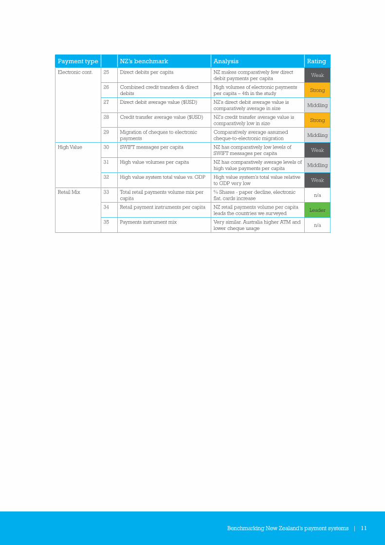
Electronic cont. 25 Direct debits per capita NZ makes comparatively few direct debit payments per capita
Weak
26 Combined credit transfers & direct debits
High volumes of electronic payments per capita – 4th in the study
Strong
27 Direct debit average value ($USD) NZ’s direct debit average value is comparatively average in size
Middling
28 Credit transfer average value ($USD) NZ’s credit transfer average value is comparatively low in size
Strong
29 Migration of cheques to electronic payments
Comparatively average assumed cheque-to-electronic migration
Middling
High Value 30 SWIFT messages per capita NZ has comparatively low levels of SWIFT messages per capita
Weak
31 High value volumes per capita NZ has comparatively average levels of high value payments per capita
Middling
32 High value system total value vs. GDP High value system’s total value relative to GDP very low
Weak
Retail Mix 33 Total retail payments volume mix per capita
% Shares - paper decline, electronic flat, cards increase
n/a
34 Retail payment instruments per capita NZ retail payments volume per capita leads the countries we surveyed
Leader
35 Payments instrument mix Very similar. Australia higher ATM and lower cheque usage
n/a

12 | Benchmarking New Zealand’s payment systems
Methodology
Introductory contextOne major challenge in benchmarking the position and usage of NZ’s payment systems relative to other countries relates to the availability of data. Detailed and comprehensive payment system statistical information on NZ is not included in any major multi-country database that is publically available. In the past, this has made it difficult to assess exactly where NZ sits with respect to other countries. While NZ features in the World Bank’s Global Financial Inclusion database, which contains some payment metrics, these are not at the level of granularity we require for detailed benchmarking.
The world’s most comprehensive multi-country payment system data set is published by the Bank of International Settlements (BIS). The BIS publish the ‘Red Book’ annually. The Red Book reports payment system and financial infrastructure data for the BIS’s 24 member countries on the Committee on Payment and Market Infrastructures (CPMI). Each country’s central bank is responsible for aggregating and delivering their statistical data inputs to the BIS.
The Red Book statistics are often used as a data source in various international reports and research papers. However, as BIS have never published any assessment of our payment systems and market infrastructures, NZ is often omitted from any comparative country analyses prepared in other jurisdictions.
Benchmarking premiseOur benchmarking is premised on creating a NZ payment systems data set that mirrors the data set for other countries contained in the Red Book, and then combining those two data sets to form one new merged data set. This merged data set allows us to benchmark NZ’s payment instruments and systems against other relevant countries to better assess our international standing across a range of payment metrics.
Data sourcesOur benchmarking draws on three data sources:
a) BIS Red Book ‘Country Tables’ – for all information on other countries.
b) Payments NZ internal data sets – for all information on NZ, except debit and credit card volumes and values.
c) Statistics NZ’s ‘infoshare’ data set on electronic card transactions – for debit and credit card volumes and values.
Data set creation - high level processWe created a merged Red Book and NZ data set by:
a) Extracting each separate Red Book country report into one common database.
b) Normalising unit sizes by giving all data points the same scale (countries sometimes use different scales, such as thousands, millions, or billions).
c) For metrics that have a monetary value, normalising the various local currencies by converting those into United States dollars (USD) at the average annual exchange rates reported by the BIS.

Benchmarking New Zealand’s payment systems | 13
d) Adding equivalent NZ statistics into the data set, sourced from Payments NZ and Statistics NZ data.
Selecting the countries to benchmark againstThe Red Book data set covers 24 countries. However, not all 24 countries were included in the benchmarking exercise. Instead, we applied two tests to select countries to include in our study:
a) From a scale perspective, the country must be statistically comparable to NZ. For example, Russia and India both feature in the Red Book but their per capita usage of various payment instruments are a fraction of NZ’s per capita usage. Including such countries in our benchmarking would not add any new insights or relevant information on the situation in NZ.
b) A country’s data-set must be complete enough to allow consistent comparison. Some countries were omitted because their BIS data set was not complete enough.
To improve readability and presentation and to make the analysis insightful, our benchmarking was confined to 10 to 15 countries. The number of countries varies from 10 to 15 because some countries had incomplete data for certain payment metrics. For example, the United States did not have data on the number of ATM machines or Point of Sale (POS) terminals, or ATM withdrawals, so we excluded that country from benchmarking on those data points. Also, on occasion, a county was omitted due to being an extreme outlier in relation to that metric, but often we referred to the outlier in our commentary.
In general terms, the countries included in our benchmarking can be described as a mix of advanced western economy countries (including South Africa) and advanced Asian economy countries. Together these countries form a balanced group of cohorts against which we can benchmark NZ.
Benchmarking We benchmarked NZ against the cohort countries across a range of payments metrics drawn from our merged data set. In most cases we compared the volume and percentage change in the metric between 2010 and 2014. For each metric we prepared a commentary and also assigned a benchmarking rating for NZ to indicate how we compare to our cohorts. The rating categories are:
• ‘Leader’- ranked 1st or 2nd out of cohort countries;
• ‘Strong’ – in the top third of cohort countries but not a leader;
• ‘Middling’ – ranked in the middle third; and
• ‘Weak’ – in the lowest third.
AssumptionsThe assumptions on which our benchmarking is based include:
a) The Red Book data set is correct and accurate. Accordingly, no effort has been taken to verify any country’s statistics. For example, Australia’s Red Book statistics have not been cross-checked against the publically available statistics reported on the Australian Payments Clearing Association (APCA) website.
b) The Red Book average annual exchange rates of the local currency against the USD are accurate.
c) NZ payment statistics can be mapped on an equivalent basis directly to Red Book data definitions. This was generally found to be the case.

14 | Benchmarking New Zealand’s payment systems
Other important notes 1. Red Book included real-time payments in its ‘credit transfer’ data point. For example, in the
United Kingdom credit transfers are predominantly made up of faster payments and credit transfers in the Bacs system.
2. There can be material differences in how countries use debit and credit cards, with cardholders in one country preferring one card type over another. In many instances, our benchmarking looks at all cards, both debit and credit, and in doing so the impact of these differences has been removed from our analysis.
3. As previously mentioned, we utilised the USD as a common currency to ensure we can compare different monetary values across the countries in our study. Movements in the value of the various exchange rates relative to the USD can impact some of the reported results and this possibility should be taken into account when drawing conclusions. That said, expressing values in a common currency of USD does provide the ability to compare and provides some directional insight into each country’s results.
4. The ATM data reported in our study does not include data on independent ATM operators. This information is not collected by Payments NZ as part of its internal data sets.
Benchmarking New Zealand’s payment systems | 15
Benchmarking assessment
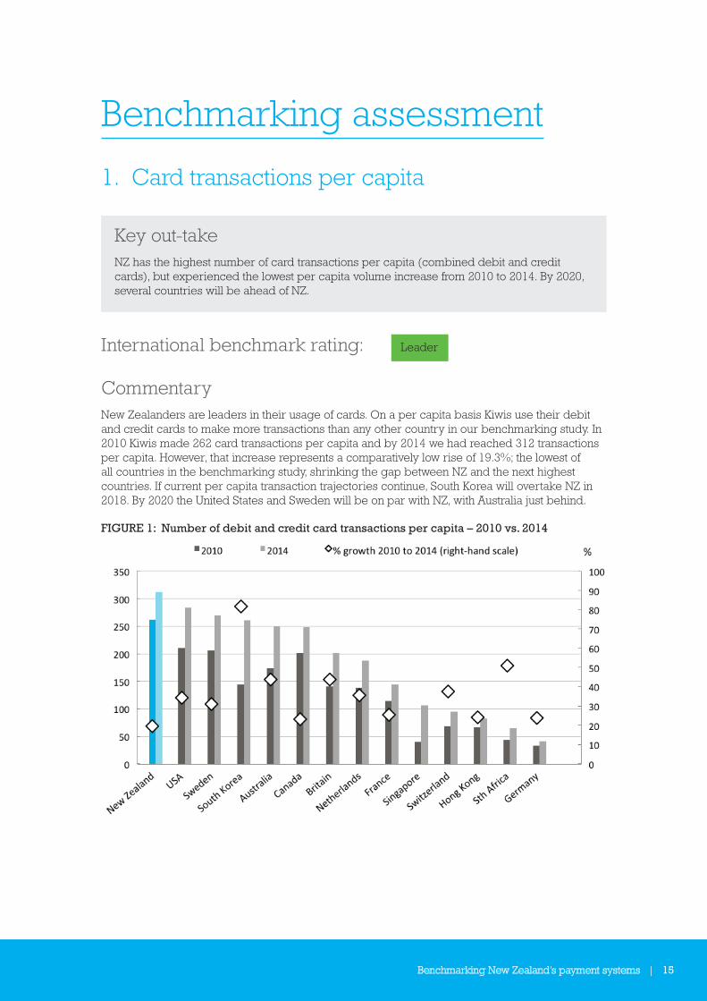
1. Card transactions per capita
Key out-takeNZ has the highest number of card transactions per capita (combined debit and credit cards), but experienced the lowest per capita volume increase from 2010 to 2014. By 2020, several countries will be ahead of NZ.
International benchmark rating: Leader
CommentaryNew Zealanders are leaders in their usage of cards. On a per capita basis Kiwis use their debit and credit cards to make more transactions than any other country in our benchmarking study. In 2010 Kiwis made 262 card transactions per capita and by 2014 we had reached 312 transactions per capita. However, that increase represents a comparatively low rise of 19.3%; the lowest of all countries in the benchmarking study, shrinking the gap between NZ and the next highest countries. If current per capita transaction trajectories continue, South Korea will overtake NZ in 2018. By 2020 the United States and Sweden will be on par with NZ, with Australia just behind.
FIGURE 1: Number of debit and credit card transactions per capita – 2010 vs. 2014
16 | Benchmarking New Zealand’s payment systems
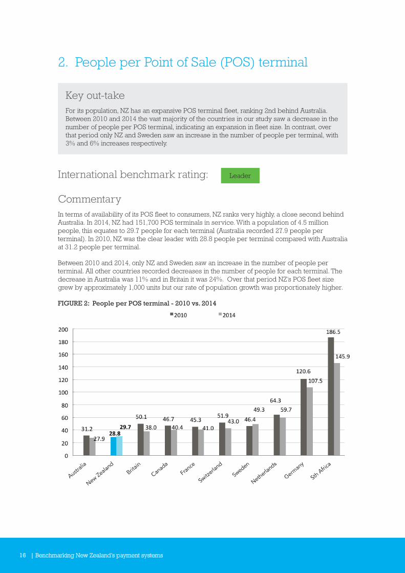
2. People per Point of Sale (POS) terminal
Key out-takeFor its population, NZ has an expansive POS terminal fleet, ranking 2nd behind Australia. Between 2010 and 2014 the vast majority of the countries in our study saw a decrease in the number of people per POS terminal, indicating an expansion in fleet size. In contrast, over that period only NZ and Sweden saw an increase in the number of people per terminal, with 3% and 6% increases respectively.
International benchmark rating: Leader
CommentaryIn terms of availability of its POS fleet to consumers, NZ ranks very highly, a close second behind Australia. In 2014, NZ had 151,700 POS terminals in service. With a population of 4.5 million people, this equates to 29.7 people for each terminal (Australia recorded 27.9 people per terminal). In 2010, NZ was the clear leader with 28.8 people per terminal compared with Australia at 31.2 people per terminal.
Between 2010 and 2014, only NZ and Sweden saw an increase in the number of people per terminal. All other countries recorded decreases in the number of people for each terminal. The decrease in Australia was 11% and in Britain it was 24%. Over that period NZ’s POS fleet size grew by approximately 1,000 units but our rate of population growth was proportionately higher.
FIGURE 2: People per POS terminal - 2010 vs. 2014
Benchmarking New Zealand’s payment systems | 17
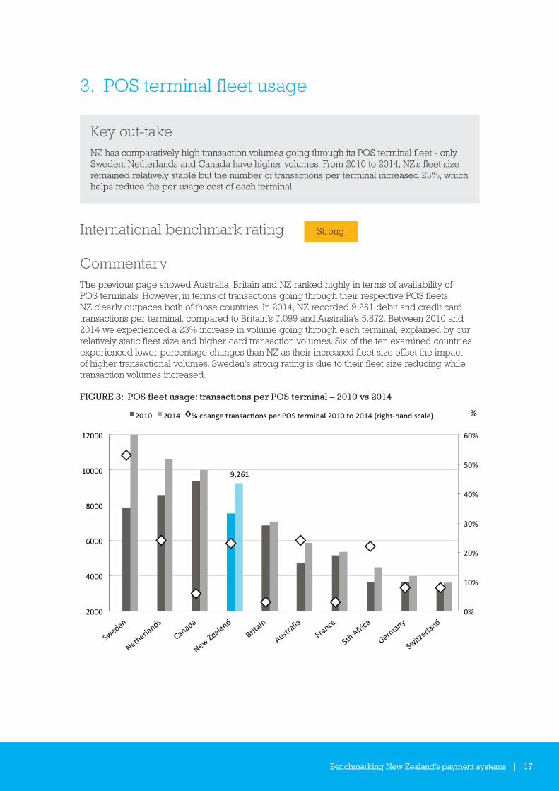
3. POS terminal fleet usage
Key out-takeNZ has comparatively high transaction volumes going through its POS terminal fleet - only Sweden, Netherlands and Canada have higher volumes. From 2010 to 2014, NZ’s fleet size remained relatively stable but the number of transactions per terminal increased 23%, which helps reduce the per usage cost of each terminal.
International benchmark rating: Strong
CommentaryThe previous page showed Australia, Britain and NZ ranked highly in terms of availability of POS terminals. However, in terms of transactions going through their respective POS fleets, NZ clearly outpaces both of those countries. In 2014, NZ recorded 9,261 debit and credit card transactions per terminal, compared to Britain’s 7,099 and Australia’s 5,872. Between 2010 and 2014 we experienced a 23% increase in volume going through each terminal, explained by our relatively static fleet size and higher card transaction volumes. Six of the ten examined countries experienced lower percentage changes than NZ as their increased fleet size offset the impact of higher transactional volumes. Sweden’s strong rating is due to their fleet size reducing while transaction volumes increased.
FIGURE 3: POS fleet usage: transactions per POS terminal – 2010 vs 2014
18 | Benchmarking New Zealand’s payment systems
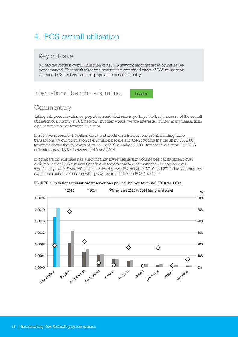
4. POS overall utilisation
Key out-takeNZ has the highest overall utilisation of its POS network amongst those countries we benchmarked. That result takes into account the combined effect of POS transaction volumes, POS fleet size and the population in each country.
International benchmark rating: Leader
CommentaryTaking into account volumes, population and fleet size is perhaps the best measure of the overall utilisation of a country’s POS network. In other words, we are interested in how many transactions a person makes per terminal in a year.
In 2014 we recorded 1.4 billion debit and credit card transactions in NZ. Dividing those transactions by our population of 4.5 million people and then dividing that result by 151,700 terminals shows that for every terminal each Kiwi makes 0.0021 transactions a year. Our POS utilisation grew 18.6% between 2010 and 2014.
In comparison, Australia has a significantly lower transaction volume per capita spread over a slightly larger POS terminal fleet. These factors combine to make their utilisation level significantly lower. Sweden’s utilisation level grew 48% between 2010 and 2014 due to strong per capita transaction volume growth spread over a shrinking POS fleet base.
FIGURE 4: POS fleet utilisation: transactions per capita per terminal 2010 vs. 2014

Benchmarking New Zealand’s payment systems | 19
5. Debit & credit cards issued per capita
Key out-takeIn terms of debit and credit cards issued per capita, there is little difference between NZ, Canada, Britain and Australia. However, Japan, South Korea, Singapore and China all have significantly higher number of debit and credit cards issued per population, especially in their 2014 results.
International benchmark rating: Middling
CommentaryIn 2014 we averaged 2.88 debit and credit cards (combined) issued per capita. This is essentially the same result as Canada, Britain and Australia, all of whom are within one decimal point of NZ. The number of debit and credit cards issued per capita in NZ increased by 42% from 2010 to 2014, bringing us in line with Canada, Britain and Australia against whom we had previously lagged. Canada and France were unique in the fact that their cards issued per capita reduced slightly (shown in the chart below by the negative percentage change with red diamonds).
FIGURE 5: Combined number of debit and credit cards issued per capita
20 | Benchmarking New Zealand’s payment systems
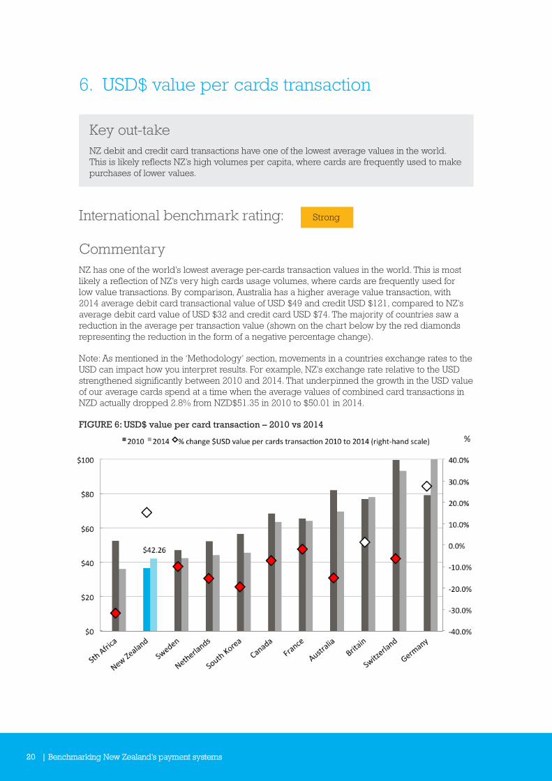
6. USD$ value per cards transaction
Key out-takeNZ debit and credit card transactions have one of the lowest average values in the world. This is likely reflects NZ’s high volumes per capita, where cards are frequently used to make purchases of lower values.
International benchmark rating: Strong
CommentaryNZ has one of the world’s lowest average per-cards transaction values in the world. This is most likely a reflection of NZ’s very high cards usage volumes, where cards are frequently used for low value transactions. By comparison, Australia has a higher average value transaction, with 2014 average debit card transactional value of USD $49 and credit USD $121, compared to NZ’s average debit card value of USD $32 and credit card USD $74. The majority of countries saw a reduction in the average per transaction value (shown on the chart below by the red diamonds representing the reduction in the form of a negative percentage change).
Note: As mentioned in the ‘Methodology’ section, movements in a countries exchange rates to the USD can impact how you interpret results. For example, NZ’s exchange rate relative to the USD strengthened significantly between 2010 and 2014. That underpinned the growth in the USD value of our average cards spend at a time when the average values of combined card transactions in NZD actually dropped 2.8% from NZD$51.35 in 2010 to $50.01 in 2014.
FIGURE 6: USD$ value per card transaction – 2010 vs 2014
Benchmarking New Zealand’s payment systems | 21
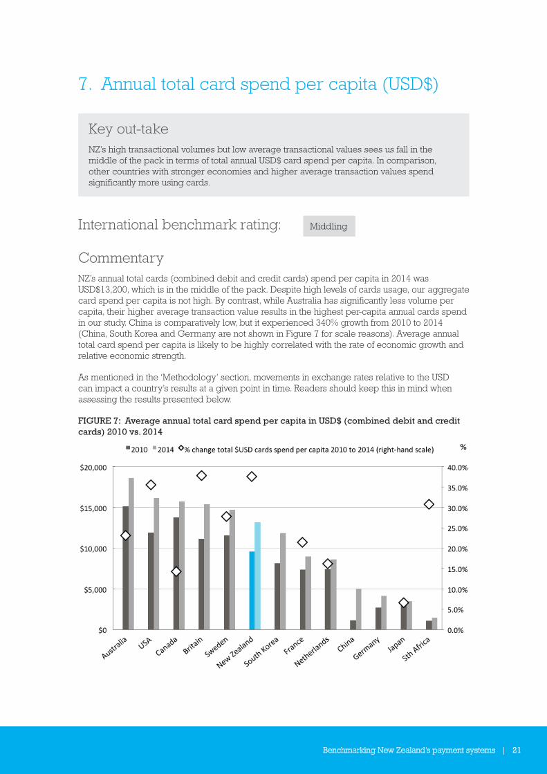
7. Annual total card spend per capita (USD$)
Key out-takeNZ’s high transactional volumes but low average transactional values sees us fall in the middle of the pack in terms of total annual USD$ card spend per capita. In comparison, other countries with stronger economies and higher average transaction values spend significantly more using cards.
International benchmark rating: Middling
CommentaryNZ’s annual total cards (combined debit and credit cards) spend per capita in 2014 was USD$13,200, which is in the middle of the pack. Despite high levels of cards usage, our aggregate card spend per capita is not high. By contrast, while Australia has significantly less volume per capita, their higher average transaction value results in the highest per-capita annual cards spend in our study. China is comparatively low, but it experienced 340% growth from 2010 to 2014 (China, South Korea and Germany are not shown in Figure 7 for scale reasons). Average annual total card spend per capita is likely to be highly correlated with the rate of economic growth and relative economic strength.
As mentioned in the ‘Methodology’ section, movements in exchange rates relative to the USD can impact a country’s results at a given point in time. Readers should keep this in mind when assessing the results presented below.
FIGURE 7: Average annual total card spend per capita in USD$ (combined debit and credit cards) 2010 vs. 2014
22 | Benchmarking New Zealand’s payment systems
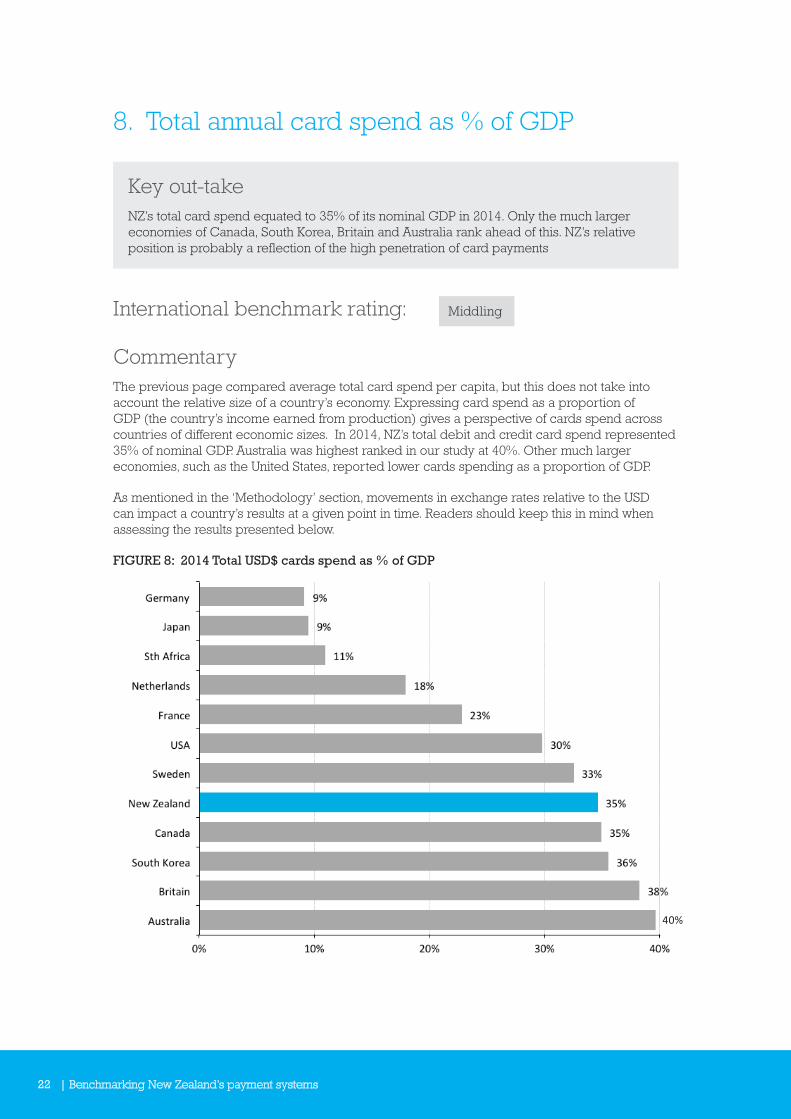
8. Total annual card spend as % of GDP
Key out-takeNZ’s total card spend equated to 35% of its nominal GDP in 2014. Only the much larger economies of Canada, South Korea, Britain and Australia rank ahead of this. NZ’s relative position is probably a reflection of the high penetration of card payments
International benchmark rating: Middling
CommentaryThe previous page compared average total card spend per capita, but this does not take into account the relative size of a country’s economy. Expressing card spend as a proportion of GDP (the country’s income earned from production) gives a perspective of cards spend across countries of different economic sizes. In 2014, NZ’s total debit and credit card spend represented 35% of nominal GDP. Australia was highest ranked in our study at 40%. Other much larger economies, such as the United States, reported lower cards spending as a proportion of GDP.
As mentioned in the ‘Methodology’ section, movements in exchange rates relative to the USD can impact a country’s results at a given point in time. Readers should keep this in mind when assessing the results presented below.
FIGURE 8: 2014 Total USD$ cards spend as % of GDP
Benchmarking New Zealand’s payment systems | 23
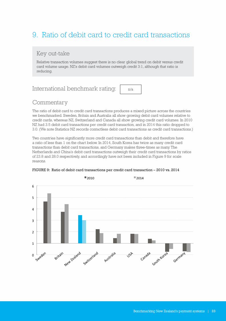
9. Ratio of debit card to credit card transactions
Key out-takeRelative transaction volumes suggest there is no clear global trend on debit versus credit card volume usage. NZ’s debit card volumes outweigh credit 3:1, although that ratio is reducing.
International benchmark rating: n/a
CommentaryThe ratio of debit card to credit card transactions produces a mixed picture across the countries we benchmarked. Sweden, Britain and Australia all show growing debit card volumes relative to credit cards, whereas NZ, Switzerland and Canada all show growing credit card volumes. In 2010 NZ had 3.5 debit card transactions per credit card transaction, and in 2014 this ratio dropped to 3.0. (We note Statistics NZ records contactless debit card transactions as credit card transactions.)
Two countries have significantly more credit card transactions than debit and therefore have a ratio of less than 1 on the chart below. In 2014, South Korea has twice as many credit card transactions than debit card transactions, and Germany makes three-times as many. The Netherlands and China’s debit card transactions outweigh their credit card transactions by ratios of 23.8 and 28.0 respectively, and accordingly have not been included in Figure 9 for scale reasons.
FIGURE 9: Ratio of debit card transactions per credit card transaction – 2010 vs. 2014

24 | Benchmarking New Zealand’s payment systems
10. Ratio of debit card to credit card value
Key out-takeLooking at the ratio of the value spent on debit to credit cards in 2014, for every $1 spent using credit cards NZ spent $1.30 on debit cards.
International benchmark rating: n/a
CommentaryThe majority of countries total credit card spend is higher than their total debit card spend. NZ, however, is in the minority. In 2014, for every $1 spent using credit cards Kiwis spent $1.30 on debit cards (down from $1.35 in 2010). This is almost exactly the inverse of Australia’s relationship between debit and credit cards. Australia is moving towards greater relative value being spent using debit cards. In 2010, for every $1 of credit card spending Australians spent $0.59 on debit cards; by 2014 spending on debit cards had risen to $0.75. Universally, credit cards have higher average per-transaction values than debit cards, which helps shift the value ratios in favour of credit cards. For example, while Australia’s debit cards are used 44% (2014) more frequently than credit cards, more is spent using credit cards because of their higher per-transaction values.
Germany and the Netherlands are not included on the chart for scale reasons. Their debit card spending in 2014 outweighs credit card spending at a ratio of and 26.6 and 8.0 respectively.
FIGURE 10: Amount spent on debit cards per $1 spent on credit cards – 2014
Benchmarking New Zealand’s payment systems | 25
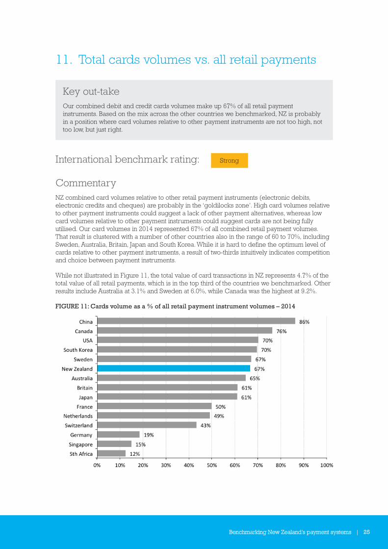
11. Total cards volumes vs. all retail payments
Key out-takeOur combined debit and credit cards volumes make up 67% of all retail payment instruments. Based on the mix across the other countries we benchmarked, NZ is probably in a position where card volumes relative to other payment instruments are not too high, not too low, but just right.
International benchmark rating: Strong
CommentaryNZ combined card volumes relative to other retail payment instruments (electronic debits, electronic credits and cheques) are probably in the ‘goldilocks zone’. High card volumes relative to other payment instruments could suggest a lack of other payment alternatives, whereas low card volumes relative to other payment instruments could suggest cards are not being fully utilised. Our card volumes in 2014 represented 67% of all combined retail payment volumes. That result is clustered with a number of other countries also in the range of 60 to 70%, including Sweden, Australia, Britain, Japan and South Korea. While it is hard to define the optimum level of cards relative to other payment instruments, a result of two-thirds intuitively indicates competition and choice between payment instruments.
While not illustrated in Figure 11, the total value of card transactions in NZ represents 4.7% of the total value of all retail payments, which is in the top third of the countries we benchmarked. Other results include Australia at 3.1% and Sweden at 6.0%, while Canada was the highest at 9.2%.
FIGURE 11: Cards volume as a % of all retail payment instrument volumes – 2014
26 | Benchmarking New Zealand’s payment systems
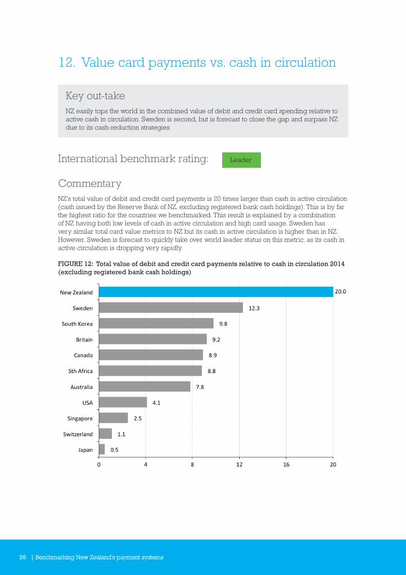
12. Value card payments vs. cash in circulation
Key out-takeNZ easily tops the world in the combined value of debit and credit card spending relative to active cash in circulation. Sweden is second, but is forecast to close the gap and surpass NZ due to its cash-reduction strategies
International benchmark rating: Leader
CommentaryNZ’s total value of debit and credit card payments is 20 times larger than cash in active circulation (cash issued by the Reserve Bank of NZ, excluding registered bank cash holdings). This is by far the highest ratio for the countries we benchmarked. This result is explained by a combination of NZ having both low levels of cash in active circulation and high card usage. Sweden has very similar total card value metrics to NZ but its cash in active circulation is higher than in NZ. However, Sweden is forecast to quickly take over world leader status on this metric, as its cash in active circulation is dropping very rapidly.
FIGURE 12: Total value of debit and credit card payments relative to cash in circulation 2014 (excluding registered bank cash holdings)
Benchmarking New Zealand’s payment systems | 27
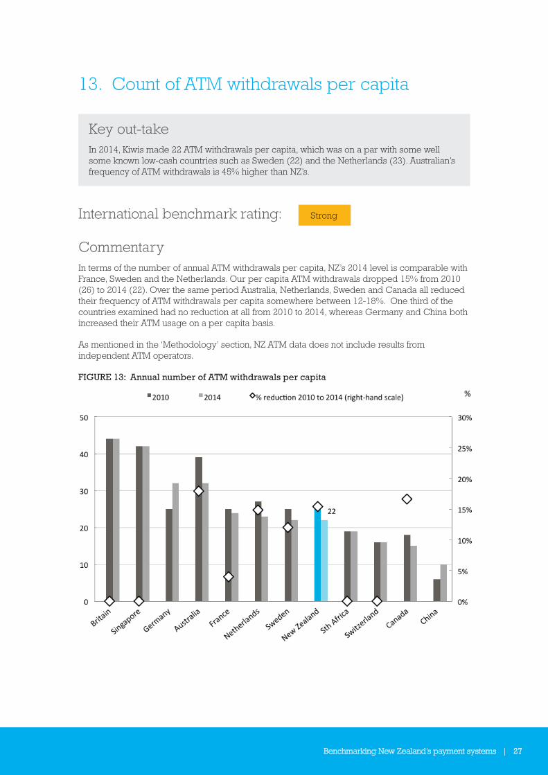
13. Count of ATM withdrawals per capita
Key out-takeIn 2014, Kiwis made 22 ATM withdrawals per capita, which was on a par with some well some known low-cash countries such as Sweden (22) and the Netherlands (23). Australian’s frequency of ATM withdrawals is 45% higher than NZ’s.
International benchmark rating: Strong
CommentaryIn terms of the number of annual ATM withdrawals per capita, NZ’s 2014 level is comparable with France, Sweden and the Netherlands. Our per capita ATM withdrawals dropped 15% from 2010 (26) to 2014 (22). Over the same period Australia, Netherlands, Sweden and Canada all reduced their frequency of ATM withdrawals per capita somewhere between 12-18%. One third of the countries examined had no reduction at all from 2010 to 2014, whereas Germany and China both increased their ATM usage on a per capita basis.
As mentioned in the ‘Methodology’ section, NZ ATM data does not include results from independent ATM operators.
FIGURE 13: Annual number of ATM withdrawals per capita

28 | Benchmarking New Zealand’s payment systems
14. Number of people per ATM
Key out-takeThe very low-cash centric countries of Sweden and the Netherlands have the smallest ATM networks, evidenced by the large and growing number of people each ATM services. NZ ranks in the middle of the pack in terms of the number of people per ATM changing little in relative size between 2010 and 2014.
International benchmark rating: Middling
CommentaryFigure 14 shows that the countries we benchmarked fall into two main groupings: countries with 700-1,200 people per ATM and those with 1,700 – 2,300 people per ATM. The very low-cash centric countries of Sweden and the Netherlands have the smallest ATM networks, evidenced by the comparatively large and growing number of people serviced per ATM. Between 2010 and 2014 the networks of both these countries shrank at the fastest rate among the countries in our study.
In 2014, NZ had one ATM per 1,764 Kiwis (2,552 bank operated ATMs, up from 2,517 in 2010). Both Australia and NZ reduced their population per ATM by 2% from 2010 to 2014, indicating minimal change over the period. The majority of countries grew their ATM fleet relative to population (as denoted by red diamond showing a negative % change, or reduction, in population per ATM). Note that China (-55%) and France (-50%) do not have red diamonds due to scale reasons.
As mentioned in the ‘Methodology’ section, NZ ATM data does not include results from independent ATM operators. However, assuming there are an estimated 800 independent ATMs, NZ’s ratio of people to each ATM would drop to 1,338 people. While this is a significant movement, it would not be sufficient to alter our relative country ranking.
FIGURE 14: Number of people per ATM – 2010 vs. 2014
Benchmarking New Zealand’s payment systems | 29
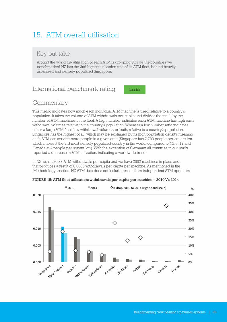
15. ATM overall utilisation
Key out-takeAround the world the utilisation of each ATM is dropping. Across the countries we benchmarked NZ has the 2nd highest utilisation rate of its ATM fleet, behind heavily urbanised and densely populated Singapore.
International benchmark rating: Leader
CommentaryThis metric indicates how much each individual ATM machine is used relative to a country’s population. It takes the volume of ATM withdrawals per capita and divides the result by the number of ATM machines in the fleet. A high number indicates each ATM machine has high cash withdrawal volumes relative to the country’s population. Whereas a low number ratio indicates either a large ATM fleet, low withdrawal volumes, or both, relative to a country’s population. Singapore has the highest of all, which may be explained by its high population density, meaning each ATM can service more people in a given area (Singapore has 7,700 people per square km which makes it the 3rd most densely populated country in the world, compared to NZ at 17 and Canada at 4 people per square km). With the exception of Germany, all countries in our study reported a decrease in ATM utilisation, indicating a worldwide trend.
In NZ we make 22 ATM withdrawals per capita and we have 2552 machines in place and that produces a result of 0.0086 withdrawals per capita per machine. As mentioned in the ‘Methodology’ section, NZ ATM data does not include results from independent ATM operators.
FIGURE 15: ATM fleet utilisation: withdrawals per capita per machine – 2010 Vs 2014

30 | Benchmarking New Zealand’s payment systems
16. ATM withdrawals vs. all retail payments
Key out-takeWhen benchmarked against other countries, Kiwis make comparatively fewer ATM withdrawals relative to the combined volumes of all other retail payment instruments. Only Canada came in ahead of NZ. All countries in our study experienced significant declines in this metric from 2010 to 2014, including NZ’s 29.7% decline.
International benchmark rating: Leader
CommentaryATM cash withdrawals are considered a proxy for (or at least is correlated with) cash payments. This metric is another way of measuring the significance of cash as part of the payments volume mix. Globally there is a clear trend for fewer ATM withdrawals being made relative to other retail payment instrument volumes. All the countries we benchmarked experienced a 20-40% decline from 2010 to 2014 in ATM withdrawals as a proportion of all retail payment instrument volumes. While not conclusive, this is further evidence of the decline of cash payments and the relative increase of other electronic payment instruments.
In 2014, NZ’s ATM withdrawals made up 4.7% of total retail payment volumes (including debit and credit cards, direct debits, credit transfers, and cheques).
FIGURE 16: ATM withdrawal volumes as % of all retail payment instrument volumes 2010 vs. 2014
Benchmarking New Zealand’s payment systems | 31
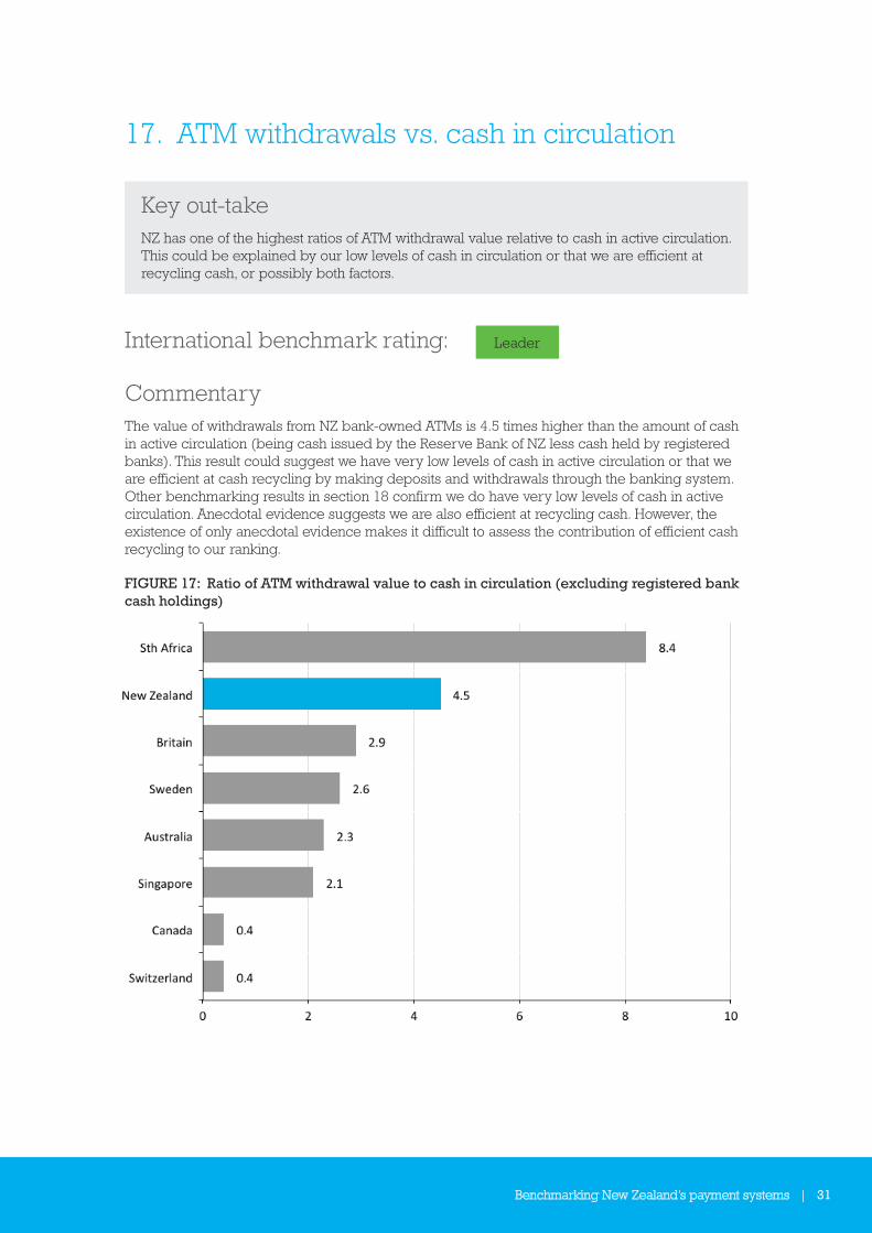
17. ATM withdrawals vs. cash in circulation
Key out-takeNZ has one of the highest ratios of ATM withdrawal value relative to cash in active circulation. This could be explained by our low levels of cash in circulation or that we are efficient at recycling cash, or possibly both factors.
International benchmark rating: Leader
CommentaryThe value of withdrawals from NZ bank-owned ATMs is 4.5 times higher than the amount of cash in active circulation (being cash issued by the Reserve Bank of NZ less cash held by registered banks). This result could suggest we have very low levels of cash in active circulation or that we are efficient at cash recycling by making deposits and withdrawals through the banking system. Other benchmarking results in section 18 confirm we do have very low levels of cash in active circulation. Anecdotal evidence suggests we are also efficient at recycling cash. However, the existence of only anecdotal evidence makes it difficult to assess the contribution of efficient cash recycling to our ranking.
FIGURE 17: Ratio of ATM withdrawal value to cash in circulation (excluding registered bank cash holdings)
32 | Benchmarking New Zealand’s payment systems
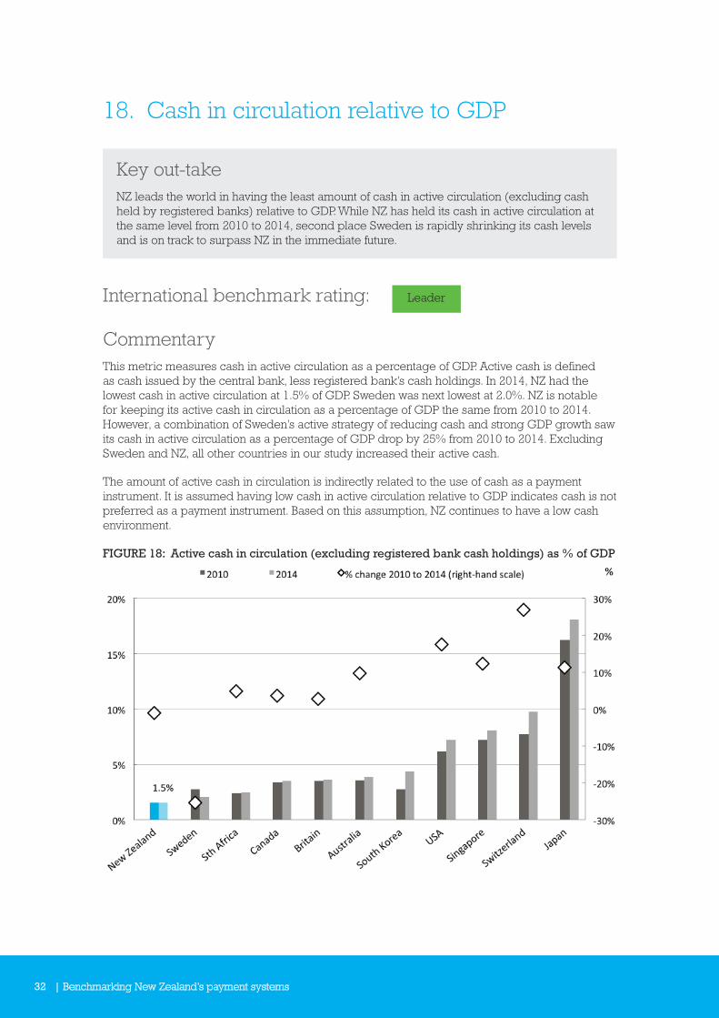
18. Cash in circulation relative to GDP
Key out-takeNZ leads the world in having the least amount of cash in active circulation (excluding cash held by registered banks) relative to GDP. While NZ has held its cash in active circulation at the same level from 2010 to 2014, second place Sweden is rapidly shrinking its cash levels and is on track to surpass NZ in the immediate future.
International benchmark rating: Leader
CommentaryThis metric measures cash in active circulation as a percentage of GDP. Active cash is defined as cash issued by the central bank, less registered bank’s cash holdings. In 2014, NZ had the lowest cash in active circulation at 1.5% of GDP. Sweden was next lowest at 2.0%. NZ is notable for keeping its active cash in circulation as a percentage of GDP the same from 2010 to 2014. However, a combination of Sweden’s active strategy of reducing cash and strong GDP growth saw its cash in active circulation as a percentage of GDP drop by 25% from 2010 to 2014. Excluding Sweden and NZ, all other countries in our study increased their active cash.
The amount of active cash in circulation is indirectly related to the use of cash as a payment instrument. It is assumed having low cash in active circulation relative to GDP indicates cash is not preferred as a payment instrument. Based on this assumption, NZ continues to have a low cash environment.
FIGURE 18: Active cash in circulation (excluding registered bank cash holdings) as % of GDP
Benchmarking New Zealand’s payment systems | 33
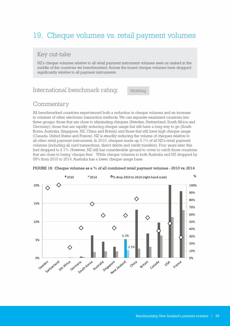
19. Cheque volumes vs. retail payment volumes
Key out-takeNZ’s cheque volumes relative to all retail payment instrument volumes sees us ranked in the middle of the countries we benchmarked. Across the board cheque volumes have dropped significantly relative to all payment instruments.
International benchmark rating: Middling
CommentaryAll benchmarked countries experienced both a reduction in cheque volumes and an increase in volumes of other electronic transaction methods. We can separate examined countries into three groups: those that are close to eliminating cheques (Sweden, Switzerland, South Africa and Germany), those that are rapidly reducing cheque usage but still have a long way to go (South Korea, Australia, Singapore, NZ, China and Britain) and those that still have high cheque usage (Canada, United States and France). NZ is steadily reducing the volume of cheques relative to all other retail payment instruments. In 2010, cheques made up 5.1% of all NZ’s retail payment volumes (including all card transactions, direct debits and credit transfers). Four years later this had dropped to 2.1%. However, NZ still has considerable ground to cover to catch those countries that are close to being ‘cheque free’. While cheque volumes in both Australia and NZ dropped by 58% from 2010 to 2014, Australia has a lower cheque usage base.
FIGURE 19: Cheque volumes as a % of all combined retail payment volumes - 2010 vs. 2014

34 | Benchmarking New Zealand’s payment systems
20. Rate of cheque volume decline comparison
Key out-takeThe absolute volume of NZ’s cheques issued dropped 48% from 2010 to 2014, which is slightly faster than Australia and Britain who are in a similar position of cheque decline.
International benchmark rating: Middling
CommentaryNZ’s cheque volumes decreased 48% from 2010 to 2014. Countries with close-to-zero cheque volumes, such as Sweden and Switzerland, had very high percentage rates of decline. Of those countries in the middle grouping, NZ had the highest percentage rate of decline. There are strong similarities in the rates of decline between the Commonwealth countries of NZ (48%), Australia (43%) and Britain (42%).
FIGURE 20: Cheque volume % decline from 2010 to 2014

Benchmarking New Zealand’s payment systems | 35
21. Annual cheque volumes per capita
Key out-takeAt 10.1 cheques per capita in 2014, NZ is well ahead of some of its cheque heavy cohorts but lags behind Australia which recorded 7.1 cheques per capita. Australia, Britain and NZ are tracking on a similar decline trajectory but Australia’s appears to be 2-3 years ahead in terms of cheque usage volumes per capita.
International benchmark rating: Middling
CommentaryNZ’s cheque volumes per capita decreased from 20.1 in 2010 to 10.1 in 2014, a drop of 50%. Britain dropped 44% from 17.1 to 10.0 over the same period. Australia dropped 46% from 13.2 to 7.1 cheques per capita. Australia’s starting point in 2010 was approximately 2 to 3 years ahead of both Britain and NZ, and Australia’s lead remained intact in 2014. Other than Australia being 2 to 3 years ahead, Australia, Britain and NZ are grouped reasonably closely together.
Countries with relatively high annual cheque volumes, like France, Canada and USA, all recorded significant decreases in absolute volumes but at a slower percentage rate of decline. The percentage rates of decline for the group of countries with close-to-zero cheques carries little statistical meaning, given the result measures a percentage change from a very small number to an even smaller number.
FIGURE 21: Annual volume of cheques per capita 2010 vs. 2014
36 | Benchmarking New Zealand’s payment systems
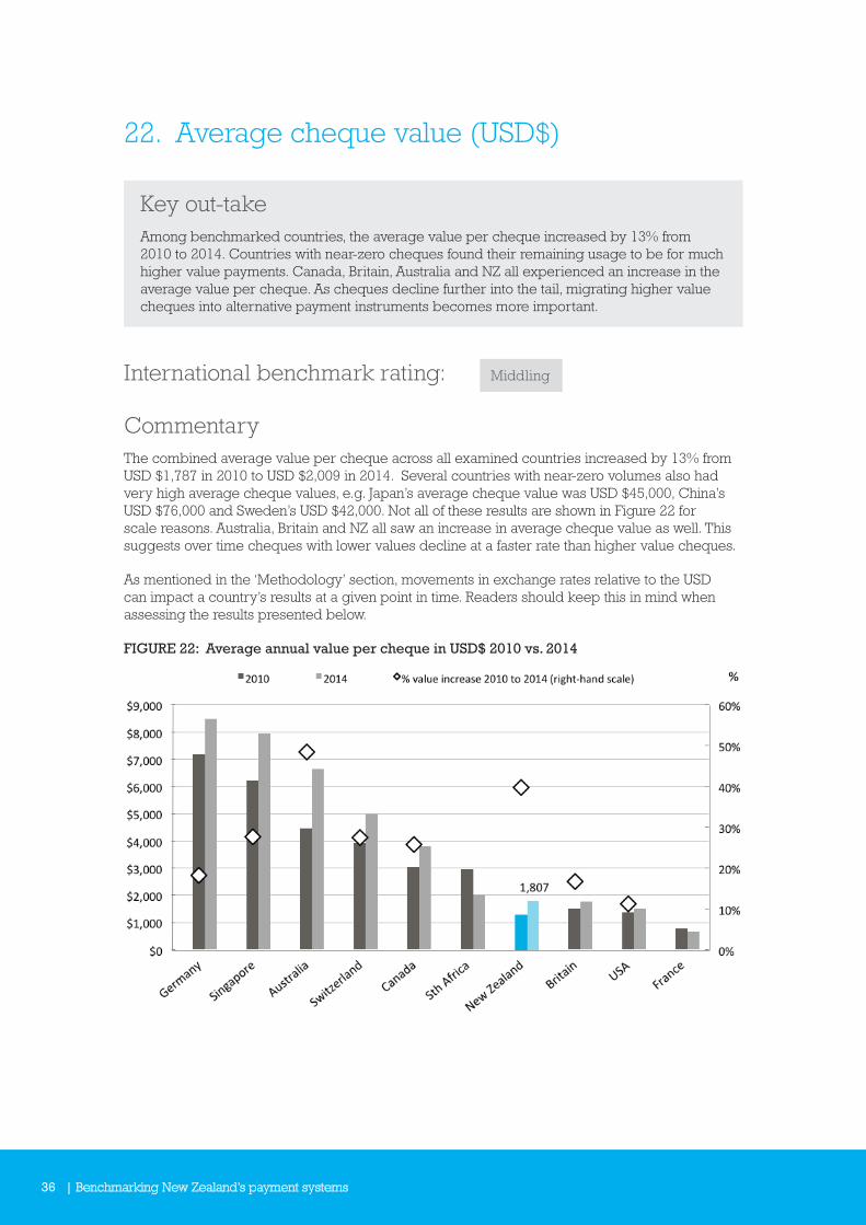
22. Average cheque value (USD$)
Key out-takeAmong benchmarked countries, the average value per cheque increased by 13% from 2010 to 2014. Countries with near-zero cheques found their remaining usage to be for much higher value payments. Canada, Britain, Australia and NZ all experienced an increase in the average value per cheque. As cheques decline further into the tail, migrating higher value cheques into alternative payment instruments becomes more important.
International benchmark rating: Middling
CommentaryThe combined average value per cheque across all examined countries increased by 13% from USD $1,787 in 2010 to USD $2,009 in 2014. Several countries with near-zero volumes also had very high average cheque values, e.g. Japan’s average cheque value was USD $45,000, China’s USD $76,000 and Sweden’s USD $42,000. Not all of these results are shown in Figure 22 for scale reasons. Australia, Britain and NZ all saw an increase in average cheque value as well. This suggests over time cheques with lower values decline at a faster rate than higher value cheques.
As mentioned in the ‘Methodology’ section, movements in exchange rates relative to the USD can impact a country’s results at a given point in time. Readers should keep this in mind when assessing the results presented below.
FIGURE 22: Average annual value per cheque in USD$ 2010 vs. 2014

Benchmarking New Zealand’s payment systems | 37
23. Ratio of credit transfers to direct debits
Key out-takeAmong benchmarked counties, NZ has comparatively lower direct debit payment volumes when compared to credit transfer payment instruments. It is difficult to determine whether our high ratio reflects the comparative attractiveness of credit transfers in NZ, or whether direct debits are underutilised.
International benchmark rating: n/a
Commentary‘Credit transfers’ are the universally accepted term for electronic credit payments, which in NZ’s case includes ‘Direct Credits’, ‘Automatic Payments’ and ‘Bill Payments’. Across the countries we benchmarked the mix of credit transfer payments relative to direct debits varies significantly. Figure 23 shows the ratio of how many credit transfers a country has for every direct debit transaction. If the ratio is less than 1, then that country has more direct debit transactions than credit transfer transactions. We have a high ratio, with 2.9 times as many credit transfers for each direct debit. Switzerland leads this metric with 16.7, although that result is not shown in Figure 23 for scale reasons. It is hard to determine whether NZ’s high ratio reflects the comparative attractiveness of credit transfers, or whether direct debits are underutilised.
FIGURE 23: Ratio of number of credit transfer transactions per direct debit transaction 2014
38 | Benchmarking New Zealand’s payment systems
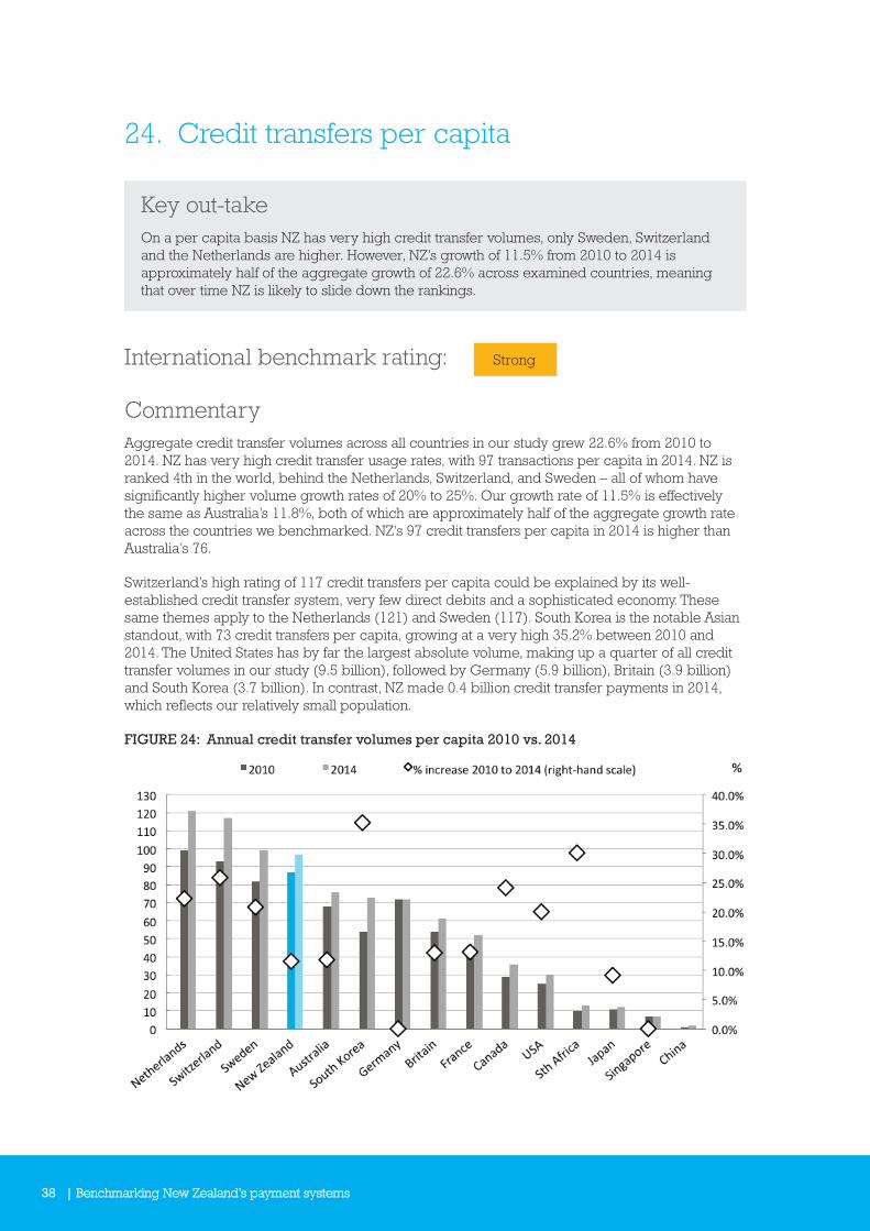
24. Credit transfers per capita
Key out-takeOn a per capita basis NZ has very high credit transfer volumes, only Sweden, Switzerland and the Netherlands are higher. However, NZ’s growth of 11.5% from 2010 to 2014 is approximately half of the aggregate growth of 22.6% across examined countries, meaning that over time NZ is likely to slide down the rankings.
International benchmark rating: Strong
CommentaryAggregate credit transfer volumes across all countries in our study grew 22.6% from 2010 to 2014. NZ has very high credit transfer usage rates, with 97 transactions per capita in 2014. NZ is ranked 4th in the world, behind the Netherlands, Switzerland, and Sweden – all of whom have significantly higher volume growth rates of 20% to 25%. Our growth rate of 11.5% is effectively the same as Australia’s 11.8%, both of which are approximately half of the aggregate growth rate across the countries we benchmarked. NZ’s 97 credit transfers per capita in 2014 is higher than Australia’s 76.
Switzerland’s high rating of 117 credit transfers per capita could be explained by its well-established credit transfer system, very few direct debits and a sophisticated economy. These same themes apply to the Netherlands (121) and Sweden (117). South Korea is the notable Asian standout, with 73 credit transfers per capita, growing at a very high 35.2% between 2010 and 2014. The United States has by far the largest absolute volume, making up a quarter of all credit transfer volumes in our study (9.5 billion), followed by Germany (5.9 billion), Britain (3.9 billion) and South Korea (3.7 billion). In contrast, NZ made 0.4 billion credit transfer payments in 2014, which reflects our relatively small population.
FIGURE 24: Annual credit transfer volumes per capita 2010 vs. 2014
Benchmarking New Zealand’s payment systems | 39
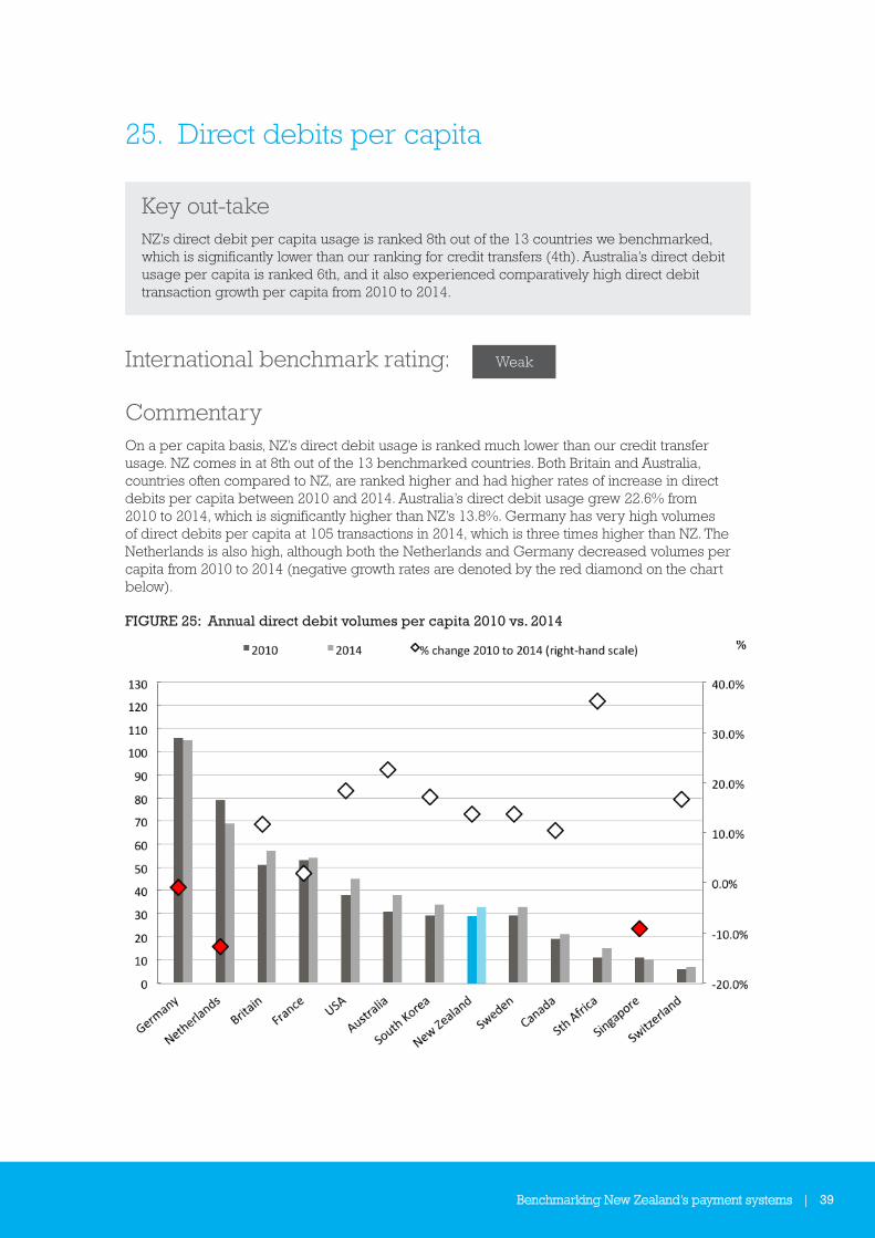
25. Direct debits per capita
Key out-takeNZ’s direct debit per capita usage is ranked 8th out of the 13 countries we benchmarked, which is significantly lower than our ranking for credit transfers (4th). Australia’s direct debit usage per capita is ranked 6th, and it also experienced comparatively high direct debit transaction growth per capita from 2010 to 2014.
International benchmark rating: Weak
CommentaryOn a per capita basis, NZ’s direct debit usage is ranked much lower than our credit transfer usage. NZ comes in at 8th out of the 13 benchmarked countries. Both Britain and Australia, countries often compared to NZ, are ranked higher and had higher rates of increase in direct debits per capita between 2010 and 2014. Australia’s direct debit usage grew 22.6% from 2010 to 2014, which is significantly higher than NZ’s 13.8%. Germany has very high volumes of direct debits per capita at 105 transactions in 2014, which is three times higher than NZ. The Netherlands is also high, although both the Netherlands and Germany decreased volumes per capita from 2010 to 2014 (negative growth rates are denoted by the red diamond on the chart below).
FIGURE 25: Annual direct debit volumes per capita 2010 vs. 2014

40 | Benchmarking New Zealand’s payment systems
26. Combined credit transfers and direct debits
Key out-takeMany countries have an inverse relationship between direct debits and credit transfers. NZ has comparatively high credit transfers per capita, with comparatively low direct debit usage per capita. When direct debits and credit transfers are combined, NZ is ranked 4th out of 14 countries in our study. We are among a group of seven countries with very similar usage rates per capita, including Australia and Britain.
International benchmark rating: Strong
CommentaryThere appears to be an inverse relationship between credit transfer and direct debit payment instrument usage in those countries we benchmarked. For example, Switzerland has an advanced and long established real-time credit transfer system that is extensively used, which goes some way to explaining why Switzerland has particularly low direct debit usage. By combining credit transfers and direct debits it is possible to get a more complete picture of each country’s non-card electronic payments situation.
NZ is ranked 4th out of benchmarked countries, just behind Sweden and just in front of Switzerland – both of whom have faster growth rates than we do. In 2014 NZ was among a cluster of 7 countries in the middle, all with broadly similar volumes ranging from 106 (France) to 132 (Sweden) combined credit transfer and direct debit transactions per capita. The Netherlands easily leads the world with 190, followed by Germany’s 177 – both countries have both high credit transfer and direct debit volumes per capita, although they both have much lower growth rates than the middle grouping of countries.
FIGURE 26: Annual combined credit transfer and direct debit volumes per capita 2010 vs. 2014
Benchmarking New Zealand’s payment systems | 41
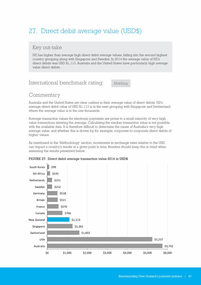
27. Direct debit average value (USD$)
Key out-takeNZ has higher than average high direct debit average values, falling into the second highest country grouping along with Singapore and Sweden. In 2014 the average value of NZ’s direct debits was USD $1,113. Australia and the United States have particularly high average value direct debits.
International benchmark rating: Middling
CommentaryAustralia and the United States are clear outliers in their average value of direct debits. NZ’s average direct debit value of USD $1,113 is in the next grouping with Singapore and Switzerland, where the average value is in the one thousands.
Average transaction values for electronic payments are prone to a small minority of very high value transactions skewing the average. Calculating the median transaction value is not possible with the available data. It is therefore difficult to determine the cause of Australia’s very high average value, and whether this is driven by, for example, corporate-to-corporate direct debits of higher values.
As mentioned in the ‘Methodology’ section, movements in exchange rates relative to the USD can impact a country’s results at a given point in time. Readers should keep this in mind when assessing the results presented below.
FIGURE 27: Direct debit average transaction value 2014 in USD$

42 | Benchmarking New Zealand’s payment systems
28. Credit transfer average value (USD$)
Key out-takeNZ has the second-to-lowest credit transfer average value, indicating their frequent usage for lower value transactions.
International benchmark rating: Leader
CommentaryThere is a clear split in our benchmarking results. Approximately half the countries have average credit transfer values of less than USD $5,000, while the other half have average values around or over USD $10,000. NZ’s average credit transfer value of USD $2,162 is the second lowest of the countries we benchmarked, just ahead of Canada’s USD $1,743. Australia has the 6th lowest at USD $3,993. Given we have comparatively high per capita credit transfer volumes, it is reasonable to assume there is a significant body of credit transfers used for lower value transactions in NZ (which is considered a strength, hence the benchmark rating of ‘leader’).
As mentioned in the ‘Methodology’ section, movements in exchange rates relative to the USD can impact a country’s results at a given point in time. Readers should keep this in mind when assessing the results presented below.
FIGURE 28: Credit transfer average transaction value 2014 in USD$
Benchmarking New Zealand’s payment systems | 43
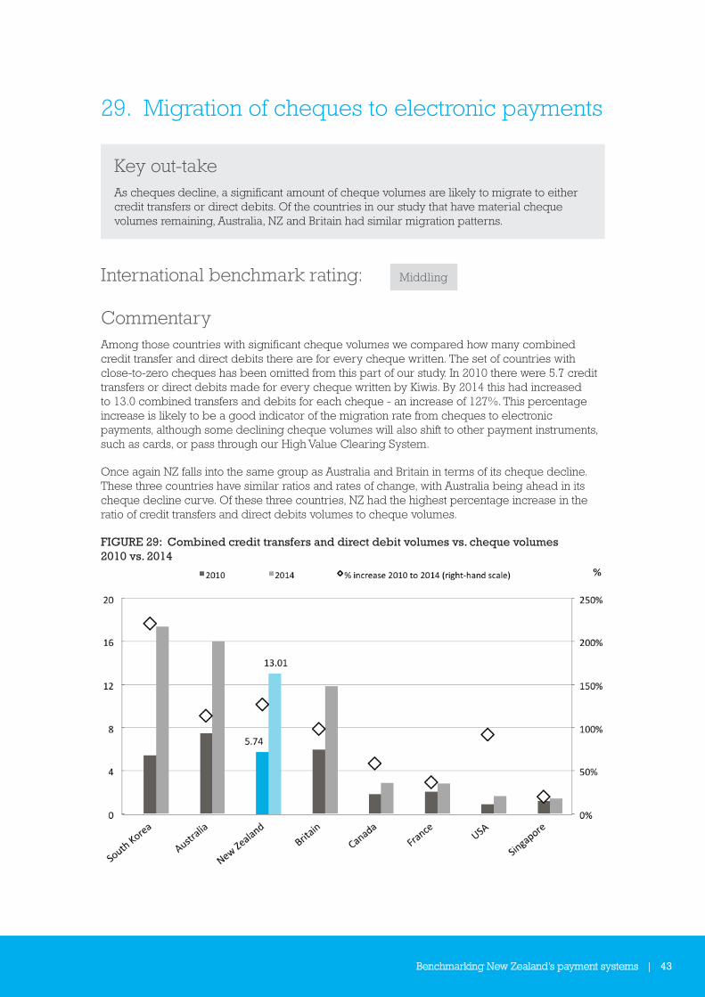
29. Migration of cheques to electronic payments
Key out-takeAs cheques decline, a significant amount of cheque volumes are likely to migrate to either credit transfers or direct debits. Of the countries in our study that have material cheque volumes remaining, Australia, NZ and Britain had similar migration patterns.
International benchmark rating: Middling
CommentaryAmong those countries with significant cheque volumes we compared how many combined credit transfer and direct debits there are for every cheque written. The set of countries with close-to-zero cheques has been omitted from this part of our study. In 2010 there were 5.7 credit transfers or direct debits made for every cheque written by Kiwis. By 2014 this had increased to 13.0 combined transfers and debits for each cheque - an increase of 127%. This percentage increase is likely to be a good indicator of the migration rate from cheques to electronic payments, although some declining cheque volumes will also shift to other payment instruments, such as cards, or pass through our High Value Clearing System.
Once again NZ falls into the same group as Australia and Britain in terms of its cheque decline. These three countries have similar ratios and rates of change, with Australia being ahead in its cheque decline curve. Of these three countries, NZ had the highest percentage increase in the ratio of credit transfers and direct debits volumes to cheque volumes.
FIGURE 29: Combined credit transfers and direct debit volumes vs. cheque volumes 2010 vs. 2014
44 | Benchmarking New Zealand’s payment systems
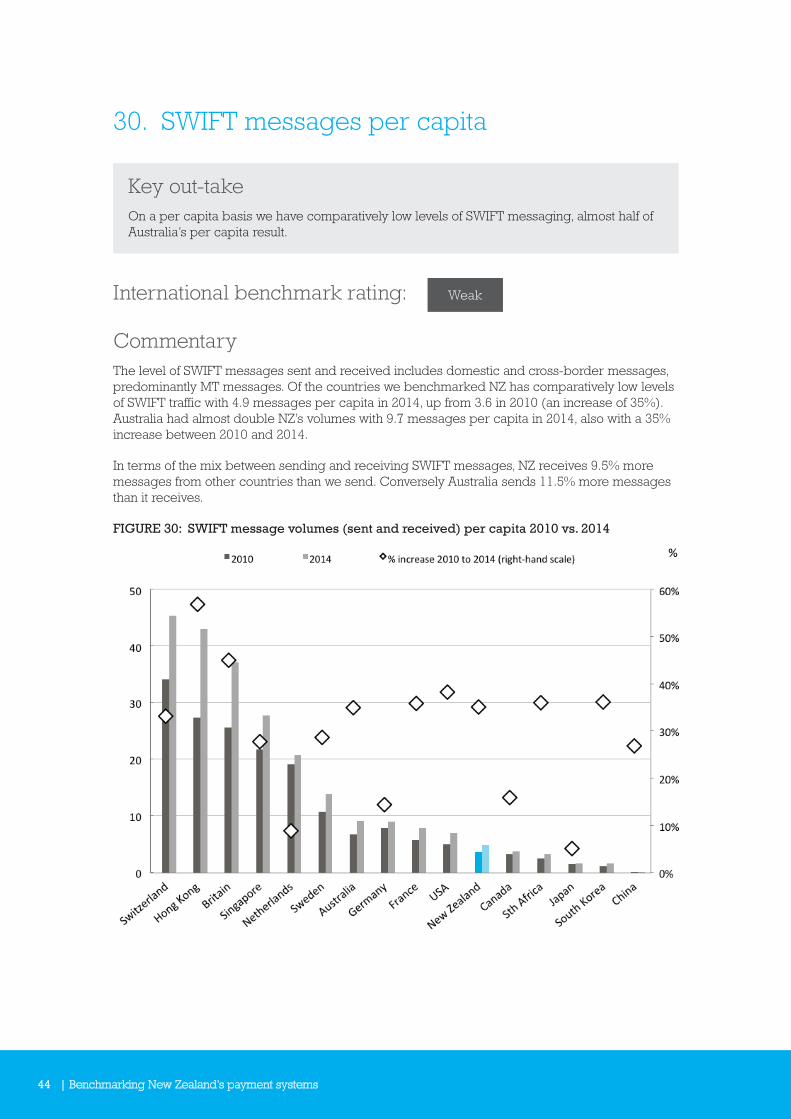
30. SWIFT messages per capita
Key out-takeOn a per capita basis we have comparatively low levels of SWIFT messaging, almost half of Australia’s per capita result.
International benchmark rating: Weak
CommentaryThe level of SWIFT messages sent and received includes domestic and cross-border messages, predominantly MT messages. Of the countries we benchmarked NZ has comparatively low levels of SWIFT traffic with 4.9 messages per capita in 2014, up from 3.6 in 2010 (an increase of 35%). Australia had almost double NZ’s volumes with 9.7 messages per capita in 2014, also with a 35% increase between 2010 and 2014.
In terms of the mix between sending and receiving SWIFT messages, NZ receives 9.5% more messages from other countries than we send. Conversely Australia sends 11.5% more messages than it receives.
FIGURE 30: SWIFT message volumes (sent and received) per capita 2010 vs. 2014
Benchmarking New Zealand’s payment systems | 45
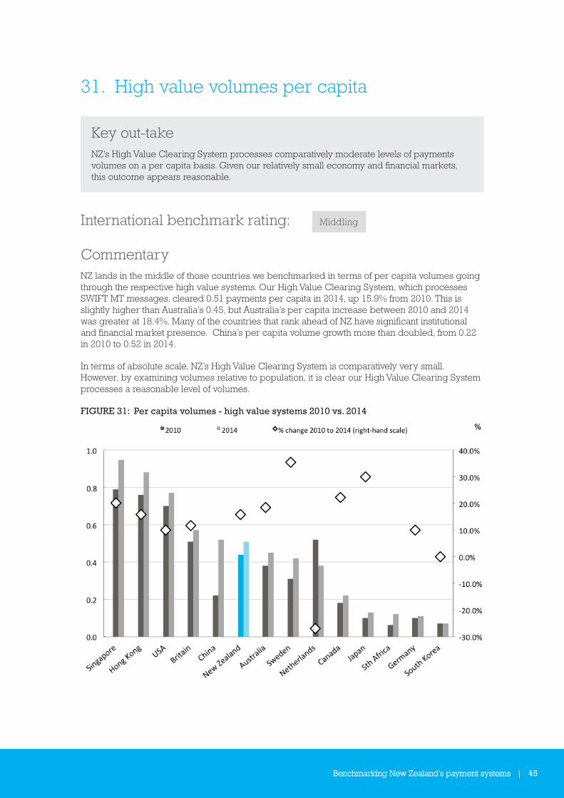
31. High value volumes per capita
Key out-takeNZ’s High Value Clearing System processes comparatively moderate levels of payments volumes on a per capita basis. Given our relatively small economy and financial markets, this outcome appears reasonable.
International benchmark rating: Middling
CommentaryNZ lands in the middle of those countries we benchmarked in terms of per capita volumes going through the respective high value systems. Our High Value Clearing System, which processes SWIFT MT messages, cleared 0.51 payments per capita in 2014, up 15.9% from 2010. This is slightly higher than Australia’s 0.45, but Australia’s per capita increase between 2010 and 2014 was greater at 18.4%. Many of the countries that rank ahead of NZ have significant institutional and financial market presence. China’s per capita volume growth more than doubled, from 0.22 in 2010 to 0.52 in 2014.
In terms of absolute scale, NZ’s High Value Clearing System is comparatively very small. However, by examining volumes relative to population, it is clear our High Value Clearing System processes a reasonable level of volumes.
FIGURE 31: Per capita volumes - high value systems 2010 vs. 2014

46 | Benchmarking New Zealand’s payment systems
32. High value system total value vs. GDP (USD)
Key out-takeNZ’s high value payment system has relatively low aggregate values going through it relative to GDP. This is probably explained by the small scale of NZ’s financial markets and our relatively modest nominal GDP level.
International benchmark rating: Weak
CommentaryFigure 32 indicates how much value (in USD) goes through a country’s main high value system relative to nominal GDP. In 2014, NZ’s High Value Clearing System cleared 21 times more value than our nominal GDP. This is the second lowest among those countries we benchmarked. However, our ranking probably reflects our comparatively small economy and the lack of large-scale financial markets, which are a driver of significant value through high value systems. The United States easily leads the pack in this metric, which reflects its large financial markets and nominal GDP levels.
As discussed in the ‘Methodology’ section, USD exchange rate movements can impact a country’s results. Readers should keep this in mind when viewing the chart below.
FIGURE 32: Large value systems - total annual value vs. GDP in USD$, 2014
Benchmarking New Zealand’s payment systems | 47
33. Total retail payments volume mix per capita
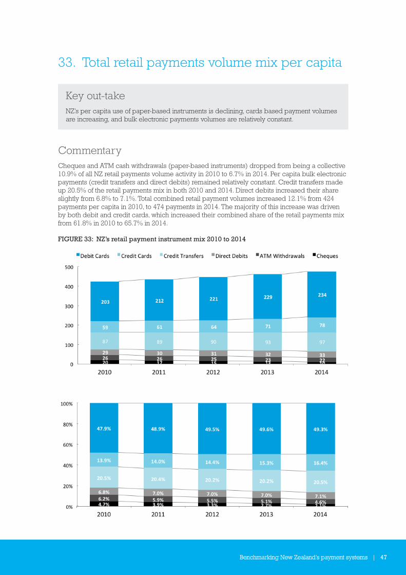
Key out-takeNZ’s per capita use of paper-based instruments is declining, cards based payment volumes are increasing, and bulk electronic payments volumes are relatively constant.
CommentaryCheques and ATM cash withdrawals (paper-based instruments) dropped from being a collective 10.9% of all NZ retail payments volume activity in 2010 to 6.7% in 2014. Per capita bulk electronic payments (credit transfers and direct debits) remained relatively constant. Credit transfers made up 20.5% of the retail payments mix in both 2010 and 2014. Direct debits increased their share slightly from 6.8% to 7.1%. Total combined retail payment volumes increased 12.1% from 424 payments per capita in 2010, to 474 payments in 2014. The majority of this increase was driven by both debit and credit cards, which increased their combined share of the retail payments mix from 61.8% in 2010 to 65.7% in 2014.
FIGURE 33: NZ’s retail payment instrument mix 2010 to 2014
48 | Benchmarking New Zealand’s payment systems
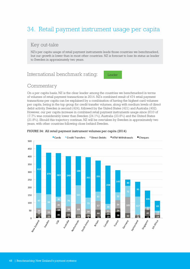
34. Retail payment instrument usage per capita
Key out-takeNZ’s per capita usage of retail payment instruments leads those countries we benchmarked, but our growth is lower than in most other countries. NZ is forecast to lose its status as leader to Sweden in approximately two years.
International benchmark rating: Leader
CommentaryOn a per capita basis, NZ is the clear leader among the countries we benchmarked in terms of volumes of retail payment transactions in 2014. NZ’s combined result of 474 retail payment transactions per capita can be explained by a combination of having the highest card volumes per capita, being in the top group for credit transfer volumes, along with medium levels of direct debit activity. Sweden is second (424), followed by the United States (421) and Australia (402). However, our per capita increase in combined retail payment instruments usage since 2010 of 17.7% was considerably lower than Sweden (24.1%), Australia (23.6%) and the United States (21.8%). Should this trajectory continue, NZ will be overtaken by Sweden in approximately two years, with other countries following close behind Sweden.
FIGURE 34: All retail payment instrument volumes per capita (2014)
Benchmarking New Zealand’s payment systems | 49
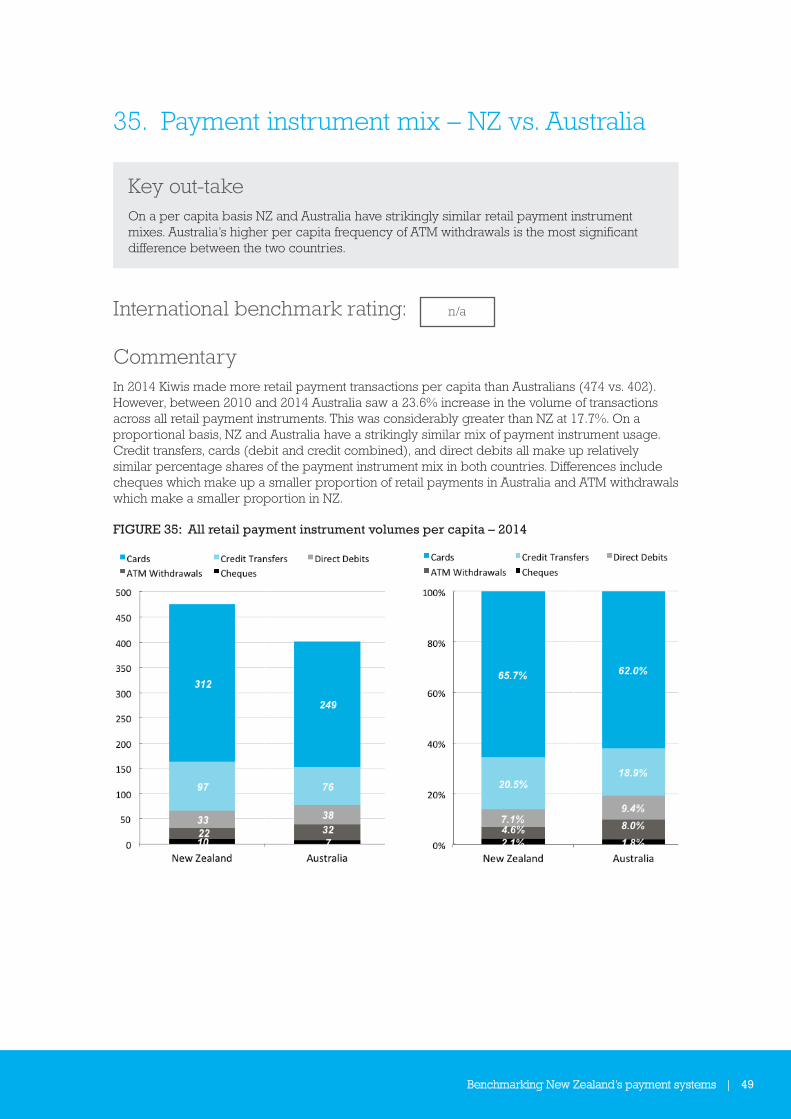
35. Payment instrument mix – NZ vs. Australia
Key out-takeOn a per capita basis NZ and Australia have strikingly similar retail payment instrument mixes. Australia’s higher per capita frequency of ATM withdrawals is the most significant difference between the two countries.
International benchmark rating: n/a
CommentaryIn 2014 Kiwis made more retail payment transactions per capita than Australians (474 vs. 402). However, between 2010 and 2014 Australia saw a 23.6% increase in the volume of transactions across all retail payment instruments. This was considerably greater than NZ at 17.7%. On a proportional basis, NZ and Australia have a strikingly similar mix of payment instrument usage. Credit transfers, cards (debit and credit combined), and direct debits all make up relatively similar percentage shares of the payment instrument mix in both countries. Differences include cheques which make up a smaller proportion of retail payments in Australia and ATM withdrawals which make a smaller proportion in NZ.
FIGURE 35: All retail payment instrument volumes per capita – 2014

Payments NZ LimitedPO Box 11418Manners StreetWellington 6142New Zealand
t +64 4 890 6750
www.paymentsnz.co.nz