automatically scaling android apps for multiple...
TRANSCRIPT

Vanteon ♦ 250 CrossKeys Office Park, Suite 285 ♦ Fairport, NY ♦ 14450 ♦ 585.419.9555
www.vanteon.com
Automatically Scaling Android Apps For Multiple Screens Aaron Sher, Vanteon Corporation
The Problem
As every Android developer is painfully aware, there are a very large number of Android devices with a
very wide range of screen characteristics. Take a look at this table (excerpted from [1] with additional
data added):
Acer beTouch E110 2.8 inches 240x320 143 ppi
LG GW620 Eve 3.0 inches 320x480 192 ppi
HTC Aria 3.2 inches 320x480 180 ppi
HTC myTouch 3G Slide 3.4 inches 320x480 170 ppi
Acer Liquid mt 3.6 inches 800x480 259 ppi
Motorola Atrix 4G 4.0 inches 540x960 275 ppi
Sony Ericsson Xperia Arc 4.2 inches 480x854 233 ppi
Samsung Galaxy Nexus 4.65 inches 720x1280 316 ppi
Dell Streak 5 inches 800x480 187 ppi
Coby Kyros 7 inches 800x480 133 ppi
Samsung Galaxy Tab 7 inches 1024x600 170 ppi
Samsung Galaxy Tab 10.1 10.1 inches 1280x800 149 ppi
There is a 134% variation in aspect ratio, 360% variation in screen size, 240% variation in pixel density,
and over 1300% variation in total number of pixels. Obviously, Android applications intended for mass
distribution need to be carefully designed so that they will look reasonable on many different screen
sizes.
To make it worse, these devices run many different versions of Android. Different versions have
different capabilities as far as modifying layouts to fit different screen sizes, and even when those
capabilities are theoretically compatible across different versions, they don’t necessarily behave
identically.
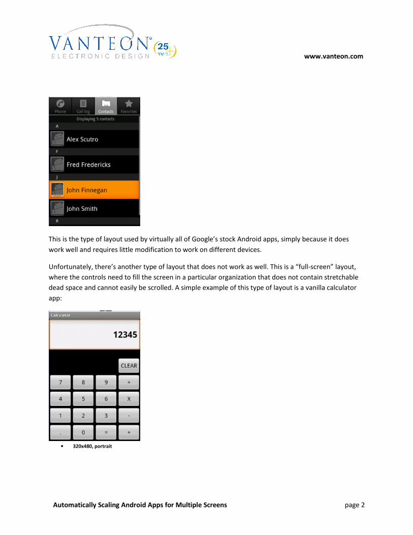
Existing Android layout support works fairly well for what I call “stretch-and-scroll” layouts. These are
layouts where each dimension contains dead space that can reasonably be scaled, or is formatted into a
list of some type that can be scrolled. For example, the stock contacts app has this type of layout:
www.vanteon.com
Automatically Scaling Android Apps for Multiple Screens page 2
This is the type of layout used by virtually all of Google’s stock Android apps, simply because it does
work well and requires little modification to work on different devices.
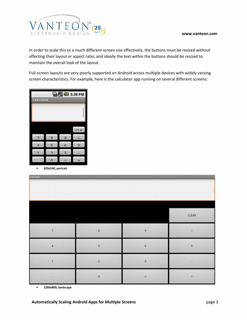
Unfortunately, there’s another type of layout that does not work as well. This is a “full-screen” layout,
where the controls need to fill the screen in a particular organization that does not contain stretchable
dead space and cannot easily be scrolled. A simple example of this type of layout is a vanilla calculator
app:
• 320x480, portrait
www.vanteon.com
Automatically Scaling Android Apps for Multiple Screens page 3
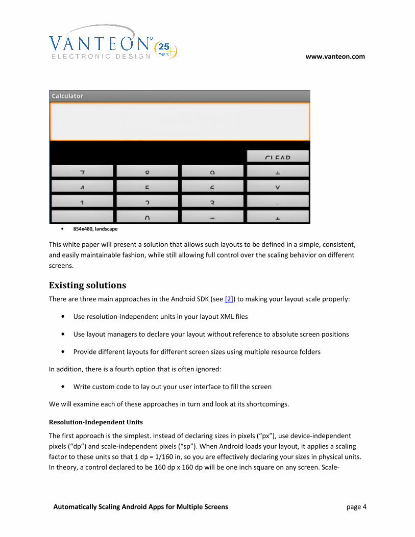
In order to scale this to a much different screen size effectively, the buttons must be resized without
affecting their layout or aspect ratio, and ideally the text within the buttons should be resized to
maintain the overall look of the layout.
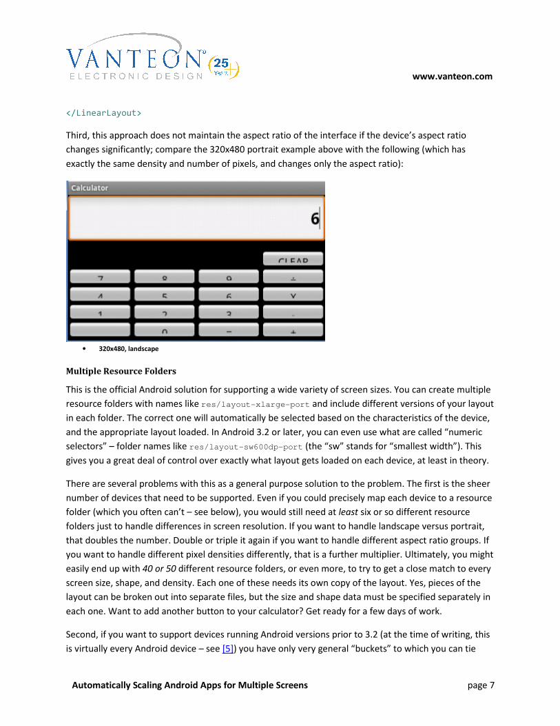
Full-screen layouts are very poorly supported on Android across multiple devices with widely varying
screen characteristics. For example, here is the calculator app running on several different screens:
• 320x240, portrait
• 1280x800, landscape
www.vanteon.com
Automatically Scaling Android Apps for Multiple Screens page 4
• 854x480, landscape
This white paper will present a solution that allows such layouts to be defined in a simple, consistent,
and easily maintainable fashion, while still allowing full control over the scaling behavior on different
screens.
Existing solutions
There are three main approaches in the Android SDK (see [2]) to making your layout scale properly:
• Use resolution-independent units in your layout XML files
• Use layout managers to declare your layout without reference to absolute screen positions
• Provide different layouts for different screen sizes using multiple resource folders
In addition, there is a fourth option that is often ignored:
• Write custom code to lay out your user interface to fill the screen
We will examine each of these approaches in turn and look at its shortcomings.
Resolution-Independent Units
The first approach is the simplest. Instead of declaring sizes in pixels (“px”), use device-independent
pixels (“dp”) and scale-independent pixels (“sp”). When Android loads your layout, it applies a scaling
factor to these units so that 1 dp = 1/160 in, so you are effectively declaring your sizes in physical units.
In theory, a control declared to be 160 dp x 160 dp will be one inch square on any screen. Scale-

www.vanteon.com
Automatically Scaling Android Apps for Multiple Screens page 5
independent pixels (“sp”) are identical, except that an additional scaling factor might or might not be
applied based on the user’s font size preference.
Unfortunately, this entirely fails to solve the full-screen layout problem; in some ways, it actually makes
it worse. Without knowing beforehand the physical dimensions of the screen, there is no way to declare
sizes in physical units that will fill the screen effectively. Your choice is between a constant physical size
or a constant pixel size, neither of which will adapt based on the screen characteristics of the device.
To make this worse, the scaling factor applied by different devices is not always correct to cause 160 dp
to equal 1 inch. Some devices (notably the original 7-inch Samsung Galaxy Tab; see [3]) modify this
scaling factor dramatically in order to make UI elements larger and easier to use; some devices make
more subtle changes. This means that when you declare your controls using device-independent pixels,
you can be sure of neither their final size in pixels nor their final size in inches.
Layout Managers
Virtually any non-trivial Android app must use layout managers to control the behavior of its user
interface. Layout managers are what make stretch-and-scroll interfaces work so well, and within a small
range of screen sizes it is possible to use them to make full-screen interfaces scale reasonably well.
However, in more complex situations, they break down.
The only stock layout manager that is fully-featured enough to make scalable full-screen layouts possible
is LinearLayout. LinearLayout allows you to lay out controls in a line, either vertical or horizontal. This is
great for stretch-and-scroll layouts, since you can simply add all your controls into the layout and let it
scroll if it’s too long.
For full-screen layouts, there is an additional feature that is extremely useful: you can declare weights
for the controls in the layout and size them relative to each other. With care, this allows you to size your
controls as percentages of the size of the layout, which is the only feature in the stock layout managers
that can truly be used to implement full-screen layouts.
This is the approach taken in the calculator app examples shown above. As you can see, it does a
reasonable job at maintaining the overall layout, and it at least fills the screen. However, this has a few
shortcomings that make it impractical. First, it does not scale the text size. As in the examples above,
this means that on a large screen your text will be disproportionately small; conversely, on a small
screen, it might not fit at all.
Second, implementing a non-trivial layout using weighted LinearLayouts requires extremely complex
nested layout hierarchies. Just to set up the simple calculator example requires the following hierarchy
(most properties not relevant to the layout elided):
<LinearLayout android:orientation="vertical" >

www.vanteon.com
Automatically Scaling Android Apps for Multiple Screens page 6
<EditText android:layout_weight="0.69"/>
<!-- Vertical spacer -->
<FrameLayout android:layout_weight="0.32" />
<LinearLayout android:layout_weight="0.75">
<!-- Horizontal spacer -->
<FrameLayout android:layout_weight="3"/>
<Button android:layout_weight="1" android:text="CLEAR" />
</LinearLayout>
<LinearLayout android:layout_weight="0.75" >
<Button android:layout_weight="1" android:text="7" />
<Button android:layout_weight="1" android:text="8" />
<Button android:layout_weight="1" android:text="9" />
<Button android:layout_weight="1" android:text="÷" />
</LinearLayout>
<LinearLayout android:layout_weight="0.75" >
<Button android:layout_weight="1" android:text="4" />
<Button android:layout_weight="1" android:text="5" />
<Button android:layout_weight="1" android:text="6" />
<Button android:layout_weight="1" android:text="X" />
</LinearLayout>
<LinearLayout android:layout_weight="0.75" >
<Button android:layout_weight="1" android:text="1" />
<Button android:layout_weight="1" android:text="2" />
<Button android:layout_weight="1" android:text="3" />
<Button android:layout_weight="1" android:text="-" />
</LinearLayout>
<LinearLayout android:layout_weight="0.75" >
<Button android:layout_weight="1" android:text="." />
<Button android:layout_weight="1" android:text="0" />
<Button android:layout_weight="1" android:text="=" />
<Button android:layout_weight="1" android:text="+" />
</LinearLayout>
www.vanteon.com
Automatically Scaling Android Apps for Multiple Screens page 7
</LinearLayout>
Third, this approach does not maintain the aspect ratio of the interface if the device’s aspect ratio
changes significantly; compare the 320x480 portrait example above with the following (which has
exactly the same density and number of pixels, and changes only the aspect ratio):
• 320x480, landscape
Multiple Resource Folders
This is the official Android solution for supporting a wide variety of screen sizes. You can create multiple
resource folders with names like res/layout-xlarge-port and include different versions of your layout
in each folder. The correct one will automatically be selected based on the characteristics of the device,
and the appropriate layout loaded. In Android 3.2 or later, you can even use what are called “numeric
selectors” – folder names like res/layout-sw600dp-port (the “sw” stands for “smallest width”). This
gives you a great deal of control over exactly what layout gets loaded on each device, at least in theory.
There are several problems with this as a general purpose solution to the problem. The first is the sheer
number of devices that need to be supported. Even if you could precisely map each device to a resource
folder (which you often can’t – see below), you would still need at least six or so different resource
folders just to handle differences in screen resolution. If you want to handle landscape versus portrait,
that doubles the number. Double or triple it again if you want to handle different aspect ratio groups. If
you want to handle different pixel densities differently, that is a further multiplier. Ultimately, you might
easily end up with 40 or 50 different resource folders, or even more, to try to get a close match to every
screen size, shape, and density. Each one of these needs its own copy of the layout. Yes, pieces of the
layout can be broken out into separate files, but the size and shape data must be specified separately in
each one. Want to add another button to your calculator? Get ready for a few days of work.
Second, if you want to support devices running Android versions prior to 3.2 (at the time of writing, this
is virtually every Android device – see [5]) you have only very general “buckets” to which you can tie
www.vanteon.com
Automatically Scaling Android Apps for Multiple Screens page 8
your resources. There were four screen sizes (small, normal, large, and xlarge), five densities (ldpi, mdpi,
hdpi, xdpi, and twdpi – and the last one is discouraged), two orientations (land and port), and two
aspect ratio buckets (long and notlong). This is already an 80-cell matrix, and it is far too general for
good support. For a given device, it is very difficult to guess beforehand which cell it will end up loading.
Even if you can correctly deduce which resource folder your layout will be loaded from, and you define a
custom layout for every possible combination of factors, the best you can get is an approximate
solution.
Custom Code
The ultimate solution, of course, is to simply define your entire layout in code. While this is absolutely
the most flexible and powerful solution, and the only one that can completely solve the problem, it is
also the most complex and difficult to maintain. Even the calculator app would require a significant
amount of code to arrange its controls appropriately, and this code must be tested across as wide a
variety of devices as possible. Most developers don’t have ten or twenty different Android devices
handy for testing, nor the time to repeat the testing every time a layout change is required.
The New Solution
I propose the following solution to this problem.
First, declare a container view to the area which you would like your UI to occupy. This is normally easy
using standard layout managers (see the example below). Second, declare your content view at an
absolute size in pixels. Yes, specifying sizes in pixels is verboten per Android guidelines, but that is
because it defeats Android’s built-in scaling, which is exactly the point of this approach.
Once you have declared your content view in pixels, simply declare its contents in pixels relative to the
size of the content view. For example, if your content view is (arbitrarily) set to 1000 px wide, you can
declare three controls to be each 300 px wide, with 25 px margins on each side and between the
controls. This makes it extremely easy to lay out your controls to exactly the (relative) size you want. You
can still use all the layout managers normally, including weighted LinearLayouts, where they are useful.
Once the view is created, we calculate the ratio between the size at which it was created and the size of
the container view. We then recursively walk through the view tree, scaling each view to fit, along with
its margins, padding, text sizes, etc.
This solution has the virtue of being extremely simple. It allows UI to be declared in a very
straightforward way, and does not preclude the use of any of the standard layout tools or classes. It
works well with dynamic view content such as fragments; simply rescale the fragment view each time it
is created. Scaling more than once, while wasteful of processing time, has no adverse effect on the
layout.
www.vanteon.com
Automatically Scaling Android Apps for Multiple Screens page 9
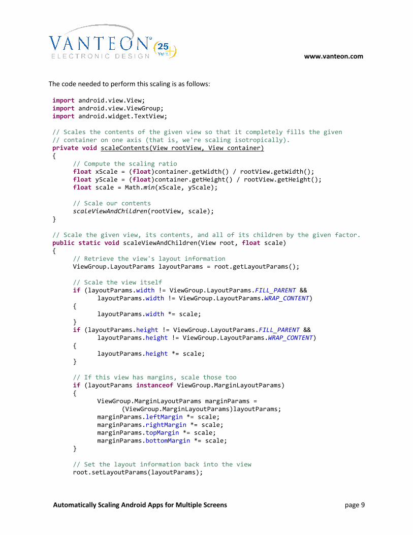
The code needed to perform this scaling is as follows:
import android.view.View;
import android.view.ViewGroup;
import android.widget.TextView;
// Scales the contents of the given view so that it completely fills the given
// container on one axis (that is, we're scaling isotropically).
private void scaleContents(View rootView, View container)
{
// Compute the scaling ratio
float xScale = (float)container.getWidth() / rootView.getWidth();
float yScale = (float)container.getHeight() / rootView.getHeight();
float scale = Math.min(xScale, yScale);
// Scale our contents
scaleViewAndChildren(rootView, scale);
}
// Scale the given view, its contents, and all of its children by the given factor.
public static void scaleViewAndChildren(View root, float scale)
{
// Retrieve the view's layout information
ViewGroup.LayoutParams layoutParams = root.getLayoutParams();
// Scale the view itself
if (layoutParams.width != ViewGroup.LayoutParams.FILL_PARENT &&
layoutParams.width != ViewGroup.LayoutParams.WRAP_CONTENT)
{
layoutParams.width *= scale;
}
if (layoutParams.height != ViewGroup.LayoutParams.FILL_PARENT &&
layoutParams.height != ViewGroup.LayoutParams.WRAP_CONTENT)
{
layoutParams.height *= scale;
}
// If this view has margins, scale those too
if (layoutParams instanceof ViewGroup.MarginLayoutParams)
{
ViewGroup.MarginLayoutParams marginParams =
(ViewGroup.MarginLayoutParams)layoutParams;
marginParams.leftMargin *= scale;
marginParams.rightMargin *= scale;
marginParams.topMargin *= scale;
marginParams.bottomMargin *= scale;
}
// Set the layout information back into the view
root.setLayoutParams(layoutParams);

www.vanteon.com
Automatically Scaling Android Apps for Multiple Screens page 10
// Scale the view's padding
root.setPadding(
(int)(root.getPaddingLeft() * scale),
(int)(root.getPaddingTop() * scale),
(int)(root.getPaddingRight() * scale),
(int)(root.getPaddingBottom() * scale));
// If the root view is a TextView, scale the size of its text
if (root instanceof TextView)
{
TextView textView = (TextView)root;
textView.setTextSize(textView.getTextSize() * scale);
}
// If the root view is a ViewGroup, scale all of its children recursively
if (root instanceof ViewGroup)
{
ViewGroup groupView = (ViewGroup)root;
for (int cnt = 0; cnt < groupView.getChildCount(); ++cnt)
scaleViewAndChildren(groupView.getChildAt(cnt), scale);
}
}
You can put this code into any class; then, once your view is loaded, call scaleContents and pass your
content view and your container view. Magically, your content view will then scale properly to every
display regardless of size, pixel density, or shape.
Note: if you’re doing this in an Activity, the right way to do it is to override onWindowFocusChanged; if
you try to do it in onCreate you’ll be in for a nasty surprise, since the views haven’t yet been assigned
sizes at that point. This results in the scaling factors being computed as NaN, and your UI goes away
entirely.
Here is the vastly-simplified layout for the calculator app using this code (again, most properties not
relevant to the layout have been elided). Note that we’re using a RelativeLayout to handle arranging the
controls, since we no longer have to use LinearLayouts in order to get the scaling behavior. I’ve elided
the layout alignment properties for clarity, but you can easily imagine what they ought to be.
<FrameLayout android:id="@+id/container"
android:layout_width="fill_parent"
android:layout_height="fill_parent">
<RelativeLayout
android:id="@+id/contents"
android:layout_width="500px"
android:layout_height="500px"
android:layout_gravity="center">
<EditText
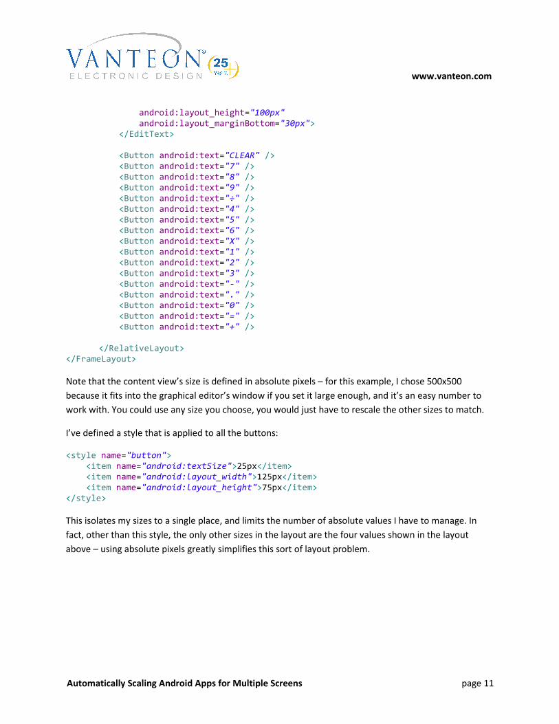
www.vanteon.com
Automatically Scaling Android Apps for Multiple Screens page 11
android:layout_height="100px"
android:layout_marginBottom="30px">
</EditText>
<Button android:text="CLEAR" />
<Button android:text="7" />
<Button android:text="8" />
<Button android:text="9" />
<Button android:text="÷" />
<Button android:text="4" />
<Button android:text="5" />
<Button android:text="6" />
<Button android:text="X" />
<Button android:text="1" />
<Button android:text="2" />
<Button android:text="3" />
<Button android:text="-" />
<Button android:text="." />
<Button android:text="0" />
<Button android:text="=" />
<Button android:text="+" />
</RelativeLayout>
</FrameLayout>
Note that the content view’s size is defined in absolute pixels – for this example, I chose 500x500
because it fits into the graphical editor’s window if you set it large enough, and it’s an easy number to
work with. You could use any size you choose, you would just have to rescale the other sizes to match.
I’ve defined a style that is applied to all the buttons:
<style name="button">
<item name="android:textSize">25px</item>
<item name="android:layout_width">125px</item>
<item name="android:layout_height">75px</item>
</style>
This isolates my sizes to a single place, and limits the number of absolute values I have to manage. In
fact, other than this style, the only other sizes in the layout are the four values shown in the layout
above – using absolute pixels greatly simplifies this sort of layout problem.

www.vanteon.com
Automatically Scaling Android Apps for Multiple Screens page 12
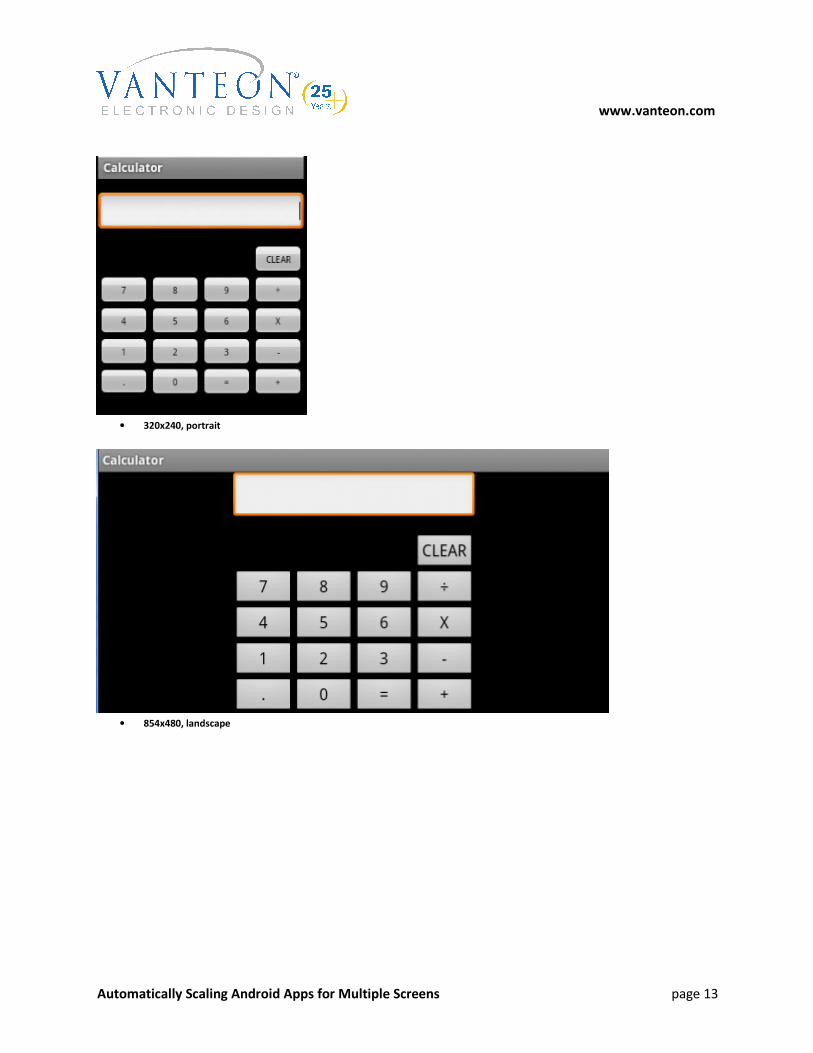
Here are some examples of the new app running on various screen sizes (you can download complete
source for this app from Vanteon’s website at http://www.vanteon.com/papersandpublications.html):
• 320x480, portrait
• 320x480, landscape
www.vanteon.com
Automatically Scaling Android Apps for Multiple Screens page 13
• 320x240, portrait
• 854x480, landscape

www.vanteon.com
Automatically Scaling Android Apps for Multiple Screens page 14
• 1280x800, landscape
Caveats
This solution works in the majority of cases, but it is not a panacea. There are two significant issues with
relying on this as the only scaling solution: first, if the UI is scaled up or down by a large factor, it may no
longer look reasonable (for example, the 1280x800 screen above would look a bit silly on a 10.1”
screen). Second, on screens with a significantly different aspect ratio than that for which the UI was
originally designed, there will be lots of “dead space” on two sides (e.g., the 854x480 landscape example
above). It would be easy to modify the code to scale anisotropically, but for most layouts that would
result in undesirable distortion.
Both of these problems can be mitigated by the use of multiple resource folders. Because you have the
safety net of in-code scaling, you no longer need to define a custom layout for every possible
combination – you can often get away with only three or four different layouts, and frequently you can
get away with defining all of your sizes in styles and putting only the styles into the size-specific resource
folders.

www.vanteon.com
Automatically Scaling Android Apps for Multiple Screens page 15
References
[1] http://en.wikipedia.org/wiki/Comparison_of_Android_devices
[2] http://developer.android.com/guide/practices/screens_support.html
[3] http://realmike.org/blog/2010/12/21/multiple-screen-sizes-with-processing-for-android/ (contains
specific details about the Samsung Galaxy Tab’s special scaling behavior)
[4] http://android-developers.blogspot.com/2011/07/new-tools-for-managing-screen-sizes.html
[5] http://developer.android.com/resources/dashboard/platform-versions.html
[6] http://www.vanteon.com/papersandpublications.html (contains a link to this white paper and the
complete source for the scaled Calculator app example)