artist interview: anoka faruqee’s optical paintings will...
TRANSCRIPT
Artist Interview: Anoka Faruqee’s Optical Paintings Will Twist And Bend Your Perception August 29, 2014 by Bill Donovan
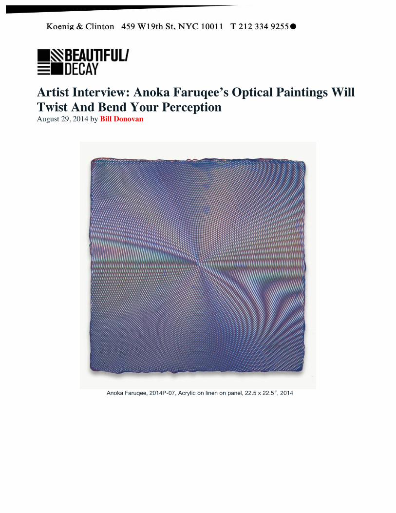
Anoka Faruqee, 2014P-07, Acrylic on linen on panel, 22.5 x 22.5″, 2014
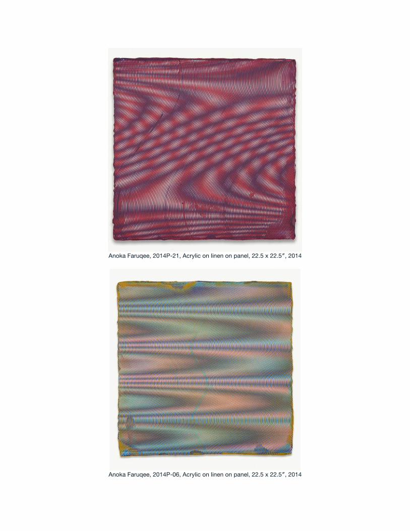
Anoka Faruqee, 2014P-21, Acrylic on linen on panel, 22.5 x 22.5″, 2014
Anoka Faruqee, 2014P-06, Acrylic on linen on panel, 22.5 x 22.5″, 2014
When walking towards a painting by Anoka Faruqee your eyes refuse to settle. Turquoise, formed into an elongated triangular band, is pinched between two golden curves. The turquoise is misbehaving. Instead of sitting still it appears to flex and blend into the yellow. As you get closer the painting changes, and at arm’s length another dramatic shift occurs, the previous turquoise and gold bands of color atomizes into narrow, serpentine, overlapping lines with several more colors, no longer just turquoise and gold. Looking across the room your eyes settle on another painting. This square shaped canvas is a warm gray that seems to dance. Upon closer inspection the pleasantly worked surface transforms into a swirling design of forest green and cherry red lines. Faruqee calls this series of paintings the Moiré series, after the illusion with the same name. The history of Modern art is often told as a race towards extremes, but will that be true of 21st century art? Anoka Faruqee’s work seems to place less emphasis on ‘pureness’ than other abstraction. Faruqee’s work suggests that we can be more complex, and where artists over the past sixty years searched for the strongest statement, maybe our searches will lead in different, more nuanced directions.
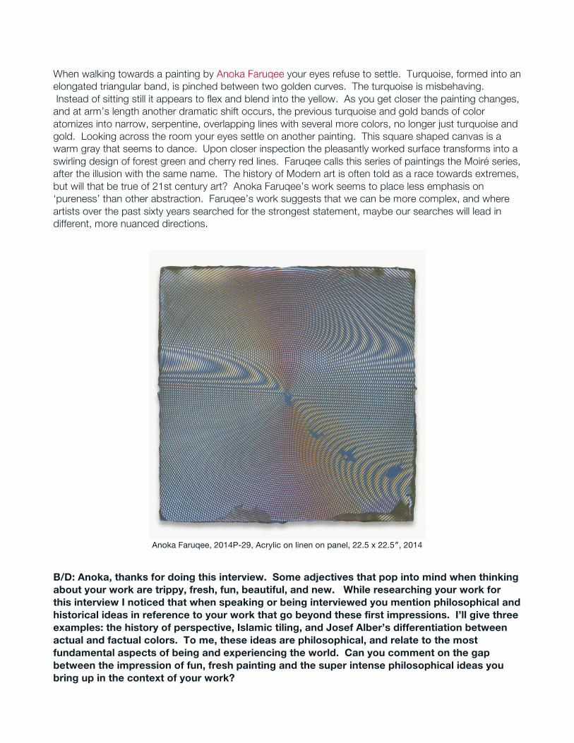
Anoka Faruqee, 2014P-29, Acrylic on linen on panel, 22.5 x 22.5″, 2014
B/D: Anoka, thanks for doing this interview. Some adjectives that pop into mind when thinking about your work are trippy, fresh, fun, beautiful, and new. While researching your work for this interview I noticed that when speaking or being interviewed you mention philosophical and historical ideas in reference to your work that go beyond these first impressions. I’ll give three examples: the history of perspective, Islamic tiling, and Josef Alber’s differentiation between actual and factual colors. To me, these ideas are philosophical, and relate to the most fundamental aspects of being and experiencing the world. Can you comment on the gap between the impression of fun, fresh painting and the super intense philosophical ideas you bring up in the context of your work?
Anoka Faruqee: Thanks, Bill for your thoughtful observations, questions, and this welcome opportunity to converse. For me, the gap between perception and idea is a continuum: the categories elide into each other. While we need to separate form and content linguistically, Thomas McEvilley said, quite beautifully, that their distinction is more like the fade between two colors.[1] However this gap is constantly reinforced by a “mind over matter” culture. Rudolf Arnheim, among others, has documented how this split between the physical and mental in Western culture has roots back to the Platonic realm: “the colorless, formless, intangible essence, visible only to the mind, the pilot of the soul.”[2] The ebullient, pleasurable aspect of these paintings can make one skeptical, or even feel guilty. David Cohen, in a conversation, described seeing them as an “orgy.” So, perhaps we resist such pleasure in part because we’re a culture of puritans. However, our collective suspicion towards beauty is justified: visual pleasure is an effective cultural tool to constantly seduce and influence us in the realms of religion, politics and consumerism. But, I don’t want to throw out the baby with the bathwater: there are so many visual phenomena in the material world, still uncorrupted by these intentions, worthy of wonder and engagement. The visual conventions you mention (Islamic tiling, perspective drawing, color theory) are all attempts to organize unruly experiences and ideas. Because we engage with these experiences, and the visual conventions that structure them, unconsciously, the challenge is to parse them both as phenomena and as philosophical ideas. Consider a more recent innovation: the 1970’s advances in fractal geometry transformed computer graphics. Previously, drawing natural forms, such as trees and mountaintops, on the computer was ineffective. The fractal algorithm systematically expressed what had previously been so complex to our eyes that we called it chaos. Of course, painters rendered mountaintops convincingly for many centuries, but once the math and computing power was there, the forms could be expressed automatically and demonstrably. One might say that the desire for knowledge led to this new type of imaging, but one could also say that the desire for the image led to this new type of knowledge. Making representations is one way to discover something about nature or reality. Before things became so specialized, artists were also inventors, scientists, mathematicians, and philosophers. We often devalue representations as mere reflections of the world we live in, but isn’t art more active: creating understanding? A more humorous example: when working on the Fade paintings, I would sometimes come out of the studio, declaring, “now I understand how a tree grows!” [1]Thomas McEvilley, “Heads It’s Form, Tails It’s Not Content,”Artforum, 21, no. 3 (November 1982), 55. [2] Rudolf Arnheim, Visual Thinking (Los Angeles: University of California Press, 1969), 7.
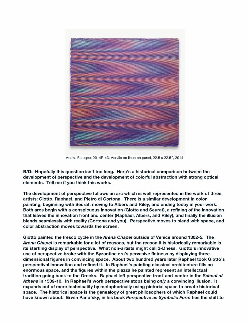
Anoka Faruqee, 2014P-43, Acrylic on linen on panel, 22.5 x 22.5″, 2014
B/D: Hopefully this question isn’t too long. Here’s a historical comparison between the development of perspective and the development of colorful abstraction with strong optical elements. Tell me if you think this works. The development of perspective follows an arc which is well represented in the work of three artists: Giotto, Raphael, and Pietro di Cortona. There is a similar development in color painting, beginning with Seurat, moving to Albers and Riley, and ending today in your work. Both arcs begin with a conspicuous innovation (Giotto and Seurat), a refining of the innovation that leaves the innovation front and center (Raphael, Albers, and Riley), and finally the illusion blends seamlessly with reality (Cortona and you). Perspective moves to blend with space, and color abstraction moves towards the screen. Giotto painted the fresco cycle in the Arena Chapel outside of Venice around 1302-5. The Arena Chapel is remarkable for a lot of reasons, but the reason it is historically remarkable is its startling display of perspective. What non-artists might call 3-Dness. Giotto’s innovative use of perspective broke with the Byzantine era’s pervasive flatness by displaying three-dimensional figures in convincing space. About two hundred years later Raphael took Giotto’s perspectival innovation and refined it. In Raphael’s painting classical architecture fills an enormous space, and the figures within the piazza he painted represent an intellectual tradition going back to the Greeks. Raphael left perspective front-and-center in the School of Athens in 1509-10. In Raphael’s work perspective stops being only a convincing illusion. It expands out of mere technicality by metaphorically using pictorial space to create historical space. The historical space is the genealogy of great philosophers of which Raphael could have known about. Erwin Panofsky, in his book Perspective as Symbolic Form ties the shift to
believable space as being a sign or symptom that heralded the birth of empiricism. During the following 17th century perspective is still being used, but perspective becomes concealed. Paradoxically, concealed perspective is much more powerful spatially, because it stops being a picture, and starts to counterfeit real space. Pietro de Cortona painted the Allegory of Divine Providence and Barberini Power in 1633-39. Cortona’s fresco creates the illusion that the ceiling is much taller than it is. With Cortona we get the blending of Giotto’s original innovation with reality. So, over three hundred years, we have Giotto figuring out something awesome – perspective, Raphael refining it, but at the same time leaving it front and center in his masterpiece The School of Athens, and finally the complete obscuration of the technical aspect in Cortona, where the painting not only gives a powerful illusion of pictorial space, but seems to actually expand the real space of the ceiling. I see your work in a similar train of correlation where you occupy Cortona’s place, let me explain. This story begins with Seurat who painted his masterpiece La Grande Jatte in 1884-6. As the most well-known Pointillist Seurat popularized optical color mixing. Like Giotto’s conspicuous use of perspective, Seurat calls attention to the newly discovered technique. Each brush stroke in a Seurat painting is so unintuitive that, to the uninitiated, it can seem like magic. How did this painter use blue and yellow brushstrokes, but I see green? What is obvious is that something exciting is being done with color. About sixty or seventy years later we see Seurat’s innovation being bifurcated between Josef Albers and Bridget Riley. Both artists need to be addressed. Albers published The Interaction of Color in 1963. In that book Albers presented optical mixing of color by demonstrating that a color was relative to the colors surrounding it. This might not seem like much to non-artists, but to artists this is an enormous idea. Bridget Riley, in my opinion, is the strongest painter among the early Op-Artists. Riley made very striking use of Seurat’s optical color mixing, including using it in gray-scale. Riley has published several essays where she explains the nuts and bolts of her relationship to Seurat. Today we are used to Riley’s paintings, but in the 1960s, according to her Wikipedia page, reviewers wrote about feelings of seasickness and skydiving. The environment that produced Albers and Riley beget us the pixel. The rise of television and computer screens parallels their work. Both Albers and Riley use Seurat’s optical color in a conspicuous way, roughly analogous to Raphael’s use of Giotto’s innovation. Your paintings, Anoka, seem to occupy the same seamless moment that Cortona occupies. Your paintings use all the previous innovations of Seurat, Albers, and Riley, but they do not call attention to the innovations, instead they are used to create an experience. The experience is one of movement, of shifting colors, and ultimately of the breakdown of the painting into its discrete marks. Do you think this analogy makes sense? Do you see your work as sophisticated and seamless? AF: One could certainly make the case for this evolution of ideas of space and color, and your comparison is astute and thought provoking, particularly in the question of the refinement towards seamlessness, which I’ll return to. For now, I hope you don’t mind me taking the question in a different direction: I’d rather mash up the two halves of your analogy (drawing vs. color) because they’ve been on my mind. What if we consider other concurrent if perhaps peripheral traditions that were happening alongside the narrative you describe? How about the Florentine court painter Bronzino, whose use of opulent color and pattern serve as a counterpoint to Raphael? A recent painting in the studio reminded me of a close-up of corduroy fabric in a Bronzino portrait that I had seen when in Rome.
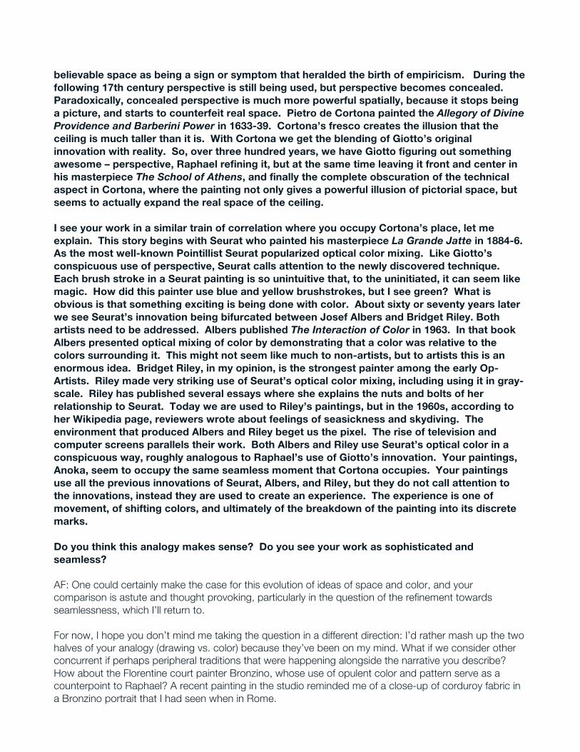
Anoka Faruqee, 2014P-14 (Wave), Acrylic on linen on panel, 33.75 x 33.75″, 2014
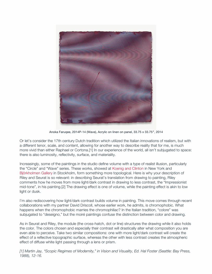
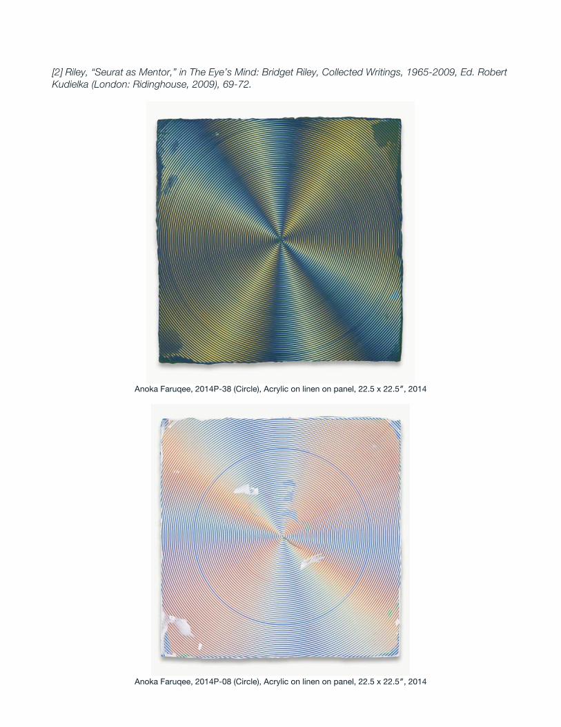
Or let’s consider the 17th century Dutch tradition which utilized the Italian innovations of realism, but with a different tenor, scale, and content, allowing for another way to describe reality that for me, is much more vivid than either Raphael or Cortona.[1] In our experience of the world, all isn’t subjugated to space: there is also luminosity, reflectivity, surface, and materiality. Increasingly, some of the paintings in the studio define volume with a type of realist illusion, particularly the “Circle” and “Wave” series. These works, showed at Koenig and Clinton in New York and Björkholmen Gallery in Stockholm, form something more topological. Here is why your description of Riley and Seurat is so relevant: in describing Seurat’s translation from drawing to painting, Riley comments how he moves from more light/dark contrast in drawing to less contrast, the “Impressionist mid-tone”, in his painting.[2] The drawing effect is one of volume, while the painting effect is akin to low light or dusk. I’m also rediscovering how light/dark contrast builds volume in painting. This move comes through recent collaborations with my partner David Driscoll, whose earlier work, he admits, is chromophobic. What happens when the chromophobic marries the chromophiliac? In the Italian tradition, “colore” was subjugated to “deseigno,” but the moiré paintings confuse the distinction between color and drawing. As in Seurat and Riley, the module (the cross-hatch, dot or line) structures the drawing while it also holds the color. The colors chosen and especially their contrast will drastically alter what composition you are even able to perceive. Take two similar compositions: one with more light/dark contrast will create the effect of a reflective topographic surface, whereas the other with less contrast creates the atmospheric effect of diffuse white light passing through a lens or prism. [1] Martin Jay, “Scopic Regimes of Modernity,” in Vision and Visuality, Ed. Hal Foster (Seattle: Bay Press, 1988), 12-16.
[2] Riley, “Seurat as Mentor,” in The Eye’s Mind: Bridget Riley, Collected Writings, 1965-2009, Ed. Robert Kudielka (London: Ridinghouse, 2009), 69-72.
Anoka Faruqee, 2014P-38 (Circle), Acrylic on linen on panel, 22.5 x 22.5″, 2014
Anoka Faruqee, 2014P-08 (Circle), Acrylic on linen on panel, 22.5 x 22.5″, 2014
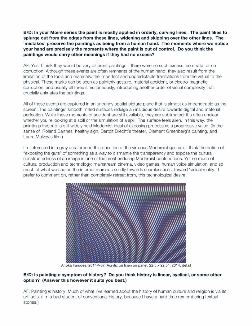
B/D: In your Moiré series the paint is mostly applied in orderly, curving lines. The paint likes to splurge out from the edges from these lines, widening and skipping over the other lines. The ‘mistakes’ preserve the paintings as being from a human hand. The moments where we notice your hand are precisely the moments where the paint is out of control. Do you think the paintings would carry other meanings if they had no excess? AF: Yes, I think they would be very different paintings if there were no such excess, no errata, or no corruption. Although these events are often remnants of the human hand, they also result from the limitation of the tools and materials: the imperfect and unpredictable translations from the virtual to the physical. These marks can be seen as painterly gesture, material accident, or electro-magnetic corruption, and usually all three simultaneously, introducing another order of visual complexity that crucially animates the paintings. All of these events are captured in an uncanny spatial picture plane that is almost as impenetrable as the screen. The paintings’ smooth milled surfaces indulge an insidious desire towards digital and material perfection. While these moments of accident are still available, they are sublimated: it’s often unclear whether you’re looking at a spill or the simulation of a spill. The surface feels alien. In this way, the paintings frustrate a still widely held Modernist ideal of exposing process as a progressive value. (In the sense of Roland Barthes’ healthy sign, Bertolt Brecht’s theater, Clement Greenberg’s painting, and Laura Mulvey’s film.) I’m interested in a gray area around this question of the virtuous Modernist gesture. I think the notion of “exposing the guts” of something as a way to dismantle the transparency and expose the cultural constructedness of an image is one of the most enduring Modernist contributions. Yet so much of cultural production and technology: mainstream cinema, video games, human voice simulation, and so much of what we see on the internet marches solidly towards seamlessness, toward ‘virtual reality.’ I prefer to comment on, rather than completely retreat from, this technological desire.
Anoka Faruqee, 2014P-07, Acrylic on linen on panel, 22.5 x 22.5″, 2014, detail
B/D: Is painting a symptom of history? Do you think history is linear, cyclical, or some other option? (Answer this however it suits you best.) AF: Painting is history. Much of what I’ve learned about the history of human culture and religion is via its artifacts. (I’m a bad student of conventional history, because I have a hard time remembering textual stories.)
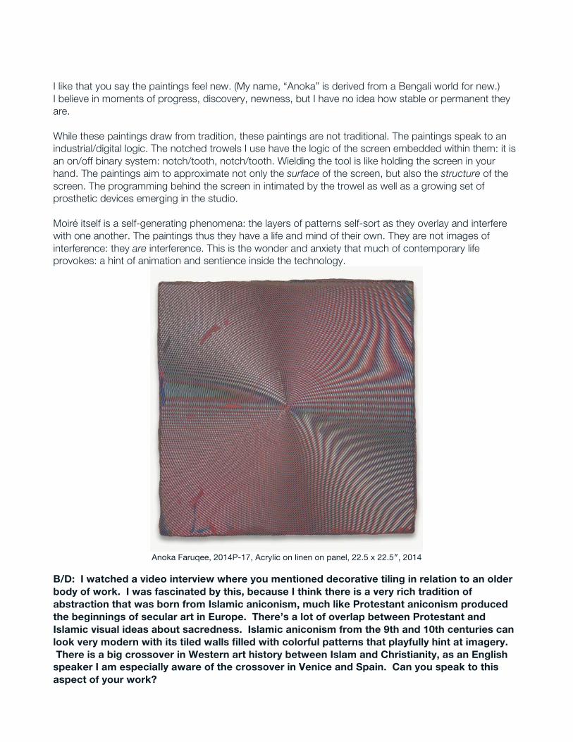
I like that you say the paintings feel new. (My name, “Anoka” is derived from a Bengali world for new.) I believe in moments of progress, discovery, newness, but I have no idea how stable or permanent they are. While these paintings draw from tradition, these paintings are not traditional. The paintings speak to an industrial/digital logic. The notched trowels I use have the logic of the screen embedded within them: it is an on/off binary system: notch/tooth, notch/tooth. Wielding the tool is like holding the screen in your hand. The paintings aim to approximate not only the surface of the screen, but also the structure of the screen. The programming behind the screen in intimated by the trowel as well as a growing set of prosthetic devices emerging in the studio. Moiré itself is a self-generating phenomena: the layers of patterns self-sort as they overlay and interfere with one another. The paintings thus they have a life and mind of their own. They are not images of interference: they are interference. This is the wonder and anxiety that much of contemporary life provokes: a hint of animation and sentience inside the technology.
Anoka Faruqee, 2014P-17, Acrylic on linen on panel, 22.5 x 22.5″, 2014
B/D: I watched a video interview where you mentioned decorative tiling in relation to an older body of work. I was fascinated by this, because I think there is a very rich tradition of abstraction that was born from Islamic aniconism, much like Protestant aniconism produced the beginnings of secular art in Europe. There’s a lot of overlap between Protestant and Islamic visual ideas about sacredness. Islamic aniconism from the 9th and 10th centuries can look very modern with its tiled walls filled with colorful patterns that playfully hint at imagery. There is a big crossover in Western art history between Islam and Christianity, as an English speaker I am especially aware of the crossover in Venice and Spain. Can you speak to this aspect of your work?
AF: This is a fascinating question, do you speak about how Protestant rejections of icons during the Reformation led to a focusing on a human, rather than priestly holiness? Are there any specific works you’re thinking about? I will say now that your question calls to mind the self-discipline of asceticism; the notion of individual worship is central to both Islam and Protestantism and evidenced in the distillation of their artistic forms.
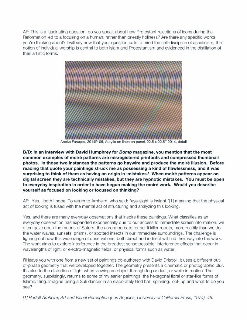
Anoka Faruqee, 2014P-06, Acrylic on linen on panel, 22.5 x 22.5″ 2014, detail
B/D: In an interview with David Humphrey for Bomb magazine, you mention that the most common examples of moiré patterns are misregistered printouts and compressed thumbnail photos. In those two instances the patterns go haywire and produce the moiré illusion. Before reading that quote your paintings struck me as possessing a kind of flawlessness, and it was surprising to think of them as having an origin in ‘mistakes.’ When moiré patterns appear on digital screen they are technically mistakes, but they are hypnotic mistakes. You must be open to everyday inspiration in order to have begun making the moiré work. Would you describe yourself as focused on looking or focused on thinking? AF: Yes…both I hope. To return to Arnheim, who said: “eye-sight is insight,”[1] meaning that the physical act of looking is fused with the mental act of structuring and analyzing this looking. Yes, and there are many everyday observations that inspire these paintings. What classifies as an everyday observation has expanded exponentially due to our access to immediate screen information: we often gaze upon the moons of Saturn, the aurora borealis, or sci-fi killer robots, more readily than we do the water waves, sunsets, prisms, or spotted insects in our immediate surroundings. The challenge is figuring out how this wide range of observations, both direct and indirect will find their way into the work. The work aims to explore interference in the broadest sense possible: interference effects that occur in wavelengths of light, or electro-magnetic fields, or physical forms such as water. I’ll leave you with one from a new set of paintings co-authored with David Driscoll; it uses a different out-of-phase geometry that we developed together. The geometry presents a cinematic or photographic blur. It’s akin to the distortion of light when viewing an object through fog or dust, or while in motion. The geometry, surprisingly, returns to some of my earlier paintings: the hexagonal floral or star-like forms of Islamic tiling. Imagine being a Sufi dancer in an elaborately tiled hall, spinning: look up and what to do you see? [1] Rudolf Arnheim, Art and Visual Perception (Los Angeles, University of California Press, 1974), 46.
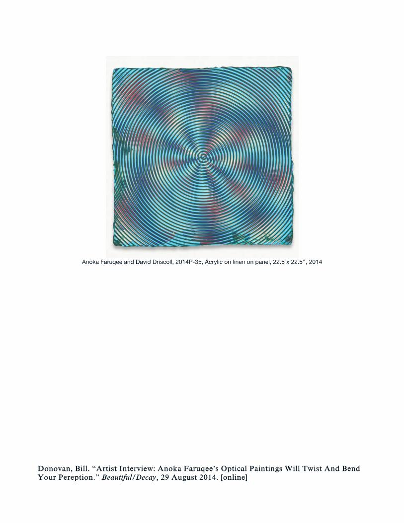
Anoka Faruqee and David Driscoll, 2014P-35, Acrylic on linen on panel, 22.5 x 22.5″, 2014
Donovan, Bill. “Artist Interview: Anoka Faruqee’s Optical Paintings Will Twist And Bend Your Pereption.” Beautiful/Decay, 29 August 2014. [online]