andi penner, ph.d. instructional designer san juan college school of energy andi penner, ph.d....
TRANSCRIPT
Andi Penner, Ph.D.Instructional Designer
San Juan College School of Energy
Andi Penner, Ph.D.Instructional Designer
San Juan College School of Energy
1September 20, 2008ASSE © 2008, A. Penner
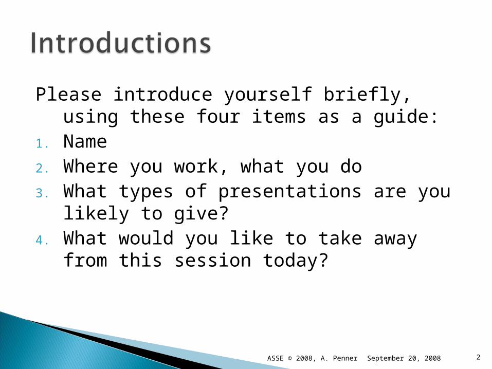
Please introduce yourself briefly, using these four items as a guide:
1. Name2. Where you work, what you do3. What types of presentations are you likely
to give?4. What would you like to take away from
this session today?
September 20, 2008 2ASSE © 2008, A. Penner
My goal today is to inspire you to engage in effective communication practices, and equip you to do so on the job, especially when you are the presenter.
Avoid the aggravations of confusing, incomplete, incoherent, or incorrect communication efforts.
3September 20, 2008ASSE © 2008, A. Penner
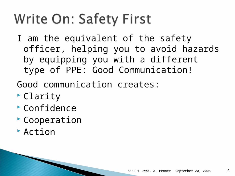
I am the equivalent of the safety officer, helping you to avoid hazards by equipping you with a different type of PPE: Good Communication!
Good communication creates: Clarity Confidence Cooperation Action
4September 20, 2008ASSE © 2008, A. Penner

The presentation cycle:
1.Define your purpose and goals
2. Identify and analyze your audience
3.Create email and hard-copy announcements
4.Design and deliver an effective presentation
5.Assess your effectiveness
5September 20, 2008ASSE © 2008, A. Penner

Presentations serve several general purposes.
Communicate important information Reach a large group at one time Reinforce the message Provide forum for discussion
6September 20, 2008ASSE © 2008, A. Penner

7
Photo by R. K. Julian
September 20, 2008ASSE © 2008, A. Penner
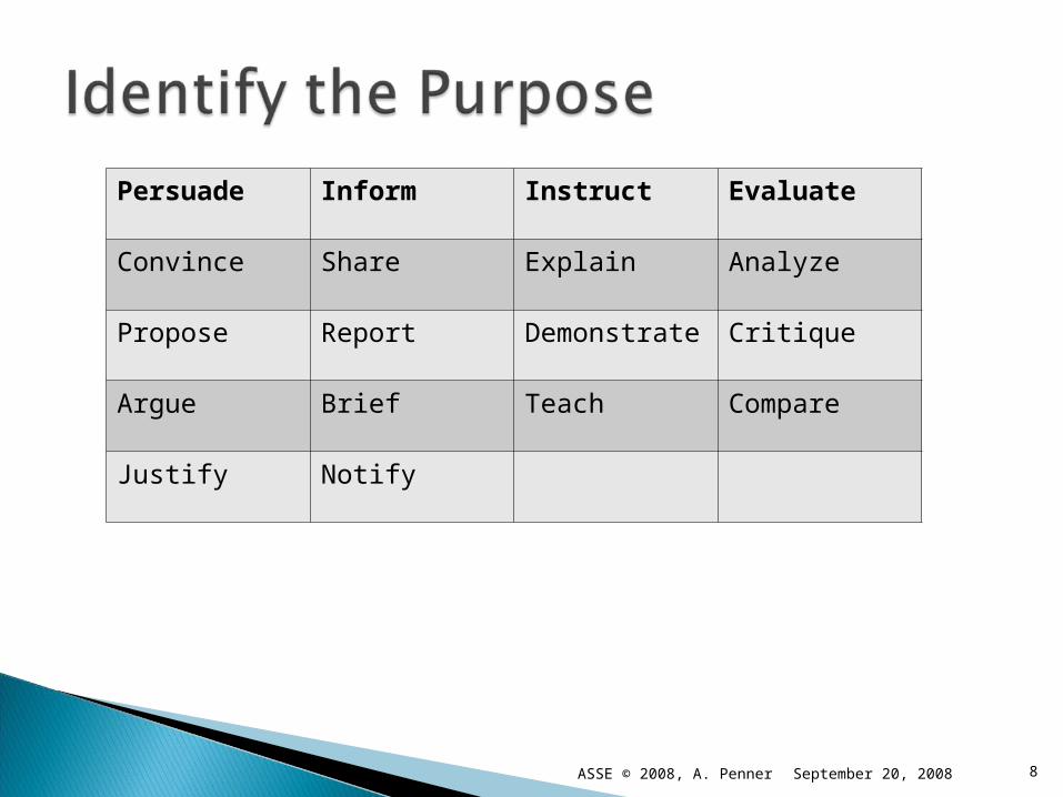
Persuade Inform Instruct Evaluate
Convince Share Explain Analyze
Propose Report Demonstrate Critique
Argue Brief Teach Compare
Justify Notify
8September 20, 2008ASSE © 2008, A. Penner

Be specific Be realistic
Complete this sentence:By the end of my presentation, my audience
will be able (and willing) to…..
9September 20, 2008ASSE © 2008, A. Penner
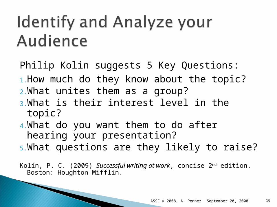
Philip Kolin suggests 5 Key Questions:1.How much do they know about the topic?2.What unites them as a group?3.What is their interest level in the topic?4.What do you want them to do after hearing
your presentation?5.What questions are they likely to raise?
Kolin, P. C. (2009) Successful writing at work, concise 2nd edition. Boston: Houghton Mifflin.
10September 20, 2008ASSE © 2008, A. Penner
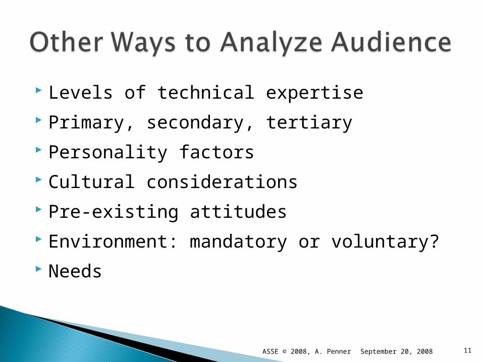
Levels of technical expertise Primary, secondary, tertiary Personality factors Cultural considerations Pre-existing attitudes Environment: mandatory or voluntary? Needs
11September 20, 2008ASSE © 2008, A. Penner
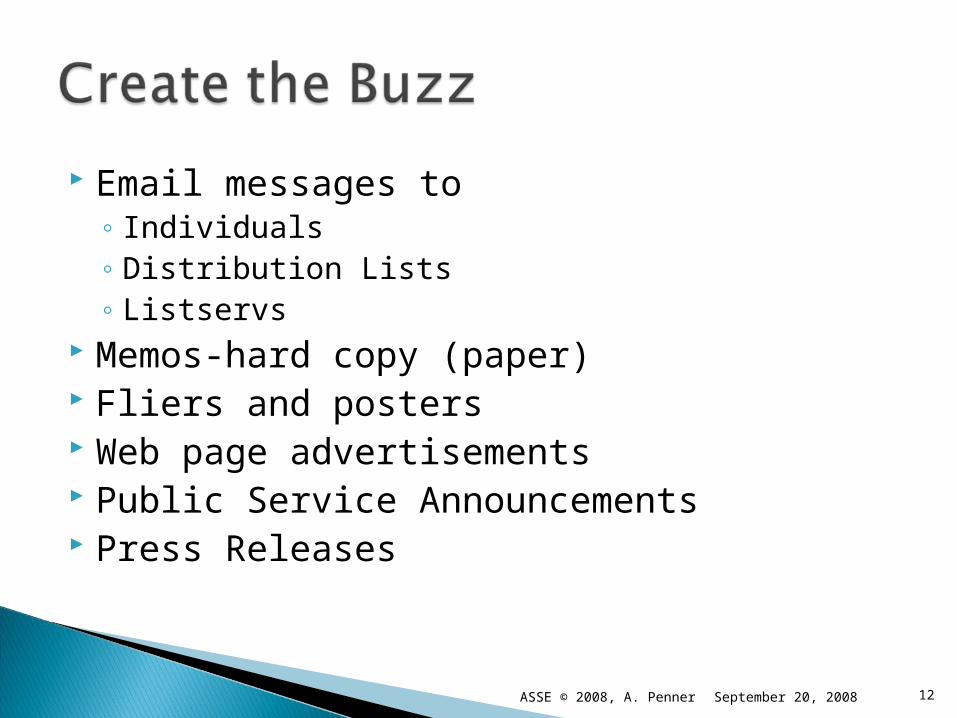
Email messages to◦ Individuals◦ Distribution Lists◦ Listservs
Memos-hard copy (paper) Fliers and posters Web page advertisements Public Service Announcements Press Releases
12September 20, 2008ASSE © 2008, A. Penner
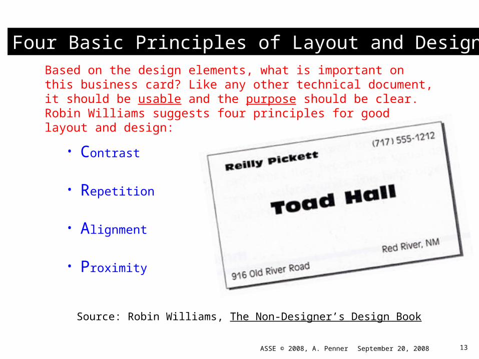
Source: Robin Williams, The Non-Designer’s Design Book
Four Basic Principles of Layout and Design
• Contrast
• Repetition
• Alignment
• Proximity
Based on the design elements, what is important on this business card? Like any other technical document, it should be usable and the purpose should be clear. Robin Williams suggests four principles for good layout and design:
13September 20, 2008ASSE © 2008, A. Penner
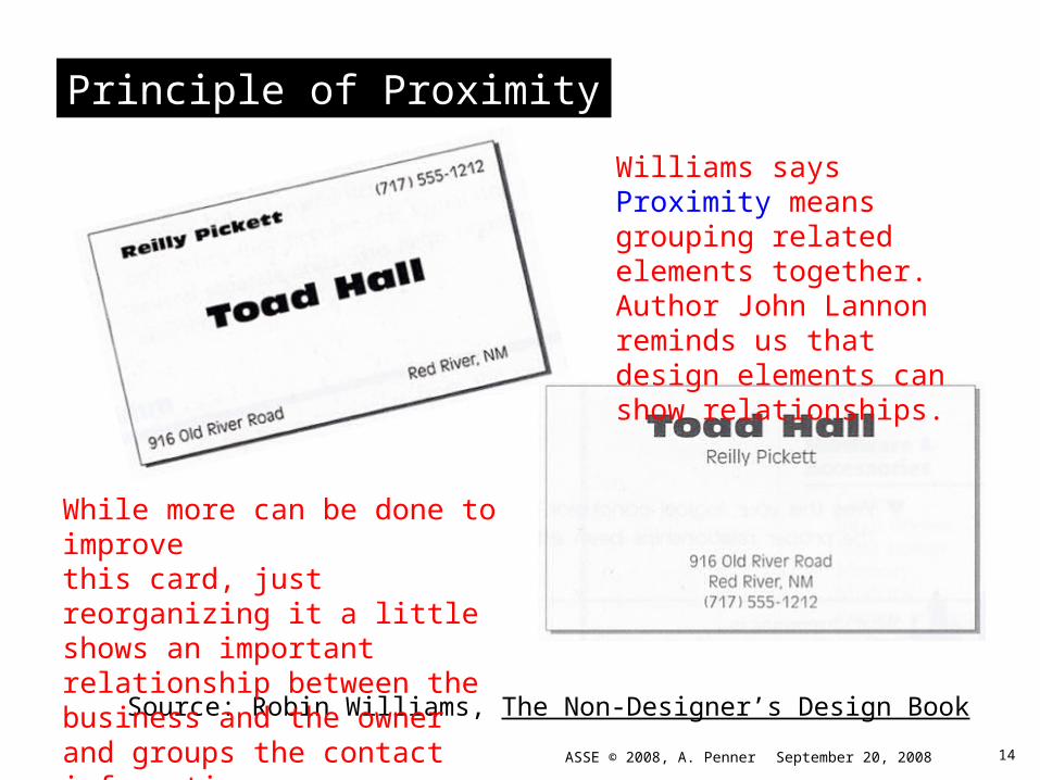
Principle of Proximity
Source: Robin Williams, The Non-Designer’s Design Book
Williams says Proximity meansgrouping related elements together. Author John Lannon reminds us that design elements can show relationships.
While more can be done to improvethis card, just reorganizing it a little shows an important relationship between the business and the owner and groups the contact information.
14September 20, 2008ASSE © 2008, A. Penner
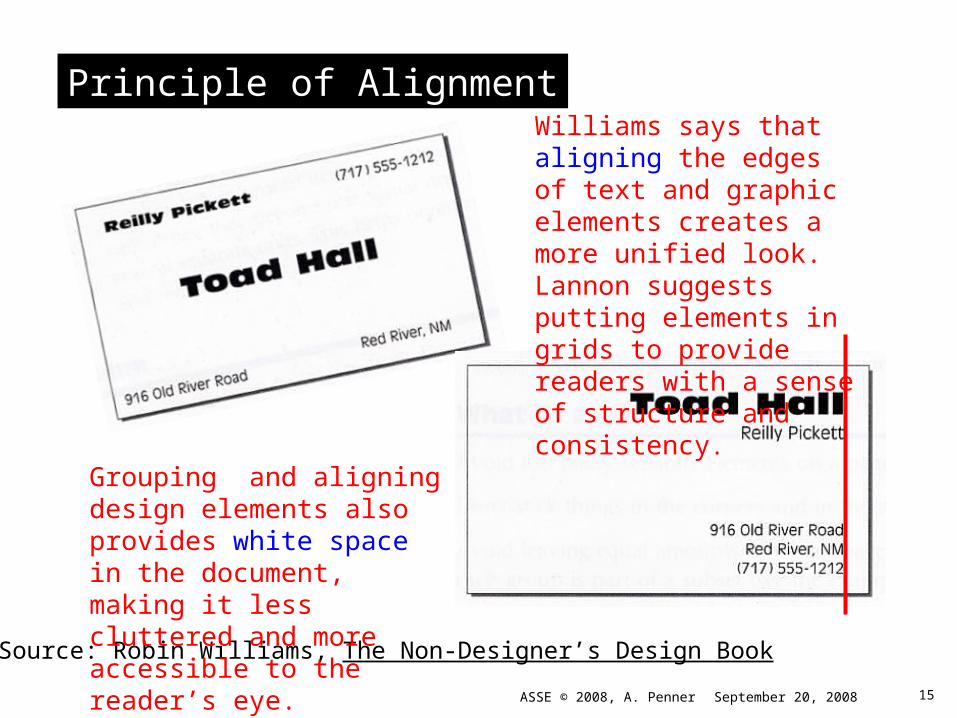
Principle of Alignment
Source: Robin Williams, The Non-Designer’s Design Book
Williams says that aligning the edges of text and graphic elements creates a more unified look. Lannon suggests putting elements in grids to provide readers with a sense of structure and consistency.
Grouping and aligning design elements also provides white space in the document, making it less cluttered and more accessible to the reader’s eye.
15September 20, 2008ASSE © 2008, A. Penner

Principles of Repetition and Contrast
Source: Robin Williams, The Non-Designer’s Design Book
Technical writers recommend repeating design elements for consistency. Notice how bolding the phone number below complements the bold element at the top of the card and contrasts with other elements.
The bold line across the top of the card helps draw the eye to the important information. A visual may also be appropriate.
16September 20, 2008ASSE © 2008, A. Penner
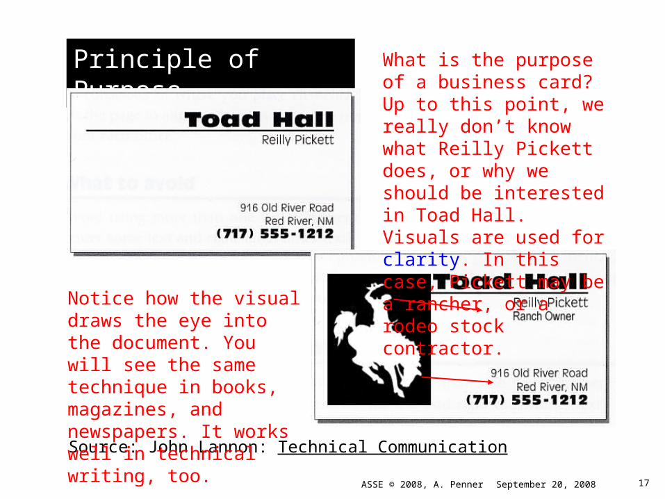
Principle of Purpose
Source: John Lannon: Technical Communication
What is the purpose of a business card? Up to this point, we really don’t know what Reilly Pickett does, or why we should be interested in Toad Hall. Visuals are used for clarity. In this case, Pickett may be a rancher, or a rodeo stock contractor.
Notice how the visual draws the eye into the document. You will see the same technique in books, magazines, and newspapers. It works well in technical writing, too.
17September 20, 2008ASSE © 2008, A. Penner
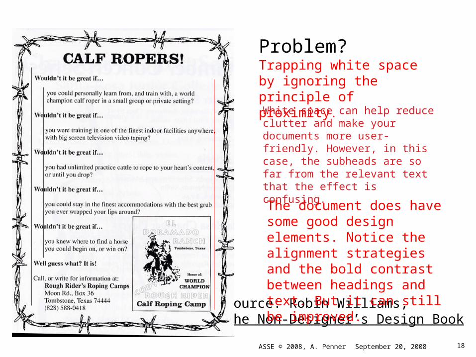
Source: Robin Williams, The Non-Designer’s Design Book
Problem?
Trapping white space by ignoring the principle of proximity.
White space can help reduce clutter and make your documents more user-friendly. However, in this case, the subheads are so far from the relevant text that the effect is confusing.
The document does have some good design elements. Notice the alignment strategies and the bold contrast between headings and text. But it can still be improved.
18September 20, 2008ASSE © 2008, A. Penner
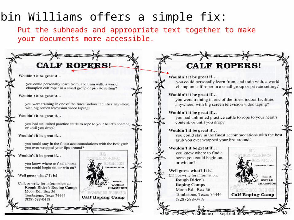
Robin Williams offers a simple fix:Put the subheads and appropriate text together to make your documents more accessible.
19September 20, 2008ASSE © 2008, A. Penner
Source: Robin Williams, The Non-Designer’s Design Book
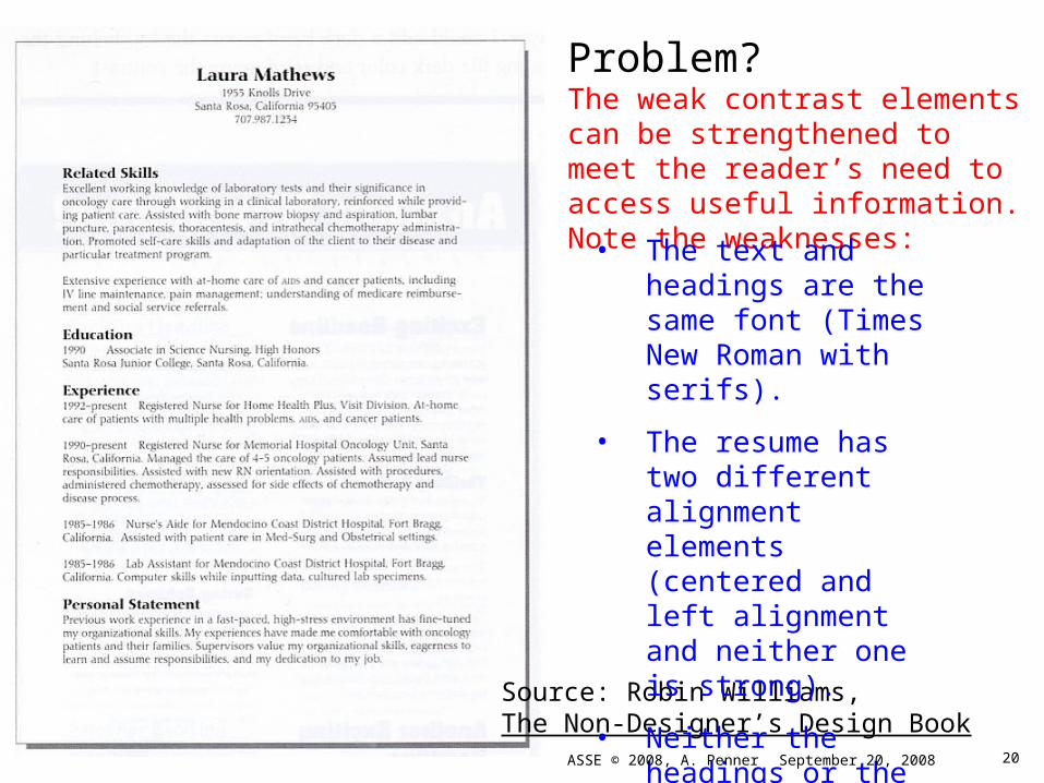
Problem?
The weak contrast elements can be strengthened to meet the reader’s need to access useful information. Note the weaknesses:
• The text and headings are the same font (Times New Roman with serifs).
• The resume has two different alignment elements (centered and left alignment and neither one is strong).
• Neither the headings or the text draw the eye to important information.
20September 20, 2008ASSE © 2008, A. Penner

Simple Fix: Williams uses different fonts (for contrast), flush left justification (alignment) in two places (repetition), and uses bold lines to group related elements (proximity). Notice how the different chunks of information standout? White space works!
21September 20, 2008ASSE © 2008, A. Penner
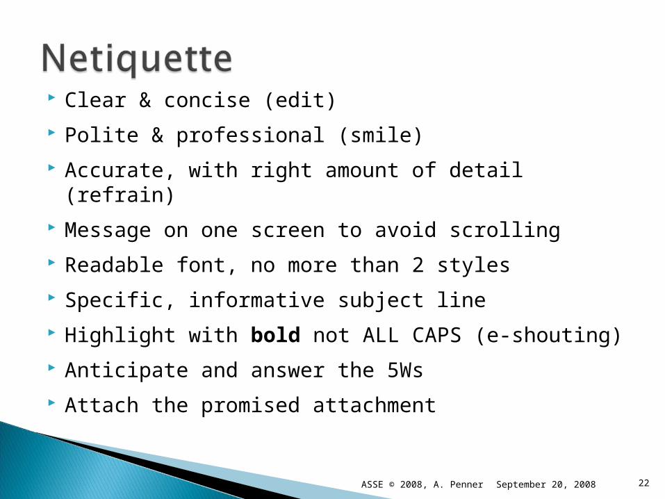
Clear & concise (edit)
Polite & professional (smile)
Accurate, with right amount of detail (refrain)
Message on one screen to avoid scrolling
Readable font, no more than 2 styles
Specific, informative subject line
Highlight with bold not ALL CAPS (e-shouting)
Anticipate and answer the 5Ws
Attach the promised attachment
22September 20, 2008ASSE © 2008, A. Penner
September 20, 2008 23ASSE © 2008, A. Penner
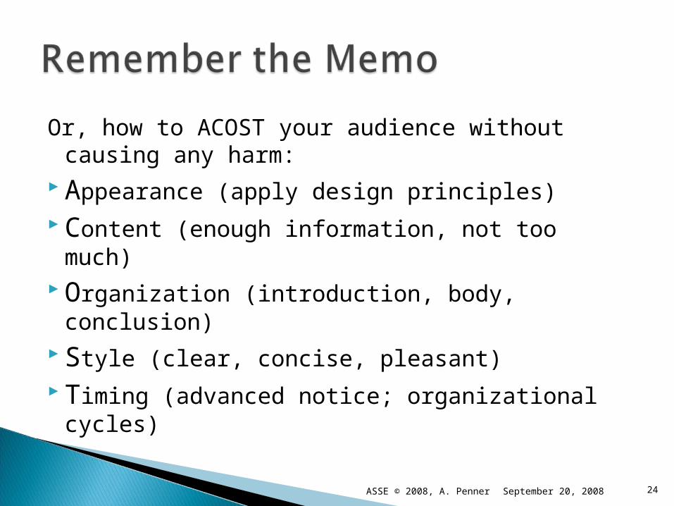
Or, how to ACOST your audience without causing any harm:
Appearance (apply design principles) Content (enough information, not too much) Organization (introduction, body, conclusion) Style (clear, concise, pleasant) Timing (advanced notice; organizational
cycles)
24September 20, 2008ASSE © 2008, A. Penner
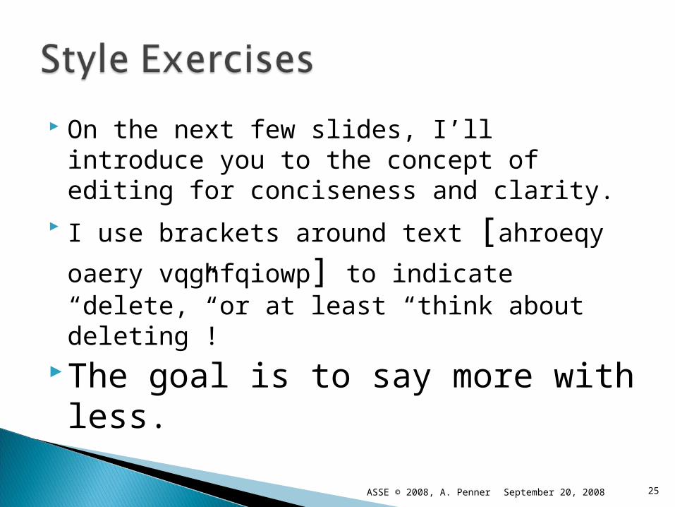
On the next few slides, I’ll introduce you to the concept of editing for conciseness and clarity.
I use brackets around text [ahroeqy oaery
vqghfqiowp] to indicate “delete,” or at least “think about deleting”!
The goal is to say more with less.
September 20, 2008 25ASSE © 2008, A. Penner

Read these two sentences:
Computers are a great resource but can hinder people from developing good writing skills. What is meant by this is people write a paper on the computer and after it is written they consider the document to be complete when in fact it is far from complete.
(47 words)
September 20, 2008 26ASSE © 2008, A. Penner

Computers are a great resource but can hinder people from developing good writing skills [. What is meant by this is] people [write a paper on the computer and after it is written they] consider the document to be complete when [in fact] it is [far from complete].
September 20, 2008 27ASSE © 2008, A. Penner
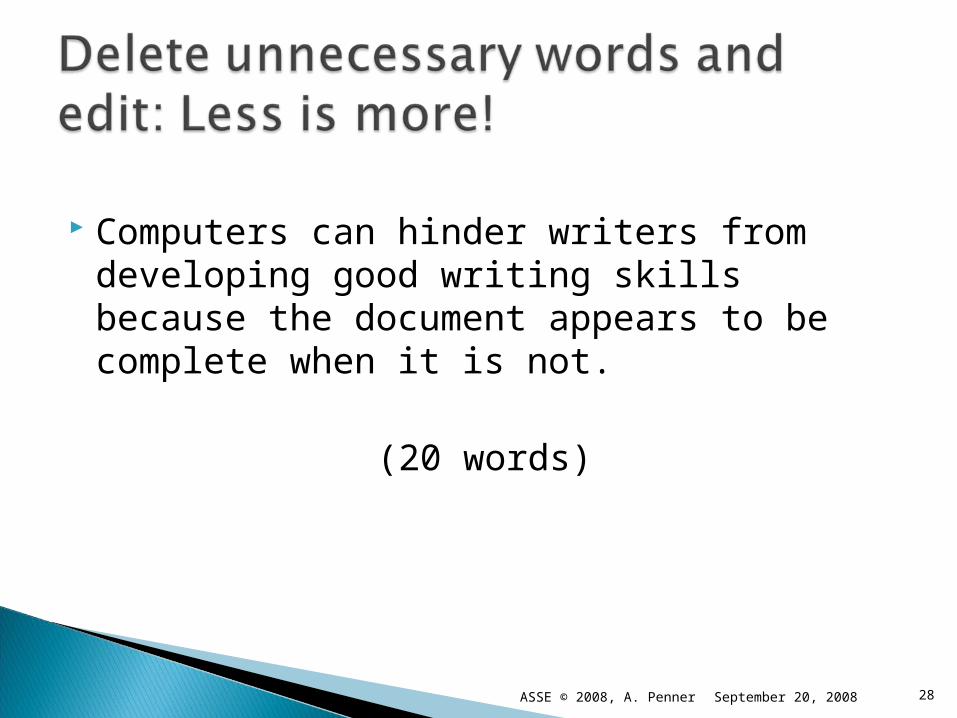
Computers can hinder writers from developing good writing skills because the document appears to be complete when it is not.
(20 words)
September 20, 2008 28ASSE © 2008, A. Penner

Start with what readers know (the “given”) Introduce what readers don’t know (the
“new”) The new then becomes the given, and the
cycle continues, building the reader’s knowledge one piece of information at a time.
Given + New
Given + New Given + New
September 20, 2008 29ASSE © 2008, A. Penner
Every autumn across the Northern Hemisphere [given], diminishing daylight hours and falling temperatures induce trees to prepare for winter [given, or possibly new]. In these preparations [given], they shed billions of tons of leaves [given/new]. In certain regions…the shedding of leaves [given] is preceded by a spectacular color show.
September 20, 2008 30ASSE © 2008, A. Penner
Formerly green leaves turn to brilliant shades of yellow, orange, and red [new]. These color changes [given] are the result of transformations in leaf pigments[new]. The green pigment in leaves [given] is chlorophyll [new]. Chlorophyll [given] absorbs red and blue light from the sunlight that falls on leaves. [new]
September 20, 2008 31ASSE © 2008, A. Penner
Therefore, the light [given] reflected by the leaves is diminished in red and blue and appears green. [new] The molecules of chlorophyll [given] are large…[new] They [given] are not soluble in the aqueous solution that fills plant cells. [new] Instead, they [given] are attached to the membranes of disc-like structures, called chloroplasts, inside the cells.
September 20, 2008 32ASSE © 2008, A. Penner
Chloroplasts [given] are the site of photosynthesis, the process in which light energy is converted to chemical energy. [new] In chloroplasts, the light absorbed by chlorophyll [given] supplies the energy used by plants to transform carbon dioxide and water into oxygen and carbohydrates…. [new]
Source: http://scifun.chem.wisc.edu/chemweek/fallcolr/fallcolr.html
September 20, 2008 33ASSE © 2008, A. Penner
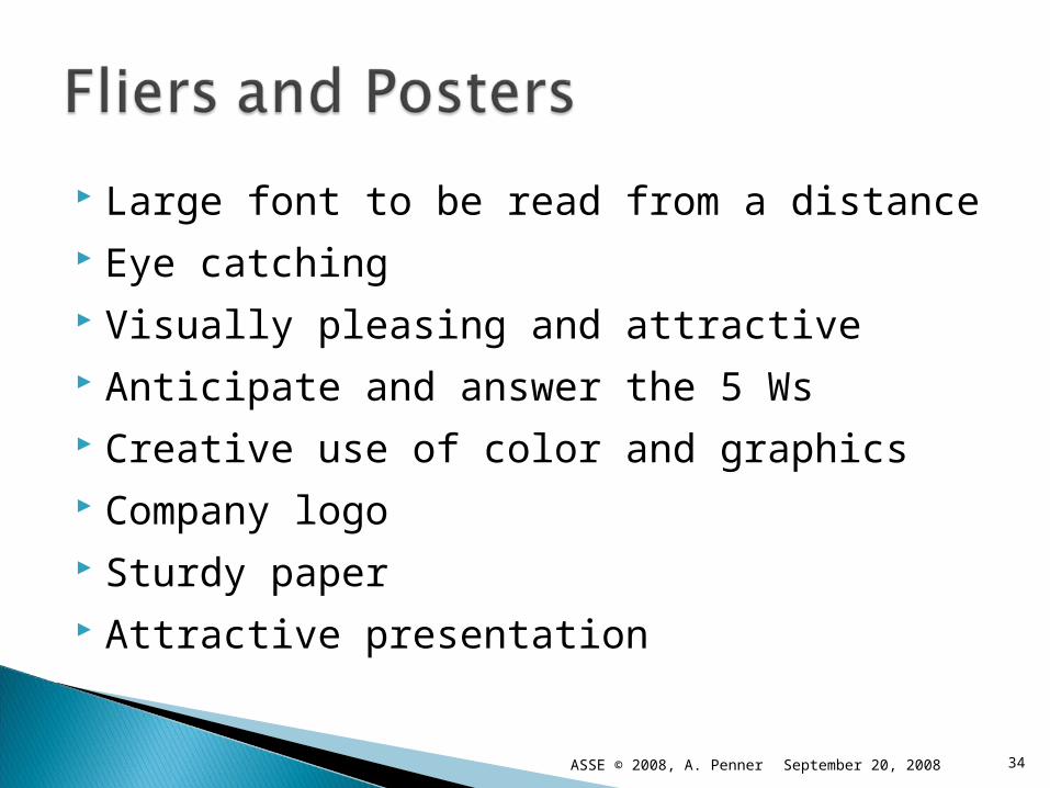
Large font to be read from a distance Eye catching Visually pleasing and attractive Anticipate and answer the 5 Ws Creative use of color and graphics Company logo Sturdy paper Attractive presentation
September 20, 2008ASSE © 2008, A. Penner 34

Review: Purpose Goals Audience Time Setting
Other?
35September 20, 2008ASSE © 2008, A. Penner
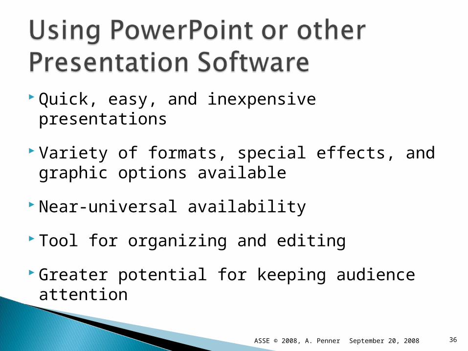
Quick, easy, and inexpensive presentations
Variety of formats, special effects, and graphic options available
Near-universal availability
Tool for organizing and editing
Greater potential for keeping audience attention
36September 20, 2008ASSE © 2008, A. Penner
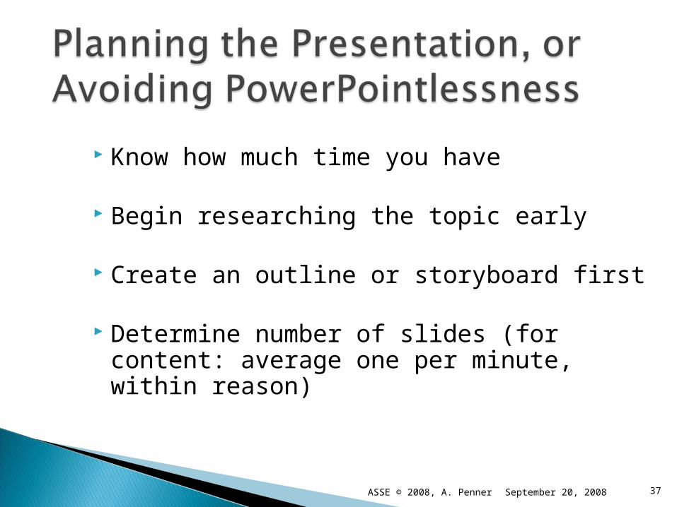
Know how much time you have
Begin researching the topic early
Create an outline or storyboard first
Determine number of slides (for content: average one per minute, within reason)
37September 20, 2008ASSE © 2008, A. Penner

Select appropriate template Manage multiple design options (KISS) Avoid “busy” and low-contrast
backgrounds Begin with an Introductory Slide (title,
your name and affiliation, date, and/or location of presentation)
Conclude with a Summary Slide (main points or credit acknowledgements)
38September 20, 2008ASSE © 2008, A. Penner
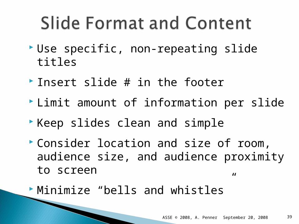
Use specific, non-repeating slide titles
Insert slide # in the footer
Limit amount of information per slide
Keep slides clean and simple
Consider location and size of room, audience size, and audience proximity to screen
Minimize “bells and whistles”
39September 20, 2008ASSE © 2008, A. Penner
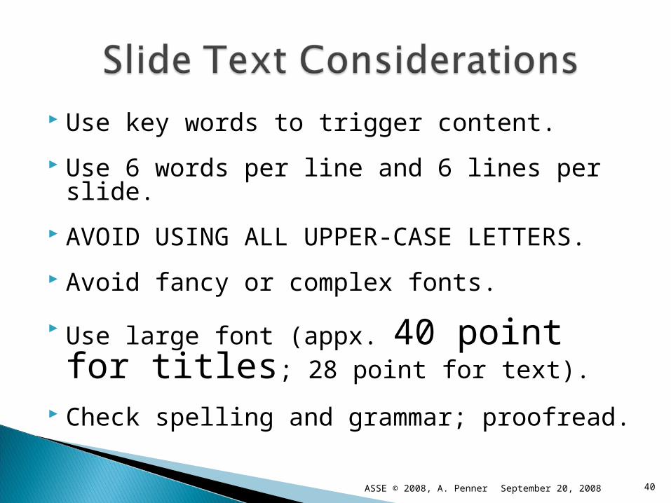
Use key words to trigger content.
Use 6 words per line and 6 lines per slide.
AVOID USING ALL UPPER-CASE LETTERS.
Avoid fancy or complex fonts.
Use large font (appx. 40 point for titles; 28 point for text).
Check spelling and grammar; proofread.
40September 20, 2008ASSE © 2008, A. Penner
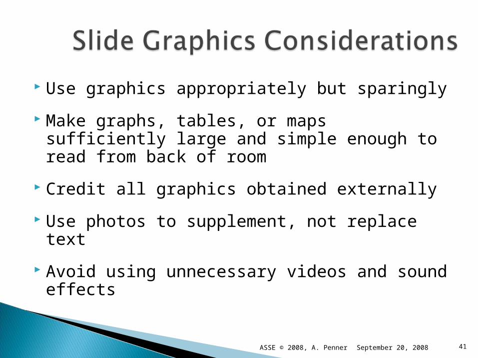
Use graphics appropriately but sparingly
Make graphs, tables, or maps sufficiently large and simple enough to read from back of room
Credit all graphics obtained externally
Use photos to supplement, not replace text
Avoid using unnecessary videos and sound effects
41September 20, 2008ASSE © 2008, A. Penner

Select appropriate scale and level of detail Provide title, legend, and distance scales www.mapquest.com/maps/map.adp?country=US&city=albuquerque&state
42September 20, 2008ASSE © 2008, A. Penner
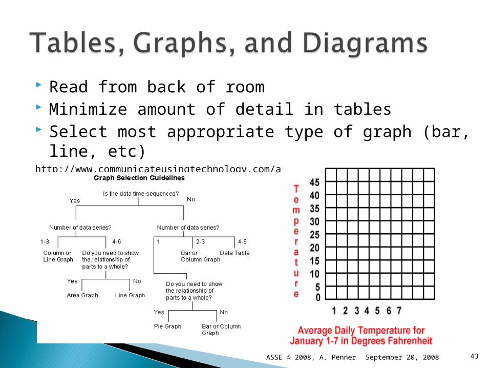
Read from back of room Minimize amount of detail in tables Select most appropriate type of graph (bar, line,
etc)http://www.communicateusingtechnology.com/articles/using_graphs_and_tables.htm
43September 20, 2008ASSE © 2008, A. Penner
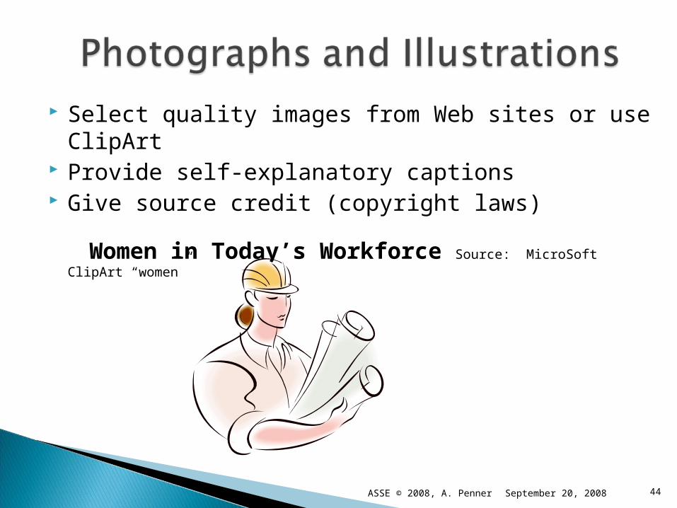
Select quality images from Web sites or use ClipArt Provide self-explanatory captions Give source credit (copyright laws)
Women in Today’s Workforce Source: MicroSoft ClipArt “women”
44September 20, 2008ASSE © 2008, A. Penner

How to make a bad slide worse:
Mix many different text fonts and sizes on the same slide
Use fancy fonts and ALL upper case letters
Use distracting special effects
Pick low contrast fonts and backgrounds
Mix many different color schemes
Don’t brother to spel chek or poofread
Include lots of irrelevant or “cute” graphics:
September 20, 2008ASSE © 2008, A. Penner 45
Practice and time presentation. Use the “Rehearse Timings” button under
“Slide Show.” Obtain feedback from others, if possible. Rehearse in presentation room, if possible. Check light, sound, and visibility levels. Double-check computer and projector. Have a back-up plan. (Uh oh!)
46September 20, 2008ASSE © 2008, A. Penner
Allow ample time per slide Don’t read text verbatim—paraphrase or
amplify Have pointer available to highlight points
and to locate key data or graphics Face audience, project your voice, speak
clearly Be aware of audience reactions and
feedback
47September 20, 2008ASSE © 2008, A. Penner
Allow time for group discussion and Q & A
Be available for individual conversation and consultation
Provide additional handouts or other follow-up information
Distribute business cards
Administer assessment tool
48September 20, 2008ASSE © 2008, A. Penner
Follow up with your audience to determine how effectively you communicated your message.
Immediate feedback, e.g. “1-minute” paperDelayed feedback via informal emailFormal surveyInvite continuing contact
49September 20, 2008ASSE © 2008, A. Penner
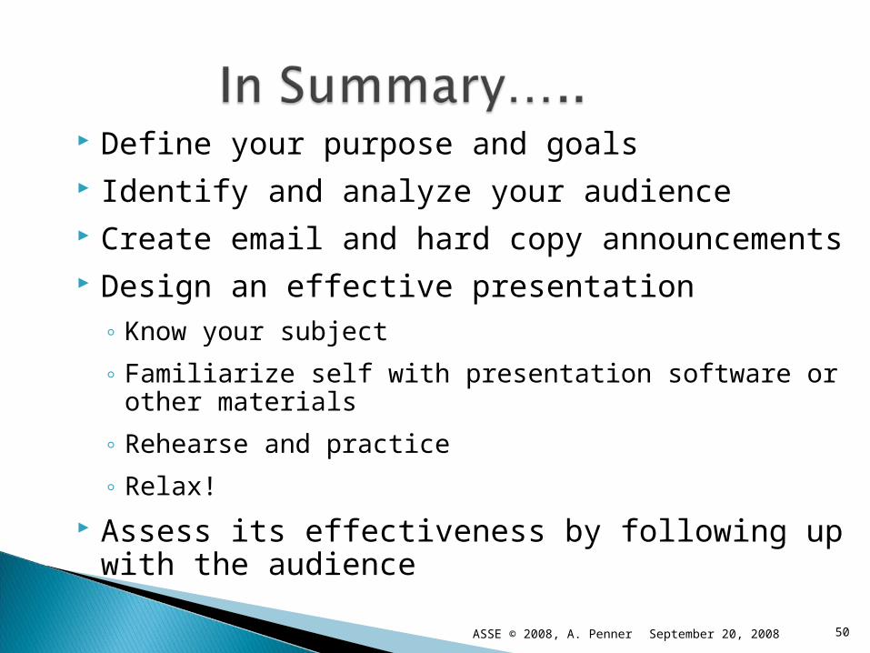
Define your purpose and goals Identify and analyze your audience Create email and hard copy announcements Design an effective presentation
◦ Know your subject
◦ Familiarize self with presentation software or other materials
◦ Rehearse and practice
◦ Relax!
Assess its effectiveness by following up with the audience
50September 20, 2008ASSE © 2008, A. Penner

September 20, 2008ASSE © 2008, A. Penner 51
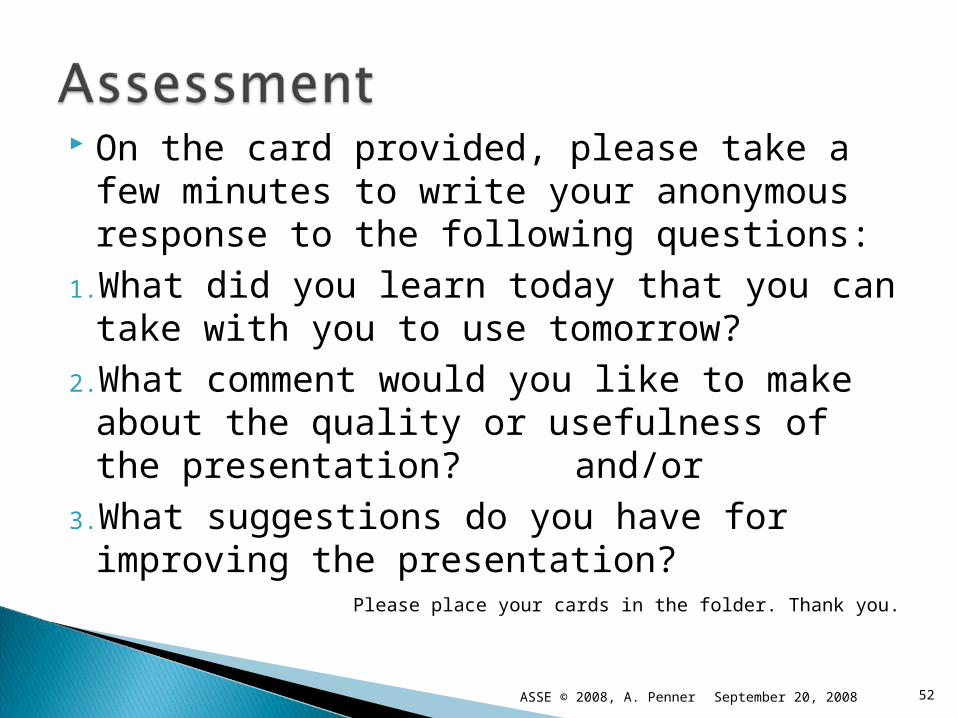
On the card provided, please take a few minutes to write your anonymous response to the following questions:
1.What did you learn today that you can take with you to use tomorrow?
2.What comment would you like to make about the quality or usefulness of the presentation? and/or
3.What suggestions do you have for improving the presentation?
Please place your cards in the folder. Thank you.
September 20, 2008 52ASSE © 2008, A. Penner
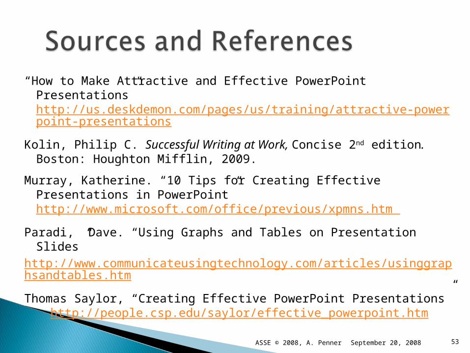
“How to Make Attractive and Effective PowerPoint Presentations” http://us.deskdemon.com/pages/us/training/attractive-powerpoint-presentations
Kolin, Philip C. Successful Writing at Work, Concise 2nd edition. Boston: Houghton Mifflin, 2009.
Murray, Katherine. “10 Tips for Creating Effective Presentations in PowerPoint” http://www.microsoft.com/office/previous/xpmns.htm
Paradi, Dave. “Using Graphs and Tables on Presentation Slides” http://www.communicateusingtechnology.com/articles/usinggraphsandtables.htm
Thomas Saylor, “Creating Effective PowerPoint Presentations” http://people.csp.edu/saylor/effective_powerpoint.htm
53September 20, 2008ASSE © 2008, A. Penner