ancillary task analysis taylor swift
TRANSCRIPT

Ancillary Task Taylor Swift
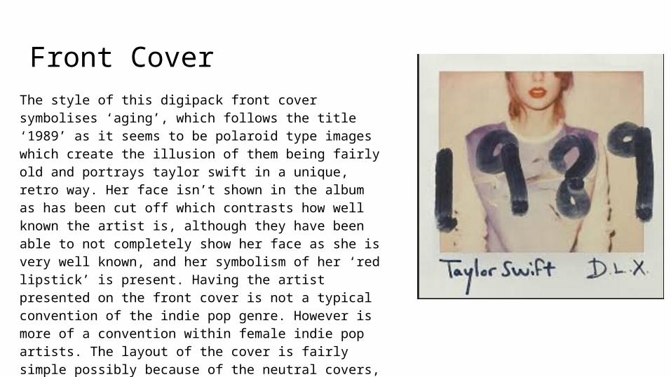
Front Cover The style of this digipack front cover symbolises ‘aging’, which follows the title ‘1989’ as it seems to be polaroid type images which create the illusion of them being fairly old and portrays taylor swift in a unique, retro way. Her face isn’t shown in the album as has been cut off which contrasts how well known the artist is, although they have been able to not completely show her face as she is very well known, and her symbolism of her ‘red lipstick’ is present. Having the artist presented on the front cover is not a typical convention of the indie pop genre. However is more of a convention within female indie pop artists. The layout of the cover is fairly simple possibly because of the neutral covers, pastel colours used which links to a fairly soft and warm fell to it. which implies that the songs on the album will follow this mood.
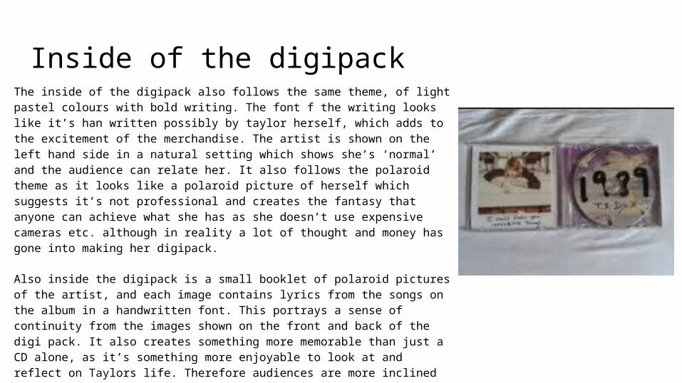
Inside of the digipack The inside of the digipack also follows the same theme, of light pastel colours with bold writing. The font f the writing looks like it’s han written possibly by taylor herself, which adds to the excitement of the merchandise. The artist is shown on the left hand side in a natural setting which shows she’s ‘normal’ and the audience can relate her. It also follows the polaroid theme as it looks like a polaroid picture of herself which suggests it’s not professional and creates the fantasy that anyone can achieve what she has as she doesn’t use expensive cameras etc. although in reality a lot of thought and money has gone into making her digipack.
Also inside the digipack is a small booklet of polaroid pictures of the artist, and each image contains lyrics from the songs on the album in a handwritten font. This portrays a sense of continuity from the images shown on the front and back of the digi pack. It also creates something more memorable than just a CD alone, as it’s something more enjoyable to look at and reflect on Taylors life. Therefore audiences are more inclined to buy as it has something extra in it.
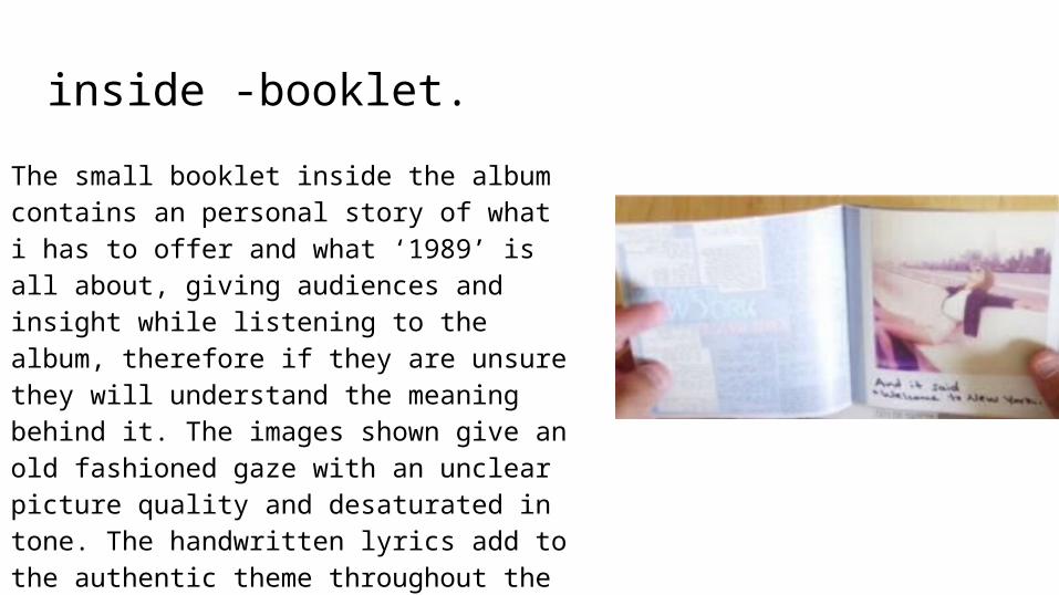
inside -booklet.The small booklet inside the album contains an personal story of what i has to offer and what ‘1989’ is all about, giving audiences and insight while listening to the album, therefore if they are unsure they will understand the meaning behind it. The images shown give an old fashioned gaze with an unclear picture quality and desaturated in tone. The handwritten lyrics add to the authentic theme throughout the digipak as it’s as if it been personally hand written by the artist.
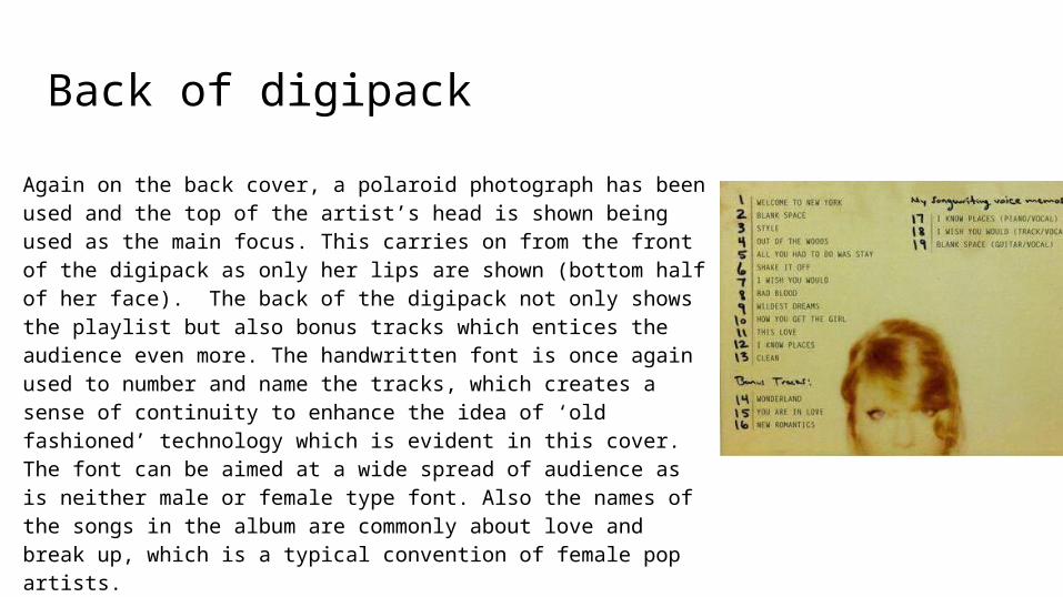
Back of digipackAgain on the back cover, a polaroid photograph has been used and the top of the artist’s head is shown being used as the main focus. This carries on from the front of the digipack as only her lips are shown (bottom half of her face). The back of the digipack not only shows the playlist but also bonus tracks which entices the audience even more. The handwritten font is once again used to number and name the tracks, which creates a sense of continuity to enhance the idea of ‘old fashioned’ technology which is evident in this cover. The font can be aimed at a wide spread of audience as is neither male or female type font. Also the names of the songs in the album are commonly about love and break up, which is a typical convention of female pop artists.
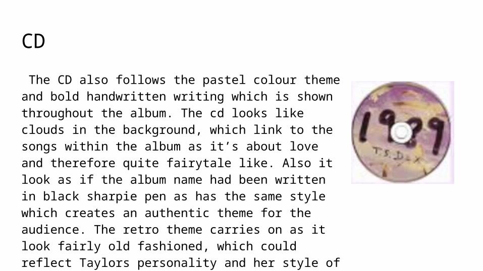
CD The CD also follows the pastel colour theme and bold handwritten writing which is shown throughout the album. The cd looks like clouds in the background, which link to the songs within the album as it’s about love and therefore quite fairytale like. Also it look as if the album name had been written in black sharpie pen as has the same style which creates an authentic theme for the audience. The retro theme carries on as it look fairly old fashioned, which could reflect Taylors personality and her style of songs throughout the digipak.