analyze the product’s visual properties using visual analysis visual design principles and visual...
TRANSCRIPT

Elements and Principles of Design
Elements and Principles of Design• Analyze the product’s visual properties using
Visual Analysis • Visual design principles and Visual design
elements constitute an aesthetic vocabulary that is used to describe an object.
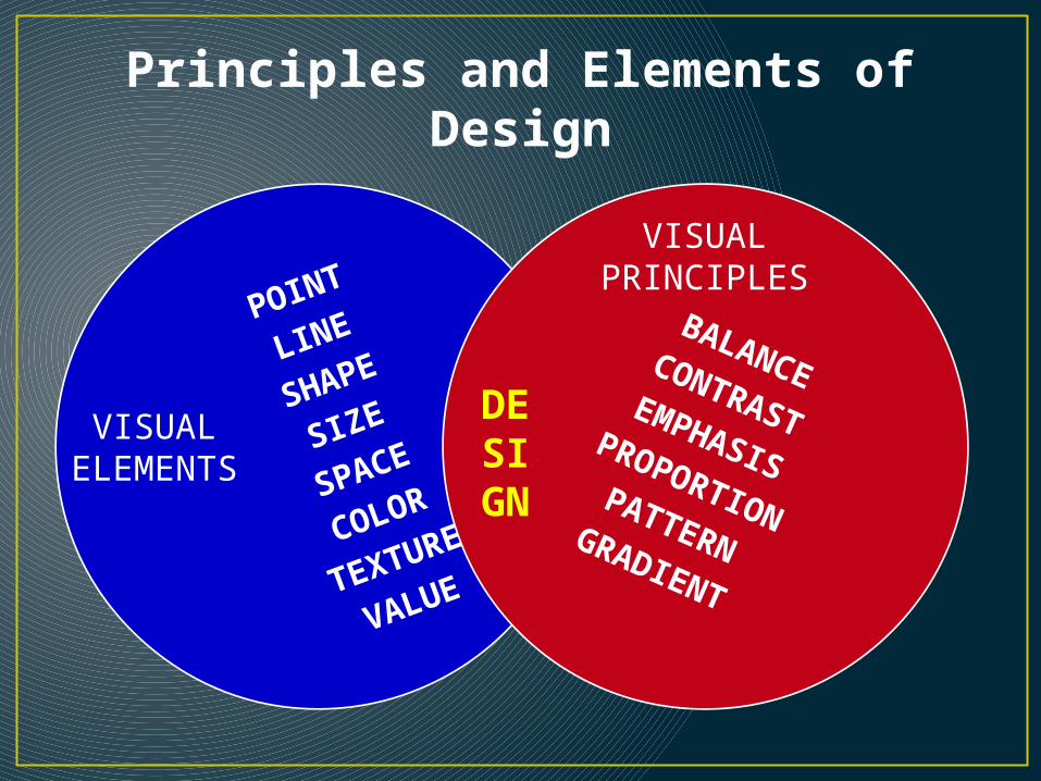
POINT
LINE
SHAPE
SIZE
SPACE
COLOR
TEXTURE
VALUE
BALANCECONTRASTEMPHASISPROPORTIONPATTERNGRADIENT
DESIGN
Principles and Elements of Design
VISUALELEMENTS
VISUALPRINCIPLES

Eight integral components used in the creation of a design:
VISUAL DESIGN ELEMENTS
The elements are like baking/cooking ingredients that can be mixed together in a recipe.
POINTLINESHAPESIZESPACECOLORTEXTUREVALUE
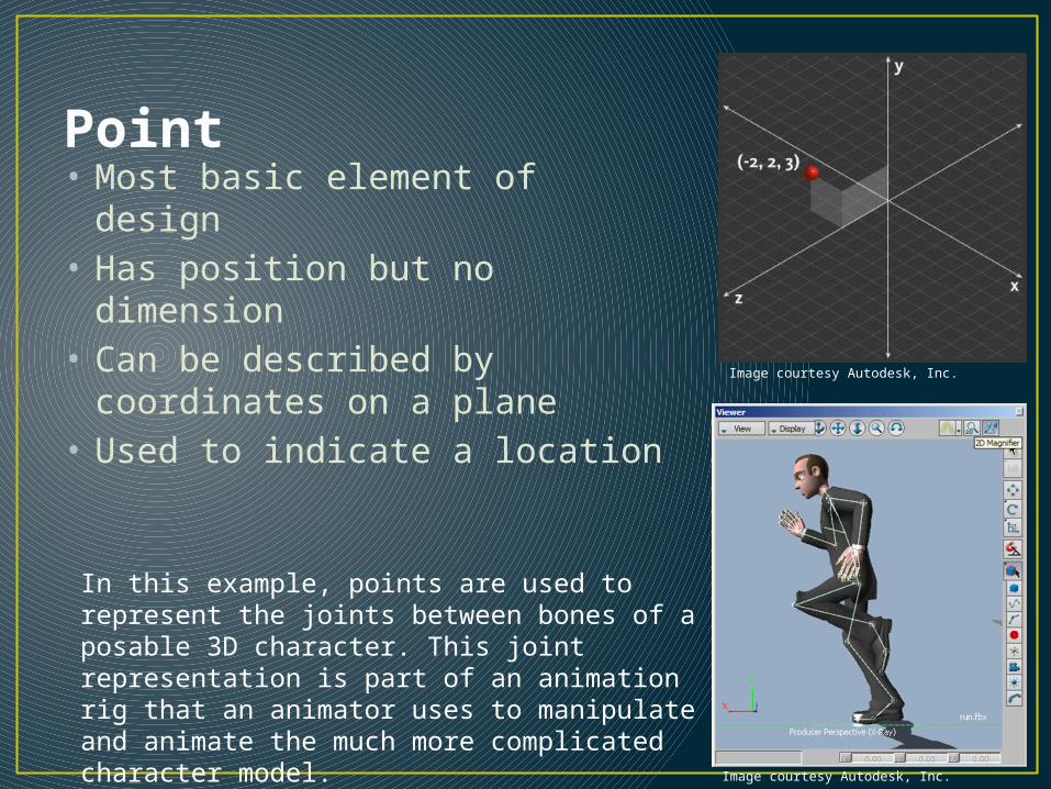
Point• Most basic element of design• Has position but no dimension• Can be described by coordinates
on a plane• Used to indicate a location
Image courtesy Autodesk, Inc.
Image courtesy Autodesk, Inc.
In this example, points are used to represent the joints between bones of a posable 3D character. This joint representation is part of an animation rig that an animator uses to manipulate and animate the much more complicated character model.
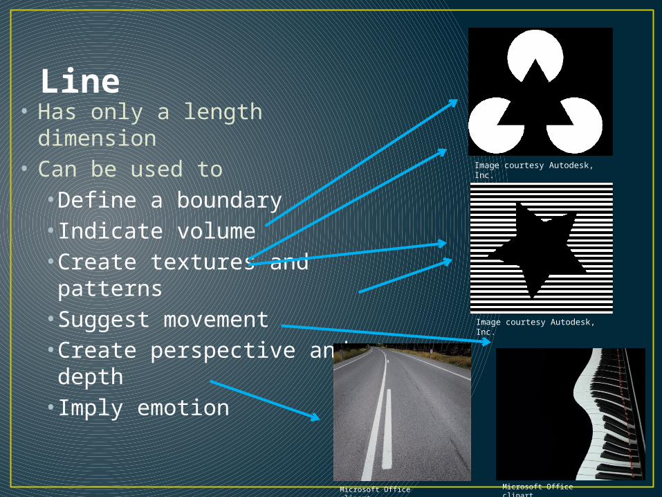
Line• Has only a length
dimension• Can be used to
• Define a boundary• Indicate volume• Create textures and patterns
• Suggest movement• Create perspective and depth
• Imply emotion
Image courtesy Autodesk, Inc.
Image courtesy Autodesk, Inc.
Microsoft Office clipart Microsoft Office clipart

HORIZONTAL LINES- Represent calm, peace and relaxation.
VERTICAL LINES Represents dignity, formality, stability and strength.
DIAGONAL LINES- Represent action, activity, excitement and movement.
CURVED LINES- Represents freedom, the appearance of the natural, softness and creates a soothing feeling or mood.

ColorDescribed by a number of qualities• Hue: base color (e.g., red)
• Value: lightness or darkness
• Saturation: purity or intensity relative to gray
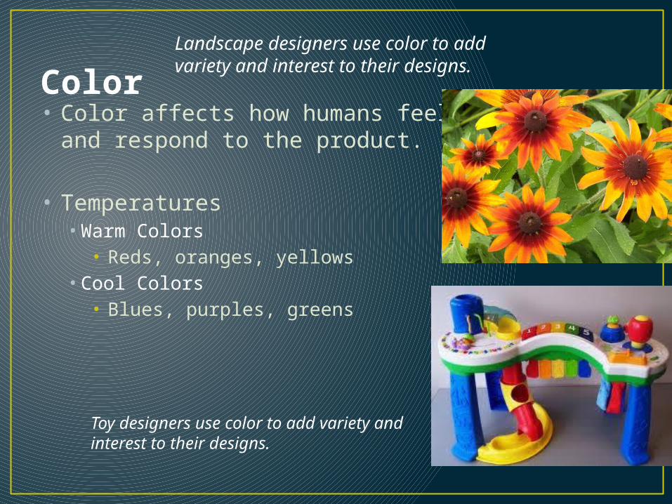
Color• Color affects how humans feel and
respond to the product.
• Temperatures• Warm Colors
• Reds, oranges, yellows• Cool Colors
• Blues, purples, greens
Landscape designers use color to add variety and interest to their designs.
Toy designers use color to add variety and interest to their designs.

Color• Color has an immediate and profound effect on a
design
Microsoft Office clipart
Microsoft Office clipart
Many colors can have a cultural, historical, or popular connotation. Green, for example, is associated with plants and nature and often implies environmental and ecological awareness.
Designers can use these color associations to their advantage and use colors to provoke desired thoughts and emotions.

Value• Relative lightness or darkness of a color, object, or
shape
Microsoft Office clipart
Color Gradient
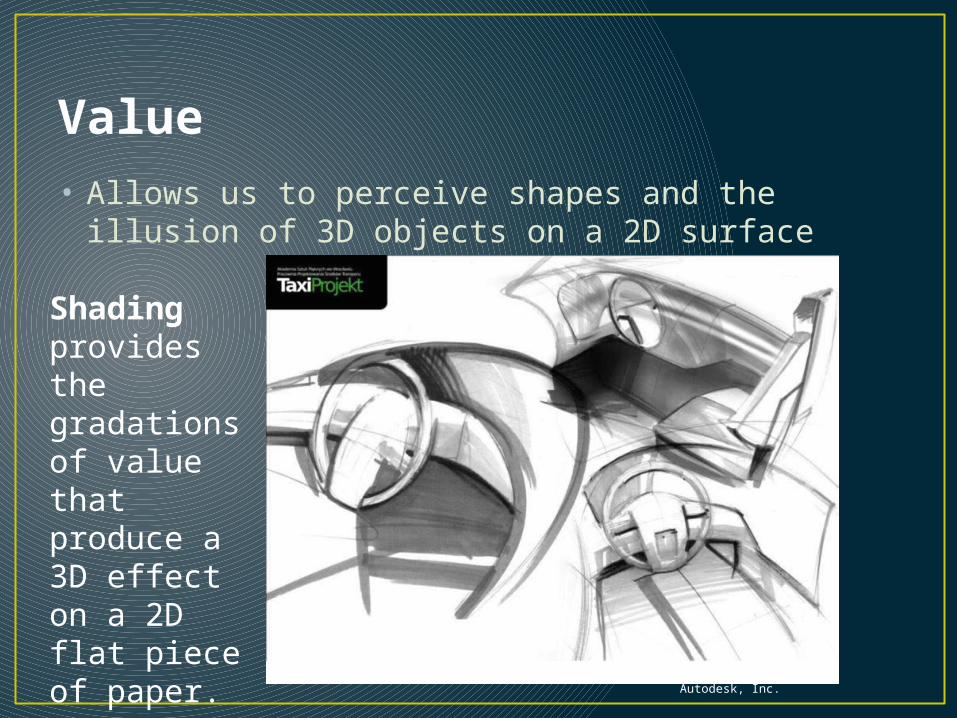
Value• Allows us to perceive shapes and the illusion of 3D
objects on a 2D surface
Image courtesy Autodesk, Inc.
Shading provides the gradations of value that produce a 3D effect on a 2D flat piece of paper.
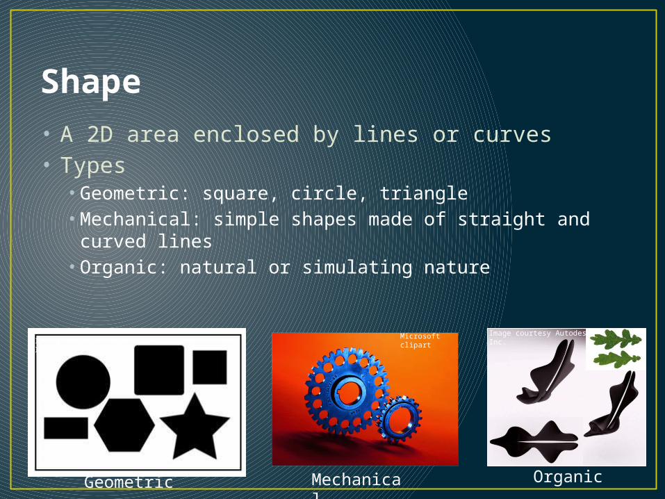
Shape• A 2D area enclosed by lines or curves• Types
• Geometric: square, circle, triangle• Mechanical: simple shapes made of straight and curved
lines• Organic: natural or simulating nature
Image courtesy Autodesk, Inc.Microsoft clipart
Geometric
Image courtesy Autodesk, Inc.
Mechanical Organic

Examples
• Squares
• Circles
• Ellipses
• Ovals
• Rectangles
• Triangles
Shape
The shape, outline, or configuration of anything.
Note how the same function is served but the form and shapes are different
Organic shapes are frequently used in consumer products. The most efficient shapes for performing specific tasks can often be found in nature.

Form• A 3D volume or solid• Often implied on a 2D surface by careful use of
value
Image courtesy Autodesk, Inc.

http://www.autoexpress.co.uk/carreviews/firstdrives/213666/nissan_mixim.html2007
Form follows function

Space• Areas between and around parts of an image or
the implied depth in that image• Types
• Positive• Negative
Image courtesy Autodesk, Inc.©iStockphoto.com
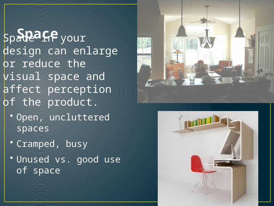
Space in your design can enlarge or reduce the visual space and affect perception of the product.
• Open, uncluttered spaces
• Cramped, busy
• Unused vs. good use of space
Space

Types
• Smooth surface
• Reflects more light and, therefore, is a more intense color.
• Rough surface
• Absorbs more light and, therefore, appears darker.
Texture• The surface look or feel of
something.
Visual Design Principles
There are five principles that encompass an interesting design.
The principles of design are like how you combine and utilize baking ingredients. Do you blend, whip or fold, do you fry, bake or broil, slow roast or microwave? How much flour, salt, spice or baking powder do you use?

Principles of Design• Many principles add to an interesting design
• Balance
• Emphasis
• Contrast
• Rhythm
• Proportion
• Unity
• Economy
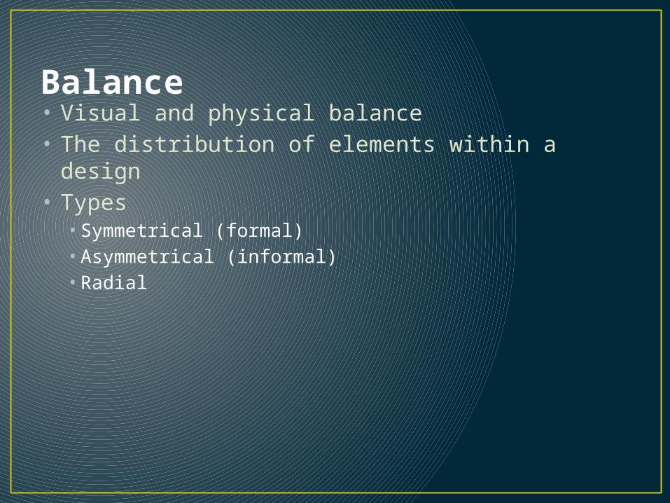
Balance• Visual and physical balance• The distribution of elements within a design• Types
• Symmetrical (formal) • Asymmetrical (informal)• Radial

Symmetrical (Formal) Balance• The elements within the design are identical in
visual weight in relation to a centerline or axis
The Taj Mahal MausoleumAgra, Uttar Pradesh, India
©iStockphoto.com
Microsoft clipart
©iStockphoto.com
Microsoft Office clipart

Asymmetrical (Informal) Balance• The elements within the design are not identical
but are arranged to provide a balanced visual weight
Image courtesy Autodesk, Inc.
Microsoft Office clipart

Radial Balance• Distribution of components in a circular pattern
around a center point
Microsoft clipart
Microsoft Office clipart
Dresden FrauenkircheDresden, Germay
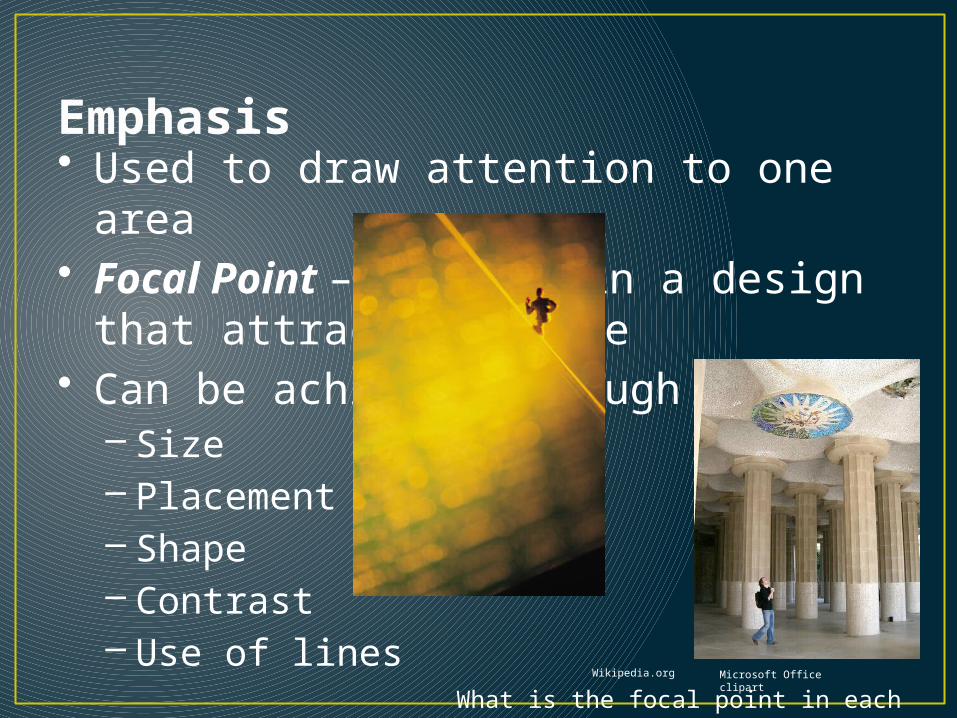
• Used to draw attention to one area• Focal Point – feature in a design
that attracts the eye• Can be achieved through
– Size– Placement – Shape– Contrast– Use of lines
Emphasis
Wikipedia.org Microsoft Office clipart
What is the focal point in each composition?
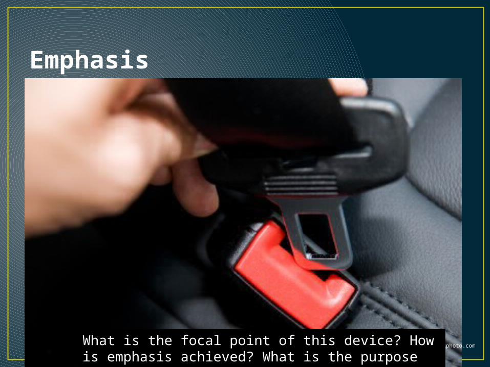
Emphasis
Microsoft clipart ©iStockphoto.com What is the focal point of this device? How is emphasis achieved? What is the purpose of the emphasis?

• The degree of relative difference between elements
ContrastMicrosoft Office clipart
©iStockphoto.com
Image courtesy Autodesk, Inc.
This shows contrast between natural and man-made objects as well as contrast in
texture and color

• Can be used to emphasize an element of a design
Contrast
Image courtesy Autodesk, Inc.
In the line drawings, the designer provides emphasis with fills of color on an otherwise neutral composition.

• Repeated use of line, shape, color, texture or pattern
• A harmonious pattern or sequence• Types
– Regular– Random– Gradated– Graduated
Rhythm
Microsoft Office clipart

• An element is repeated at the same repetition/interval
Regular Rhythm
Microsoft Office clipart

Random Rhythm
Microsoft Office clipart
Microsoft Office clipart
• The repetition of the element is random or situated at irregular intervals
Gradated Rhythm
www.wikimedia.org
Left: Stack of rocks used as focal point in landscaping
Microsoft Office clipart
Right: The Chinese Tower English GardensMunich, Germany
Microsoft Office clipart
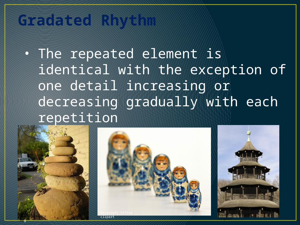
• The repeated element is identical with the exception of one detail increasing or decreasing gradually with each repetition
Graduated Rhythm
Microsoft Office clipart
Microsoft Office clipart
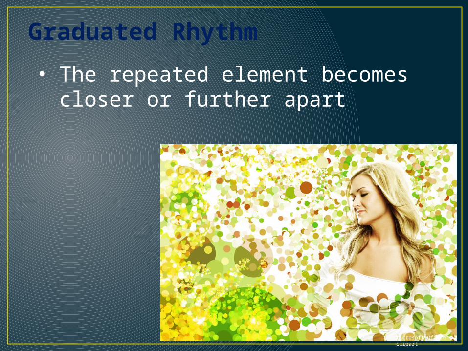
• The repeated element becomes closer or further apart
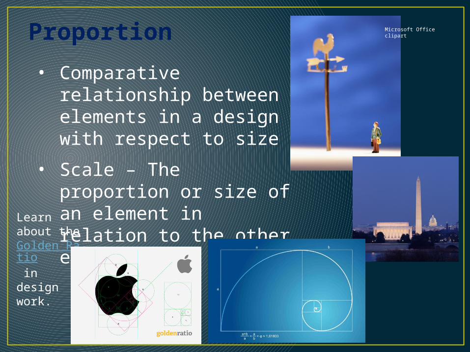
• Comparative relationship between elements in a design with respect to size
• Scale – The proportion or size of an element in relation to the other elements
Proportion Microsoft Office clipart
Learn about the Golden Ratio in design work.

• The consistent use of design elements
Unity
©iStockphoto.com
Microsoft Office clipart

• Use of the bare minimum of elements• Can be achieved by removing extraneous
elements• In simplicity there is beauty• Less is more
Economy
If you can remove an element within a design, and the design still accomplishes the goals within the constraints, you have practiced economy of design.
Graphic signs provide good examples of economy because they often simplify a complex idea with only essential details.
Simplicity in Design: iMac Vs. PC

VISUAL ANALYSIS of your product
1. Take 3 pictures of your product (T, FR, RS)
2. Put them into 1 Powerpoint slide.
3. Save slide in your team SHARE folder
4. Label the pictures/views
5. Apply design elements and principles analysis to your product.
6. On the next slide is an example of how to fill in the Visual Analysis matrix handed out in class.
7. At left is a an example of how the concepts are applied in a more narrative format.
