analysis of fonts
TRANSCRIPT

Lemon/Milk fontI like this font as it is very sharp and bold and I feel it will easily catch the audiences’ attention. But I feel it is a very conventional and similar font that is used a lot for music magazines and I feel this wouldn’t make the masthead stand out.
Bebas fontI like this font as the letters are very sharp and defined which automatically makes the text stand out but I feel the letters are very close together and won’t spread out across the header for the front cover which is the layout I want.
FFF Light Trial fontI like this font as it will contrast well against the background as it is a very thin font but I feel due to the fact it is a thin font, the masthead may not stand out as much as it would with a bolder font.
The Next FontI like this font as it is very bold and defined and I feel this will easily stand out and capture the audiences’ attention and I feel this definitely is a contender for my magazine masthead font.

Mermaid fontI like this font as it is unconventional and will make my magazine stand out because it is unique. But, I feel that due to the fact my style of my magazine is going to be very dramatic due to the colour palette of black, white and red so I feel this font won’t work with my overall look of the magazine.
Romance Fatal Serif fontI like this font as it is very individual but I feel due to the fact it is very thin, it won’t stand out and I also feel that the style doesn’t work with my genre of alternative rock.
Arual fontI feel this is a very nice font and I feel will work well for the Contents header but I feel it is too thin for the masthead to stand out.
Couture fontI like this font as it is very bold and dramatic so I feel it works well with the overall look I want for this magazine and I can’t see any negatives.
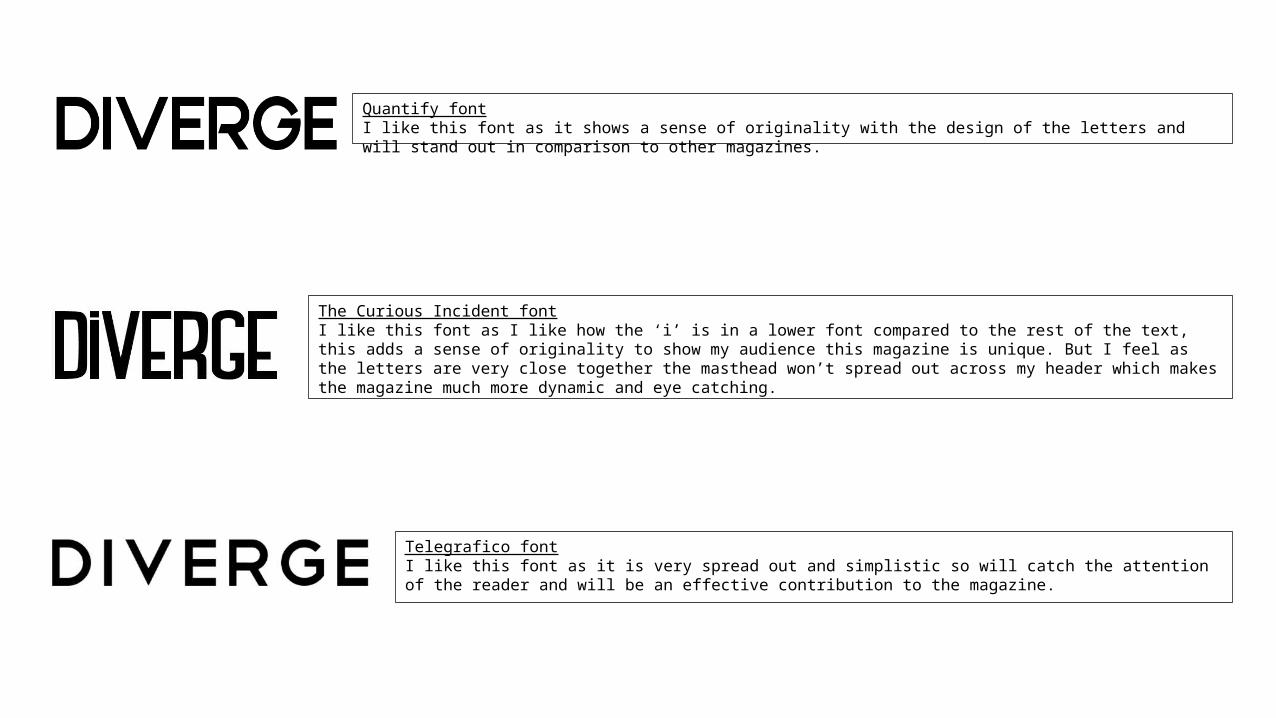
Quantify fontI like this font as it shows a sense of originality with the design of the letters and will stand out in comparison to other magazines.
The Curious Incident fontI like this font as I like how the ‘i’ is in a lower font compared to the rest of the text, this adds a sense of originality to show my audience this magazine is unique. But I feel as the letters are very close together the masthead won’t spread out across my header which makes the magazine much more dynamic and eye catching.
Telegrafico fontI like this font as it is very spread out and simplistic so will catch the attention of the reader and will be an effective contribution to the magazine.
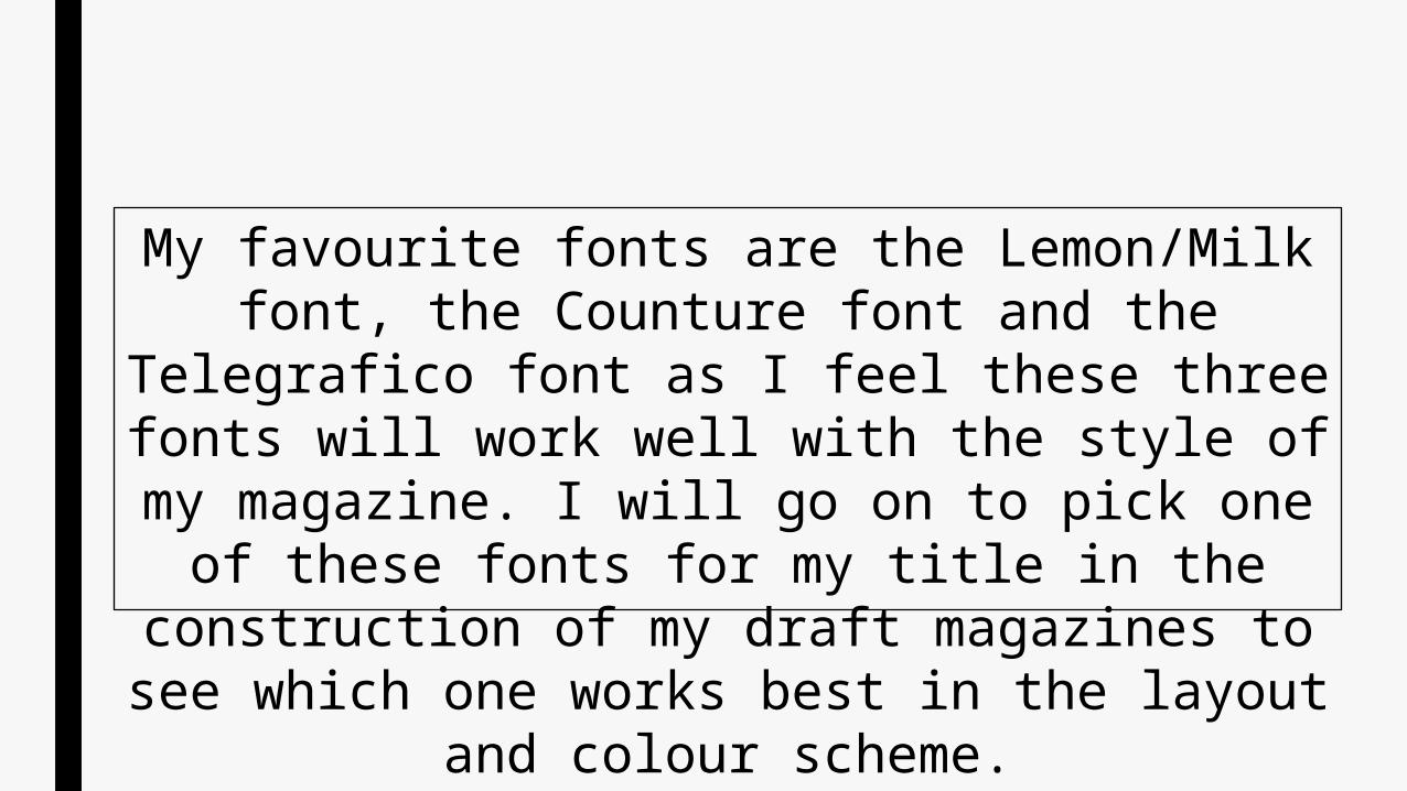
My favourite fonts are the Lemon/Milk font, the Counture font and the Telegrafico font as I feel these
three fonts will work well with the style of my magazine. I will go on to pick one of these fonts for my title in the construction of my draft magazines to see
which one works best in the layout and colour scheme.