akzonobel decorative paints global aesthetic center ...… · the colour of the year and create...
TRANSCRIPT
AKZONOBEL DECORATIVE PAINTS
GLOBAL AESTHETIC CENTER PRESENTS
COLOURFUTURES 2020TM
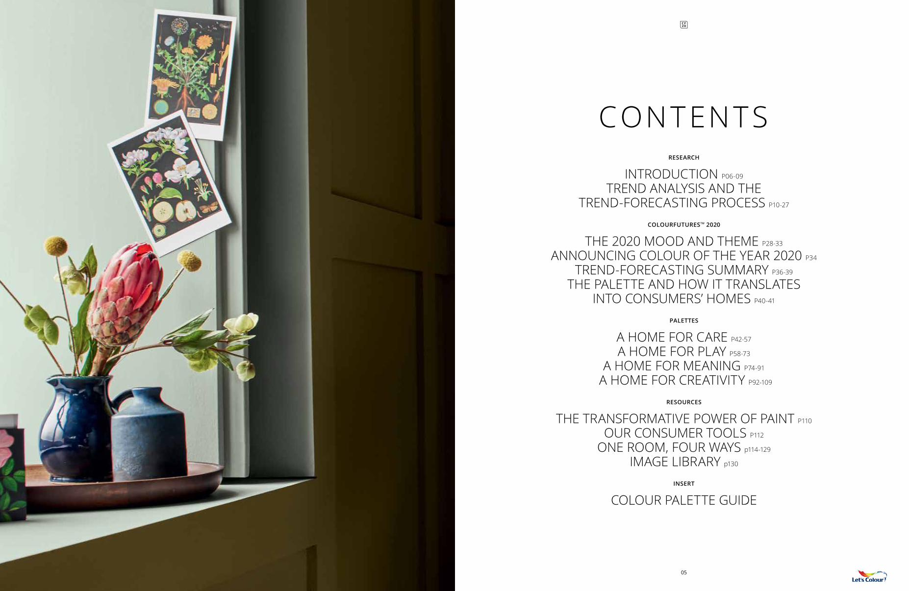
CONTENTSRESEARCH
INTRODUCTION P06-09 TREND ANALYSIS AND THE
TREND-FORECASTING PROCESS P10-27 COLOURFUTURESTM 2020
THE 2020 MOOD AND THEME P28-33 ANNOUNCING COLOUR OF THE YEAR 2020 P34
TREND-FORECASTING SUMMARY P36-39 THE PALETTE AND HOW IT TRANSLATES
INTO CONSUMERS’ HOMES P40-41
PALETTES
A HOME FOR CARE P42-57 A HOME FOR PLAY P58-73
A HOME FOR MEANING P74-91 A HOME FOR CREATIVITY P92-109
RESOURCES
THE TRANSFORMATIVE POWER OF PAINT P110 OUR CONSUMER TOOLS P112
ONE ROOM, FOUR WAYS p114-129 IMAGE LIBRARY p130
INSERT
COLOUR PALETTE GUIDE
05
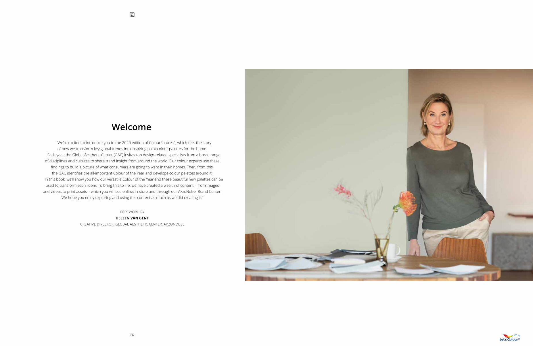
Welcome
FOREWORD BY
HELEEN VAN GENT
CREATIVE DIRECTOR, GLOBAL AESTHETIC CENTER, AKZONOBEL
“We’re excited to introduce you to the 2020 edition of ColourFuturesTM, which tells the story of how we transform key global trends into inspiring paint colour palettes for the home.
Each year, the Global Aesthetic Center (GAC) invites top design-related specialists from a broad range of disciplines and cultures to share trend insight from around the world. Our colour experts use these
findings to build a picture of what consumers are going to want in their homes. Then, from this, the GAC identifies the all-important Colour of the Year and develops colour palettes around it.
In this book, we’ll show you how our versatile Colour of the Year and these beautiful new palettes can be used to transform each room. To bring this to life, we have created a wealth of content – from images
and videos to print assets – which you will see online, in store and through our AkzoNobel Brand Center. We hope you enjoy exploring and using this content as much as we did creating it.”
06
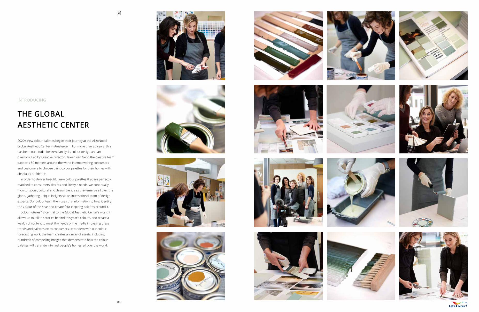
08
THE GLOBALAESTHETIC CENTER
2020’s new colour palettes began their journey at the AkzoNobel
Global Aesthetic Center in Amsterdam. For more than 25 years, this
has been our studio for trend analysis, colour design and art
direction. Led by Creative Director Heleen van Gent, the creative team
supports 80 markets around the world in empowering consumers
and customers to choose paint colour palettes for their homes with
absolute confidence.
In order to deliver beautiful new colour palettes that are perfectly
matched to consumers’ desires and lifestyle needs, we continually
monitor social, cultural and design trends as they emerge all over the
globe, gathering unique insights via an international team of design
experts. Our colour team then uses this information to help identify
the Colour of the Year and create four inspiring palettes around it.
ColourFuturesTM is central to the Global Aesthetic Center’s work. It
allows us to tell the stories behind this year’s colours, and create a
wealth of content to meet the needs of the media in passing these
trends and palettes on to consumers. In tandem with our colour
forecasting work, the team creates an array of assets, including
hundreds of compelling images that demonstrate how the colour
palettes will translate into real people’s homes, all over the world.
INTRODUCING
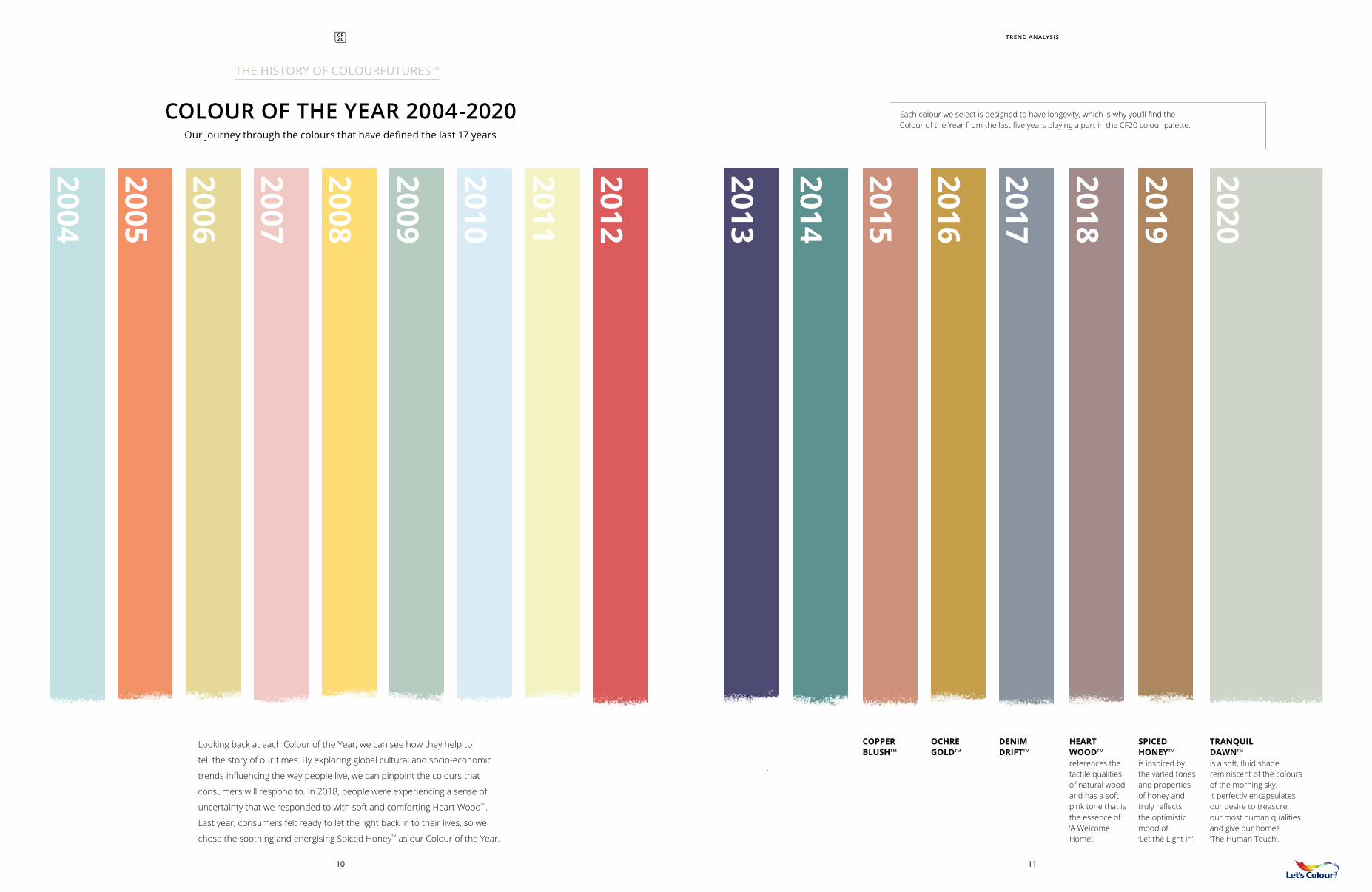
2005
2006
2007
2008
2009
2010
2011
2012
2013
2014
2015
2016
2017
2018
2019
2020
2004
Each colour we select is designed to have longevity, which is why you’ll find the Colour of the Year from the last five years playing a part in the CF20 colour palette.
COLOUR OF THE YEAR 2004-2020Our journey through the colours that have defined the last 17 years
THE HISTORY OF COLOURFUTURES TM
TREND ANALYSIS
HEART WOODTM references the tactile qualities of natural wood and has a soft pink tone that is the essence of ‘A Welcome Home’.
DENIM DRIFTTM
OCHRE GOLDTM
COPPER BLUSHTM
SPICED HONEYTM is inspired by the varied tones and properties of honey and truly reflects the optimistic mood of ‘Let the Light in’.
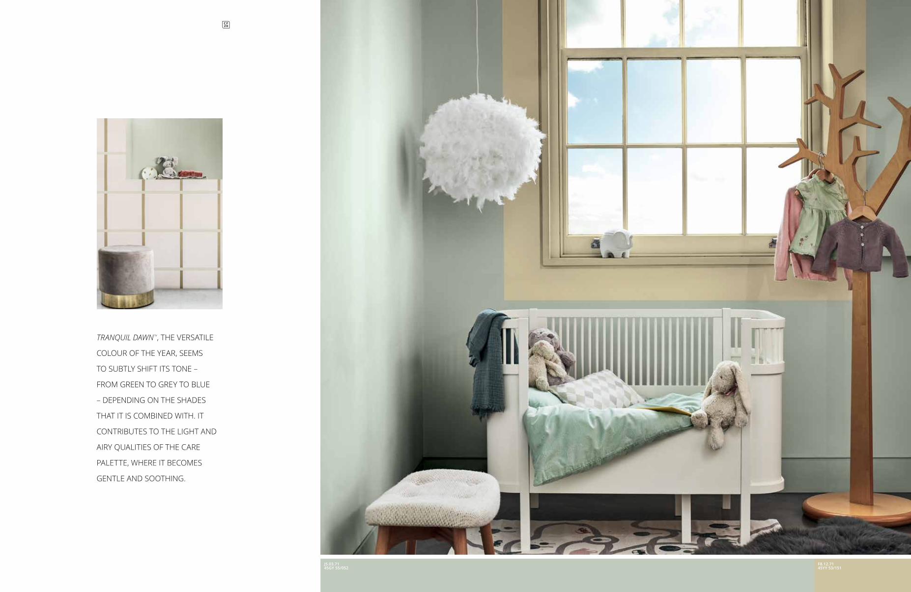
TRANQUIL DAWNTM is a soft, fluid shade reminiscent of the colours of the morning sky. It perfectly encapsulates our desire to treasure our most human qualities and give our homes ‘The Human Touch’.
Looking back at each Colour of the Year, we can see how they help to
tell the story of our times. By exploring global cultural and socio-economic
trends influencing the way people live, we can pinpoint the colours that
consumers will respond to. In 2018, people were experiencing a sense of
uncertainty that we responded to with soft and comforting Heart WoodTM.
Last year, consumers felt ready to let the light back in to their lives, so we
chose the soothing and energising Spiced HoneyTM as our Colour of the Year.
1110
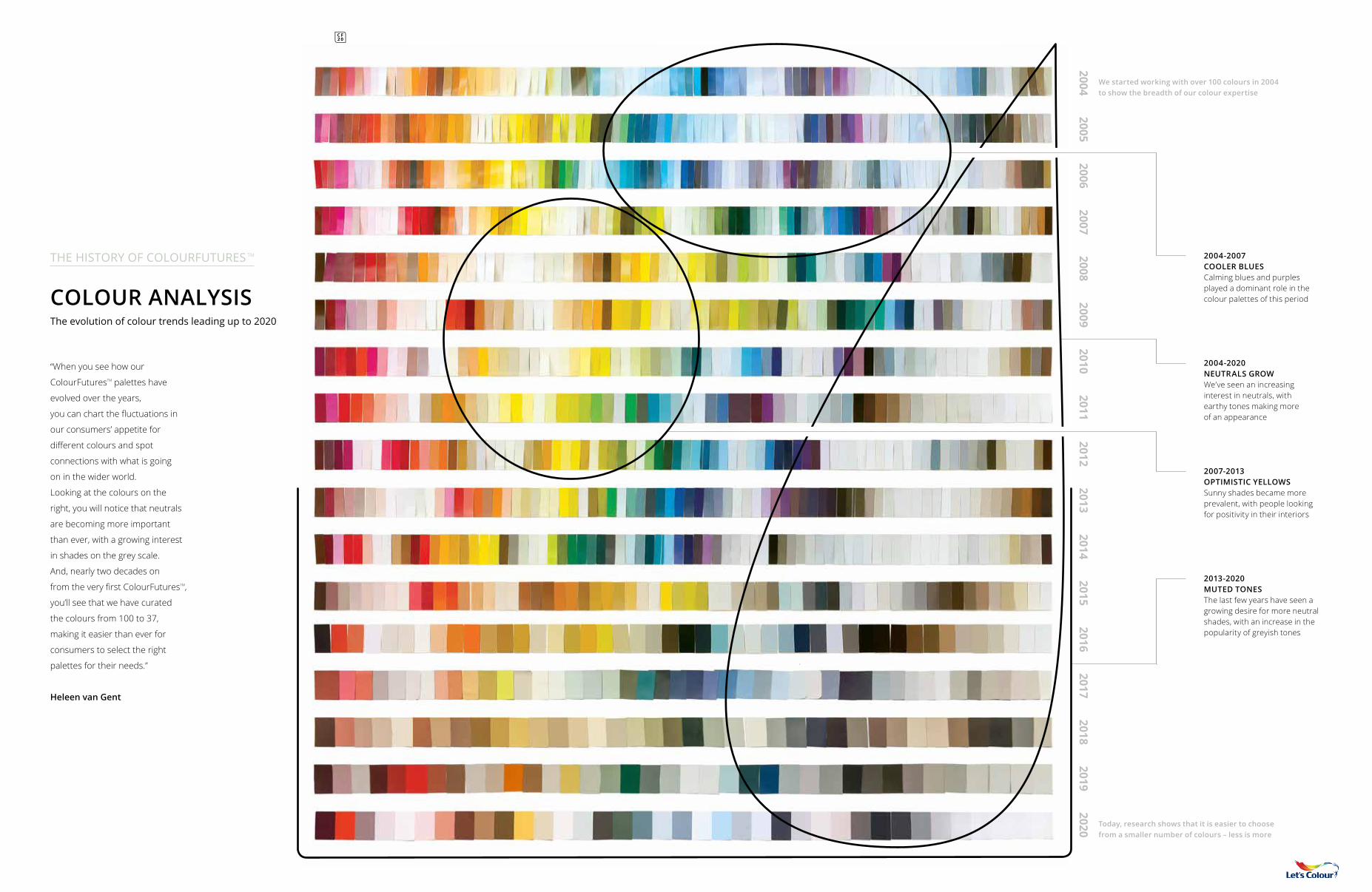
COLOUR ANALYSIS The evolution of colour trends leading up to 2020
“When you see how our
ColourFuturesTM palettes have
evolved over the years,
you can chart the fluctuations in
our consumers’ appetite for
different colours and spot
connections with what is going
on in the wider world.
Looking at the colours on the
right, you will notice that neutrals
are becoming more important
than ever, with a growing interest
in shades on the grey scale.
And, nearly two decades on
from the very first ColourFuturesTM,
you’ll see that we have curated
the colours from 100 to 37,
making it easier than ever for
consumers to select the right
palettes for their needs.”
Heleen van Gent
THE HISTORY OF COLOURFUTURES TM
2004-2020 NEUTRALS GROWWe’ve seen an increasing interest in neutrals, with earthy tones making more of an appearance
2004-2007 COOLER BLUESCalming blues and purples played a dominant role in the colour palettes of this period
2007-2013 OPTIMISTIC YELLOWSSunny shades became more prevalent, with people looking for positivity in their interiors
2013-2020 MUTED TONESThe last few years have seen a growing desire for more neutral shades, with an increase in the popularity of greyish tones
We started working with over 100 colours in 2004 to show the breadth of our colour expertise
Today, research shows that it is easier to choose from a smaller number of colours – less is more
20052004
20062007
20082009
20102011
20122013
20142015
20162017
20182019
2020
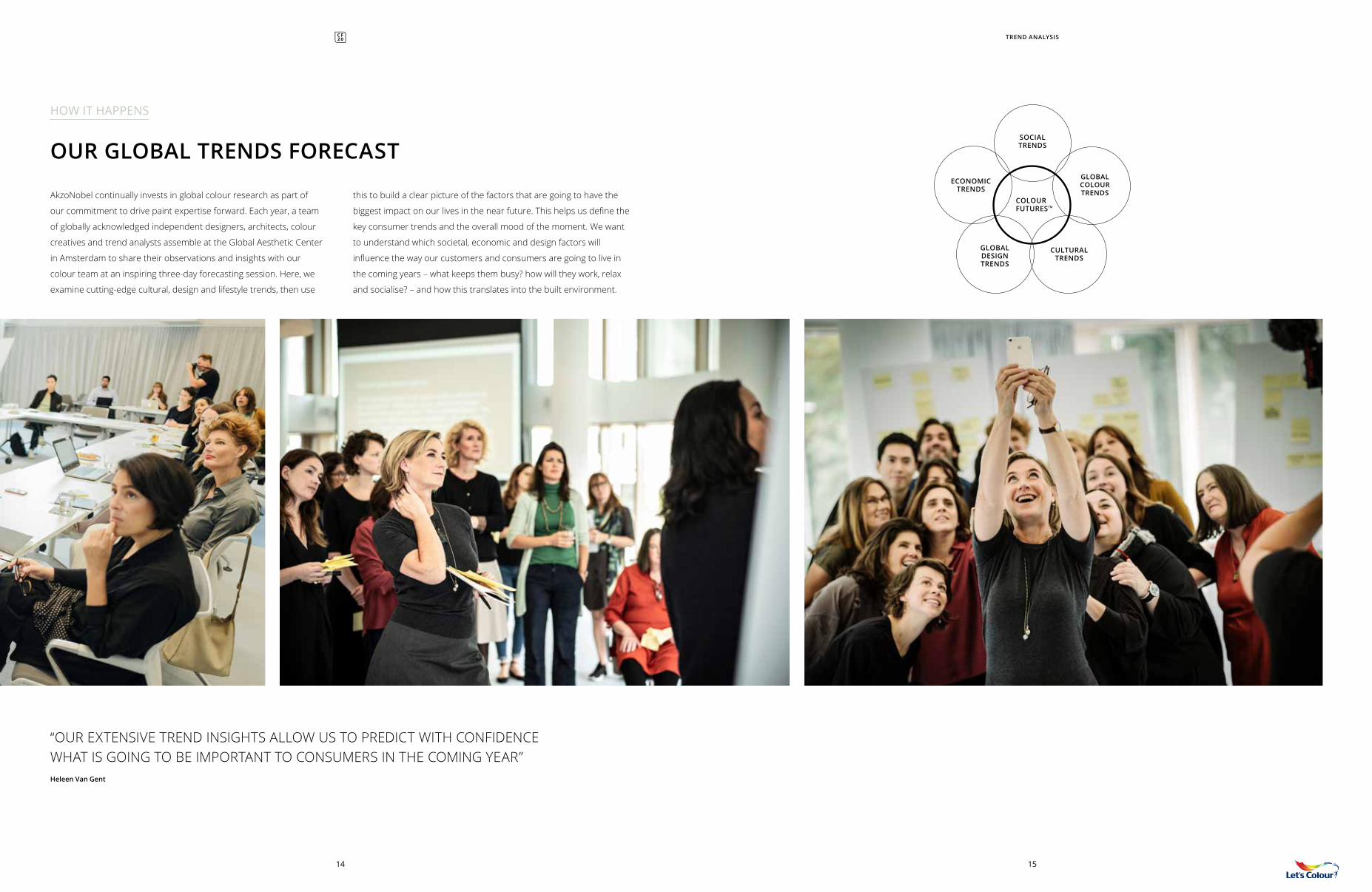
AkzoNobel continually invests in global colour research as part of
our commitment to drive paint expertise forward. Each year, a team
of globally acknowledged independent designers, architects, colour
creatives and trend analysts assemble at the Global Aesthetic Center
in Amsterdam to share their observations and insights with our
colour team at an inspiring three-day forecasting session. Here, we
examine cutting-edge cultural, design and lifestyle trends, then use
OUR GLOBAL TRENDS FORECAST
this to build a clear picture of the factors that are going to have the
biggest impact on our lives in the near future. This helps us define the
key consumer trends and the overall mood of the moment. We want
to understand which societal, economic and design factors will
influence the way our customers and consumers are going to live in
the coming years – what keeps them busy? how will they work, relax
and socialise? – and how this translates into the built environment.
“OUR EXTENSIVE TREND INSIGHTS ALLOW US TO PREDICT WITH CONFIDENCE WHAT IS GOING TO BE IMPORTANT TO CONSUMERS IN THE COMING YEAR”Heleen Van Gent
14 15
TREND ANALYSIS
SOCIAL TRENDS
ECONOMIC TRENDS
GLOBAL COLOUR TRENDS
COLOURFUTURESTM
CULTURAL TRENDS
GLOBAL DESIGN TRENDS
HOW IT HAPPENS
“IN 2020, WE ARE LOOKING TO NEW HORIZONS AND ASKING IMPORTANT QUESTIONS LIKE, WHAT DOES IT MEAN TO BE HUMAN?” Heleen van Gent
16 17
Heleen joined the Global Aesthetic Center in 2009, following 20 years
of working in the magazine industry as an interior stylist and design editor. After graduating
from The Royal Academy of Art in The Hague, she went on to teach at
the Artemis Design Academy in Amsterdam and has edited many
books on interior and colour design. She travels the world
offering guidance on colour and design to the AkzoNobel markets.
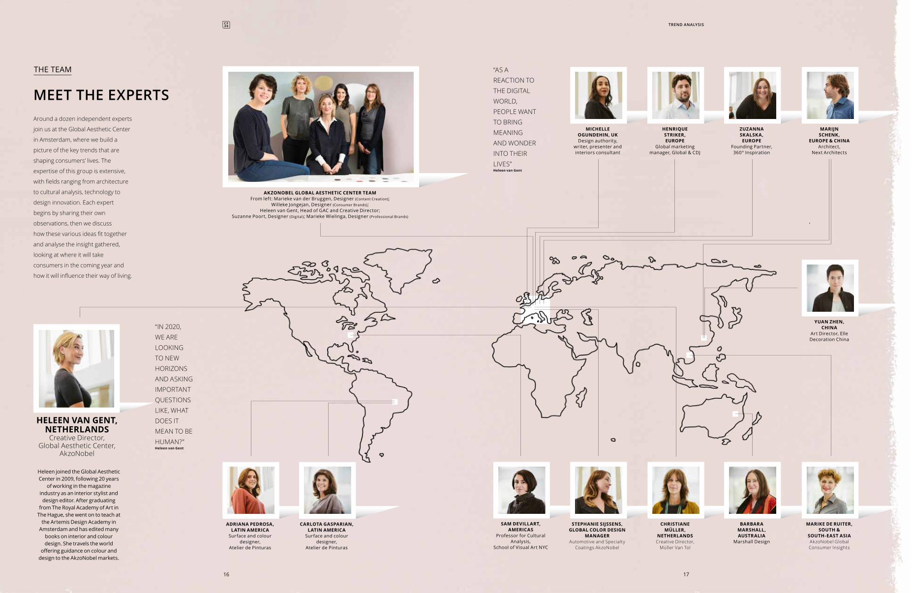
MEET THE EXPERTSAround a dozen independent experts
join us at the Global Aesthetic Center
in Amsterdam, where we build a
picture of the key trends that are
shaping consumers’ lives. The
expertise of this group is extensive,
with fields ranging from architecture
to cultural analysis, technology to
design innovation. Each expert
begins by sharing their own
observations, then we discuss
how these various ideas fit together
and analyse the insight gathered,
looking at where it will take
consumers in the coming year and
how it will influence their way of living.
HELEEN VAN GENT, NETHERLANDS
Creative Director, Global Aesthetic Center,
AkzoNobel
THE TEAM “AS A REACTION TO THE DIGITAL WORLD, PEOPLE WANT TO BRING MEANING AND WONDER INTO THEIR LIVES”Heleen van Gent
MARIJN SCHENK,
EUROPE & CHINAArchitect,
Next Architects
MICHELLE OGUNDEHIN, UK Design authority,
writer, presenter and interiors consultant
AKZONOBEL GLOBAL AESTHETIC CENTER TEAM From left: Marieke van der Bruggen, Designer (Content Creation);
Willeke Jongejan, Designer (Consumer Brands); Heleen van Gent, Head of GAC and Creative Director;
Suzanne Poort, Designer (Digital); Marieke Wielinga, Designer (Professional Brands)
CARLOTA GASPARIAN, LATIN AMERICA
Surface and colour designer,
Atelier de Pinturas
ADRIANA PEDROSA, LATIN AMERICA
Surface and colour designer,
Atelier de Pinturas
YUAN ZHEN, CHINA
Art Director, Elle Decoration China
HENRIQUE STRIKER, EUROPE
Global marketing manager, Global & CDJ
ZUZANNA SKALSKA, EUROPE
Founding Partner,360° Inspiration
STEPHANIE SIJSSENS, GLOBAL COLOR DESIGN
MANAGERAutomotive and Specialty
Coatings AkzoNobel
SAM DEVILLART, AMERICAS
Professor for Cultural Analysis,
School of Visual Art NYC
CHRISTIANE MÜLLER,
NETHERLANDSCreative Director,
Müller Van Tol
MARIKE DE RUITER, SOUTH &
SOUTH-EAST ASIAAkzoNobel Global Consumer Insights
BARBARA MARSHALL, AUSTRALIA
Marshall Design
TREND ANALYSIS
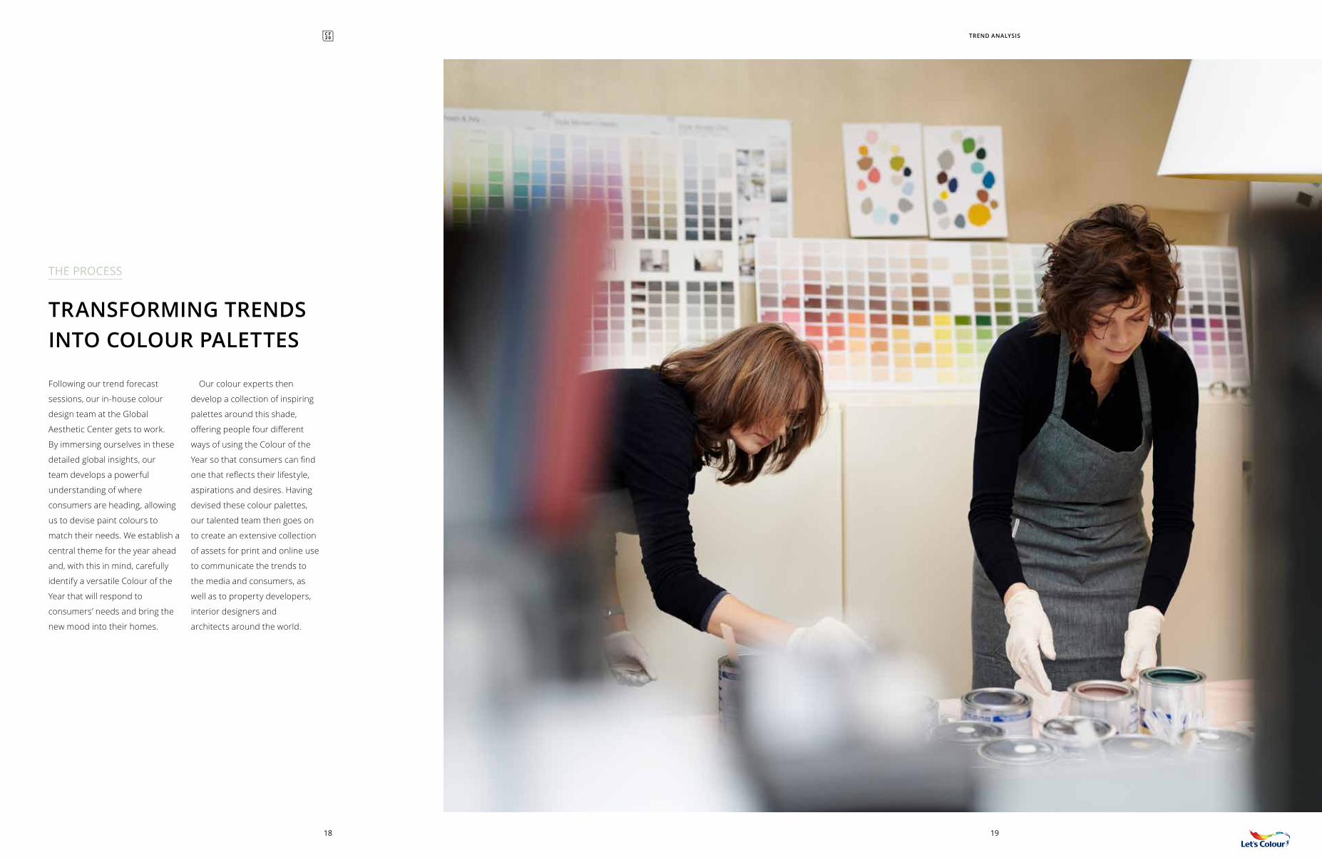
Following our trend forecast
sessions, our in-house colour
design team at the Global
Aesthetic Center gets to work.
By immersing ourselves in these
detailed global insights, our
team develops a powerful
understanding of where
consumers are heading, allowing
us to devise paint colours to
match their needs. We establish a
central theme for the year ahead
and, with this in mind, carefully
identify a versatile Colour of the
Year that will respond to
consumers’ needs and bring the
new mood into their homes.
Our colour experts then
develop a collection of inspiring
palettes around this shade,
offering people four different
ways of using the Colour of the
Year so that consumers can find
one that reflects their lifestyle,
aspirations and desires. Having
devised these colour palettes,
our talented team then goes on
to create an extensive collection
of assets for print and online use
to communicate the trends to
the media and consumers, as
well as to property developers,
interior designers and
architects around the world.
TRANSFORMING TRENDS INTO COLOUR PALETTES
THE PROCESS
TREND ANALYSIS
1918
20
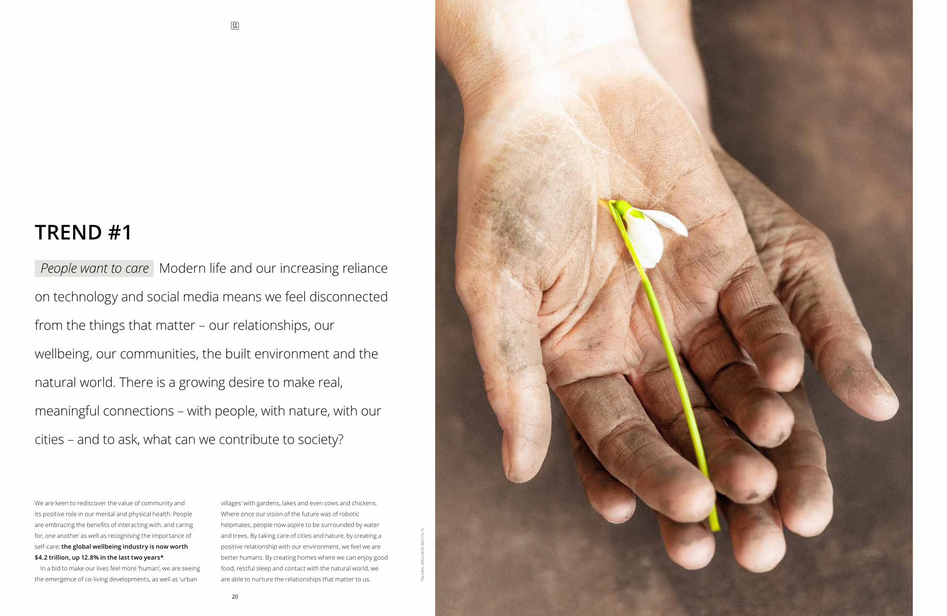
We are keen to rediscover the value of community and
its positive role in our mental and physical health. People
are embracing the benefits of interacting with, and caring
for, one another as well as recognising the importance of
self-care; the global wellbeing industry is now worth
$4.2 trillion, up 12.8% in the last two years*.
In a bid to make our lives feel more ‘human’, we are seeing
the emergence of co-living developments, as well as ‘urban
villages’ with gardens, lakes and even cows and chickens.
Where once our vision of the future was of robotic
helpmates, people now aspire to be surrounded by water
and trees. By taking care of cities and nature, by creating a
positive relationship with our environment, we feel we are
better humans. By creating homes where we can enjoy good
food, restful sleep and contact with the natural world, we
are able to nurture the relationships that matter to us.
TREND #1People want to care Modern life and our increasing reliance
on technology and social media means we feel disconnected
from the things that matter – our relationships, our
wellbeing, our communities, the built environment and the
natural world. There is a growing desire to make real,
meaningful connections – with people, with nature, with our
cities – and to ask, what can we contribute to society?*G
LOB
AL
WEL
LNES
S IN
STI
TUTE
05 23
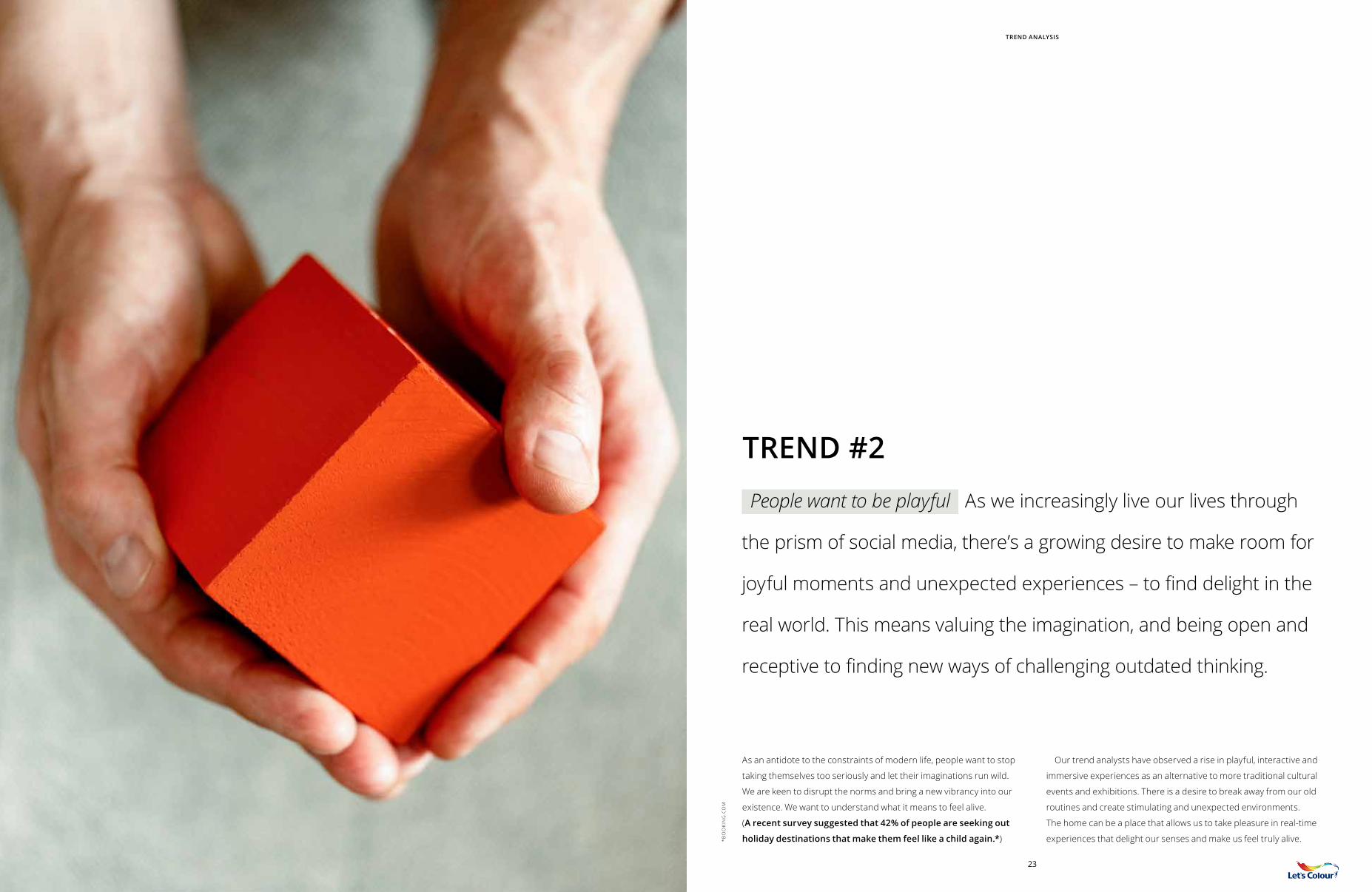
As an antidote to the constraints of modern life, people want to stop
taking themselves too seriously and let their imaginations run wild.
We are keen to disrupt the norms and bring a new vibrancy into our
existence. We want to understand what it means to feel alive.
(A recent survey suggested that 42% of people are seeking out
holiday destinations that make them feel like a child again.*)
Our trend analysts have observed a rise in playful, interactive and
immersive experiences as an alternative to more traditional cultural
events and exhibitions. There is a desire to break away from our old
routines and create stimulating and unexpected environments.
The home can be a place that allows us to take pleasure in real-time
experiences that delight our senses and make us feel truly alive.
People want to be playful As we increasingly live our lives through
the prism of social media, there’s a growing desire to make room for
joyful moments and unexpected experiences – to find delight in the
real world. This means valuing the imagination, and being open and
receptive to finding new ways of challenging outdated thinking.
TREND #2
TREND ANALYSIS
*BO
OK
ING
.CO
M
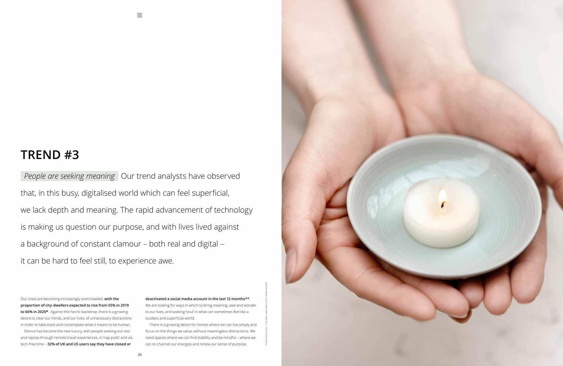
People are seeking meaning Our trend analysts have observed
that, in this busy, digitalised world which can feel superficial,
we lack depth and meaning. The rapid advancement of technology
is making us question our purpose, and with lives lived against
a background of constant clamour – both real and digital –
it can be hard to feel still, to experience awe.
TREND #3
24
Our cities are becoming increasingly overcrowded, with the
proportion of city-dwellers expected to rise from 55% in 2019
to 66% in 2020*. Against this hectic backdrop, there is a growing
desire to clear our minds, and our lives, of unnecessary distractions
in order to take stock and contemplate what it means to be human.
Silence has become the new luxury, with people seeking out rest
and repose through remote travel experiences, in ‘nap pods’ and via
tech-free time – 32% of UK and US users say they have closed or
deactivated a social media account in the last 12 months**.
We are looking for ways in which to bring meaning, awe and wonder
to our lives, and seeking ‘soul’ in what can sometimes feel like a
soulless and superficial world.
There is a growing desire for homes where we can live simply and
focus on the things we value, without meaningless distractions. We
need spaces where we can find stability and be mindful – where we
can re-channel our energies and renew our sense of purpose. *NE
WS
TRU
ST.
OR
G. *
*GLO
BA
L W
EB IN
DE
X 20
19 T
REN
D R
EPO
RT
05
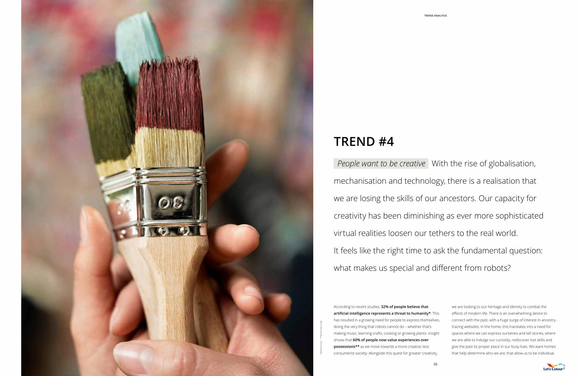
According to recent studies, 32% of people believe that
artificial intelligence represents a threat to humanity*. This
has resulted in a growing need for people to express themselves,
doing the very thing that robots cannot do – whether that’s
making music, learning crafts, cooking or growing plants. Insight
shows that 60% of people now value experiences over
possessions** as we move towards a more creative, less
consumerist society. Alongside this quest for greater creativity,
we are looking to our heritage and identity to combat the
effects of modern life. There is an overwhelming desire to
connect with the past, with a huge surge of interest in ancestry-
tracing websites. In the home, this translates into a need for
spaces where we can express ourselves and tell stories, where
we are able to indulge our curiosity, rediscover lost skills and
give the past its proper place in our busy lives. We want homes
that help determine who we are, that allow us to be individual.
TREND #4People want to be creative With the rise of globalisation,
mechanisation and technology, there is a realisation that
we are losing the skills of our ancestors. Our capacity for
creativity has been diminishing as ever more sophisticated
virtual realities loosen our tethers to the real world.
It feels like the right time to ask the fundamental question:
what makes us special and different from robots?
*BR
OO
KIN
GS.
**B
OO
KIN
G.C
OM
TREND ANALYSIS
THE 2020 MOOD
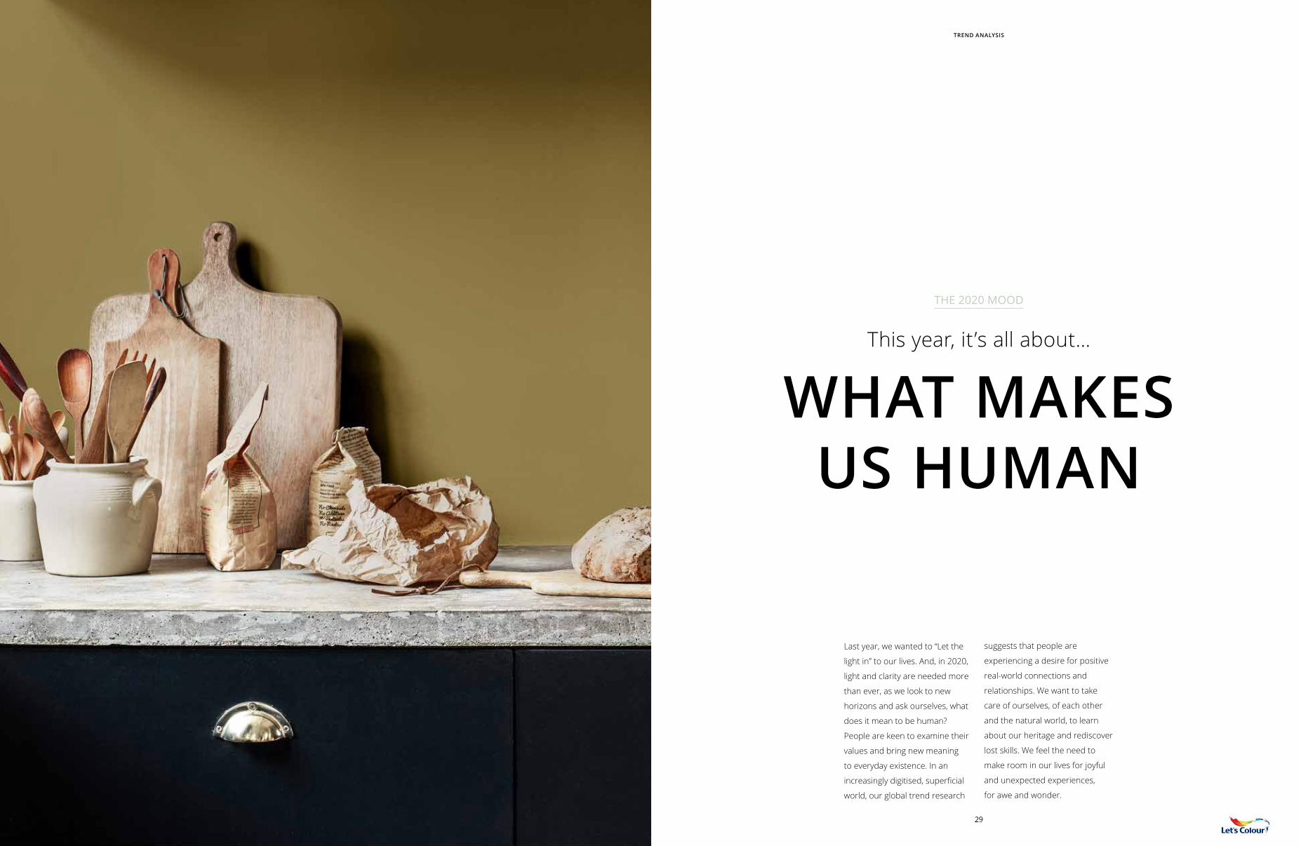
This year, it’s all about… WHAT MAKES
US HUMAN
Last year, we wanted to “Let the
light in” to our lives. And, in 2020,
light and clarity are needed more
than ever, as we look to new
horizons and ask ourselves, what
does it mean to be human?
People are keen to examine their
values and bring new meaning
to everyday existence. In an
increasingly digitised, superficial
world, our global trend research
suggests that people are
experiencing a desire for positive
real-world connections and
relationships. We want to take
care of ourselves, of each other
and the natural world, to learn
about our heritage and rediscover
lost skills. We feel the need to
make room in our lives for joyful
and unexpected experiences,
for awe and wonder.
29
TREND ANALYSIS

We are looking for a place where we can contemplate our
future, consider our purpose in this brave new world. Where
we can better connect with our friends and family, our
surroundings, with nature. Where we can express ourselves,
be ourselves. We are looking to give our homes…
“The human touch”
HOW THIS TRANSLATES INTO OUR HOMES
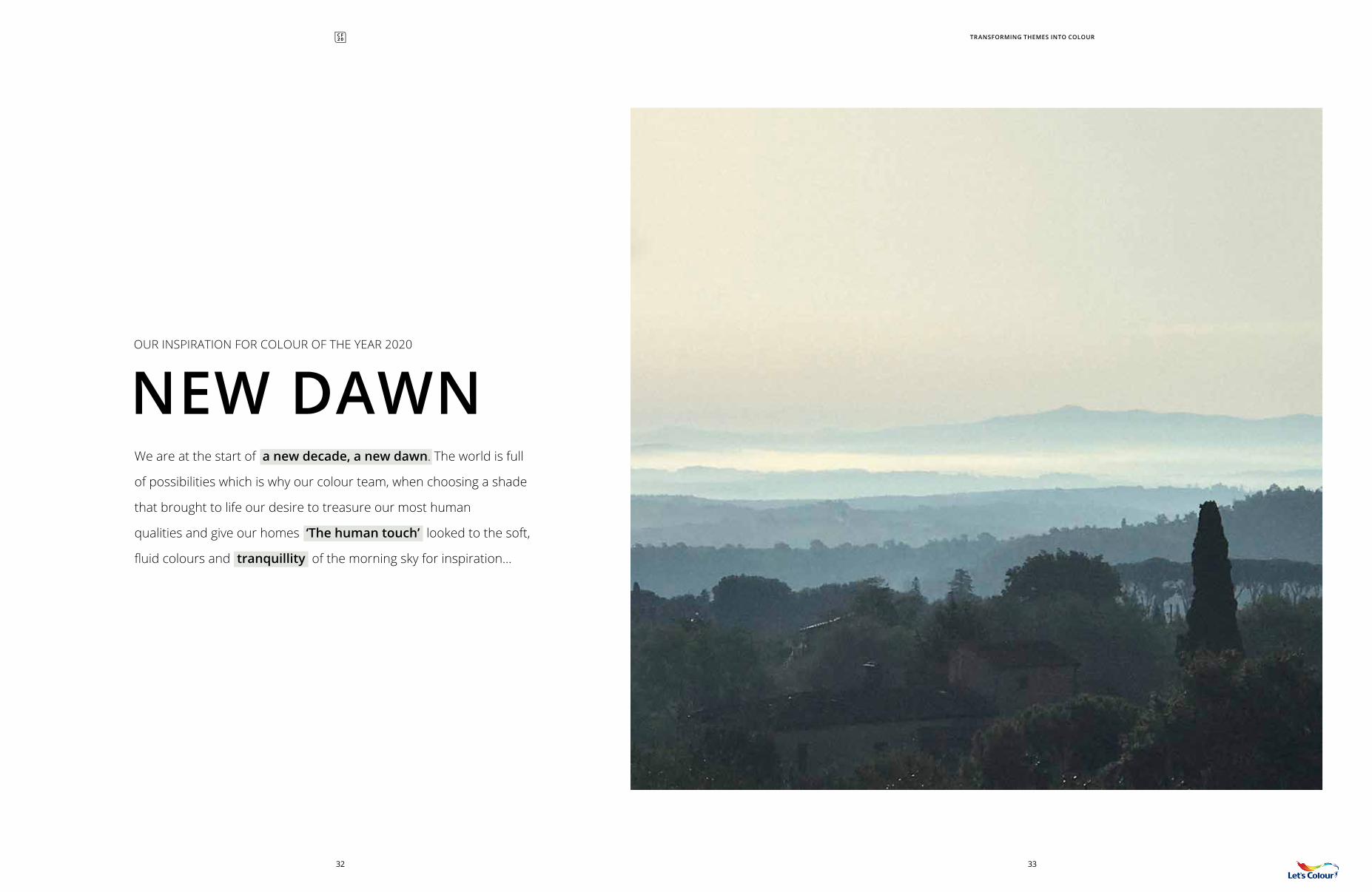
NEW DAWNOUR INSPIRATION FOR COLOUR OF THE YEAR 2020
We are at the start of a new decade, a new dawn. The world is full
of possibilities which is why our colour team, when choosing a shade
that brought to life our desire to treasure our most human
qualities and give our homes ‘The human touch’ looked to the soft,
fluid colours and tranquillity of the morning sky for inspiration…
3332
TRANSFORMING THEMES INTO COLOUR
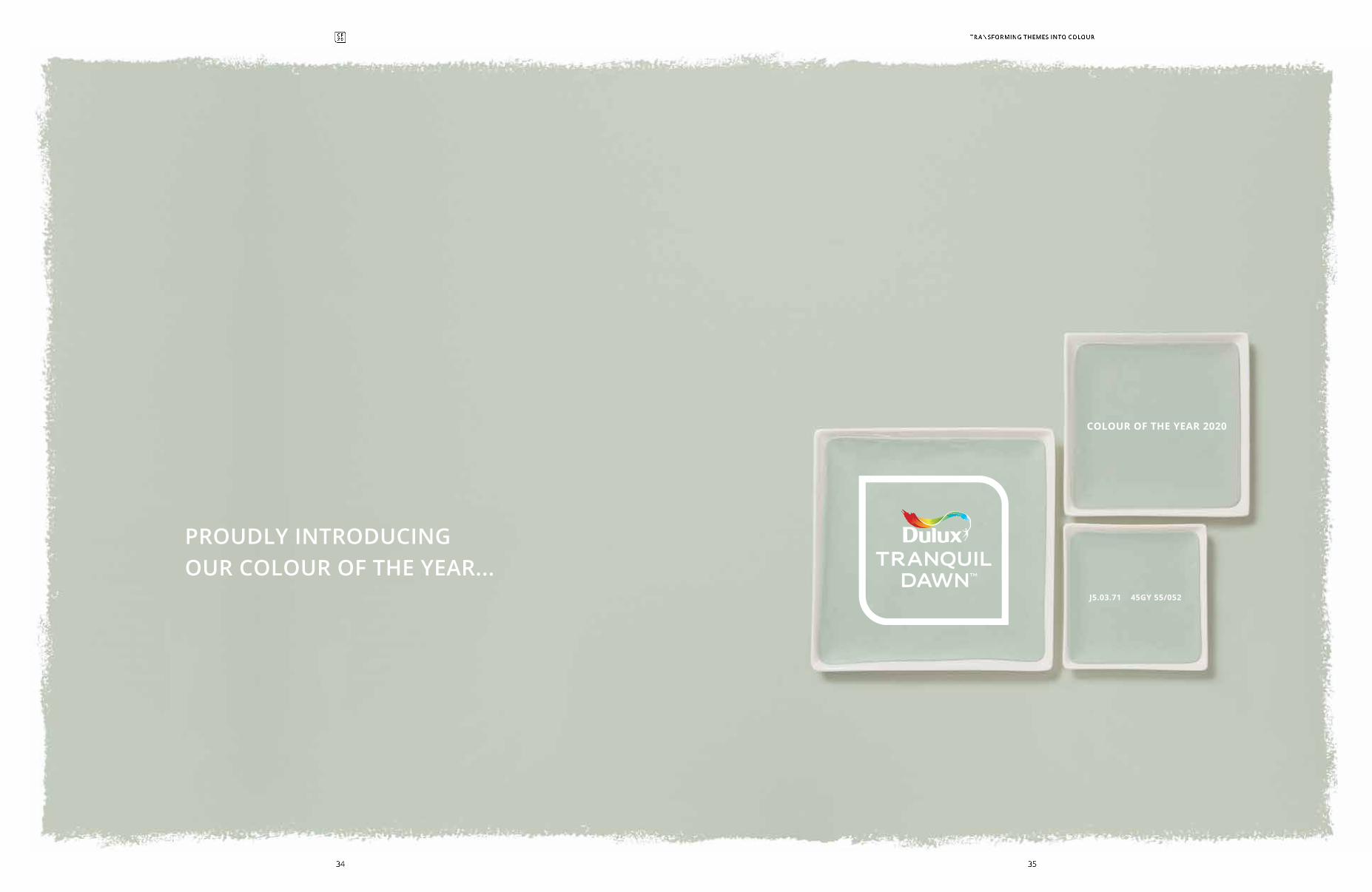
J5.03.71 45GY 55/052
COLOUR OF THE YEAR 2020
PROUDLY INTRODUCING OUR COLOUR OF THE YEAR...
TRANSFORMING THEMES INTO COLOUR
3534
TRANQUIL DAWNTM
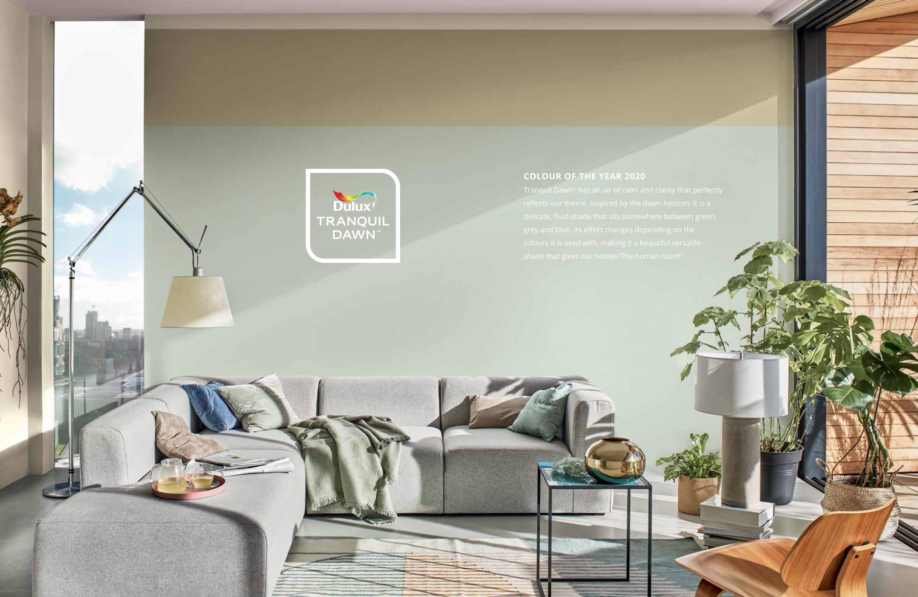
COLOUR OF THE YEAR 2020Tranquil DawnTM has an air of calm and clarity that perfectly
reflects our theme. Inspired by the dawn horizon, it is a
delicate, fluid shade that sits somewhere between green,
grey and blue. Its effect changes depending on the
colours it is used with, making it a beautiful versatile
shade that gives our homes ‘The human touch’.
TRANQUIL DAWNTM
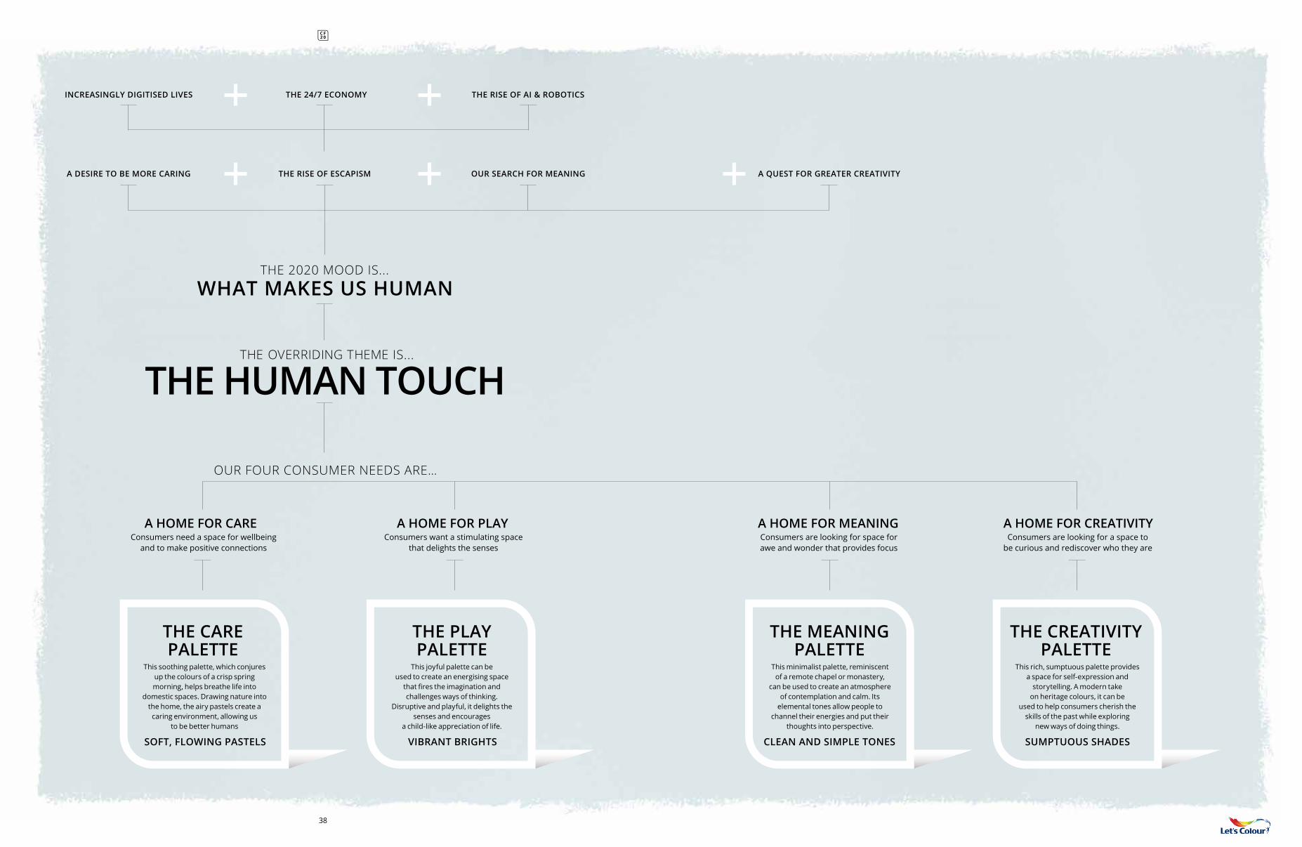
WHAT MAKES US HUMANTHE 2020 MOOD IS...
THE HUMAN TOUCHTHE OVERRIDING THEME IS...
OUR FOUR CONSUMER NEEDS ARE…
A QUEST FOR GREATER CREATIVITYTHE RISE OF ESCAPISM OUR SEARCH FOR MEANINGA DESIRE TO BE MORE CARING
INCREASINGLY DIGITISED LIVES THE RISE OF AI & ROBOTICSTHE 24/7 ECONOMY
This minimalist palette, reminiscent of a remote chapel or monastery,
can be used to create an atmosphere of contemplation and calm. Its
elemental tones allow people to channel their energies and put their
thoughts into perspective.
Consumers are looking for space for awe and wonder that provides focus
A HOME FOR MEANING
THE MEANING PALETTE
CLEAN AND SIMPLE TONES
Consumers need a space for wellbeing and to make positive connections
A HOME FOR CARE
THE CARE PALETTE
This soothing palette, which conjures up the colours of a crisp spring morning, helps breathe life into
domestic spaces. Drawing nature into the home, the airy pastels create a caring environment, allowing us
to be better humans
SOFT, FLOWING PASTELS
THE CREATIVITYPALETTE
Consumers are looking for a space to be curious and rediscover who they are
A HOME FOR CREATIVITY
This rich, sumptuous palette provides a space for self-expression and
storytelling. A modern take on heritage colours, it can be
used to help consumers cherish the skills of the past while exploring
new ways of doing things.
SUMPTUOUS SHADES
THE PLAYPALETTE
Consumers want a stimulating space that delights the senses
A HOME FOR PLAY
This joyful palette can be used to create an energising space
that fires the imagination and challenges ways of thinking.
Disruptive and playful, it delights the senses and encourages
a child-like appreciation of life.
VIBRANT BRIGHTS
38
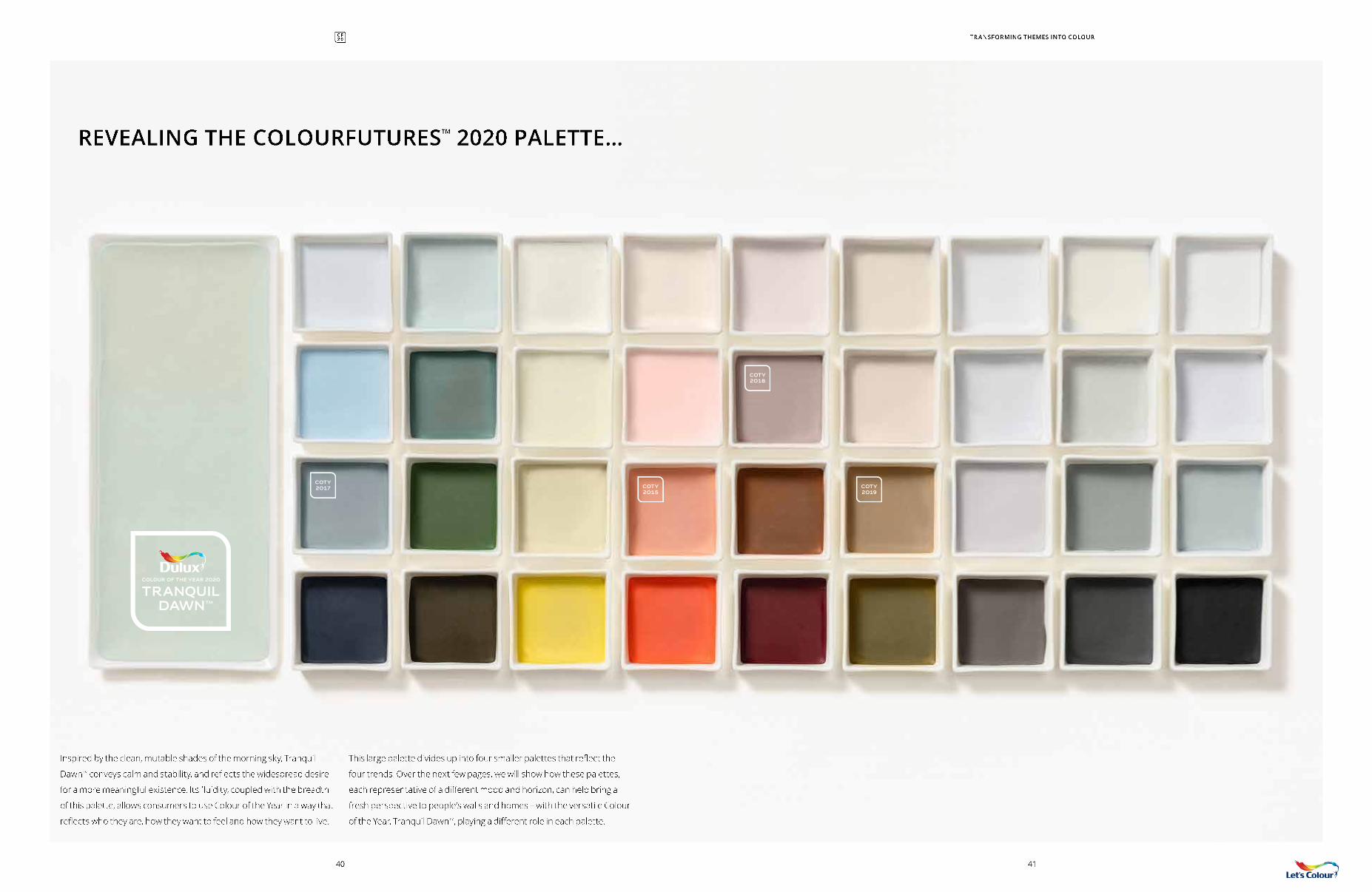
REVEALING THE COLOURFUTURESTM 2020 PALETTE…
COTY 2017 COTY
2015COTY 2019
COTY 2018
TRANQUIL DAWN
COLOUR OF THE YEAR 2020
TM
TRANSFORMING THEMES INTO COLOUR
Inspired by the clean, mutable shades of the morning sky, Tranquil
DawnTM conveys calm and stability, and reflects the widespread desire
for a more meaningful existence. Its fluidity, coupled with the breadth
of this palette, allows consumers to use Colour of the Year in a way that
reflects who they are, how they want to feel and how they want to live.
This large palette divides up into four smaller palettes that reflect the
four trends. Over the next few pages, we will show how these palettes,
each representative of a different mood and horizon, can help bring a
fresh perspective to people’s walls and homes – with the versatile Colour
of the Year, Tranquil DawnTM, playing a different role in each palette.
4140
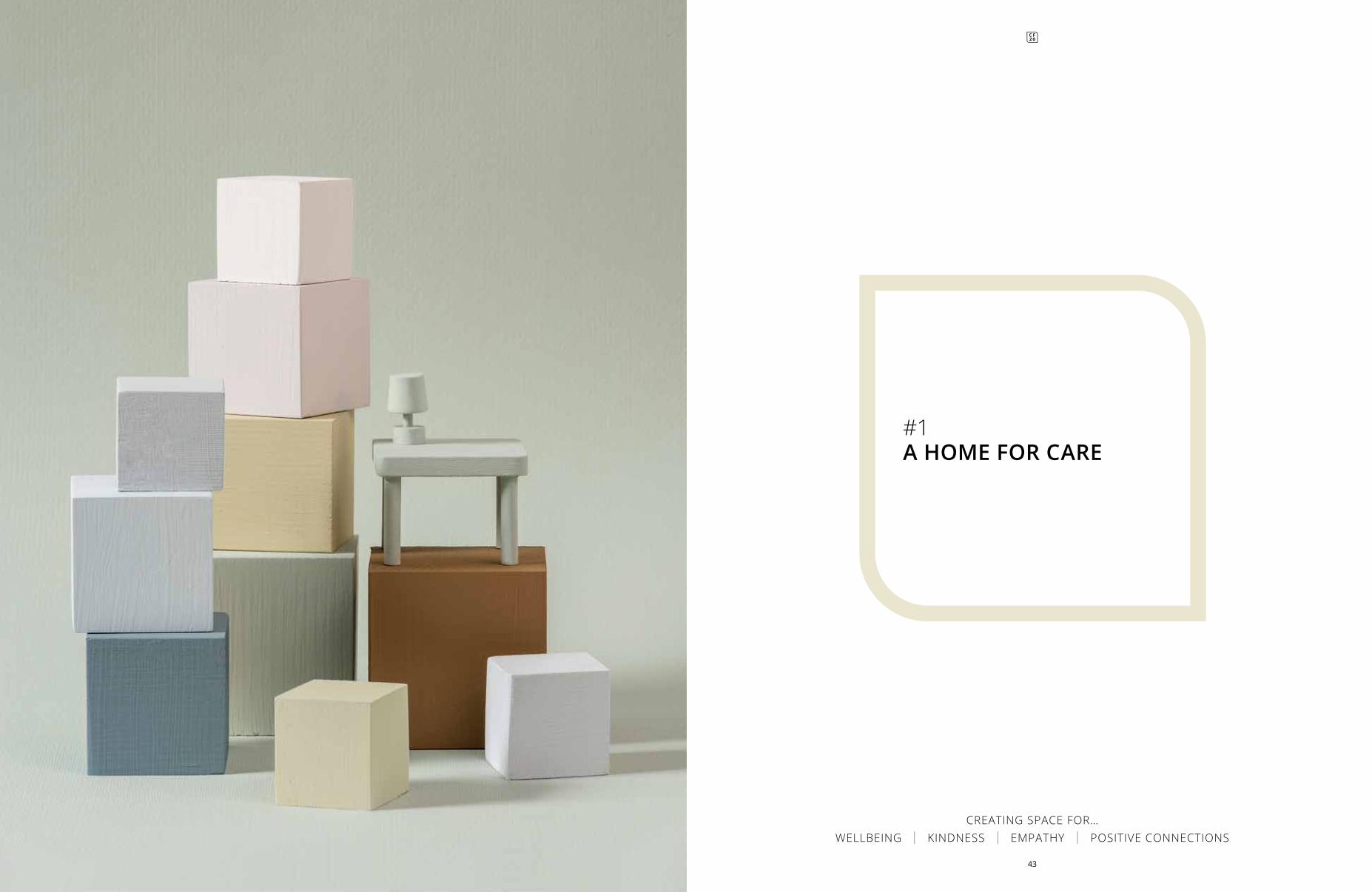
#1A HOME FOR CARE
CREATING SPACE FOR… WELLBEING | KINDNESS | EMPATHY | POSITIVE CONNECTIONS
43
DN.03.8680YR 83/035
F8.12.7145YY 53/151
J5.03.7145GY 55/052
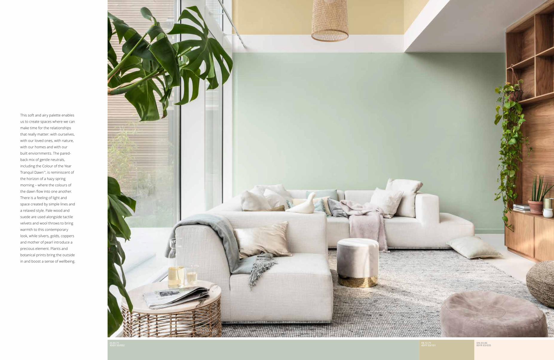
This soft and airy palette enables
us to create spaces where we can
make time for the relationships
that really matter: with ourselves,
with our loved ones, with nature,
with our homes and with our
built enviornments. The pared-
back mix of gentle neutrals,
including the Colour of the Year
Tranquil DawnTM, is reminiscent of
the horizon of a hazy spring
morning – where the colours of
the dawn flow into one another.
There is a feeling of light and
space created by simple lines and
a relaxed style. Pale wood and
suede are used alongside tactile
velvets and wool throws to bring
warmth to this contemporary
look, while silvers, golds, coppers
and mother of pearl introduce a
precious element. Plants and
botanical prints bring the outside
in and boost a sense of wellbeing.
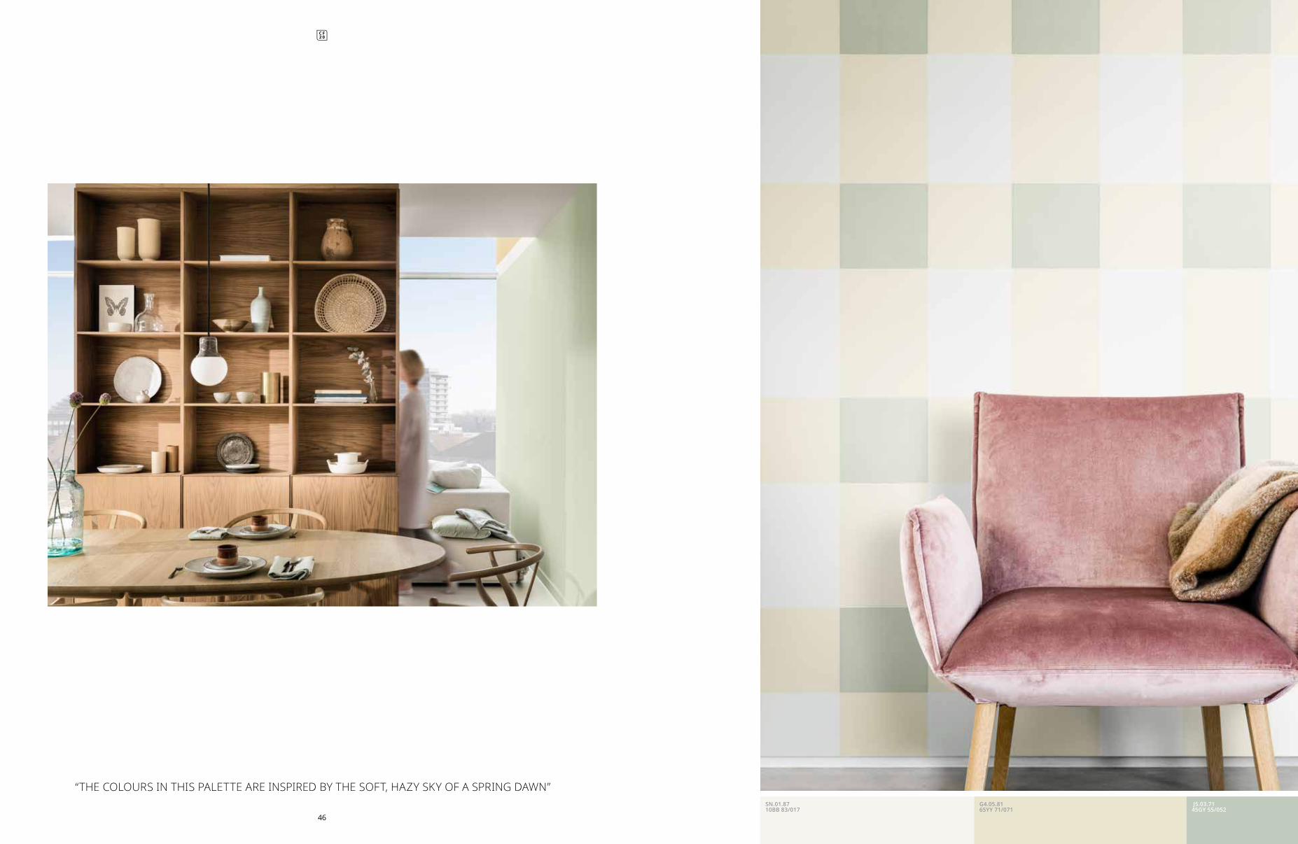
“THE COLOURS IN THIS PALETTE ARE INSPIRED BY THE SOFT, HAZY SKY OF A SPRING DAWN”
46
J5.03.7145GY 55/052
G4.05.8165YY 71/071
SN.01.8710BB 83/017
49
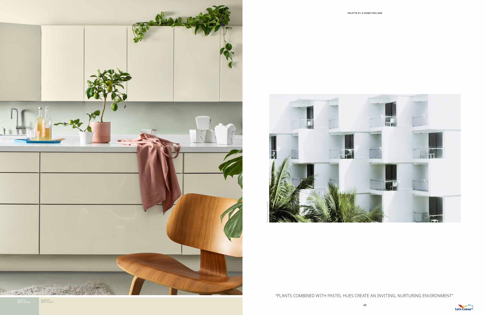
“PLANTS COMBINED WITH PASTEL HUES CREATE AN INVITING, NURTURING ENVIRONMENT” J5.03.7145GY 55/052
G4.05.8165YY 71/071
PALETTE #1: A HOME FOR CARE
Nat
chay
a Sh
w u
nspl
ash
5150
J5.0
3.71
45G
Y 55
/052
T5.0
3.76
30B
B 6
2/04
4S1
.05.
8290
BG
72/
063
BN
.02.
7790
RR 6
4/03
6
PALETTE #1: A HOME FOR CARE
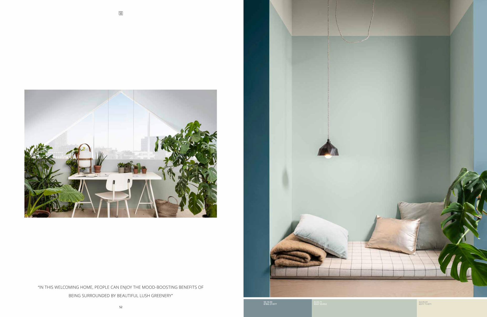
“IN THIS WELCOMING HOME, PEOPLE CAN ENJOY THE MOOD-BOOSTING BENEFITS OF
BEING SURROUNDED BY BEAUTIFUL LUSH GREENERY”
52
J5.03.7145GY 55/052
G4.05.8165YY 71/071
S0.10.5087BG 27/077
J5.03.7145GY 55/052
F8.12.7145YY 53/151
TRANQUIL DAWN TM, THE VERSATILE
COLOUR OF THE YEAR, SEEMS
TO SUBTLY SHIFT ITS TONE –
FROM GREEN TO GREY TO BLUE
– DEPENDING ON THE SHADES
THAT IT IS COMBINED WITH. IT
CONTRIBUTES TO THE LIGHT AND
AIRY QUALITIES OF THE CARE
PALETTE, WHERE IT BECOMES
GENTLE AND SOOTHING.
SN.01.87 10BB 83/017
DN.03.86 80YR 83/035
BN.02.7790RR 64/036
S1.05.82 90BG 72/063
T5.03.76 30BB 62/044
F8.12.71 45YY 53/151
S0.10.5087BG 27/077
G4.05.81 65YY 71/071
E4.22.4900YY 26/220
COTY 2019
COTY 2017
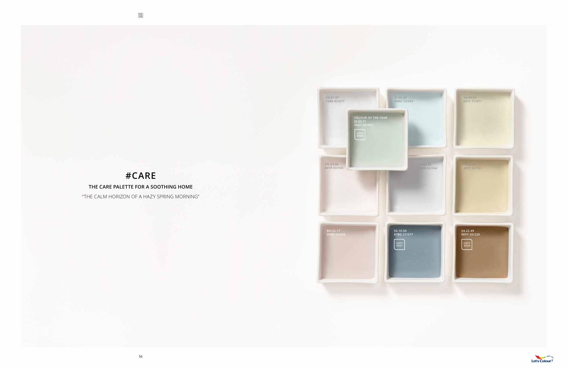
#CARE THE CARE PALETTE FOR A SOOTHING HOME
“THE CALM HORIZON OF A HAZY SPRING MORNING”
COLOUR OF THE YEAR J5.03.7145GY 55/052
COTY 2020
56
59
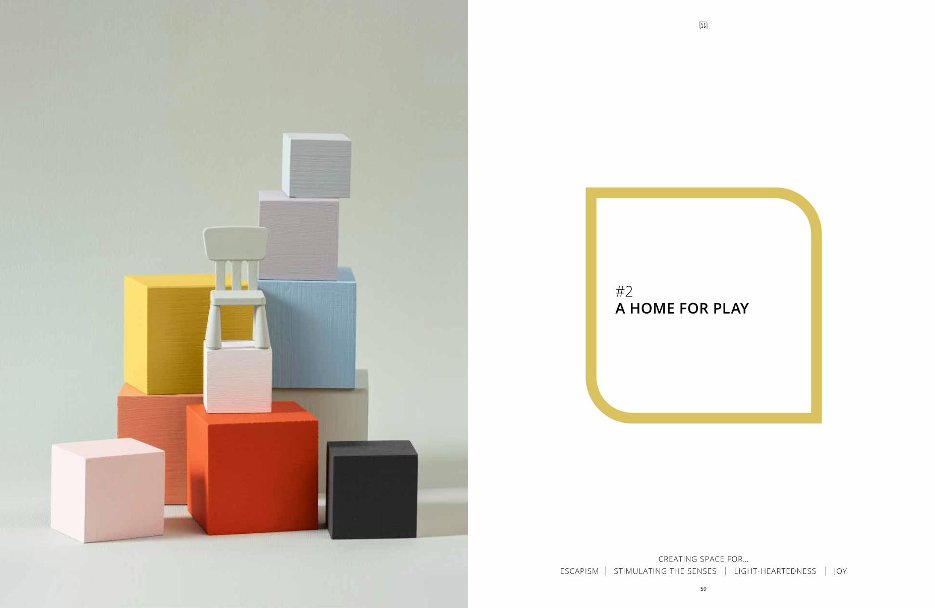
#2A HOME FOR PLAY
CREATING SPACE FOR… ESCAPISM | STIMULATING THE SENSES | LIGHT-HEARTEDNESS | JOY
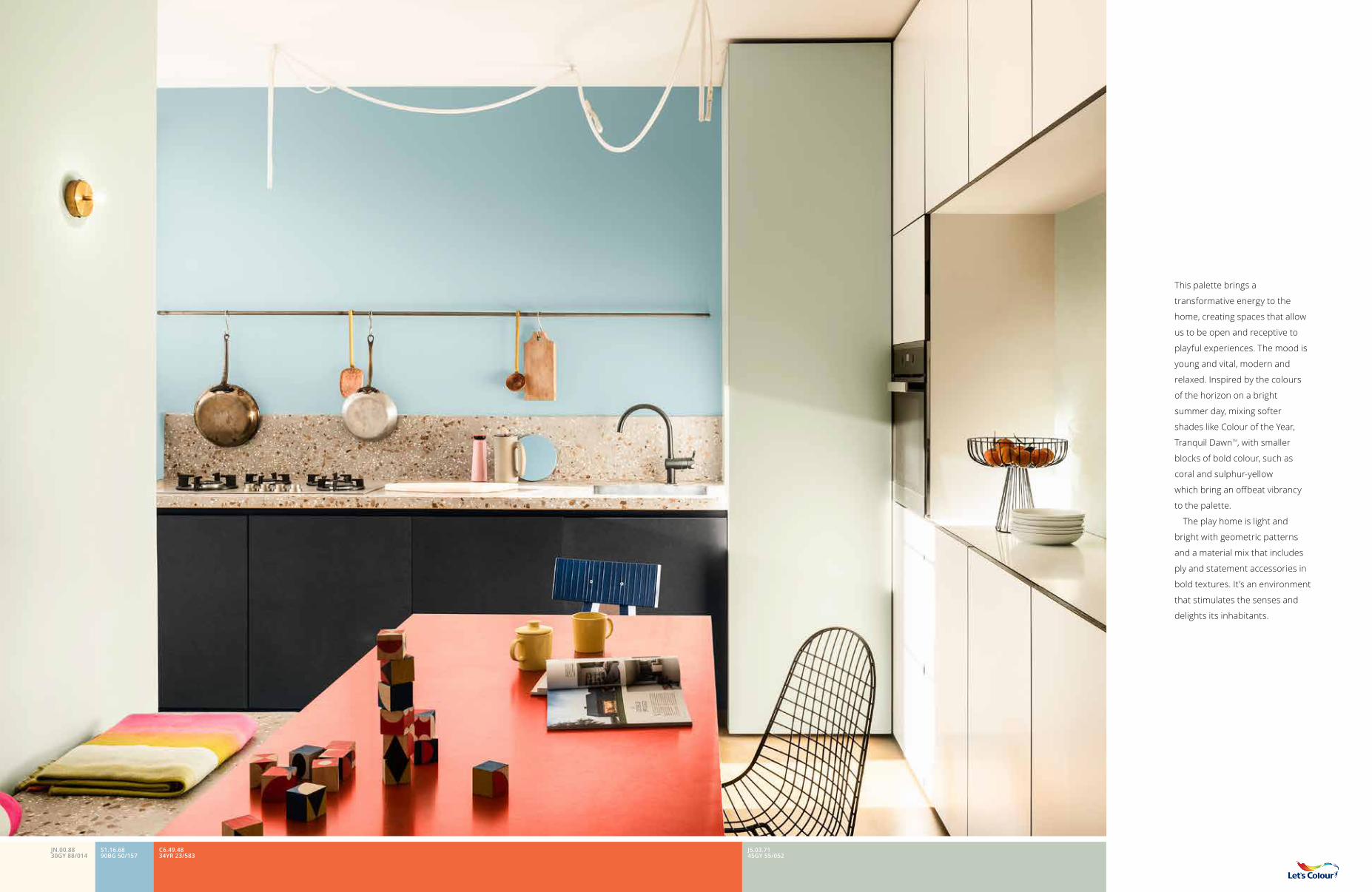
This palette brings a
transformative energy to the
home, creating spaces that allow
us to be open and receptive to
playful experiences. The mood is
young and vital, modern and
relaxed. Inspired by the colours
of the horizon on a bright
summer day, mixing softer
shades like Colour of the Year,
Tranquil DawnTM, with smaller
blocks of bold colour, such as
coral and sulphur-yellow
which bring an offbeat vibrancy
to the palette.
The play home is light and
bright with geometric patterns
and a material mix that includes
ply and statement accessories in
bold textures. It’s an environment
that stimulates the senses and
delights its inhabitants.
S1.16.6890BG 50/157
C6.49.4834YR 23/583
J5.03.7145GY 55/052
JN.00.8830GY 88/014
Pixa
squa
re u
nspl
ash
PALETTE #2: A HOME FOR PLAY
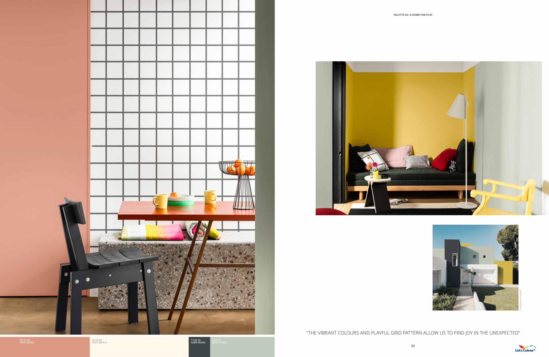
“THE VIBRANT COLOURS AND PLAYFUL GRID PATTERN ALLOW US TO FIND JOY IN THE UNEXPECTED”
63
C9.21.5850YR 36/263
T7.05.2542BB 09/032
J5.03.7145GY 55/052
JN.00.8830GY 88/014
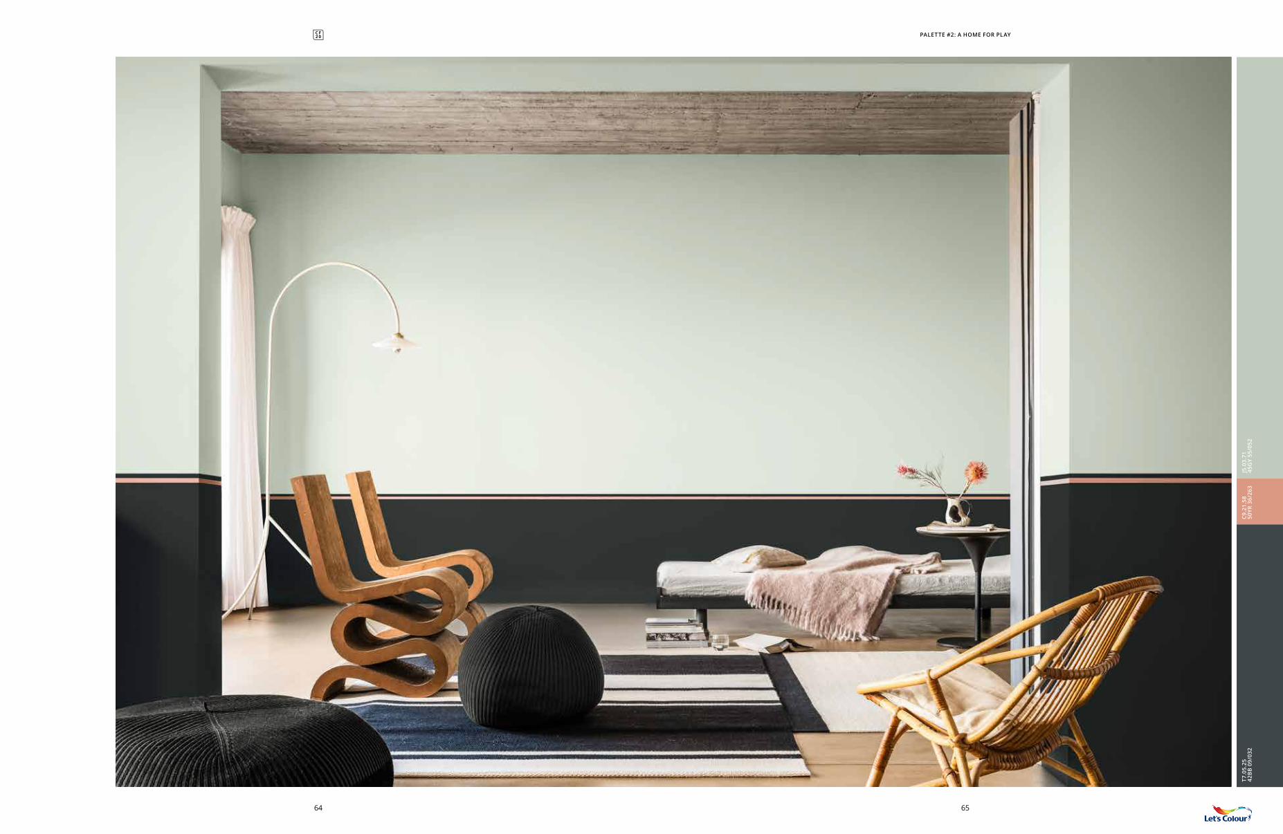
PALETTE #2: A HOME FOR PLAY
6564
C9.2
1.58
50YR
36/
263
J5.0
3.71
45G
Y 55
/052
T7.0
5.25
42B
B 0
9/03
2
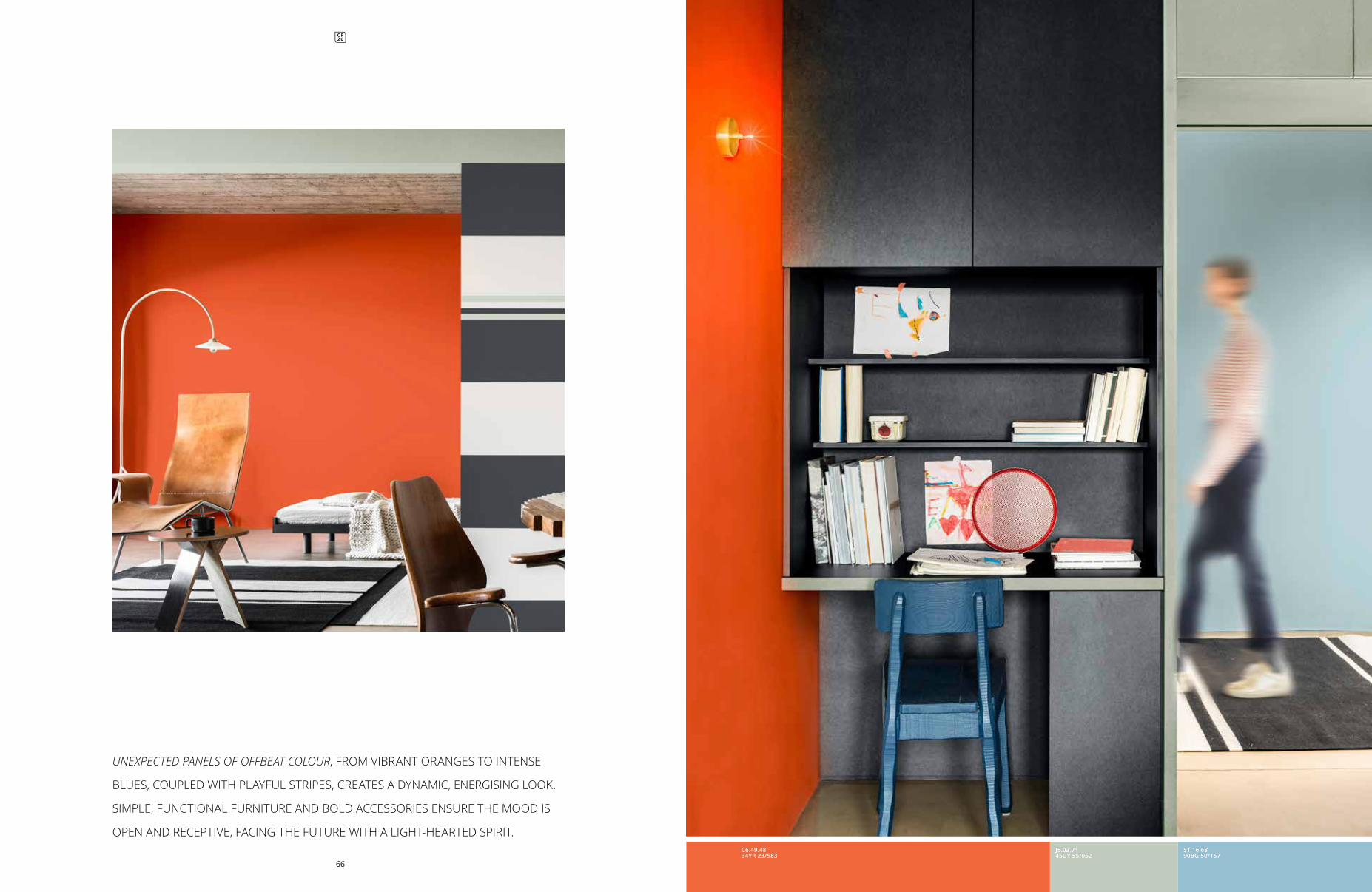
UNEXPECTED PANELS OF OFFBEAT COLOUR, FROM VIBRANT ORANGES TO INTENSE
BLUES, COUPLED WITH PLAYFUL STRIPES, CREATES A DYNAMIC, ENERGISING LOOK.
SIMPLE, FUNCTIONAL FURNITURE AND BOLD ACCESSORIES ENSURE THE MOOD IS
OPEN AND RECEPTIVE, FACING THE FUTURE WITH A LIGHT-HEARTED SPIRIT.
66
S1.16.6890BG 50/157
J5.03.7145GY 55/052
C6.49.4834YR 23/583
PALETTE #2: A HOME FOR PLAY
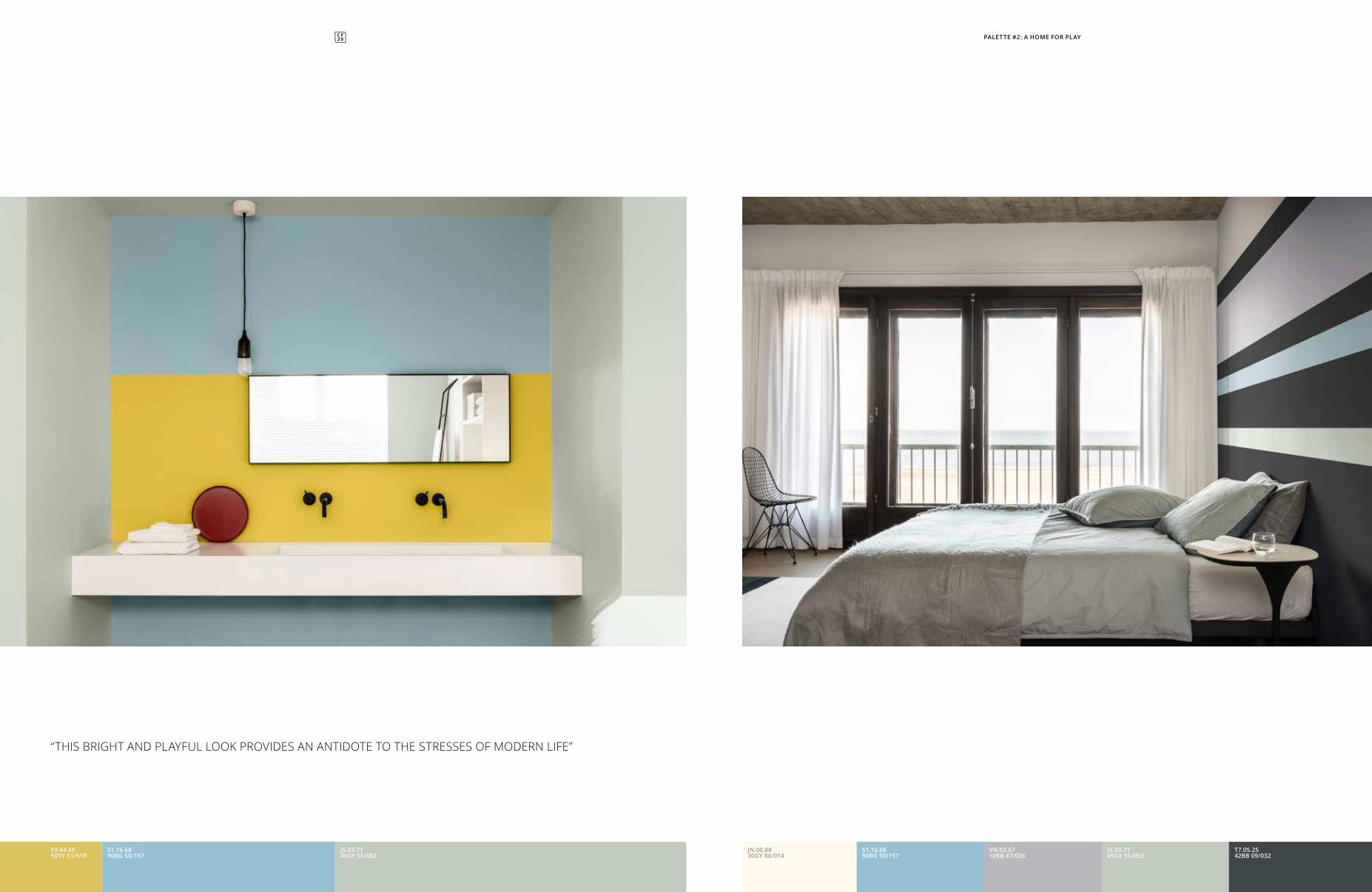
“THIS BRIGHT AND PLAYFUL LOOK PROVIDES AN ANTIDOTE TO THE STRESSES OF MODERN LIFE”
S1.16.6890BG 50/157
F9.44.6950YY 51/519
J5.03.7145GY 55/052
T7.05.2542BB 09/032
VN.02.6710RB 47/036
J5.03.7145GY 55/052
S1.16.6890BG 50/157
JN.00.8830GY 88/014
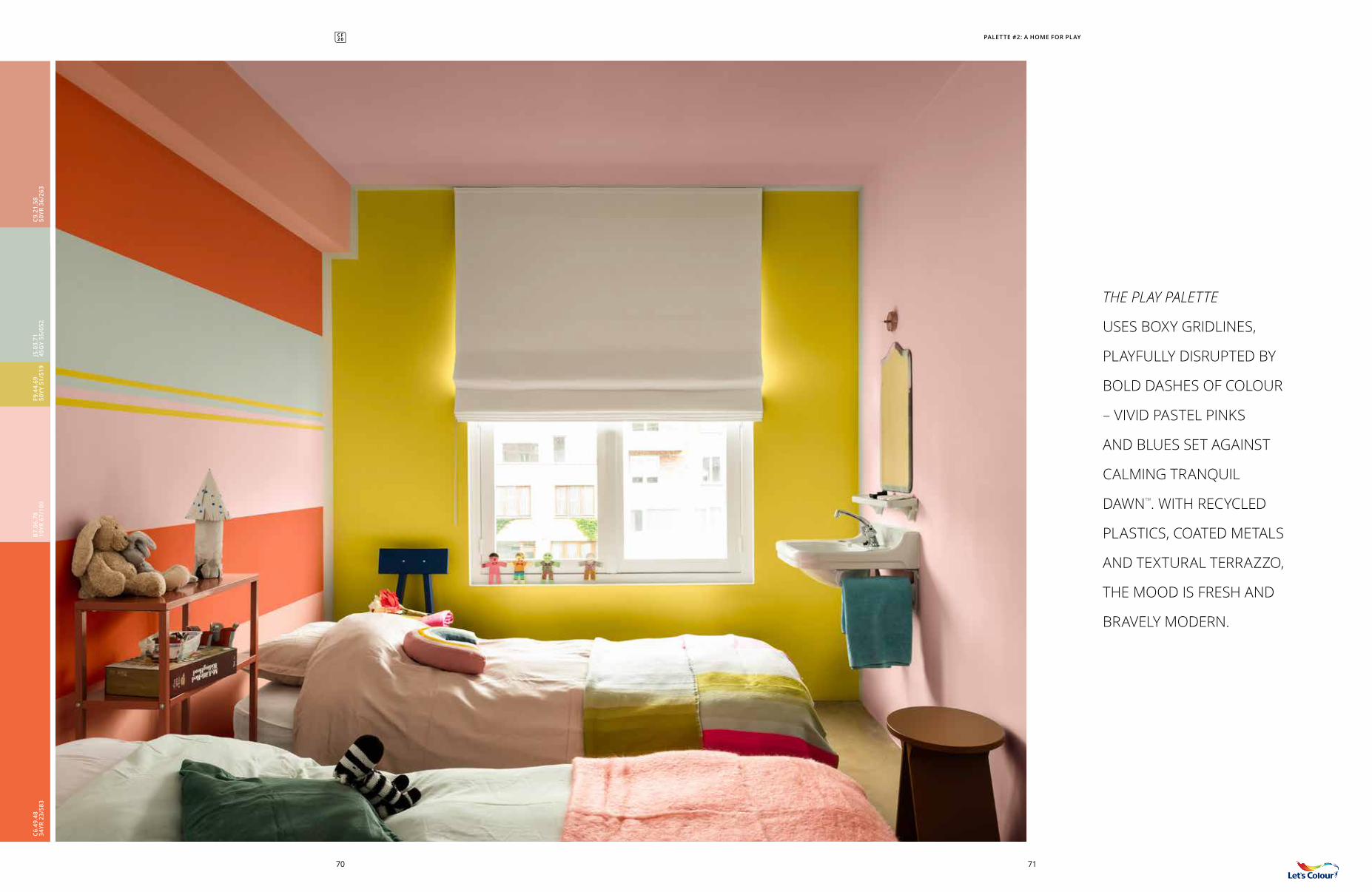
THE PLAY PALETTE
USES BOXY GRIDLINES,
PLAYFULLY DISRUPTED BY
BOLD DASHES OF COLOUR
– VIVID PASTEL PINKS
AND BLUES SET AGAINST
CALMING TRANQUIL
DAWNTM. WITH RECYCLED
PLASTICS, COATED METALS
AND TEXTURAL TERRAZZO,
THE MOOD IS FRESH AND
BRAVELY MODERN.
PALETTE #2: A HOME FOR PLAY
7170
B7.
06.7
810
YR 6
7/10
0J5
.03.
7145
GY
55/0
52C9
.21.
5850
YR 3
6/26
3F9
.44.
6950
YY 5
1/51
9C6
.49.
4834
YR 2
3/58
3
COLOUR OF THE YEAR J5.03.7145GY 55/052
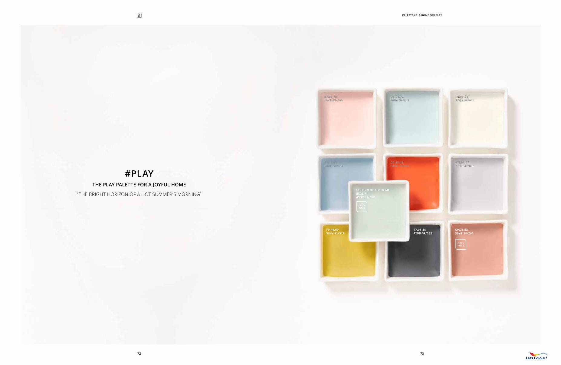
B7.06.7810YR 67/100
S1.16.6890BG 50/157
F9.44.6950YY 51/519
Q5.04.7230BG 56/045
C6.49.4834YR 23/583
VN.02.6710RB 47/036
T7.05.2542BB 09/032
JN.00.8830GY 88/014
C9.21.5850YR 36/263
#PLAYTHE PLAY PALETTE FOR A JOYFUL HOME
“THE BRIGHT HORIZON OF A HOT SUMMER’S MORNING”
COTY 2015
COTY 2020
PALETTE #2: A HOME FOR PLAY
7372
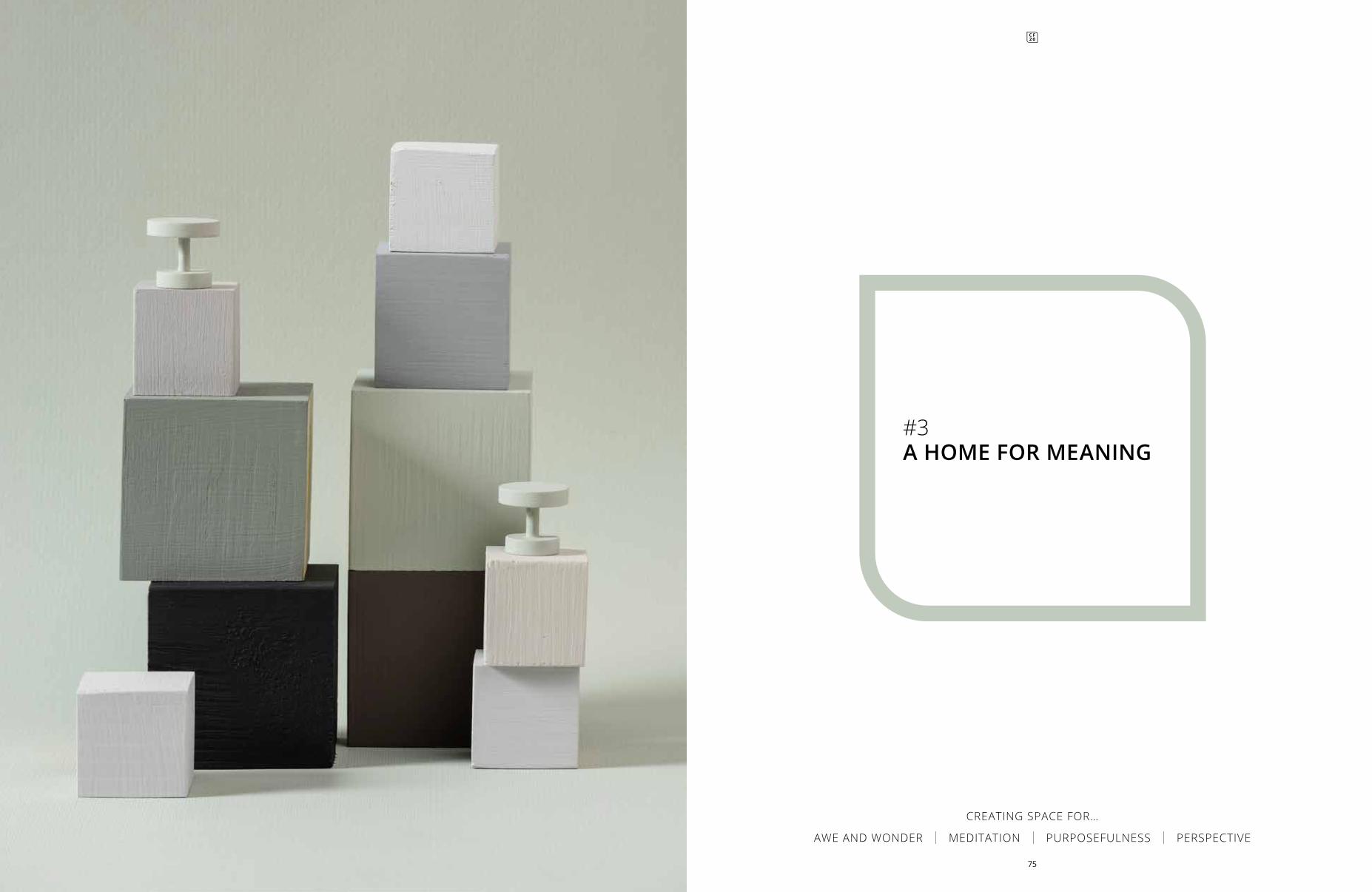
#3A HOME FOR MEANING
CREATING SPACE FOR…
AWE AND WONDER | MEDITATION | PURPOSEFULNESS | PERSPECTIVE
75
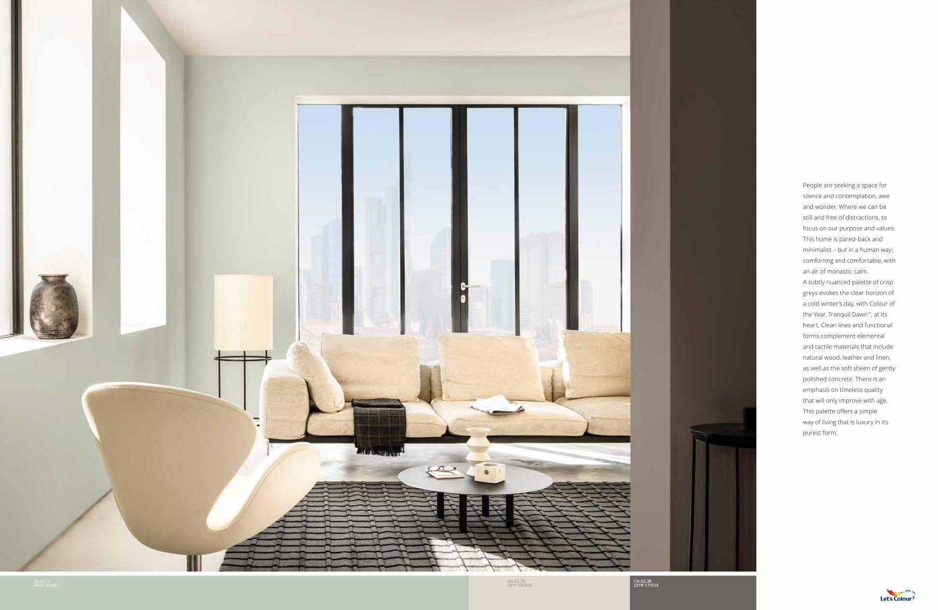
People are seeking a space for
silence and contemplation, awe
and wonder. Where we can be
still and free of distractions, to
focus on our purpose and values.
This home is pared-back and
minimalist – but in a human way;
comforting and comfortable, with
an air of monastic calm.
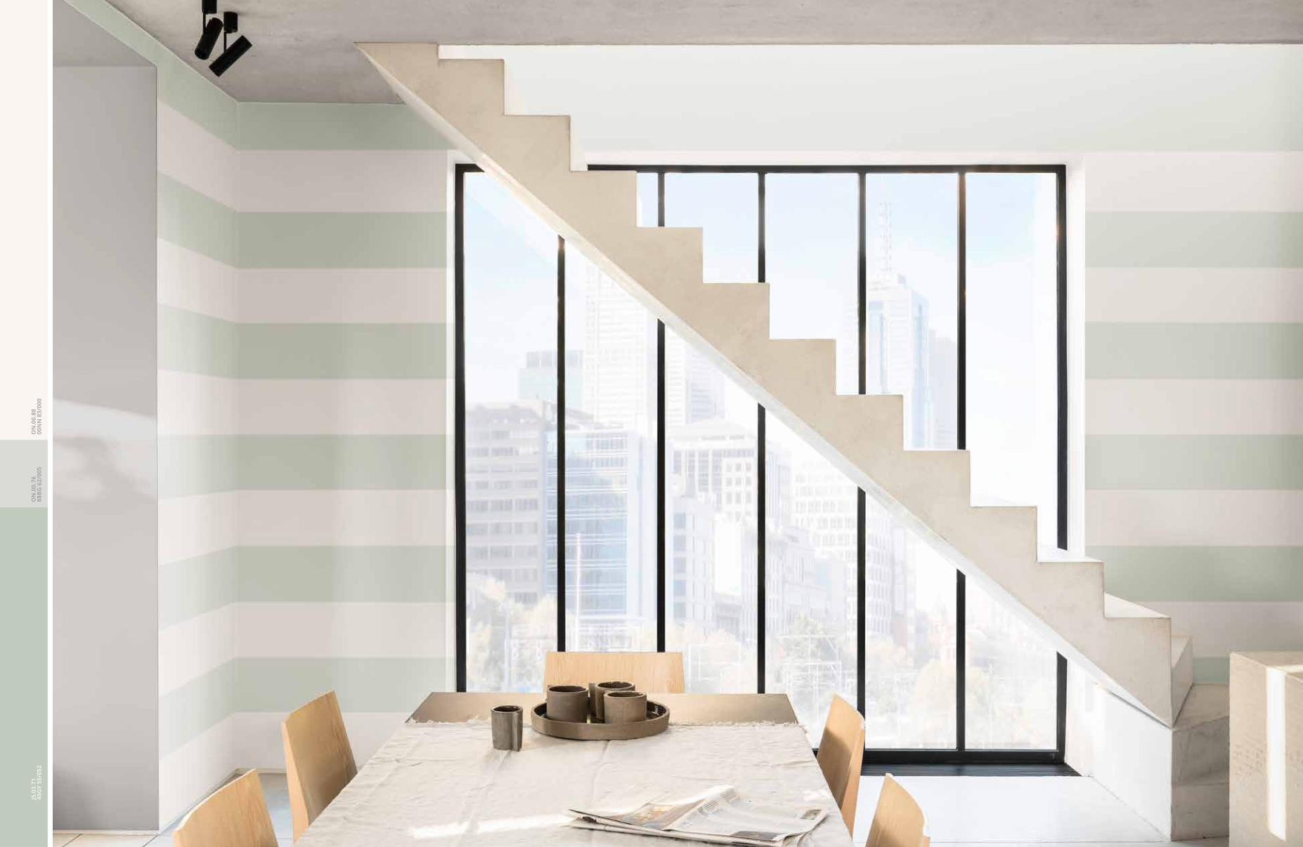
A subtly nuanced palette of crisp
greys evokes the clear horizon of
a cold winter’s day, with Colour of
the Year, Tranquil DawnTM, at its
heart. Clean lines and functional
forms complement elemental
and tactile materials that include
natural wood, leather and linen,
as well as the soft sheen of gently
polished concrete. There is an
emphasis on timeless quality
that will only improve with age.
This palette offers a simple
way of living that is luxury in its
purest form.
EN.02.7800YY 63/024
CN.02.3822YR 17/023
J5.03.7145GY 55/052
ON
.00.
8800
NN
83/
000
79
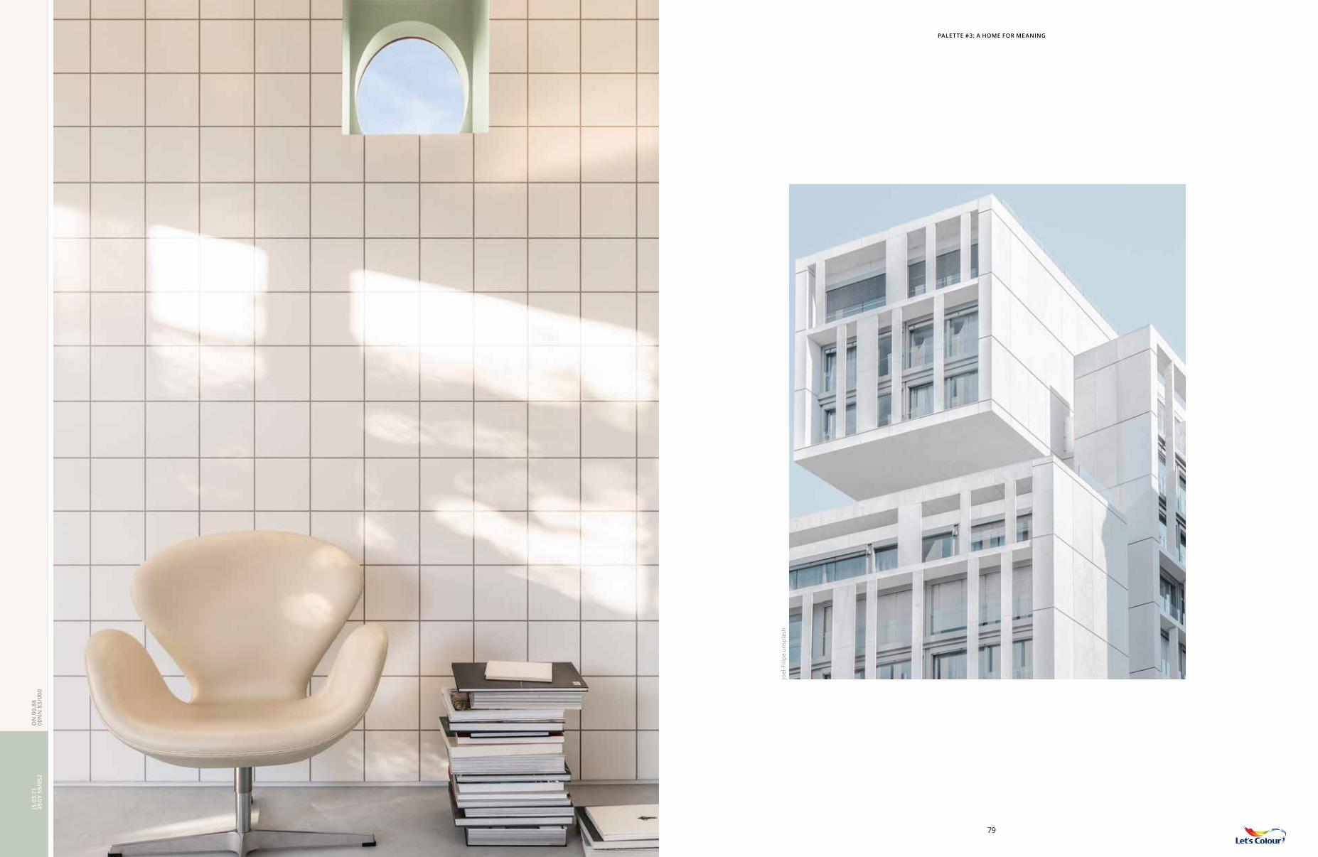
PALETTE #3: A HOME FOR MEANING
Joel
-Fili
pe u
nspl
ash
J5.0
3.71
45G
Y 55
/052
THE MEANING PALETTE
HELPS TO CREATE
SPACES WHERE PEOPLE
CAN FOCUS ON WHAT
MATTERS MOST TO THEM.
IT IS MINIMALISM BUT
ON A HUMAN SCALE.
EVOCATIVE GREY TONES,
SMOOTHLY FINISHED
NATURAL WOODS AND
UNFUSSY LINENS ALL
HELP TO CREATE ROOMS
DEDICATED TO LIFE’S
SIMPLE PLEASURES.
CN.0
2.38
22YR
17/
023
J5.0
3.71
45G
Y 55
/052
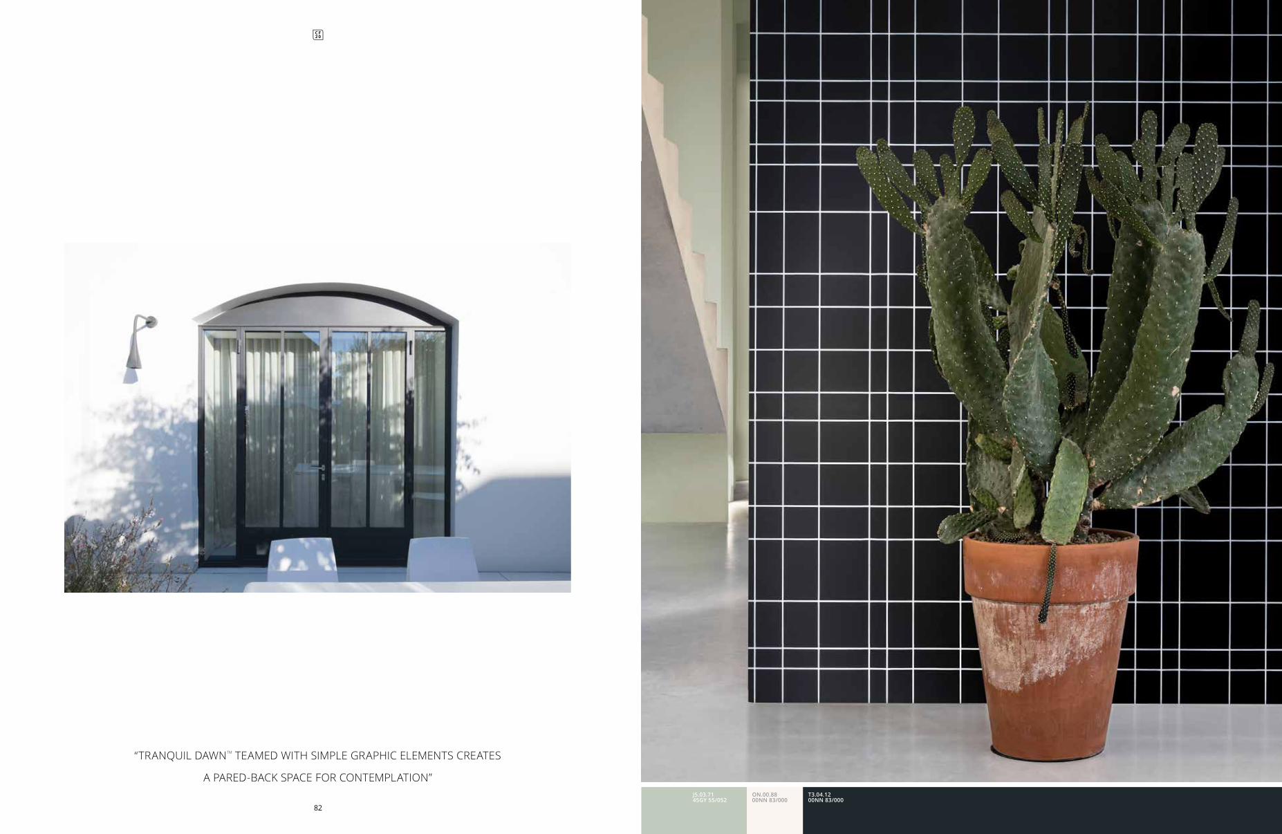
“TRANQUIL DAWNTM TEAMED WITH SIMPLE GRAPHIC ELEMENTS CREATES
A PARED-BACK SPACE FOR CONTEMPLATION”
82
T3.04.1200NN 83/000
J5.03.7145GY 55/052
ON.00.8800NN 83/000
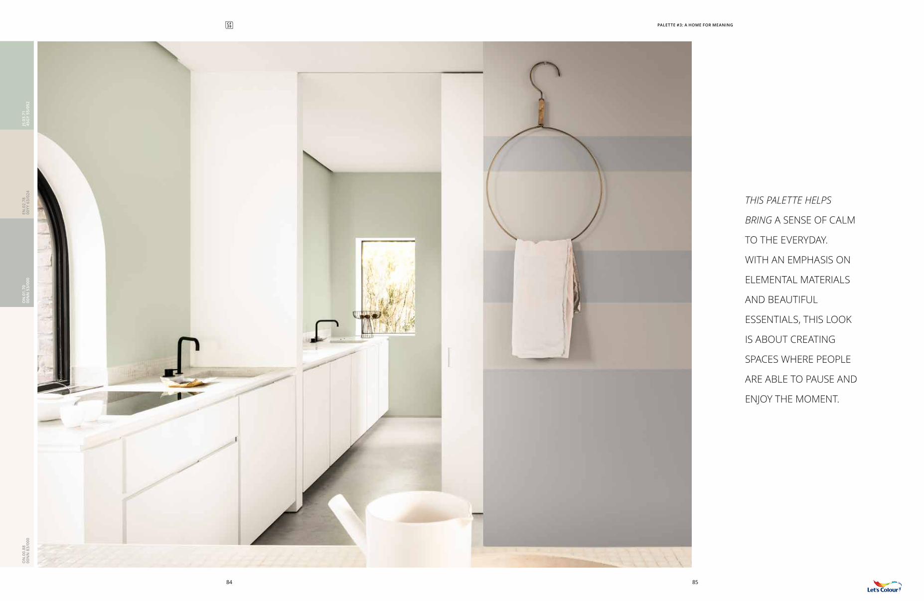
THIS PALETTE HELPS
BRING A SENSE OF CALM
TO THE EVERYDAY.
WITH AN EMPHASIS ON
ELEMENTAL MATERIALS
AND BEAUTIFUL
ESSENTIALS, THIS LOOK
IS ABOUT CREATING
SPACES WHERE PEOPLE
ARE ABLE TO PAUSE AND
ENJOY THE MOMENT.
PALETTE #3: A HOME FOR MEANING
8584
ON
.01.
7000
NN
53/
000
ON
.00.
8800
NN
83/
000
EN.0
2.78
00YY
63/
024
J5.0
3.71
45G
Y 55
/052
ON
.00.
8800
NN
83/
000
ON
.00.
7688
BG
62/
005
J5.0
3.71
45G
Y 55
/052
PALETTE #3: A HOME FOR MEANING
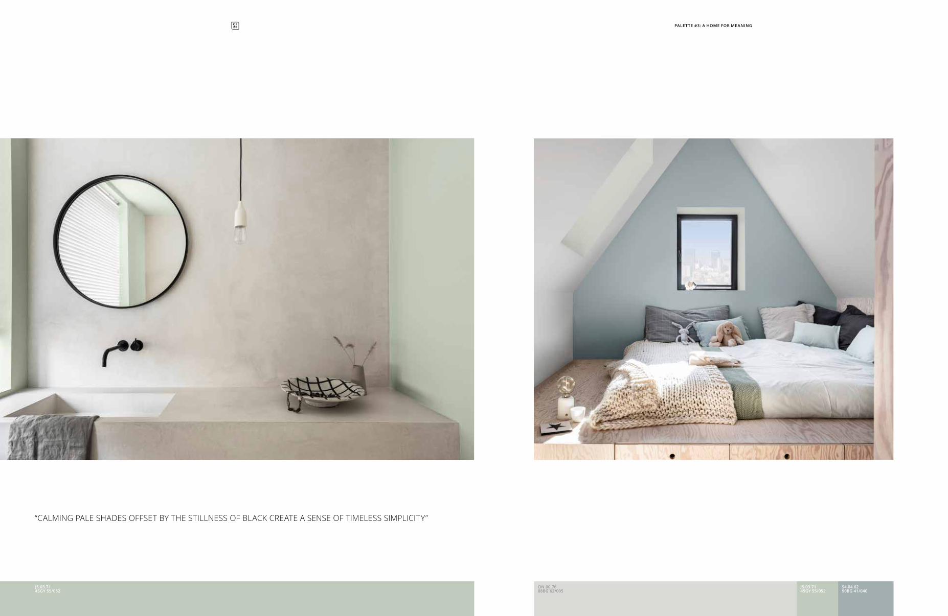
“CALMING PALE SHADES OFFSET BY THE STILLNESS OF BLACK CREATE A SENSE OF TIMELESS SIMPLICITY”
ON.00.7688BG 62/005
S4.04.6290BG 41/040
J5.03.7145GY 55/052
J5.03.7145GY 55/052
ON.00.88 00NN 83/000
EN.02.78 00YY 63/024
T3.04.12 30BB 05/022
ON.00.76 88BG 62/005
NN.01.54 62GG 31/016
S4.04.62 90BG 41/040
CN.02.38 22YR 17/023
TN.02.82 04BB 75/027
ON.01.70 00NN 53/000
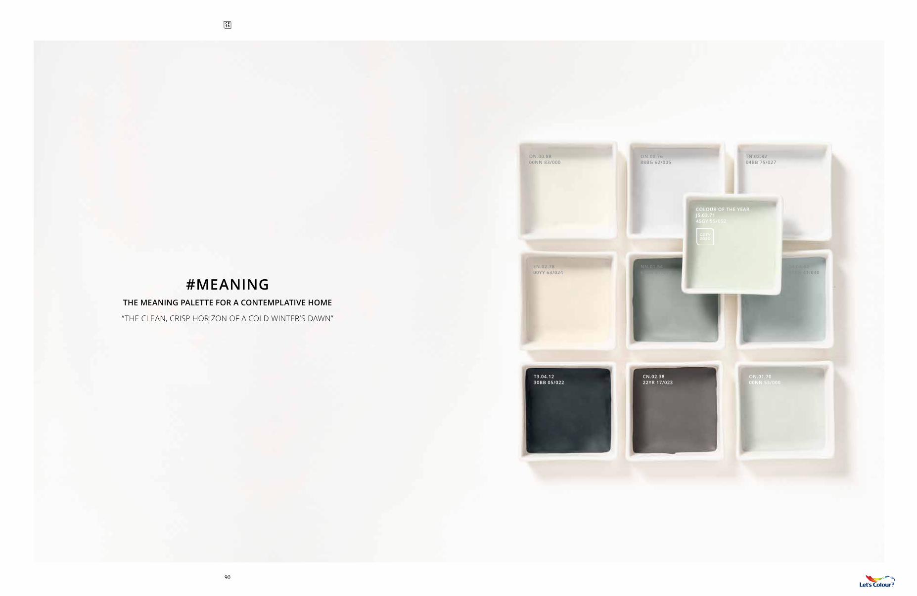
#MEANING THE MEANING PALETTE FOR A CONTEMPLATIVE HOME
“THE CLEAN, CRISP HORIZON OF A COLD WINTER’S DAWN”
COLOUR OF THE YEAR J5.03.7145GY 55/052
COTY 2020
90
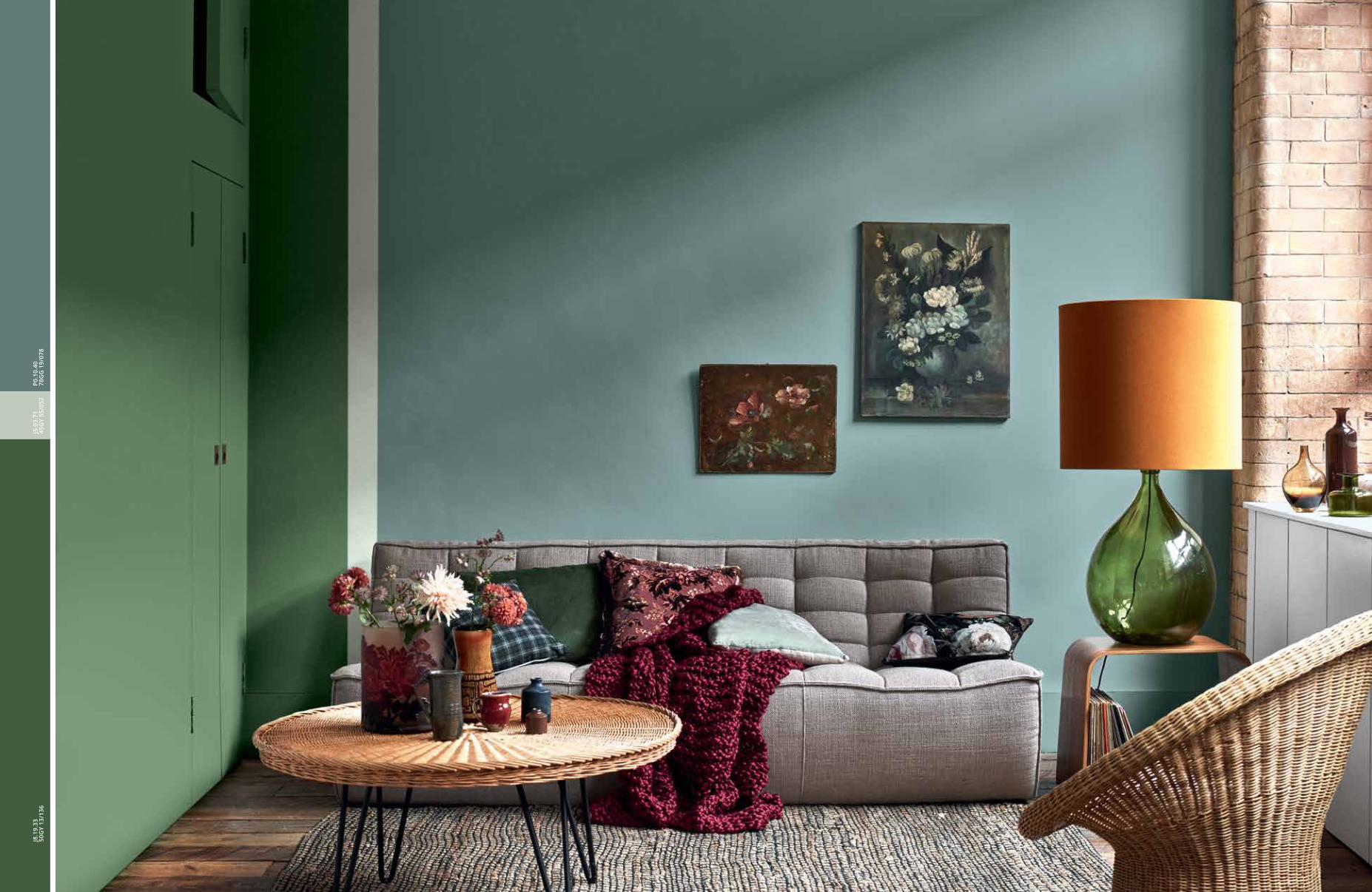
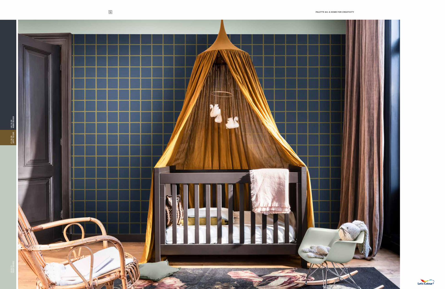
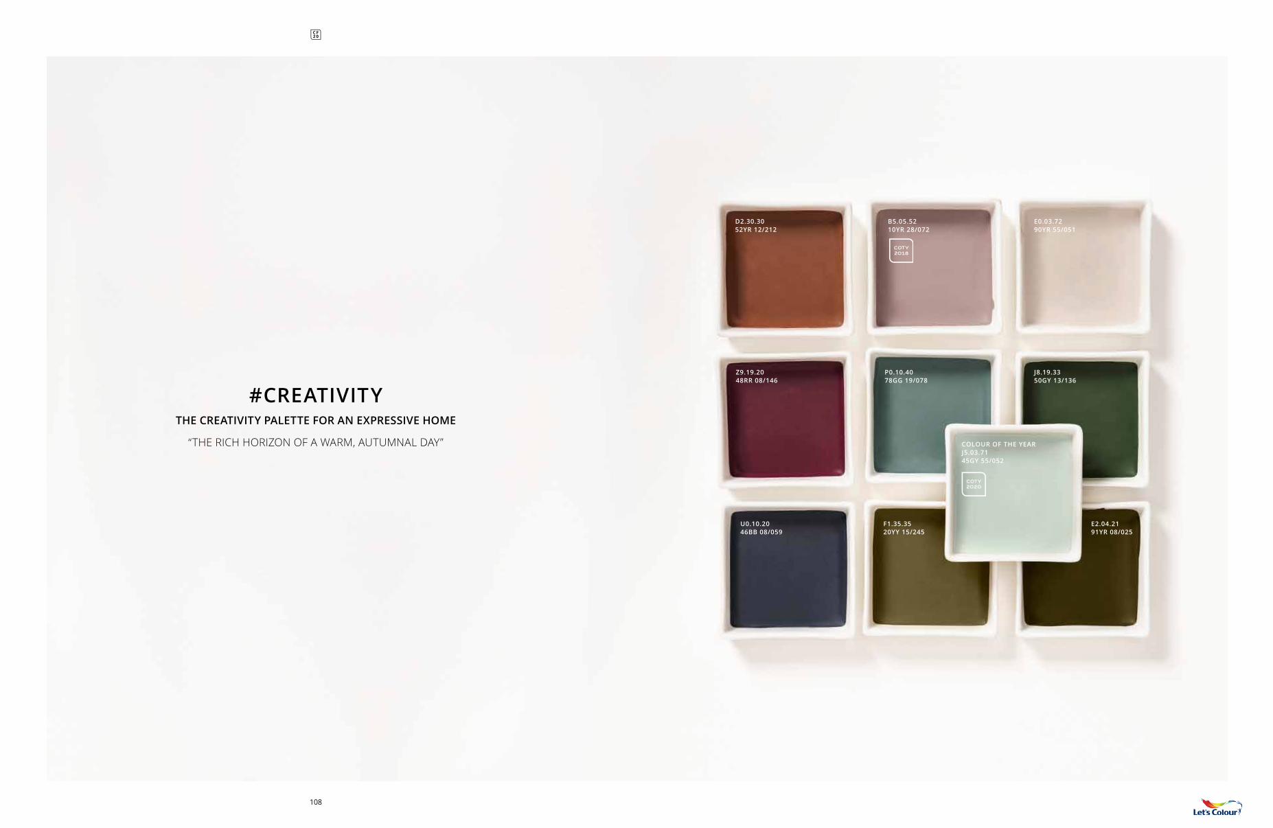
#4A HOME FOR CREATIVITY
93
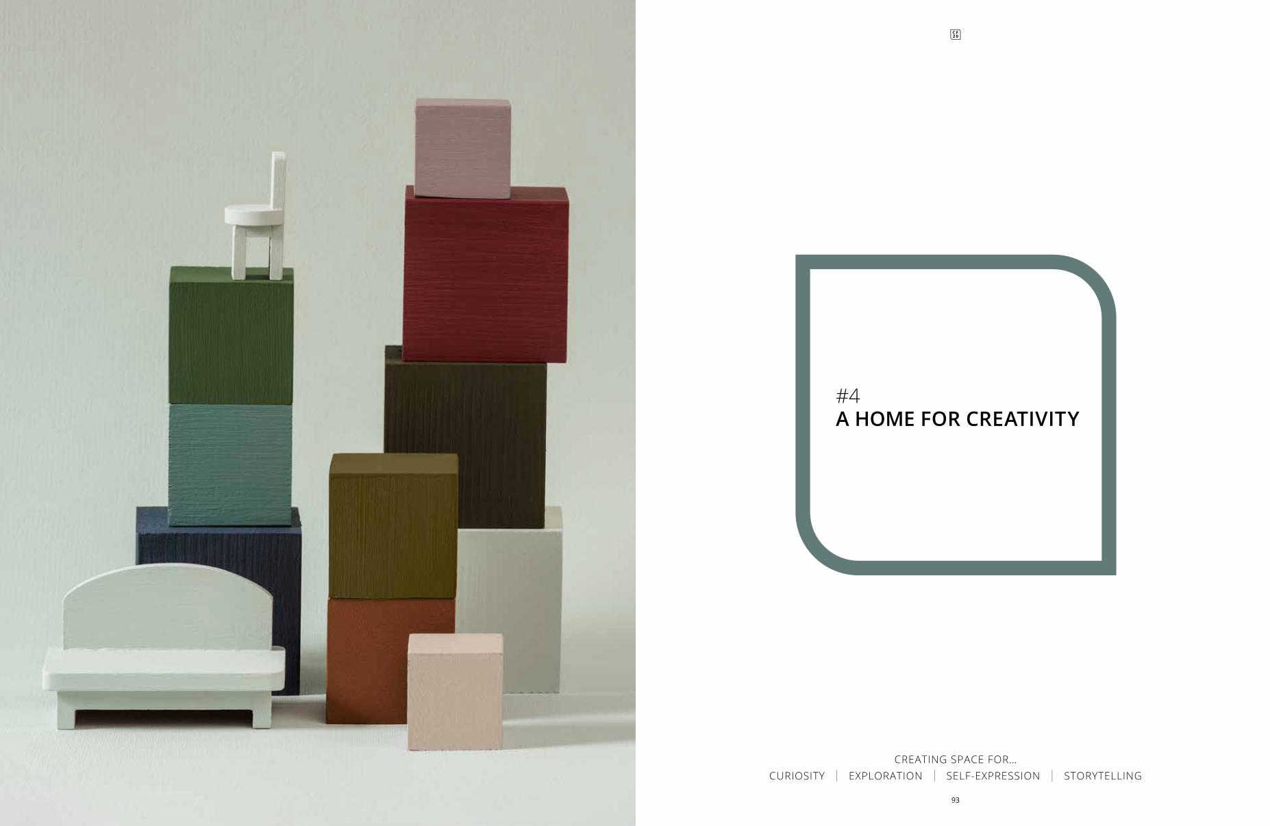
CREATING SPACE FOR… CURIOSITY | EXPLORATION | SELF-EXPRESSION | STORYTELLING
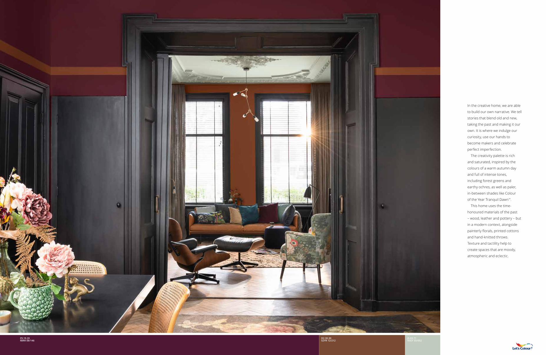
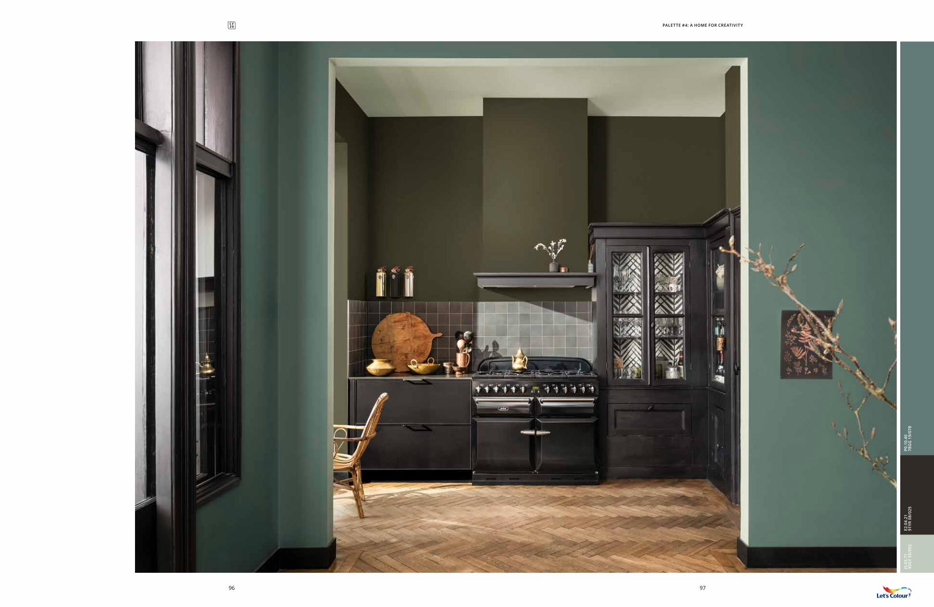
In the creative home, we are able
to build our own narrative. We tell
stories that blend old and new,
taking the past and making it our
own. It is where we indulge our
curiosity, use our hands to
become makers and celebrate
perfect imperfection.
The creativity palette is rich
and saturated, inspired by the
colours of a warm autumn day
and full of intense tones,
including forest greens and
earthy ochres, as well as paler,
in-between shades like Colour
of the Year Tranquil DawnTM.
This home uses the time-
honoured materials of the past
– wood, leather and pottery – but
in a modern context, alongside
painterly florals, printed cottons
and hand-knitted throws.
Texture and tactility help to
create spaces that are moody,
atmospheric and eclectic.
D2.30.3052YR 12/212
J5.03.7145GY 55/052
Z9.19.2048RR 08/146
J5.0
3.71
45G
Y 55
/052
E2.0
4.21
91YR
08/
025
P0.1
0.40
78G
G 1
9/07
8
9796
PALETTE #4: A HOME FOR CREATIVITY
98
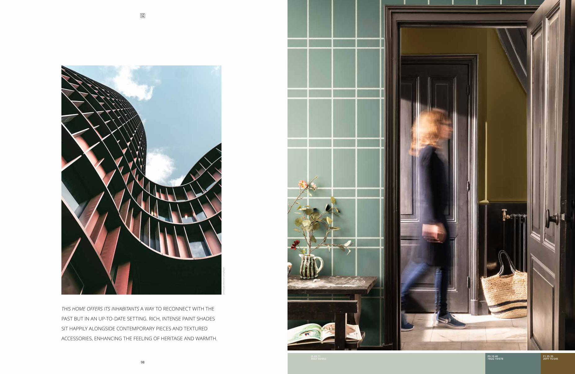
THIS HOME OFFERS ITS INHABITANTS A WAY TO RECONNECT WITH THE
PAST BUT IN AN UP-TO-DATE SETTING. RICH, INTENSE PAINT SHADES
SIT HAPPILY ALONGSIDE CONTEMPORARY PIECES AND TEXTURED
ACCESSORIES, ENHANCING THE FEELING OF HERITAGE AND WARMTH.
Jona
s Ja
cobs
son
unsp
lash
J5.03.7145GY 55/052
P0.10.4078GG 19/078
F1.35.3520YY 15/245
J5.0
3.71
45G
Y 55
/052
J8.1
9.33
50G
Y 13
/136
P0.1
0.40
78G
G 1
9/07
8
J5.03.7145GY 55/052
J8.19.3350GY 13/136
U0.10.2046BB 08/059
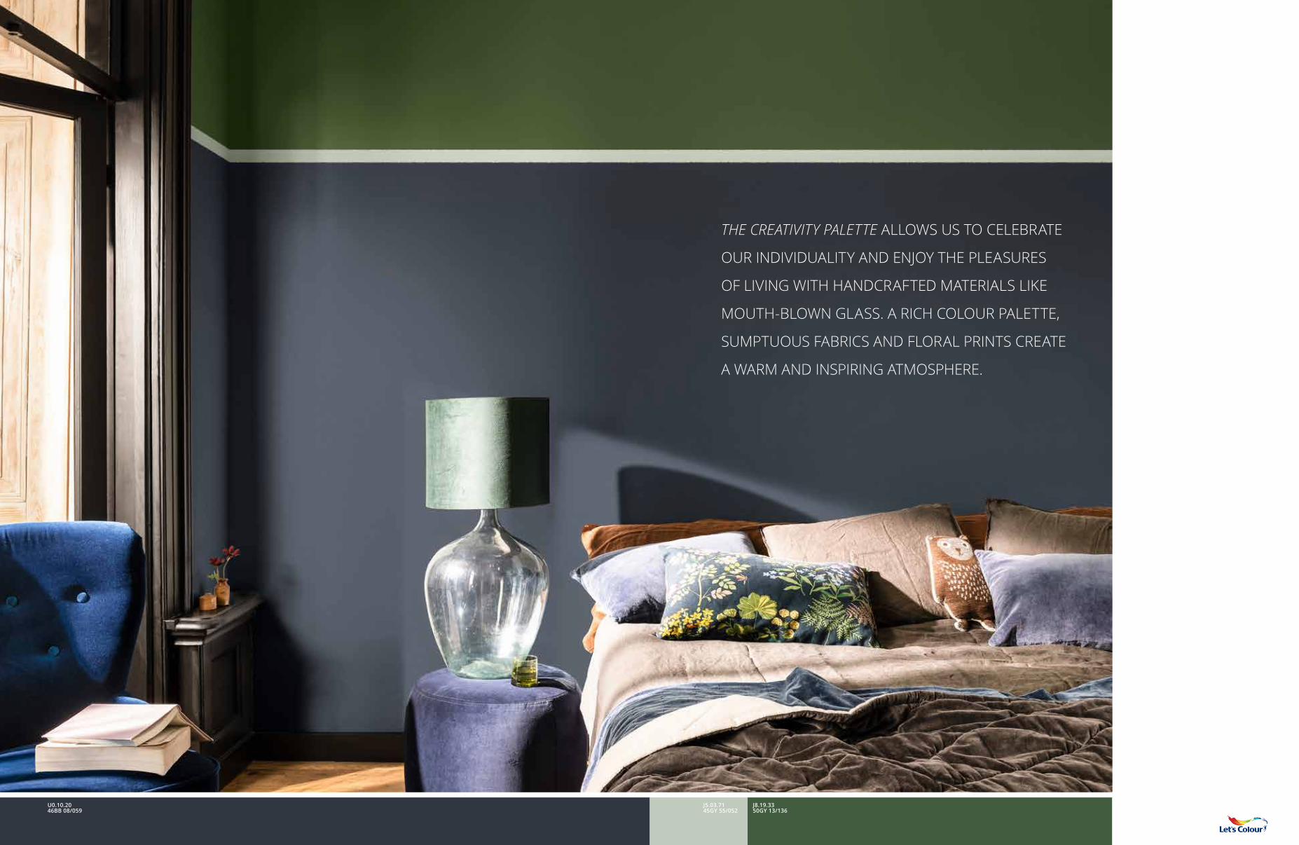
THE CREATIVITY PALETTE ALLOWS US TO CELEBRATE
OUR INDIVIDUALITY AND ENJOY THE PLEASURES
OF LIVING WITH HANDCRAFTED MATERIALS LIKE
MOUTH-BLOWN GLASS. A RICH COLOUR PALETTE,
SUMPTUOUS FABRICS AND FLORAL PRINTS CREATE
A WARM AND INSPIRING ATMOSPHERE.
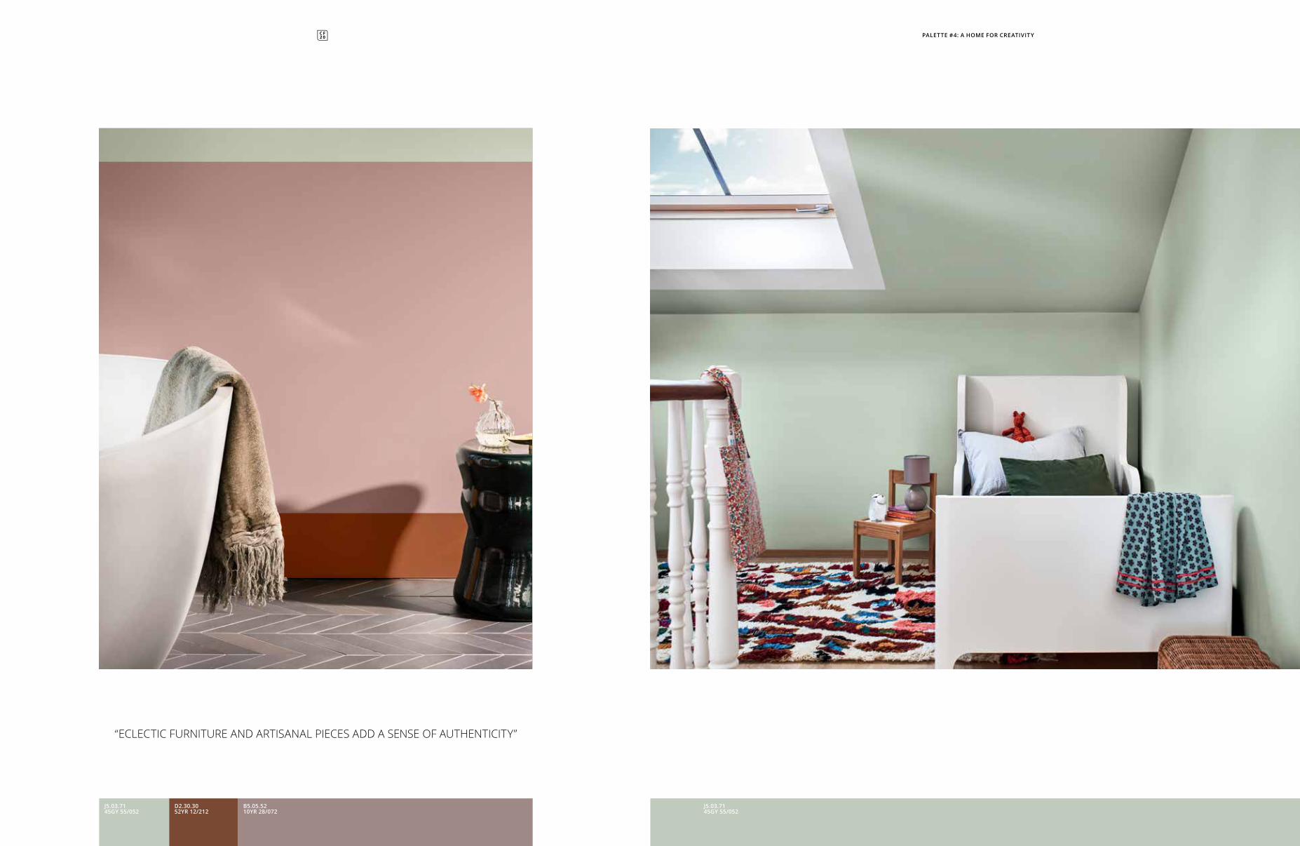
“ECLECTIC FURNITURE AND ARTISANAL PIECES ADD A SENSE OF AUTHENTICITY”
B5.05.5210YR 28/072
J5.03.7145GY 55/052
J5.03.7145GY 55/052
D2.30.3052YR 12/212
PALETTE #4: A HOME FOR CREATIVITY
J5.0
3.71
45G
Y 55
/052
U0.
10.2
046
BB
08/
059
F1.3
5.35
20YY
15/
245
PALETTE #4: A HOME FOR CREATIVITY
COLOUR OF THE YEAR J5.03.7145GY 55/052
D2.30.3052YR 12/212
Z9.19.2048RR 08/146
U0.10.2046BB 08/059
B5.05.5210YR 28/072
P0.10.4078GG 19/078
J8.19.3350GY 13/136
F1.35.3520YY 15/245
E0.03.7290YR 55/051
E2.04.2191YR 08/025
#CREATIVITY THE CREATIVITY PALETTE FOR AN EXPRESSIVE HOME
“THE RICH HORIZON OF A WARM, AUTUMNAL DAY”
COTY 2020
COTY 2018
108
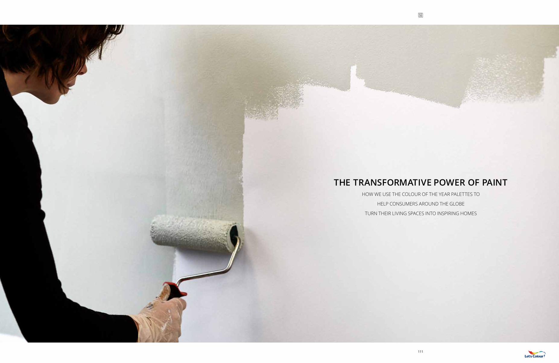
THE TRANSFORMATIVE POWER OF PAINTHOW WE USE THE COLOUR OF THE YEAR PALETTES TO
HELP CONSUMERS AROUND THE GLOBE
TURN THEIR LIVING SPACES INTO INSPIRING HOMES
111
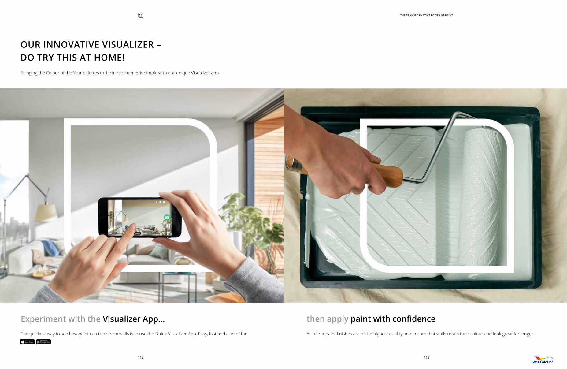
Bringing the Colour of the Year palettes to life in real homes is simple with our unique Visualizer app
OUR INNOVATIVE VISUALIZER – DO TRY THIS AT HOME!
THE TRANSFORMATIVE POWER OF PAINT
then apply paint with confidence
All of our paint finishes are of the highest quality and ensure that walls retain their colour and look great for longer.
113112
The quickest way to see how paint can transform walls is to use the Dulux Visualizer App. Easy, fast and a lot of fun.
Experiment with the Visualizer App...
THE PLAYFUL SPACE THE EXPRESSIVE SPACETHE NURTURING SPACE THE CALMING SPACE
115114
BEFORE
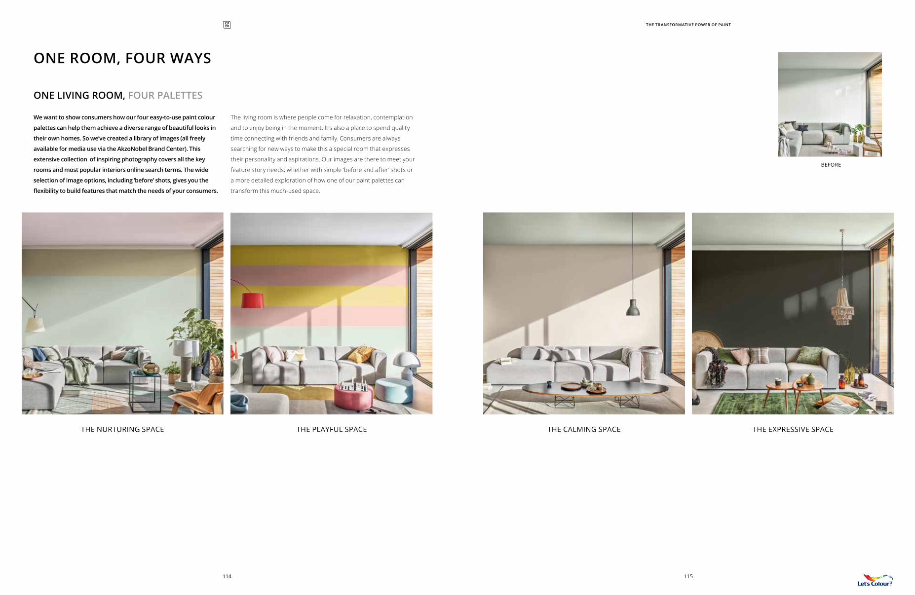
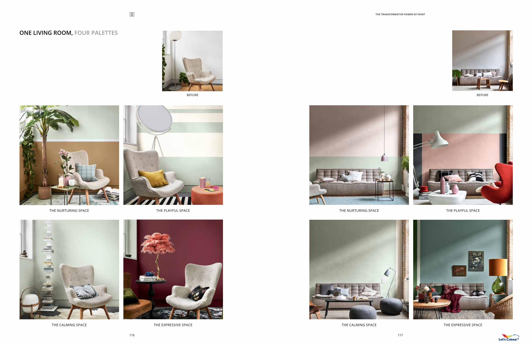
We want to show consumers how our four easy-to-use paint colour
palettes can help them achieve a diverse range of beautiful looks in
their own homes. So we’ve created a library of images (all freely
available for media use via the AkzoNobel Brand Center). This
extensive collection of inspiring photography covers all the key
rooms and most popular interiors online search terms. The wide
selection of image options, including ‘before’ shots, gives you the
flexibility to build features that match the needs of your consumers.
ONE ROOM, FOUR WAYS
The living room is where people come for relaxation, contemplation
and to enjoy being in the moment. It’s also a place to spend quality
time connecting with friends and family. Consumers are always
searching for new ways to make this a special room that expresses
their personality and aspirations. Our images are there to meet your
feature story needs; whether with simple ‘before and after’ shots or
a more detailed exploration of how one of our paint palettes can
transform this much-used space.
ONE LIVING ROOM, FOUR PALETTES
THE TRANSFORMATIVE POWER OF PAINT
BEFORE
THE TRANSFORMATIVE POWER OF PAINT
BEFORE
117116
ONE LIVING ROOM, FOUR PALETTES
THE CALMING SPACE THE CALMING SPACETHE EXPRESSIVE SPACE THE EXPRESSIVE SPACE
THE NURTURING SPACE THE NURTURING SPACETHE PLAYFUL SPACE THE PLAYFUL SPACE
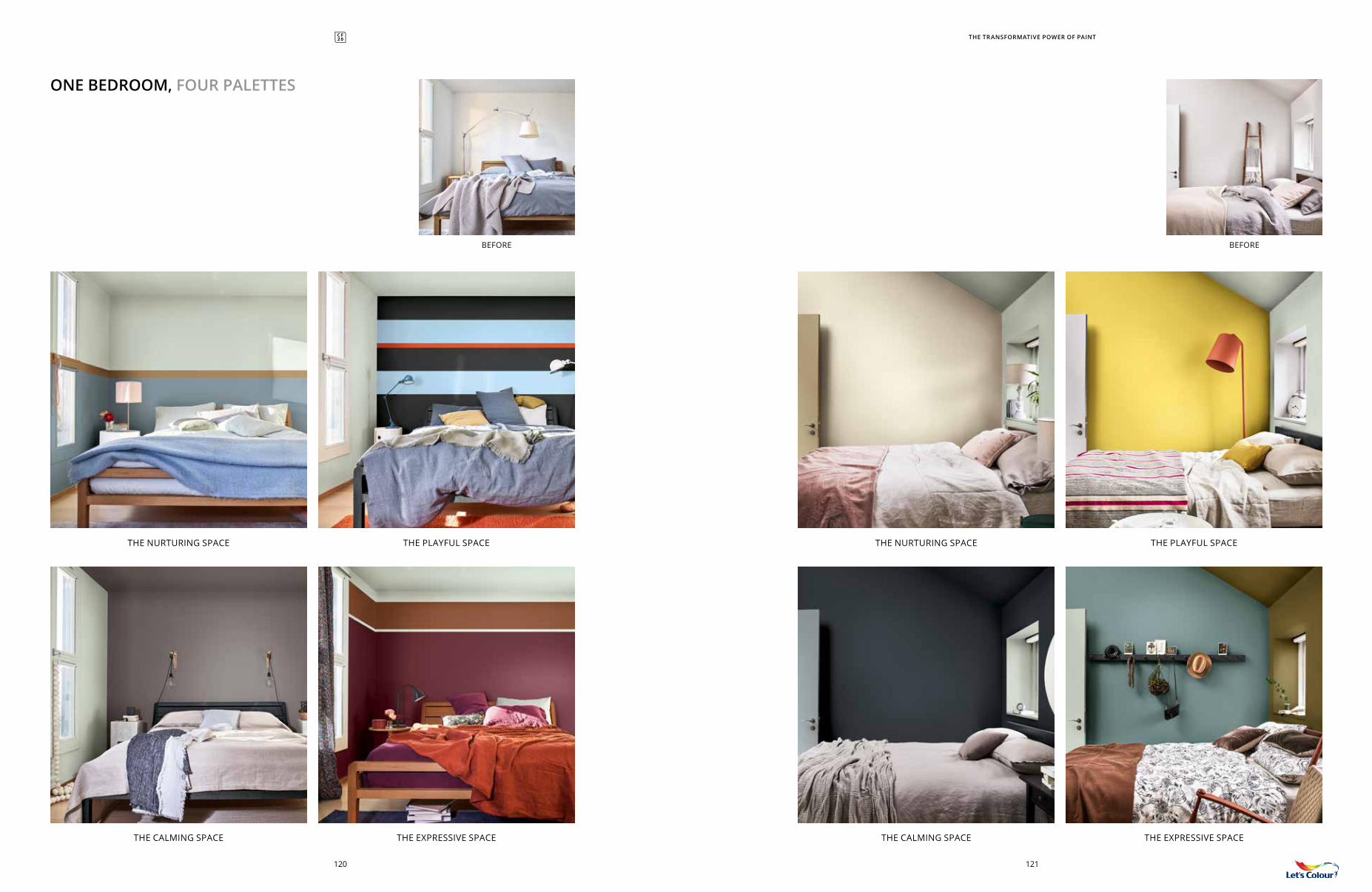
In today’s fast-paced and ‘connected’ world, the bedroom has
become increasingly important as a private retreat, an intimate
room where people can rest and recharge. Consumers are paying
ever more attention to making this room meet their needs and
provide a haven. We’ve created a wide selection of incredible images
to help you easily compile a beautiful bedroom story to suit the
tastes of your consumers, such as ‘one bedroom, four ways’, which
will really bring home the transformative power of paint.
ONE BEDROOM, FOUR PALETTES
THE TRANSFORMATIVE POWER OF PAINT
BEFORE
THE EXPRESSIVE SPACETHE CALMING SPACETHE PLAYFUL SPACETHE NURTURING SPACE
119118
THE NURTURING SPACE THE NURTURING SPACETHE PLAYFUL SPACE THE PLAYFUL SPACE
THE CALMING SPACE THE CALMING SPACETHE EXPRESSIVE SPACE THE EXPRESSIVE SPACE
121120
BEFOREBEFORE
ONE BEDROOM, FOUR PALETTES
THE TRANSFORMATIVE POWER OF PAINT
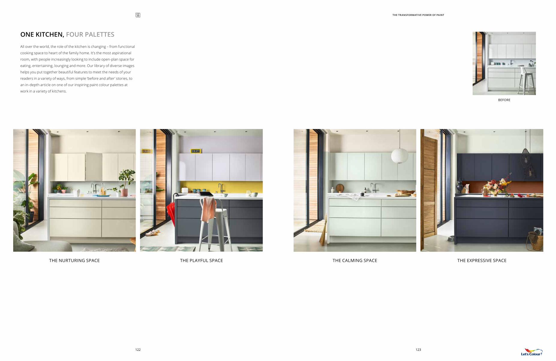
All over the world, the role of the kitchen is changing – from functional
cooking space to heart of the family home. It’s the most aspirational
room, with people increasingly looking to include open-plan space for
eating, entertaining, lounging and more. Our library of diverse images
helps you put together beautiful features to meet the needs of your
readers in a variety of ways, from simple ‘before and after’ stories, to
an in-depth article on one of our inspiring paint colour palettes at
work in a variety of kitchens.
ONE KITCHEN, FOUR PALETTES
THE TRANSFORMATIVE POWER OF PAINT
BEFORE
THE CALMING SPACETHE NURTURING SPACE THE EXPRESSIVE SPACETHE PLAYFUL SPACE
123122
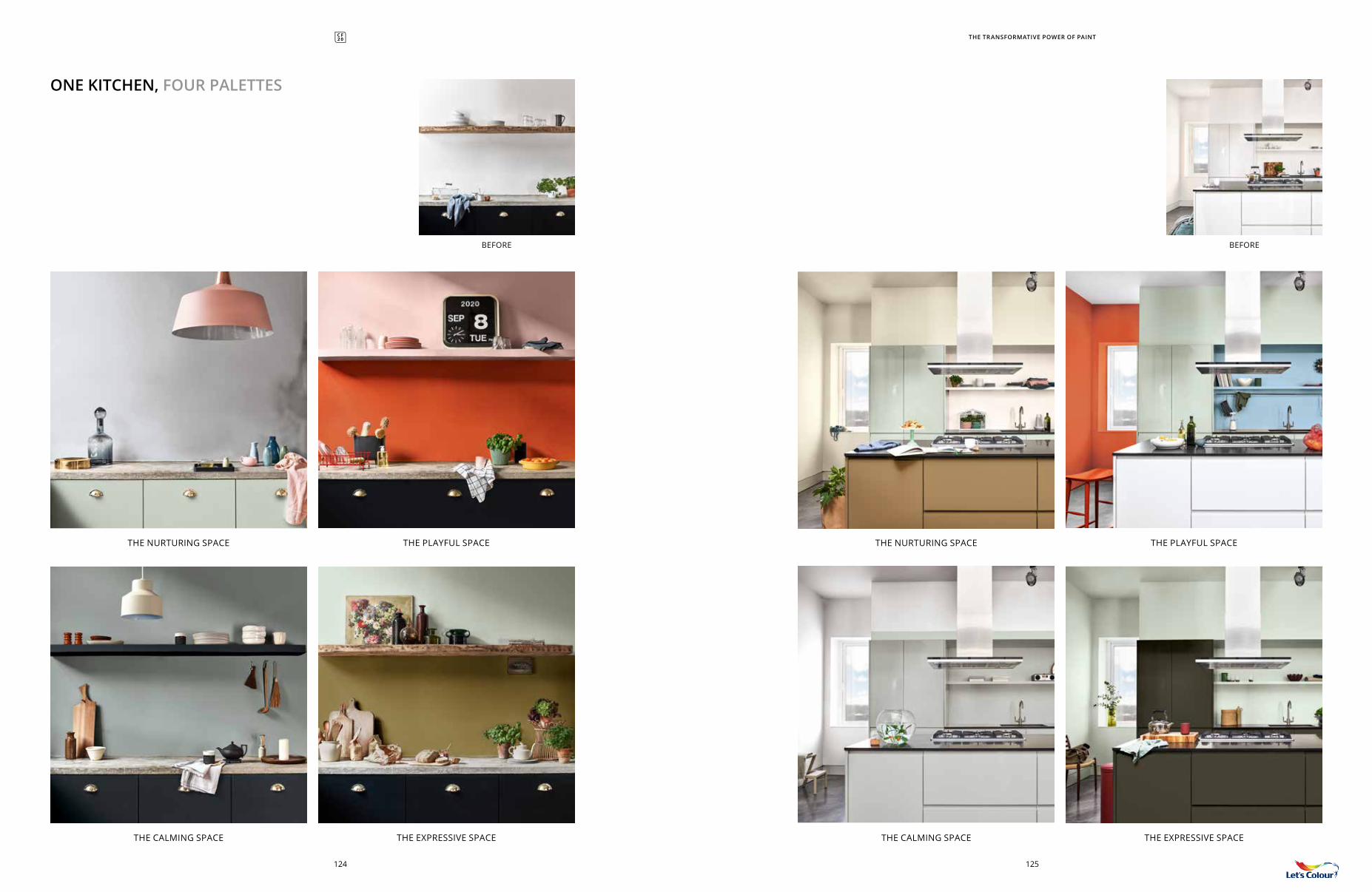
ONE KITCHEN, FOUR PALETTES
THE TRANSFORMATIVE POWER OF PAINT
THE CALMING SPACE THE CALMING SPACETHE EXPRESSIVE SPACE THE EXPRESSIVE SPACE
THE NURTURING SPACE THE NURTURING SPACETHE PLAYFUL SPACE THE PLAYFUL SPACE
BEFOREBEFORE
125124
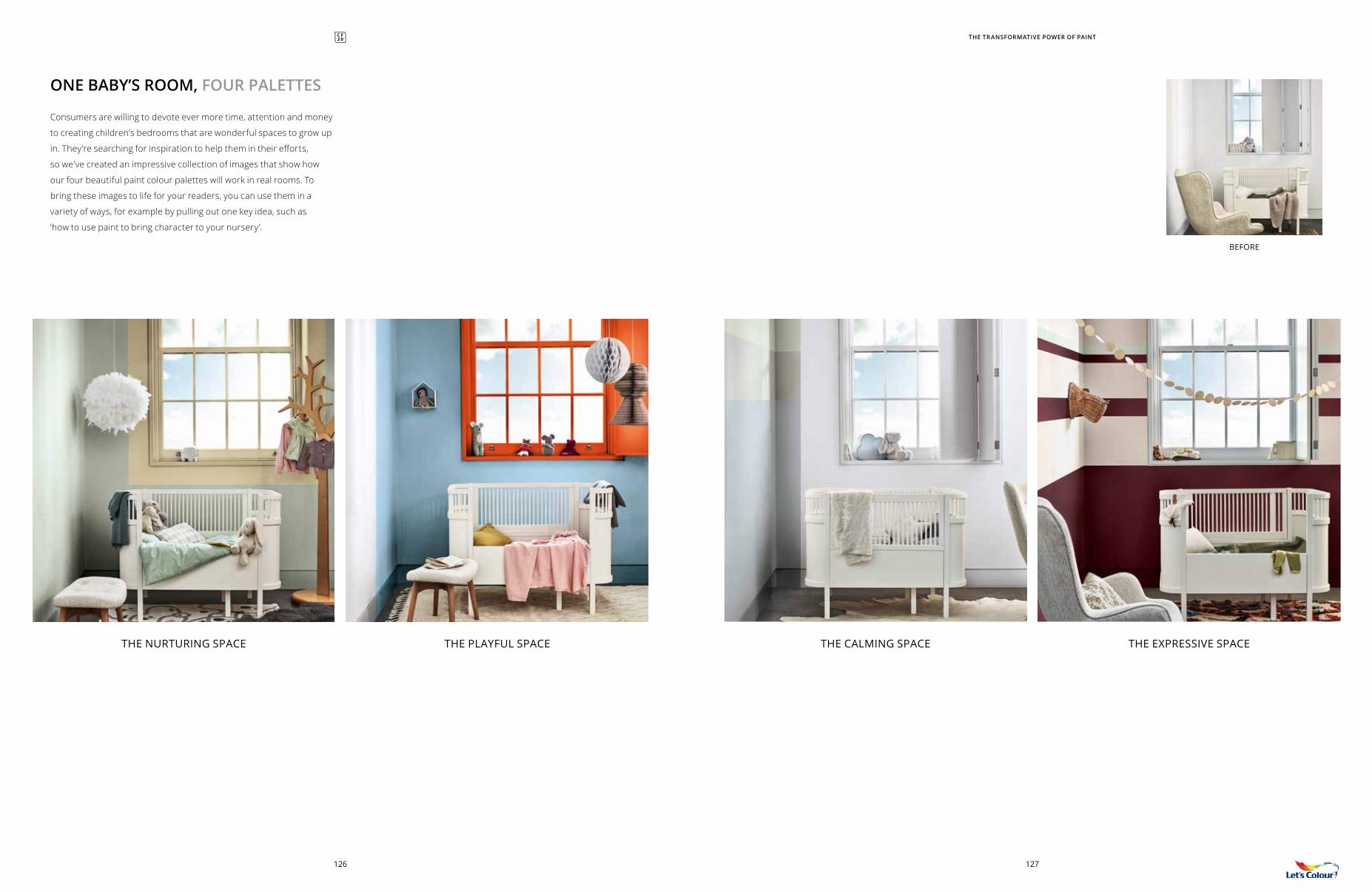
Consumers are willing to devote ever more time, attention and money
to creating children’s bedrooms that are wonderful spaces to grow up
in. They’re searching for inspiration to help them in their efforts,
so we’ve created an impressive collection of images that show how
our four beautiful paint colour palettes will work in real rooms. To
bring these images to life for your readers, you can use them in a
variety of ways, for example by pulling out one key idea, such as
‘how to use paint to bring character to your nursery’.
ONE BABY’S ROOM, FOUR PALETTES
THE CALMING SPACETHE NURTURING SPACE THE EXPRESSIVE SPACETHE PLAYFUL SPACE
BEFORE
THE TRANSFORMATIVE POWER OF PAINT
127126
ONE KID’S ROOM, FOUR PALETTES
THE CALMING SPACE THE CALMING SPACETHE EXPRESSIVE SPACE THE EXPRESSIVE SPACE
THE NURTURING SPACE THE NURTURING SPACETHE PLAYFUL SPACE THE PLAYFUL SPACE
THE TRANSFORMATIVE POWER OF PAINT
129128
BEFOREBEFORE
P04-41
P42-57
P58-73
COVER
P74-91
P92-109
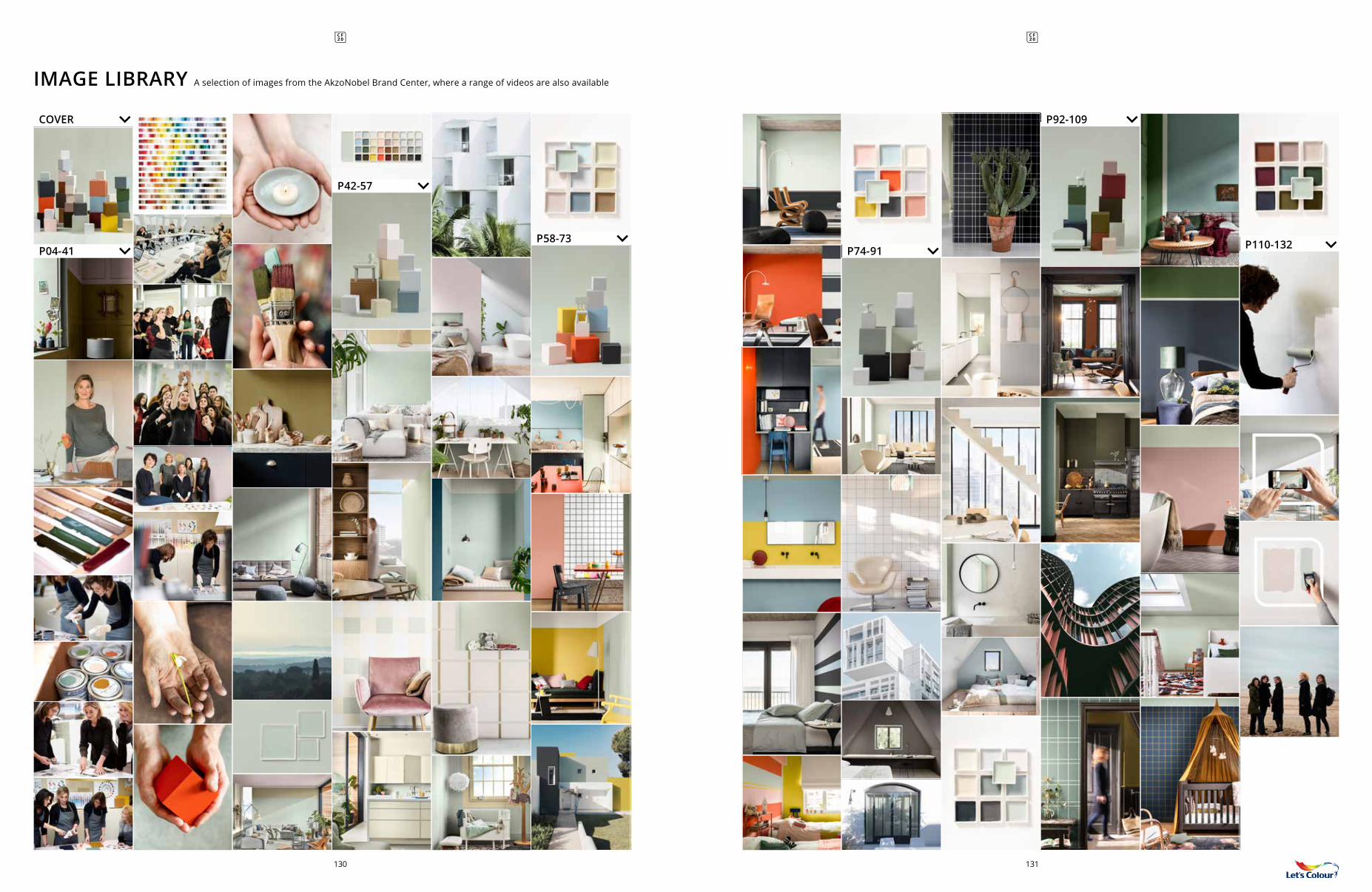
IMAGE LIBRARY A selection of images from the AkzoNobel Brand Center, where a range of videos are also available
P110-132
131130
132
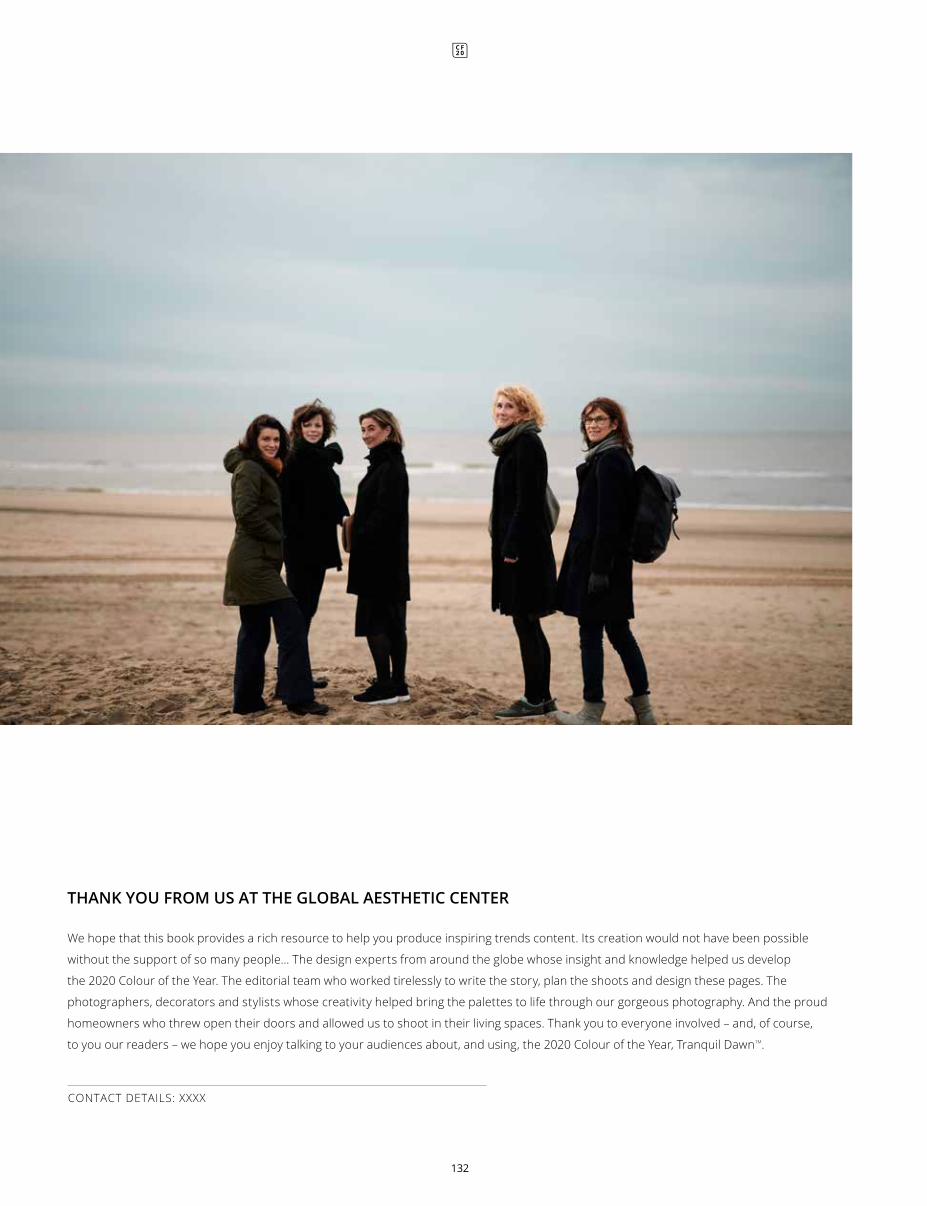
We hope that this book provides a rich resource to help you produce inspiring trends content. Its creation would not have been possible
without the support of so many people… The design experts from around the globe whose insight and knowledge helped us develop
the 2020 Colour of the Year. The editorial team who worked tirelessly to write the story, plan the shoots and design these pages. The
photographers, decorators and stylists whose creativity helped bring the palettes to life through our gorgeous photography. And the proud
homeowners who threw open their doors and allowed us to shoot in their living spaces. Thank you to everyone involved – and, of course,
to you our readers – we hope you enjoy talking to your audiences about, and using, the 2020 Colour of the Year, Tranquil DawnTM.
CONTACT DETAILS: XXXX
THANK YOU FROM US AT THE GLOBAL AESTHETIC CENTER