abbie ronald preliminary task and planning & research marked
TRANSCRIPT

OCR Media Studies – AS Level
Unit G321: Foundation Portfolio in Media
Planning & Research
Name: Abigail RonaldCandidate Number: 2121Center Name: St. Andrew’s Catholic SchoolCenter Number:64135
Set Brief - Print
Music Magazine – Production
Preliminary Task Progression and Planning & Research

Section 1) – Preliminary Task
Preliminary Task Progression– EvidenceFront Cover
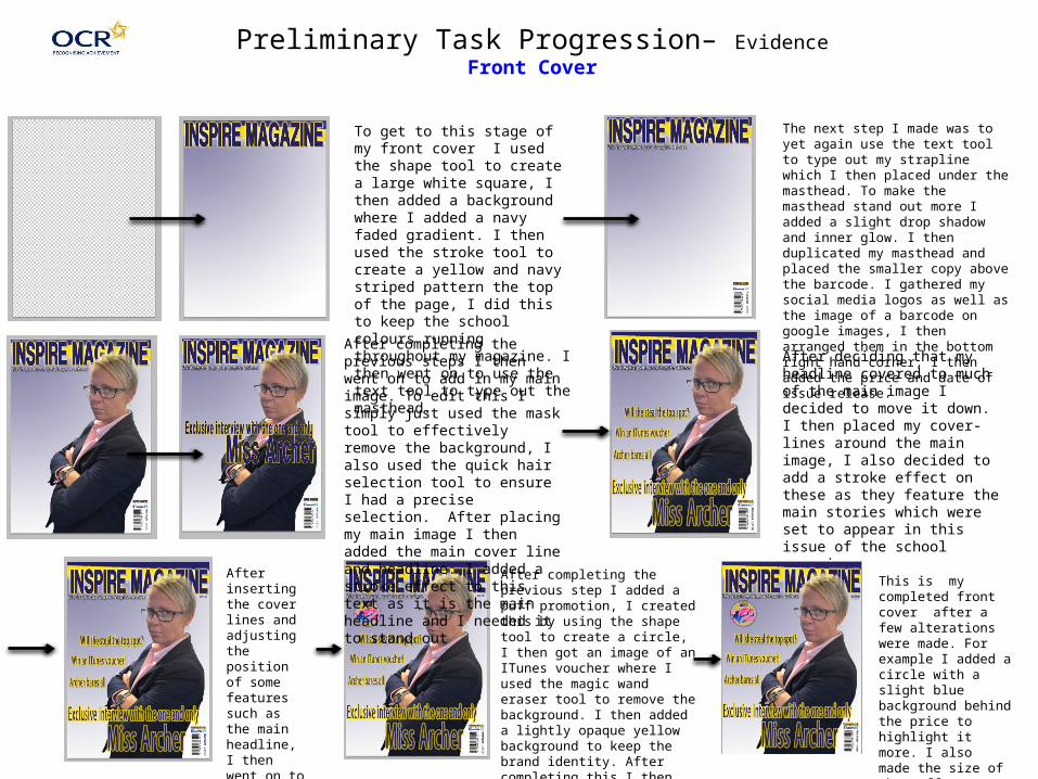
To get to this stage of my front cover I used the shape tool to create a large white square, I then added a background where I added a navy faded gradient. I then used the stroke tool to create a yellow and navy striped pattern the top of the page, I did this to keep the school colours running throughout my magazine. I then went on to use the text tool to type out the masthead.
The next step I made was to yet again use the text tool to type out my strapline which I then placed under the masthead. To make the masthead stand out more I added a slight drop shadow and inner glow. I then duplicated my masthead and placed the smaller copy above the barcode. I gathered my social media logos as well as the image of a barcode on google images, I then arranged them in the bottom right hand corner, I then added the price and date of issue release.
After completing the previous steps I then went on to add in my main image. To edit this I simply just used the mask tool to effectively remove the background, I also used the quick hair selection tool to ensure I had a precise selection. After placing my main image I then added the main cover line and headline. I added a stroke effect to this text as it is the main headline and I needed it to stand out
After deciding that my headline covered to much of the main image I decided to move it down. I then placed my cover-lines around the main image, I also decided to add a stroke effect on these as they feature the main stories which were set to appear in this issue of the school magazine.
After inserting the cover lines and adjusting the position of some features such as the main headline, I then went on to add in the price below the masthead.
After completing the previous step I added a puff promotion, I created this by using the shape tool to create a circle, I then got an image of an ITunes voucher where I used the magic wand eraser tool to remove the background. I then added a lightly opaque yellow background to keep the brand identity. After completing this I then used the text tool to write ‘WIN’ in the font I used for my masthead (To yet again keep the house style)
This is my completed front cover after a few alterations were made. For example I added a circle with a slight blue background behind the price to highlight it more. I also made the size of the puff promotion slightly bigger.

Masthead
Main Image
Social Media
Main Headline
Strapline
Issue Number
Barcode
Puff Promotion
Cover Lines
Price
Date of Issue
Web Address
Final Version of Front Cover

Preliminary Task Progression– EvidenceContents Page
The first step I took when making my contents page was duplicating the background layer from my front cover and using it on this page as I wanted to keep the brand identity.
The next step I took was to create the heading, I did this by using the text tool, I decided to use the same font as the masthead as it was bold and eye catching, I also used the same effects such as a drop shadow. I then duplicated the masthead an placed it above the heading,
I then went on to add in the subheading to deconstruct what would feature in each page of my magazine, I then thought that there was too much dead space surrounding these subheadings, so in order to fill this I added in the school logo after each one of them.
I then added in my editorial in the bottom left hand corner. I first typed it out in word before inserting it in a text box on my page. I created the drop capital by creating a separate text box and just typing out the ‘H’, I then used the ‘Character’ window to enlarge this and make it bolder by changing the colour to navy and making the letter thicker. I then scanned in a copy of my signature which I then placed in along side my social media information and logos. After doing this I added in an image of myself, backed by a navy and yellow shape which I created using the shape tool.
To eliminate some dead space I added in a ‘Star Students of the Week’ section where I featured three students. I got three students and photographed them and made up a story to why they featured in this section of my magazine.
I then added in images which supported some of the main stories featuring in this issue of my school magazine. I then decided to copy what I had done with my editorial image and added the navy and yellow backing to each image to make them stand out more.
The next thing I did was add on the corresponding number on each supporting image so that the reader knew which image was linked to what story. I also used the same font as the masthead to maintain the housestyle.
The final thing I did on my contents page was add in the page number as well as the web address in the bottom right hand corner. I also used the masthead font style here to ensure that the colours of the school ran through the entirety of my magazine to keep the brand/school identity,

Web AddressEditorial
School Logos
Sublines & Page Numbers
Copy of masthead/Logo
Heading
Supporting Images
Page Number
Final Version of Contents Page

Section 2) – Log Book

Magazine Process• Date of Publication – The first thing that is done it to set the date the magazine will be published to the
general public. This will help with setting a schedule for the development.• Managing the Schedule – You must have enough space in the schedule to fix any mistakes before the
deadline.• Editorial and Budgetary Decision – It is the editorial decisions which involved the content that is covered
in the next issue of the magazine. Once they have made the decisions they look at how much money is available for them and how much should be spent in the production of the magazine.
• Content Acquisition – Probably the most important step because without content there would be no magazine. There is in-house staff writers for the magazine and external writers that write about a specialist nature. There is also artwork and illustrations and pictures in the magazine.
• Sub-Editing – This focuses on the quality control, it involves checking the accuracy of the facts, making sure words are spelt correctly, property grammar and punctuation are used, make sure that the articles follow the house style and work on the page layout.
• Page Layout – This person will correctly lay the articles out to put it together as a magazine using powerful programs such as Desktop Publishing (DTP) or InDesign or Pagemaker to do this. The advertisers are also placed into the content.
• Proof Reading – The editorial department will print a hardcopy of the magazine in order to read through it and to find any mistakes. Any mistake that is spotted is quickly corrected, the editorial keeps proof reading until all the team is satisfied there is no mistakes.
• Printing – The entire magazine is send to the printer, Pre-Press’ are printed to check all the colours and layout is fine before printing hundreds or thousands of copies.
• Distribution – It is the final stage where the company packs the magazines and go to a warehouse to go to the general public.
: http://hosbeg.com/the-magazine-production-process/

Established Magazine for my Research
Bold Masthead which is a capital letter on top of a bright red background (stands out from the rest of the cover). The masthead is also a different font to the rest of the text on the front cover (e.g Coverlines) which creates an effective contrast.
Colour scheme – The colour scheme is quite limited as all text is white, this makes the front cover unique compared to many other music magazine designs in the industry.
Barcode – The barcode is displayed in the bottom left hand corner which makes it discreet – this makes the main image stand out more. The barcode also has a web address alongside it which allows the reader to then visit the companies main site.
Main image – the main image is the underlay background which the writing sits upon, ‘Q’ should have slightly overlaid Florence’s face over the logo so it makes her stand out more and makes her look more significant. As the image is so big the writing surrounds her face, which adds extra emphasis on her face as well as her contrasting makeup.
Main headline – the main cover line on the front cover of this magazine is one of its main selling points. This cover line is very effective as it sounds exclusive to the magazine – this is a good technique as it makes more people want to buy it so they can know about the exclusive gossip.
‘Exclusive’ Competitions and prizes – Q magazine have included a small feature on the magazine as an alternation technique to attract more buyers. By buying this magazine it gives the reader a chance to win an ‘exclusive’ prize. Using the word ‘exclusive’ is appealing as it means that this specific competition is restricted to this magazine only.

Target AudienceThe denotation of the target audience is teenagers to young adults, mainly targeted at the ages 15 – 30 years old (Hartley's 7 subjectivities). The vast majority of the readers are men (around 70%) however there are a small amount of women (around 30%) who also read it. Q magazine is also aimed at a middle class audience as the price of the magazine is £3.99. Q magazine make sure to cover many different music genres which open the appeal to most ethnicities and nationalities. Unlike many other magazines, ‘Q’ magazine is extremely factual, ensuring that they include details about artists personal life's, as well as includes many statistics about recent sales figures etc. For this reason I believe that the readership for this magazine would be ‘Survivors’ as they like to be able to rely on a product, and like to feel secure in what they are reading.
What is the USP of this magazine? From the research completed into this media product, I think the USP varies between a few of the different codes and conventions within the magazine. One of the main unique selling points of this magazine is the design of the front cover – Q magazine have an original and repetitive style on each of their front covers - The typical front page of Q magazine always has to have the trademark masthead, a big red box with a bold white Q in it. It is always positioned in the top left of the magazine. The text is always very simple but viewable as it always seems to be in a bold font. The main image of the artist always dominates the front page as the majority of the time no other images are used on the front page.

Publisher researchEditor: Phil AlexanderFrequency: 12 issues per yearPublisher: Bauer Media Group
Q Magazine is a music magazine which has an extensive review section it also features new releases, film and live concert reviews as well as TV and radio reviews.
Q Magazine is targeted at mainly 15-30 year olds..
Annual circulation figure (2014) : 39,000

Conventions of a Music MagazineMasthead – the masthead of this CLASH magazine front cover is bold as it is very simplistic, as it is a plain font and plain white. The masthead is the magazine companies logo but in white and is very appealing due to the size of the font as well as its placement on every issues front cover – as it is displayed right at the top of the cover, it is the first thing the consumer gets drawn to when looking for what magazine to purchase.
Main Image – The denotation of the technical code for this image is a close up image. As Iggy Azalea's image is the only image o the front cover it allows all the attention to be drawn to her – as her clothing is the only pop of colour on the front cover, it emphasises her even though the text is all over laid on top of her image. The image also has a large amount of star appeal as she is the only person featured , making her the centrepiece.
Cover Lines – On the vast majority of issues produced by CLASH magazine, the cover lines consist of the different artists names that also feature elsewhere in the magazine. By using cover lines in this unique way, they provide a brief summary and insight into what the magazine holds, yet doesn’t give too much away which means the reader is still intrigued enough to buy it.
Colour Scheme – CLASH magazine have used a very effective and simplistic colour scheme. The colour scheme is effective as the backdrop colour is plain grey, and all the text is simply white. This is gives off a very smart and professional look as the only bold colour on the front cover is the photograph, this emphasises Iggy Azalea’s hair as well as her clothing.
Barcode/ Date/ Price/ Web address – This is discretely placed on the right hand side of the magazine cover, it is also fairly narrow which allows more of a space for other text and images which are displayed on the cover. The web address is also an effective feature as it allows the company to direct the reader to their website where they have more information, interviews, photos etc.
This issue of ‘CLASH’ magazine is however lacking many features in
which other magazines include. This included features such as a Puff
Promotion, Social Media links and a strapline. When making my own music magazine I will ensure to include these features as it adds extra appeal to the magazine.

Target Audience - The target audience for CLASH magazine is portrayed as young adults, aged between 15 – 35, the ‘Download generation’. As the magazine alternates between modern artists and groups such as Coldplay and Iggy Azalea, it attracts a broad audience that are interested and music as well as modern fashion. As the magazine incorporate fashion, film and music into one magazine it allows them to open up their magazine to people who aren’t that interested in music as well as the ones who are. Inside the magazine the text style is very simplistic and there are no large blocks of text which makes it easier to read and makes it more appealing to those who are short of time. The magazine mainly consists of pictures which also makes the magazine more appealing for those who are less interested in reading about the artists. According the Katz’ the readership for this magazine would be white males/females aged between 18-35years.
What is the USP of this magazine? From the research completed into this media product, I think the USP is the unique style. CLASH has a very indigenous style compared to many other music magazines on the market, the colour schemes features are usually very simplistic, on the majority of the pages there is a main image which fills the entirety of the space, the text styles used are also very basic which gives a chic, minimalist look, compared to other magazines which use as bold fonts as possible to try and draw people to their magazine. Another unique selling point of this magazine is the lack of codes and conventions in which are portrayed on their front cover, as well as throughout the rest of the magazine. Many other magazines include Straplines, Puff Promotions as well as other fetaures to entice readership to their magazine, making CLASH unique for not doing this.

Publisher researchEditor: Simon HarperFrequency: 12 issues per yearPublisher: Music Republic LimitedAnnual Circulation Figure: 17,000
CLASH is a music magazine that includes a brief insight on the world of fashion and also photography.
The magazine is targeted at 18 – 35 year olds.
CLASH is sold in many stores around the UK; including WHSmith, Martins, ASDA, Sainsbury's etc.