2015 brand portfolio
TRANSCRIPT
676-612-8284email; [email protected]
URL: http://www.studiob3creative.com
FB: https://www.facebook.com/pages/Studiob3/104731049570283
LinkedIn : http://www.linkedin.com/in/carlbradford3
2015 Brand Design
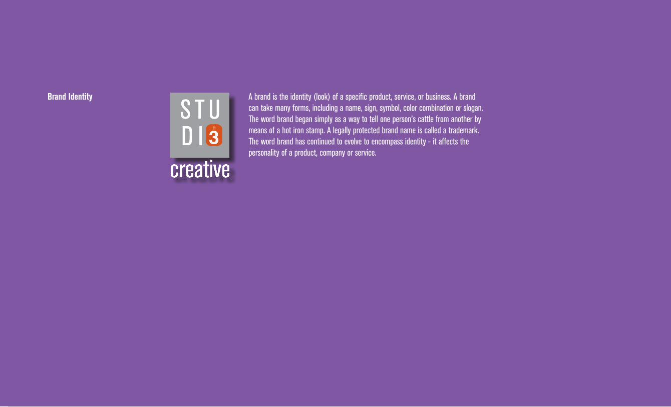
A brand is the identity (look) of a specific product, service, or business. A brand can take many forms, including a name, sign, symbol, color combination or slogan. The word brand began simply as a way to tell one person’s cattle from another by means of a hot iron stamp. A legally protected brand name is called a trademark. The word brand has continued to evolve to encompass identity - it affects the personality of a product, company or service.
Brand Identity
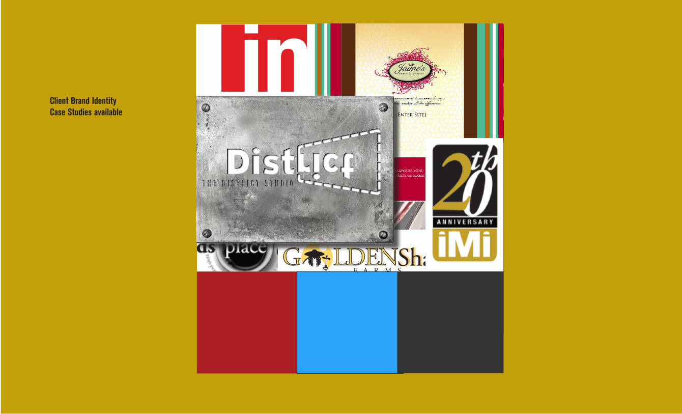
Client Brand IdentityCase Studies available
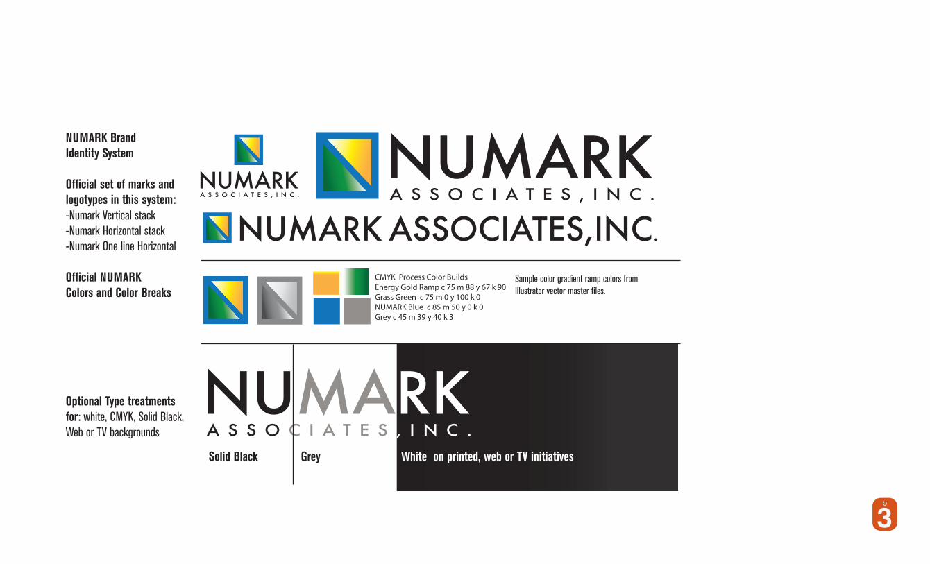
NUMARK Brand Identity System
Official set of marks and logotypes in this system:-Numark Vertical stack-Numark Horizontal stack-Numark One line Horizontal
Official NUMARK Colors and Color Breaks
Optional Type treatments for: white, CMYK, Solid Black, Web or TV backgrounds
Solid Black Grey White on printed, web or TV initiatives
Sample color gradient ramp colors from Illustrator vector master files.
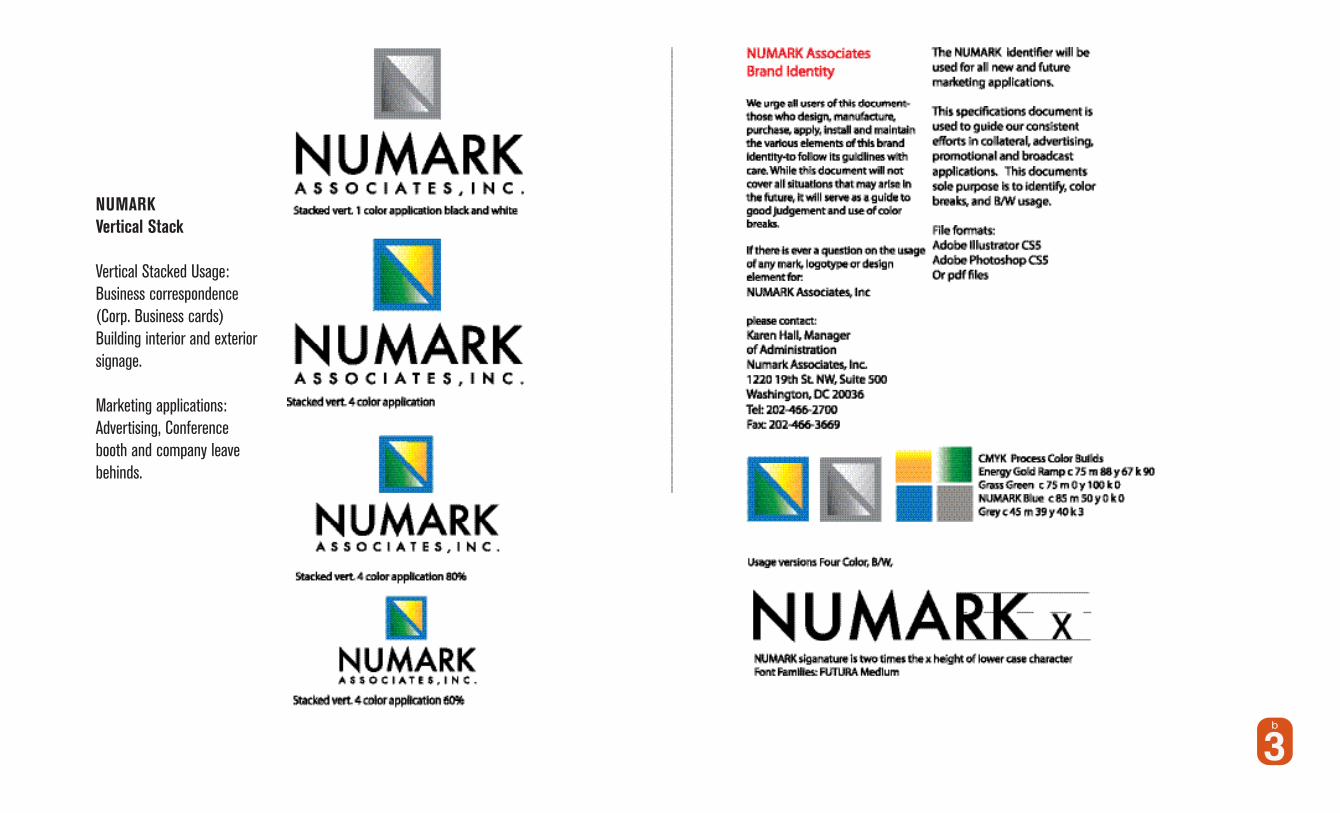
NUMARK Vertical Stack
Vertical Stacked Usage:Business correspondence (Corp. Business cards)Building interior and exterior signage.
Marketing applications:Advertising, Conference booth and company leave behinds.
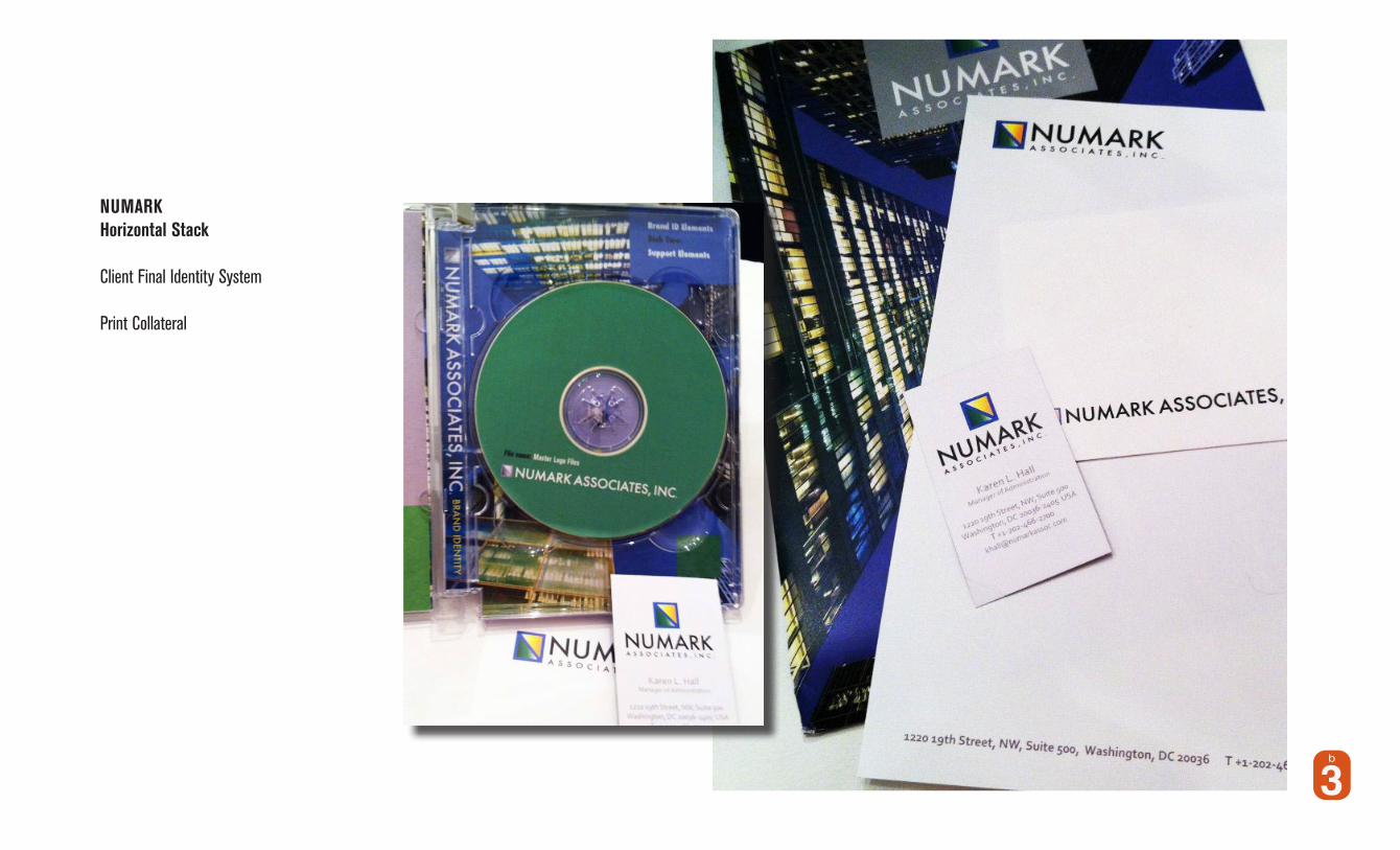
NUMARK Horizontal Stack
Client Final Identity System
Print Collateral

Sushine Sweetie Packaging design
Brand Specifics
Packaging Examples

Sushine Sweetie Packaging design
Brand Specifics
Packaging Examples

SDMS 360Strategic Diversity Management Solutions
Brand Identity

SDMS 360Strategic Diversity Management Solutions
Brand Identity Mark
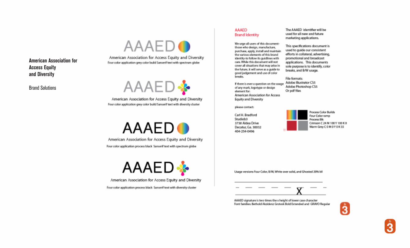
American Association for Access Equity and Diversity
Brand Solutions
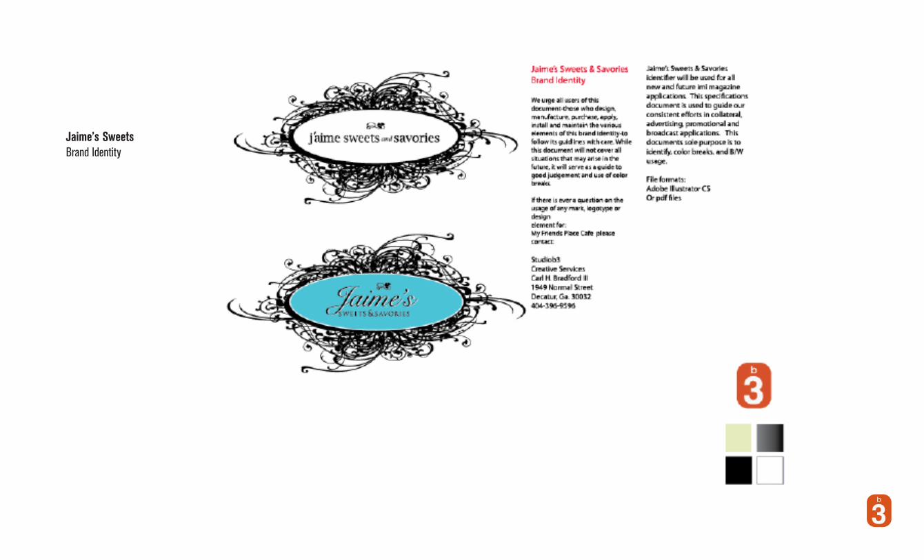
Jaime’s SweetsBrand Identity
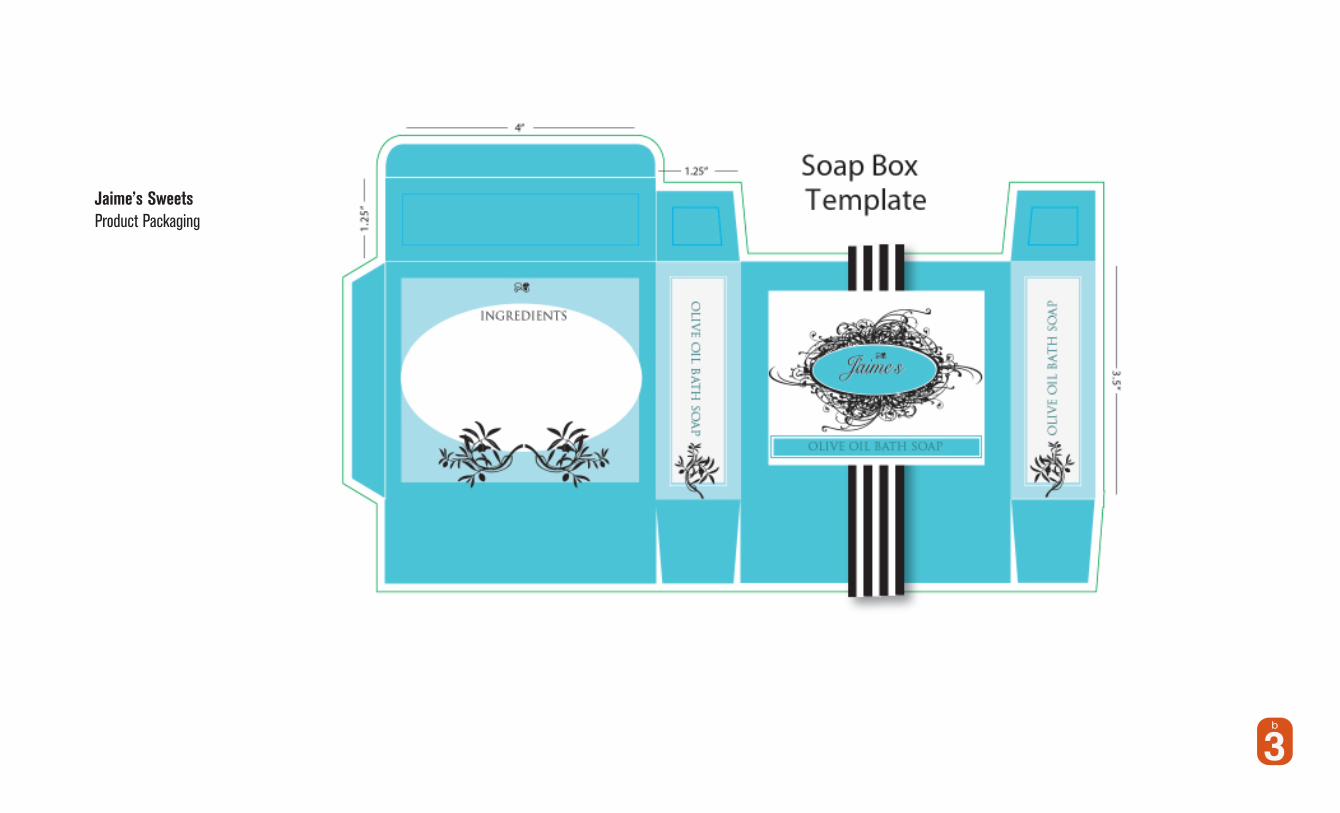
Jaime’s SweetsProduct Packaging

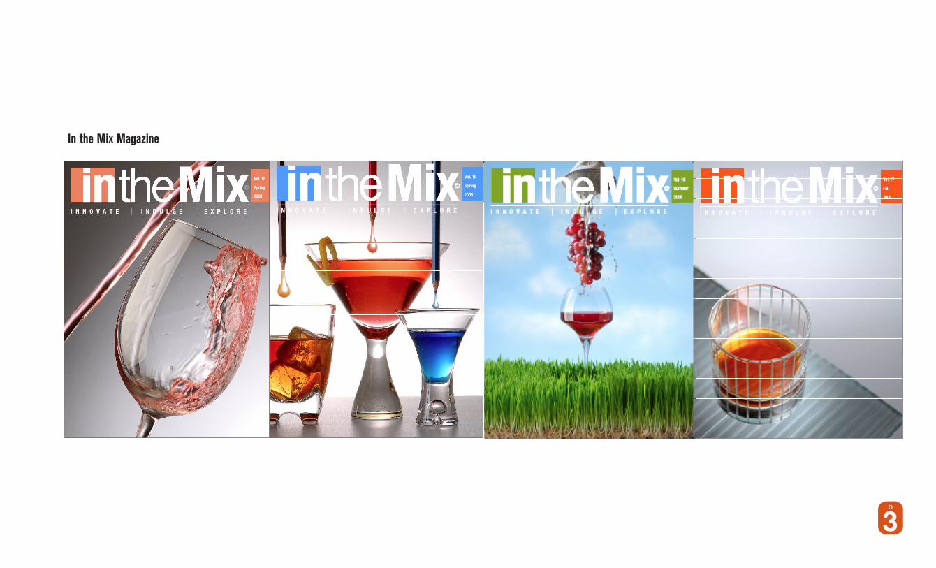
In the Mix Magazine
Brand Identity StandardsMasthead, headers, sectional and divisions were created and presented for this award winning design for the Food and Beverage industry clientele.
IMI Agency is a F&B marketing on and off premise beverage marketing company. Clients: DIAGEO, SKY Vodka, Red Bull, Inter-continental Hotels, Harrahs etc.
©
©
©
In the mix MagazineBrand Identity
We urge all users of this document-t-those who design, manufacture, purchase, apply, install and maintain the various elements of this brand identity-to follow its guidlines with care. While this document will not cover all situations that may arise in the future, it will serve as a guide to good judgement and use of color breaks.
If there is ever a question on the usage of any mark, logotype or design element for:the Incentives Marketing Agency (Imi) please contact:
iMi AgencyCreative ServicesCarl H. Bradford III1196 Buckhead CrossingWoodsstock, Ga. 30189770.928.1980
iMi Agency/In The Mix magazineidentifier will be used for all new and future imi magazine applica-tions. This specifications document is used to guide our consistent efforts in collateral, advertising, promotional and broadcast applications. This documents sole purpose is to identify, color breaks, and B/W usage.
File formats:Adobe Illustrator CSOr pdf files
©
©
In the Mix Magazine

In the Mix Magazine
Brand Identity StandardsCover and interiors


Marketing Business Collateral Print Advertising
1
IN THE MIX www.imidrinks.com
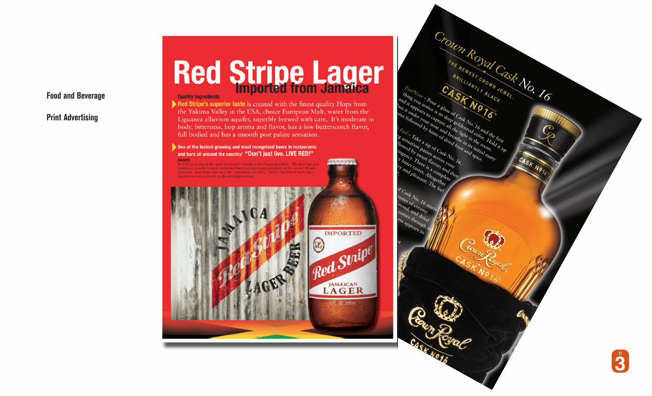
Crown Royal Cask No. 16Eye/Nose – Pour a glass of Cask No. 16 and the first
thing you notice is its deep goldenrod color. Hold it up
and it appears to capture all the light in the room.
Pass it under your nose and breathe in its initial nutty
aroma followed by hints of dried fruit and spice.
Mouth Feel – Take a sip of Cask No. 16.
A cooling sensation passes across your
tongue followed by sweet flavors and then
a slight astringency. There is a complete
absence of any bitter tastes. Altogether
the whisky is dry and pleasant. The feel
is medium to full.Palate – The flavor of Cask No. 16 starts
out sweet. There are tastes of creamy
butterscotch, vanilla, almond, and dried
fruit. A pleasant richness comes through in
the mid-palate and a spiciness appears to
enrich the flavors.Flavor Finish – The finish is what
separates Cask No. 16 from any
other whisky. This is where the
Cognac Oak finish shines. The finish
is long and rich. There is an oak
smokiness along with all the
flavor notes. The flavors are
engaging and balanced all the
way through to the end.
T H E N E W E S T C R O W N J E W E L .
B R I L L I A N T L Y B L A C K
DIAGEO_CrownRCask16.indd 1
7/25/08 1:24:58 PM
Food and Beverage
Print Advertising

Food and Beverage Product DesignRed Bull
Product Design leave behind for Red Bull’s Energy Break Campaign.
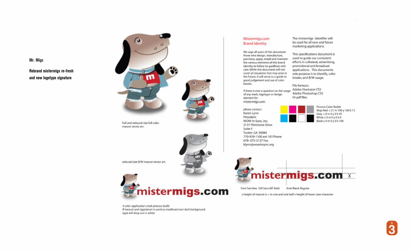
Mr. Migs
Rebrand mistermigs re-fresh
and new logotype signature

Re Brand
All marketing &Business collateral
Press kit
Counter Cards
Karen Lynn
President
2137 Flintstone Drive
Suite ETucker, GA 30084
770-939-1100 ext 101 ph
678- 672-2127 fx
Seriously Cool Dog Gear
Seriously Cool D
og Gear

Mistermigs Discovery Program Digital and print collateral Leave behinds
Email blast and digital collateral assets
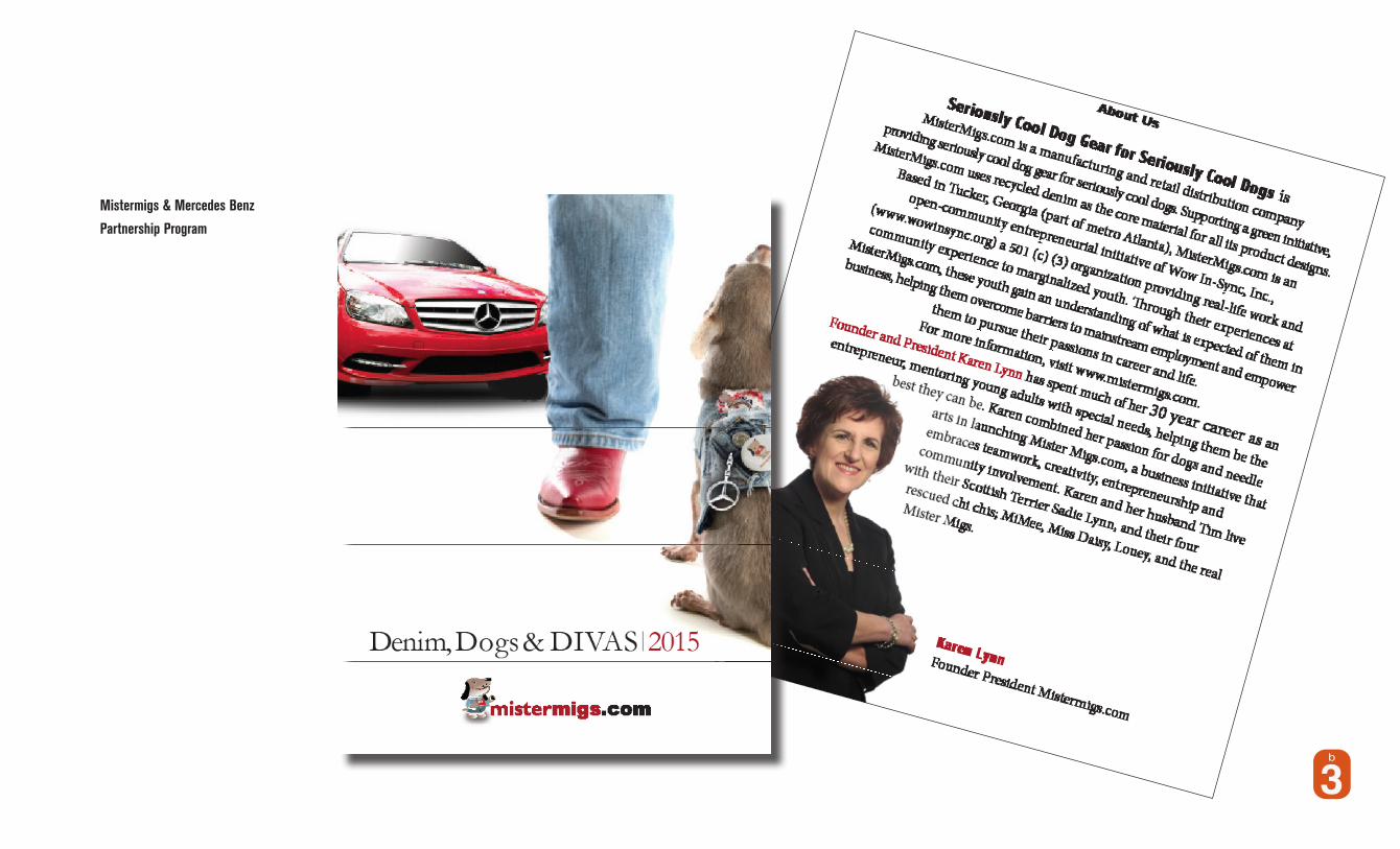
Mistermigs & Mercedes Benz
Partnership Program
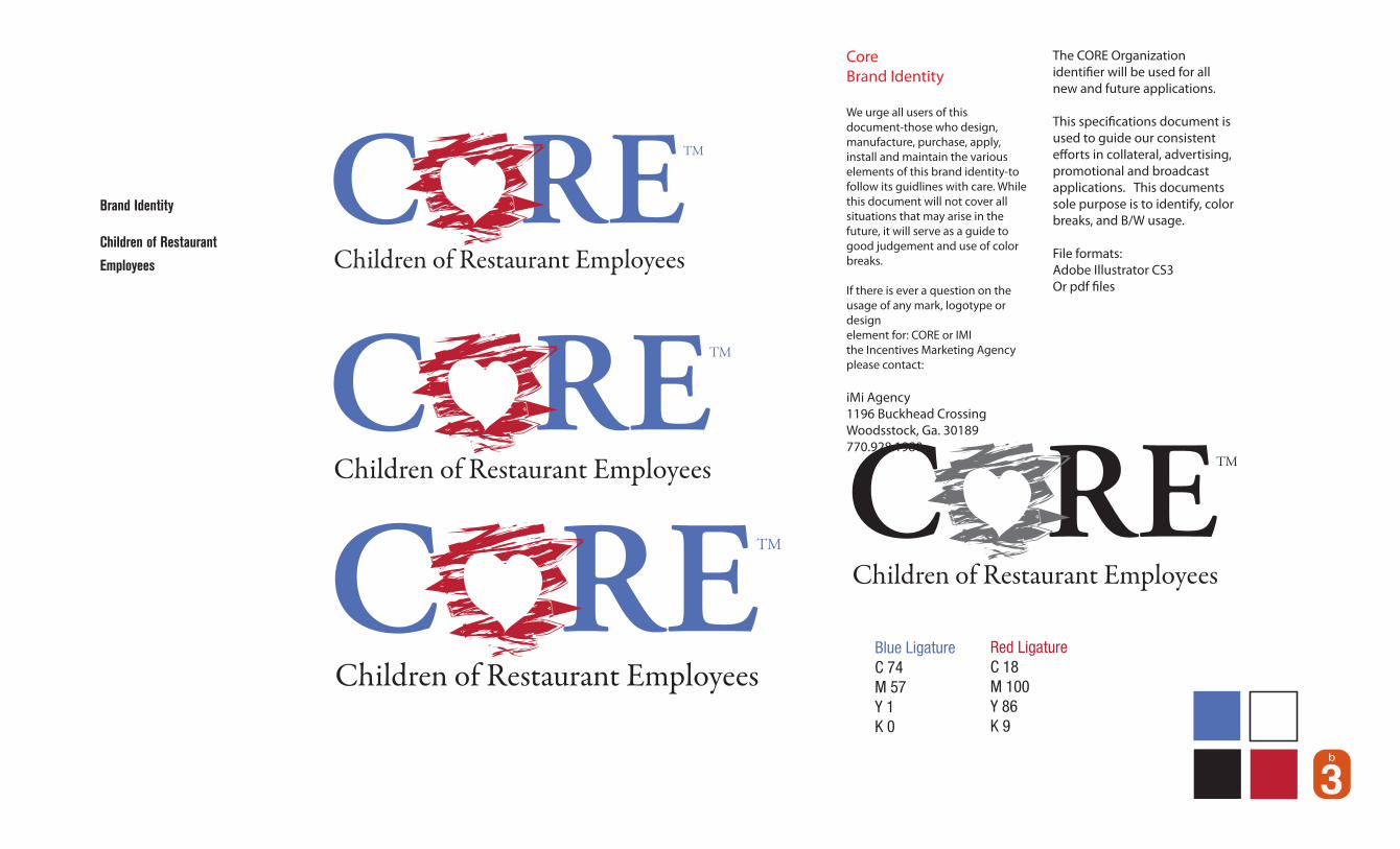
Brand Identity
Children of Restaurant
Employees

D
OB GYN&A S S O C I A T E S
OB GYN&A S S O C I A T E S
Brand Identity
OB/GYN Midwife Associates

Brand Identity
CKL IT Services
Brand Identity
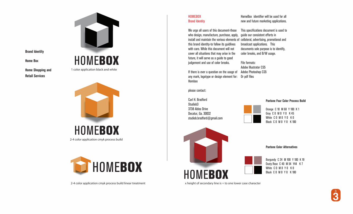
Home Box
Home Shopping and
Retail Services
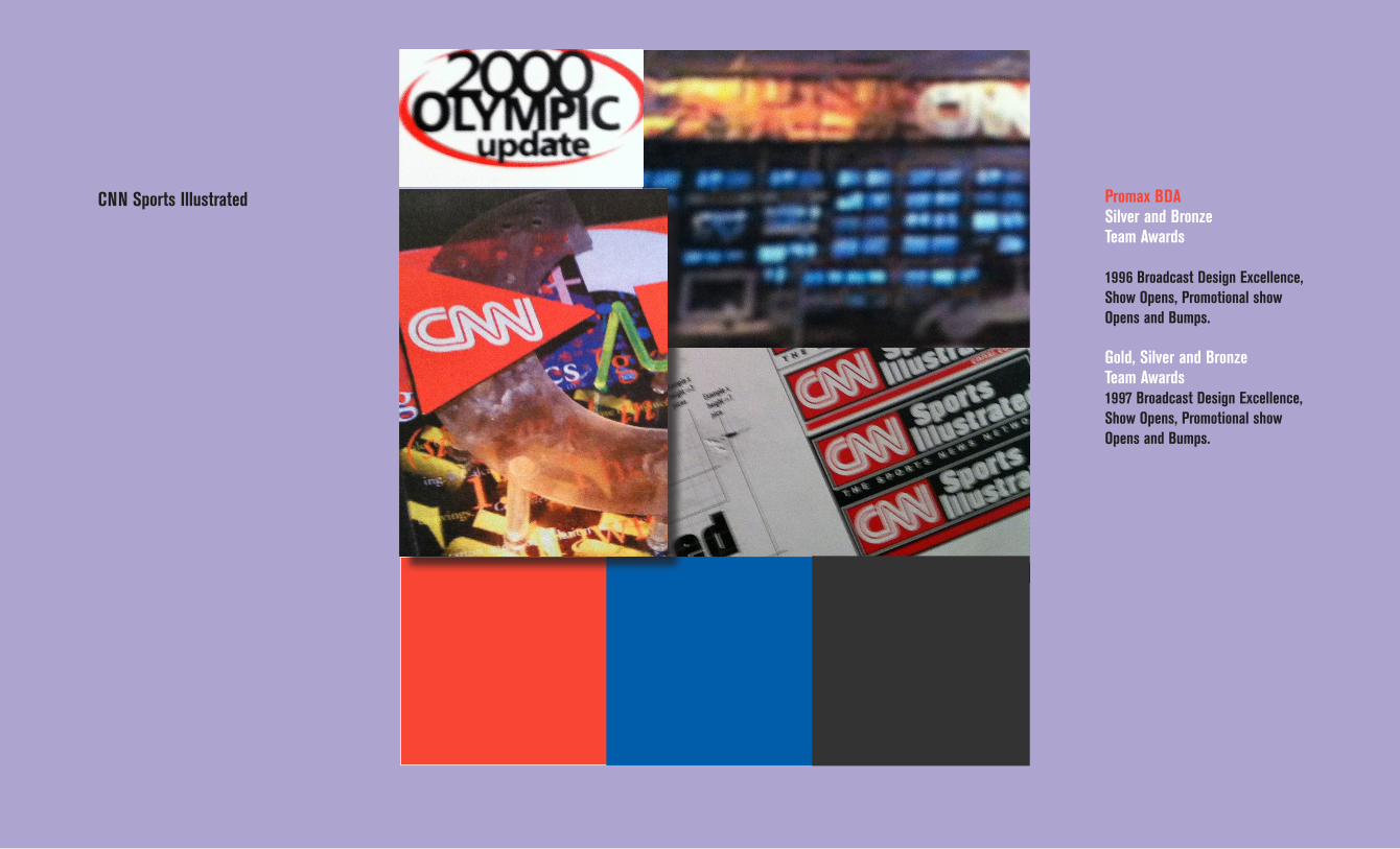
CNN Sports Illustrated Promax BDASilver and Bronze Team Awards
1996 Broadcast Design Excellence, Show Opens, Promotional show Opens and Bumps.
Gold, Silver and Bronze Team Awards 1997 Broadcast Design Excellence, Show Opens, Promotional show Opens and Bumps.

CNN/ CNNSI Brand Standards and Extension
Signage concept CNN DesignBrand extension with layerd acrylyte and neon signage design for the CNN design
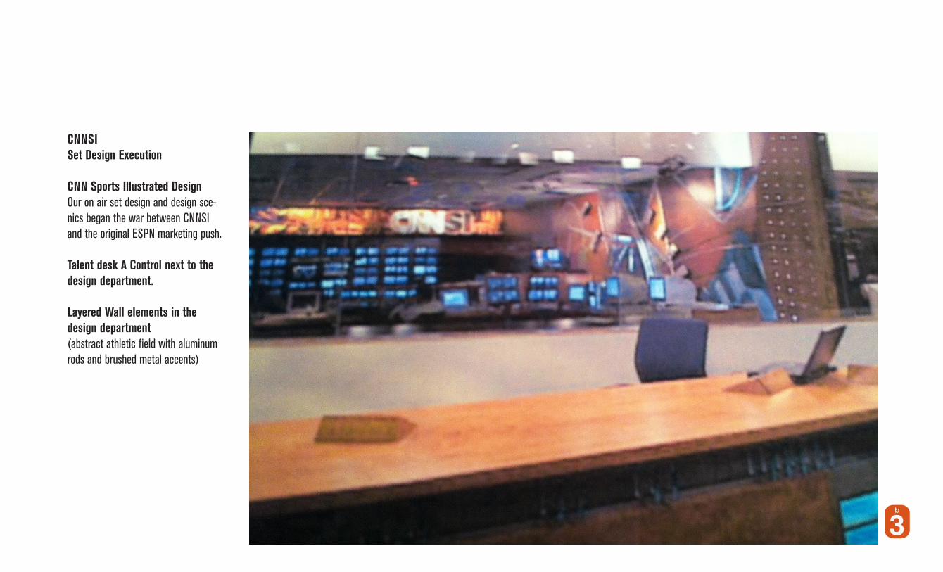
CNNSI Set Design Execution
CNN Sports Illustrated DesignOur on air set design and design sce-nics began the war between CNNSI and the original ESPN marketing push.
Talent desk A Control next to the design department.
Layered Wall elements in the design department (abstract athletic field with aluminum rods and brushed metal accents)
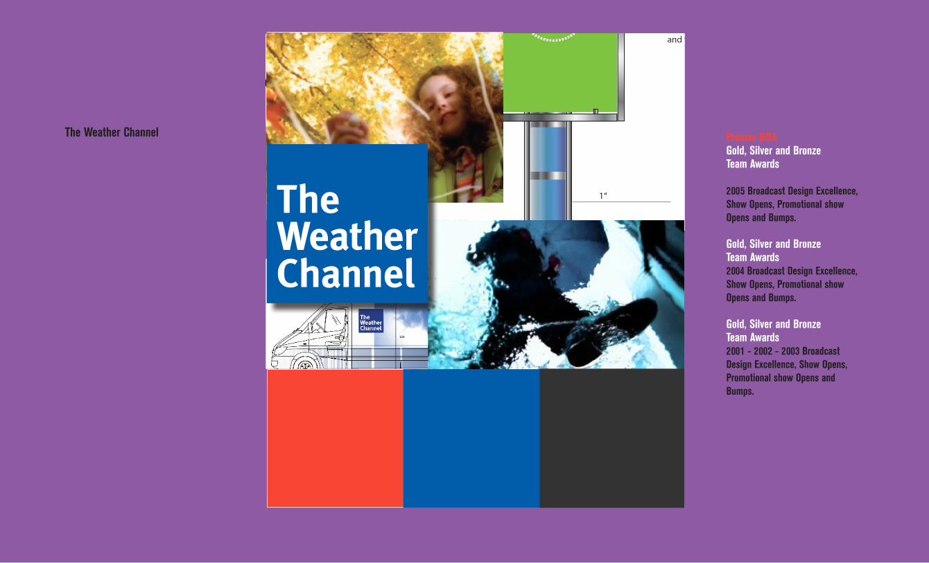
The Weather Channel Promax BDAGold, Silver and Bronze Team Awards
2005 Broadcast Design Excellence, Show Opens, Promotional show Opens and Bumps.
Gold, Silver and Bronze Team Awards 2004 Broadcast Design Excellence, Show Opens, Promotional show Opens and Bumps.
Gold, Silver and Bronze Team Awards2001 - 2002 - 2003 Broadcast Design Excellence, Show Opens, Promotional show Opens and Bumps.

The Weather Channel
Brand Identity StandardsBrand Extension Image BrandingCreative image
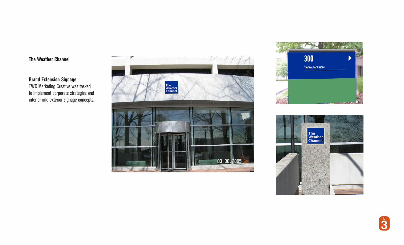
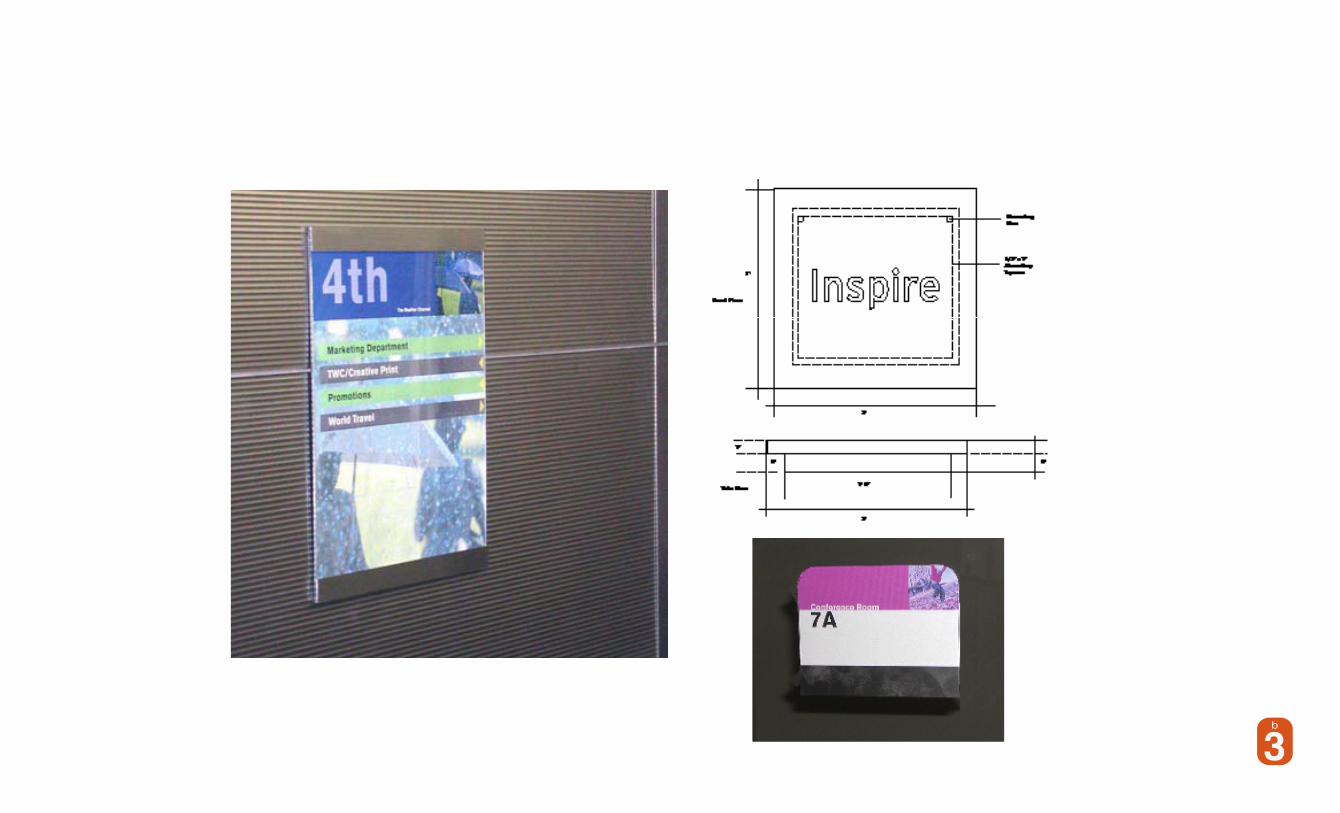
The Weather Channel
Brand Identity StandardsBrand Extension SignageTWC Marketing Creative was tasked to implement corporate strategies and interior and exterior signage concepts.
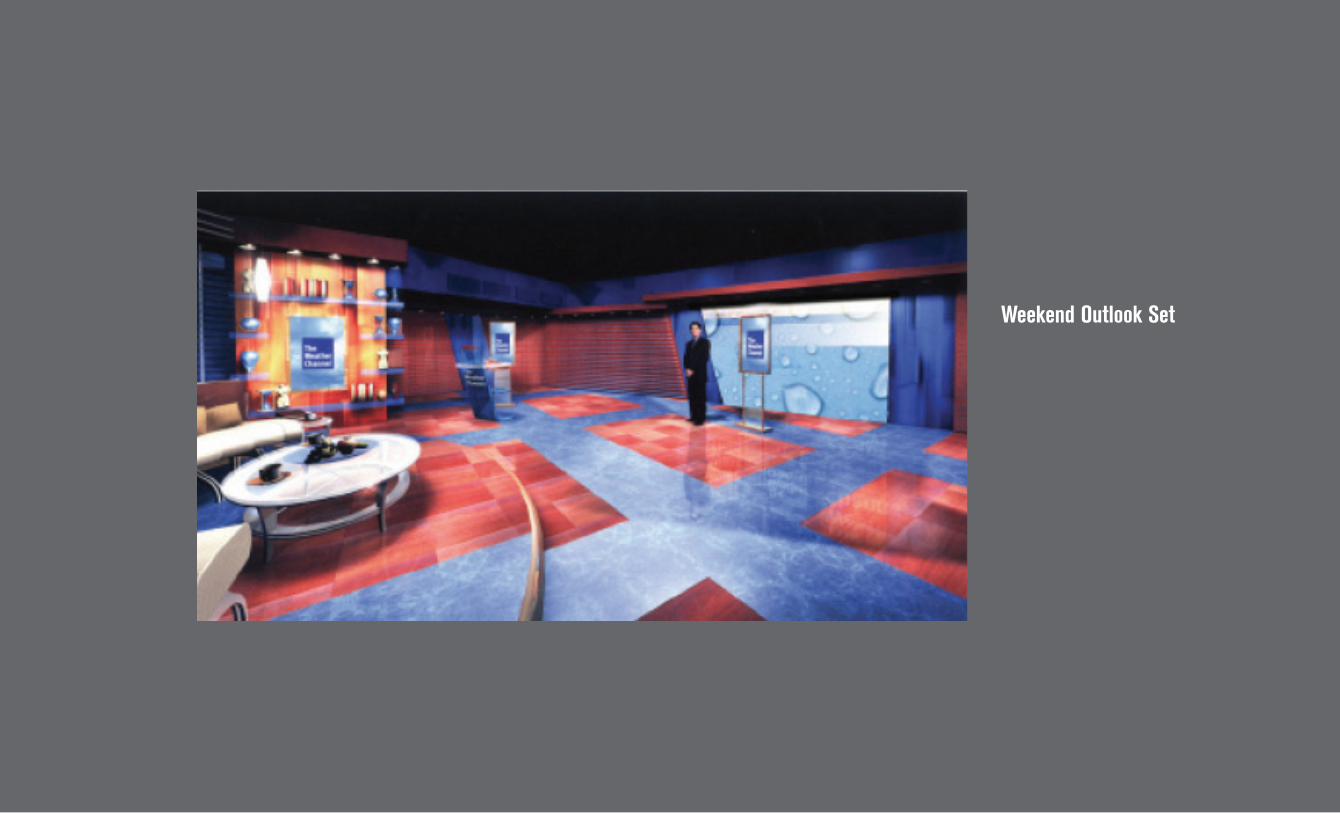
Weekend Outlook Set
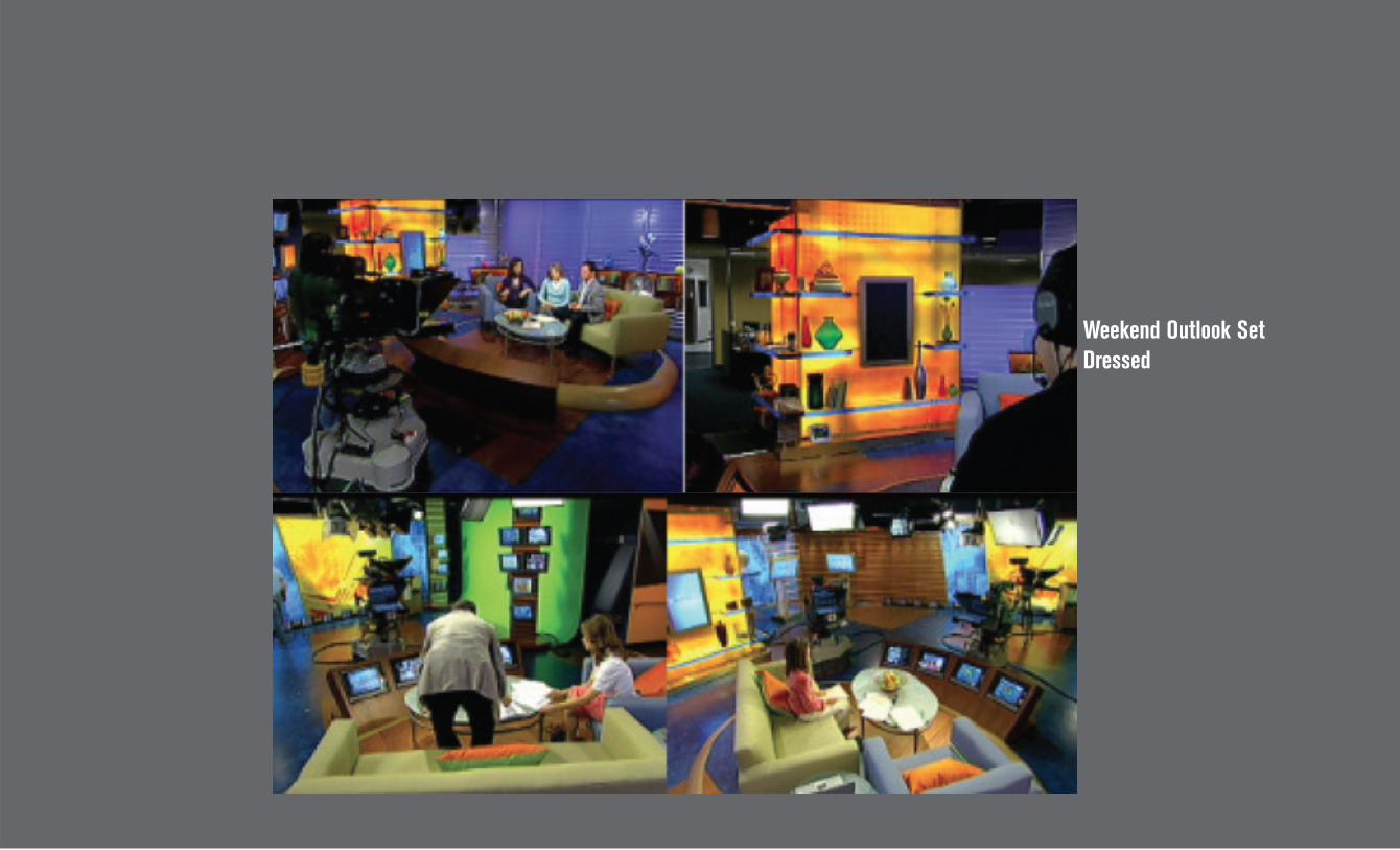
Weekend Outlook Set Dressed

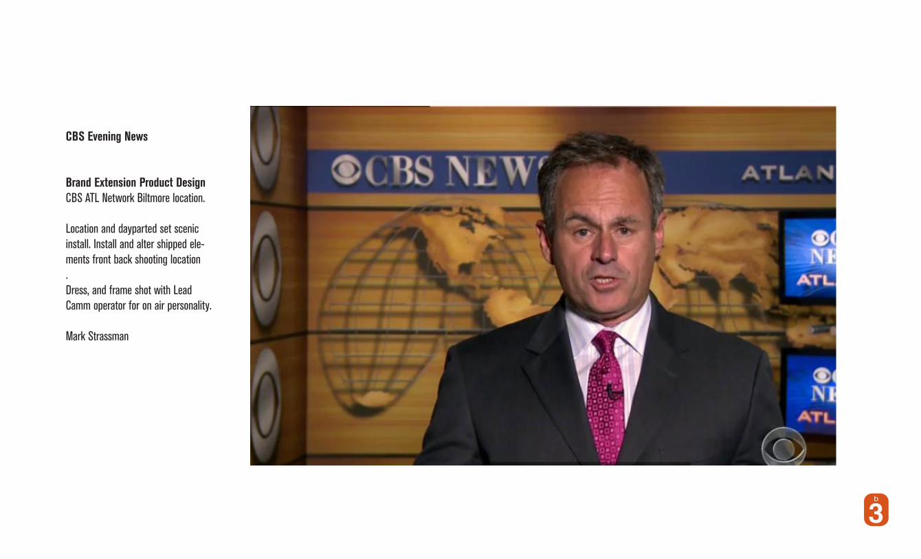
CBS Evening News
CBS Creative Set Scenics Consultant
On Location Audio Tech
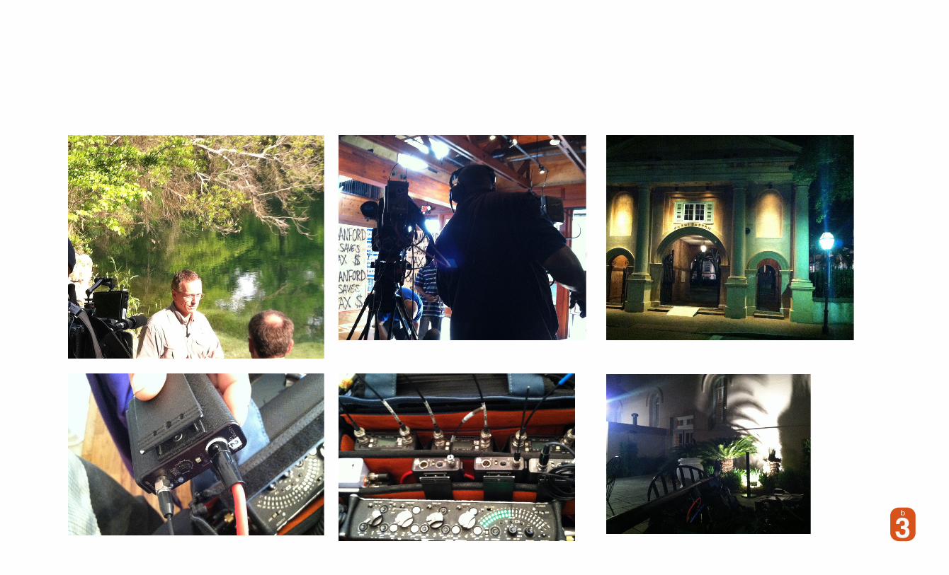
CBS Evening News
Brand Identity StandardsBrand Extension Product DesignCBS ATL Network Biltmore location. Location and dayparted set scenic install. Install and alter shipped ele-ments front back shooting location.Dress, and frame shot with Lead Camm operator for on air personality.
Mark Strassman

ON Location CBS Audio Tech Support
On Deck White House Press Pool
Sunday Morning Drone Story
Crusie Shp Coverage
Sunday Morning Sink Hole StoryStardsSanford Re-election Coverage