2012 fonts of cam e-exhibition
DESCRIPTION
Fonts of CA M examines how type served San Antonio in March 2012.TRANSCRIPT

fontscam
of


3
Mission:Fontmasters is dedicated
to establishing personal gainthrough Font educationin an ethical approachat the highest level.
(cc) attribution-noncommercial 3.0 unported (cc bY-nc 3.0) 2012
published bY Fontmasterssan antonio, tXwww.Fontmasters.org

4
dedicated to you know who for you know what.

fonts of came EXHIBItIonfonts of caM examines how type served San antonio in March 2012.
-

Form vs. Function.Hand vs. Machine.sans vs. serif.
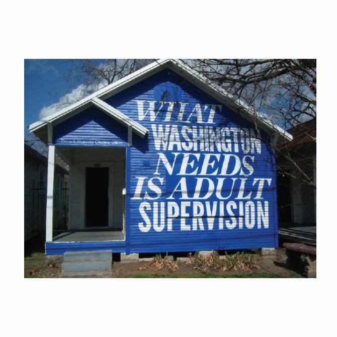
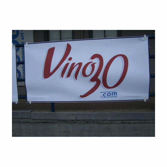
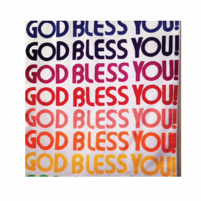
over the course of 30 days in March, artists and curators host events in galleries and in out-of-the-way nooks and cranies throughout San antonio for contemporaty art Month (caM). fontmasters charged caM followers to capture their most interesting interactions with fonts. Some images directly follow the exhibitions while others find aesthetic inspiration outside of the art world. along with the font images submitted, we also included a sample of graphics that were used in the online caM calendar and an interview with caM co-chair, nina hassele, about the new feminized logo for caM.
thanks to everyone who participated. enjoy fonts of caM 2012!
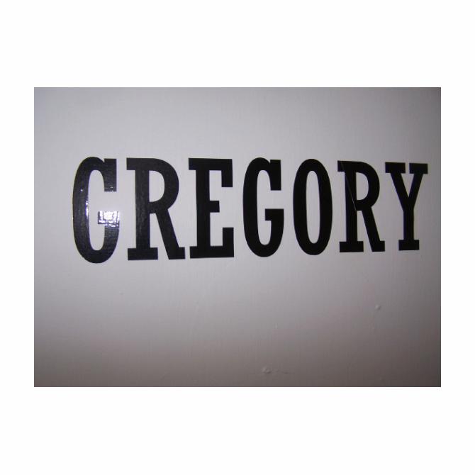
Mary e. cantuchris castillo
cornelia Swann
7

table of contents
eMily Barker..................................................................................
Mary e cantu................................................................................
nate caSSie....................................................................................
14
15
16

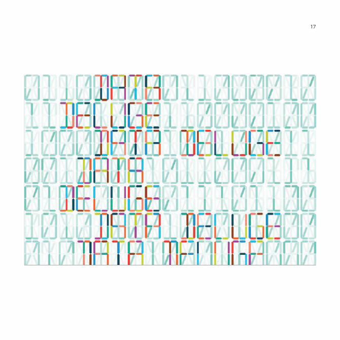
chriS caStillo...............................................................................
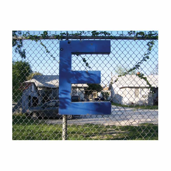
kriStina elizondo........................................................................
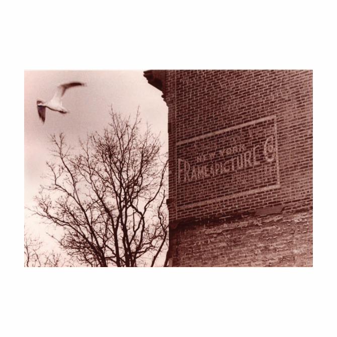
ana fernandez............................................................................
17
20
21

table of contents
nina haSSele.................................................................................
aMy JohnSon.................................................................................
Mat kuBo.......................................................................................
22
66
68

andrew loPez..............................................................................
kriSten MancillaS.......................................................................
JiM Mendiola.................................................................................
69
72
74

table of contents
JunG Mun......................................................................................
cruz ortiz.....................................................................................
laura SalGuero...........................................................................
79
80
81

JeSSi rae Sanchez........................................................................
cornelia white Swann..............................................................
q&a with nina haSSele..............................................................
froM the 2012 conteMPorary art Month calendar.......
82
83
88
84

114

215

116
1717


120

21

222

1

2

1

2


66

68
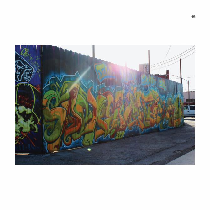
69


this page intentionallY leFt blank.

72


74


79

80

81

82

83

84
froM the
Pencil thiS in
via http://contemporaryartmonth.com/
facinG PaGe: calendar entry in ff dinGBatS 2.0

4
1 12:01 am - 11:59 pm “Open Call for Images - Fonts of CAM (Contempo-rary Art Month) e E x h i b i -tion” Fontmas-ters.org Face-book » 10:00 am - 6:00 pm “Light-forms 2012”

1. Bluestockings at Studio one zero three 2. Pick your Goddess at Blank / studio garden 3. Serigraph killer at nightrockers live 4. andy warhol: fame and Misfortune at Mcnay art Museum 5. Vacancy_02 Beauty Salon at cesar chavez Building at Guadalupe cultural arts center
1
2
3
4
5
font-aStic VoyaGeS

4
1. Spiritual Milk for the american Babe at Southwest School of art 2. hello Studios Presents: Bradley wilkinson 3. head case at the Special Projects Social 4. SiGnS - Poster Show & Sale at Boneshakers Bicycle Pub
-cc
1
2
3 4

88 2
interview by CORNELIA WHITE SWANN Fontmaster Social Media Co-Chair
q&awith nina hassele
when first launched to the public, the new caM 2012 logo created quite a social media buzz. Some people loved it and others were quite critical of the new design. of course, this is the juicy font chisme we at fontmasters love so after much speculation and a michelada meeting later, we decided to go to the source and ask a few questions about the new logo to nina hassele, co-chair of contemporary art Month 2012.
Fontmasters was excited to see a new logo for CAM. Tiara, tractor and a girl! Can you tell us a little about the decision to update the logo? at a board meeting with our Pr rep the topic of feminizing the logo came up, before we knew it, we decided on a female with a crown or tiara. we passed the information on to XGroup design who generously did all of our graphic design work for caM 2012 and like magic the caM 2012 logo was born.
How do you feel the new logo reflects this year’s CAM? i believe its a direct reflection of caMs new beginnings. we started off with a small 5 per-son executive Board (Ben Judson & nina hassele co-chairs, kael hoskings, John fahle and Marta francine) this year. we also formed an artist advisory Board with former long term board members and additional local artists consisting of david alcantar, andy Benevides, nate cassie, anjali Gupta, Jake zollie harper, dayna de hoyos, Mat kubo, ken little, karen Mahaffy,

Michele Monseau and chris Sauter. Miss caM antonio was a direct result of the new logo. CAM has utilized different designers each year. Based on our collective memory, the original logo was designed by Chuck Ramirez and the second year was Beto Gonzales. What designer/s were used this year? Do you plan on utilizing a new designer each year? yes, chuck ramirez is the original designer of the well known caM tractor logo and font. it was not caMs intention to have two different designers follow in chuck’s work. when chuck passed away Beto Gonzales was approached by then board member’s and at the time caM had funds for a graphic designer. when caM 2011 ended caM was left with a balance of under $1000 dollars, and as we all know, a $1000 dollars doesn’t go too far. during the same board meeting where we discussed feminizing the logo we went through a list of designers we could approach for in-kind caM graphic designing with a very short time line. it was already the end of 2011. i mentioned a very good friend of mine who designed my last two Bling Bling fling invites with Martinez Street women’s center and the possibility of her in-kind services for caM 2012. two emails later and she agreed to support caM 2012, doing all of our graphic design work.
What font was used for the logo? tightrope. And finally, what’s your current favorite font? right now Garamond Bold :)
“...the topic of feminizing the logo came up, before we knew it, we decided on a female with a crown or tiara.”

3
Fonts used in tHis publication:BraggadocioFF dingbats 2.0
fummEl
Garamond Bold
helveticamaven pro

4